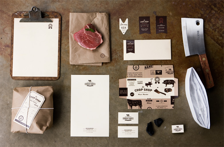
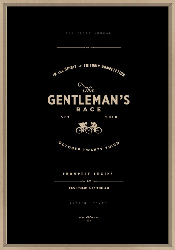
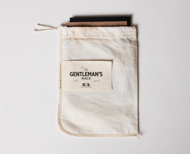
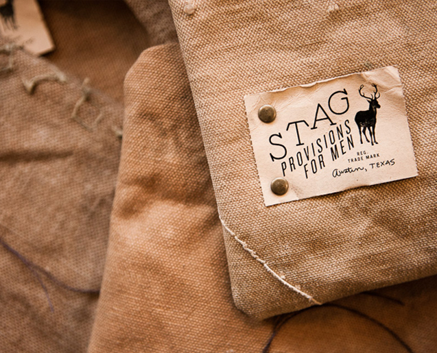
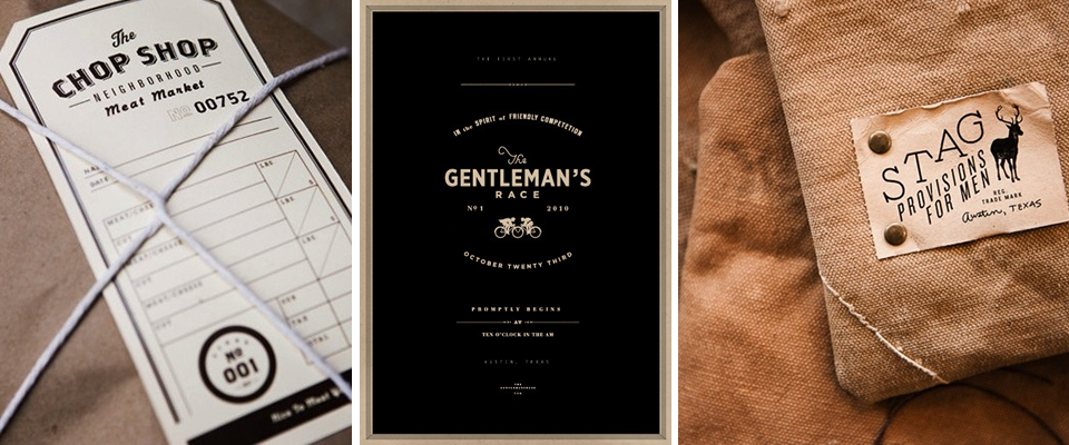
Caleb Owen Everitt
Loving the masculine feel of these designs for masculine clients (a butcher shop, a men’s clothing store, a “gentleman’s race,” I wasn’t kidding!) by Caleb Owen Everitt.


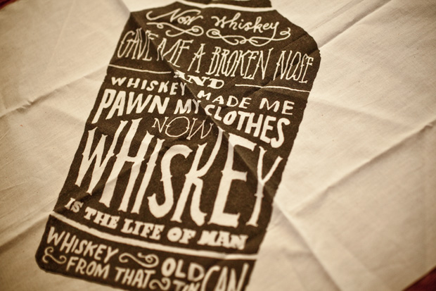
Alvin Diec
I recently came across the work of Alvin Diec and originally thought I’d post a couple of his pieces on Editor’s Chair. Then, I started perusing his entire portfolio, and as I usually do, I was dragging things I liked into various folders on my desktop. Then, I realized I’d dragged almost every single thing in his portfolio into one folder or another.
So, I decided to share all of it with you (or at least, a lot of it). His brand identity and graphic design work is just so spot on. Classic and authentic looking, like the brands could have been around for decades, and yet unique and interesting. And he seems to have a lot of the same obsessions that I do… things that look like old tickets, twine, airmail envelopes, ampersands, luggage tags…
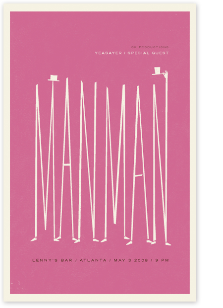
Here are a few of his poster designs…

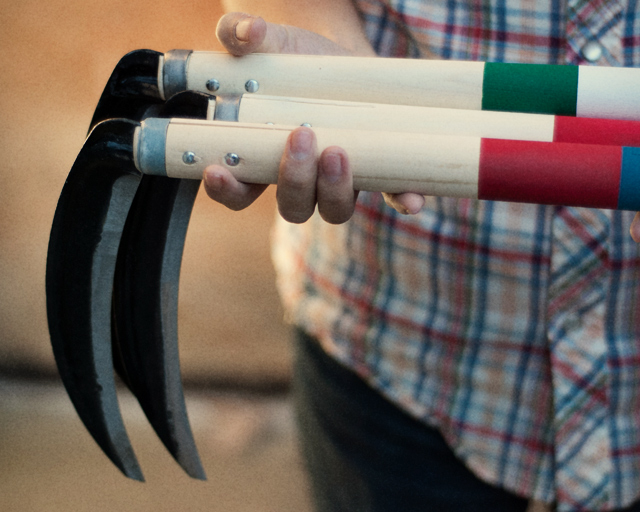
Oh! And he has a project in his porftolio called Fairly Well Made Co.– clearly a play on Best Made Co., the axe brand that I developed a serious fascination and love/hate relationship with– that makes scythes instead of axes and is hilarious. Here it is:

[And here, here, and here are past posts on Best Made Co if you missed them.]
Check out the gallery for lots more work…


PS- AND, he lives in Atlanta! Atl represent!
Levi’s Photo Workshop
This is such a fun (and smart) idea by Levi’s. They’ve created a pop-up “shop,” in New York, but instead of being an actual Levi’s store, it’s a photography center– with computers and equipment for digital photo processing, a photobooth, and an area where you can rent out vintage film cameras. And should you need any help, there are sharply dressed Levi’s reps there to assist.
And this pop-up is on the heels of a successful printmaking workshop space in San Francisco a few months ago. Pretty clever move for a denim brand that as of a couple years ago was a rather unexciting, tired brand rapidly losing market share to the the dozens of expensive niche denim purveyors out there.

Here’s what CoolHunting had to say about the thinking behind the project after their conversation with the brand’s head of collaborations, Joshua Katz:
“The payoff of course is “if you make that extra effort, people can believe in it.” Or in other words, their success comes from embracing hard work and community as core values from the top down. “There are fundamental philosophies that don’t change,” says Katz. “The [brands] that stick around are people who recognize that they are part of a community.” In addition to opening its doors to artists, community groups and non-profits, all proceeds from sales of Levi’s goods (including the exclusive Trucker Jacket, pictured) and camera-related items will go to NYC-based charitable organizations Harvey Milk High School, Lower Manhattan Cultural Council and Edible Schoolyard New York.”
I personally think that the rationale presented may be a little overwrought, but who cares, because it’s fun and cool and its getting them tons of attention, press, and renewed brand awareness and perception. Well done, Levi’s.
More images and info on coolhunting.
Spirit of ’77
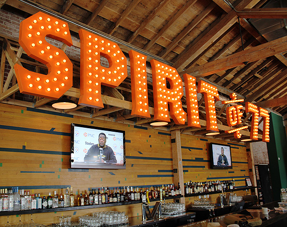

And I don’t mean putting the establishment logo everywhere. What I mean is that every single aspect, from the fonts on the signage, to the paper products (menus, in-room binders, door tags), to the food and drinks, to the kinds of glasses and silverware you choose, all have to speak the same language, constantly reminding the visitor what the place is all about.

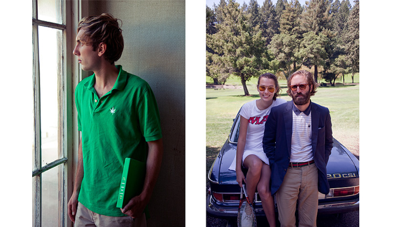
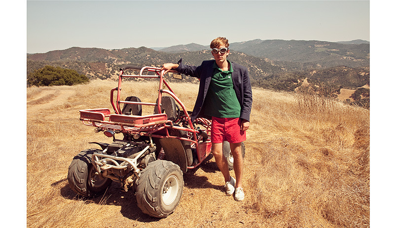
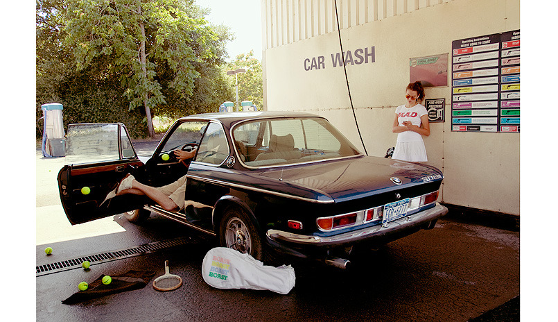
Boast is Back
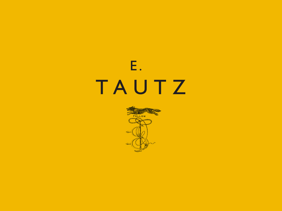
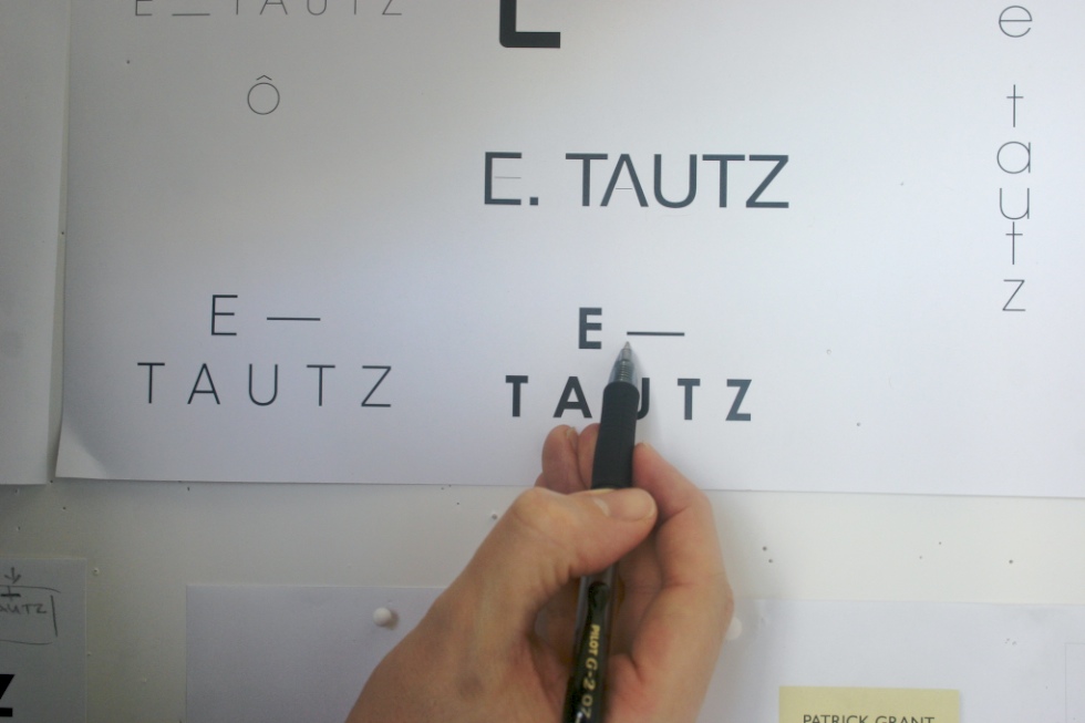
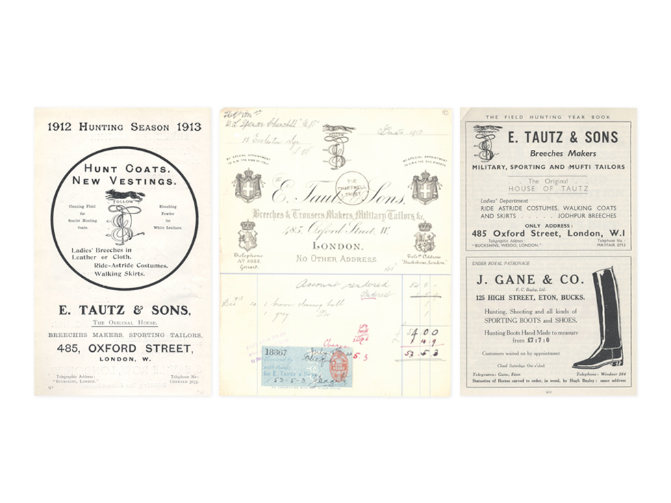
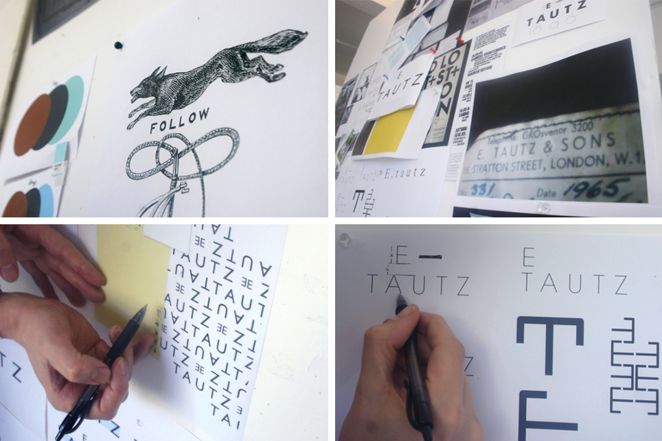
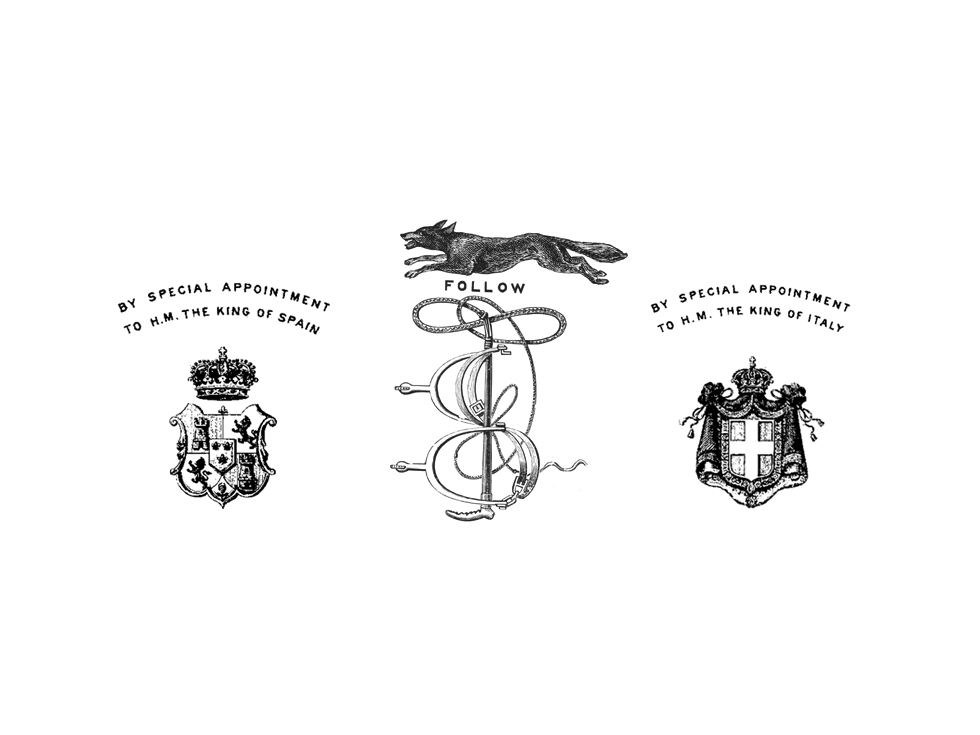
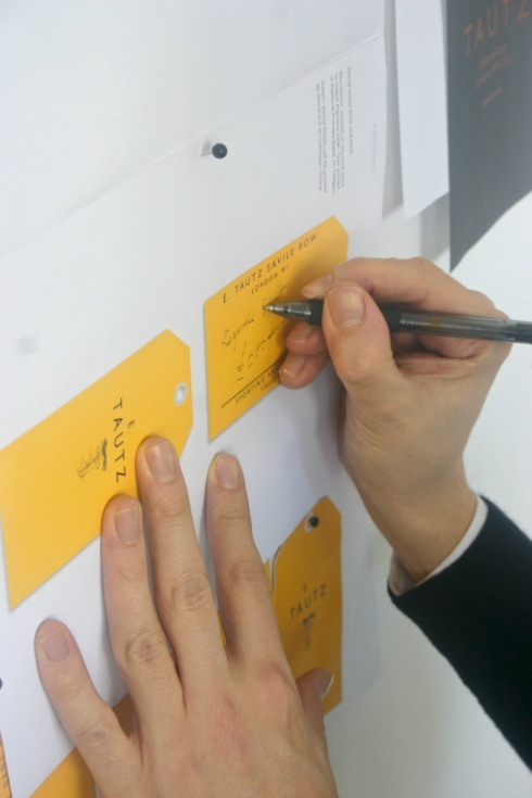
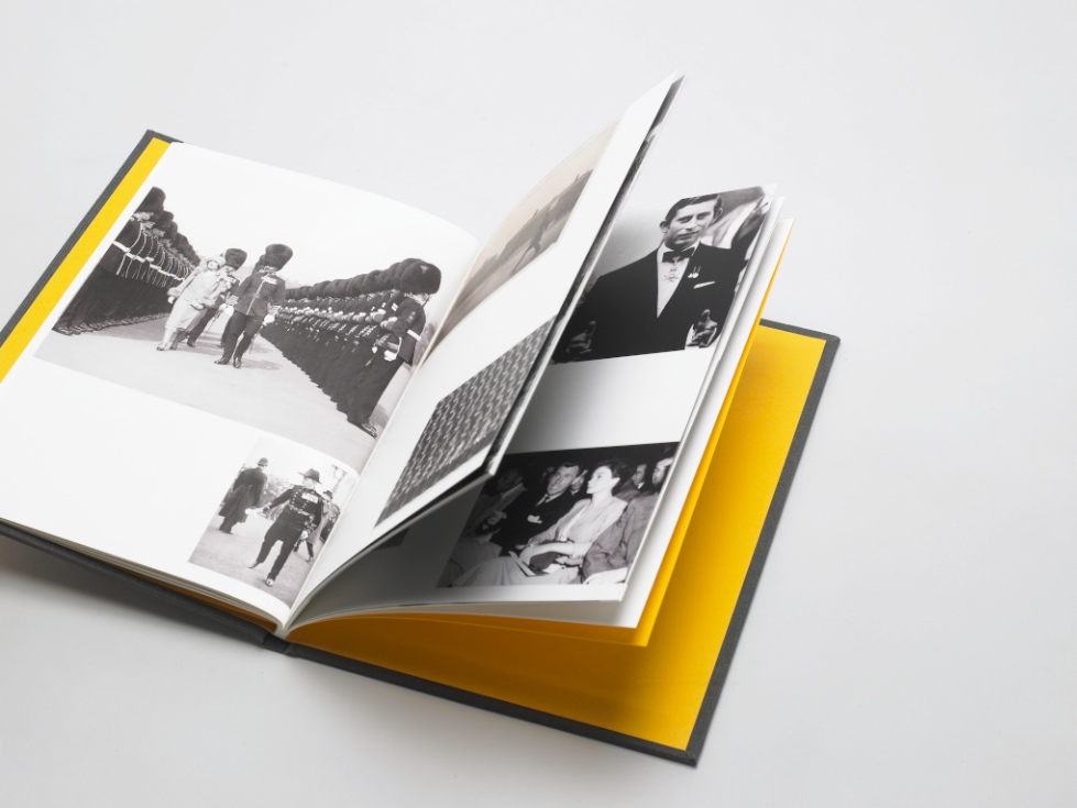
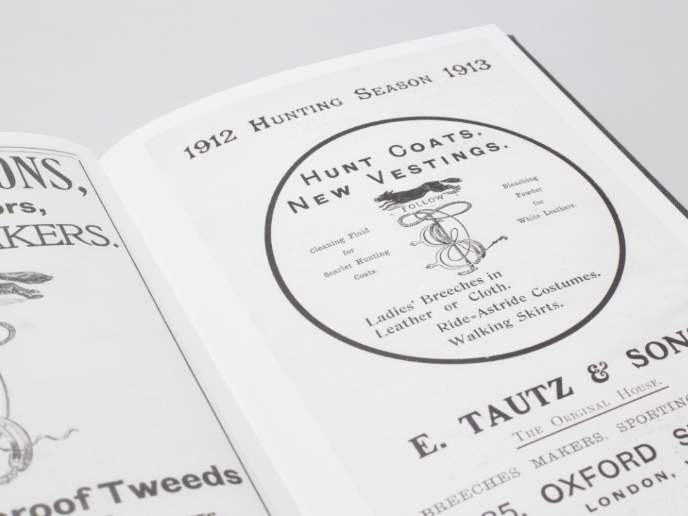
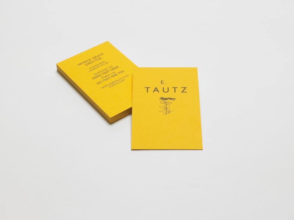
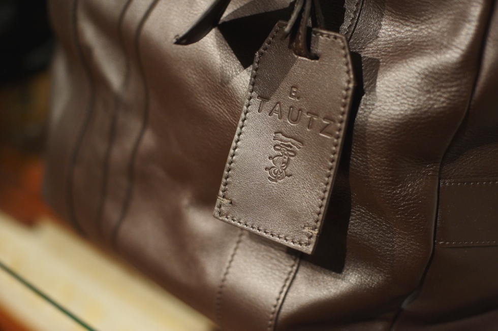
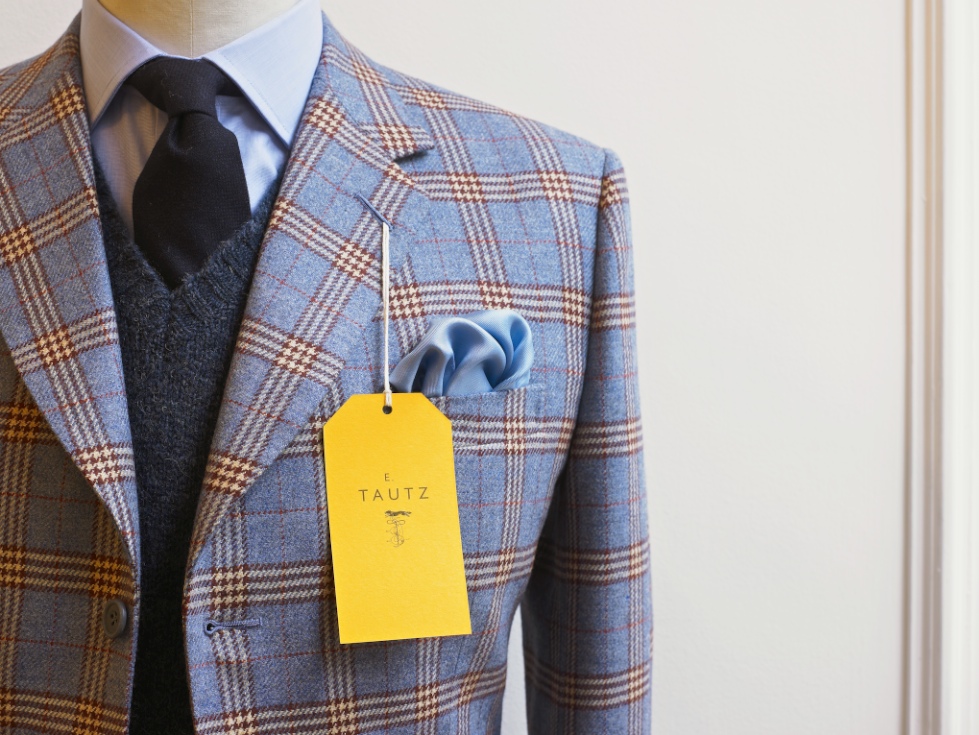
E. Tautz Branding
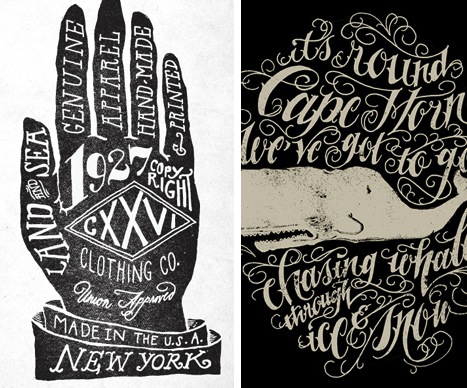
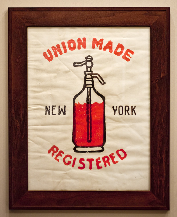
CXXVI
Many Fold Farm Identity System


Seriously. I’m totally hooked, just based on the identity system. That’s impressive for meat and cheese, something about which you really want to be sure of the quality.
It’s not flashy or catchy at all, but the details work perfectly together– the font and its color, the image and its color, the card shape with its cutouts, the super-thickness of the paper, and the letterpress– to speak volumes about the quality of the brand. …Exactly what you’d want in an identity system.
By Studio on Fire for Many Fold Farm, which specializes in fine meats and cheeses. You can check out Many Fold Farm’s blog here.
images reblogged from Pixels & Arrows


