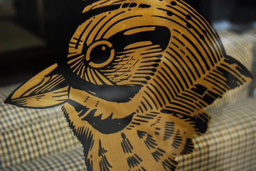
This is your life.
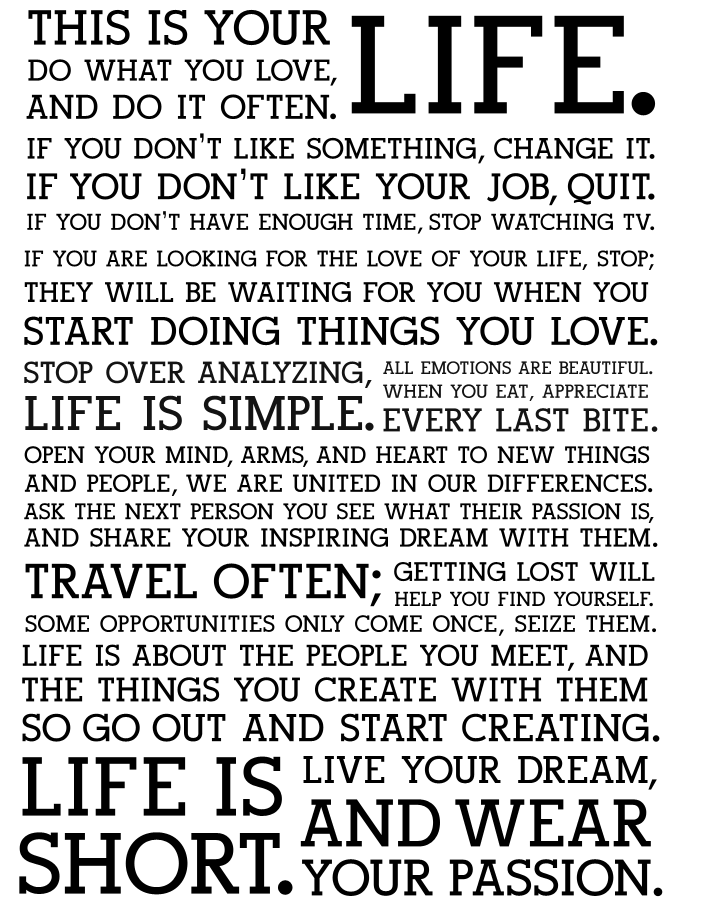
RIGHT??? These are the things I plan to tell my kids every day. At least one per day. Maybe I’ll just hang this on my kids’ walls. I’m not one for “inspirational” posters, but I love how bold this one is, both in its statements and in its style.
[from here]
[via Elements of Style]
Mr. Sign
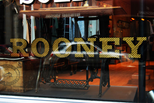
Window-shopping is getting even more appealing in Montreal these days Dave Arnold, or “Mr. Sign,” is bringing back the art of hand-painted window signs. Apparently, his work is catching on like wild-fire and store owners are eagerly seeking him out.
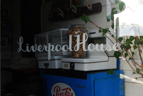
Isn’t that cool?? A resurgence of hand-made anything is pretty exciting. If you missed the post with the video about the dying art of hand-painted billboards in New York, check it out back here. It’s a pretty touching homage.
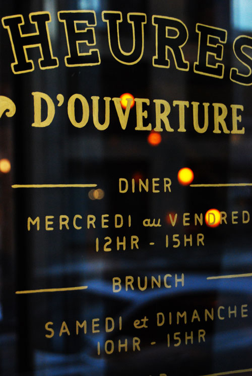
[Dave Arnold/Mr. Sign]
[Poppytalk]
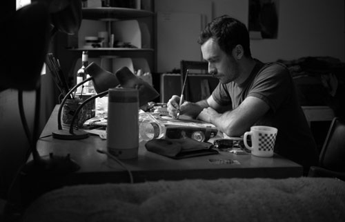
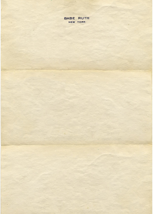
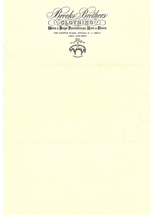
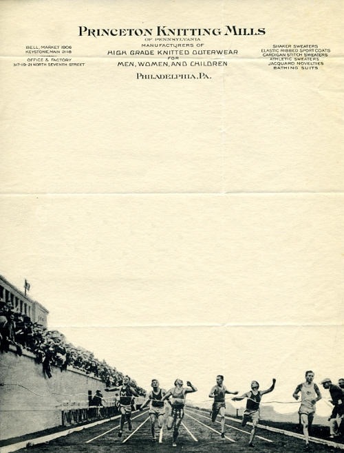
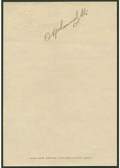
Letterhead

This is awesome. Just discovered a sister blog to Letters of Note (check it out if you don’t know it– it publishes scans of original historically significant letters) called Letterheady, which publishes the letterhead of famous figures and companies. Could browse their archives for… a while.
(Stephen King)
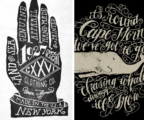
CXXVI
See, I said it was going to be a music-themed day, but I get bored really easily and I’m already really over the idea of posting three music themed things in a row. I did it, and it’s making me feel really anxious, so I’m taking one down, putting it back in the drafts folder, and will post it later. So now you have something to look forward to! Aren’t you dying to know what it was now?
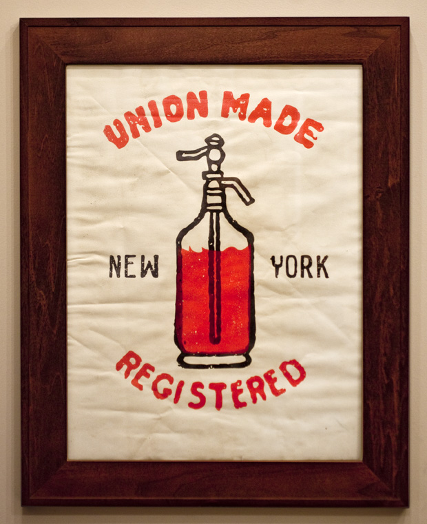
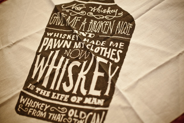
Moving on, I discovered CXXVI Clothing Co. via the cool hand-lettered collateral materials by Jon Contino shown below (I’m not really sure what they’re for, neither are their logo).
Upon seeing these materials, I decided I had to check out whatever company would commission these to be made, and that’s when I found this framed print of a seltzer bottle that I’m dying for.
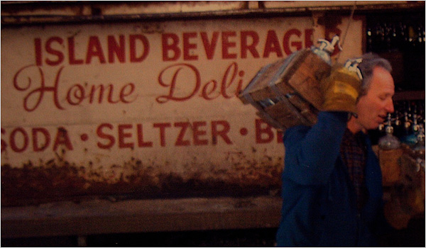
I’m still charmed by this article about the seltzer man in Brooklyn who had been delivering seltzer to homes for almost 40 years (accompanying photo below), and I think the print would happily remind me of the article every time I looked at it. But I digress…
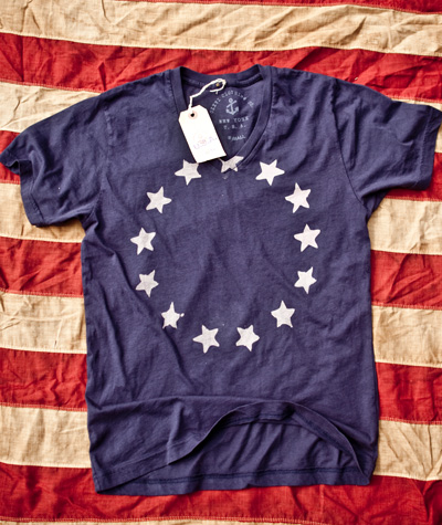
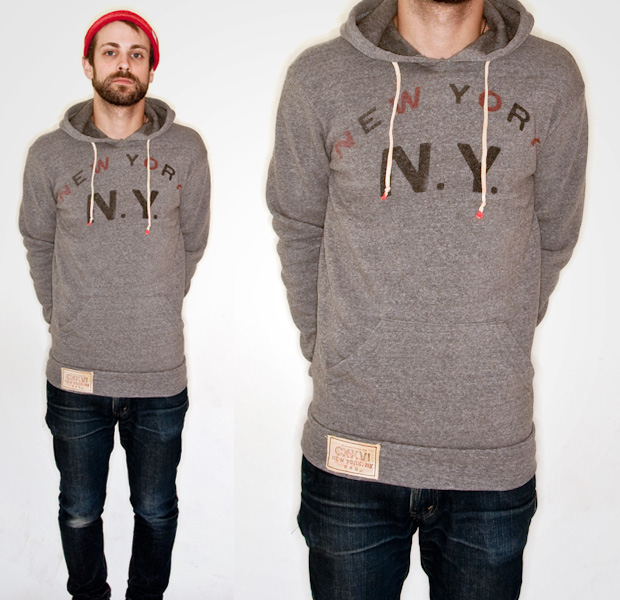
I love brands that have a really defined look, so I like how all of their stuff seems to have this Moby Dick-inspired nautical/Americana thing going on, even if the nautical theme is getting a lot of air time right now.
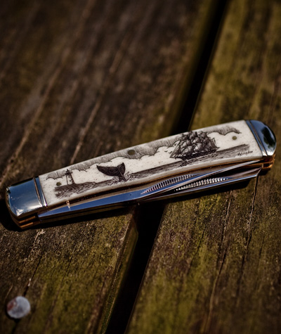
A pocket knife etched and inked with black India ink by a company in Maine. (I might need this too.)
More lettering by Jon Contino, I presume?
Now wondering how I’d never heard of this company??
CXXVI here.
Rad Picnic Boxes
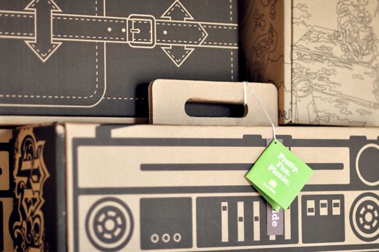
Totally sustainable, bio-degradable picnic boxes!
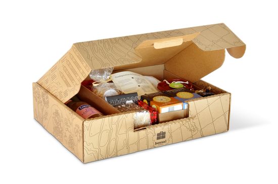
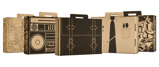
The Brand Hatchery created these as an in-house project, and they liked them so much that they decided to start a company, Three Blind Ants, focused on “picnic and consumer fun” products!

Of course I the one that looks like an attache!
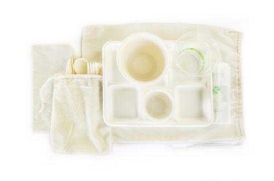
Even the utensils are bio-degradable!

The Hipster Fashion Cycle

Old Paper

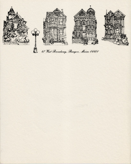
I’m a sucker for old paper things, like airmail envelopes and tickets… they have that effect I’ve mentioned before of making me long for an era I never actually lived through. They also make me wish the design of small, everyday things like this were still given such attention.
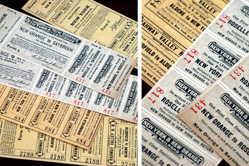
It’s the same way I feel about public buildings, like post offices and public schools– they used to be built so beautifully, and were architectural icons in town, and now they’re just built to be functional and cheap.
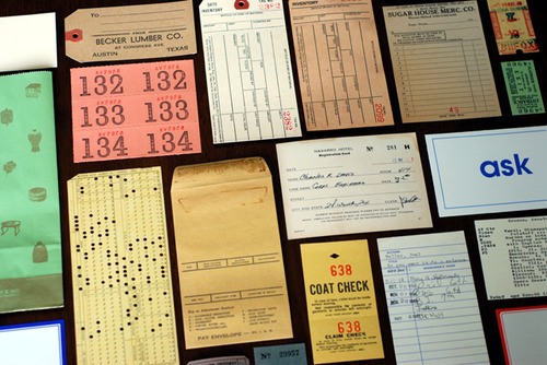
via Paper is Lovely
We Love DataVis Blog
I think clever infographics can be functional design at its best… Communicating statistics or messages clearly and simply in a visual medium, and then even making it look pretty, is not actually a simple task.
Here, a few great ones from the We Love Datavis (data visualization) blog, which keeps track of the latest and greatest infographics. I swear it’s not as nerdy as it sounds.
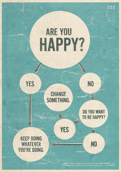
Who can resist a great flow chart?
And maybe the only thing better than a flow chart is a really good Venn diagram…

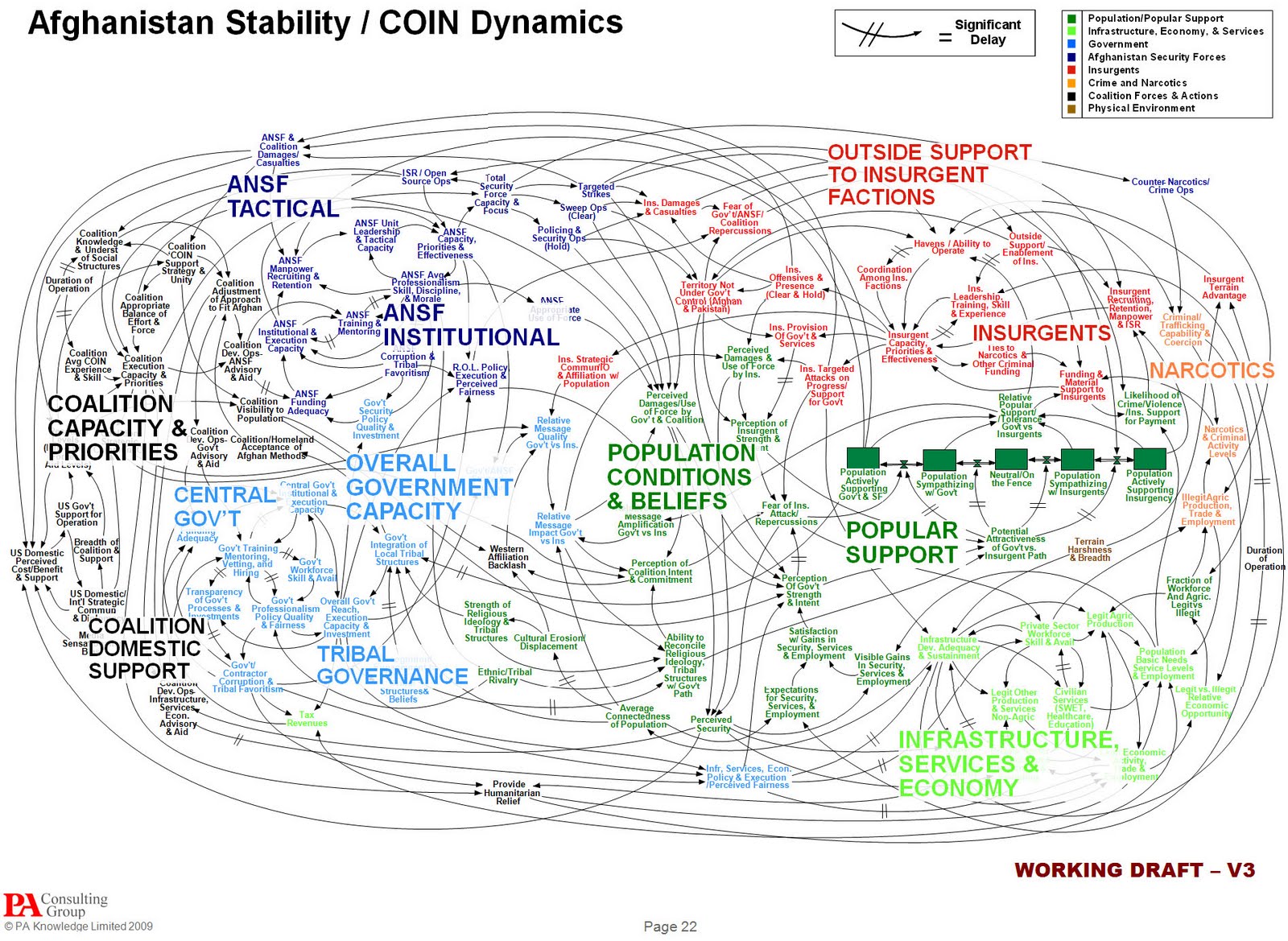
Below is an example of a more technical infographic gone wrong. This graphic was generated by a consulting firm for the US Army, and it is meant to show the complexity of the military strategy in Afghanistan to Gen. Stanley McChrystal.
As it turns out, all it shows is that the strategy is so complex that no one can understand it. (NYT article about this here.)
I particularly appreciate when people with this sort of visualization skill put their efforts into something fairly useless… The below graphic shows the evolution of crayola color choices from 1903 to the present.
Maybe working on “fluff pieces” like this is like the guilty pleasure of infographics people?
They’re like, “What data, if arranged into a graphic, will just look really pretty?” … “I know, crayola colors over time!”
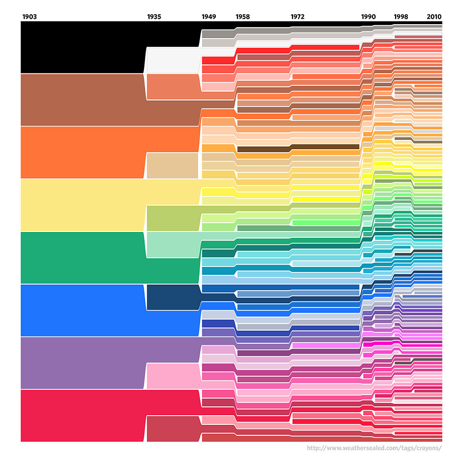
This is an amazing example of a totally useless, and yet totally awesome infographic.
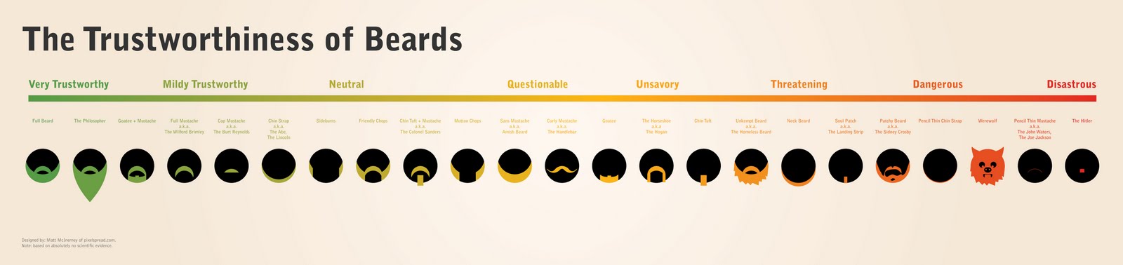
On a continuum, the pierceived trustworthiness of beard types. (Click image for larger version, then click it again to zoom.)
This is pretty entertaining… We all know about the “Missed Connections” section on Craiglist (I happen to love it), and this graphic shows the most commonly listed locations people give for where the missed connection happened, by state.
The geographic variation between places like gyms vs coffee places vs Walmarts is pretty interesting!
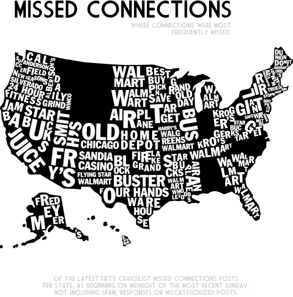
Map by A Very Small Array
Google Maps + Snail Mail
Ahh I love maps, and I love snail mail, and the intersection of the two is almost too much.
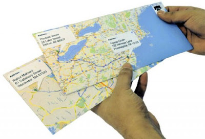

Right now it’s just a concept, but if it happens, you could print these envelopes from Google Maps showing where you are and where your recipient is, and the route between you two. Pretty cute.
via SwissMiss
Monogram Collections
Did you know that people in the early 1900s used to collect monograms?? I didn’t, and I think it’s so cool!
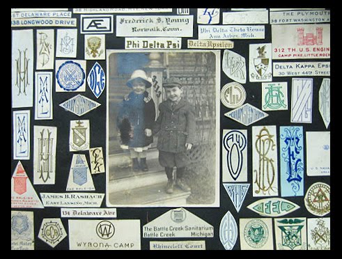
Elizabeth Hildreth II, 1914
Below is the description of this monogram scrapbook page, by Scrapbook: An American History author Jessica Helfand. I’m still not sure though what these monograms were pulled from– are the cut from stationery? Or are the sewn?
Elizabeth Hildreth’s book begins with a blurry snapshot of a kewpie doll surrounded by a whirling constellation of monograms, which were themselves highly collectable by both men and women during this period. (The English writer Evelyn Waugh had several such scrapbooks, which may have been compiled by someone other than he: they are meticulous, fastidiously — and densely — arranged on the page.)
Indeed, while many collectors pasted their specimens into an alphabetical taxonomy, young Hildreth operated under no such apparent editorial constraints. Like many young people, her interest seems to have been based on creating pleasing compositions. Nevertheless, her pages display none of the polite placements that so consistently characterize many other nineteenth century scrapbooks. Collaged elements in Hildreth’s book are more playful, and include fragments of letterheads and other typographic miscellany.
I’m also intrigued by this girl because her name is Elizabeth Hildreth II — “the second” — a girl with a generational suffix. That’s cool. Girls don’t usually get to take part in that tradition. But, it’s also intriguing that she’s not “Elizabeth Hildreth Jr.” — she’s “II.” But that’s cool with me.


