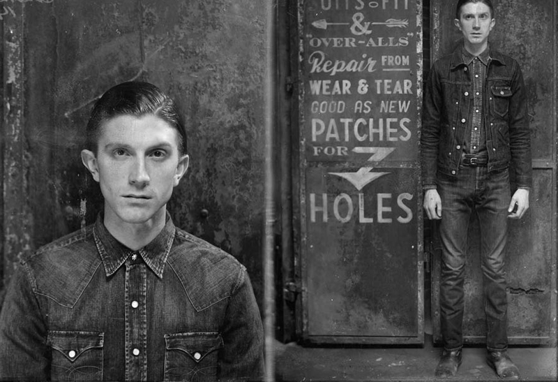
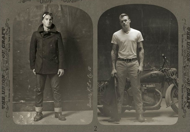
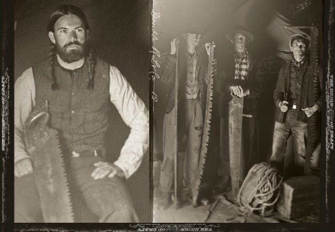
RRL’s Vintage-y Lookbook
As Miss Moss said, there have been an influx (onslaught?) of vintage-inspired lookbooks recently, but as Ralph Lauren tends to do, they really nailed the details on making the style of this lookbook for RRL look authentic, and I’m really liking how they took it to the max. Even the models look like they’re from another era!
It also totally fits with RRL’s overall aesthetic, which focuses on rugged American old-West classics that look authentically, convincingly vintage-y and distressed. I’m not usually a fan of pre-distressed clothing, but again, RRL does it so wellll.
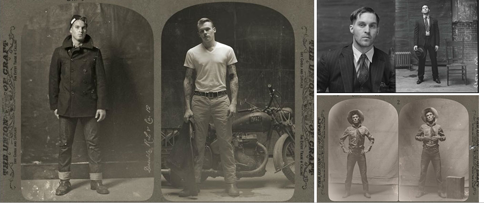
If you like this, check out this post about an artist who is bringing back collodion process photography.
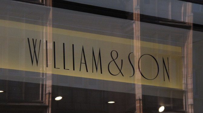
Andreas Neophytou
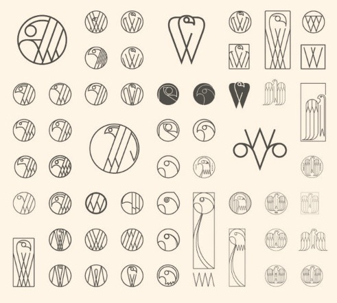
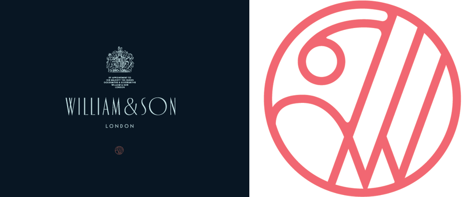
Loved this branding work by Andreas Neophytou for British rifle maker William & Son, and loved seeing bits from the creative process that went into, including all of these different type treatments below. Interesting what a difference the different style of “W” can make, the weight of the line, or whether the letters are varying sizes, heights, etc.

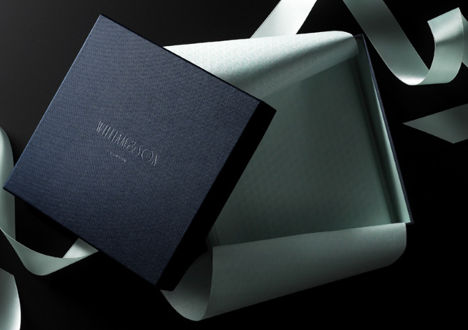
Also, the next thing I now want for Cultivate is a brand pattern like Neophytou made for W&S. We actually will use lots of different patterns in our packaging (all the boxes will each have a different pattern), but what fun to have a brand pattern!
Actually, now that I’m thinking about it, I think we’re probably way to fickle and flexible as a brand to pin ourselves to one pattern (or color scheme)– it took us AGES to settle on a logo and brand colors, and we finally settled on navy/cream, and then decided basically that it was too much commitment and changed to charcoal/cream. But I do love the idea of a brand pattern like this one.

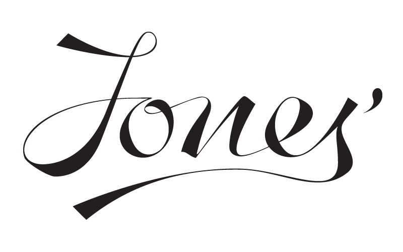
More of Neophytou’s logo work in the gallery– two fun scripts and couple that really reminded me of the mid-century logos in this post!


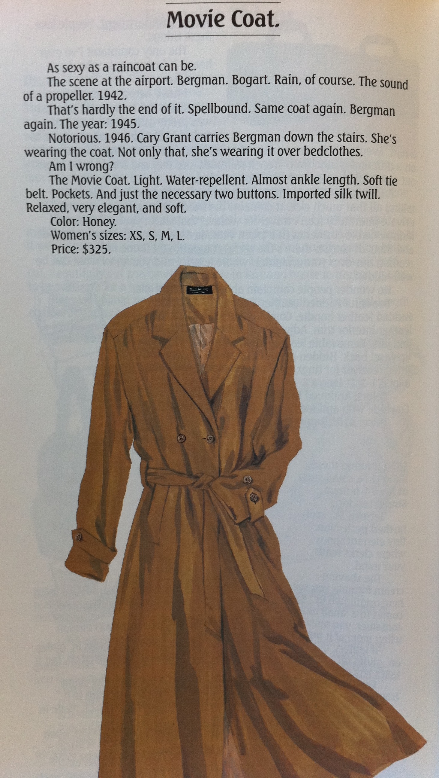
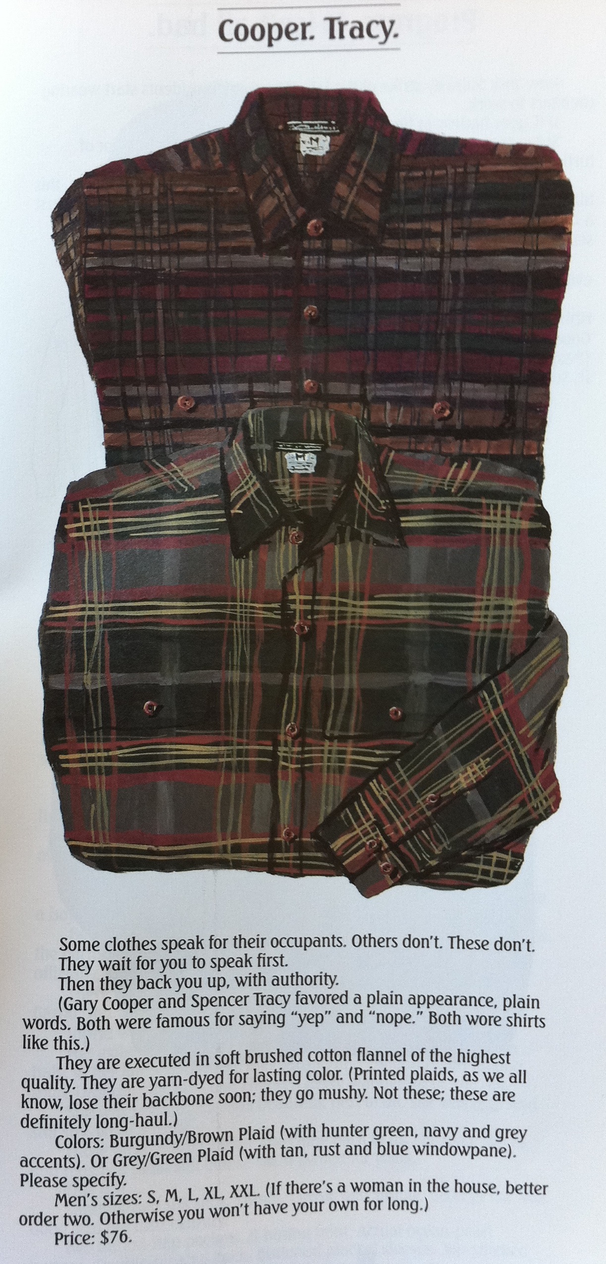
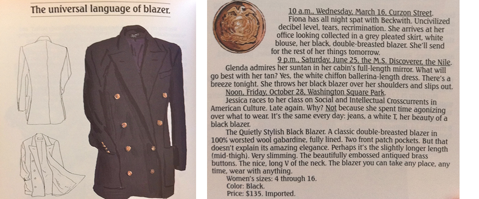
Ode to J. Peterman
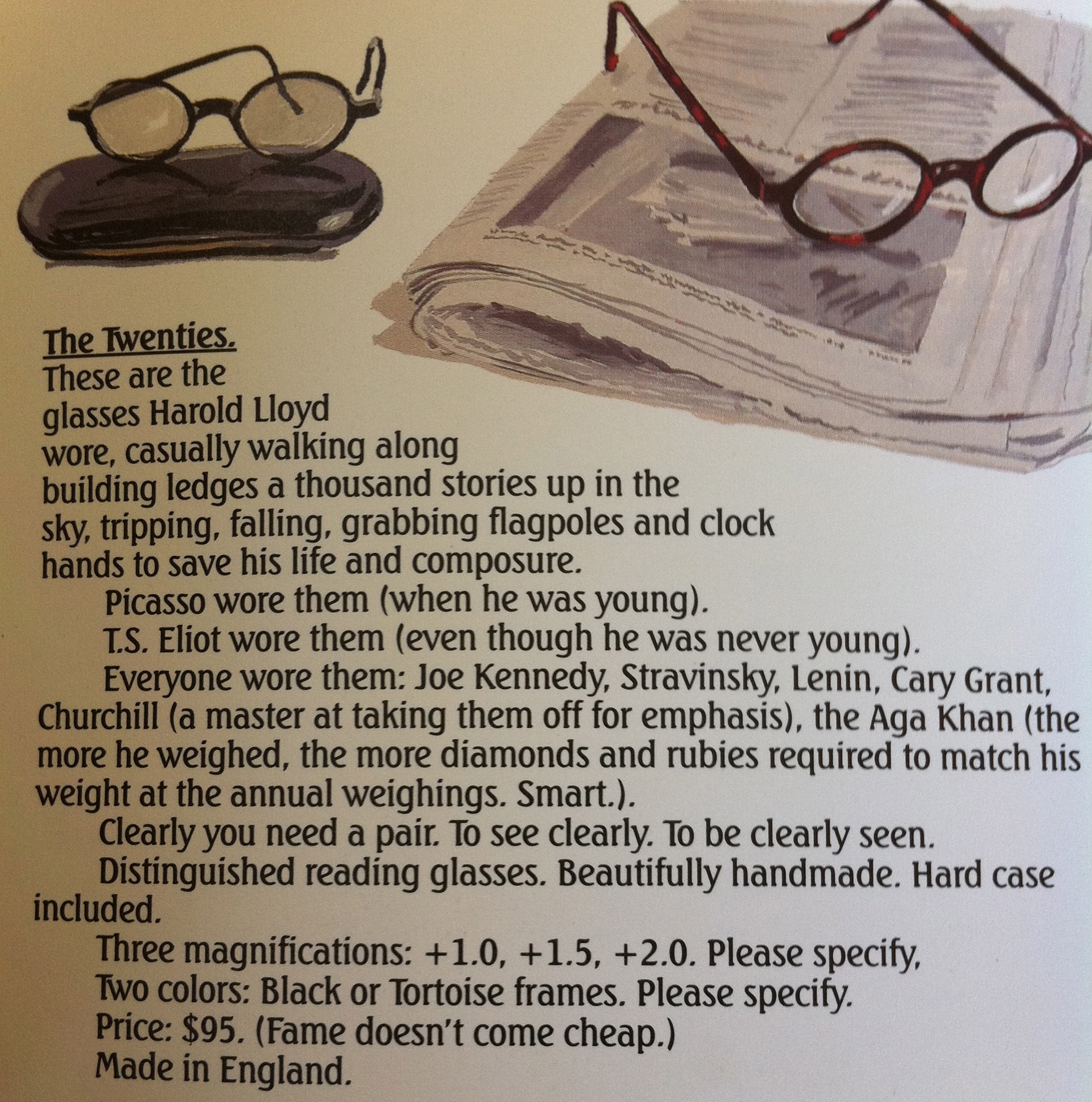
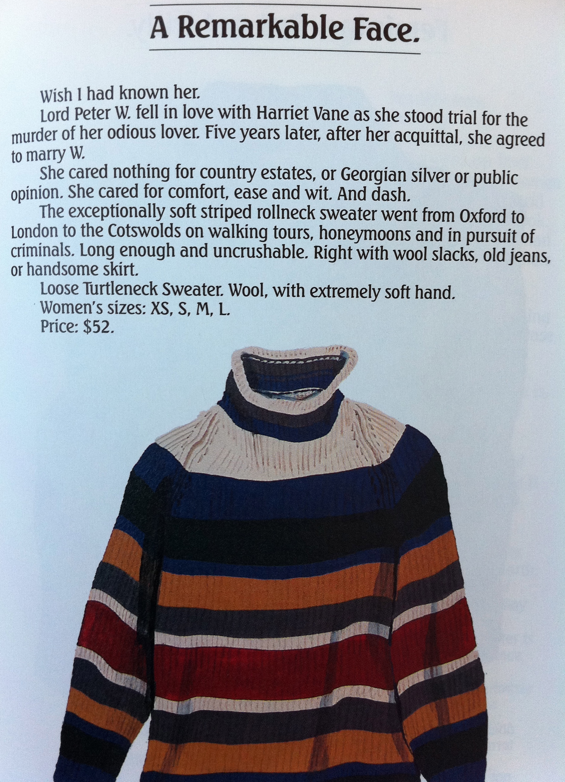
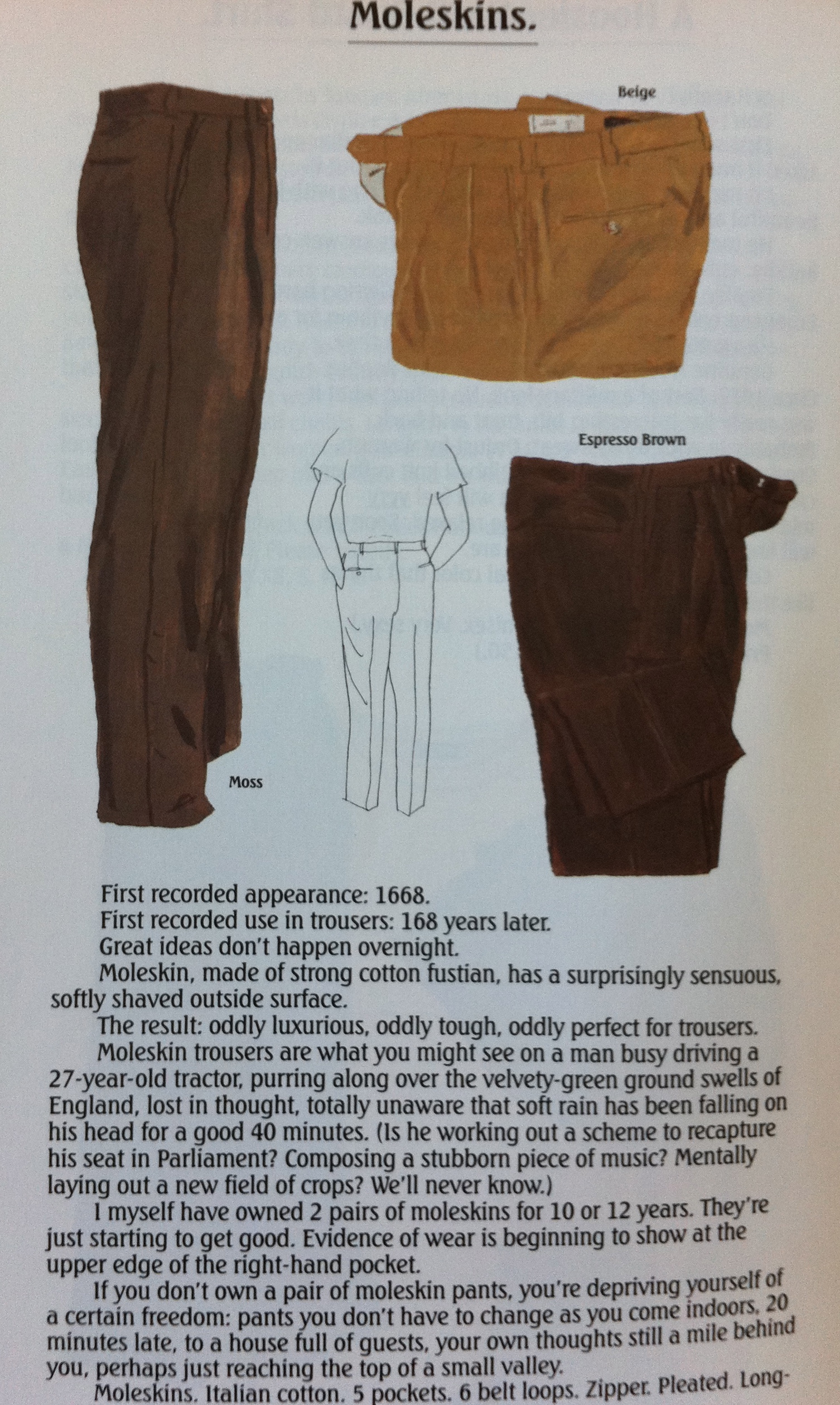
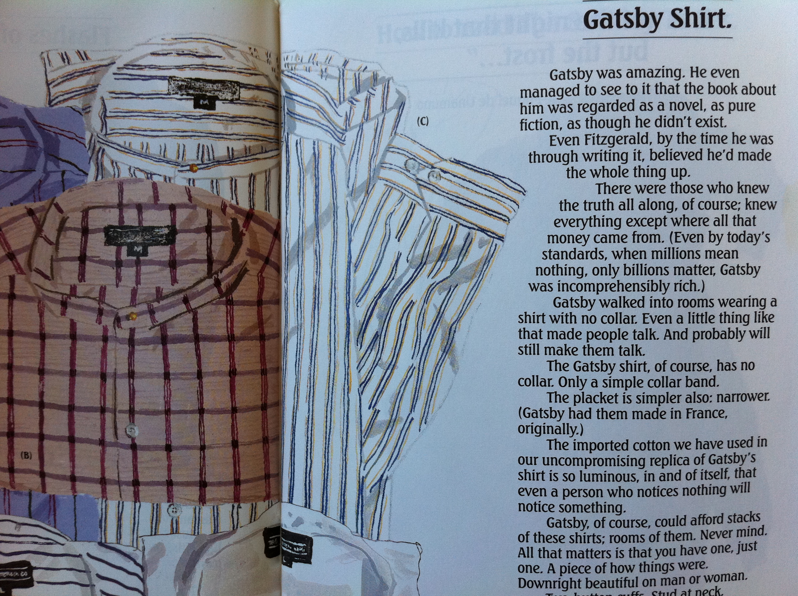
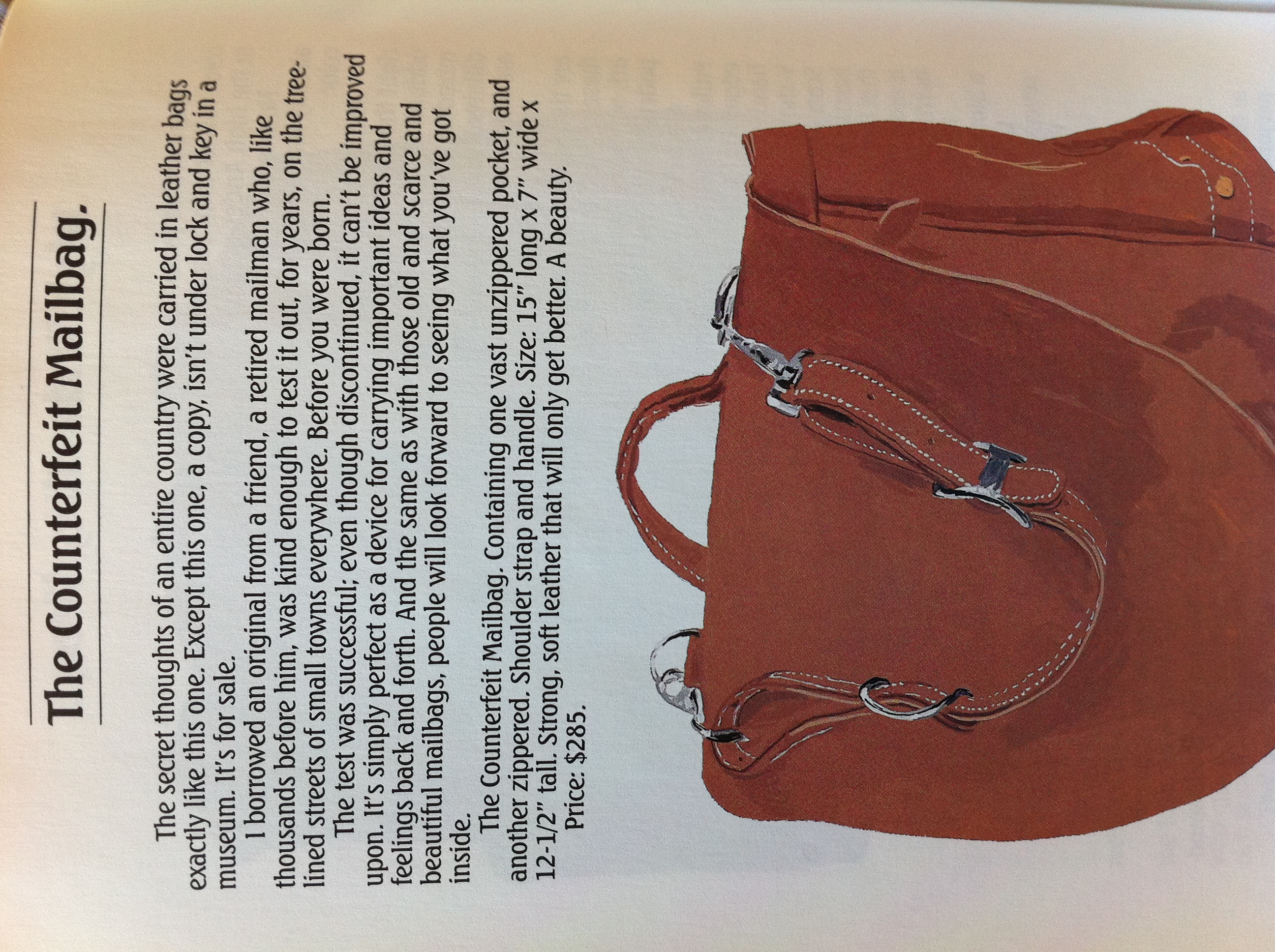
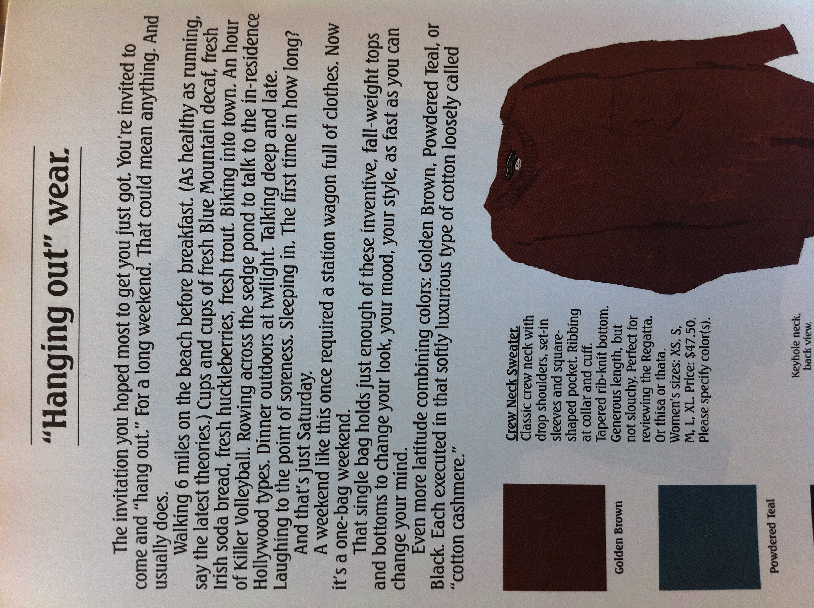
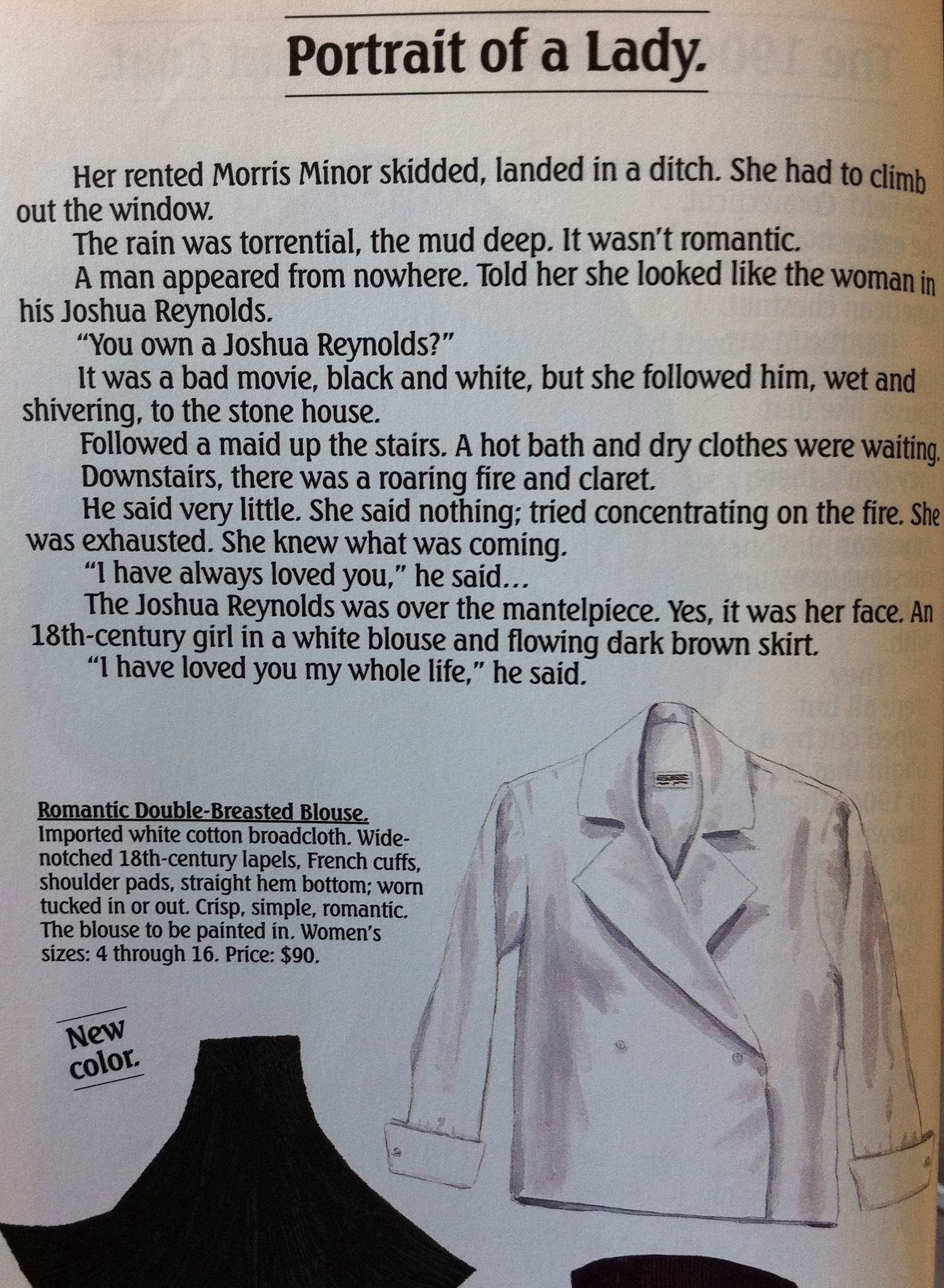
A few months ago, my sister ordered an old J. Peterman catalog for me off eBay after she found out that I only knew J. Peterman as Elaine’s boss on Seinfeld and believing that it would be useful reference material for an upcoming project.
How right she was. I recently retrieved the catalog for a bit of writing inspiration, and I got completely sucked in and read the thing cover to cover. A catalog. So I decided I had to write an ode to the copywriters of J. Pete of old (J. Peterman still exists, I learned today, as an e-store, but the quality of writing seems to have gone downhill). I LOVE the characters and stories they created to give their products life.

What catalog have you read, not just looked at, cover to cover? I don’t think I’ve ever read more winning product descriptions. They sell you through a combination of a narrative details that ignite either nostalgia or imagination (or both) and the description of details and features you never knew you cared about.
There aren’t even photos of the products, you can’t see them in person, and yet, you end up wanting them (ok well not the Judy Tomkins, because those colors sound awful, but I still love the character). That is brilliant marketing.
Do yourself a favor and take a minute to read these. If you have to do any sort of writing, selling, or marketing in your daily life, I’m betting they’ll inspire you.


Mid-Century Logos
Love this flickr set of Mid-Century Modern logos designed in the 60s, particularly the letterform logos. So simple, and now so retro looking compared to flashy modern corporate logos, but they remind you how much personality can be conveyed in a letterform.
![]()
They also reminded me of the San Francisco MUNI logo that I spend a considerable amount of time looking at as the buses and trolley drive around town. I love that SF has stayed with this logo, which was designed in the mid-70s by a Bay Area graphic designer.
via Aqua Velvet
(Their designers and the companies they represented can be found on the flickr site.)
Like No Other
There’s no way this video/ad won’t put a smile on your face. It made me so happy I almost cried.
Maybe y’all have already seen this, as it was on TV, but I don’t watch TV really (except whatever my dear roommate has on in the background while I blog, or series that I get way obsessively sucked into via Netflix instant, but then there’s no ads) so I miss out on all the ads that get raved about. And I don’t really care if you’ve already seen it. Watch it again.
The team (who I think are brilliant) behind this spot for Sony Bravia TVs wanted to connect people to the product in an emotional, rather than rational way, which is SO smart– it’s what Apple does all the time. TVs are traditionally sold by bragging about the specs and high tech this or that. This spot said absolutely nothing about the product other than “Color like no other,” as part of their larger “like no other” branding campaign, and they made you feel something instead of telling you something.
I also loved this behind the scenes/making-of video, as I was very curious about the details! Here are the basics: 250,000 bouncy balls, 23 cameras. (Tangentially, did anyone else get really thrown off when the theme music from NPR’s On Point came on??)
Also, the images at top are available for purchase as prints– photographer Peter Funch was at the scene and captured these amazing shots.
PS- Happy birthday to my sister Kaki and my niece Ginny! Festive post for your birthday, no?
via WTF
Nike’s ‘Paint With Your Feet’ Project
I am so impressed when brands endeavor to do something totally original and creative.
Those pieces of art above are representations of runners’ routes, as documented by Nike Free technology. YesYesNo, the company that created the software, describes the project below:

For the launch of the Nike Free Run+ 2 City Pack series, YesYesNo was invited to develop software that would allow runners to create dynamic paintings with their feet using their Nike+ GPS run data. During the two day workshop at Nike headquarters, we invited the participants to record their runs and then using our custom software we imported the metrics from their run, to create visuals based on the speed, consistency and unique style of each person’s run.
 Using the software the participants were able to play with the mapping and adjust the composition of their run which was then outputted as a high resolution print for them to take home. We also worked with the Innovation Lab at Nike to laser etch the runner’s name, the distance they ran and their run path onto a custom fabricated shoe box, which contained a pair of the ‘City Pack’ shoes from their city of origin.

[via Creative Journal]
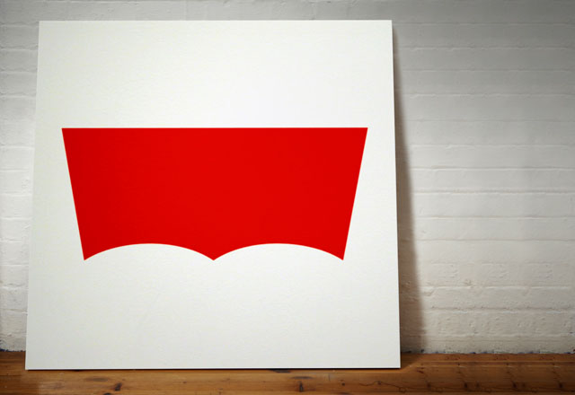
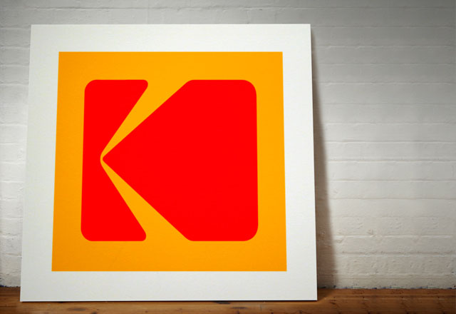
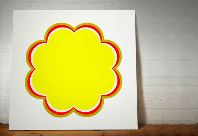
Stripped Logos
Dorothy, a collective of designers and artists, has just created this series of paintings of iconic logos stripped of their names, creating a series that looks like potentially could have been by Frank Stella or Ellsworth Kelly in the ’60s. I wonder if a lot of these logos were created around the same time?

Pretty interesting to see which of them still look pretty when they’re just art without the words!


More Kulte Goodness
In researching for the post last week on Kulte’s photography for their new campaign, I was looking around on their website and discovered their online magazine-meets-catalog called Kultorama, and it is a treasure trove of even more wonderful photography and eye candy.

With a combination of a sort of travel journal/vintage photo album feel, articles, and outfit collages, they have definitely figured out a formula to creatively communicate their brand identity and to totally hook you on it!
I am really digging the aesthetic of whoever their artistic director is!!

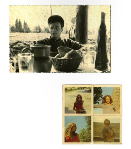
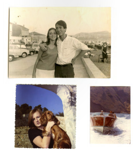
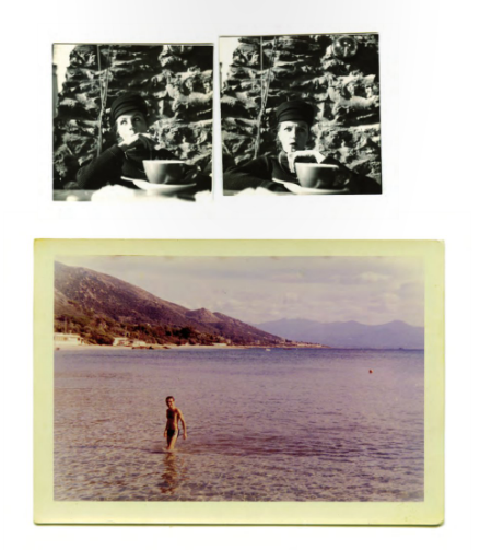


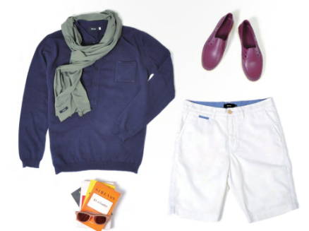
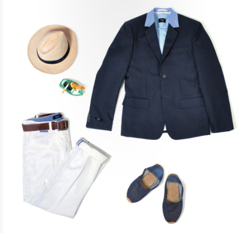
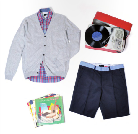
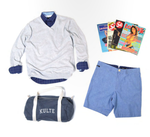
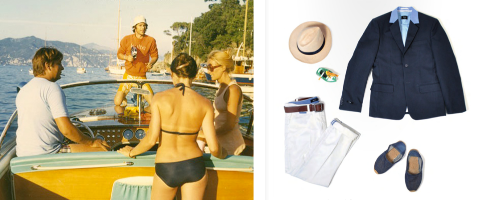
Check out previous issues here and their online store here. You could spend quite a while browsing the Kultoramas. Really quite brilliant because often times I feel like when I discover a store/brand I like, I want to really delve into it, not just to browse the online store, because there’s no story or feeling there, but there’s nothing else really to do on the website. Kultorama certainly gives the consumer a way to delve into the brand…
What if the abc logo had been one of these?


