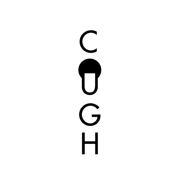
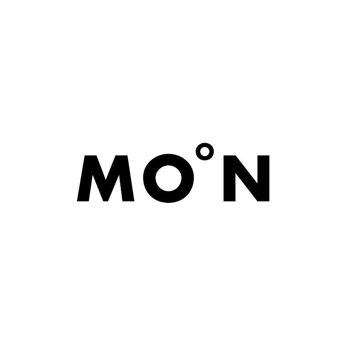
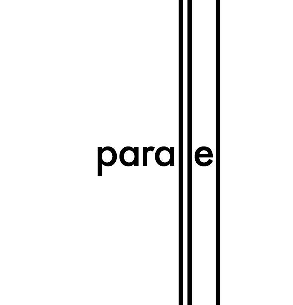
Graphic Fix
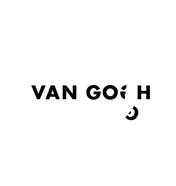
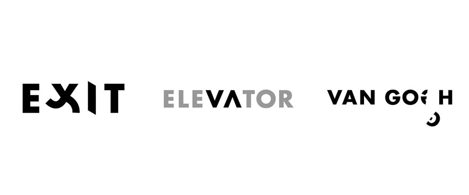
Word as Image
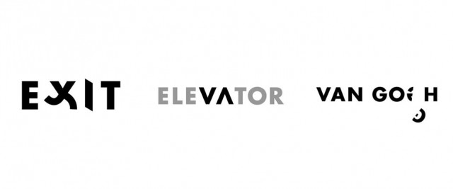
A delightful, thought-provoking project by designer Ji Lee– a new book called Word as Image. In his words:
“When we were children, letters were like fun toys. We played with them through our building blocks. We colored them in books. We danced and sang along with TV puppets while learning C was for “cookie.” Soon, letters turned into words. Words turned into sentences. Sentences turned into thoughts. And along the way, we stopped playing with them and stopped marveling at A through Z.
Word as Image brings a little magic back to the alphabet by helping us see the fun and humor behind the lines and squiggles.
This project started nearly twenty years ago as an assignment in my typography class at art school. Students were encouraged to see letters beyond their dull, practical functionality. We played with their unique shapes and tinkered with their infinite possibilities. The challenge was hard, so the reward of “cracking” a word felt great. This became a lifelong project for me.”
Check out the short animated video above, it’s awesome!


Graphic Fix
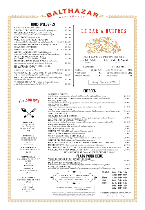
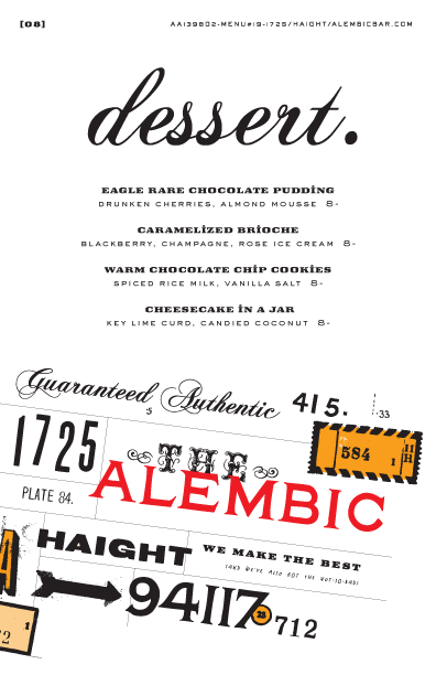
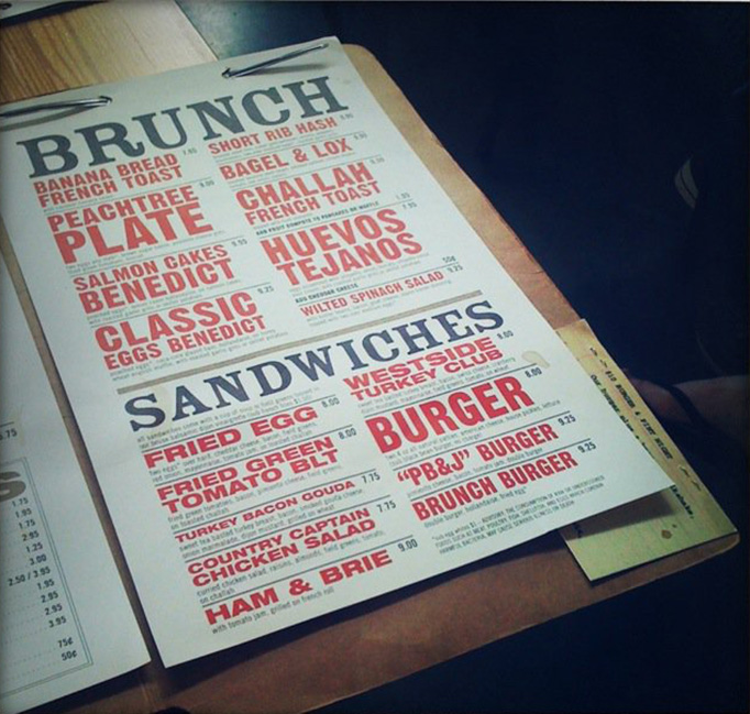
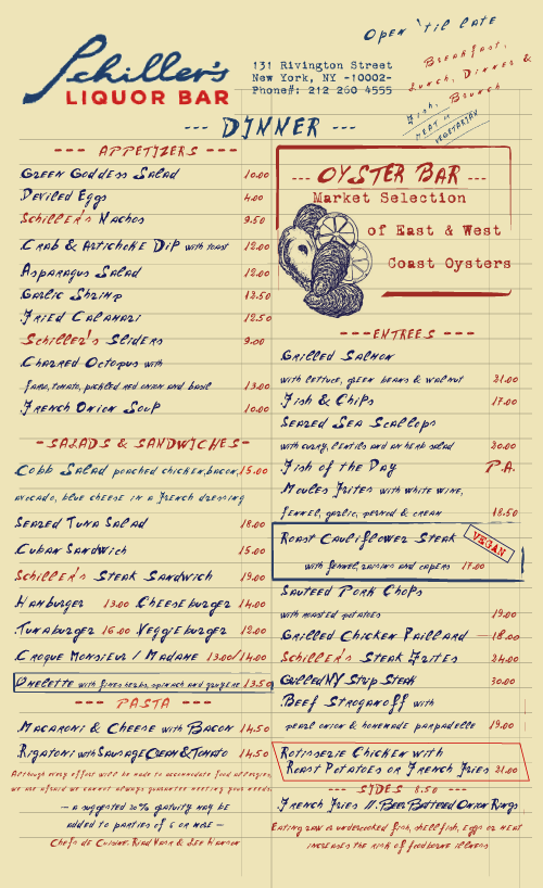
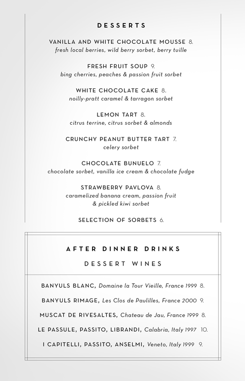
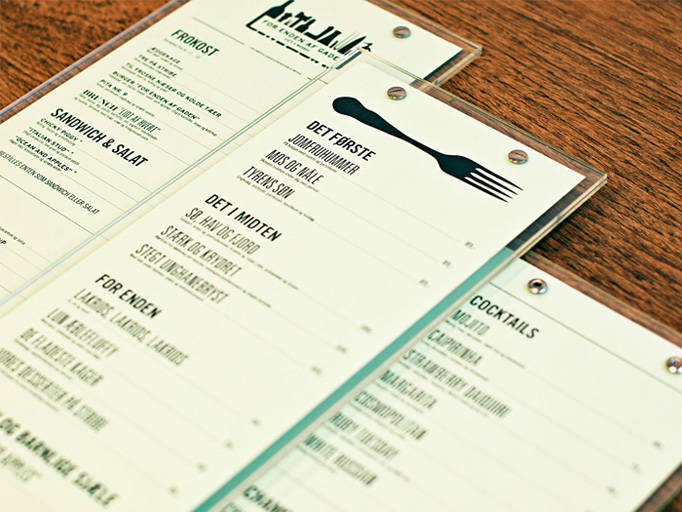
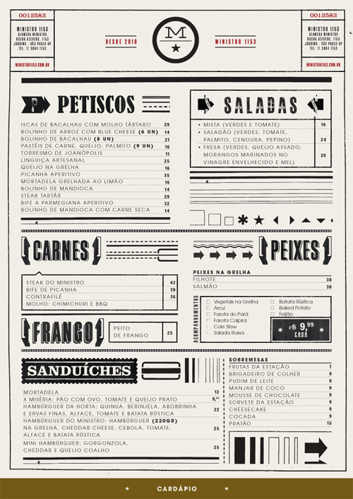
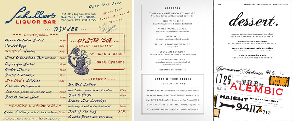
Art of the Menu

I’m excited about this new site, Art of the Menu, which is compiling menu designs! How fun!

I’m still in love with Cynthia Warren’s menus, which I emailed them to submit to the site!

Graphic Fix
Early 1900s Cigarette Packaging
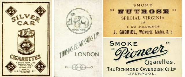
Great Flickr set of cigarette cards from the early 20th century. I have such a thing for one- and two-color packaging design, so clean and it forces the imagery to be super simple. And the typefaces sing!
If you saw the post on Cultivate Wines (one of my day jobs), you might recognize that we took inspiration for the box wine labels from this era of design! The lovely Cynthia Warren executed them brilliantly.

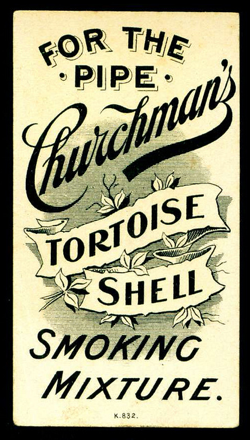
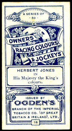
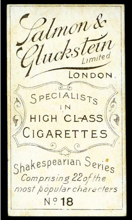
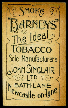

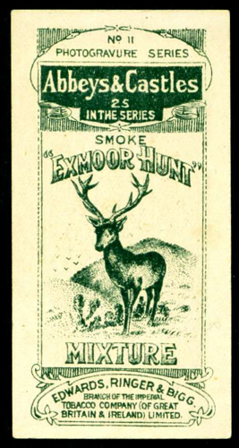
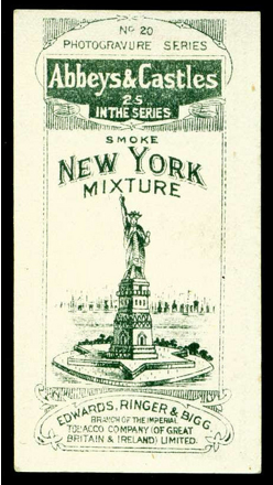

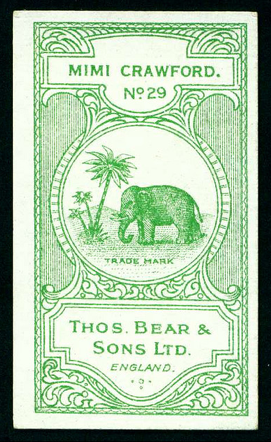
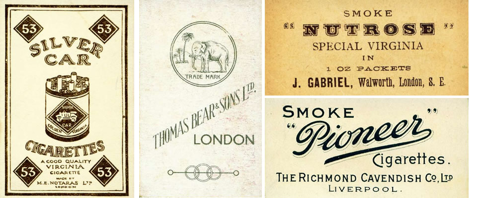
via Design Love Fest (who I took the photoshop class from you might have heard me tweet about!)
Graphic Fix
Fauxgo
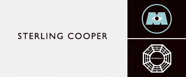
This is so clever. Fauxgo, a tumblr, collects faux logos created for movies and tv shows. Above three from shows/movies I loved, and they all happened to play integral parts in their stories, and hence are very recognizable. Mad Men, Monsters Inc., and LOST. C
Check out the gallery for more (their titles tell you what they came from and the name of the company), and Fauxgo for even more (with more added all the time).


via Swiss Miss
Graphic Fix
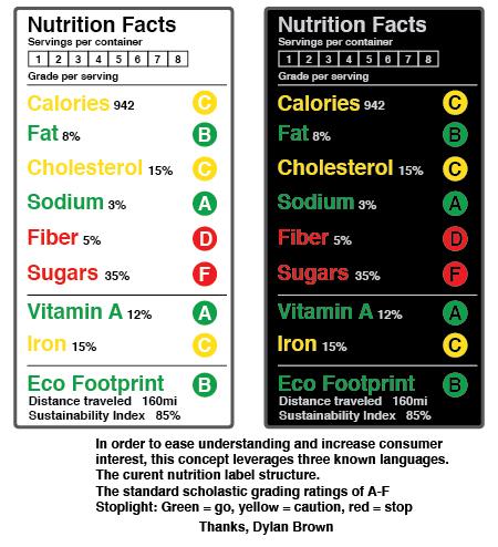
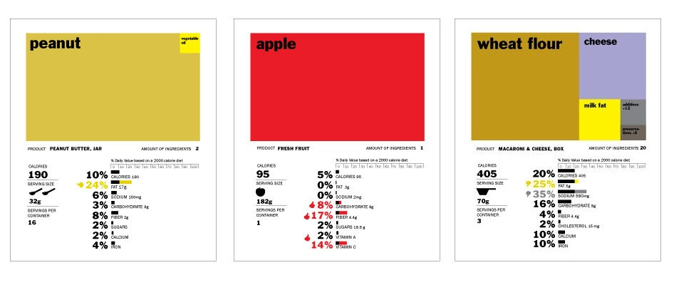
Redesigning Nutrition

I hadn’t ever thought about it before I saw this article, but the nutrition label that comes on the side of every packaged food really is in desperate need of redesign. So, GOOD held a contest to come up with a new design! Above is the winning entry, below, a few others.
Isn’t it amazing how design can totally change the way we understand and process information? Compare how you process the info in the label concept at top vs these below. Your understanding of the food really differs with the different designs! The FDA really is about to redesign the nutrition label, hopefully by combining ideas from all these entries, they can come up with something that is easily understandable and will lead us to better eating choices!

It also reminded me of this project I came across a while back– a conceptual redesign of the boarding pass…. I now think about this every time I fly, wishing my boarding pass were something visually pleasing and easy to understand like this!


Graphic Fix
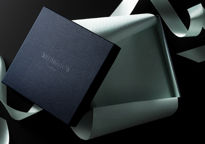
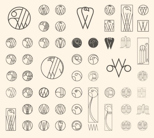
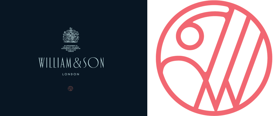
Andreas Neophytou

Loved this branding work by Andreas Neophytou for British rifle maker William & Son, and loved seeing bits from the creative process that went into, including all of these different type treatments below. Interesting what a difference the different style of “W” can make, the weight of the line, or whether the letters are varying sizes, heights, etc.

Also, the next thing I now want for Cultivate is a brand pattern like Neophytou made for W&S. We actually will use lots of different patterns in our packaging (all the boxes will each have a different pattern), but what fun to have a brand pattern!
Actually, now that I’m thinking about it, I think we’re probably way to fickle and flexible as a brand to pin ourselves to one pattern (or color scheme)– it took us AGES to settle on a logo and brand colors, and we finally settled on navy/cream, and then decided basically that it was too much commitment and changed to charcoal/cream. But I do love the idea of a brand pattern like this one.

More of Neophytou’s logo work in the gallery– two fun scripts and couple that really reminded me of the mid-century logos in this post!


Graphic Fix
Mid-Century Logos
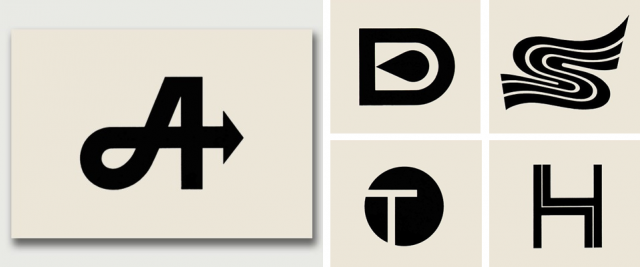
Love this flickr set of Mid-Century Modern logos designed in the 60s, particularly the letterform logos. So simple, and now so retro looking compared to flashy modern corporate logos, but they remind you how much personality can be conveyed in a letterform.
![]()
They also reminded me of the San Francisco MUNI logo that I spend a considerable amount of time looking at as the buses and trolley drive around town. I love that SF has stayed with this logo, which was designed in the mid-70s by a Bay Area graphic designer.

via Aqua Velvet
(Their designers and the companies they represented can be found on the flickr site.)
Graphic Fix
Portland General Store
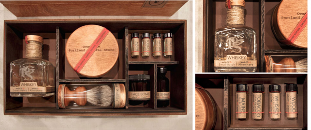
Portland General Store, which I used to buy from on etsy when they were just getting started, has recently come out with a limited of these handmade men’s grooming kits designed by Owen & Stork.
I don’t care if this look is getting overdone (is it? Or do I just notice it a lot because I like it?) I love the use of natural materials– cork, twine, wood– and colors. Also, I love that the boxes have those little compartments in the perfect sizes for each product, it’s so aesthetically pleasing. It reminds me of the tumblr Things Organized Neatly.
Graphic Fix
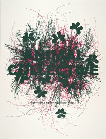
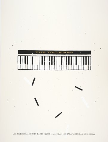
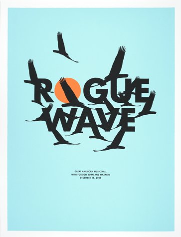
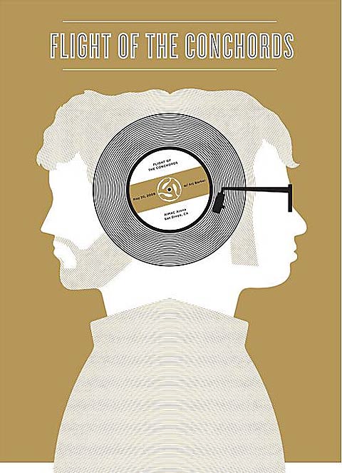
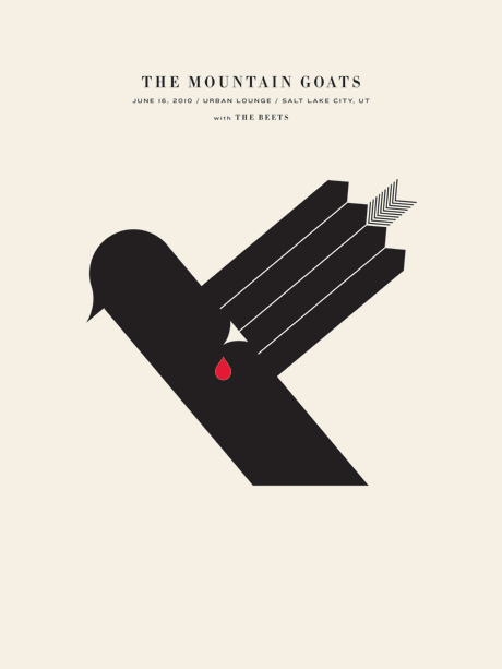
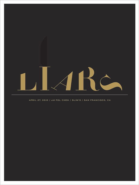
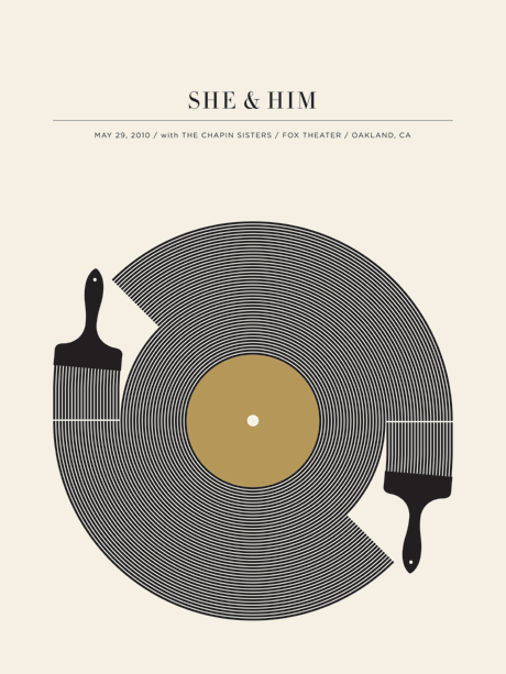
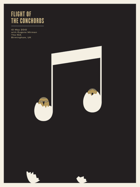
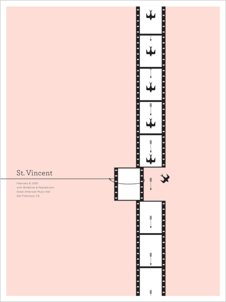
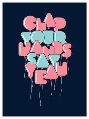
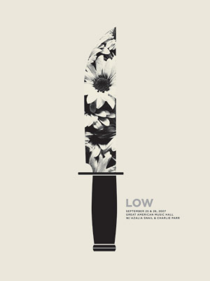
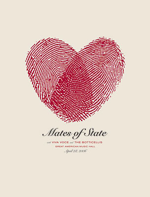
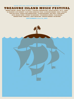
The Small Stakes
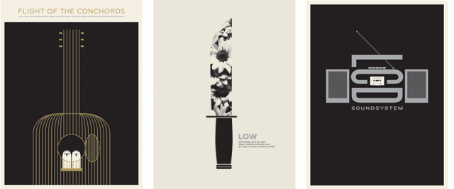
Loving the concert poster art of Jason Munn, who works under the name The Small Stakes.

Also just discovered his work is in the collection at SFMoMA!


Graphic Fix
Cowboy Junkies
This well-rounded piece on The Bold Italic about the best places in San Francisco to listen to classic country music got me in so many ways.
It first caught my eye because of the graphics used for the story– creations made out of paper by artist Chloe Fluery that somehow remind me of the work of Wayne Thiebaud.
Then, the wonderful intro essay (below) by Sasha Darling about coming around to classic country music later in life after an early education by her dad totally sucked me in. I too developed a love of the music I grew up listening to with my dad– though it was more along the lines of The Rolling Stones, early soul, and anything with a good beat to dance to– and Darling put it more eloquently than I ever could have.

Finally, I love reading a good city guide (or really reviews of anything, also inherited from my dad) in the same illogical way that I love reading a cookbook cover to cover. It doesn’t make a ton of sense to read such things as leisure reading, when they’re meant for specific research. You can’t take advantage of the acquired knowledge at that moment. But still, just immersing yourself in the details takes you on a little escape as your imagination creates a preview of the thing you’re going to do/cook/go to/read/etc. Point being, I loved reading the descriptions of all these country joints that I now definitely want to check out in SF!
Below, the essay by Darling, and click over to the article to read about the spots she highlights.

“My dad bought me my first turntable when I was in third grade, and searching for records was our bonding activity. We spent all weekend hitting up record dealers and flea markets in search of rare scores. We agreed on almost everything when it came to music – except that I refused to listen to country.
Country was for rednecks and I was becoming a little new wave, punk rock girl. I couldn’t understand how my incredibly cool father could listen to such crap. He insisted that when I grew up I would appreciate country music. I firmly stated, never!
Of course as I grew older, I ate my immature words. In my late teens I got involved in the budding rockabilly scene. This new world of ex-punks turned hillbilly opened my mind to honky-tonk. As the years went on, I found myself putting on George Jones and Patsy Cline more often than the Descendents or The Smiths.
I was shocked at how connected I felt to the music. As much as I tried as a child to block out the lonesome and rebellious crooners, I knew the words to every country standard by adulthood. I still love all types of music, but these days I’m definitely a little bit more country and a little less rock and roll.
In this rock- and electronic-heavy city, it can be hard to find some good honky-tonks to hang out at, but with a little country know-how, you can find that hillbilly spirit within these urban confines.”
This one’s for my dad – if there’s a country singer, or rather duo, he loves, it’s Waylon and Willie, and particularly this song. He bought me an album of their duets before a cross country road trip, and I’ll forever associate the album with that trip. We even made a detour to go through Luckenbach, TX, just so we could listen to this song there.


