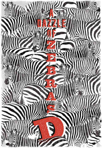
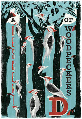
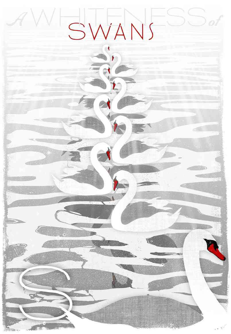
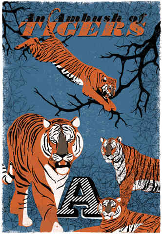
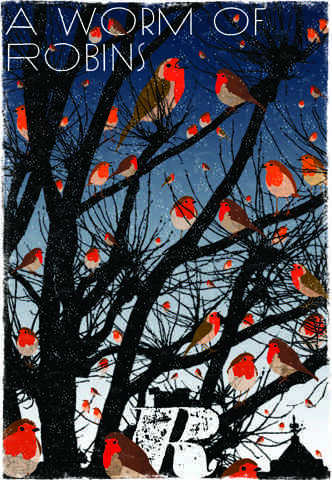
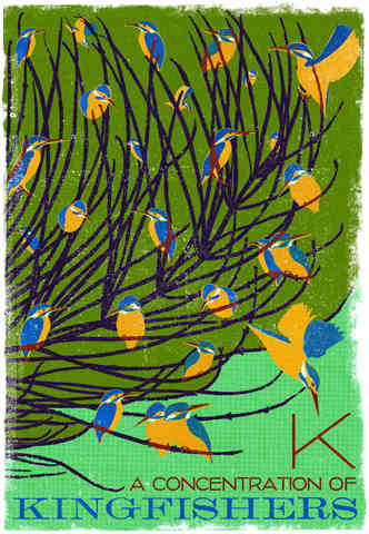
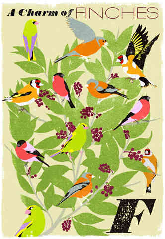
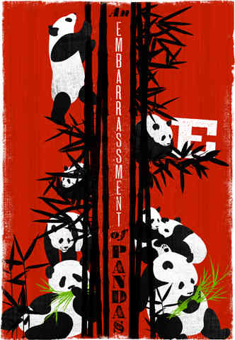
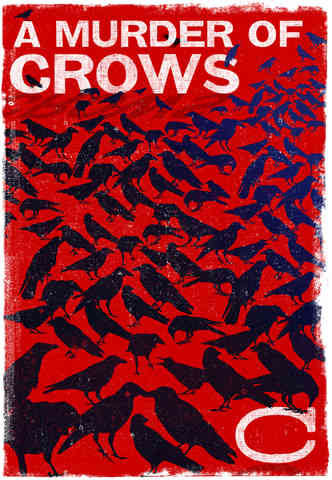
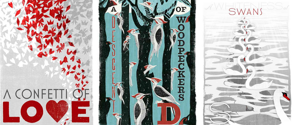
Collective Noun Posters
How fun are collective nouns?? This seriesof posters were created by WOOP Studios (who are also the graphic designers of the Harry Potter series) to celebrate collective nouns, which are, as they put it, “one of the eccentricities of the English language.”

It’s true! How random that we have terms for gatherings of so many different things? Terms that you really rarely use, and actually never need, considering they all mean “group.” I love it! They’re so evocative! “Murder of crows,” “parliament of owls,” “charm of goldfinches,” “party of jays” … the bird ones are some of my favorites.
I think a collection of these posters (sadly there’s no collective noun dedicated to posters, or I would have used it!) would be so cute in a kid’s room!

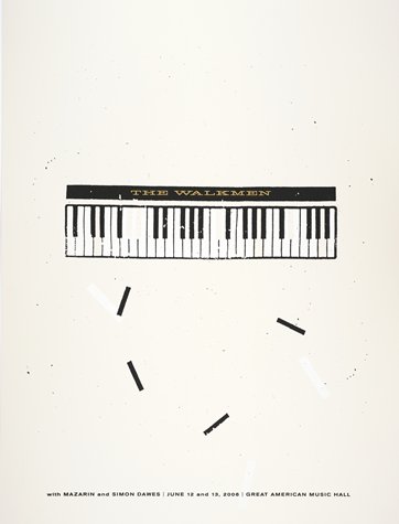
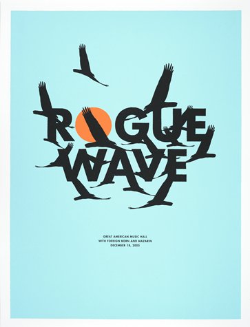
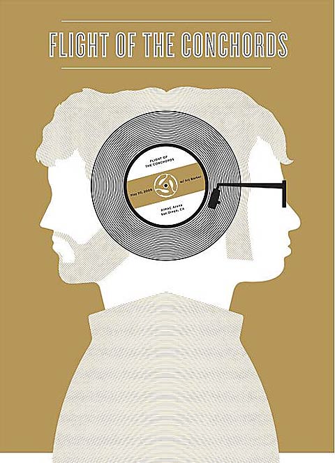
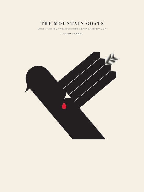
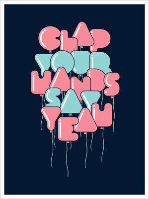
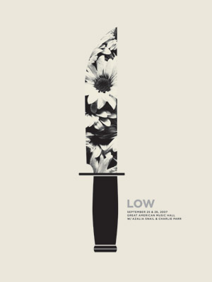
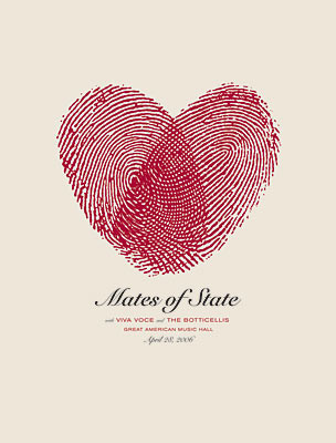
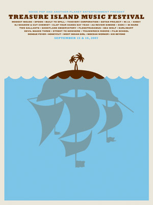
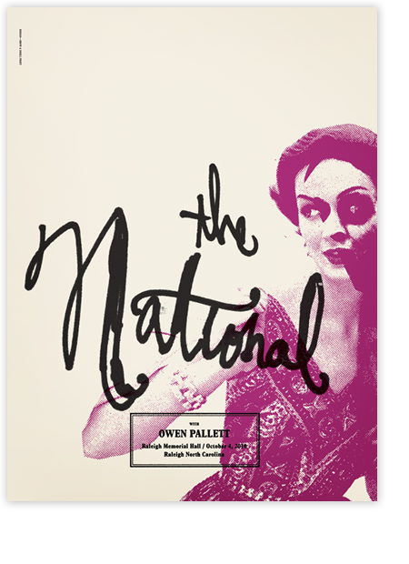
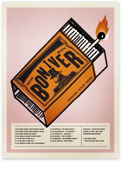
The Small Stakes
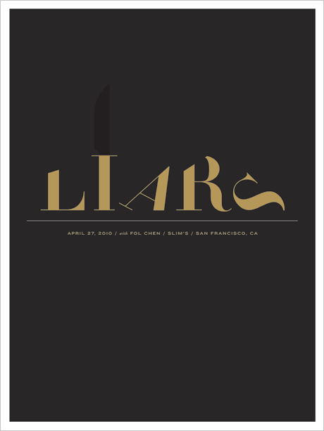
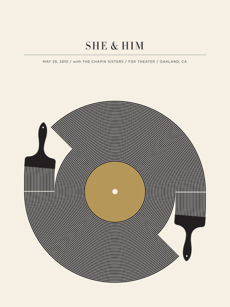
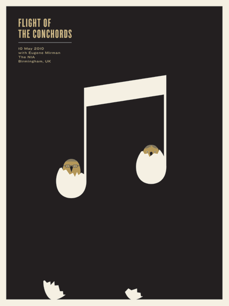
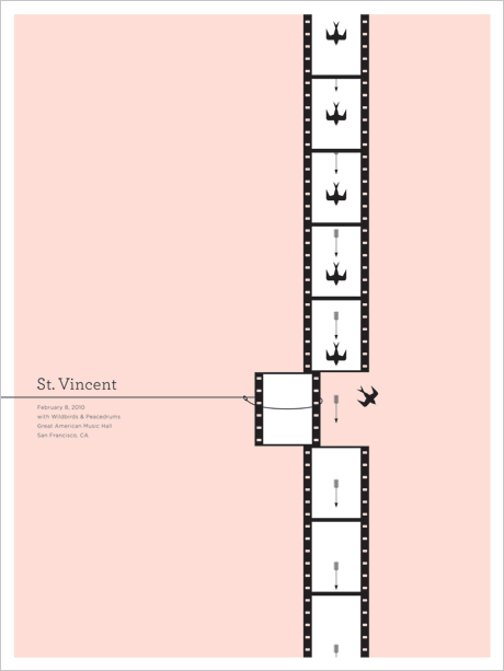
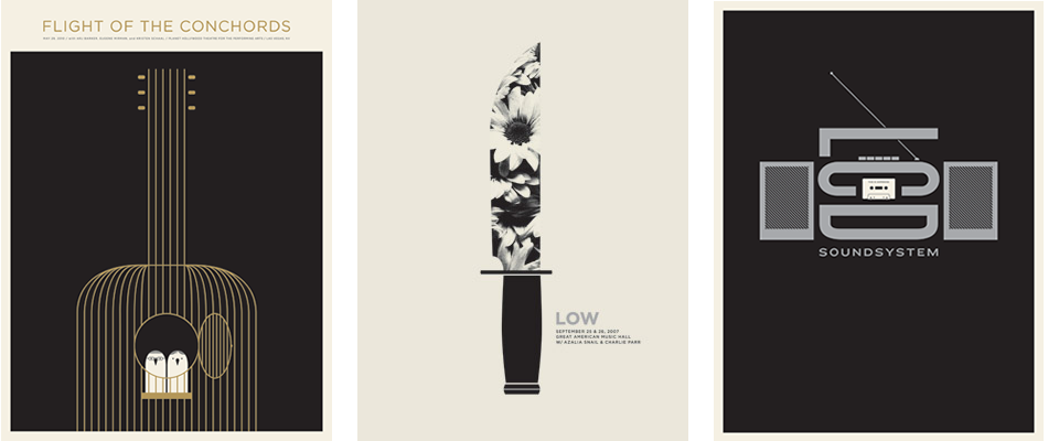
Loving the concert poster art of Jason Munn, who works under the name The Small Stakes.

Also just discovered his work is in the collection at SFMoMA!


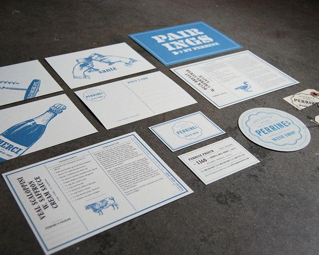
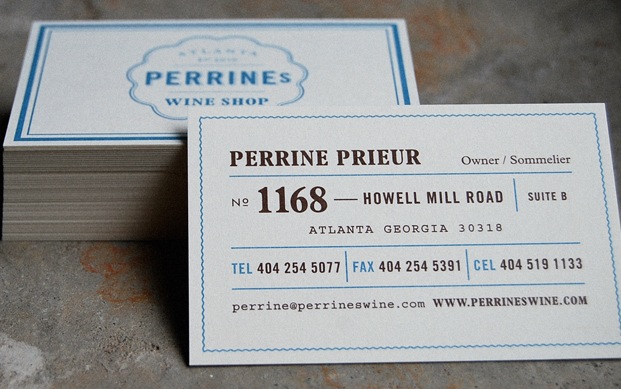
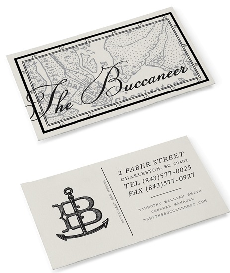
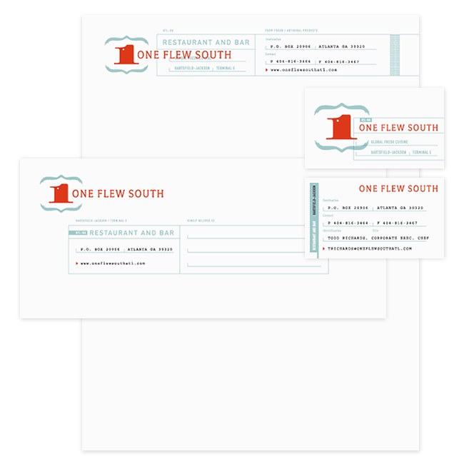
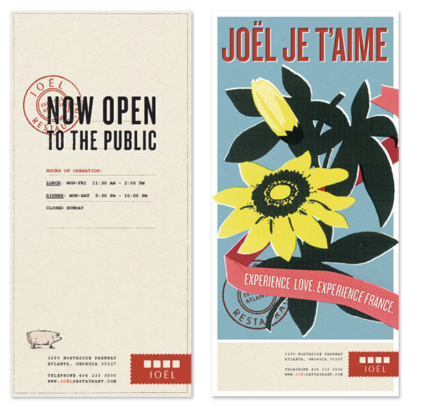
Alvin Diec
I recently came across the work of Alvin Diec and originally thought I’d post a couple of his pieces on Editor’s Chair. Then, I started perusing his entire portfolio, and as I usually do, I was dragging things I liked into various folders on my desktop. Then, I realized I’d dragged almost every single thing in his portfolio into one folder or another.
So, I decided to share all of it with you (or at least, a lot of it). His brand identity and graphic design work is just so spot on. Classic and authentic looking, like the brands could have been around for decades, and yet unique and interesting. And he seems to have a lot of the same obsessions that I do… things that look like old tickets, twine, airmail envelopes, ampersands, luggage tags…
Here are a few of his poster designs…

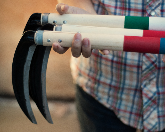
Oh! And he has a project in his porftolio called Fairly Well Made Co.– clearly a play on Best Made Co., the axe brand that I developed a serious fascination and love/hate relationship with– that makes scythes instead of axes and is hilarious. Here it is:

[And here, here, and here are past posts on Best Made Co if you missed them.]
Check out the gallery for lots more work…
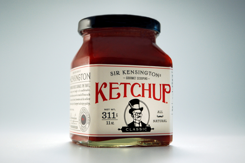
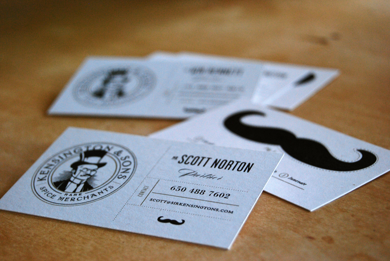
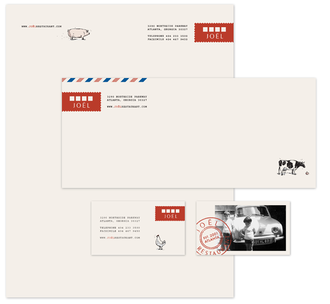

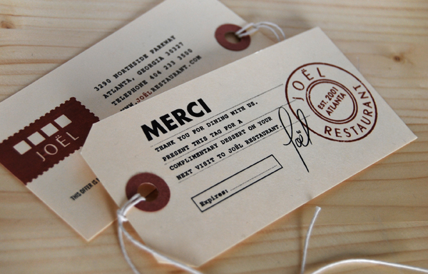

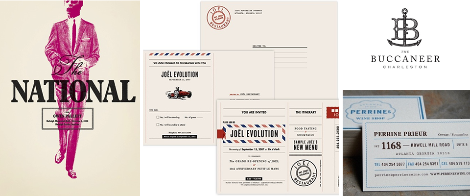
PS- AND, he lives in Atlanta! Atl represent!
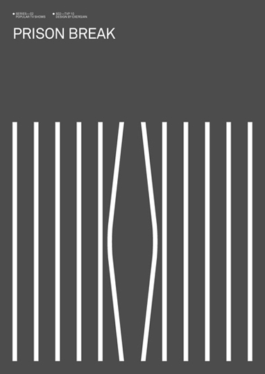
Minimalist Movie Posters
Like the “unsheets” I posted a while back, these movie posters by Kyle Tezak have an awesome minimalist style; they say a lot with very little.
Here’s what Tezak says about the project:
“Lately I’ve been working a lot with icons. Trying to capture the essence of an object or idea with only a few lines and at the same time maintaining its elegance is pretty much design in a nutshell. That’s what is so great about icons, they’re tiny poems. I decided it would be a fun project to attempt to sum up some of my favorite books, movies, historical events, anything, with just four icons; the meat and potatoes.”


50 and 50: The State Mottos
This is horribly embarrassing, but If I had to point out Iowa and Missouri on a blank map, there’s about a 50/50 chance I’d mix them up. Also, the other day, I found myself in a conversation in which I was suddenly wondering if the Emirates in the United Arab Emirates were cities? Or states? How did I make it through 17 years of great schools without mastering geography?
All of that to say, I think this new project called 50 and 50, where a graphic designer from each state will illustrate their state’s motto, creating a “designers’ atlas,” may be my ticket to finally at least mastering our own 50 states.
So far, there are only six finished, but they are pretty enough that I spent time checking out each one, and if something is visually interesting, I have a far better chance of learning it…

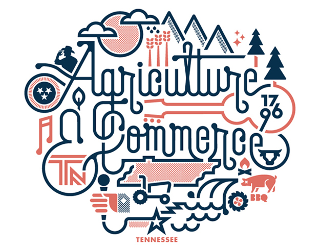
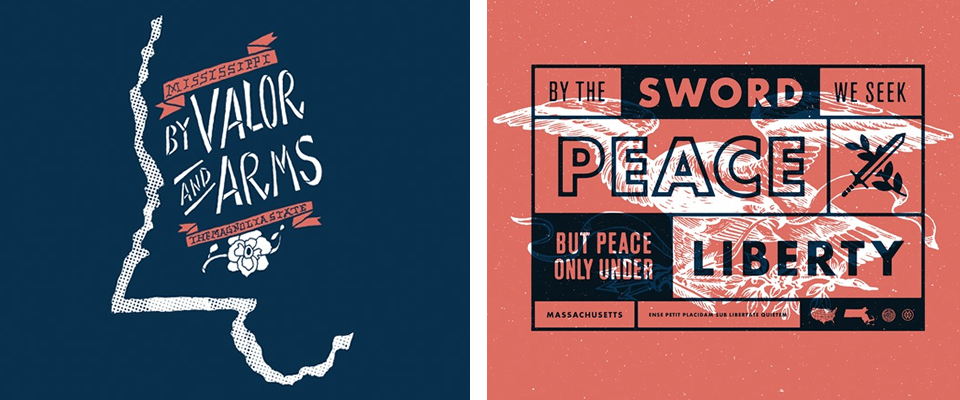
PS- Did you know that California’s state motto is “I have found it! (Eureka)”? How awesome and (so California) is that? All of the other ones sound very formal and heavily wrought and then there’s California’s. And incidentally, as a California transplant, I talk almost every day about how I feel like I’ve discovered the best place on earth, so I can see why CA’s state motto-authors were unable to write anything other than something simply reflecting their joy at having found this state.
Tati

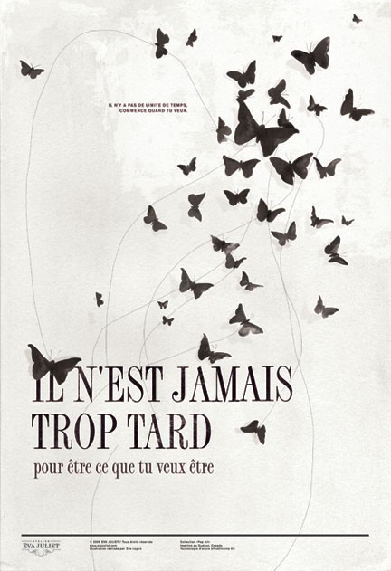
It’s Never Too Late
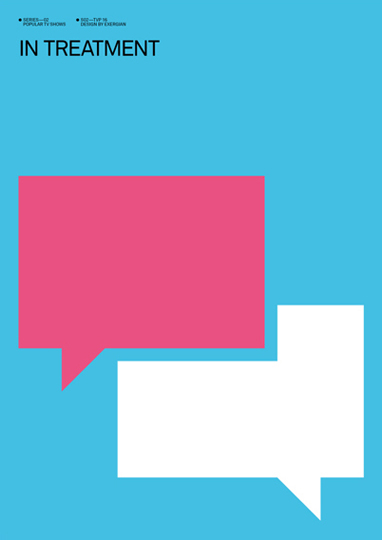
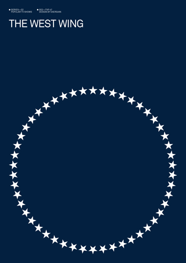
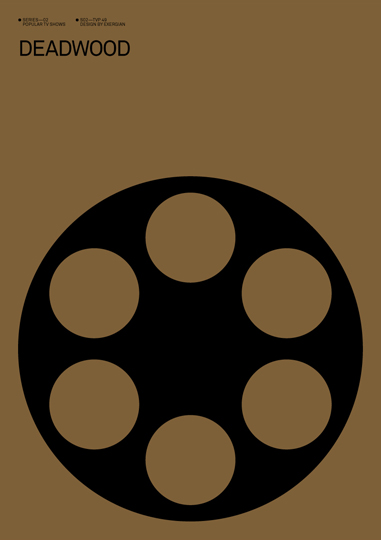
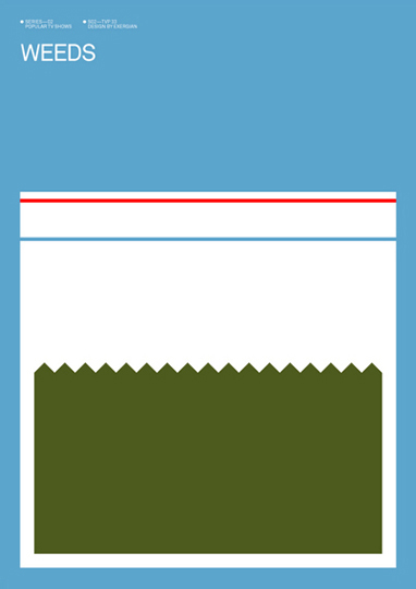
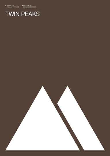
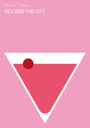
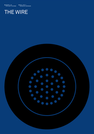
Minimalist Series Posters


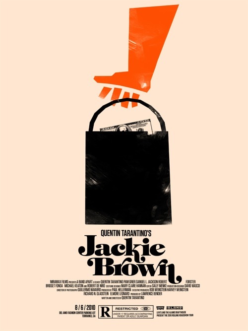
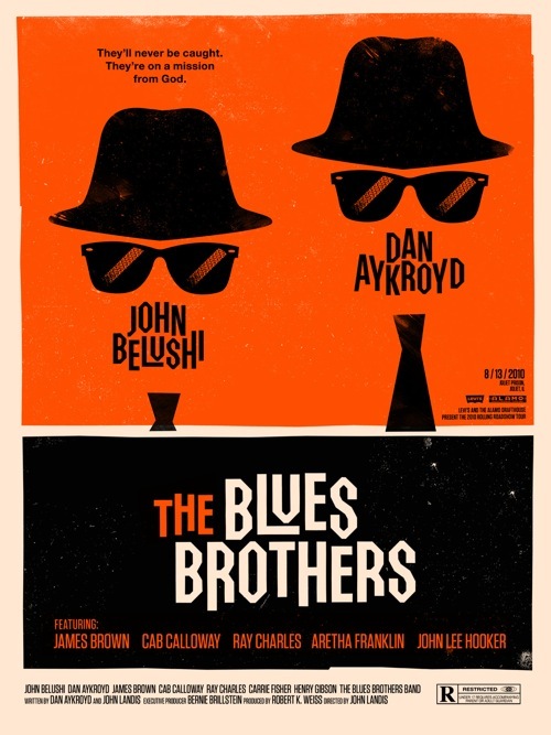
Graphic Fix >> 2010 Rolling Roadshow Posters
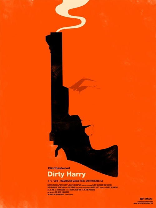
I discovered these through screenwriter John August’s website in his post about what he calls “unsheets.” ”One-sheets” are what Hollywood people call the posters designed for movies that are hung outside of theaters and are solely meant to sell tickets. They are generally formulaic and not very artistic, and almost always use the font Trajan (see hilarious video here about the unending use of Trajan for movies).
[2010 Rolling Roadshow]
[Olly Moss]
[past unsheet posts here and here]
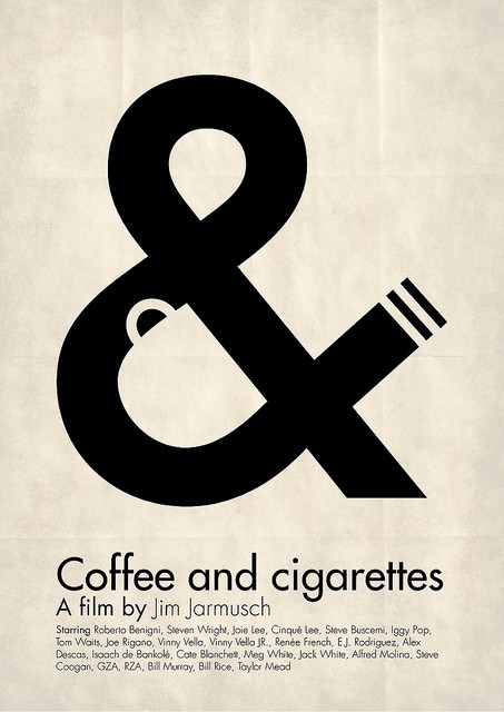
The Ampersand