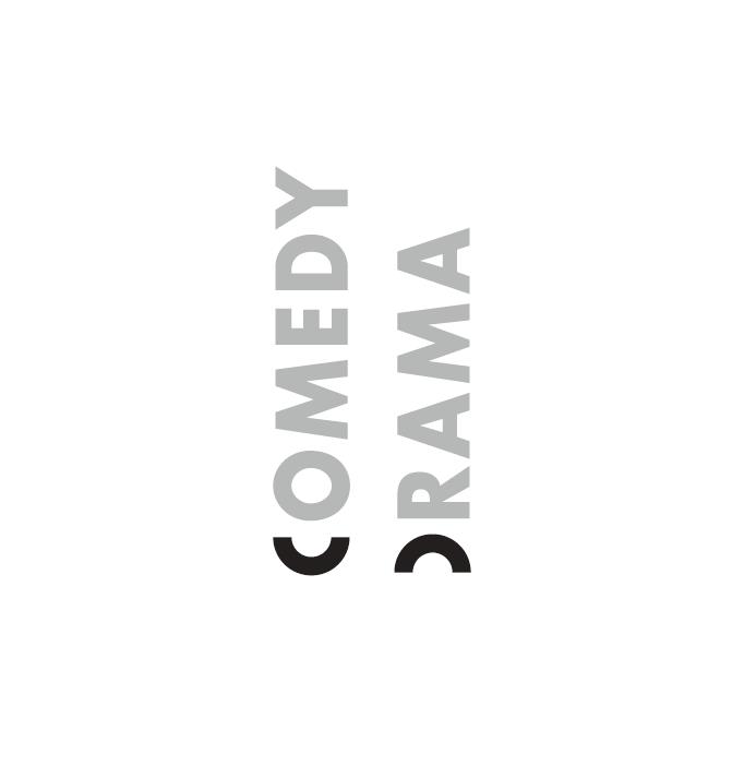
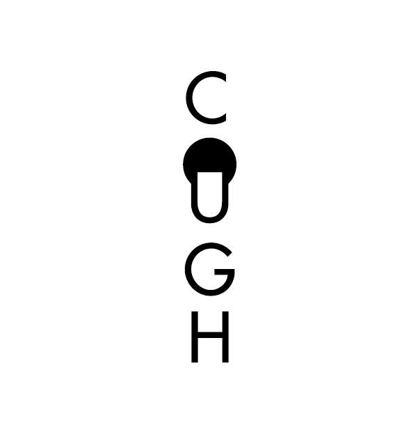
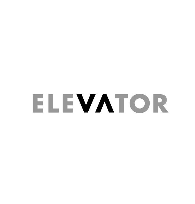
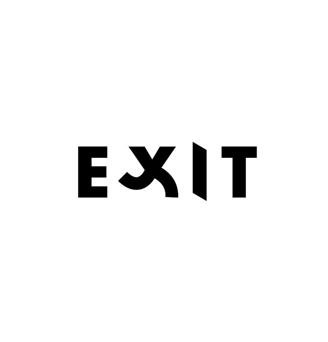
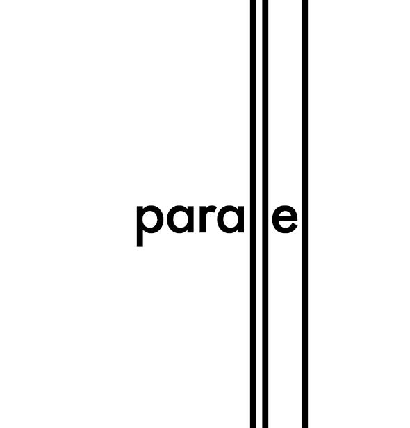
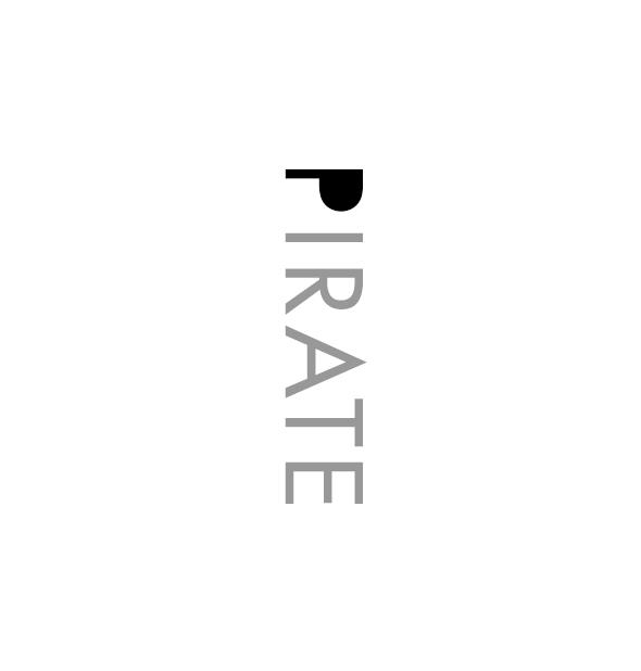
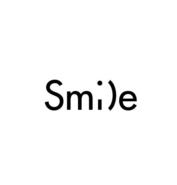
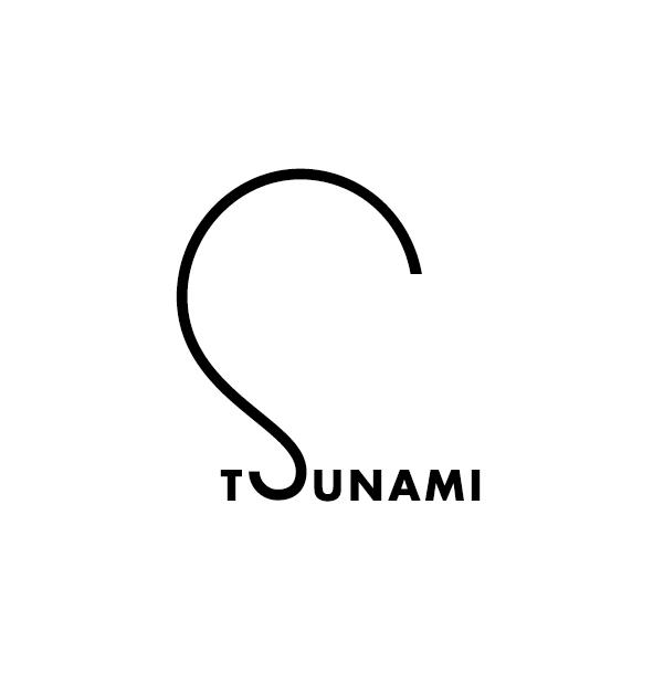
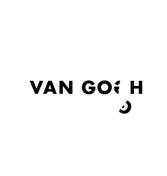
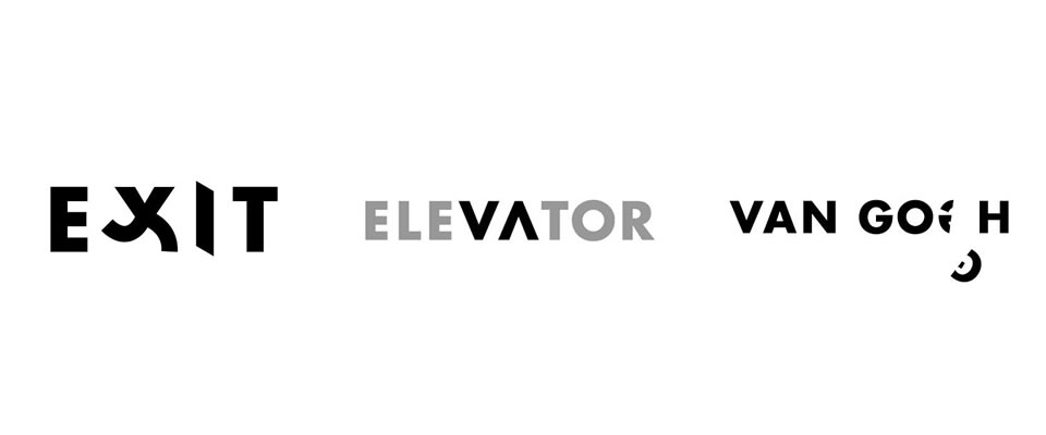
Word as Image
A delightful, thought-provoking project by designer Ji Lee– a new book called Word as Image. In his words:
“When we were children, letters were like fun toys. We played with them through our building blocks. We colored them in books. We danced and sang along with TV puppets while learning C was for “cookie.” Soon, letters turned into words. Words turned into sentences. Sentences turned into thoughts. And along the way, we stopped playing with them and stopped marveling at A through Z.
Word as Image brings a little magic back to the alphabet by helping us see the fun and humor behind the lines and squiggles.
This project started nearly twenty years ago as an assignment in my typography class at art school. Students were encouraged to see letters beyond their dull, practical functionality. We played with their unique shapes and tinkered with their infinite possibilities. The challenge was hard, so the reward of “cracking” a word felt great. This became a lifelong project for me.”
Check out the short animated video above, it’s awesome!


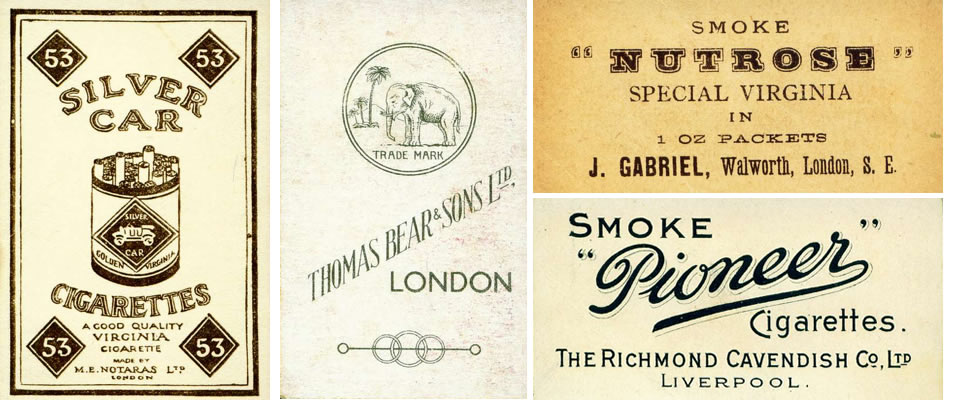
Early 1900s Cigarette Packaging
Great Flickr set of cigarette cards from the early 20th century. I have such a thing for one- and two-color packaging design, so clean and it forces the imagery to be super simple. And the typefaces sing!
If you saw the post on Cultivate Wines (one of my day jobs), you might recognize that we took inspiration for the box wine labels from this era of design! The lovely Cynthia Warren executed them brilliantly.

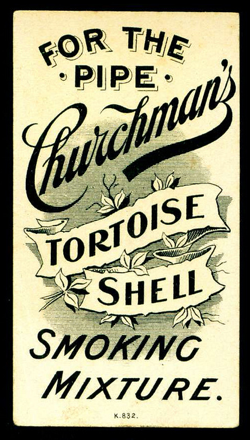
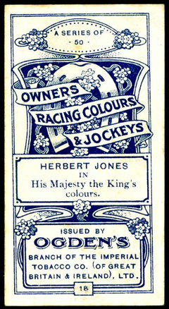
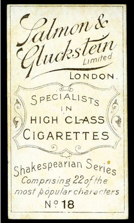
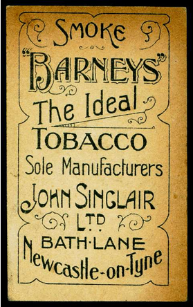

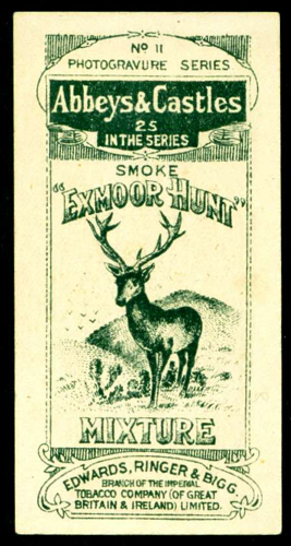
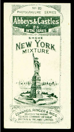

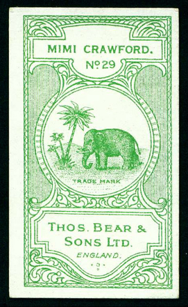
via Design Love Fest (who I took the photoshop class from you might have heard me tweet about!)

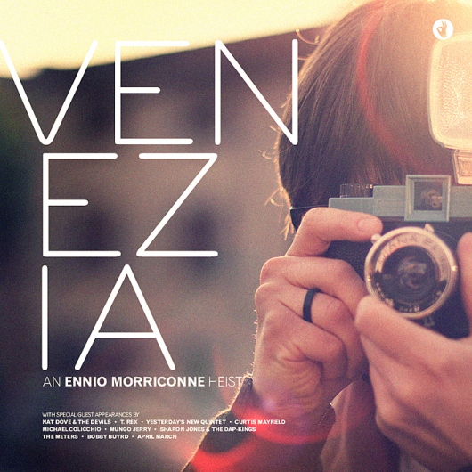
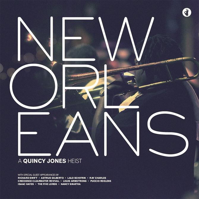
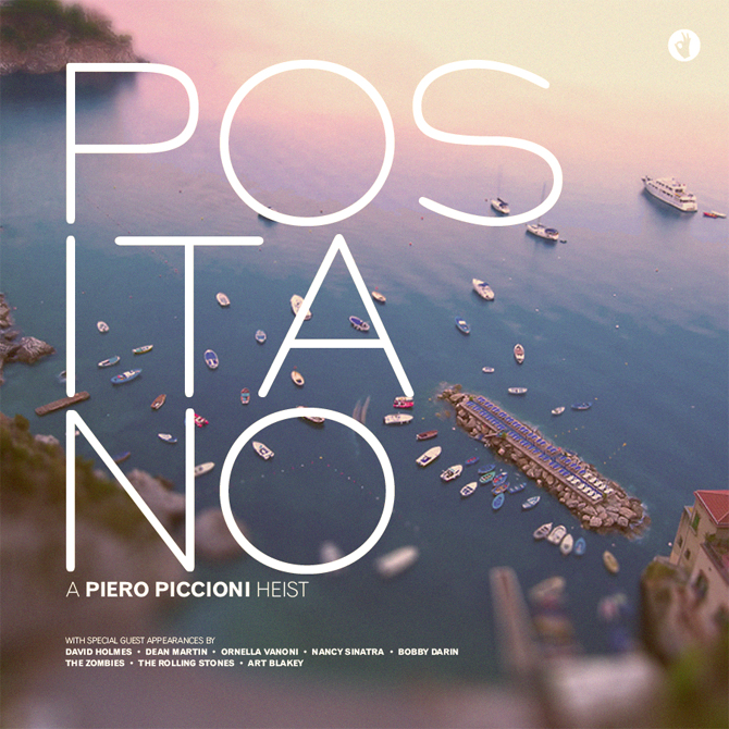
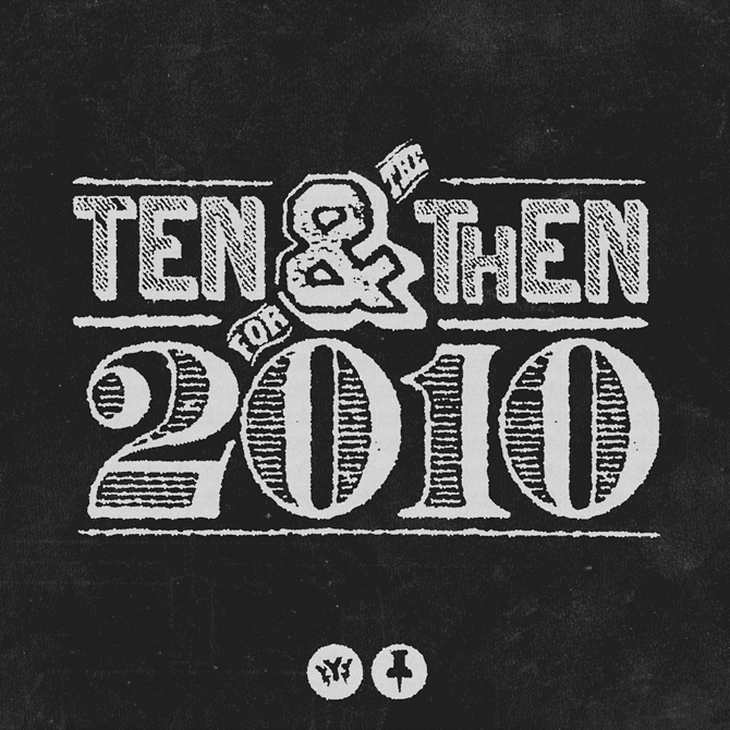
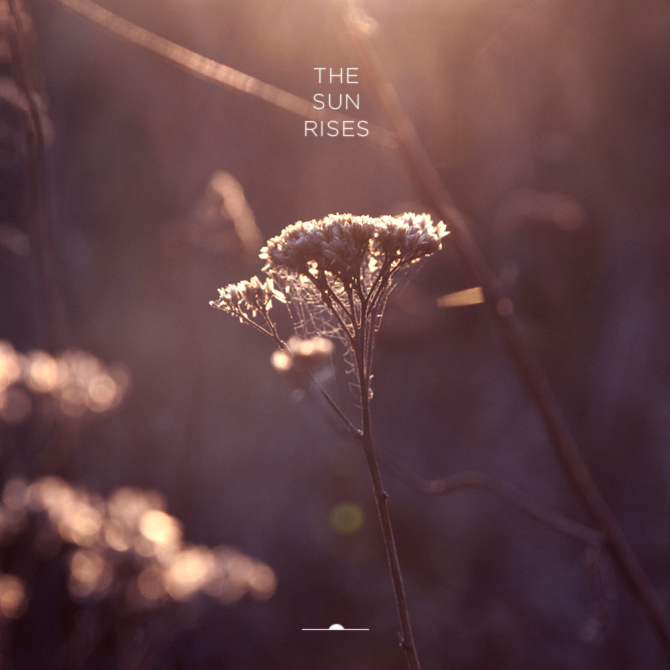
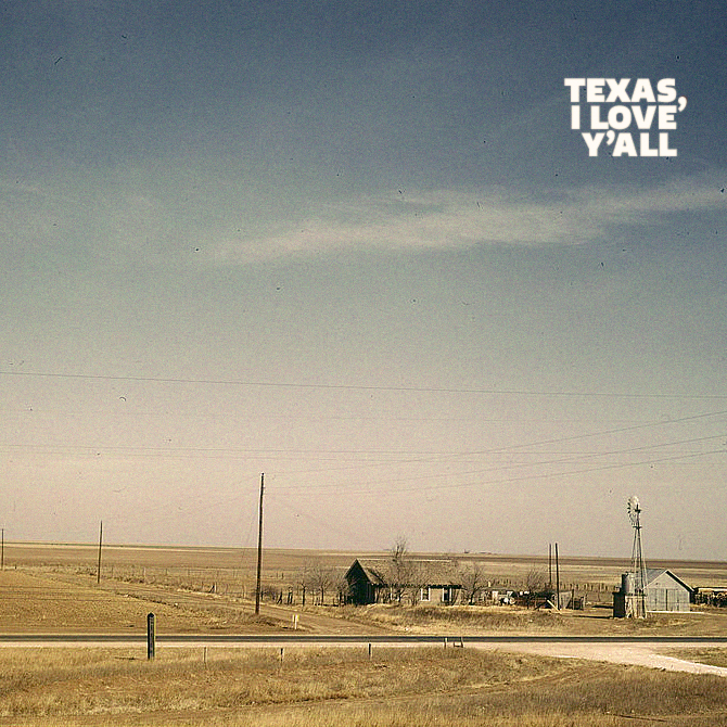
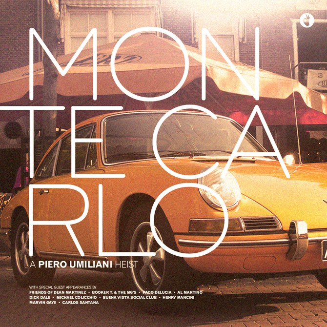
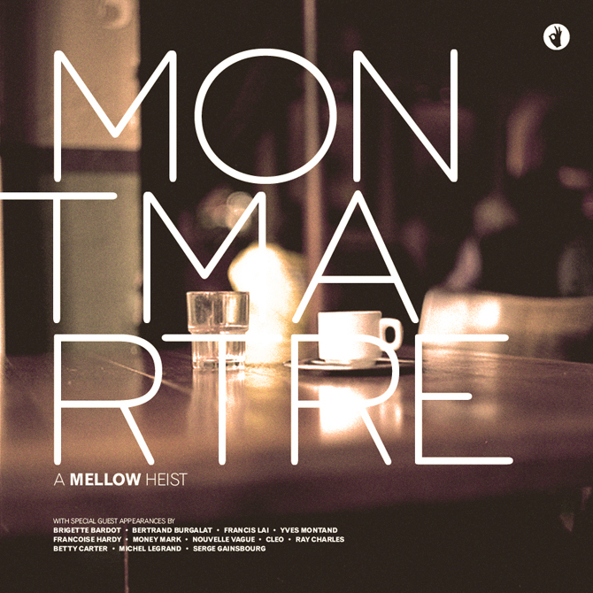
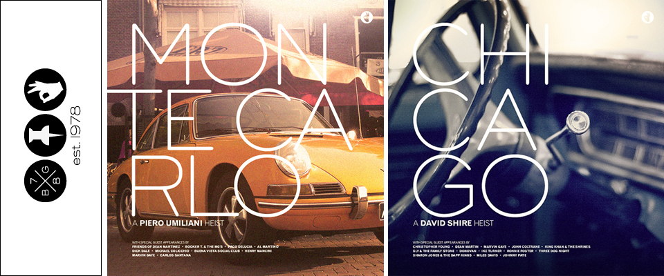
The Rad Mixes and Album Art of Brian Gossett
I am obsessed with the blog and work of Brian Gossett. Gossett is a freelance designer/art director/illustrator, and he also happens to have great (and eclectic) taste in music, which he has parlayed into a series of mixes created around different moods, themes, seasons, or whatever the inspiration might be that week.
The “album covers” above are from a series of mixes Gossett imagined as soundtracks for heist movies set in various international cities, each with their own little description like the one below. The descriptions of each mix are another thing I love about the blog, I love them like I love reading the description of a dish before reading the ingredients.

Another series, apparently very popular in the blog world (I figured I must’ve been late to this party, this stuff is too good to have gone unnoticed this long), was inspired by Take Ivy (you’re really late to the (blog) party if you missed that boat…) and A Continuous Lean and features solid mixes of current favorites like Phoenix and Grizzly Bear with classics like John Lennon and The Kinks.


I’ll leave you with a new favorite song off one of his mixes that will jumpstart your weekend…
And a more mellow tune if you’re still waking up this Friday…
Live the Language
These short films by Education First are brilliant advertising. They are so all over the trend of making short web films that are heavy on aesthetics and low on anything that says “this is advertising.” You can make it all the way through the film without knowing what it’s for, but it’s so awesome that at the end you’ll want to dig a little deeper to find out.
After watching those, if I were to need a language learning program in the future, would I go to EF first? You know it! Am I a sucker for pretty things despite lack of content? You know it!
The cinematography is gorgeous and the use of typography really, really got me. I now want to design everything I’m working on using French signage as inspiration (all those lines around the words, the engraving shadows, the deco fonts, the angles of the words… oh la la).
The films were a collaboration between Gustav Johansson, Nicklas Johansson, Albin Holmqvist, and Camp David, all of whom I plan to research immediately (check back soon for results!), but I’m also just so curious what advertising/marketing firm EF hired that then in turn put this team together! I can’t imagine they sought these guys out on their own…
(And now they just need that same firm to redo their logo and their website so that it is all in sync with these videos…)
Two more films here.
Dana Tanamachi’s Chalk Installations
I love chalkboard paint (see past post on chalk paint walls), and I love chalk writing (don’t menus in cafes look so much more charming when they’re written on a chalk board?), so naturally, I love Dana Tanamachi’s chalk installations. Their retro hand-painted storefront window sign quality is so appealing!
In addition to her chalk work, Dana also works for Louise Fili, so it’s no surprise that she’s a whiz with letterforms and signage.

Check out this fun 30-second time-lapse film of her Cooper Collection installation. I love that it’s set to a Morning Benders song!
like butter

Typoesie, 1939

The Ampersand
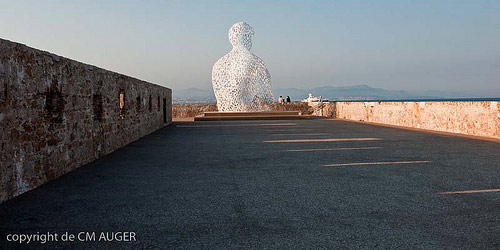
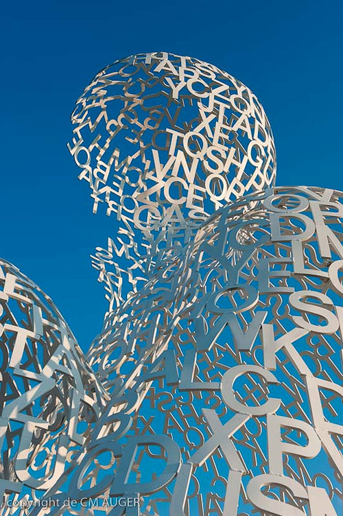
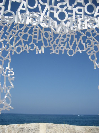
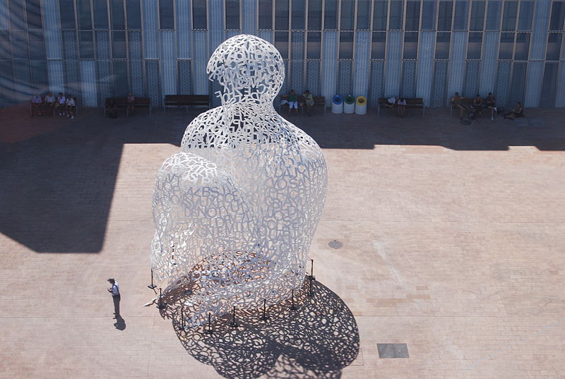
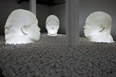
Jaume Plensa