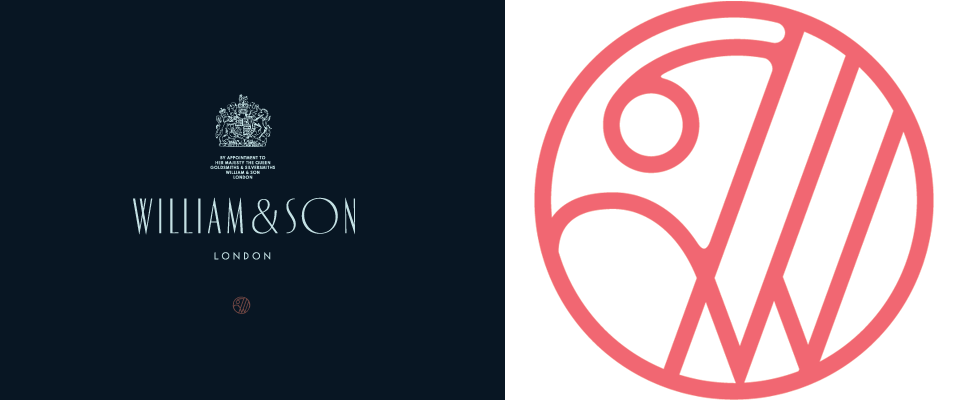
Andreas Neophytou
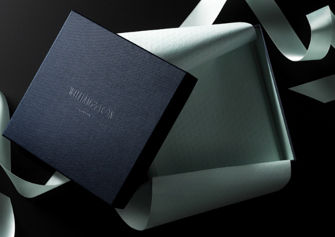
Loved this branding work by Andreas Neophytou for British rifle maker William & Son, and loved seeing bits from the creative process that went into, including all of these different type treatments below. Interesting what a difference the different style of “W” can make, the weight of the line, or whether the letters are varying sizes, heights, etc.

Also, the next thing I now want for Cultivate is a brand pattern like Neophytou made for W&S. We actually will use lots of different patterns in our packaging (all the boxes will each have a different pattern), but what fun to have a brand pattern!
Actually, now that I’m thinking about it, I think we’re probably way to fickle and flexible as a brand to pin ourselves to one pattern (or color scheme)– it took us AGES to settle on a logo and brand colors, and we finally settled on navy/cream, and then decided basically that it was too much commitment and changed to charcoal/cream. But I do love the idea of a brand pattern like this one.

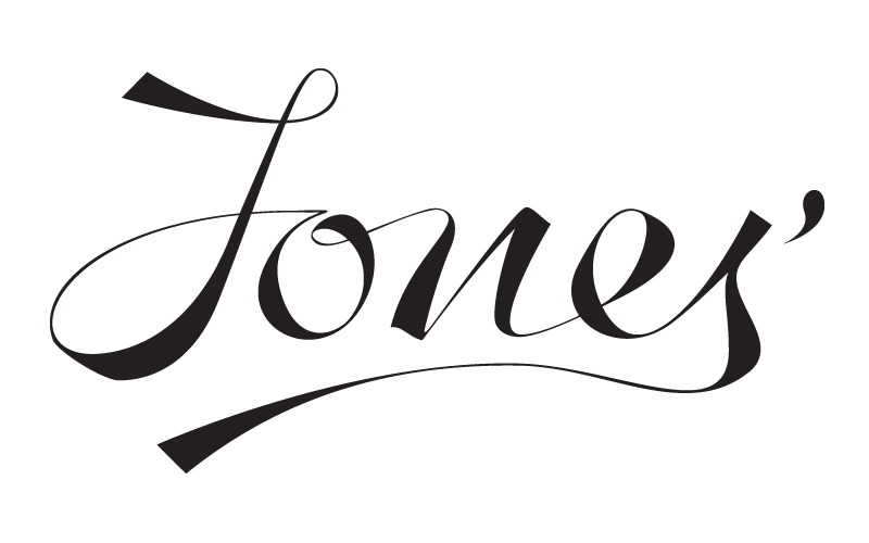
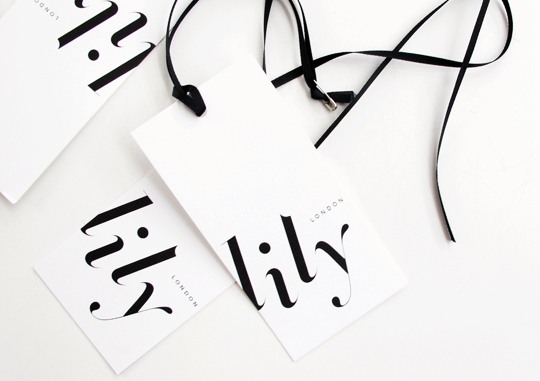
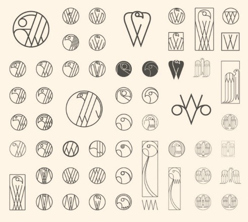
More of Neophytou’s logo work in the gallery– two fun scripts and couple that really reminded me of the mid-century logos in this post!