Andreas Neophytou
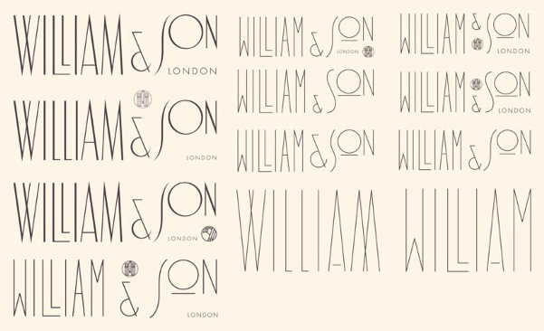
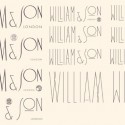
Loved this branding work by Andreas Neophytou for British rifle maker William & Son, and loved seeing bits from the creative process that went into, including all of these different type treatments below. Interesting what a difference the different style of “W” can make, the weight of the line, or whether the letters are varying sizes, heights, etc.
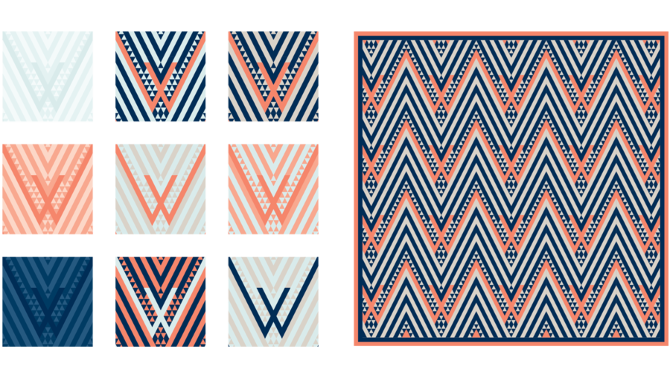
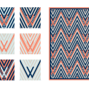
Also, the next thing I now want for Cultivate is a brand pattern like Neophytou made for W&S. We actually will use lots of different patterns in our packaging (all the boxes will each have a different pattern), but what fun to have a brand pattern!
Actually, now that I’m thinking about it, I think we’re probably way to fickle and flexible as a brand to pin ourselves to one pattern (or color scheme)– it took us AGES to settle on a logo and brand colors, and we finally settled on navy/cream, and then decided basically that it was too much commitment and changed to charcoal/cream. But I do love the idea of a brand pattern like this one.
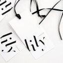
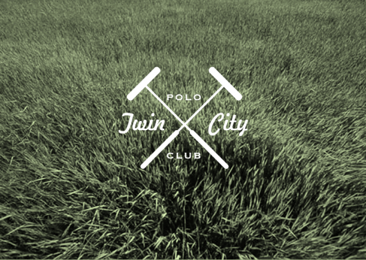
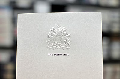
More of Neophytou’s logo work in the gallery– two fun scripts and couple that really reminded me of the mid-century logos in this post!
Stripped Logos
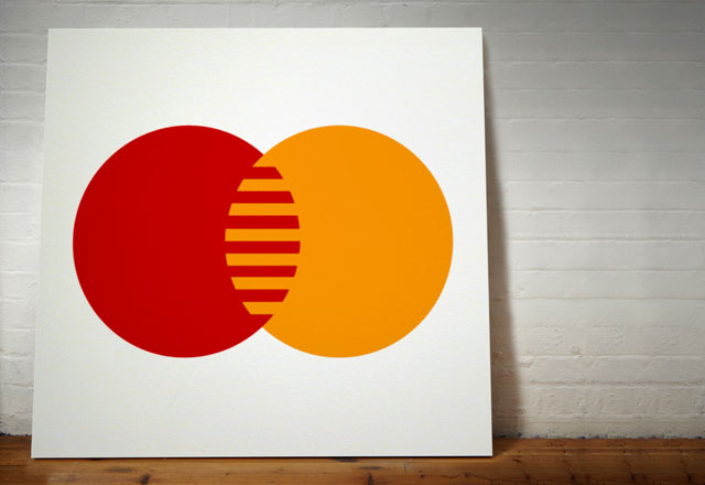
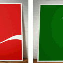
Dorothy, a collective of designers and artists, has just created this series of paintings of iconic logos stripped of their names, creating a series that looks like potentially could have been by Frank Stella or Ellsworth Kelly in the ’60s. I wonder if a lot of these logos were created around the same time?
Pretty interesting to see which of them still look pretty when they’re just art without the words!
What if the abc logo had been one of these?
