Graphic Fix
Music + Typography
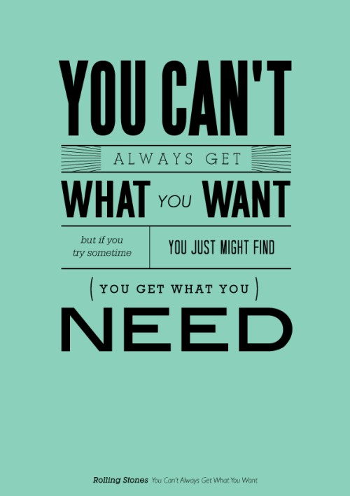
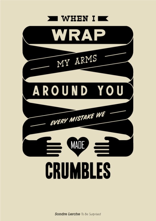
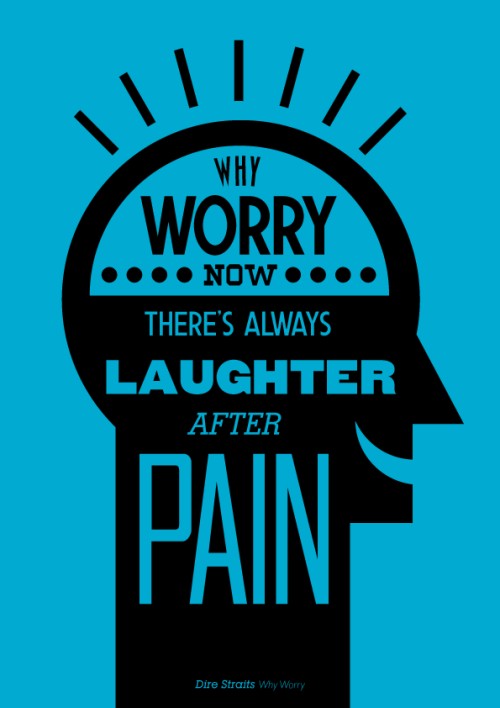
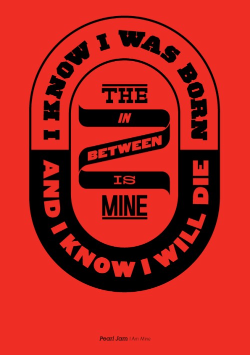
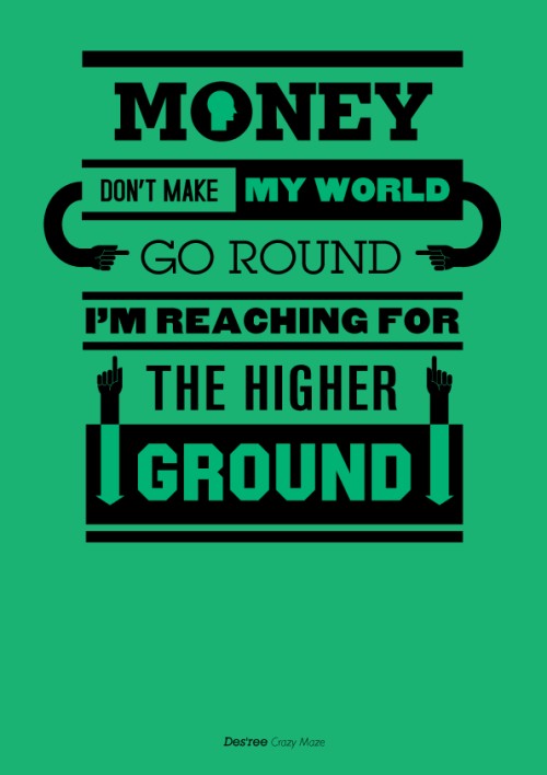
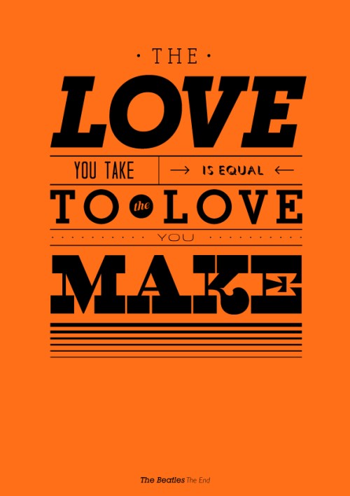
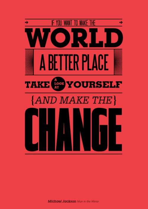
LOVE these typographic prints of lyrics by artist Mico Toledo. Done with less sophisticated designs, these could have been cheesy, but the graphic tone is spot-on. Love the use of fonts, layout, and simple graphics.


Graphic Fix
The Hipster Fashion Cycle

Graphic Fix
Old Paper

I’m a sucker for old paper things, like airmail envelopes and tickets… they have that effect I’ve mentioned before of making me long for an era I never actually lived through. They also make me wish the design of small, everyday things like this were still given such attention.
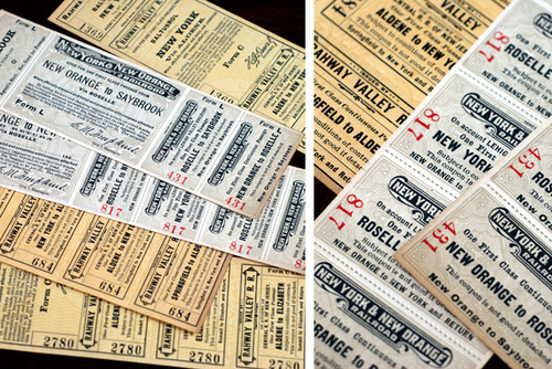
It’s the same way I feel about public buildings, like post offices and public schools– they used to be built so beautifully, and were architectural icons in town, and now they’re just built to be functional and cheap.
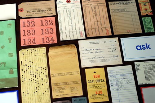
via Paper is Lovely
Graphic Fix
Evolution of the World Cup Ball
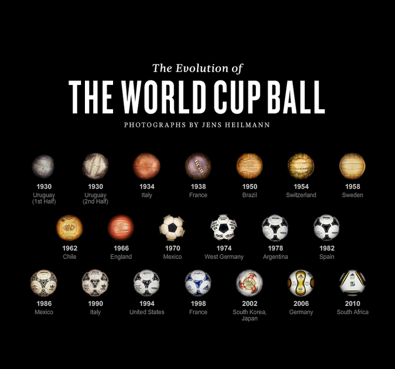
The NYT created this interactive feature about the evolution of the world cup ball. …I still feel nostalgic for the 32 hexagon-paneled balls!
Graphic Fix
MASH: Purveyors of the Fine
In my recent wine label researching, I came across the design firm MASH, based in Australia. And I think their stuff is just awesome. Any of these would definitely catch my attention immediately on a shelf.
Seemingly unconstrained by any wine world standards, MASH creates their concepts based on the people and ideas behind the wines they are designing for, coming up with a real and full identity for the wine as a whole, rather than just designing a little rectangular label to stick on a bottle.
Their concepts are totally unique fully realized in every detail, and they also simultaneously are sophisticated enough visually avoid sliding into gimmick territory, which could be a danger given how into the concepts they get.
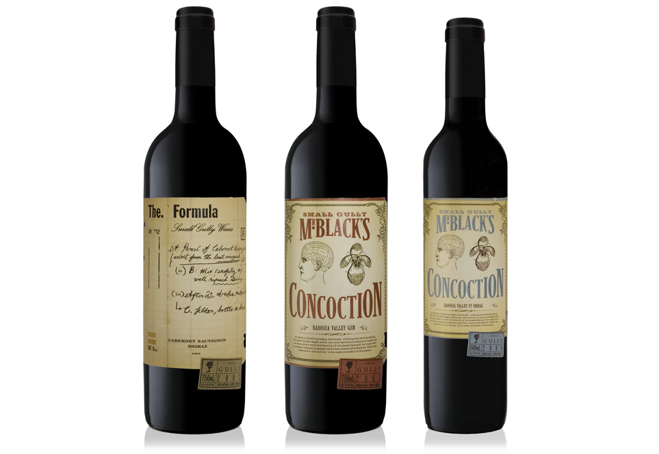
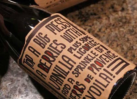
For the wine above, MASH created the concept based on the identity of the man behind the Small Gully wines, a Mr. Stephen Black, who formerly was a chemist who worked in pharmaceuticals. So MASH ran with the chemist thing, calling the wine “Mr. Black’s Concoction” and designing a retro apothecary-ish feeling label.
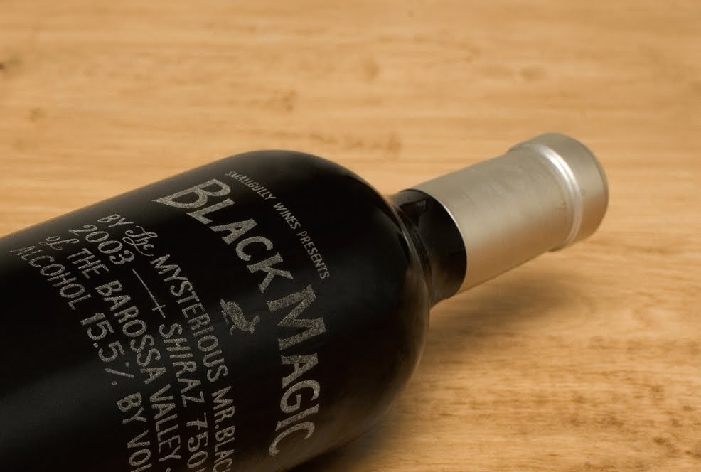
The other concept they created for Mr. Black is Black Magic, which has the “label” laser-etched directly onto the glass instead of using a paper label. They said they wanted it to look as if perhaps the winemaker himself scratched the information on to the bottle, and the subtle etched glass also works perfectly to complement the concept of “black magic.”
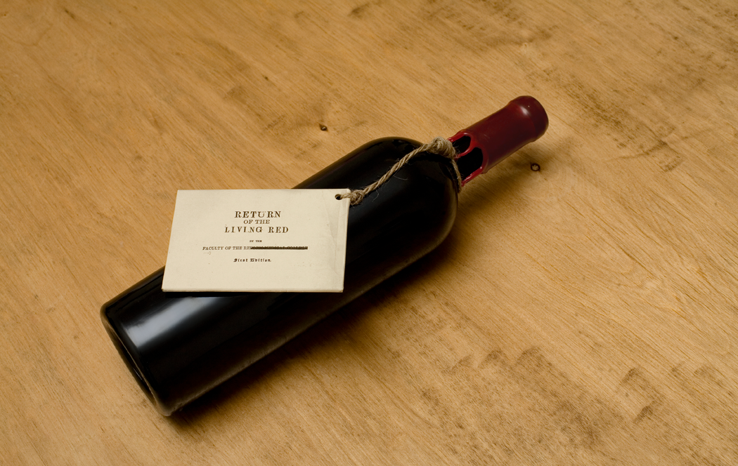
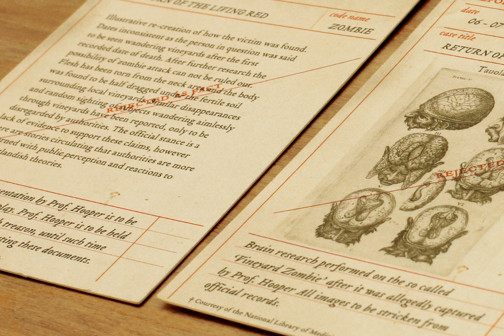
The concept for this cheeky, almost creepy wine, called Return of the Living Red, was born out of the fact that the wine is “non-vintage” — the two grape varieties are from two different vintages — meaning it is “ageless.”
Once again, MASH took the idea and ran with it, coming up with a whole identity for the wine based on this “Return of the Living Red” idea…

“This was a complex fine wine with no listed age; a mysterious and intriguing wine. To compliment this the nature of the product, Mash developed a concept to create a small pack containing missing and/or supproessed crime files implying the existence of the living dead in and around the vineyards.”

“With the use of disturbing illustrations and fascinating old photos on a toothy uncoated paper the concept was brought to life. A slip knot with old twine and a deep red wax dipped bottle went with the old crime file folder to create one of our favorite wine packaging pieces.”
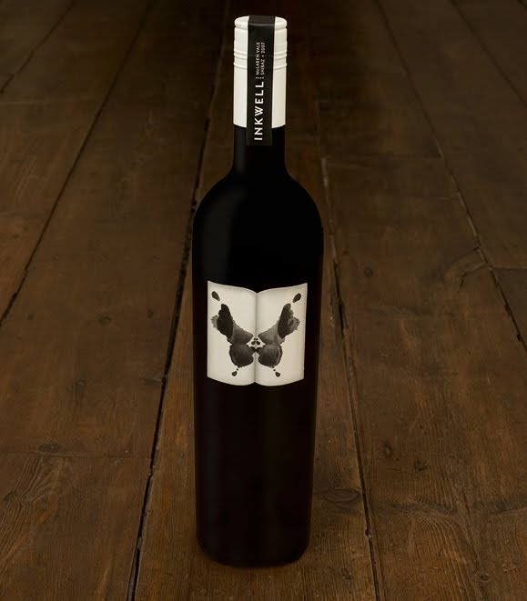
For Inkwell, they came up with the imagery, the inkblot, directly from the name, and left the label free of any other text or design. The name itself resides on a neck label. The simple black and white palette is used to great graphic effect, and the inkblot is artistic and literal without being in your face or cheesy.
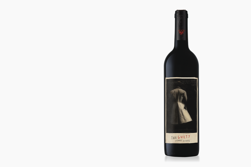
Here’s another one where they based the concept off of the man behind the wine– the o
wner of this winery also happened to be a magistrate judge, so they decided to go with the idea of “The Guilty.”
wner of this winery also happened to be a magistrate judge, so they decided to go with the idea of “The Guilty.”
The label has only the ambiguous and creepy black and white photo, from which it is impossible to tell whether “the guilty” is the defendent or the judge himself, and the handwritten info at the bottom.
More MASH labels to come…
Graphic Fix
Typestaches, A Field Guide
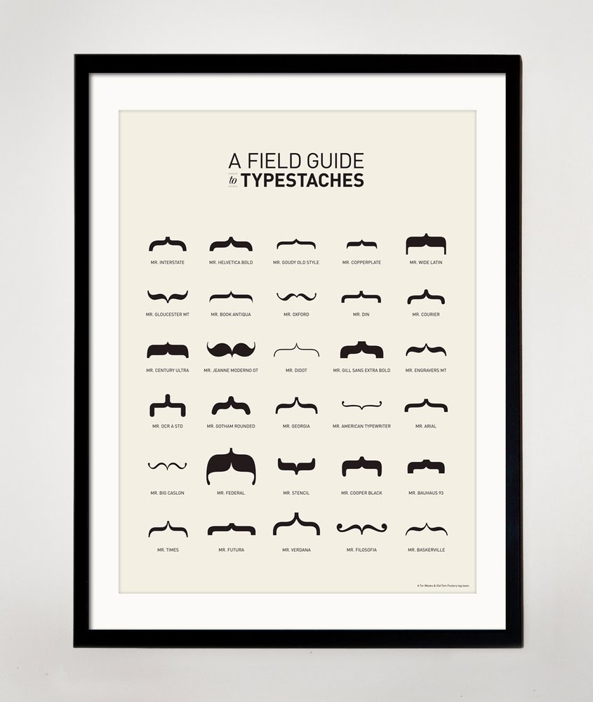
I just couldn’t resist.
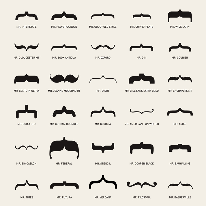
Available at Old Tom Foolery.
Graphic Fix
Stationery + Snark >> “Mean Cards”
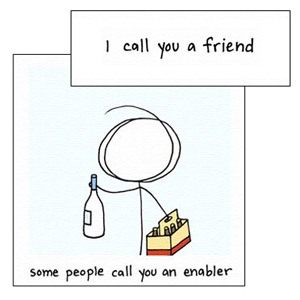
Mean Cards combines snark, humor, a little meanness, but still a little sentiment in their playful cards…
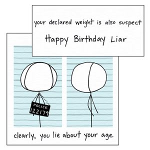
You must know you’re really good friends with someone if they give you a card like this… it at least means they know you well enough to know you won’t take it the wrong way.
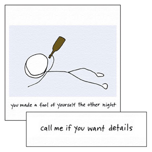

Mean Cards here. They also deliver iPhone cards, making it even easier to deliver some snark.
Graphic Fix
Typographic Wine Labels
For a new project we’re gearing up for, I’ve been digging around looking at different kinds of wine labels that have been coming out recently, and I’ve noticed a couple of interesting trends…
One of them is the use of interesting typography and an emphasis on typography rather than imagery and logos.
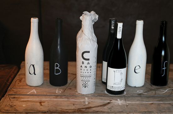
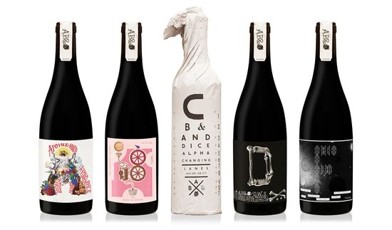
Above, the ABCD&F line from Justin Lane, designed by Australia-based Mash, whose names and labels are each a letter of the alphabet, which then takes on a personality and story–
A for Apostle, B for Blood of Jupiter, C for Changing Lanes, D for Dead Winemakers Society, and F for Fog.
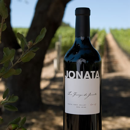
With no image at all and highly restricted palette, the graphic Jonata label stands out as clean and sophisticated and is a perfect example of a label that focuses solely on typography. It also happens to taste fantastic…
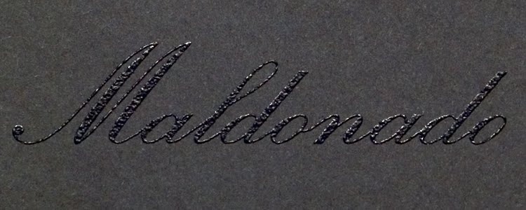
This Maldonado label, designed by Michael McDermott, uses black thermography and gold foil to emphasize the word alone.

Broadside deftly and cleverly uses typography to mirror the name of the wine and its meaning as an ad or leaflet printed on one side of a piece of paper and simultaneously underscores the “broad” portion of the word through the expansive font.
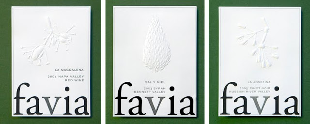
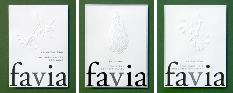
Favia, incidentally one of my favorite wines, uses blind embossing for the images used on the different labels so that the very simple, bold word is what always pops.
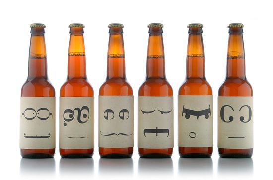
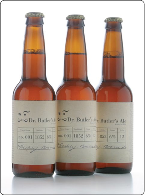
Ok, it’s not a wine, but I couldn’t resist sharing this beer, “Dr. Butler’s Ale,” whose labels are all faces made of characters from the Bodoni font. A student project by Ashley Lewis, the different faces are meant to represent the multiple crazy personalities of Dr. Butler, who was an infamously nutty “doctor” in England and used his ale as a cure for many ailments.
Love the back label as well… feels very apothecary-ish.
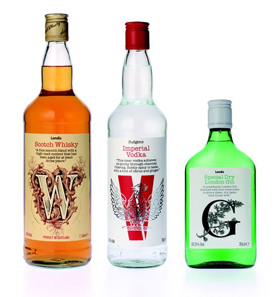
Again, not a wine, but thought this concept was clever — they used the first letter alone of each type of liquor to totally create it’s identity. And it works! They all have a totally different feel, communicated solely by the design of the letter.
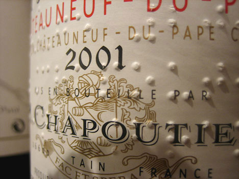
Starting in 1994, Chapoutier started included braille on its label, adding another kind of typography to the mix. The braille is a nod to the property’s history, but it also has a very cool graphic effect.
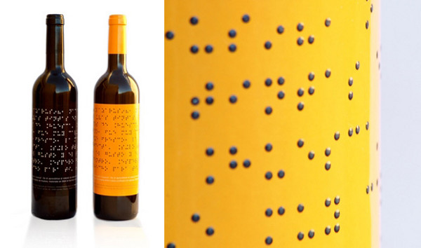
Lazarus Wines takes the braille thing a step further…
These next few labels combine creative typography with a touch of wit that communicates a message of “dropping the act” of the snobbery of wine. They are straightforward and intentionally avoid pretense. There’s nothing to read into, it just is what it says it is.
Love the idea of the label telling you what it tastes like in easy to understand, appetizing terms. By magnificent wines.

I can’t help it, I really, really like this concept of just a good, standby house wine being called House Wine. It’s so simple and conveys exactly what it is meant to be.
It might be bordering on gimmicky, but B Frank’s concept is pretty clever– you are meant to write on the label why you are sharing the wine with someone.

I even just like the idea that you are meant to write on it– how has no one ever thought of a label that the person buying it participates in in some way? It makes sense given that wine is frequently a gift and even more frequently something someone is sharing with someone else.
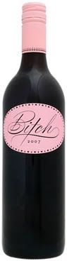
Ok I personally think this wine is so gimmicky I can’t stand it, but whoever designed this packaging was on to something and really nailed it– the girly-cute script used for “Bitch” and the all-pink label gauranteed this wine’s place at every bachelorette party since its debut.
More trends to come as the research continues…
Graphic Fix
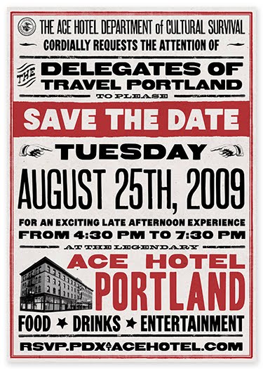
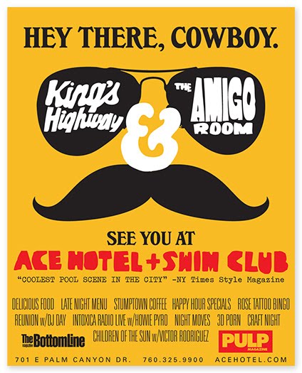
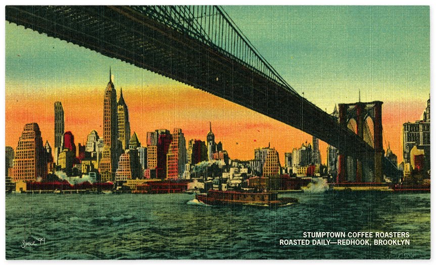
The Official Mfg. Co.
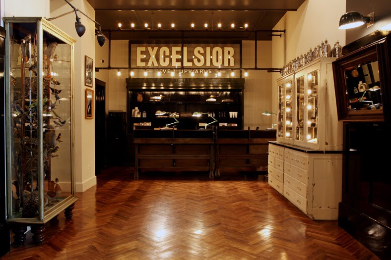
The Official Manufacturing Co. (OMFG), a collective of designers, describe themselves as “thing makers.” After working separately for the Ace Hotel and Wielden+Kennedy, they came together to unite their creative abilities.
Below, some of the marketing collateral and identity work they have produced…
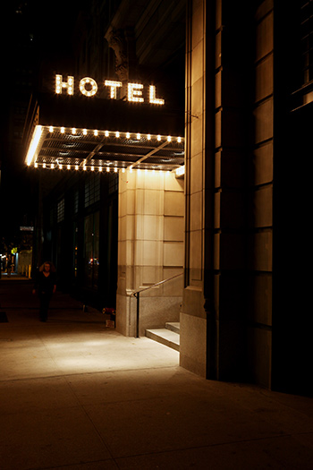
Their work, including the indoor and outdoor signage for the Ace Hotels, has a wonderful retro quality that manages to be evocative and authentic feeling, rather than kitschy. Or at least when it is kitschy, it is in a winkingly ironic way.
Doesn’t the sign above just do it for you? The marquee lighting is so simple, yet so appealing.


An album cover design for Black Prairie.
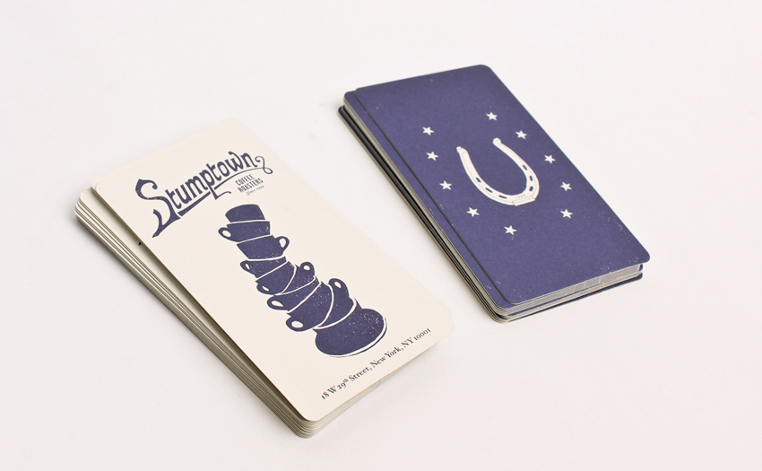
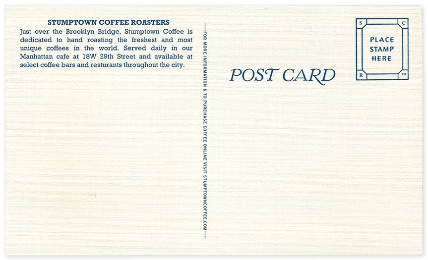
They also designed the packaging and marketing collateral for Stumptown Coffee (yum), which has a similar retro feel and looks awesome.

OMFG.
See more of OMFG’s work at their website here.
via Secret Forts
Graphic Fix
Field and Sea
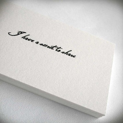
Loving Field and Sea’s tiny note cards– their straightforward messages are perfect examples of the kinds of things you just might rather say in a note than in person…


Also love the ones that say “You’re right, I’m wrong,” “You’re an amazing human being,” and “I have lost the right words, will these do?” Many more here.


