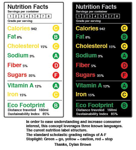
Redesigning Nutrition
I hadn’t ever thought about it before I saw this article, but the nutrition label that comes on the side of every packaged food really is in desperate need of redesign. So, GOOD held a contest to come up with a new design! Above is the winning entry, below, a few others.
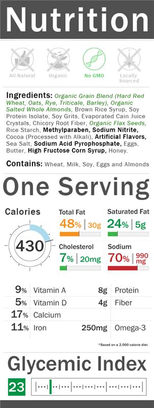
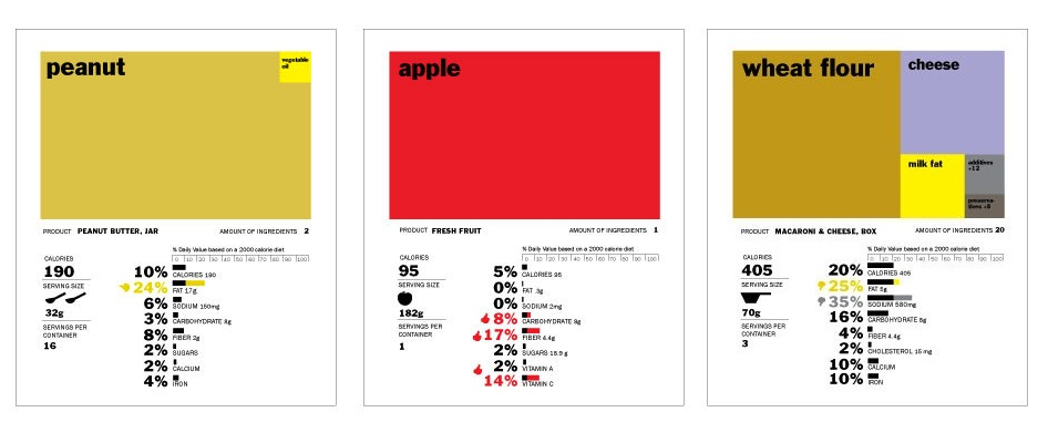
Isn’t it amazing how design can totally change the way we understand and process information? Compare how you process the info in the label concept at top vs these below. Your understanding of the food really differs with the different designs! The FDA really is about to redesign the nutrition label, hopefully by combining ideas from all these entries, they can come up with something that is easily understandable and will lead us to better eating choices!

It also reminded me of this project I came across a while back– a conceptual redesign of the boarding pass…. I now think about this every time I fly, wishing my boarding pass were something visually pleasing and easy to understand like this!

The Most Typical Person
Is: 29 years old, a man, Han Chinese, earns less than $12k/yr, has a cell phone, and doesn’t have a bank account.
Above is a composite image of thousands of 29 year old Han Chinese men, resulting in an image of the world’s most typical human. There are 9 million 29yo Han Chinese men. Crazy, right?! 9 million!
Fascinating, right? In a special series, called 7 billion, National Geographic is going to spend a year exploring the demographics and trends in demographics of the human population and what the implications are.
With a rapidly growing population, that seems like pretty important stuff. And maybe a little scary. To me it seems like one of those things I feel like I should think about, but I might rather just remain blissfully ignorant. Like if I dig too deep I’m going to find out that we’re doomed to run out of food by 2030 or something.
But before you go into Malthusian-inspired hyperventilation, did you know that if all 7 billion of us stood shoulder-to-shoulder, we would all fit in Los Angeles? So it’s at least comforting to know that space is not an issue.
That’s according to the video above. Check it out for more intro information on this series and to find out how freaked out you really should (or shouldn’t) be.
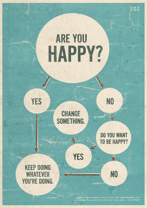
Street Fight Flow Chart
I like to keep a good mix of high and low, intellectual and fun, feminine and masculine, etc. etc. on Wonderlust, and since I just posted all those pretty outfits, I thought I’d throw this into the ring for a bit of more man-oriented fun/humor. And who doesn’t love a good flow chart?
Click the images below for full size….
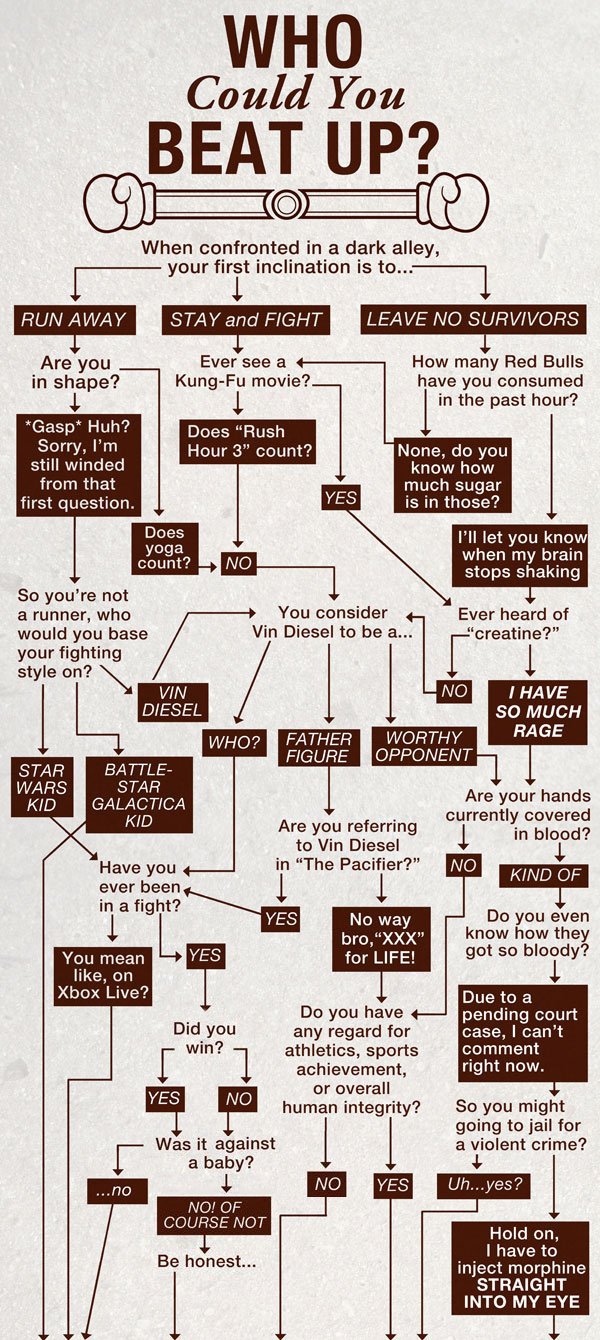

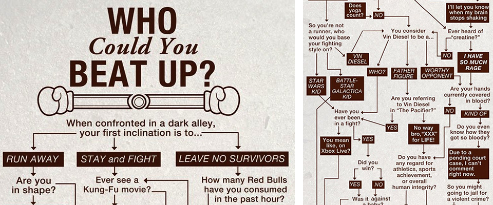
From none other than College Humor via LaEM.
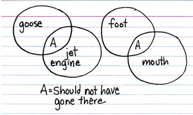
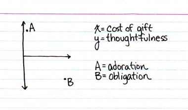
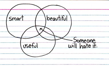
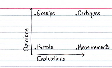
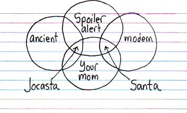
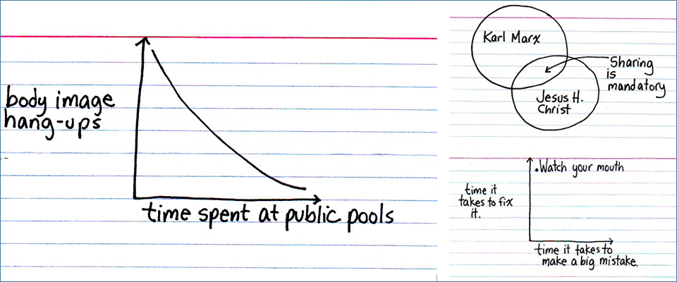
Indexed
Every once in a while, I love to check in on Jessica Hagy’s blog, Indexed. Each day, Jessica publishes either a venn diagram or a chart, and I absolutely love them for the same reason that I love good design: they communicate something complex simply. And quite often, they say something funny concisely, which is extra impressive.


Don Q Lady Data
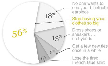
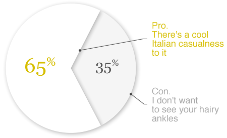
But lest you think this is a huge downer, I feel strongly that menswear in America is really having a moment (in fact, such a moment that I think menswear is more interesting than womenswear right now) and that this could all turn around. Also, this only means that the guys out there who do dress well have a serious leg up!
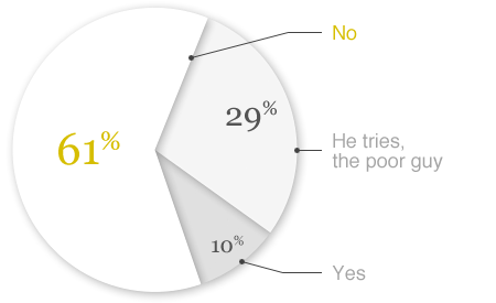
You can check out the results to the other 7 questions, including more insight into why 61% of women think the average man dresses poorly, here.
The Hipster Fashion Cycle

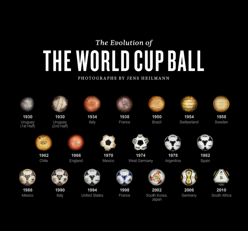
Evolution of the World Cup Ball
We Love DataVis Blog
Here, a few great ones from the We Love Datavis (data visualization) blog, which keeps track of the latest and greatest infographics. I swear it’s not as nerdy as it sounds.

Information is Beautiful
Below, the “in” colors for women from 2002-2010. (Click for larger image.)

David McCandless is an information designer. I like design, and for that matter, I really like information too (a friend regularly tells me I should put all my random factoids in a book. I think she means “instead of telling them to me all the time.”), so it’s no surprise I think the idea of an information designer is INCREDIBLE!! He basically takes information and makes it digestible through a visual form that is not just your typical pie chart.

Today, he created this graphic in response to the news that Google has stated that it will now refuse to censor google.cn in accordance with China’s censorship rules. In red are phrases that are blocked, and in black, websites that are blocked. (Again, click for legible image.)
Some are expected, like “political dissent,” others, like perezhilton.com, are a surprise!
Below, a comparison of “billions.” This was in response to constantly hearing incomprehensible multi-billion dollar figures in the news. See billions spent by US govt on the Iraq war compared to billions it would take to feed and educate every child in the world for a year, for example.

Environmental impact of pets vs cars… surprising!!

I think he’s brilliant. Being able to comprehend information and translate it into something visual and easily understood and also make it aesthetically pleasing is quite a skill.
Ps… I bet he’s a fan of Frank Stella’s 60s and 70s work, don’t you? Below, Frank Stella’s “Harran II,” 1967.

 And above, “Sunset Beach,” 1967.


