Graphic Fix
Beyond Pen & Ink >> Fashion Week’s Most Original Invitations
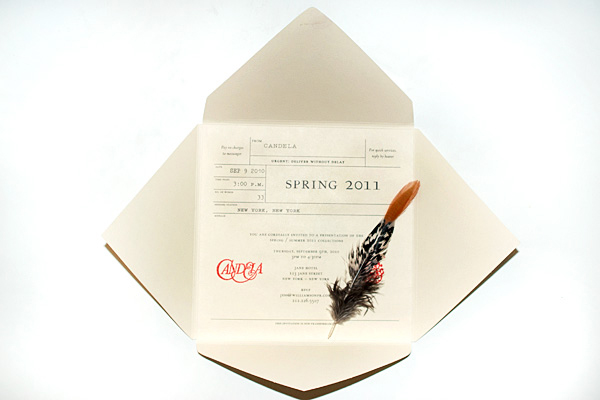
A feather for your cap was included with Candela’s invite.
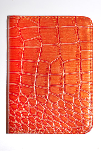
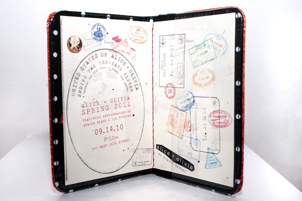
Alice + Olivia’s invite came in a faux-croc passport case you can actually use for your passport!
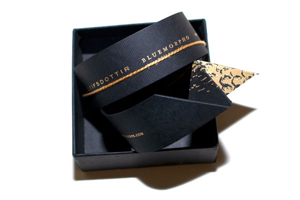
Leifsdottir’s chic ribbon-esque invite is actually a slap-bracelet. A little more sophisticated than the (Lisa Frank) ones I had back in the day…
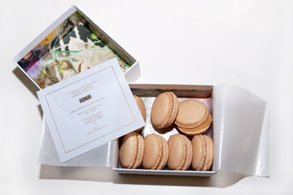
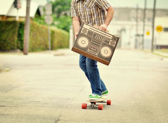
Who wouldn’t want to get a box of macarons in the mail? Clever move by Honor.
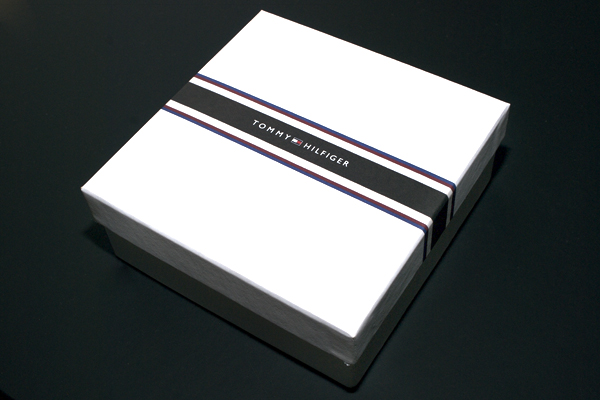
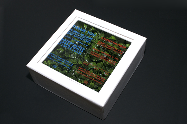
Inside the Tommy Hilfiger box, under the glass, is a boxwood!
Graphic Fix
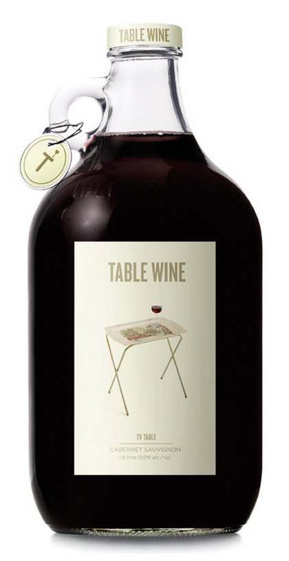
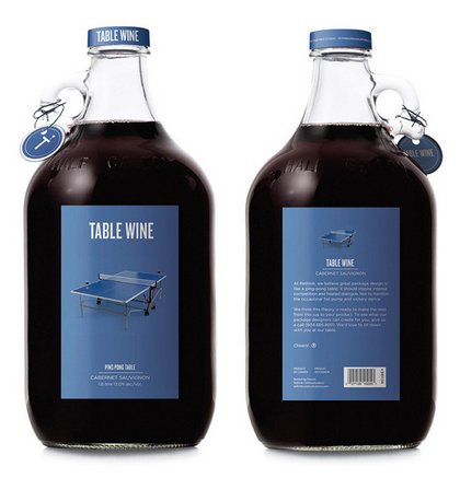
Table Wine
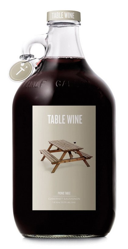
Rethink Communication rethought (ha, ha, great pun, I know) the concept of “table wine” for this wine packaging they created as a promo to display their outside-the-box design capabilities. Pretty clever, no?
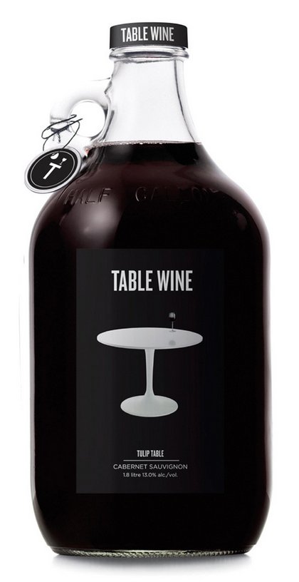
Of course I love the Saarinen tulip table version.
[Rethink Communications]
[via Serious About Wine]
Graphic Fix
Your Handwriting –> Digital Font
Pilot has created a program that turns your handwriting into a digital font.
Major downside is that you can only use the font on their website to send emails to people… you can’t download the font to use in other applications. But this must mean its only a matter of time until there’s a program that does let you create a downloadable font, right??
Graphic Fix
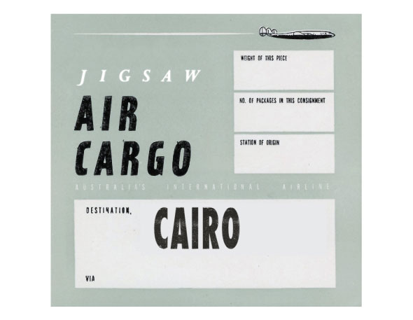
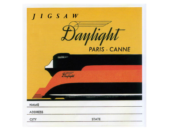
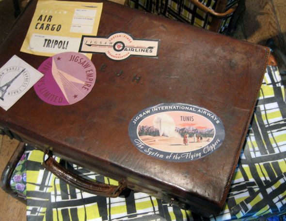
Retro Travel-Inspired Graphic Design
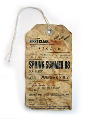
Love these retro travel-inspired pieces designed by Caroline Popham as press invites for UK fashion brand Jigsaw.
Graphic Fix
Coralie Bickford Smith's Fitzgerald Book Covers


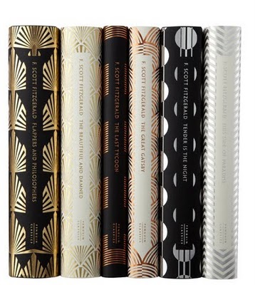
Gorgeous Art Deco book covers by Coralie Bickford Smith.
Graphic Fix
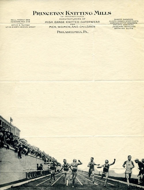
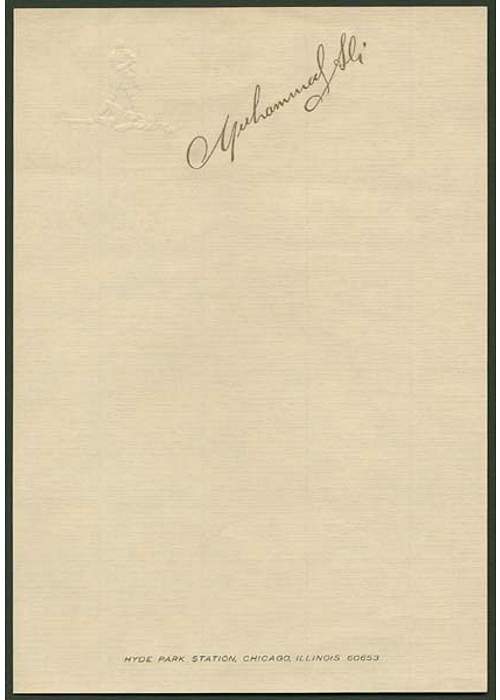
Letterhead

This is awesome. Just discovered a sister blog to Letters of Note (check it out if you don’t know it– it publishes scans of original historically significant letters) called Letterheady, which publishes the letterhead of famous figures and companies. Could browse their archives for… a while.
(Stephen King)
Graphic Fix
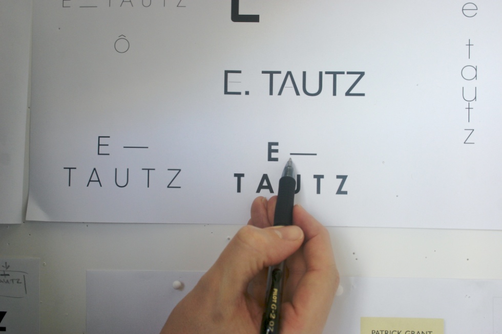
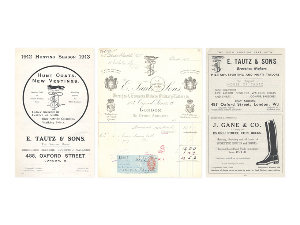
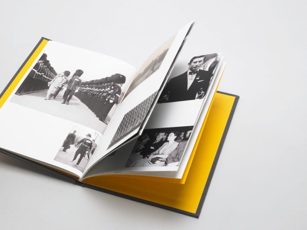
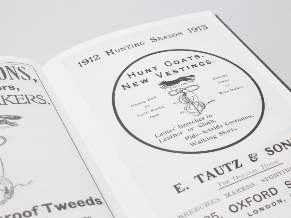
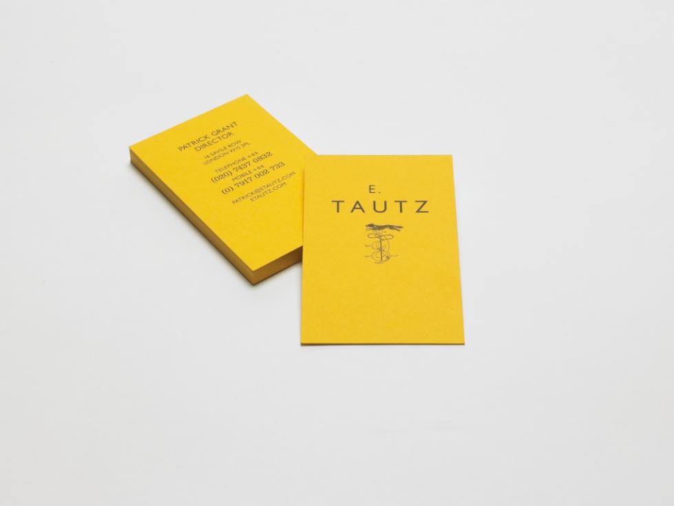
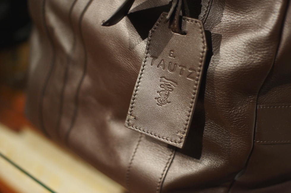
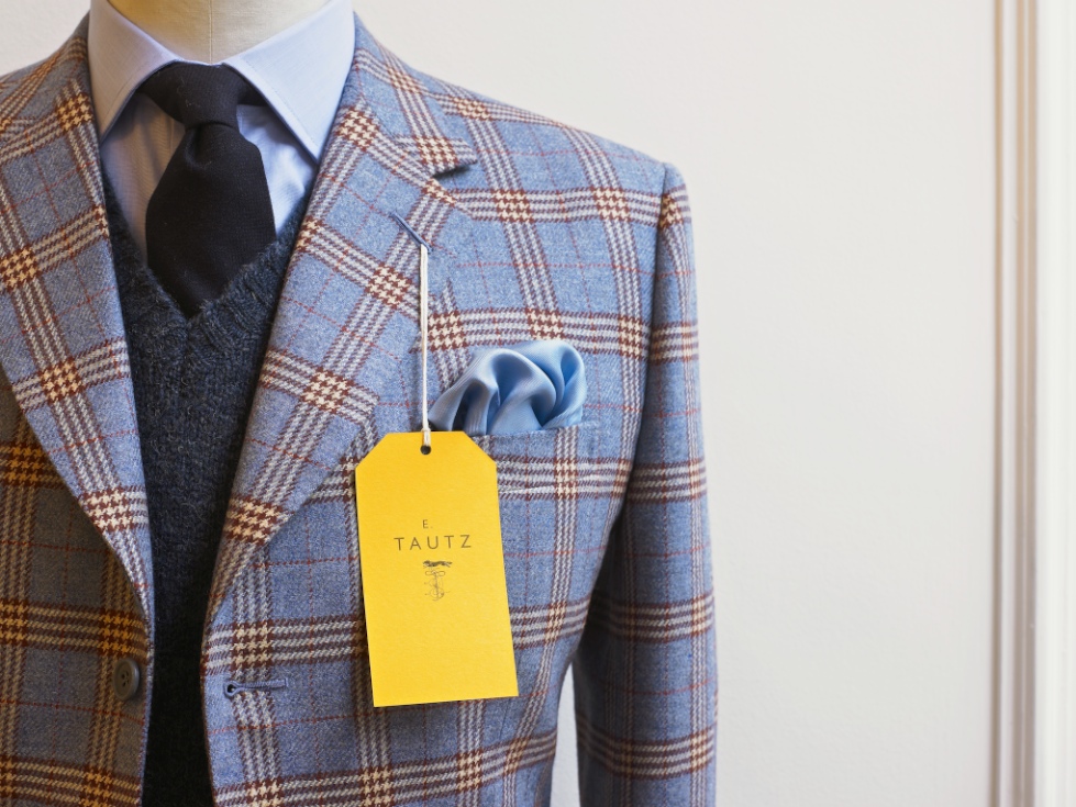
E. Tautz Branding
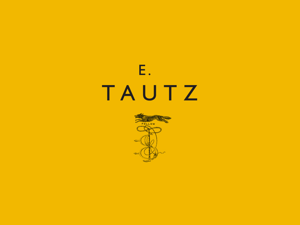
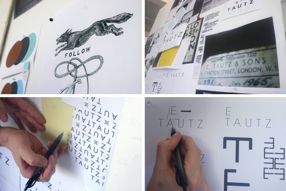
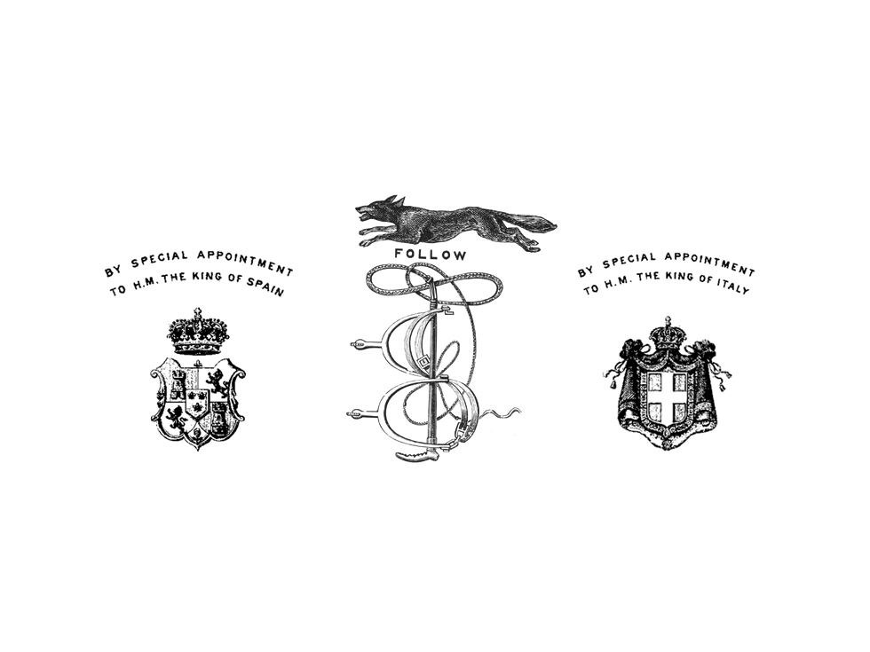
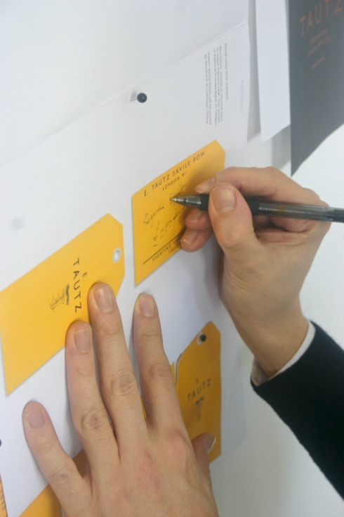
Moving Brands, a branding company based in London, was asked by E. Tautz, a luxury menswear brand, which started out as a military-outfitter, to create a brand identity for them.
Above is the logo they came up with, pairing the clean, modern Gill typeface with the traditional-looking fox and whip icon, all set on the broad field of utilitarian-feeling yellow. Don’t you think the yellow is a stroke of genius? The yellow is so unusual and distinctive and the size of the field compared to the actual logo makes a serious visual impact.
Below, their creative process and the resulting collateral.
Graphic Fix
Typography + Architecture >> Colosseo

I just couldn’t end the day with that creepy pageant post, and it was actually really hard to find something to follow that, because all of a sudden, knowing that those images would follow whatever I put up next, they started tainting everything!
So anyway… I’ve had this in the vault for a while and thought, ok, there’s no way the pageant pics could have any kind of dialogue with something with almost no allusions or connotations, something that is just purely graphicly, visually interesting.
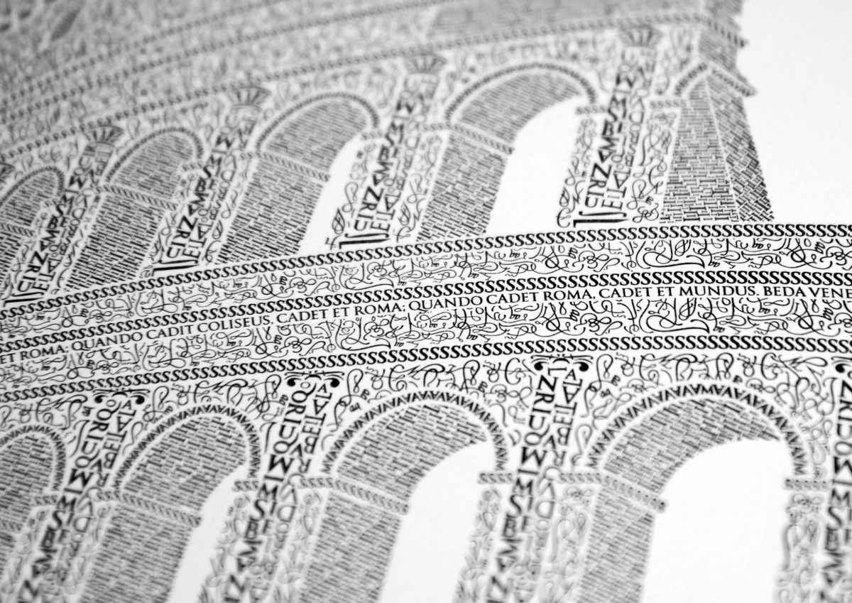
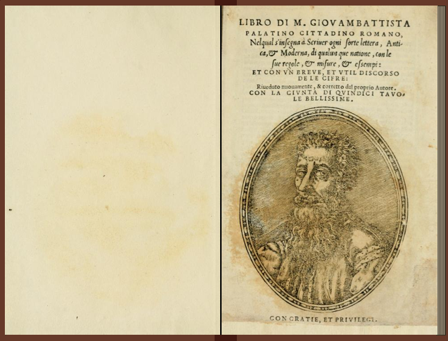
After a 10-year anniversary trip to Rome with his wife, designer Cameron Moll decided to make the Colosseum his next artistic subject. Using 16th century calligrapher M. Giovambattista Palatino’s work as his inspiration (see bottom), he then spent over 250 hours creating this piece, character by character, using the Goudy Trajan Bembo Pro typefaces.
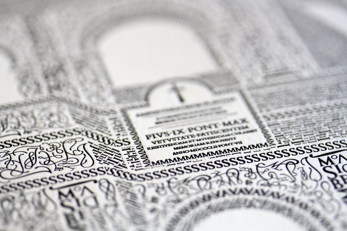
[Available as a print here.]
Graphic Fix
TypeSeat
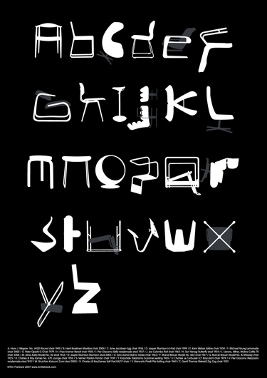
This is just so satisfying to my designy nerd soul.
By Tim Fishlock.
PS – I once found a pair of the Z chair in lucite at a consignment shop for like $200 total, and I decided to think about it for a day, and I went back and they were gone, and I’ve honestly mourned the decision ever since. Bird in the hand, people, bird. in. the. hand. Let me have learned this lesson for you.
PPS – Kyle, I know what you’re going to say- we literally have no space or use for more chairs. I know. But I looove them. You got lucky on this one.
Graphic Fix
Rad Picnic Boxes
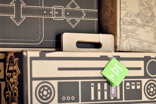
Totally sustainable, bio-degradable picnic boxes!
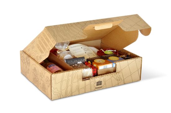
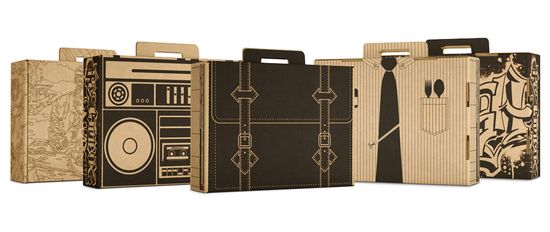
The Brand Hatchery created these as an in-house project, and they liked them so much that they decided to start a company, Three Blind Ants, focused on “picnic and consumer fun” products!
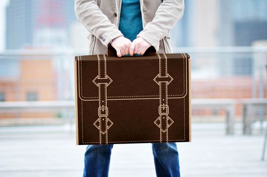
Of course I the one that looks like an attache!
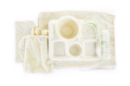
Even the utensils are bio-degradable!