Redesigning Nutrition
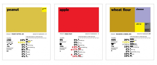
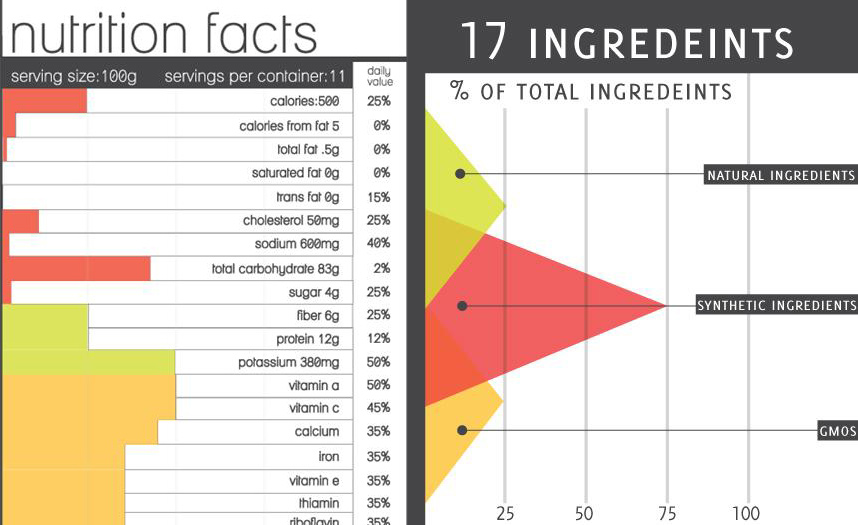
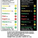
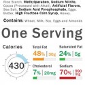
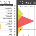
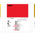
I hadn’t ever thought about it before I saw this article, but the nutrition label that comes on the side of every packaged food really is in desperate need of redesign. So, GOOD held a contest to come up with a new design! Above is the winning entry, below, a few others.
Isn’t it amazing how design can totally change the way we understand and process information? Compare how you process the info in the label concept at top vs these below. Your understanding of the food really differs with the different designs! The FDA really is about to redesign the nutrition label, hopefully by combining ideas from all these entries, they can come up with something that is easily understandable and will lead us to better eating choices!
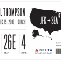
It also reminded me of this project I came across a while back– a conceptual redesign of the boarding pass…. I now think about this every time I fly, wishing my boarding pass were something visually pleasing and easy to understand like this!
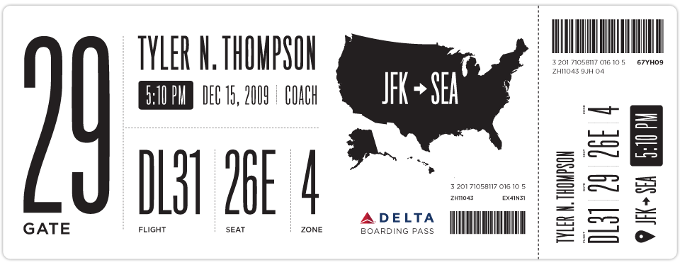



















i love that boarding pass. and yes, the nutritional label needs and update. maybe if it was prettier, people would read it and realize how bad what they’re eating is
and as for the other post… “i love a good game of day-time night-time!”