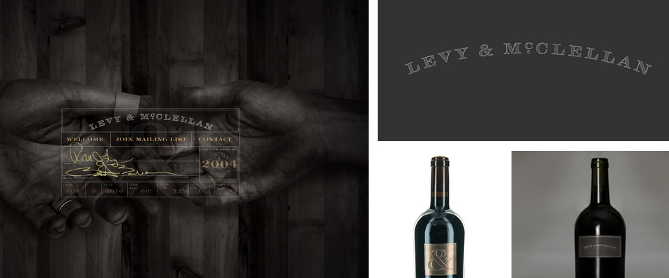
Graphic Fix
November 10, 2010 · Comment
This is definitely a “yes to all.” Typeface for the name, website design, and sole ampersand as label (I do love a good ampersand). Nailed on every level.
Levy & McClelland website here.
Designed by Dan Miller.
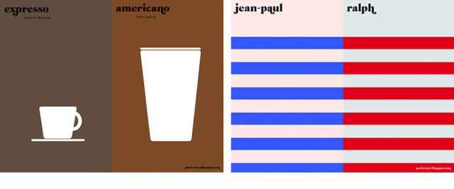
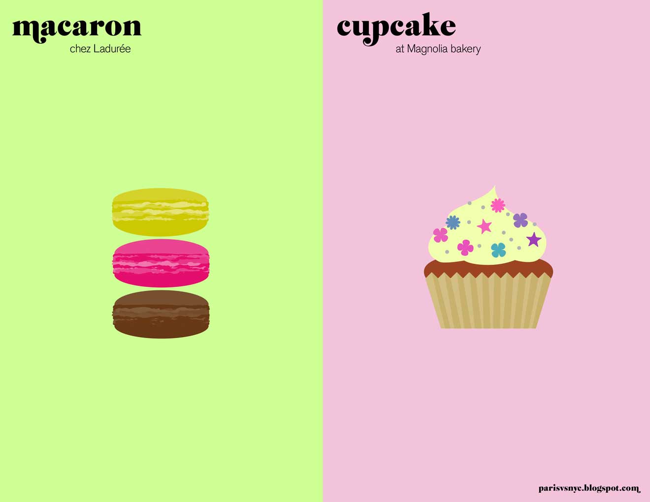
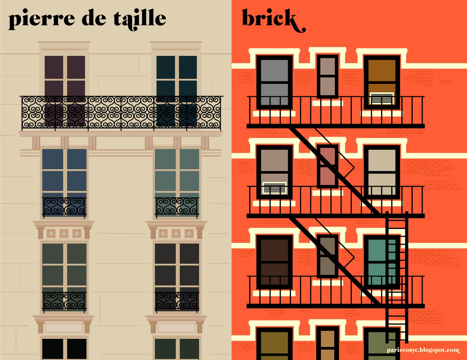
Graphic Fix
November 8, 2010 · Comment
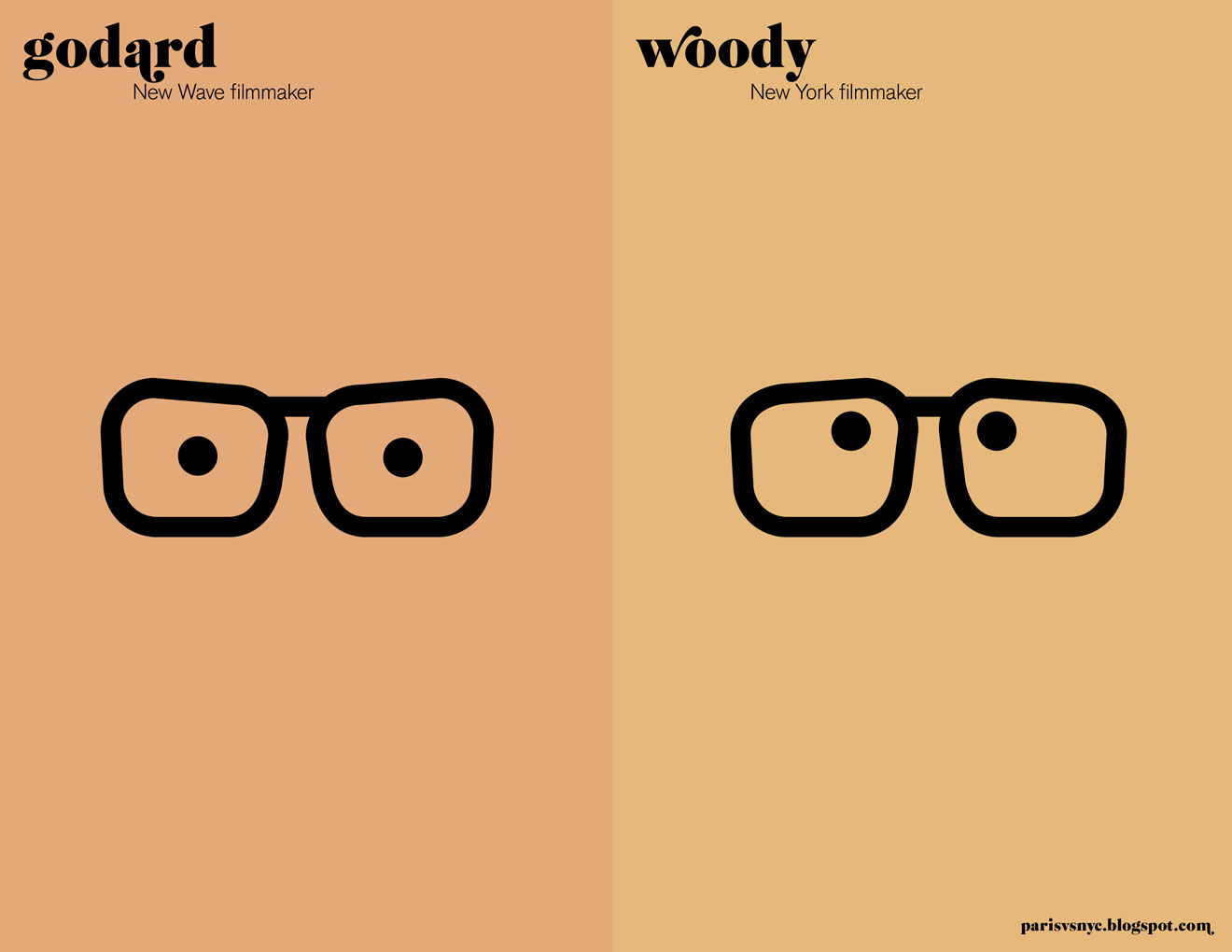
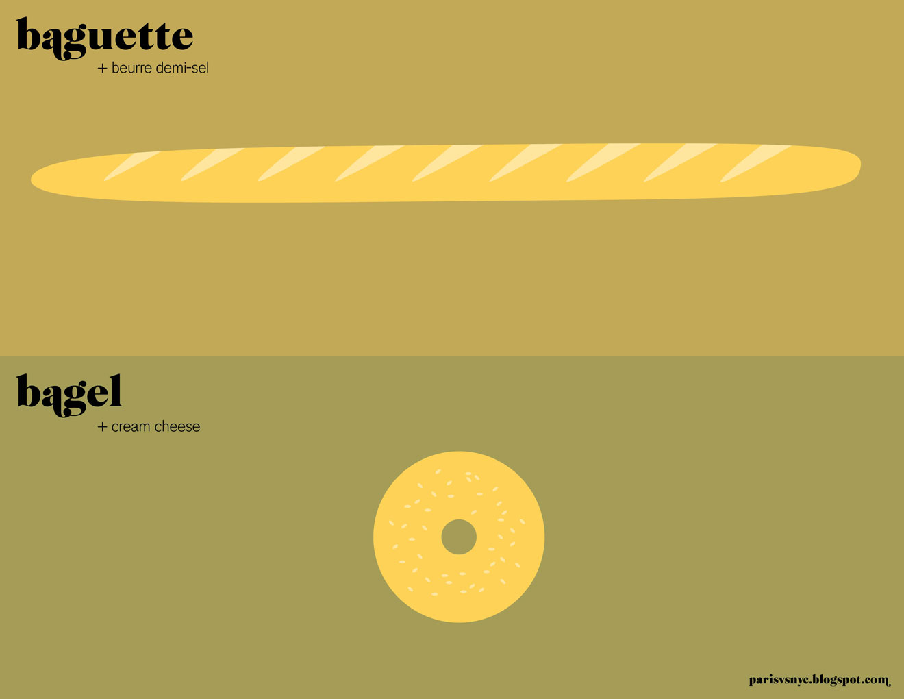
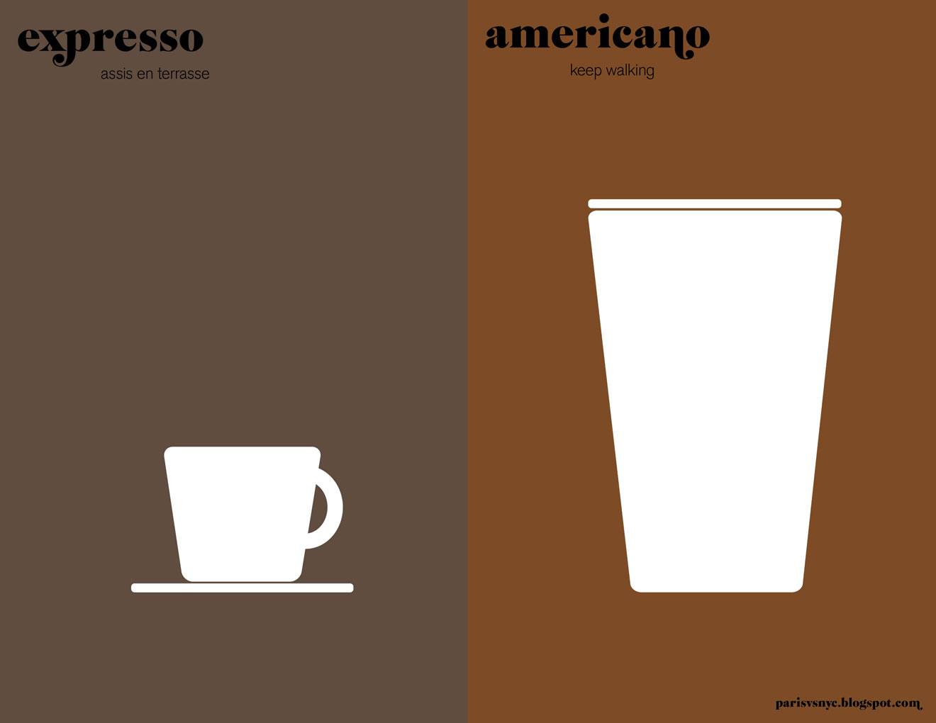
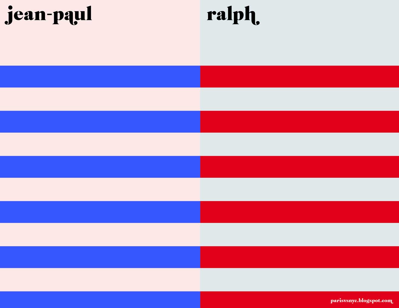
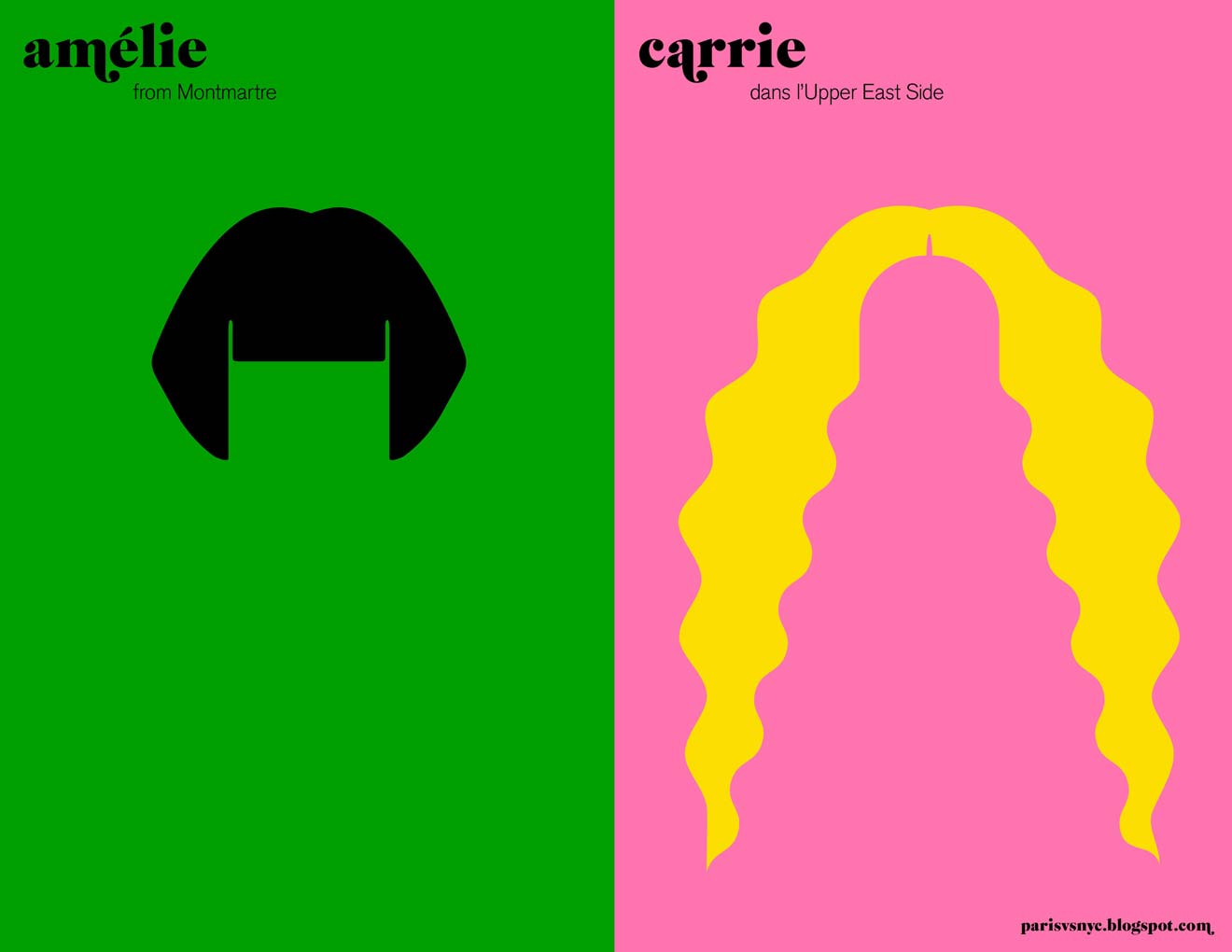
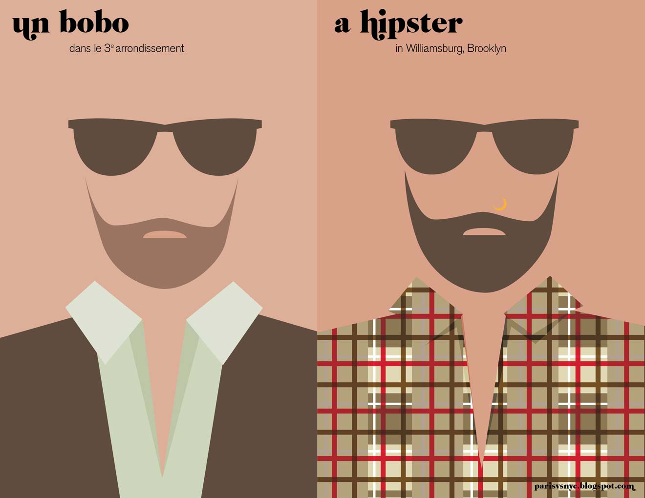
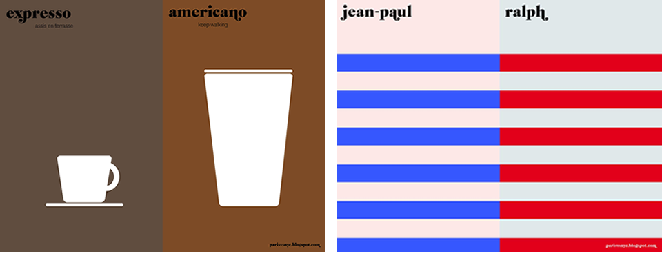
I love this representation of the idea of “Paris versus New York”– the reduction of a vast subject down to highly simplistic, single image representations is a great example of effective graphic design. Communicating a complex subject in a way that makes it seem straightforward.
From this blog, by Vahram Muratyan.
PS- Did you get to the end and feel like you have a preference for one over the other? Even though I love New York, I preferred Paris in almost every single one! So either the illustrator’s bias (which I can’t even detect in these images) swayed me, or I’m really a little secret Francophile. But who doesn’t love Paris.
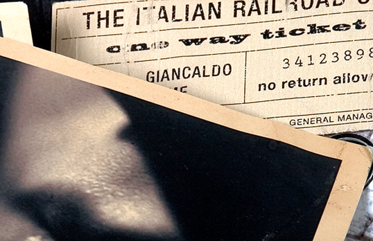
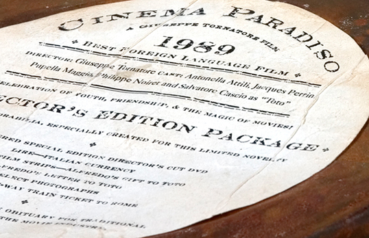
Graphic Fix
October 20, 2010 · Comment
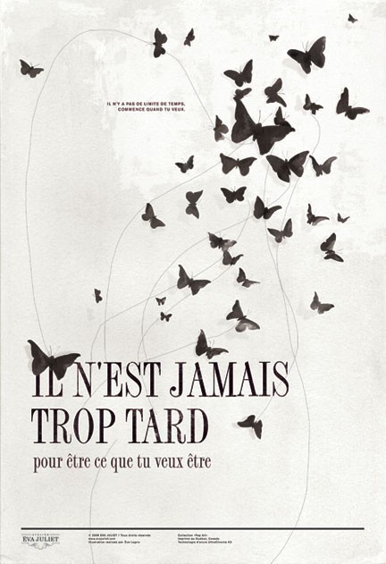
…to be what you want to be.
When I first saw this print, I thought it was a movie poster, like the “unsheets” I’ve been posting. Doesn’t the format, with the line along the bottom and what looks like tiny credits underneath, lead you to think so? And for a French film, the design would be perfectly suitable. It kind of looks like it could be for The Diving Bell and the Butterfly, no?
And it turns out it’s just a lovely print with a lovely meaning by an artist, and unlike the general genre of “inspirational posters,” not cheesy at all. I particularly love the (unsentimental) typeface.
Here.
["Unsheet" movie poster
Graphic Fix
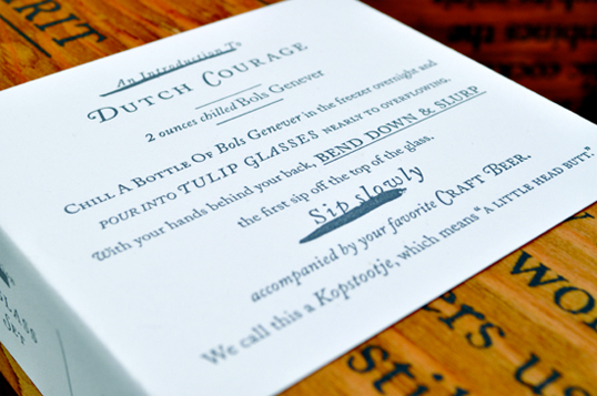
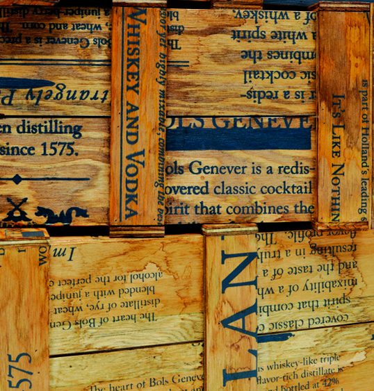
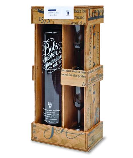
October 14, 2010 · Comment
Love the label and screen-printed crate.
Graphic Fix
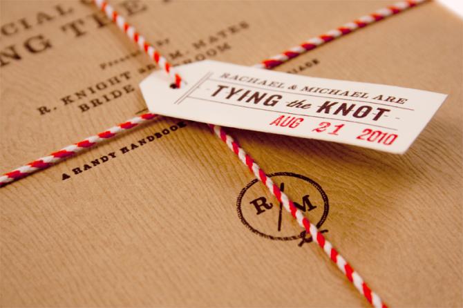
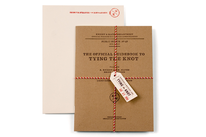
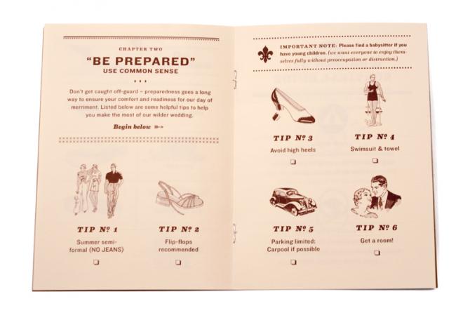
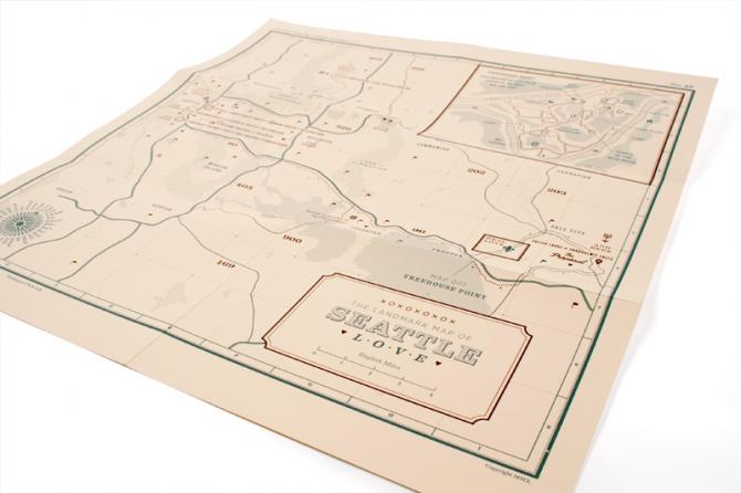
October 12, 2010 · Comment
I love anything field guide-esque, and I love brown paper with red and white bakers’ twine, so I immediately fell hard for these “tying the knot” themed wedding invitations. But the cover of the “guidebook to tying the knot” is only the beginning. There’s even more to love inside…
They just nailed every detail. The fonts, the stamps with the date, the retro clip art-like icons on the “be prepared” page, the luggage tag, the trail map, the very “official”-looking, unsentimental layout of the cover, ugh, I’m dying. These aren’t just invitations, this is like full-on branding for their wedding. I don’t know that I’d ever do something like this for my own wedding, but I am obsessed with how creative and thorough this is!
Designed for and by, not surprisingly, a guy who works for a branding firm
Urban Influence – he is the groom as well as the designer!
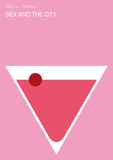
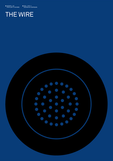
Graphic Fix
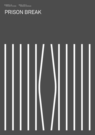
October 4, 2010 · Comment
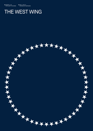
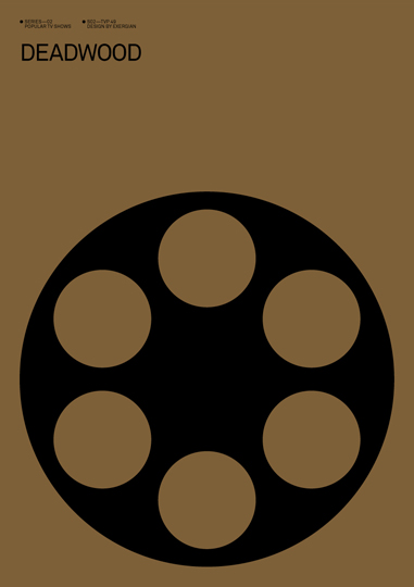
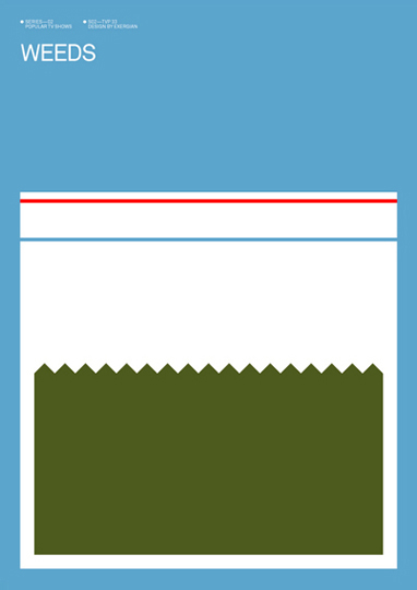
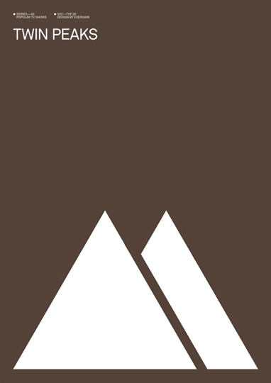
Amazingly clever in their simplicity, “unsheets” for TV shows by Albert Exergian.
by Albert Exergian
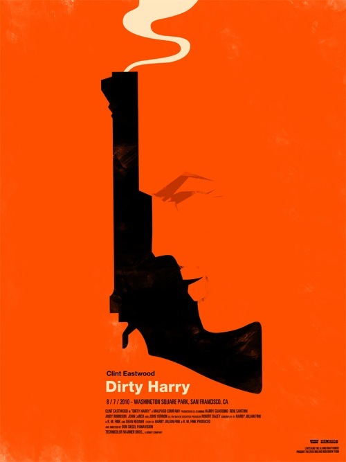
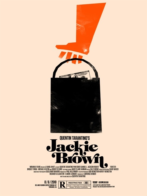
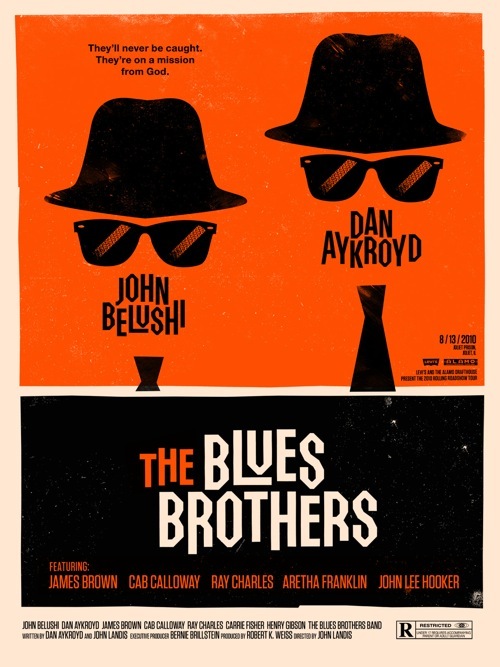
Graphic Fix
September 28, 2010 · 2 Comments
Over the summer, Alamo Drafthouse Cinema and Levi’s collaborated to put on free screenings of “famous movies in famous places.” For the series, they had new, awesome-ly graphic and pared-down posters designed for the films by Olly Moss.
I discovered these through screenwriter John August’s website in his post about what he calls “unsheets.” ”One-sheets” are what Hollywood people call the posters designed for movies that are hung outside of theaters and are solely meant to sell tickets. They are generally formulaic and not very artistic, and almost always use the font Trajan (see hilarious video here about the unending use of Trajan for movies).

“Unsheets,” on the other hand, are movie posters designed by fans after the movie has come out and typically have no commercial purpose, but rather are just designed as an homage to the movie (like
these A Single Man posters I loved or
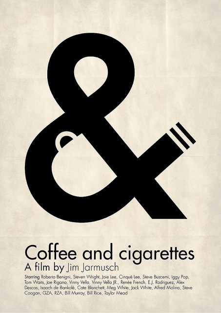
this Coffee & cigarettes poster). While one-sheets are often photoshop horrors of scenes from the movie that you would never want to hang on your wall, unsheets are distilled artistic representations that get at the essence of the film and are often quite well-done, like the Olly Mosses here.
I love this concept of unsheets, both because they are often really well designed and because I like that they are commonly done by designers for fun… ie, random acts of creativity!, and will have more posts to come on them…
[2010 Rolling Roadshow]
[Olly Moss]
[past unsheet posts here and here]
Graphic Fix
September 23, 2010 · Comment
Graphic Fix
September 22, 2010 · Comment
[These are Things]
Graphic Fix
September 20, 2010 · Comment
Seriously love this poster for Coffee & Cigarettes cleverly containing a coffee cup, an ampersand, and a cigarette.