Arts Visuels
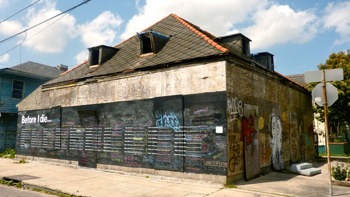
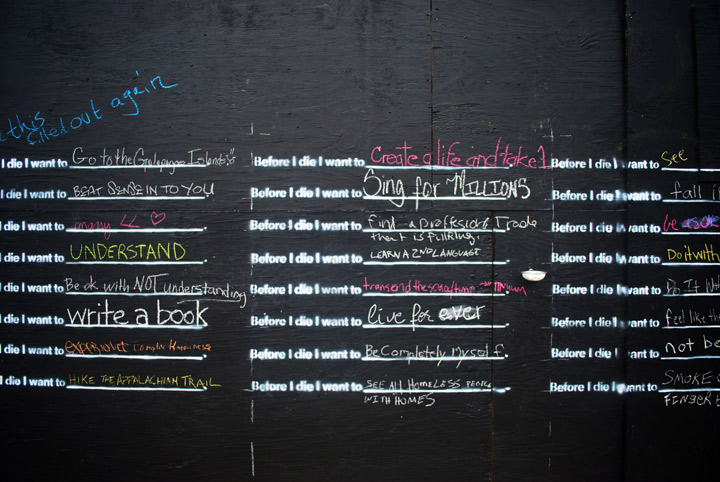
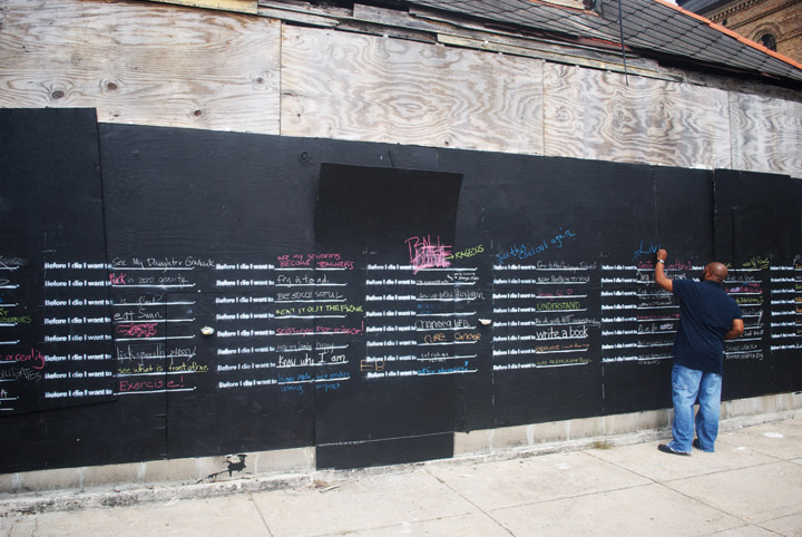
Before I die…
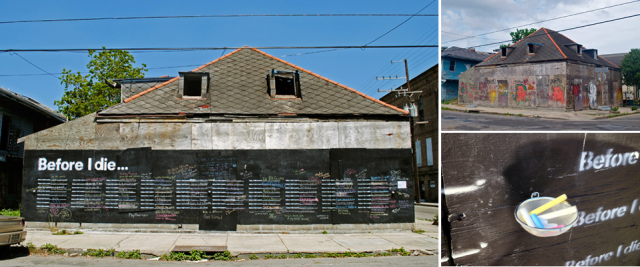
Installation artist and urban planner Candy Chang is a believer that “our public spaces can better reflect what’s important to us as residents and as human beings.”
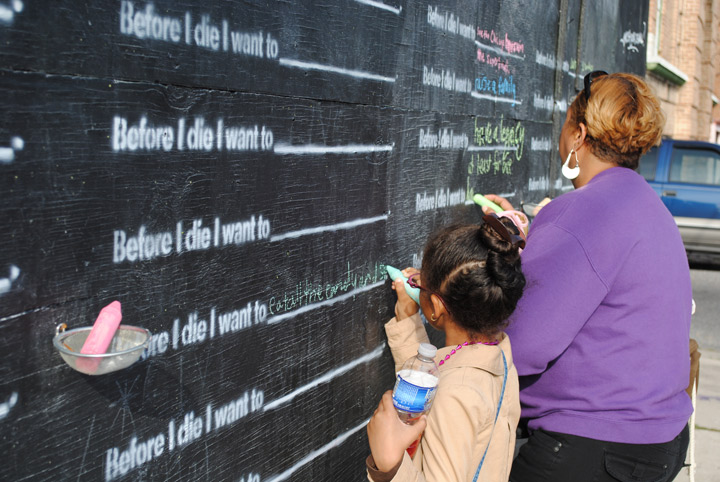
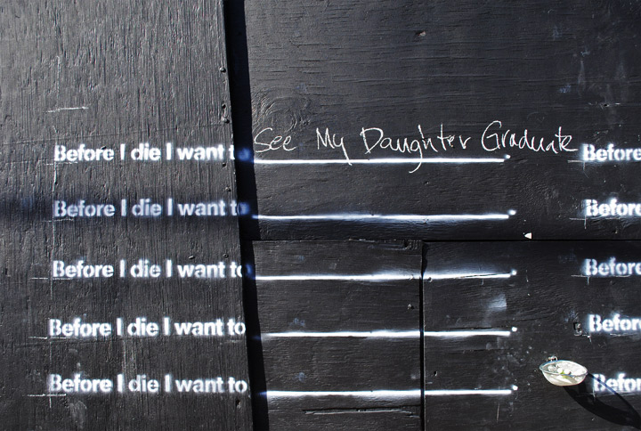
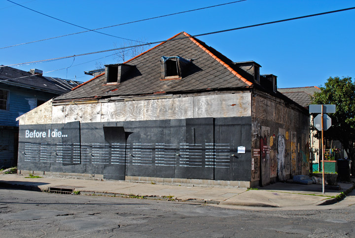
In her own neighborhood, she created a very literal interpretation of this idea when she turned the side of an abandoned building in her neighborhood into a chalkboard (after obtaining many permits) with the statement “Before I die …” with blanks for people to fill in repeated over and over.
According to Chang, the response was overwhelming. People were constantly filling in answers, and each time the wall filled up, Chang would document all the answers, wash the wall, and let the process begin again.

The home has now been purchased, but the couple who bought it are fans of the project and have agreed to let it continue while they obtain permitting for renovation.
But even once construction begins, the project will not end. People around the country have emailed Chang asking her to do this in their cities, so she is putting together a kit that people can purchase with all the materials and instructions for how to execute the project on their own.


Arts Visuels
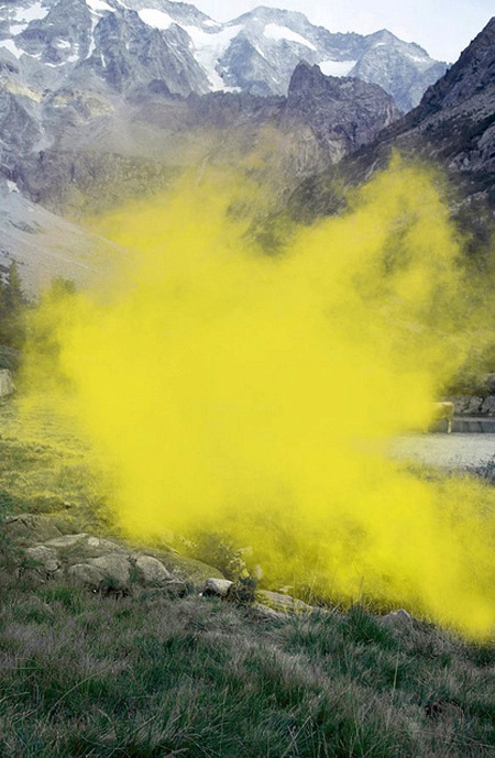
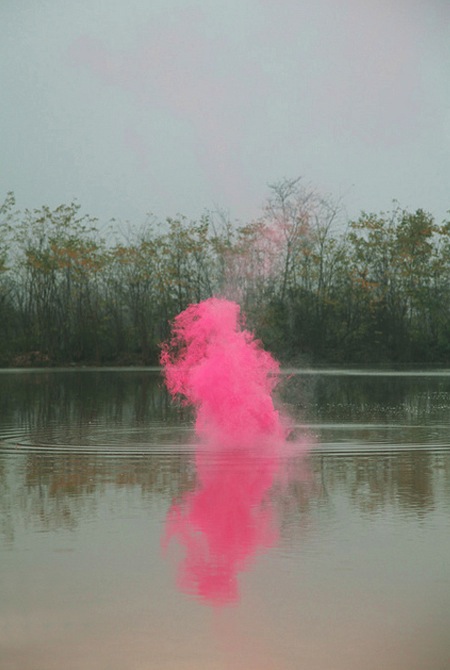
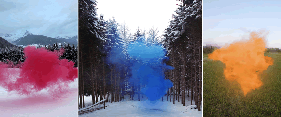
The Festival of Holi
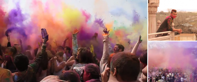
The images above and the video below are from the Festival of Holi, also called the Festival of Colors. I really cannot claim to know anything about this festival (despite some basic research) other than that it is a Hindu tradition that involves throwing colored dust everywhere (awesome) and on some level celebrates the arrival of spring.
There are other, more complex and religiously-based parts to it also, so I don’t mean to over-simplify, but I have to be honest– the colors are the part I like.
And I have to believe that some of the 50,000 people that show up to the temple in Utah– yes, Utah– seen above to celebrate the festival might be there mostly for the colors too. (The temple doesn’t seem to mind the tourist/commercialization aspect, they sell t-shirts saying “I survived Holi, Spanish Fork, Utah.”)

Video (and stills) by Brian Thomson, and the music in the video is by cellist Zoe Keating.
If you need to see more of this thing (I did), there’s another good video of the same event here.
Also, it’s official, I have a thing for colored dust in the air (previously: 1, 2; and there’s another related post in the works!).
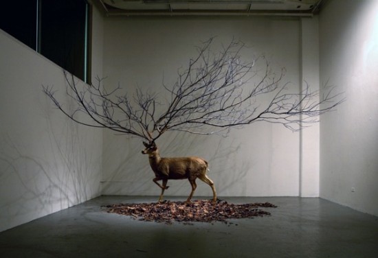
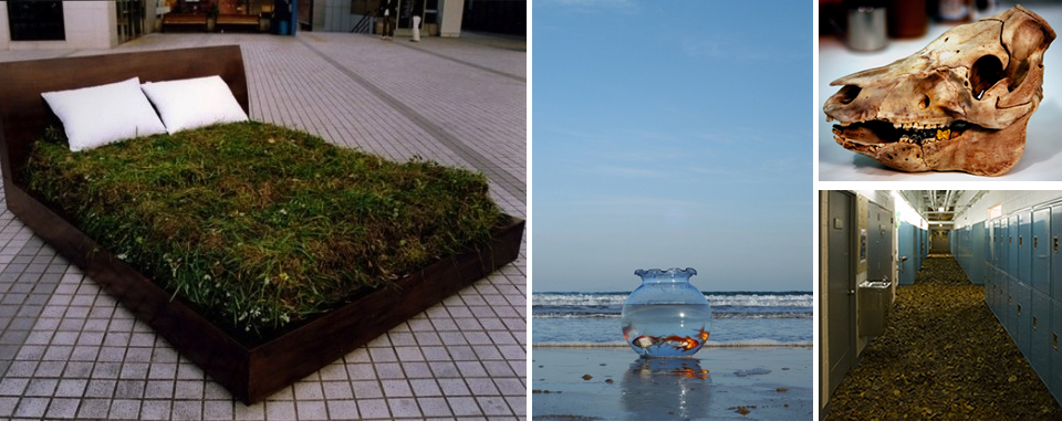
Arts Visuels
Myeongbeom Kim

These surrealist installations by Myeongbeom Kim that point out the vast distinctions between our manmade world and the natural world, and strict boundaries around the ways that we expect them to interact, made me look. I love the touch of humor. I would be so thrilled if elevator doors open and there was a Christmas tree planted inside.

Arts Visuels
Nike’s ‘Paint With Your Feet’ Project
I am so impressed when brands endeavor to do something totally original and creative.
Those pieces of art above are representations of runners’ routes, as documented by Nike Free technology. YesYesNo, the company that created the software, describes the project below:

For the launch of the Nike Free Run+ 2 City Pack series, YesYesNo was invited to develop software that would allow runners to create dynamic paintings with their feet using their Nike+ GPS run data. During the two day workshop at Nike headquarters, we invited the participants to record their runs and then using our custom software we imported the metrics from their run, to create visuals based on the speed, consistency and unique style of each person’s run.
 Using the software the participants were able to play with the mapping and adjust the composition of their run which was then outputted as a high resolution print for them to take home. We also worked with the Innovation Lab at Nike to laser etch the runner’s name, the distance they ran and their run path onto a custom fabricated shoe box, which contained a pair of the ‘City Pack’ shoes from their city of origin.

[via Creative Journal]
Arts Visuels
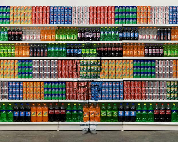
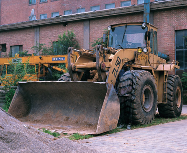
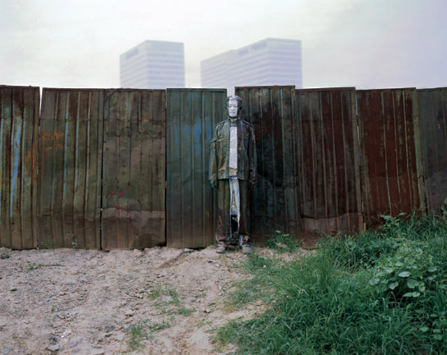
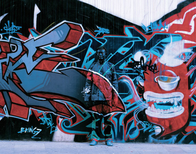
The Invisible Man
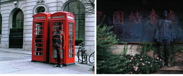
Do you see him?
Liu Bolin spends hours painting himself to camouflage himself into a scene and then photographs himself. Here are a few from his series “Hiding in the City.”


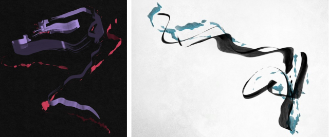
Arts Visuels
Filippo Minelli “Shapes”
Loving this serious of mysterious photographs by Filippo Minelli, who has also done some very provocative street art of a very different nature.
Also, doesn’t it remind you of this photo for Lola by Marc Jacobs?
via automatism
Arts Visuels
So Yoon Lym
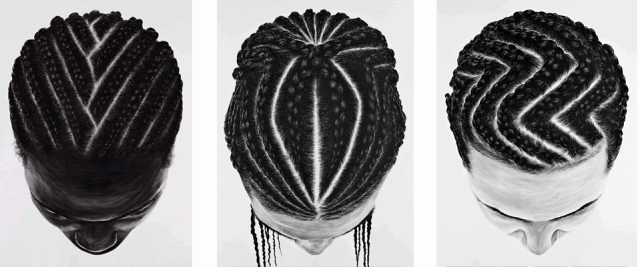
I’m digging these photo-realistic acrylic on paper paintings by Korean-born artist So Yoon Lym. Lym, after moving from Korea to Uganda to Kenya to the US, studied art in Rhode Island, Normandy, and Manhattan before settling in Patterson, New Jersey. Quite a journey, no?
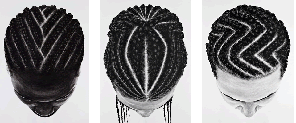
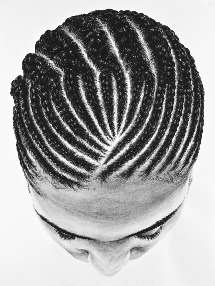
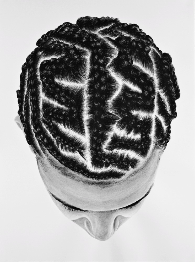
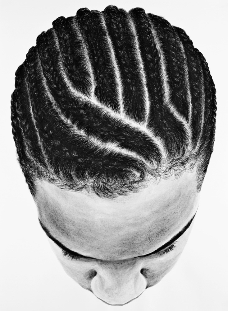
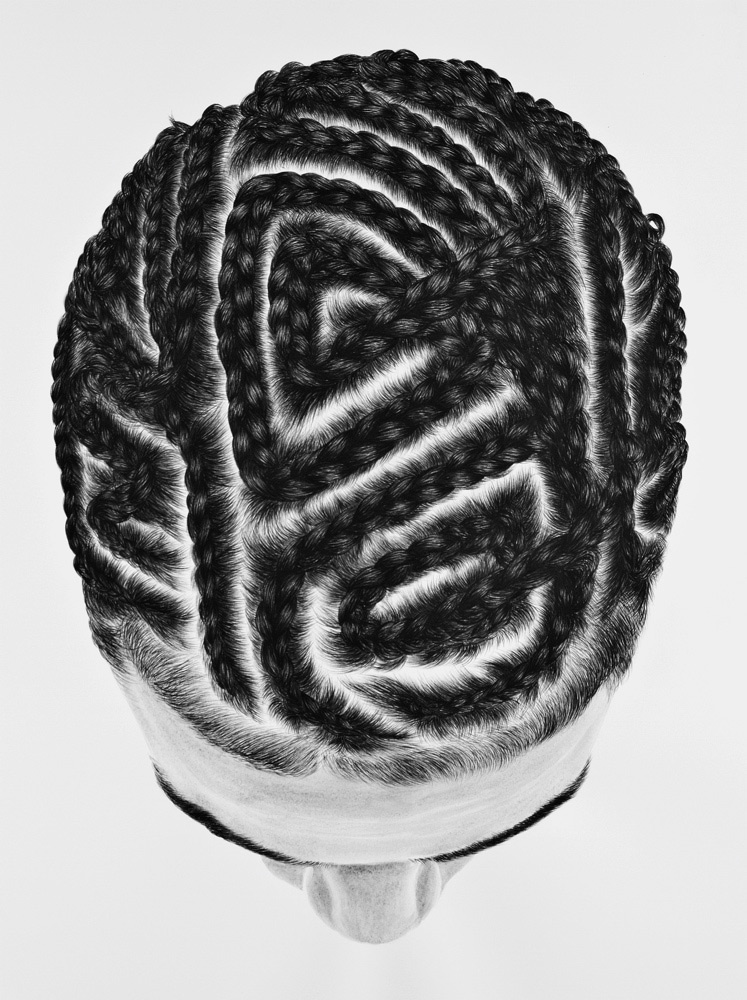
This series of paintings are based of off photos she’s taken in Patterson, and the subject matter arose out of her interest in hair as a means of self-expression and affiliation. Here is what Lym says about the series:
I have a strong interest in hair as a transformative vehicle of physicality. I am also interested in the associations of hair and hairstyles as indicators of social, cultural, ethnic and gender affiliations. The interest in urban hairstyles is of particular interest since these hairstyles are unique to a particular social, cultural and ethnic experience that is not my own. As a woman, I have always been aware of the power of hair. And perhaps because of the experience of my strict and traditional upbringing, I have never explored the full potentials of my own possible hairstyles in public. Perhaps it is through my paintings that I am able to explore different representations of identity.
via LAEM
Arts Visuels
Earth Art Meets Clever Proposal
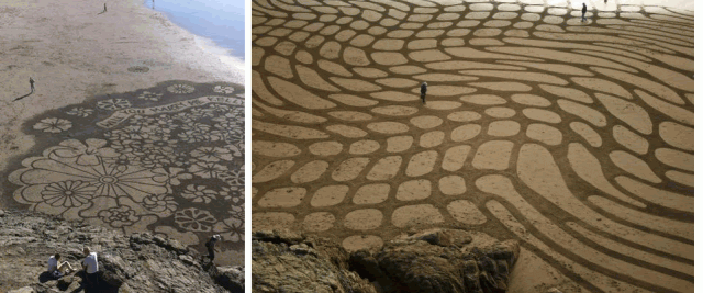
Last week, 7×7, a San Francisco blog, picked up photos of this proposal written in the sand (above left) at Ocean Beach, not knowing who the proposal was to or from or who did the art and asking if anyone had any information. Just the kind of mystery I love!
Quickly, readers identified the artist as Andres Amador, who frequently creates artwork in the sand at Ocean Beach, and by today, the whole case was cracked.
This is a pretty amazing proposal story:
“Here’s how it all went down: Several years ago, Jason and Kelly were enjoying a picnic of Thai take-out on Ocean Beach when they noticed Amador creating a mural in the sand. “It was one of our first dates in San Francisco and it was just so cool,” says Kelly. “We took a bunch of photos and it was a great memory.”
Three years later, Jason tracked down the artist via the Internet and asked him to create a wedding proposal sand mural on February 12. The artist conceptualized the design and directed a handful of the couple’s friends in raking it into Ocean Beach. It took them, according to Amador, about an hour and a half to get the job done; then everyone took cover on the sidewalk above the rocks.

Meanwhile, Jason was luring Kelly back to the picnic spot. “As we walked down the beach, we talked about the mural we’d seen years ago,” Kelly says. “When we came upon the patterns in the sand, I couldn’t believe the artist was back!”
Because the design was so large, Kelly couldn’t read the message until she climbed up on the rocks (which took some coaxing). The waves were just starting to erase the edges of the mural when Jason pointed out the words and got on his knee. “I was in total shock,” says Kelly. “I mean, after five years I was getting a bit impatient, but I had no idea he would do anything like that! He told me that he’d made me wait so long, he knew he had to make it really good.”
And, as I said at the beginning, she said “yes.” Jason slipped the ring he’d designed on her finger, their friends (and the small band of onlookers) cheered and the champagne started flowing by a fire pit on the beach.”
Arts Visuels
The Pantone Diet (and Public Art Project)
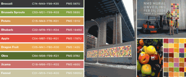
What you’re looking at above are Pantone matches to the colors of the fruits and vegetables that Tattfoo Tan (not Tattoo Fan, which is what you thought if you’re like me, and I thought it was a pretty cool moniker) brings home from his frequent trips to the Union Square Greenmarket in New York.
Tan, a Malaysian-born artist living in New York, is interested in using art to address social issues, and for this project, called “Nature Matching” (The Pantone Diet was my name… I just love anything Pantone so I thought it was catchy), he created a color-coding system to visually show people the colors they should be eating everyday. He put the Pantone squares together in murals that are being hung publicly in places with high volumes of walking traffic.

Another piece of this project were the fruit stickers he created with the clear patch showing the color of the fruit (image above in banner), which he used as guerilla art, going around to produce sections and sticking them on fruits and veggies in addition to the FDA/brand stickers. I also learned this highly useful piece of information on his site about the normal stickers you see on fruit:
“Did you realize there are these numbers on the fruit labels? What did they means? Well, you just need to look at the first number. Remember (9) is good, which menas it is organic. While is (8) means the fruits is Genetic Modify. (4) is bad, it is conventionally grown. That means with synthetic fertilizer and pesticide.”
Genetically modified anything freaks me out so I’m glad to know to avoid anything starting with 8!
I love this concept and the use of public art to encourage healthy eating habits, and for me anything visual is easier to learn and remember, so I think this “Pantone Diet” could go big (don’t you think he should re-name it that?)!
Hopefully it will inspire people to fill their plates with pretty produce (and hopefully they won’t notice that a lot of these colors look a lot like French fry and chicken nugget colors!).
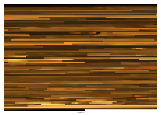
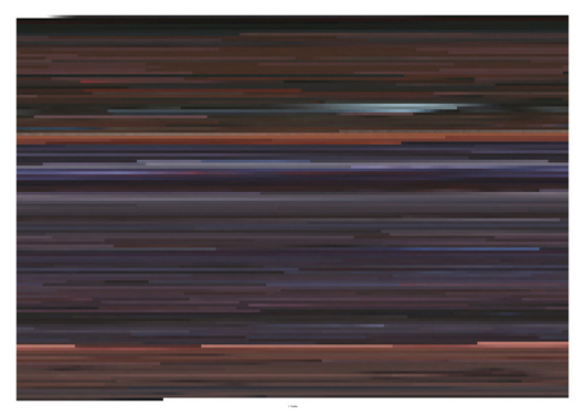
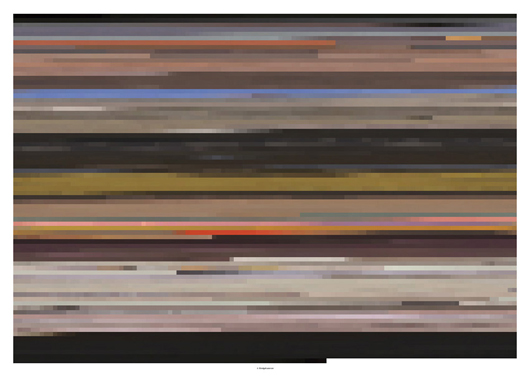
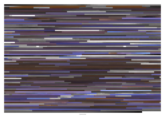
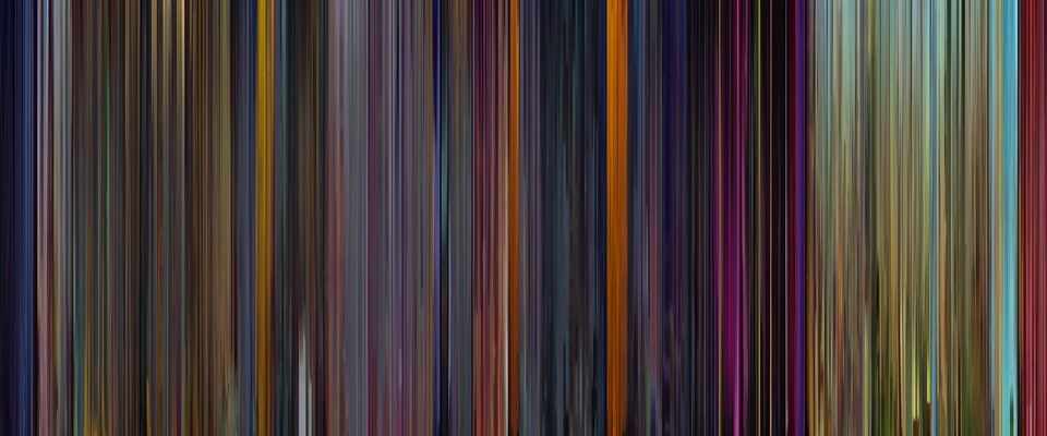
Arts Visuels
Cinematic Chromatics
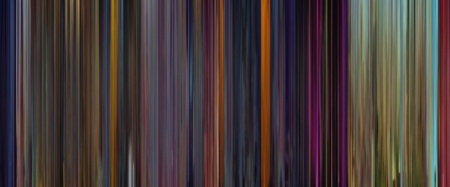
I confess to knowing next to nothing about filmmaking in the technical sense (honestly, “nothing” is probably more accurate than “next to nothing”), but I am a keen observer while watching movies, and one thing I do tend to notice is the use of color and color filters.
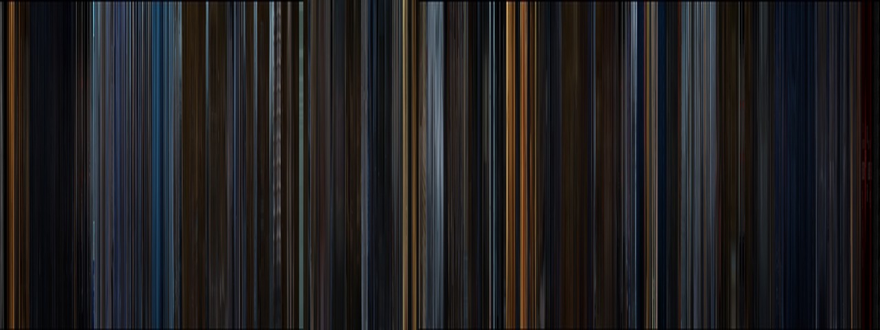
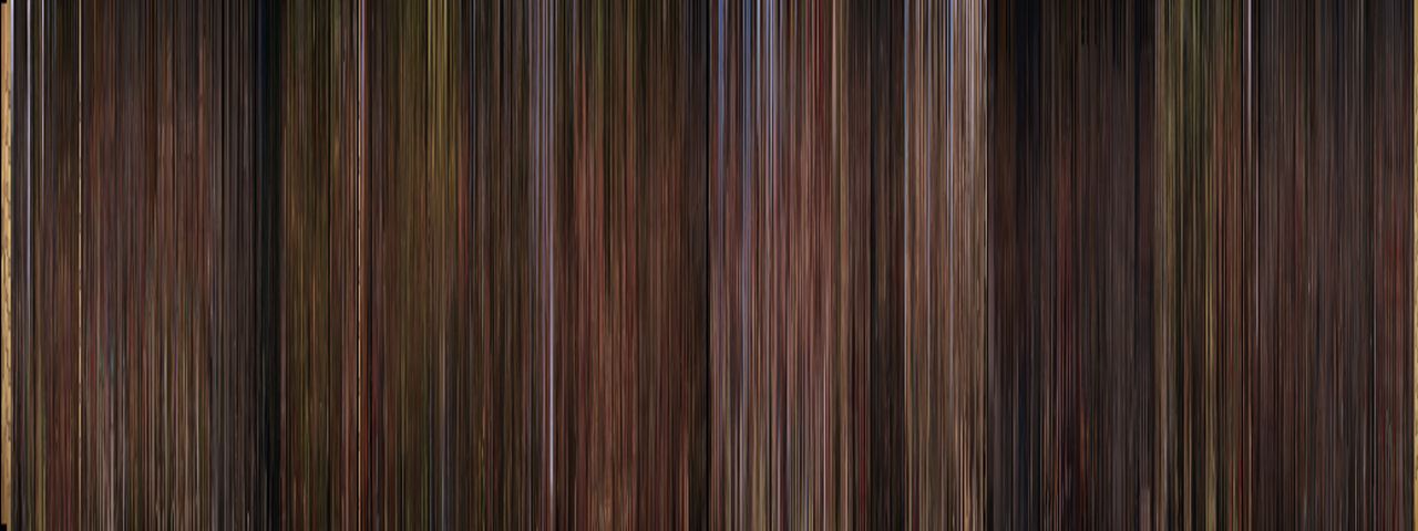
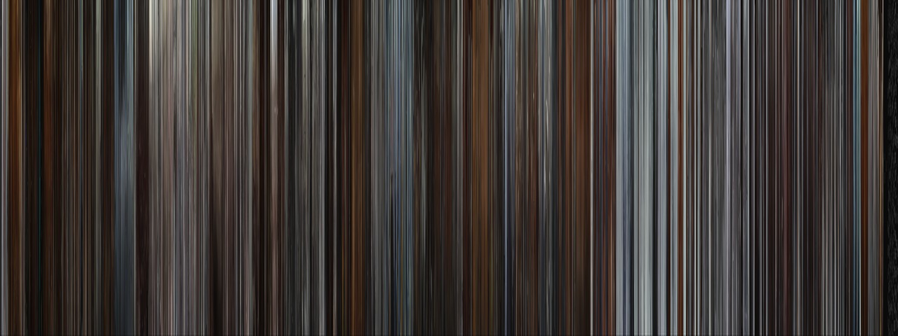
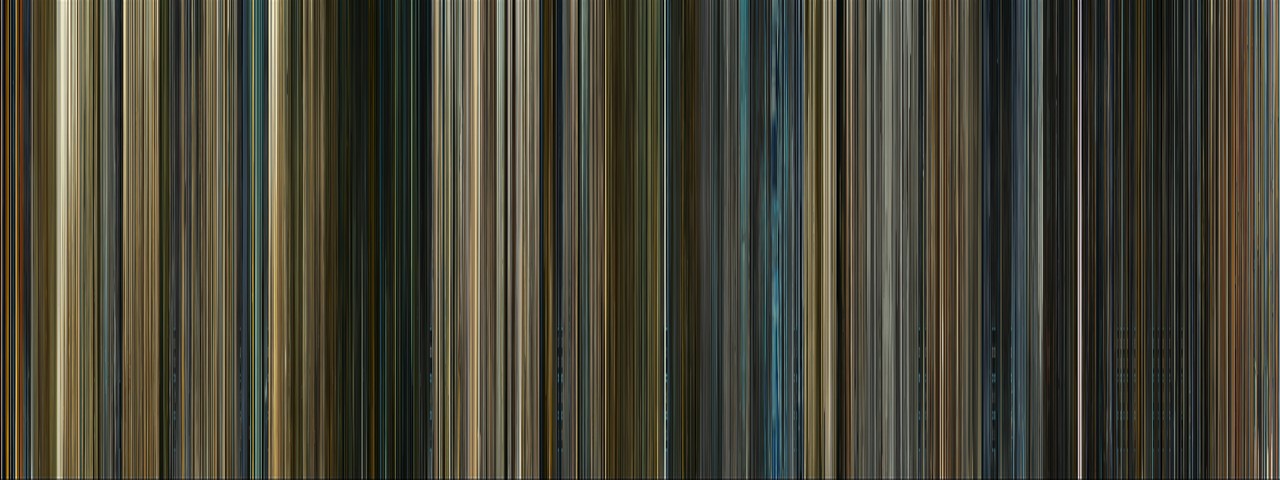
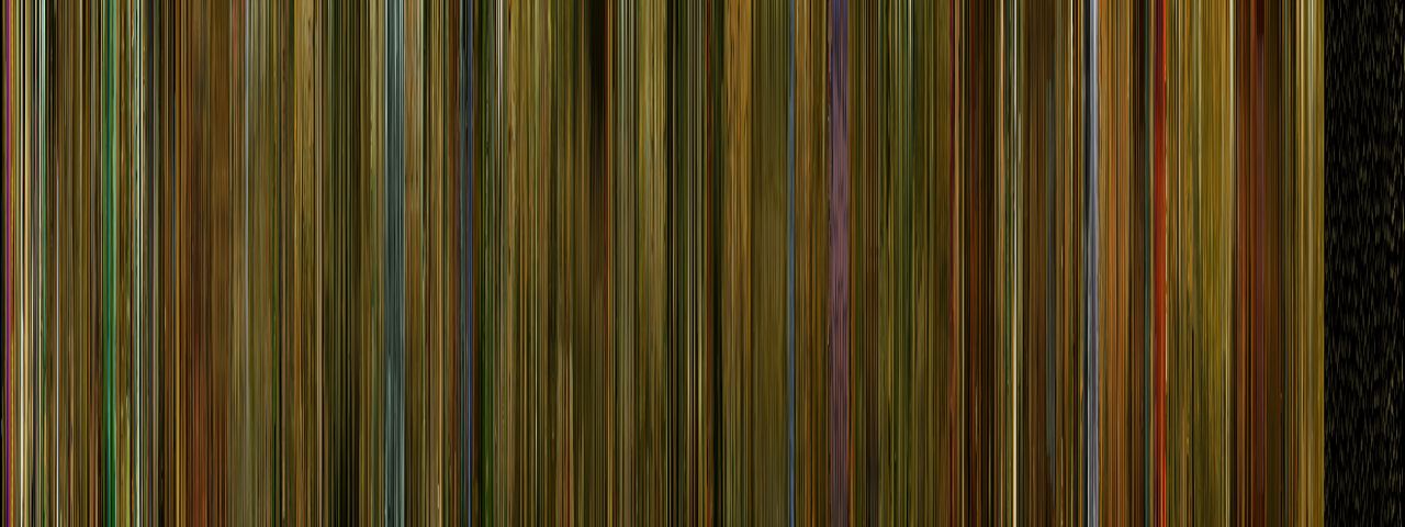
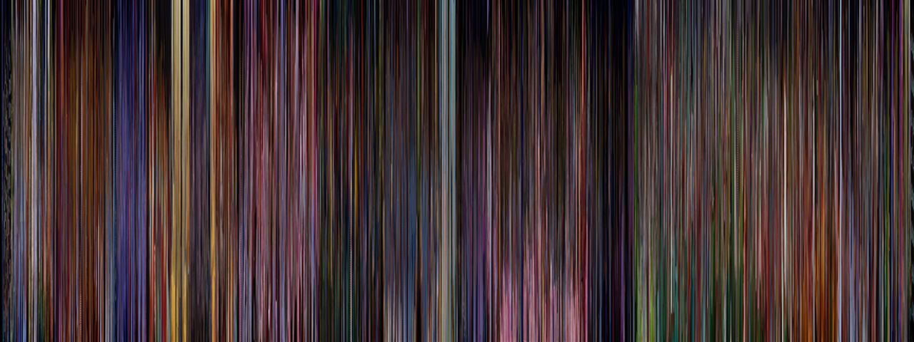
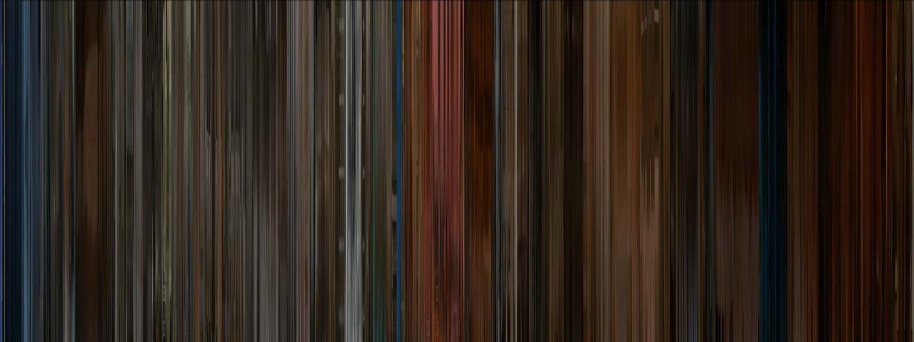
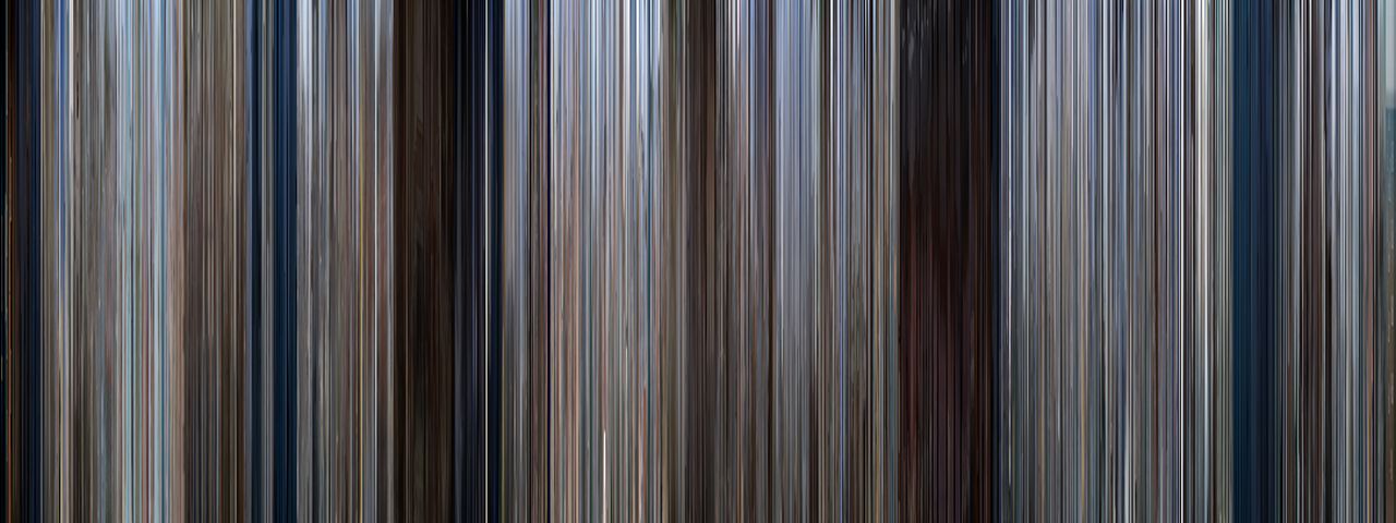
So, I found this project, called Movie Barcodes, highly fascinating. The concept is this: using data compression, each frame of the film is reduced to its mean color, and that color is represented by one vertical sliver in the barcode. When all the slivers are lined up sequentially, you see the whole movie in order in terms of its colors.
Most of them are fairly monochromatic, with the exceptions usually being animated and children’s movies, which makes sense! At top is Dumbo, which I thought was a rather pretty one.
")
Above is the barcode for the Matrix, which is a fun one because you can see when they are in and out of the system! Another one I liked was the Amelie barcode because that movie was so noticeably greeeen with punches of other colors, and that is exactly what the barcode reflects (see gallery).
Oddly, on the tumblr that presents and indexes all of these “movie barcodes,” there is no information or credit as to who is creating these, and I hunted around on various blogs that mention it, and none of them mention the creator either!
They do mention that this is not an entirely new concept, as Jason Salavon first did this about 10 years ago with the top ten music videos in MTVs history. His use the same idea, but his “slivers” are little bars that were laid horizontally and stacked end-to-end and meant to be read left to right and top to bottom. Interestingly, the music videos seem even more intensely monochromatic, which makes sense as soon as you think about it.
Below is the Express Yourself video:


Check out the full index of movie barcodes here.


