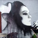
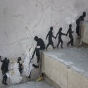
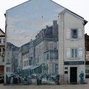
Street Art Round-Up
Awesome round-up by Street Art Utopia of the 106 best street art photos of 2010. (106… guess they just couldn’t stop at 100?) Check out the gallery for more, these were my favorites out of their 106!

A lot of the images in the round-up were by artists I’ve posted on previously– for more related posts, click the “street art” tag on the right of this post.
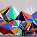
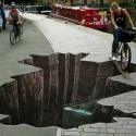

Street Art + 3D + Band Poster
To promote their new single, “Horses,” British band Dry the River teamed up with FOAM and Xavier Barade to make these 3D paper posters. Yes, paper.
In addition to being a brilliant promotional move and twist on the traditional poster, I also love that once “in the wild,” these function like 3D street art… something I haven’t seen too much of!
I loved these at first site, but three things made me love them more:
1) They are made of paper. 2) They were created using Google Sketchup. #1 + #2 means an awesome intersection of handmade, crafty, tangible, and cool tech tools. 3) They went one step further after creating them (they took 35 hours each) and installing them and made this video below showing them in their habitats and the reactions of passersby. #ilovevideocontent
With so much to love, the music was sort of an afterthought for me, but I do like the song!
Finally, how do I get my hands on one of these??
Via/more info here.
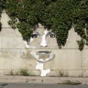
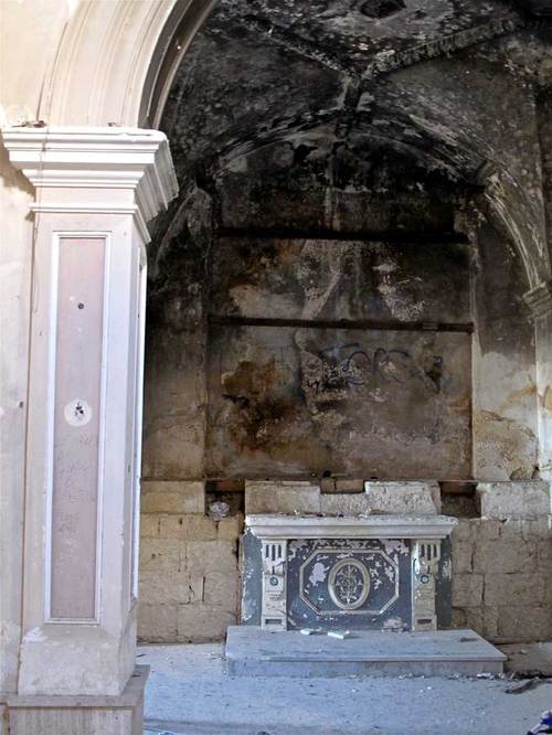
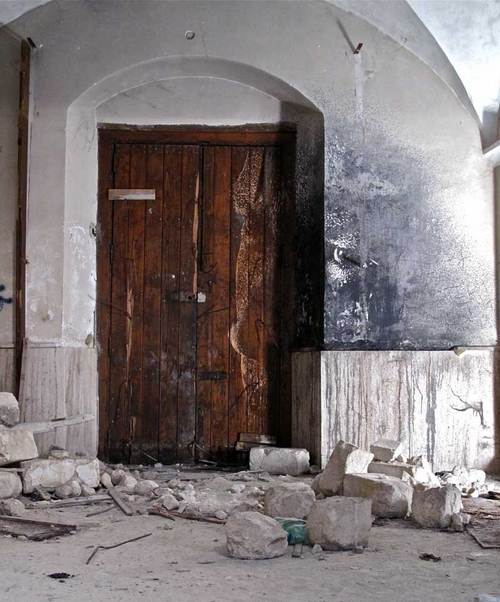
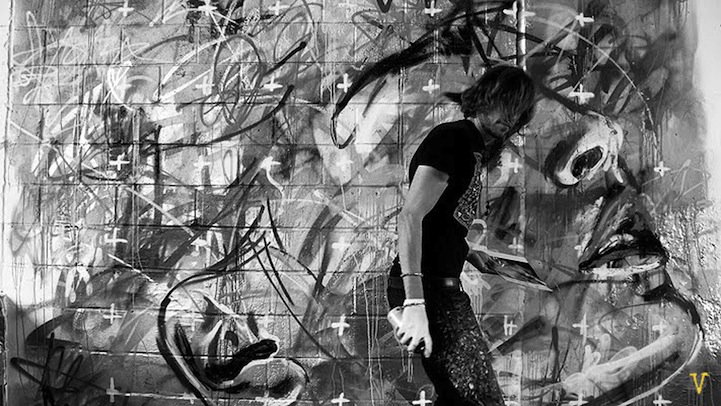
Scratching the Surface
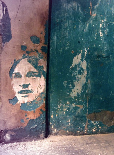
If houses hold stories, walls are one of the essential gatekeepers of those stories. When remodeling an old house, it’s the layers of walls, floors, and ceilings you can tear away that reveal the past lives of the house.
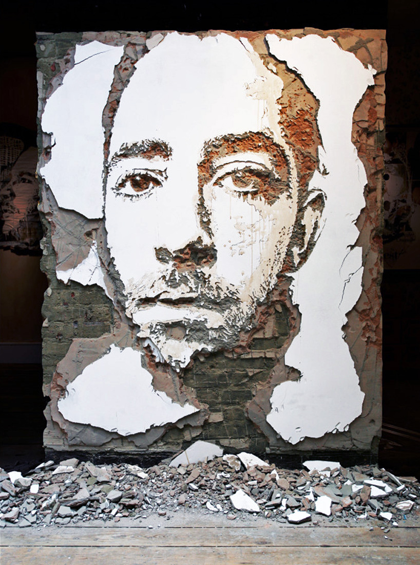
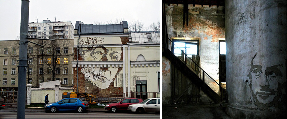
Peeling away layers to unearth a story is true not only literally, for buildings, but metaphorically for people as well, which is what makes Portuguese artist Alexandre Farto’s medium and technique– removing layers of wall– just so darn perfect for his subject matter– portraits.

In an interview, Farto, who goes by the pseudonym Vhils, says this about the meaning of layers in his work:
“I believe that, as social animals, we are all composed and shaped by a variety of different influences which are layered onto us. We are formed by these social and historical layers which are provided by the environment and context we grow up and live in … I believe that by removing some of these layers and leaving other, deeper and therefore older, layers, we can expose some of the things which have been forgotten or discarded along the way. Some of these might be truly important or valuable, or even just interesting or whatever. These lost memories compose who we are today.”

As for method, Vhils uses many tools to chip and chisel the walls, but he also uses explosives.
This hi-def, slow-motion capture of his use of explosives is pretty stunning. Honestly, this video is cool enough that I probably would have made a post about it even if I knew nothing about Vhils!
You can see more of Vhils work, which includes wood, metal, and billboard work in addition to walls, here.


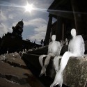
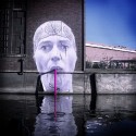
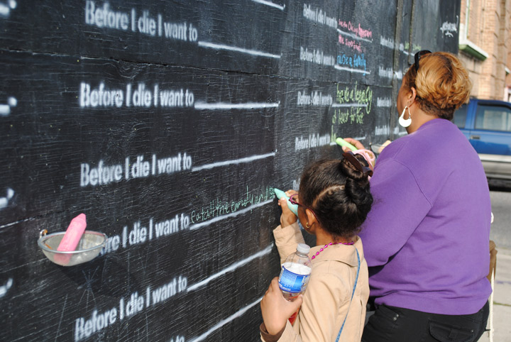
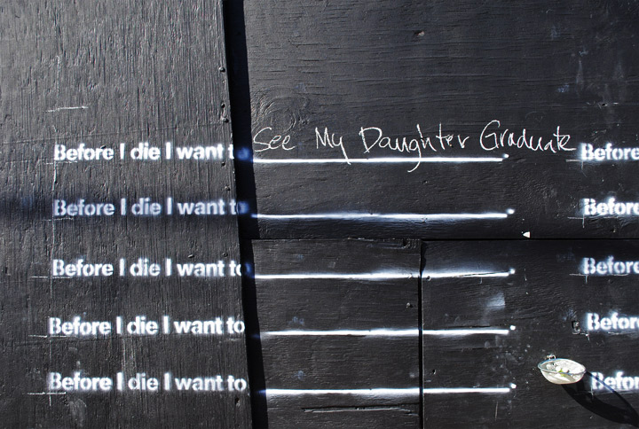
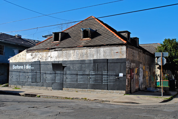
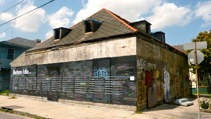
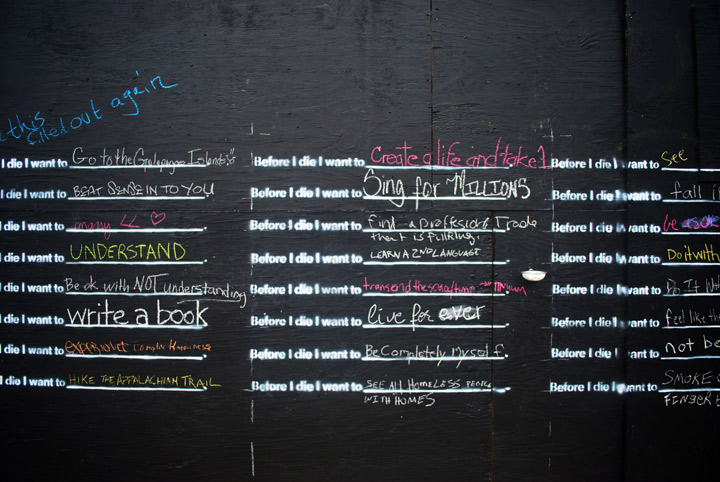
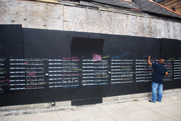
Before I die…
Installation artist and urban planner Candy Chang is a believer that “our public spaces can better reflect what’s important to us as residents and as human beings.”
In her own neighborhood, she created a very literal interpretation of this idea when she turned the side of an abandoned building in her neighborhood into a chalkboard (after obtaining many permits) with the statement “Before I die …” with blanks for people to fill in repeated over and over.
According to Chang, the response was overwhelming. People were constantly filling in answers, and each time the wall filled up, Chang would document all the answers, wash the wall, and let the process begin again.

The home has now been purchased, but the couple who bought it are fans of the project and have agreed to let it continue while they obtain permitting for renovation.
But even once construction begins, the project will not end. People around the country have emailed Chang asking her to do this in their cities, so she is putting together a kit that people can purchase with all the materials and instructions for how to execute the project on their own.


The Pantone Diet (and Public Art Project)
What you’re looking at above are Pantone matches to the colors of the fruits and vegetables that Tattfoo Tan (not Tattoo Fan, which is what you thought if you’re like me, and I thought it was a pretty cool moniker) brings home from his frequent trips to the Union Square Greenmarket in New York.
Tan, a Malaysian-born artist living in New York, is interested in using art to address social issues, and for this project, called “Nature Matching” (The Pantone Diet was my name… I just love anything Pantone so I thought it was catchy), he created a color-coding system to visually show people the colors they should be eating everyday. He put the Pantone squares together in murals that are being hung publicly in places with high volumes of walking traffic.

Another piece of this project were the fruit stickers he created with the clear patch showing the color of the fruit (image above in banner), which he used as guerilla art, going around to produce sections and sticking them on fruits and veggies in addition to the FDA/brand stickers. I also learned this highly useful piece of information on his site about the normal stickers you see on fruit:
“Did you realize there are these numbers on the fruit labels? What did they means? Well, you just need to look at the first number. Remember (9) is good, which menas it is organic. While is (8) means the fruits is Genetic Modify. (4) is bad, it is conventionally grown. That means with synthetic fertilizer and pesticide.”
Genetically modified anything freaks me out so I’m glad to know to avoid anything starting with 8!
I love this concept and the use of public art to encourage healthy eating habits, and for me anything visual is easier to learn and remember, so I think this “Pantone Diet” could go big (don’t you think he should re-name it that?)!
Hopefully it will inspire people to fill their plates with pretty produce (and hopefully they won’t notice that a lot of these colors look a lot like French fry and chicken nugget colors!).
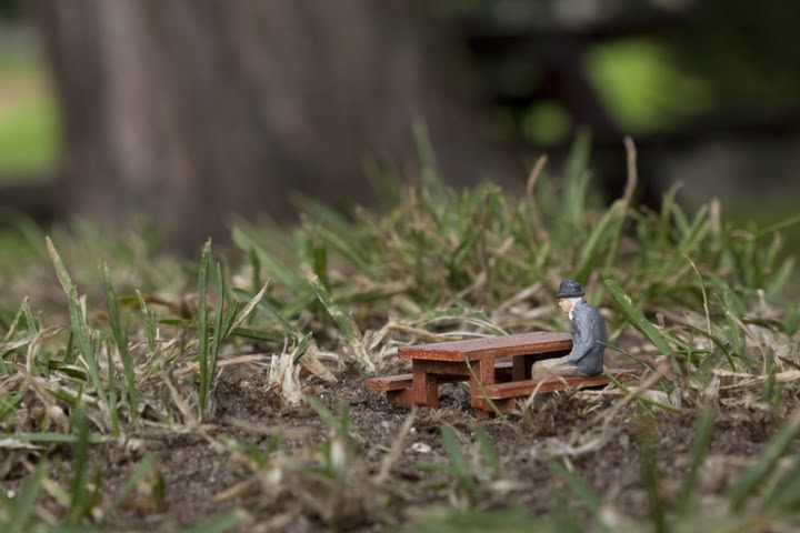
Tiny Street Art
I LOVE these street art installations of tiny people in tiny vignettes by Slinkachu!
Slinkachu, a 28 year old British guy, takes people and parts sold by model train companies, paints and customizes them, and then creates these miniature scenes around various European cities.
Unlike most street art, which calls attention to itself via size (remember JR’s mammoth photography installations) or vibrant colors splashed up on public property (like David Walker’s amazing graffiti portraits), Slinkachu’s work sits quietly, only to be discovered and enjoyed by the most observant of passersby.

And what a delight they would be if you did come across one! Can you imagine one of these tiny things catching your eye, and you get closer to see what it is, only to discover a complete, carefully constructed little tableau that mirrors a plausible real-world scene? It would absolutely make my day!

The video below shows the water park installation with the speakers Slinkachu planted beneath the grate to play sounds of water splashing and kids playing! So if you saw this one, in addition to finding the little scene, it would actually sound like there’s a secret water park going on in the sewer system! It reminds me of some of the fun Amelie gets up to, making people question reality, even if just for a fraction of a second.


A fantastic example of injecting experiences of wonder into the world…
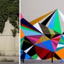
Gene Davis and Multicolored Stripes
I came across the above street painting by Gene Davis today on Black*Eiffel and totally fell in love. Seriously, how could you not just love this street painting? How fun is that? I would be so elated if I stumbled across something like this in real life without expecting it. Nothing like an unexpected bit of creativity in the world.
Typically, Davis just painted stripes on canvases, but he did the one above street painting in Philadelphia, in front of the Philadelphia Museum of Art, and then in 1987 and again in 2007, a group got together to honor Davis (who had died in 1985) by painting a similar scheme on a street in D.C., where the artist had lived for most of his life.

But in addition to loving the street paintings, this sent me into a multicolored stripe-inspiration frenzy. Paul Smith has used multicolored stripes to great effect, as has Kate Spade on the stairs of the London store. I’m also a big fan of the multicolored stripes used in Rebecca Ward’s tape installations and even Ball-Nogues Studio’s thread installations. Now I’m wondering if they were all inspired by Gene Davis! Isn’t cool how your picture of the world keeps making more sense as you learn more and can piece together what/who inspired what/whom?
It makes me want to paint some bright stripes somewhere fun and unexpected. Maybe the inside of my medicine cabinet doors?
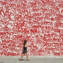
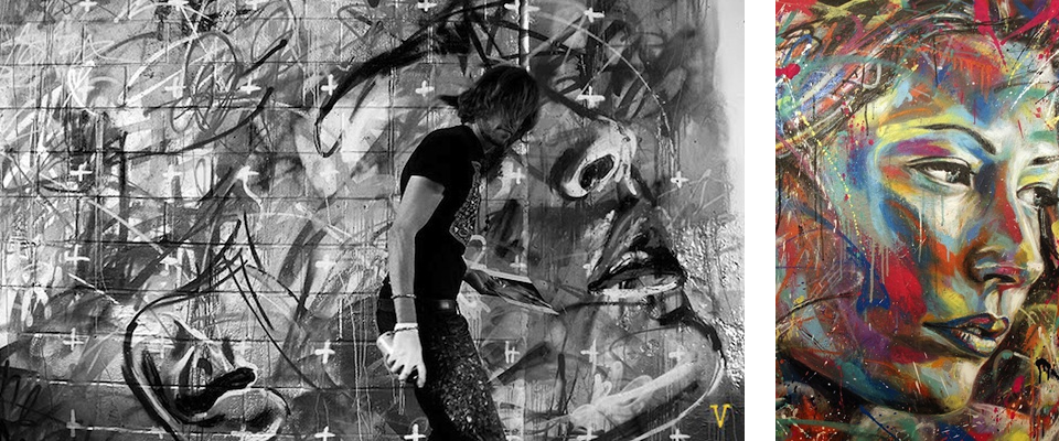
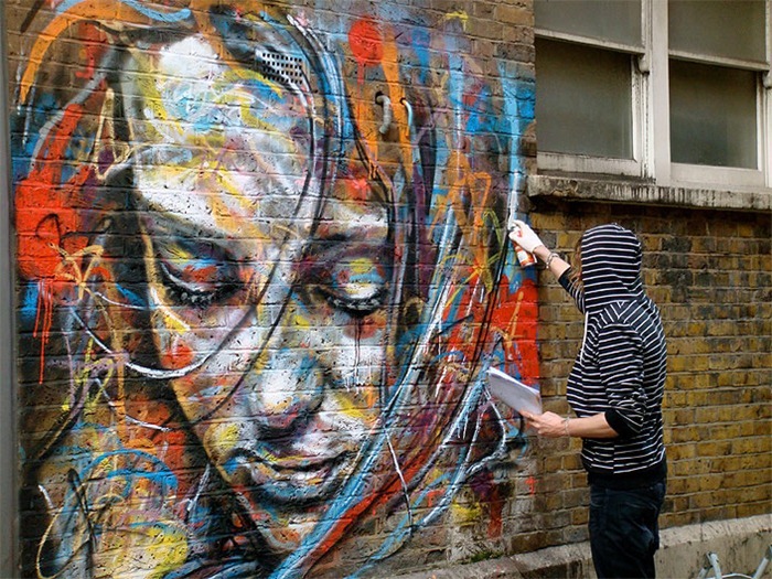
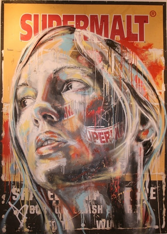
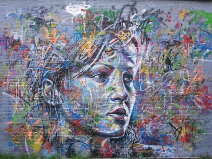
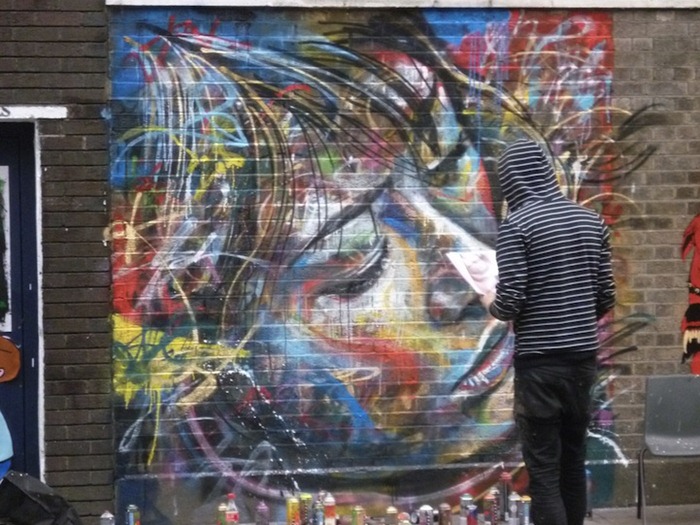
David Walker’s Graffiti Portraits
Graffiti’s place in society is an ever-evolving topic, one that totally fascinates me (as is probably no surprise if you’ve read this blog for a while), as the debate rolls on about public space (and its defacement), the use of public art to draw attention to an issue, art that cannot be collected, etc.
David Walker’s graffiti portraits add a new dimension to the street art debate. Though I’m sure his work is not totally unprecedented, I, at least, have never seen a classical subject like portraiture (or landscape, etc) approached through the medium of spraypaint, in a public place, and executed in a traditional style (the faces are three-dimensional representations with shadows and lights and darks, not just abstract lines or cartoon-style flattened figures). How wonderful to be walking down the street and see a huge, vibrant portrait?

It’s like Jackson Pollock’s removal of the brushstroke meets Warhol’s use of pop colors for representations of people meets de Kooning’s figurative expressionism meets public art! Such an interesting intersection of art historical influences and the place of art in society it makes my little heart pound. I love it. Oh, and Walker’s only been painting for three years.

2011 TED Prize winner: Street Artist JR
For street artist JR’s work, size matters. So does location. Though his content– portraits of marginalized members of societies the world over– may not be unprecedented, his presentation is, and that changes everything.
Using insanely large-format photographs plastered up on sides of buildings, trains, stairs, bridges, or really any public structure, JR’s work is not only made accessible to the public, it actually confronts the public in an unavoidable way.

What his various projects have in common is that they represent an overlooked or misunderstood group of people– the elderly, women, member of different sides of conflicts, etc. For his 28 Millimeter project, he had residents of a slum outside of Paris (that had recently been in the news for the riots that had started there) act out the stereotypes they knew of themselves, photographed them, and plastered them around a bourgeois neighborhood of Paris along with the subjects’ name, phone numbers, and building numbers– effectively emphasizing that they are real individuals, not homogeneous representatives of a stereotype.

For his Face2Face project, he photographed residents living on either side of the wall dividing Israel and Palestine, basically making silly faces and looking utterly, universally human, and posted them on the opposite side of their respective sides of the wall. As he explains in the video below, he expected hostile reactions, but amazingly, he received none.
Check out the two videos below for more info and more installations. The first is the video posted by TED, and the second is about his upcoming film, “Women are Heroes.”


