The Pantone Diet (and Public Art Project)
What you’re looking at above are Pantone matches to the colors of the fruits and vegetables that Tattfoo Tan (not Tattoo Fan, which is what you thought if you’re like me, and I thought it was a pretty cool moniker) brings home from his frequent trips to the Union Square Greenmarket in New York.
Tan, a Malaysian-born artist living in New York, is interested in using art to address social issues, and for this project, called “Nature Matching” (The Pantone Diet was my name… I just love anything Pantone so I thought it was catchy), he created a color-coding system to visually show people the colors they should be eating everyday. He put the Pantone squares together in murals that are being hung publicly in places with high volumes of walking traffic.
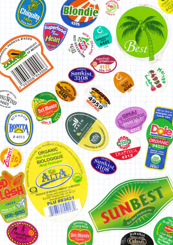
Another piece of this project were the fruit stickers he created with the clear patch showing the color of the fruit (image above in banner), which he used as guerilla art, going around to produce sections and sticking them on fruits and veggies in addition to the FDA/brand stickers. I also learned this highly useful piece of information on his site about the normal stickers you see on fruit:
“Did you realize there are these numbers on the fruit labels? What did they means? Well, you just need to look at the first number. Remember (9) is good, which menas it is organic. While is (8) means the fruits is Genetic Modify. (4) is bad, it is conventionally grown. That means with synthetic fertilizer and pesticide.”
Genetically modified anything freaks me out so I’m glad to know to avoid anything starting with 8!
I love this concept and the use of public art to encourage healthy eating habits, and for me anything visual is easier to learn and remember, so I think this “Pantone Diet” could go big (don’t you think he should re-name it that?)!
Hopefully it will inspire people to fill their plates with pretty produce (and hopefully they won’t notice that a lot of these colors look a lot like French fry and chicken nugget colors!).

