Your Handwriting –> Digital Font
Pilot has created a program that turns your handwriting into a digital font.
Major downside is that you can only use the font on their website to send emails to people… you can’t download the font to use in other applications. But this must mean its only a matter of time until there’s a program that does let you create a downloadable font, right??
Mr. Sign
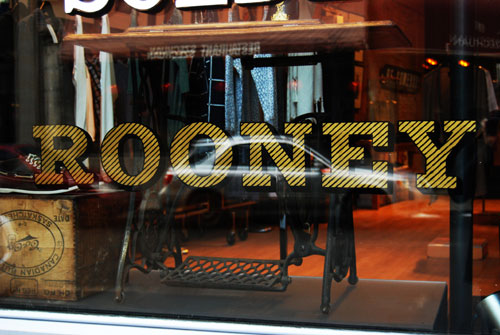
Window-shopping is getting even more appealing in Montreal these days Dave Arnold, or “Mr. Sign,” is bringing back the art of hand-painted window signs. Apparently, his work is catching on like wild-fire and store owners are eagerly seeking him out.
Isn’t that cool?? A resurgence of hand-made anything is pretty exciting. If you missed the post with the video about the dying art of hand-painted billboards in New York, check it out back here. It’s a pretty touching homage.
[Dave Arnold/Mr. Sign]
[Poppytalk]
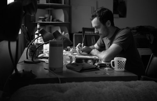
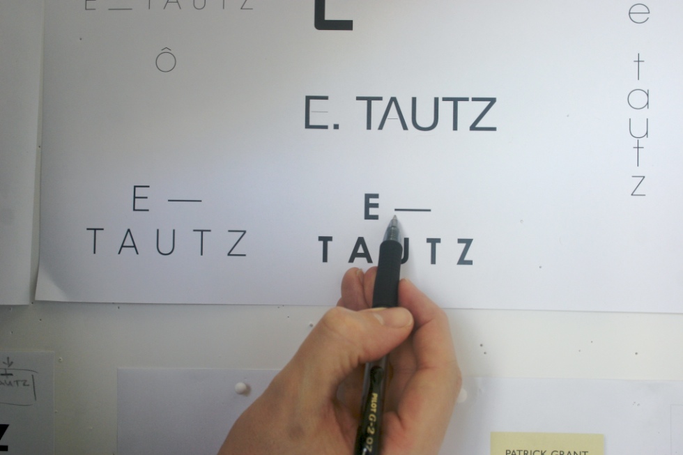
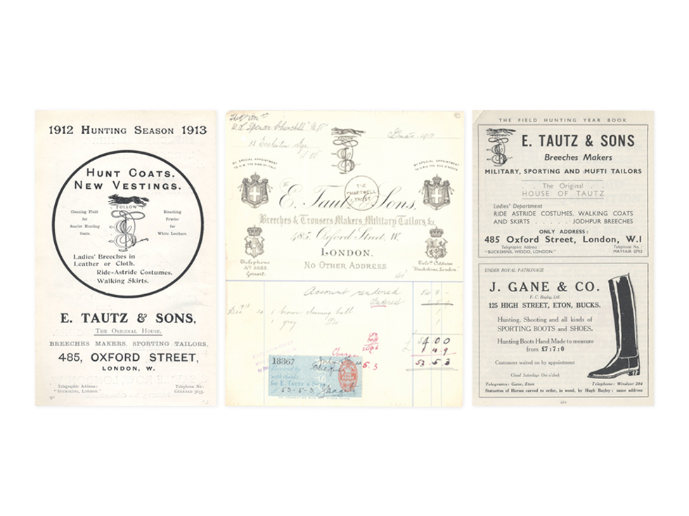
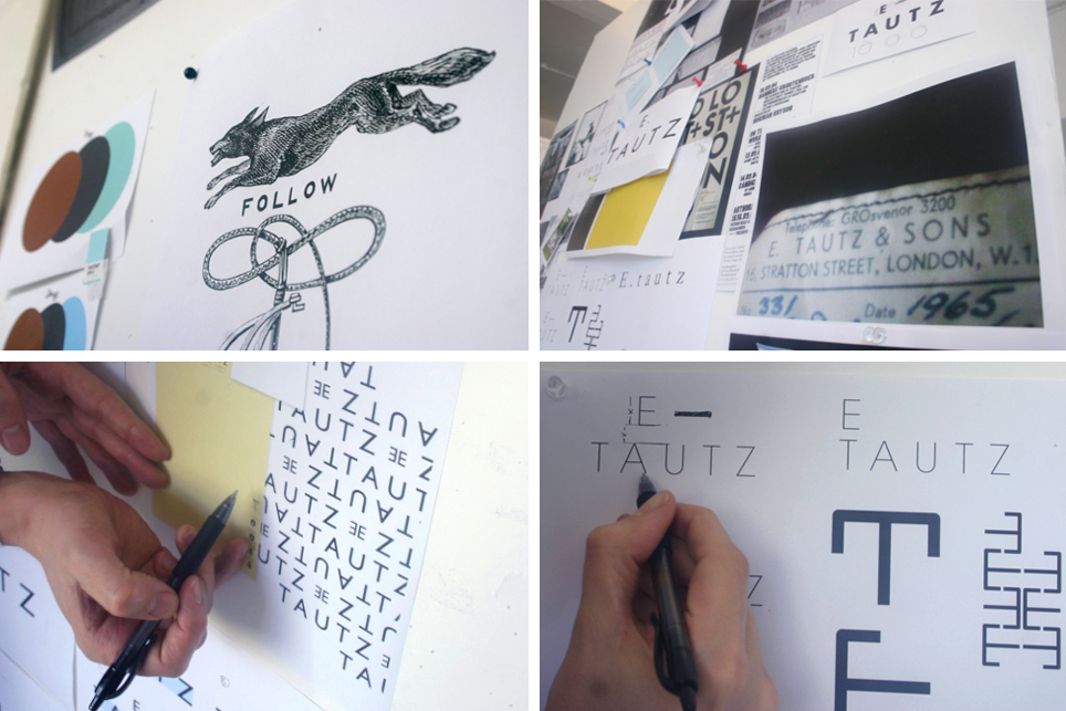
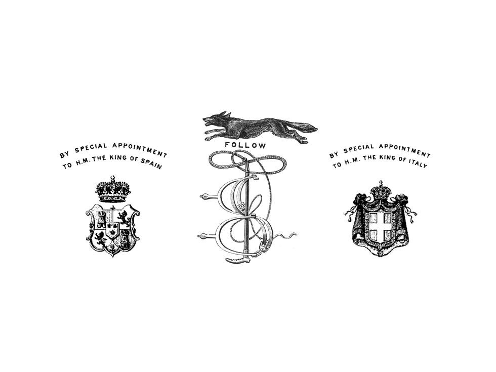
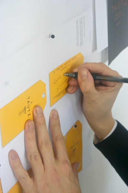
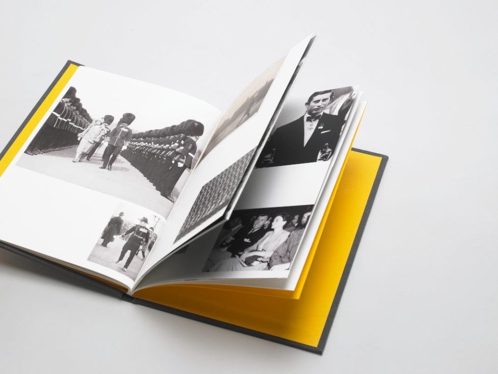
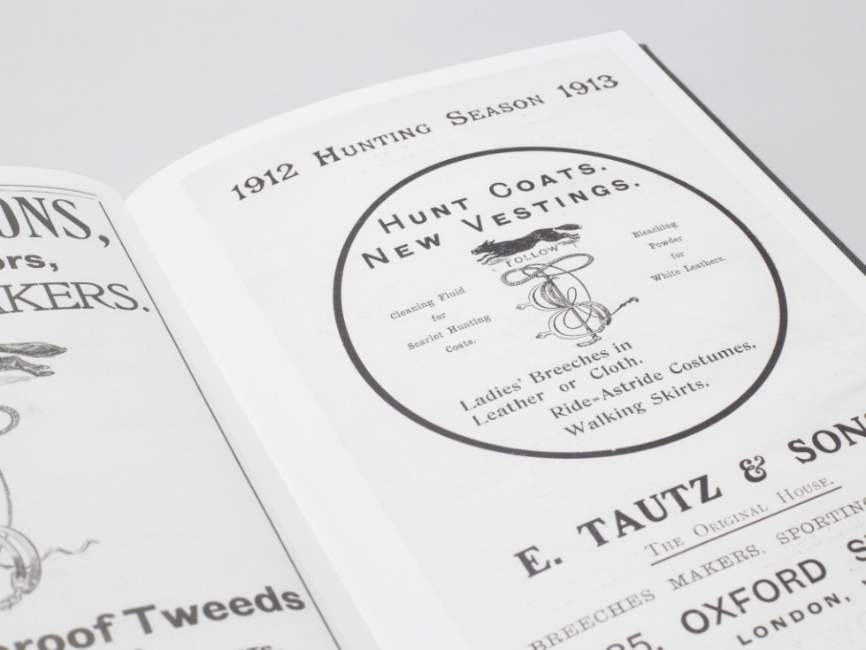
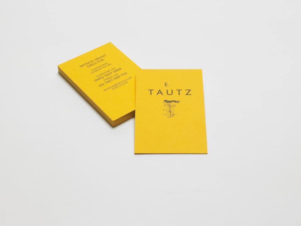
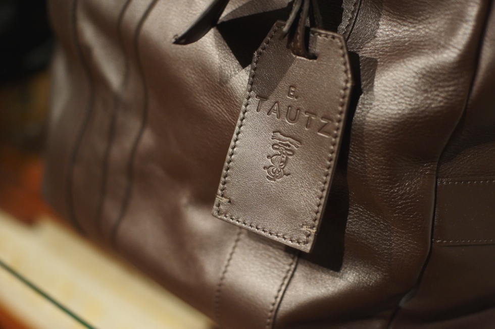
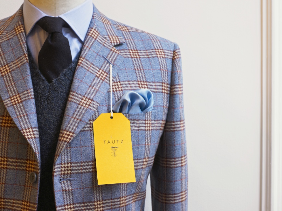
E. Tautz Branding
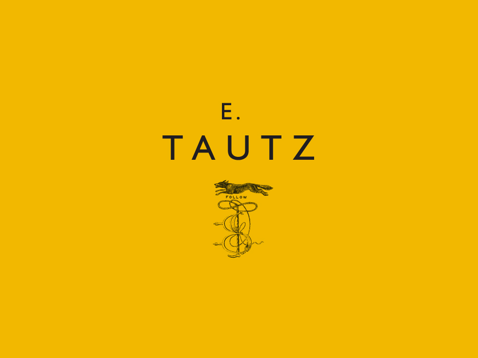
Moving Brands, a branding company based in London, was asked by E. Tautz, a luxury menswear brand, which started out as a military-outfitter, to create a brand identity for them.
Above is the logo they came up with, pairing the clean, modern Gill typeface with the traditional-looking fox and whip icon, all set on the broad field of utilitarian-feeling yellow. Don’t you think the yellow is a stroke of genius? The yellow is so unusual and distinctive and the size of the field compared to the actual logo makes a serious visual impact.
Below, their creative process and the resulting collateral.
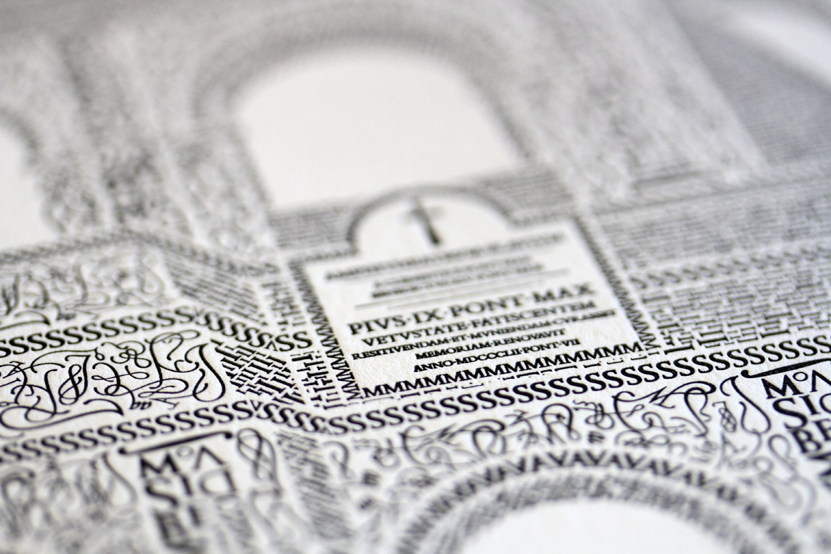
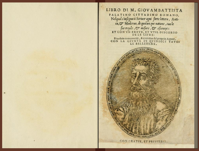
Typography + Architecture >> Colosseo

I just couldn’t end the day with that creepy pageant post, and it was actually really hard to find something to follow that, because all of a sudden, knowing that those images would follow whatever I put up next, they started tainting everything!
So anyway… I’ve had this in the vault for a while and thought, ok, there’s no way the pageant pics could have any kind of dialogue with something with almost no allusions or connotations, something that is just purely graphicly, visually interesting.
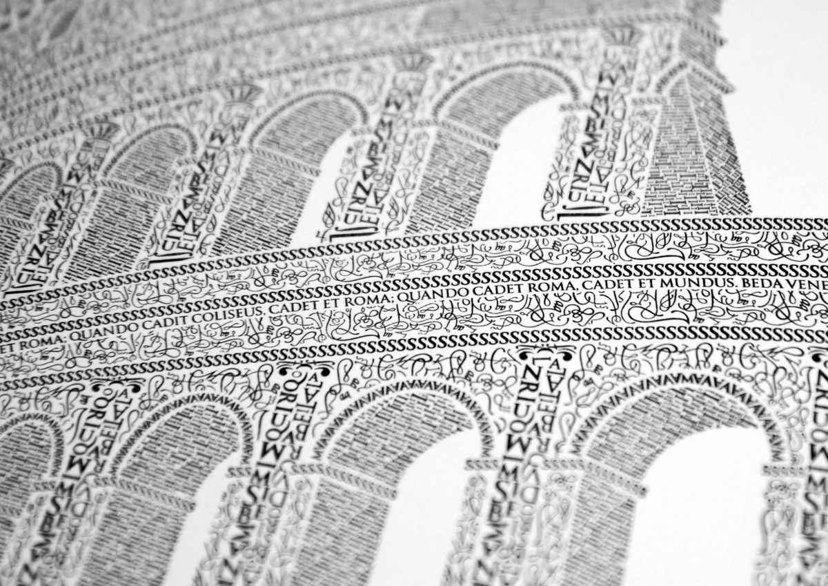
After a 10-year anniversary trip to Rome with his wife, designer Cameron Moll decided to make the Colosseum his next artistic subject. Using 16th century calligrapher M. Giovambattista Palatino’s work as his inspiration (see bottom), he then spent over 250 hours creating this piece, character by character, using the Goudy Trajan Bembo Pro typefaces.
[Available as a print here.]
Jay-Z’s "Hello Brooklyn"
Sometimes when I really like something straight away upon encountering it, all eloquence and diligently learned SAT vocab words suddenly seem far out of reach, and all I can think of are childish descriptors like “awesomeness.” I feel (hope) that if I thought about it longer, the analytical side of my brain would kick in and help me describe why I find something worthy of being called awesomeness, but for this Jay-Z video, I think awesomeness is just about right. So take my word for it and check out the awesomeness.
This video is not the official music video, but rather an independent “tribute” to Jay-Z, Brooklyn, and New York by Greg Solenstrom, which actually in a way makes it even cooler, knowing that this guy produced this video pretty much for fun (ok, and maybe self-promotion) without any direction from the Jay-Z team. Although I will say that before I knew it was independently done, and I thought it was Jay-Z’s idea, I was like, “Wow, Jay-Z is even cooler than I thought!” Alas.
Solenstrom uses the font Akzidenz Grotesk (the precursor to Helvetica), which, as the font on MTA subway map designed in the late 60′s (and still used today) by Massimo Vignelli, seems a perfect choice, along with tons of still images of Brooklyn treated with the Vanishing Point effect in Photoshop and After Effects to animate the video.
The above video is a non-traditional but fascinating “making of”– meaning it will not teach you how to create a video like this, but rather will boggle your mind and convince you that you could never learn how to do this. Still, despite the mind-boggling, it’s worth checking out for the appreciation of the video and this guy’s talent that it will give you. I really had no idea how much work it would take to create a video like this.
TypeSeat
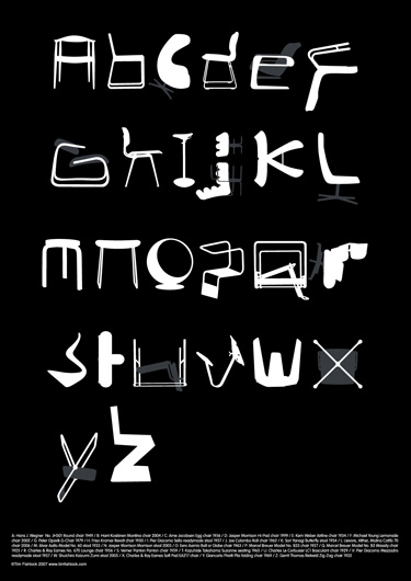
This is just so satisfying to my designy nerd soul.
By Tim Fishlock.
PS – I once found a pair of the Z chair in lucite at a consignment shop for like $200 total, and I decided to think about it for a day, and I went back and they were gone, and I’ve honestly mourned the decision ever since. Bird in the hand, people, bird. in. the. hand. Let me have learned this lesson for you.
PPS – Kyle, I know what you’re going to say- we literally have no space or use for more chairs. I know. But I looove them. You got lucky on this one.
Easy as ABC
I don’t know why exactly, but I found this little video so charming. Watching the little boy trying to write letters, struggling with the forms and fitting them on the paper, while his dad, who clearly does this as his trade, masterfully writes beautiful letters is sort of inexplicably touching, and not just because I like handwriting. But maybe the combination of handwriting plus father/son stuff and the snapshot of a phase of childhood was just too much for me.
The little boy’s efforts are so wonderfully child-like, at that stage where imitating shapes is still so difficult, and he’s trying so hard, glancing at his dad’s paper but rarely able to get it right, and you know some day he’ll probably show the same talent as his father and dad will be so proud of the tradition and ability he passed on.
PS- the intro credits are long, but even those are entertaining, watching the dad write in two distinct fonts!
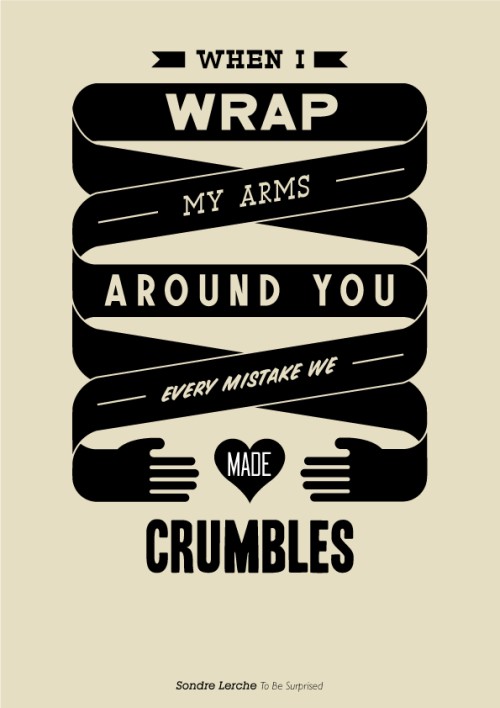
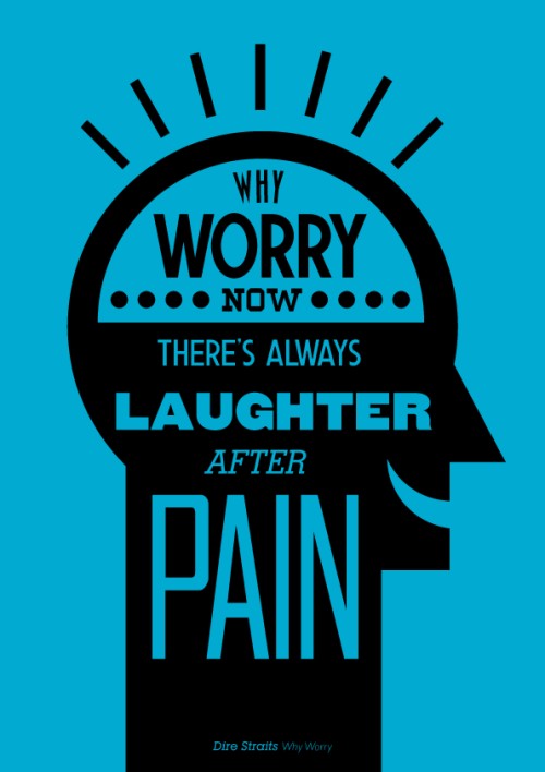
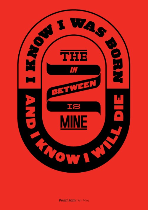
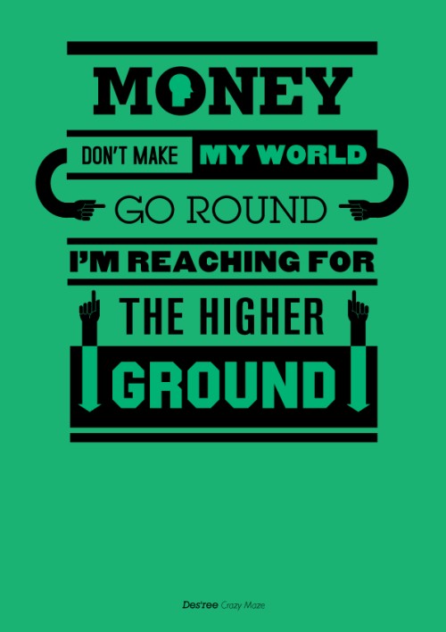
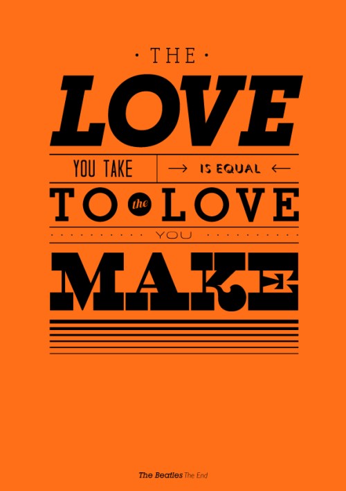
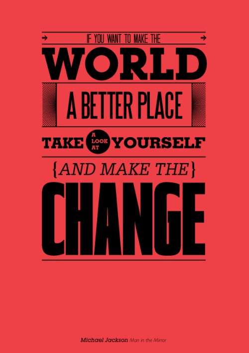
Music + Typography
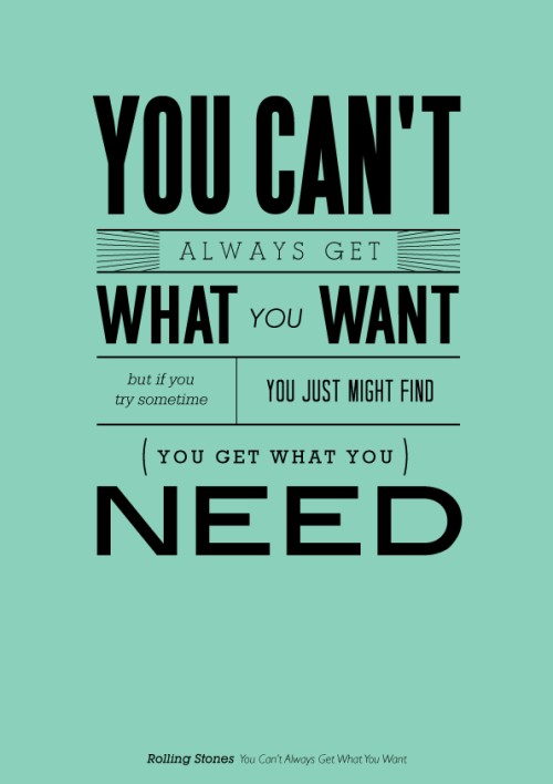
LOVE these typographic prints of lyrics by artist Mico Toledo. Done with less sophisticated designs, these could have been cheesy, but the graphic tone is spot-on. Love the use of fonts, layout, and simple graphics.


Typestaches, A Field Guide
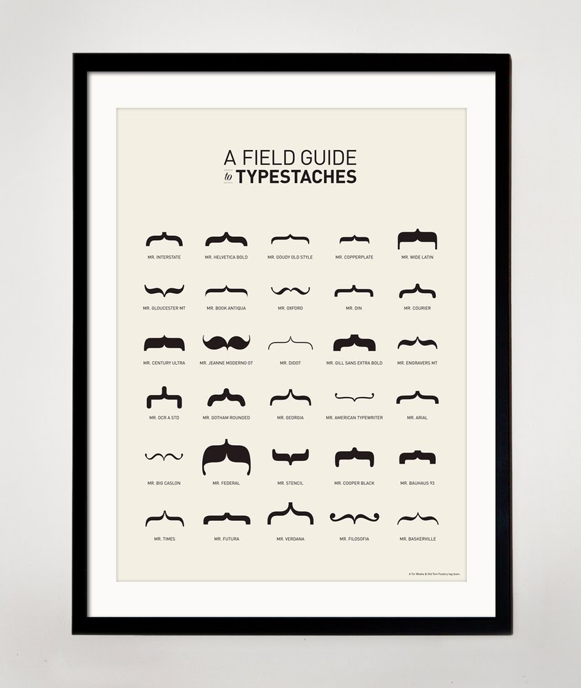
I just couldn’t resist.
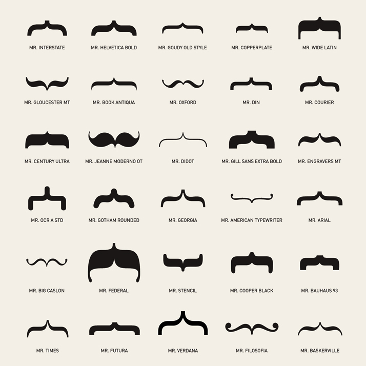
Available at Old Tom Foolery.
High Contrast
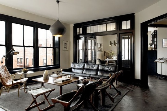
Another space by Roman and Williams, who I featured a while back for the design of the Ace Hotel. I’m digging the high contrast created by the black molding and mullions and the modern but comfy looking furnitre.
The whole space feels so sexy, no? I wouldn’t mind having a glass of wine on that couch come five o’clock, with some Nina Simone in the background.
I seem to be feeling anything bold, contrasty, and typographic today, including the wine labels and the space above, so why not throw in a video of a Nina Simone song made only with typography and typographic elements? Seems fitting…
Pretty cool.


