Steve Powers is Back
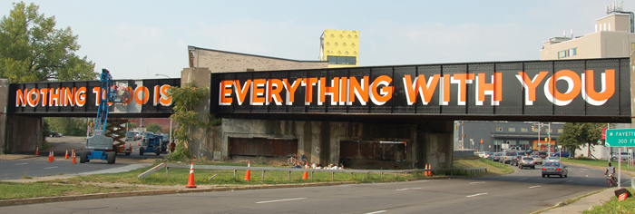
So glad to see that Steve Powers (a graffiti artist AND Fulbright scholar) is back with a new project. Called “A Love Letter for Syracuse,” it’s a project in conjunction with Syracuse University and local organizations intended to use public art as a means to neighborhood revitalization.
Powers, together with these organizations, used painted phrases to turn three train bridges that are physical and metaphorical dividers between two very disparate neighborhoods into points of unity and conversation-starters.
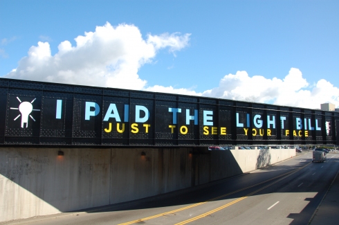
Here, Steve discusses “why” of the font, the words, etc behind this project…
The bridges that cross Fayette and West Streets were hand made in the 1940s from Carnegie Steel and the toil of countless people. They were built for a Syracuse of great industry and remain faithful to the industrial ideals of utility, dependability and (yes) austerity. In the era the bridges were built, sign painting was a viable profession and like many other professions in Syracuse, went away because a machine replaced hands, heart and head.
Once sign painting as a trade became extinct, it became interesting to me as a medium for art. I learned to paint signs as they had been painted for generations, but instead of the commercial concerns of most signage I used the letters and colors to talk about love and life. The font I employ was prized by sign painters because it is clear and versatile, qualities that serve me well when I am talking about complex things like love. Beyond that, my use of the sign painters craft is about the importance of the hands, heart and head being present in the work I make. The work we are calling on to renew the West side must possess the same qualities.
The words we painted were drawn from the neighborhood. The font was already on one side of the w. Fayette Street bridge. (It was painted for Romano Ford in the 60′s and again in the 70′s) The colors we used are present in every industry, the federal safety colors, blue, red, yellow, green, and especially orange. The gloss black is what the bridge was painted when it was first built. The innovations of the color and the content emerge from the history of the black paint. In doing so, these painted bridges represent what I believe is the future of Syracuse; Taking what has value and remaking it for the future, in a way that respects tradition and innovation.
If you missed his last project, the now-famous “A Love Letter For You,” check it out back here. More about the current project here.
Urban Play
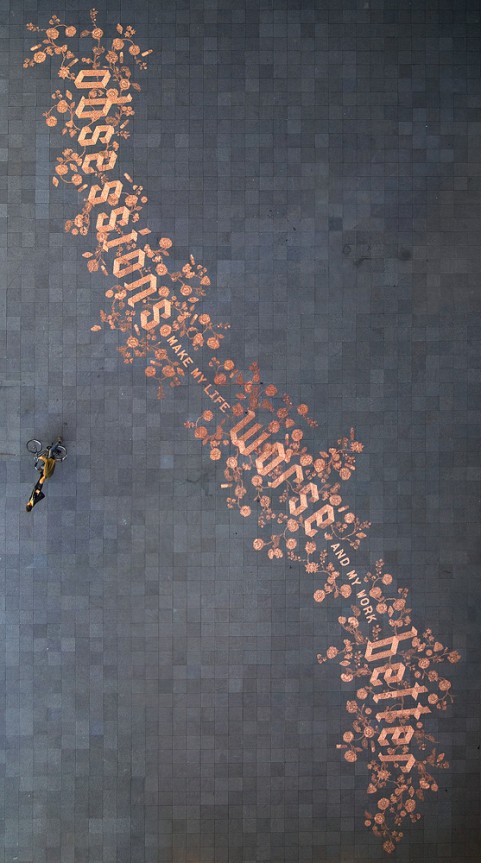
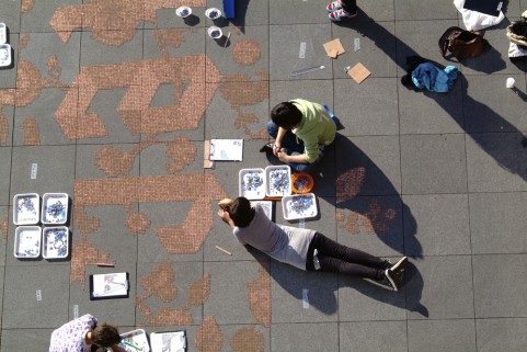
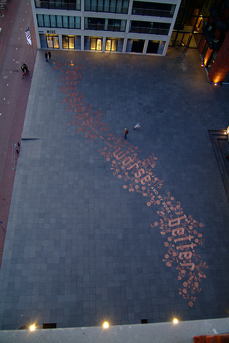
Graphic designer Stefan Sagmeister, in collaboration with lettering guru Jessica Hische and 150 volunteers, created this public installation in Amsterdam composed of 250,000 eurocents proclaiming, “Obsessions make my life worse and my work better.” After it was finished, the installation was left unprotected to see how the public would interact with it.
About 20 afters after it was complete, when the plaza was empty, a man came through and started picking up the coins and putting them in bags. A neighbor, concerned that someone was “stealing the artwork,” called the police, who tried to find the artist, and when they couldn’t, they called a city cleaning company to bag up all the money and put it in a safe until they could reach the artist. Ha!
More on Sagmeister’s site here, including a timelapse video of the installation.
Jessica Hische website here (tons of awesome typography/graphic design stuff to explore).
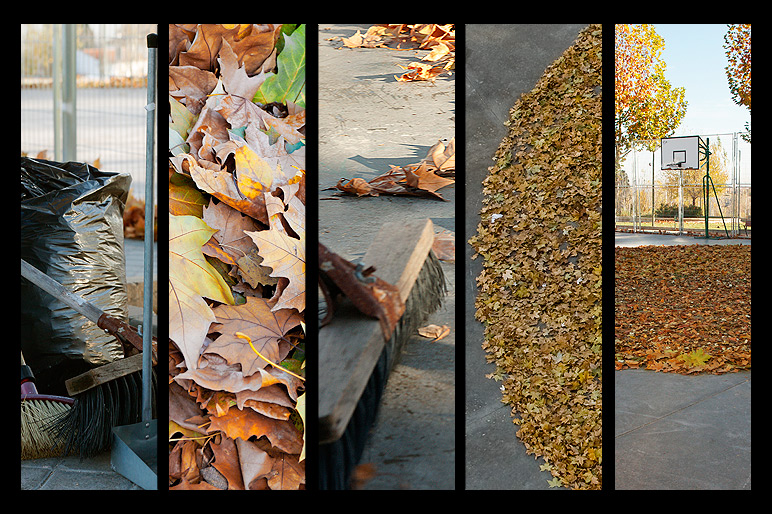
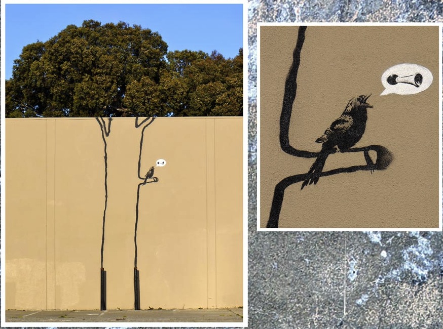
SpY >> Looks like Fall
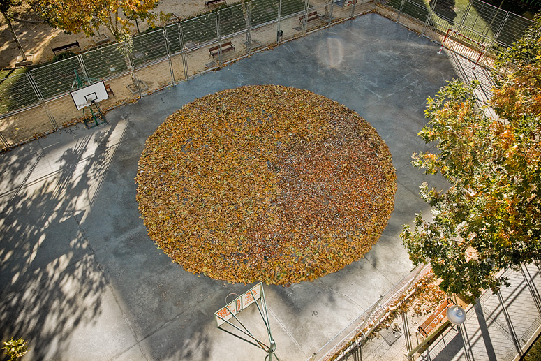
By Spanish street artist SpY

A Little Cheer
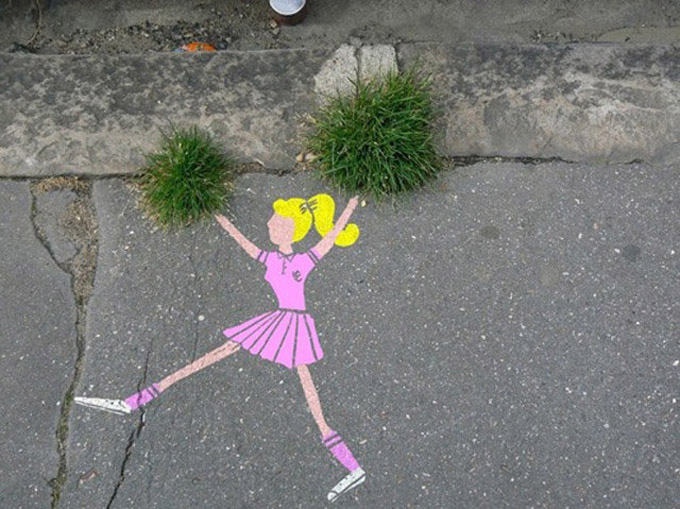
Unknown location, unknown artist.
I love it!
SpY

LOVE the public art by Spanish artist SpY.

Here’s an excerpt of a review of his work:
His work involves the appropiation urban elements through transformation or replication, commentary on urban reality, and the interference in its communicative codes. The bulk of his production stems from the observation of the city and an appreciation of its components, not as inert elements but as a palette of materials overflowing with possibilities. His ludic spirit, careful attention to the context of each piece, and a not invasive, constructive attitude, unmistakably characterize his interventions.
…SpY’s pieces want to be a parenthesis in the automated inertia of the urbanite. They are pinches of intention, hidden in a corner for those who want to let themselves be surprised. Filled with equal parts of irony and positive humor, they appear to raise a smile, incite reflection, and to favor an enlightened conscience.
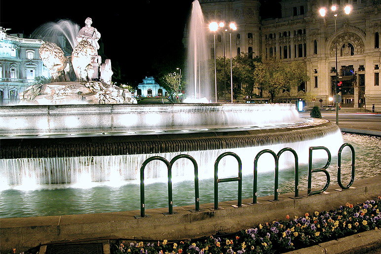
(Based on the typical bike rack found in Madrid.)
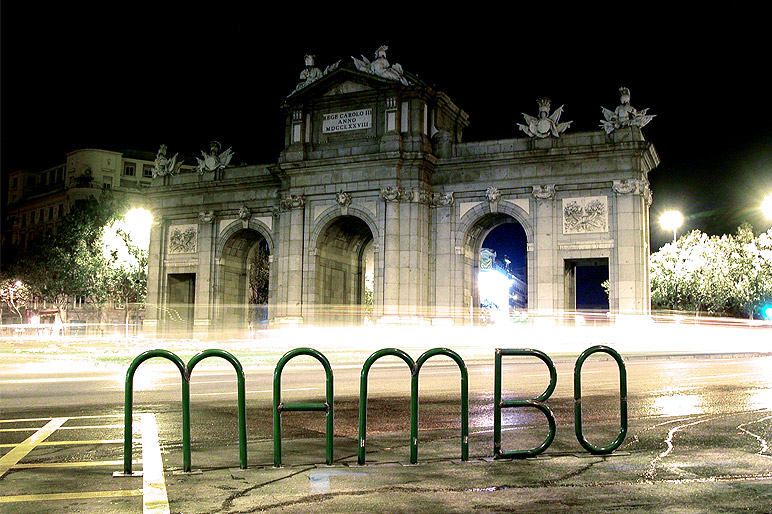


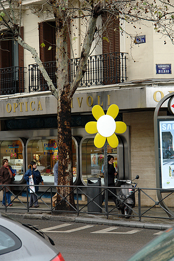
A statement from SpY on his website about taking this photo…
I was taking the pictures of this sign, placed in a very busy street in Madrid city center, when a policeman approached and said: “Did you put it there last night?” I said no, I’m a photographer taking pictures of the city. He insisted: “are you taking pictures of the flower?” I said yes, I’ve seen it and found it funny. Then the cop says: “I think I know your face, maybe we know each other?” I then thought: fuck, this cop knows me and has figured all out. Y said no, I don’t seem to remember you. His face was partly hidden with a hat and a scarf. He went again: “I’m sure to remember you, didn’t you hang out with Suso? I think we know each other from graffiti.” Already more relaxed, I asked him what neighbourhood he was from. He was a member of Los Trece, a well-known graffiti crew from Móstoles. I recognized him and said that his looks had gotten me nervous. He laughed and said: “I saw it this morning, I thought it was probably put there last night, it’s pretty cool, I hope it stays long.” I then kept on with the pictures. When seeing me precariously try to do it from the middle of the street, he said: “Do you want me to stop the traffic so you can take the picture better?” I said, well, if you don’t mind… He then walked to the middle of the street and started stopping the traffic. I quickly took the pictures, thanked him and said goodbye, he said goodbye and I left.
Must See >> Blu
A stop-motion animation film of sometimes small-, sometimes very large-scale murals by the Argentine artist Blu on the sidewalks of Buenos Aires.
I don’t know how quickly he changes these drawings, but it would be pretty cool if you came across something like this on your daily commute, and you could see it evolve every day, not having any idea where it’s headed.
Also pretty amazing that after each drawing was photographed, that became a frame in the film, and there was no way to go back and change previous frames, since he had already changed the drawing and moved on. I’m curious how much he planned out the whole trajectory ahead of time!
The “Let’s Colour” Project
The “Let’s Colour” Project, sponsored by Dulux paints, is on a mission to color over grey spaces (ie, plain concrete) around the world. While I do think that color can add energy and happiness to a space, I’m not totally sure how I feel about the project as a whole. Regardless, the video they’ve made of their work so far is pretty cool… check it out and see what you think!
Must See >> Banksy’s Exit Through the Gift Shop
Very curious to see Banksy’s documentary “Exit Through the Gift Shop.”
If you’re unfamiliar with the mysterious/prankish street artist Banksy, who pulls stunts like replacing art in museusms with his own pieces and whose work sells for millions, or to read more about the premise of the documentary, check out this article in the NYT.
Since Banksy’s work regularly plays with irony and the idea of “the art world,” many people have questioned how “real” this documentary is. Of this issue, the Melena Ryzik says in the NYT article:
“Ultimately, wondering whether “Exit Through the Gift Shop” is real or not may be moot. It certainly asks real questions: about the value of authenticity, financially and aesthetically; about what it means to be a superstar in a subculture built on shunning the mainstream; about how sensibly that culture judges, and monetizes, talent.”

See more Banksy work here.
Broken Fingaz Street Art
Always love stop-motion animation. And when it meets street art, well, it’s pretty cool.
Hand-Painted Wall Ads
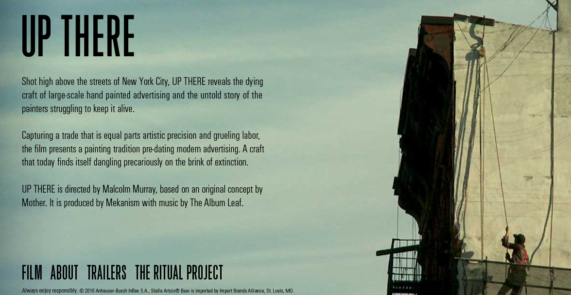
This video about the hand-painted billboards on the sides of buildings in New York, and the people who paint them, has a really magical quality. It sort of feels like when something starts with an image of the world from outer space and then zooms in and zooms in and zooms in and you finally land on one tiny detail on ground level… here the detail is the little world that revolves around the tiny and dying industry of hand-painted billboards.
It’s one of those things you might stop to think about for a brief moment every once in a while– “Who painted that? How long did it take?”– but then you never really get answers so your mind never wanders very far. In this really well-done (love the cinematography and the editing) short sponsored by Stella (brilliant move), you get a close-up peak at this world that not only gives those answers, but also puts human faces to the signs that seem to magically appear around town.
If nothing else, watch the the thirty seconds at the end between about 12:00 and 12:30… you miss out on the story but the visual is still awesome.


