Recently on Editor’s Chair…
Just a tiny preview of the visual inspiration on Editor’s Chair this week…
Not to mention the most well-styled and art-directed skateboarding short I’ve ever seen and an interview with Banksy…
Cave de Saint Tropez

h2o

Monte dos Cabacos

Recently on Editor’s Chair
For more (tumblr-style) visual inspiration, click over to Editor’s Chair…
like butter

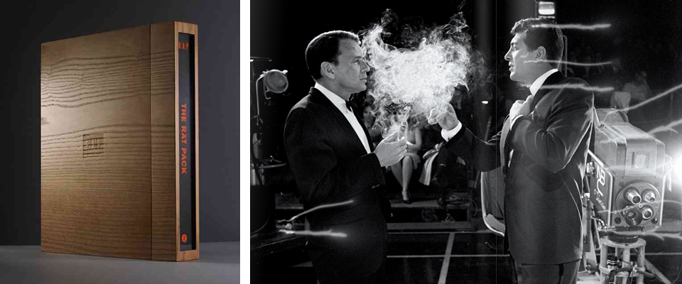
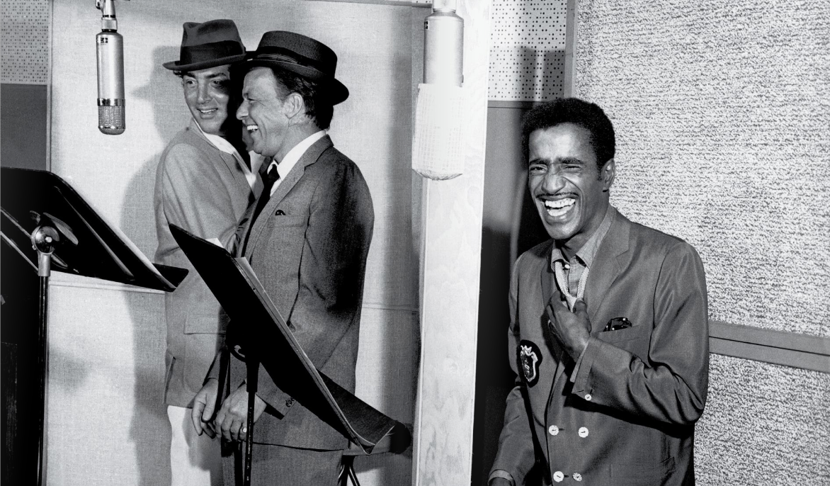
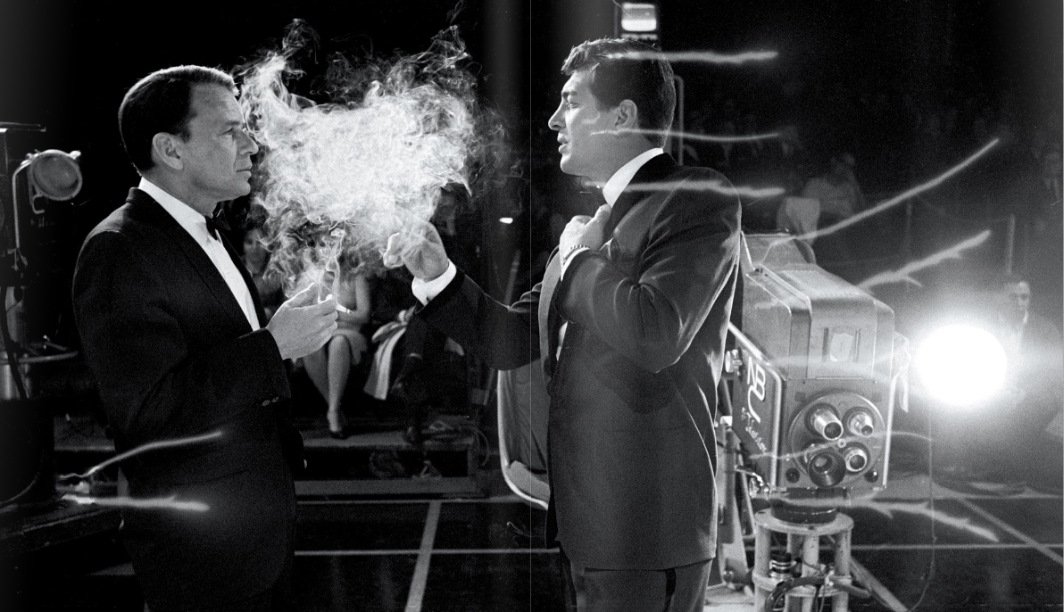
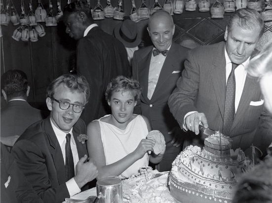
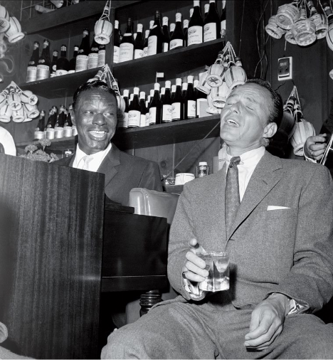
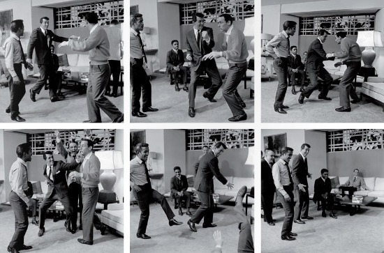
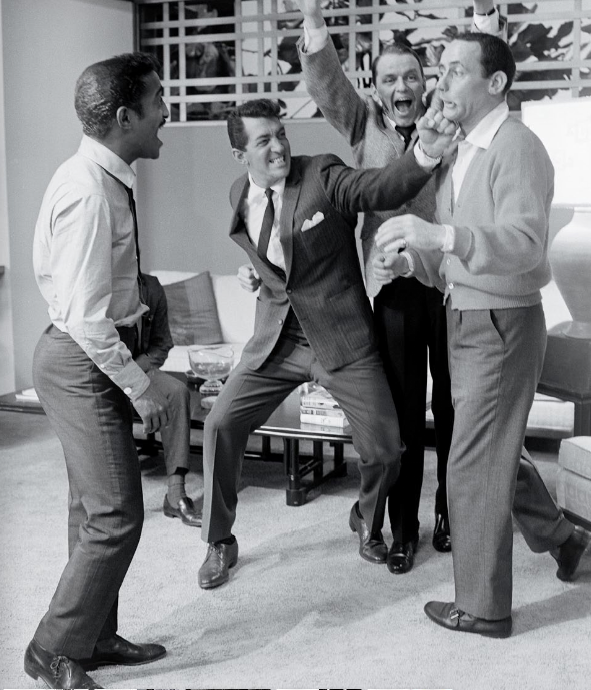
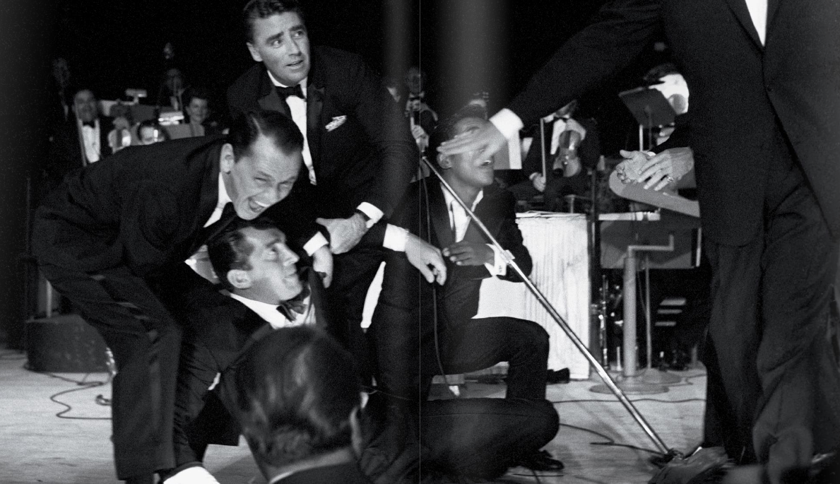
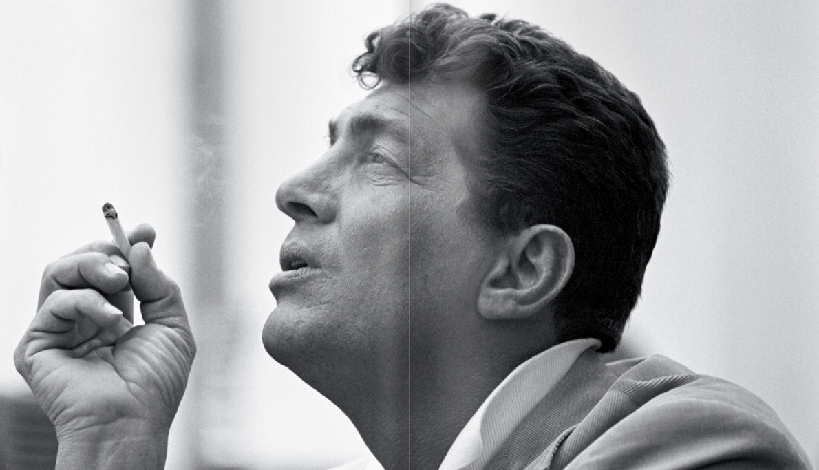
LustList: The Rat Pack Master Edition
Loving the looks of this beautifully-bound limited edition compendium of photos of the Rat Pack in their heyday. The packaging, designed by Progress Packaging, was what first caught my eye, but the photos and content are equally appealing. Published by Reel Art Press, here is what they say about the book:
“Frank Sinatra’s legendary clique defined life in the fast lane throughout the late fifties and early sixties, dominating American culture and epitomising a life of cocktails, love affairs and Hollywood glamour.
A select group of photographers, including Sid Avery and Bob Willoughby, captured the Rat Pack in their heyday. Many of the images they produced have been largely stored away, many even undeveloped. For the first time, access to these shots has been made possible to produce one deluxe, collector’s edition.

The Rat Pack is the definitive book on Frank, Dean, Sammy and co. tearing up Hollywood and Las Vegas with an extended cast including Marilyn Monroe and JFK. Fifty years on from the year many refer to as The Year of the Rat Pack, 1960, and their influence endures. Shooting Ocean’s 11 by day, performing at the Sands by night and sweating out the sour mash in the sauna in between, The Rat Pack includes behind the scenes footage at the JFK Presidential Inauguration and house parties with Ava Gardner and Marilyn Monroe.”"


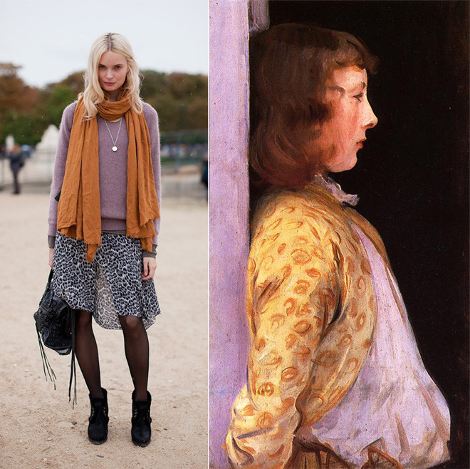
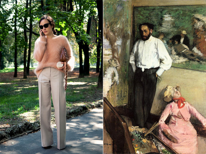
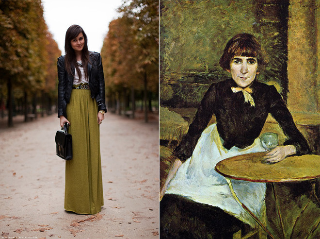
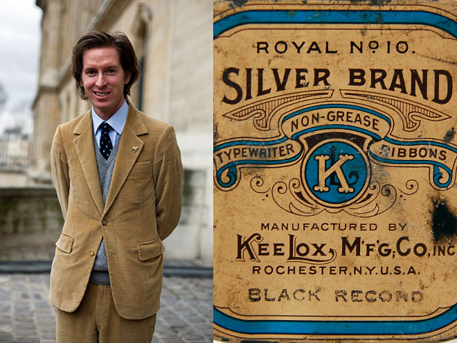
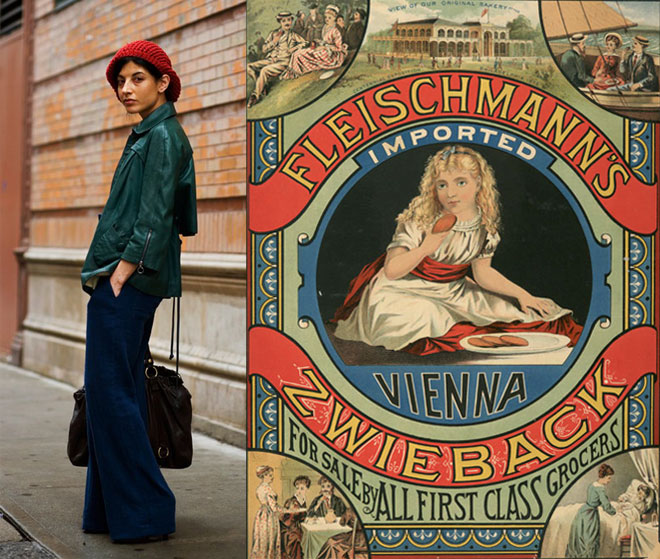
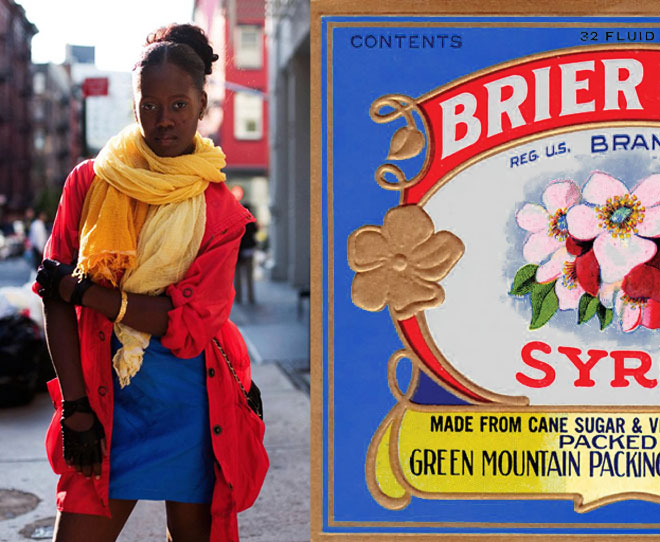
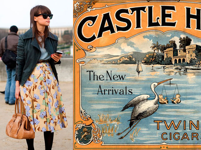
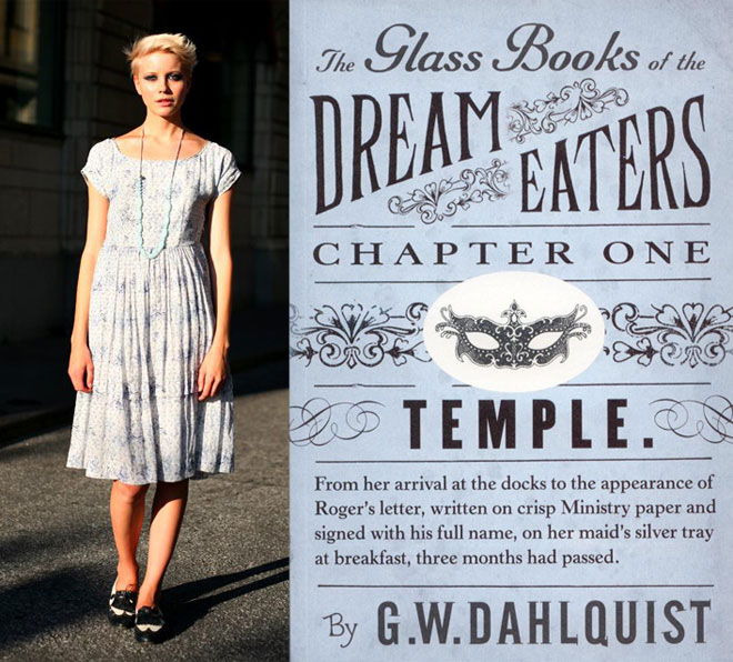
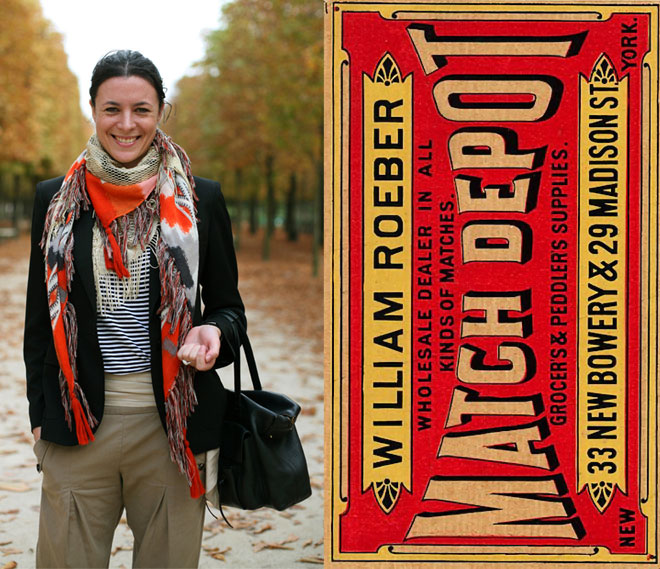
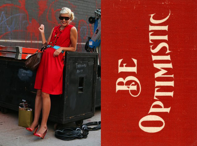
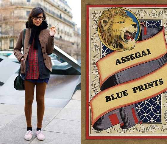
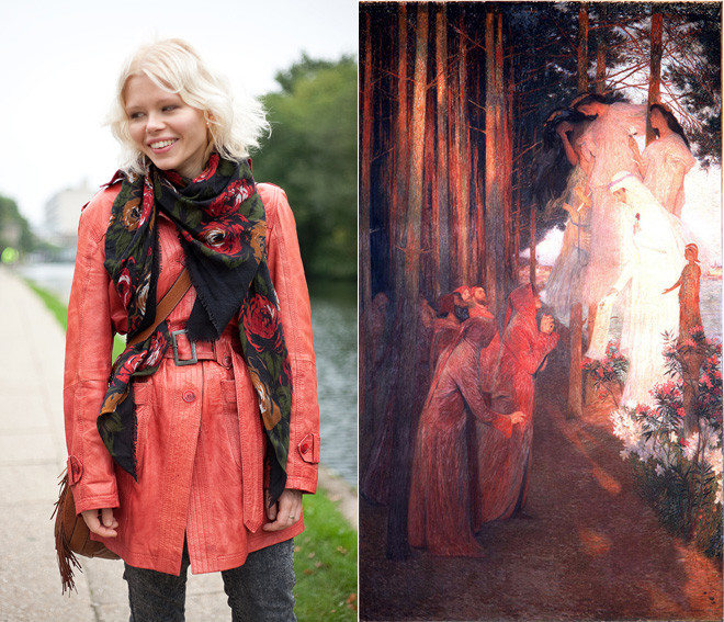
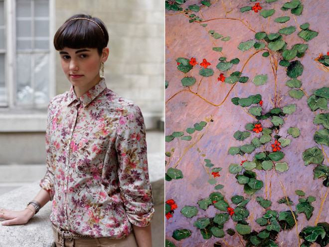
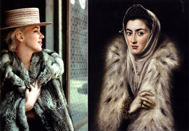
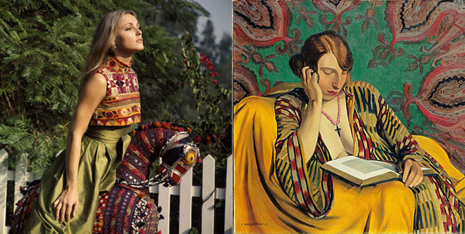
Diana Moss’s Image Comparisons
Graphic designer Diana Moss, of the Miss Moss blog, puts together these awesome color and style comparisons using outfits from street fashion photos (there’s a whole series using Sartorialist photos, like the ones above), stills from old movies, and magazine editorials and matching them up with the palettes and styles of everything from vintage packaging, to wallpaper patterns, to old master paintings.
The result is a visual feast for the design/fashion/color/art lover. Seriously, I feel like I could pore over these for hours, I love the nuances she finds and presents, and I love the comparisons between past and present.
Isn’t interesting to see that those with a great eye can make even a really quirky palette work, and that creative types have been coming up with those off-beat combinations for ages? See image with the dusky orange and lavender going on. A painter loved it then, a fashionista loves it now. Never would have occurred to me, but cool to see that these two great minds both thought of it!


honesty

Collector's Edition