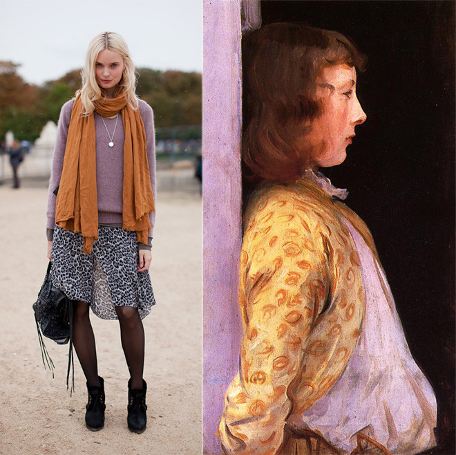
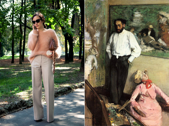
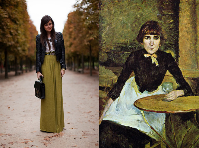
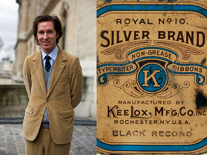
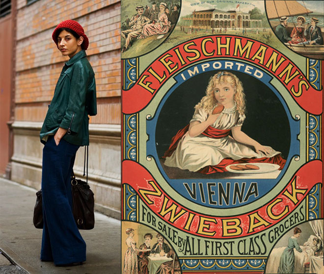
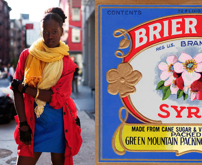
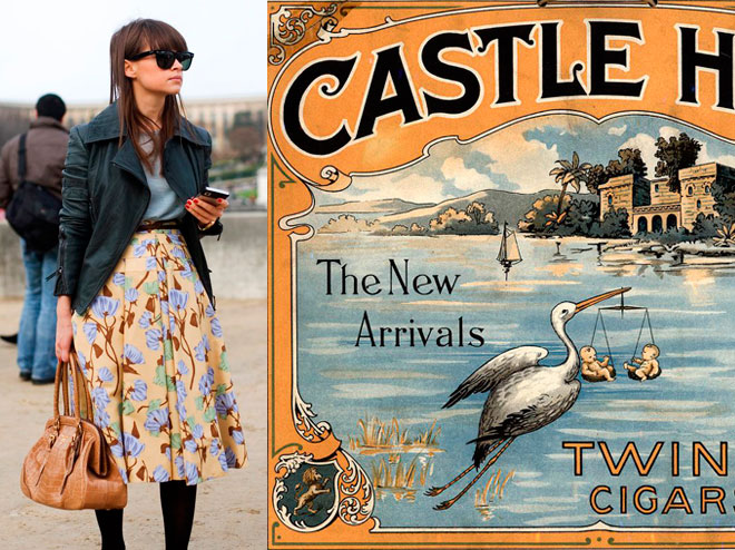
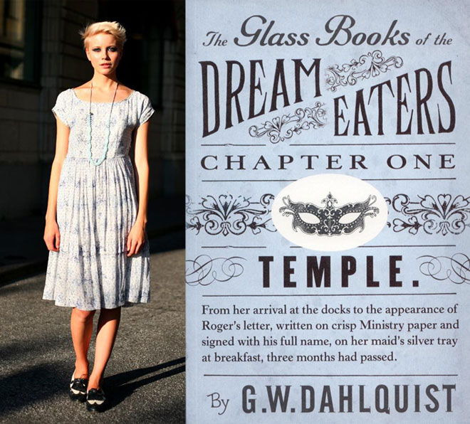
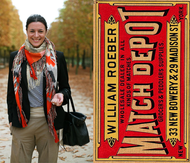
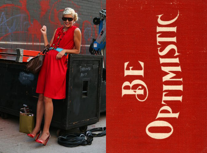
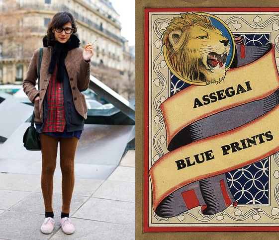
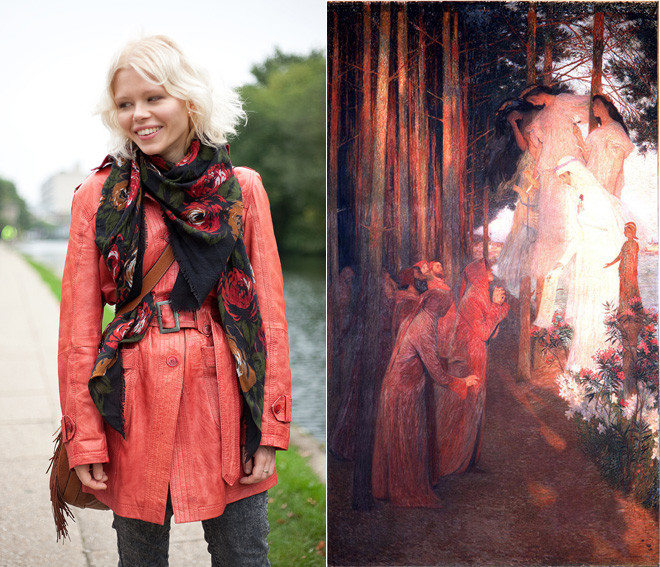
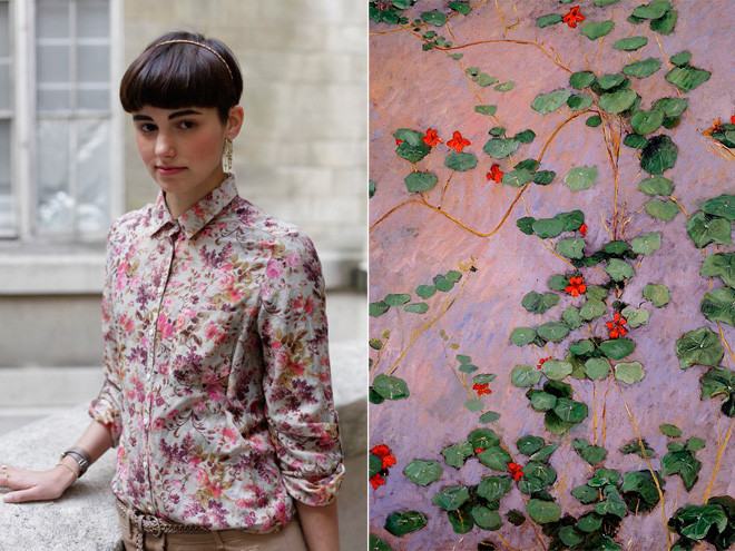
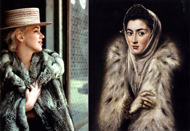
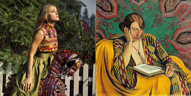
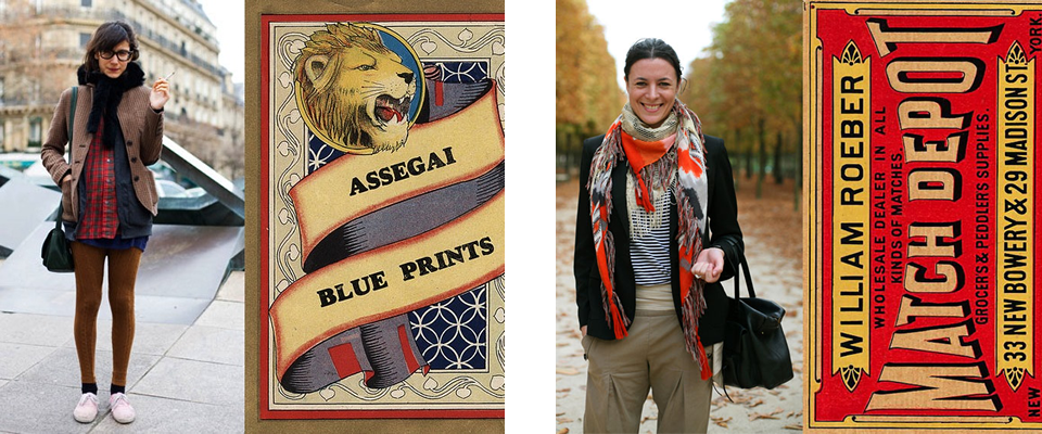
Diana Moss’s Image Comparisons
Graphic designer Diana Moss, of the Miss Moss blog, puts together these awesome color and style comparisons using outfits from street fashion photos (there’s a whole series using Sartorialist photos, like the ones above), stills from old movies, and magazine editorials and matching them up with the palettes and styles of everything from vintage packaging, to wallpaper patterns, to old master paintings.
The result is a visual feast for the design/fashion/color/art lover. Seriously, I feel like I could pore over these for hours, I love the nuances she finds and presents, and I love the comparisons between past and present.
Isn’t interesting to see that those with a great eye can make even a really quirky palette work, and that creative types have been coming up with those off-beat combinations for ages? See image with the dusky orange and lavender going on. A painter loved it then, a fashionista loves it now. Never would have occurred to me, but cool to see that these two great minds both thought of it!


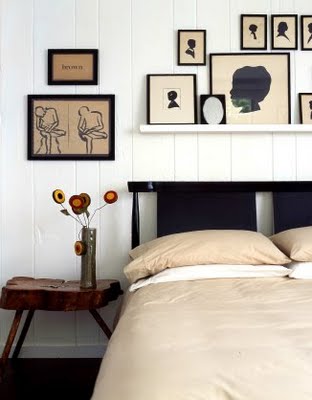
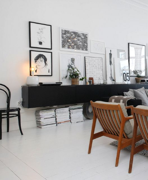
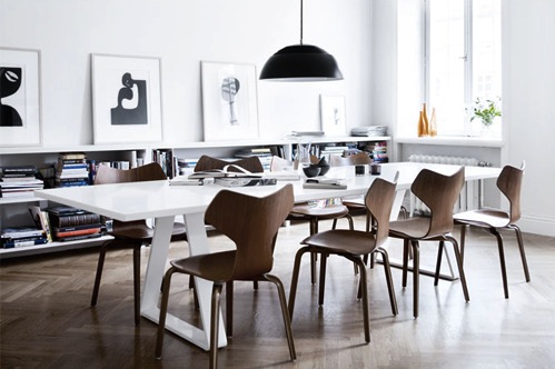
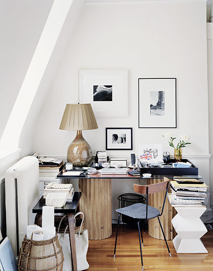
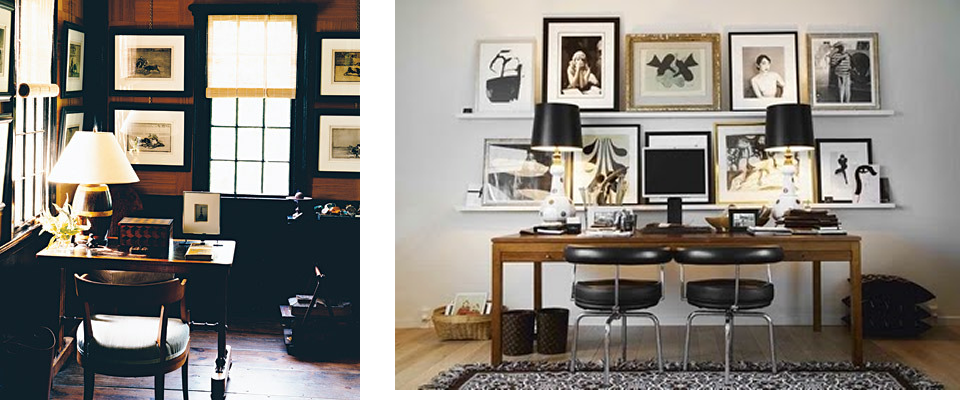
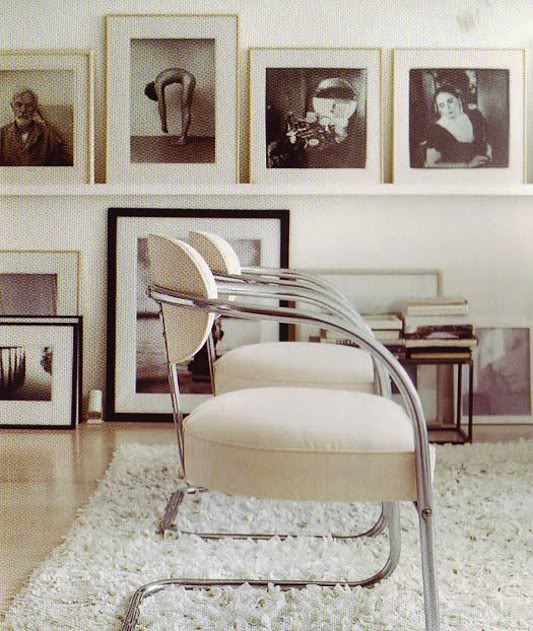
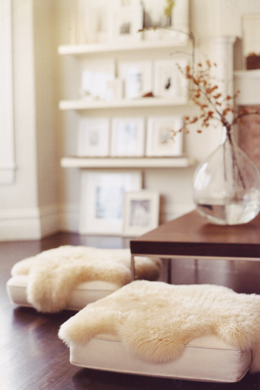
white, brown, black + art and books
My fixation with the restricted white/black/brown combo, generally with warm woods and leathers serving as the brown, just isn’t letting up. It’s amazing to me that without any color or pattern, just texture, style of furniture, architectural detail, finishes, and styling, this color story can communicate such a wide range of styles, from traditional cabin to modern industrial.
It’s like the little black dress of interior design. There’s a million little black dresses out there, but depending on the cut and material, they can be appropriate for a variety of body types and occasions. And then just changing the accessories can switch up the whole mood of the dress.
This time, a few examples that skillfully use art and books to keep the restricted palette from becoming too dry or impersonal. A well-accessorized LBD, if you well.


Cream and Christmas

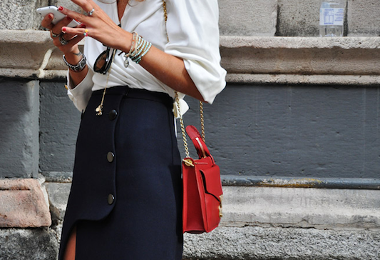
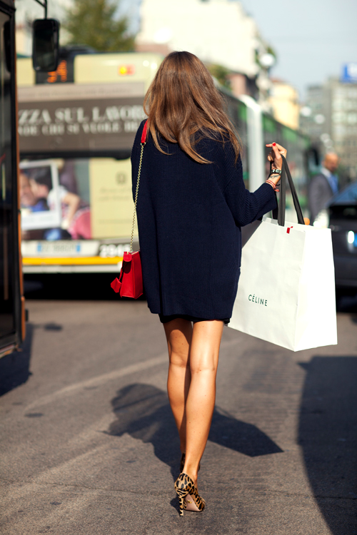
Red, White, Navy, Gold, Leopard
Loving >> Creams, Whites, and Neutrals + Texture


Leather/Wool/Silk/Suede + Cream/Olive/Navy/Cognac

Click through for details…
Colorscope

This is fun– without clicking on the image to make it legible, pick your favorite colors. Then click to see it larger and read what they say about you. It’s like a Seventeen Magazine quiz for grown ups*.
It’s from the Paper Source blog, and it is made using their product palette, and I think they did an amazing job selecting colors for their palette that look good together. Almost any three you put together look good!! Even if they are really odd combos! All about the same level of saturation and tint/shade (see more about the color sphere here**).
*read: “nerds”
**remember what I said about nerds?


