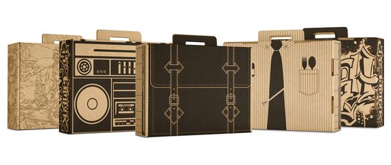
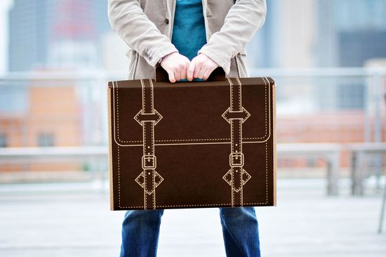
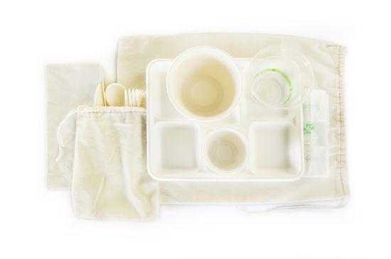
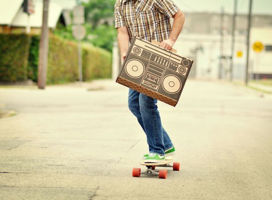
Posted by Eliza Coleman on July 14, 2010 · Leave a Comment
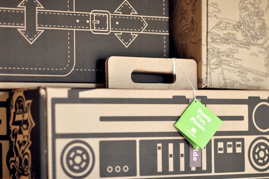
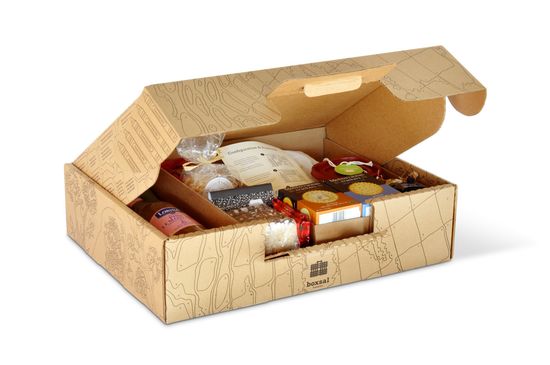
Totally sustainable, bio-degradable picnic boxes!
The Brand Hatchery created these as an in-house project, and they liked them so much that they decided to start a company,
Three Blind Ants, focused on “picnic and consumer fun” products!
Of course I the one that looks like an attache!
Even the utensils are bio-degradable!
[The DieLine]
Posted by Eliza Coleman on June 4, 2010 · 2 Comments
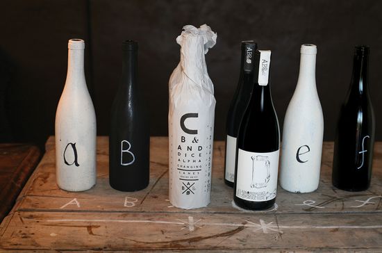
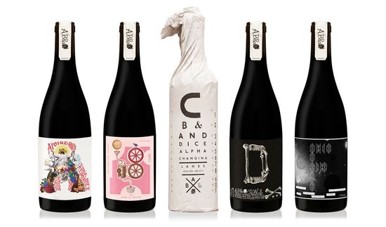
For a new project we’re gearing up for, I’ve been digging around looking at different kinds of wine labels that have been coming out recently, and I’ve noticed a couple of interesting trends…
One of them is the use of interesting typography and an emphasis on typography rather than imagery and logos.
Above, the ABCD&F line from Justin Lane, designed by Australia-based Mash, whose names and labels are each a letter of the alphabet, which then takes on a personality and story–
A for Apostle, B for Blood of Jupiter, C for Changing Lanes, D for Dead Winemakers Society, and F for Fog.
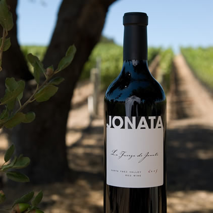
With no image at all and highly restricted palette, the graphic Jonata label stands out as clean and sophisticated and is a perfect example of a label that focuses solely on typography. It also happens to taste fantastic…
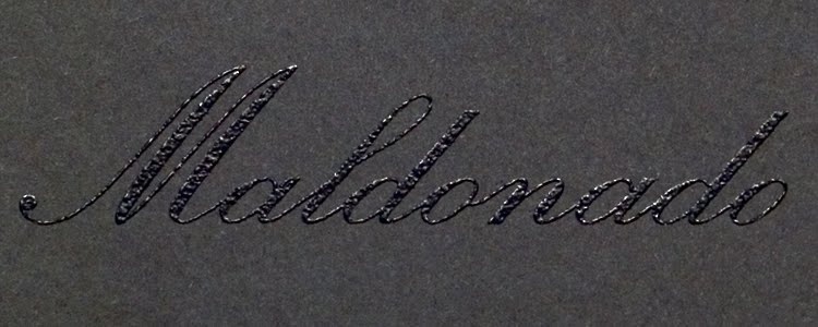
This Maldonado label, designed by Michael McDermott, uses black thermography and gold foil to emphasize the word alone.
Broadside deftly and cleverly uses typography to mirror the name of the wine and its meaning as an ad or leaflet printed on one side of a piece of paper and simultaneously underscores the “broad” portion of the word through the expansive font.
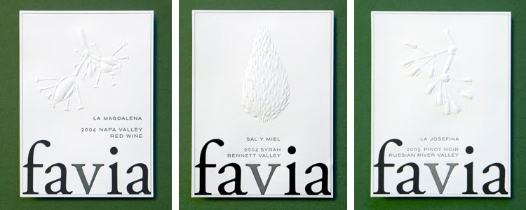
Favia, incidentally one of my favorite wines, uses blind embossing for the images used on the different labels so that the very simple, bold word is what always pops.

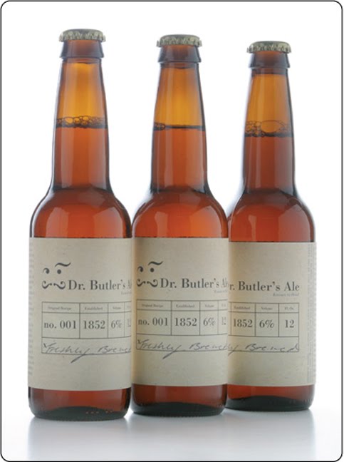
Ok, it’s not a wine, but I couldn’t resist sharing this beer, “Dr. Butler’s Ale,” whose labels are all faces made of characters from the Bodoni font. A student project by Ashley Lewis, the different faces are meant to represent the multiple crazy personalities of Dr. Butler, who was an infamously nutty “doctor” in England and used his ale as a cure for many ailments.
Love the back label as well… feels very apothecary-ish.
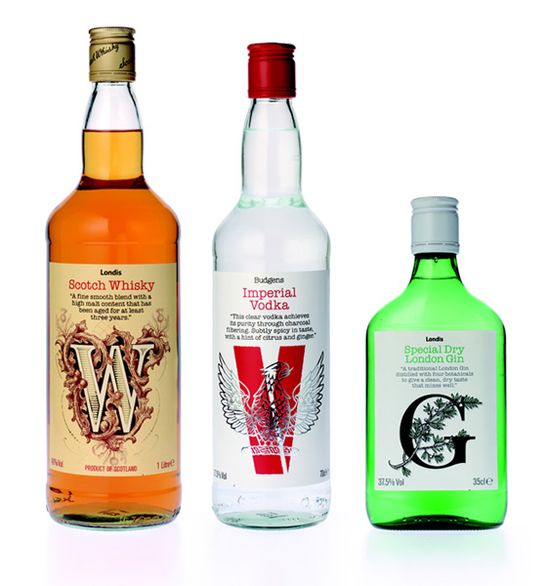
Again, not a wine, but thought this concept was clever — they used the first letter alone of each type of liquor to totally create it’s identity. And it works! They all have a totally different feel, communicated solely by the design of the letter.
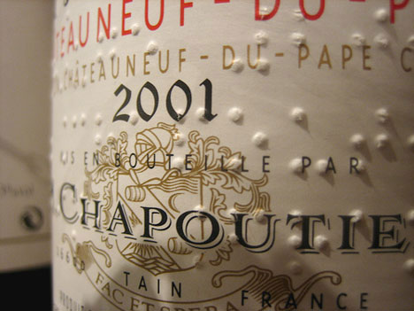
Starting in 1994, Chapoutier started included braille on its label, adding another kind of typography to the mix. The braille is a nod to the property’s history, but it also has a very cool graphic effect.
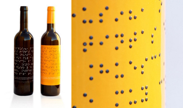
Lazarus Wines takes the braille thing a step further…
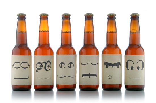
These next few labels combine creative typography with a touch of wit that communicates a message of “dropping the act” of the snobbery of wine. They are straightforward and intentionally avoid pretense. There’s nothing to read into, it just is what it says it is.
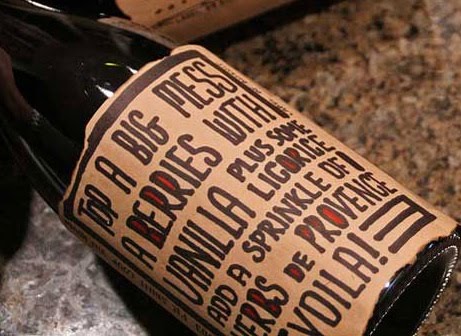
Love the idea of the label telling you what it tastes like in easy to understand, appetizing terms. By
magnificent wines.I can’t help it, I really, really like this concept of just a good, standby house wine being called House Wine. It’s so simple and conveys exactly what it is meant to be.
It might be bordering on gimmicky, but B Frank’s concept is pretty clever– you are meant to write on the label why you are sharing the wine with someone.
I even just like the idea that you are meant to write on it– how has no one ever thought of a label that the person buying it participates in in some way? It makes sense given that wine is frequently a gift and even more frequently something someone is sharing with someone else.
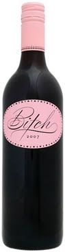
Ok I personally think this wine is so gimmicky I can’t stand it, but whoever designed this packaging was on to something and really nailed it– the girly-cute script used for “Bitch” and the all-pink label gauranteed this wine’s place at every bachelorette party since its debut.
More trends to come as the research continues…
Posted by Eliza Coleman on February 8, 2010 · 1 Comment
I absolutely do judge food products by their packaging, and here are a few recent favorites.
 Chocolates designed by Sonia Rykel for Laduree. Feminine, stylish, luxe chocolates for the discerning, dare I say snobbish, chocoholic. Three-color illustrations on packaging always works for me.
 I love French Bulldogs, and I love Laduree (for their macarons, but I’m not diametrically opposed to these truffles), so naturally, this box does it for me. Also how funny is it that they made a French Bulldog look fancy(ish)? I would name her Scarlett.

Particularly like the handwritten (looking) labels (and the sketches on the rosemary!) for Jamie Oliver’s JME line.
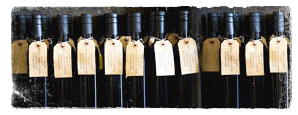 Maybe things just look better in bunches, but I love this shot of St. Helena Olive Oil Co.’s olive oil bottles. Actually, generally anything made with craft paper and/or resembling a luggage tag is right in my book.
Click the jump for more…
 Wonderfully simple homemade packaging by BBBCraft, via Design*Sponge. The look perfectly matches the product — it just oozes feelings of health, comfort, and simplicity.
 Pork rinds made cool in a classy wrapper* from Cochon. via this NYT article.
*Craft paper does it again.
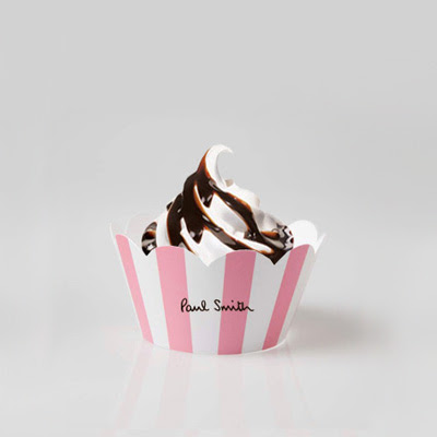 Clever marketing by Access Agency, via CoolHunter. Fun play on high-low– the Beverly Hills Hotel pink/white awning stripe + soft serve. But you know what I think is weird? At first I just thought they were inspired by the BHH stripe, but Paul Smith’s logo font is almost identical to Beverly Hills Hotel’s font… maybe that’s why the iconic pink/white stripe seems so fitting?? Maybe that’s where Access Agency got the idea? I mean the stripe + font is basically the whole BHH identity… wonder if it was intentional.
 Finally, just a cheeky poster via Happy Lady Eats by Jane Lang.
…I was actually just thinking the other day when I heard the song from which this line comes (thank you, 50cent) about how this would make a funny Valentine…
PS, this is not going to win any kind of packaging design awards, but is this for real??
« Previous Page


 Chocolates designed by Sonia Rykel for Laduree. Feminine, stylish, luxe chocolates for the discerning, dare I say snobbish, chocoholic. Three-color illustrations on packaging always works for me.
 I love French Bulldogs, and I love Laduree (for their macarons, but I’m not diametrically opposed to these truffles), so naturally, this box does it for me. Also how funny is it that they made a French Bulldog look fancy(ish)? I would name her Scarlett.
 Maybe things just look better in bunches, but I love this shot of St. Helena Olive Oil Co.’s olive oil bottles. Actually, generally anything made with craft paper and/or resembling a luggage tag is right in my book.
 Wonderfully simple homemade packaging by BBBCraft, via Design*Sponge. The look perfectly matches the product — it just oozes feelings of health, comfort, and simplicity.
 Pork rinds made cool in a classy wrapper* from Cochon. via this NYT article.
 Clever marketing by Access Agency, via CoolHunter. Fun play on high-low– the Beverly Hills Hotel pink/white awning stripe + soft serve. But you know what I think is weird? At first I just thought they were inspired by the BHH stripe, but Paul Smith’s logo font is almost identical to Beverly Hills Hotel’s font… maybe that’s why the iconic pink/white stripe seems so fitting?? Maybe that’s where Access Agency got the idea? I mean the stripe + font is basically the whole BHH identity… wonder if it was intentional.
 Finally, just a cheeky poster via Happy Lady Eats by Jane Lang.


