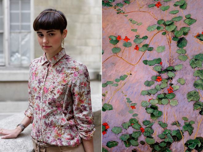
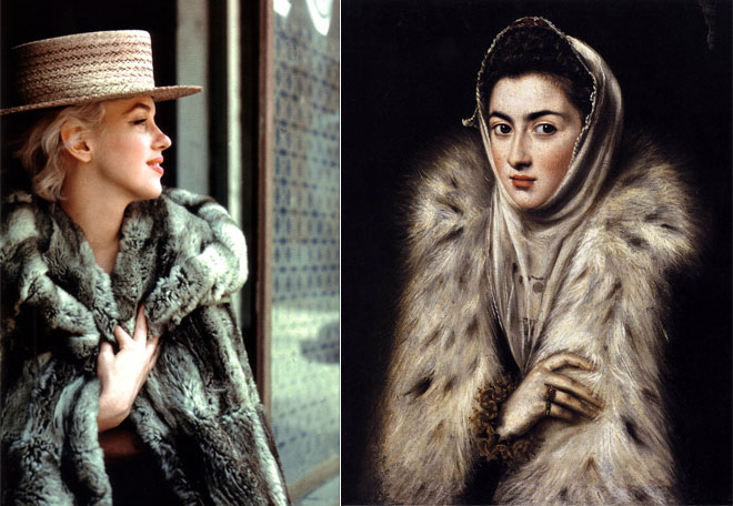
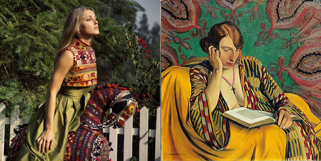
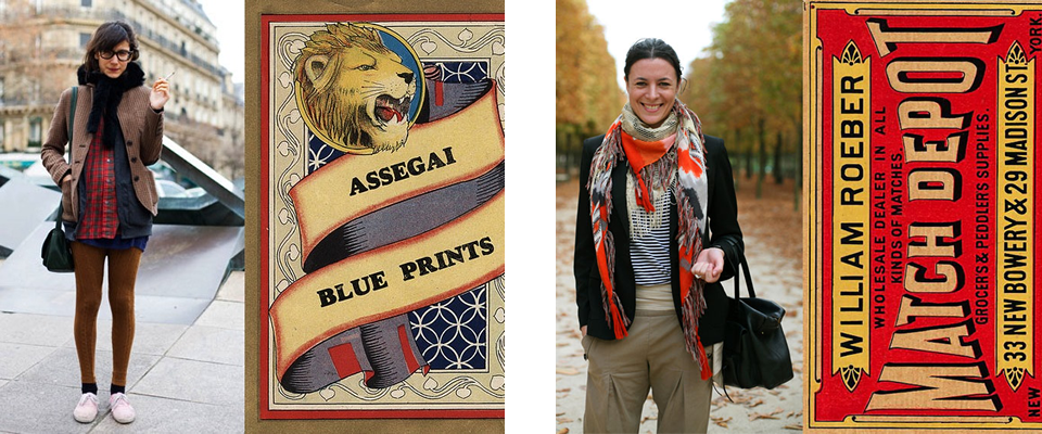
Diana Moss’s Image Comparisons

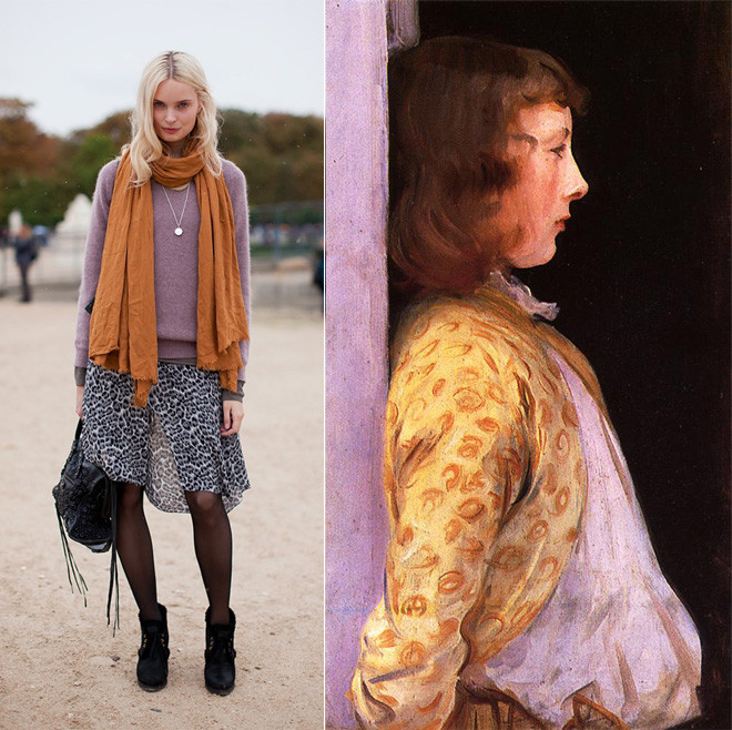
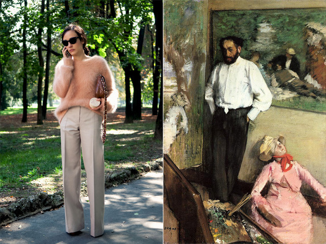
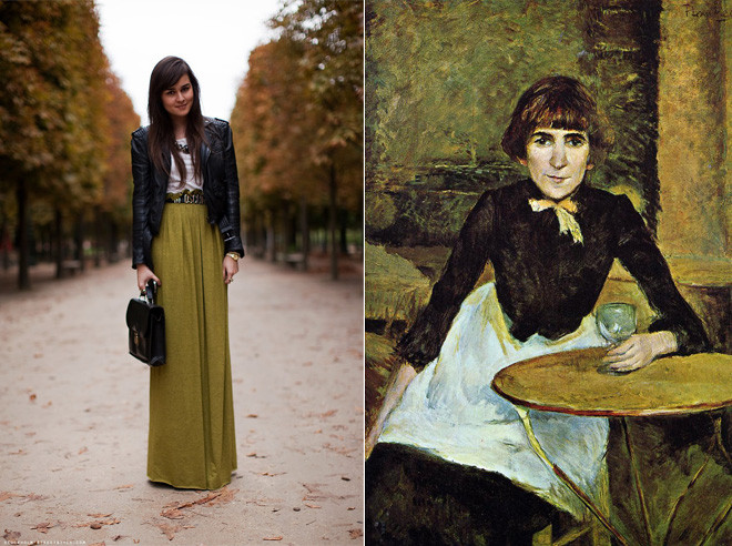
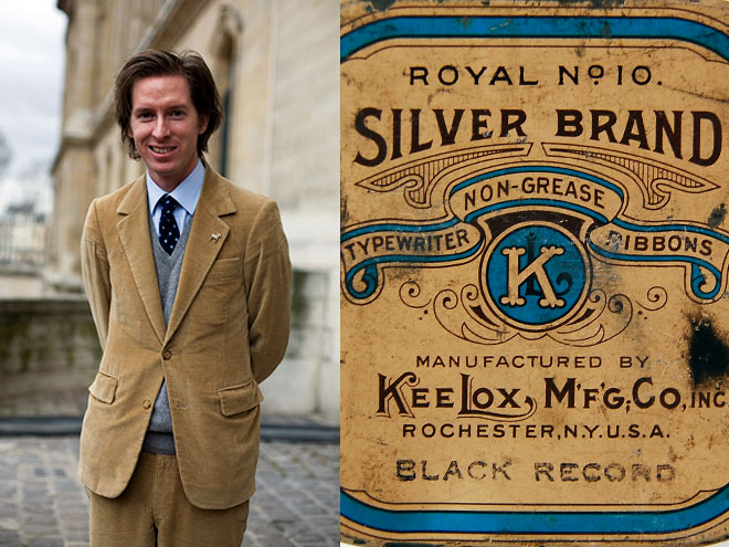
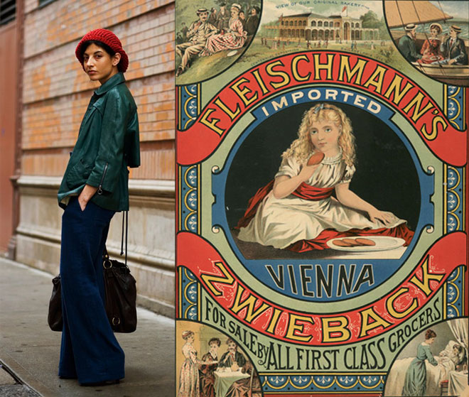
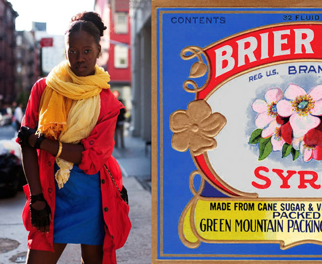
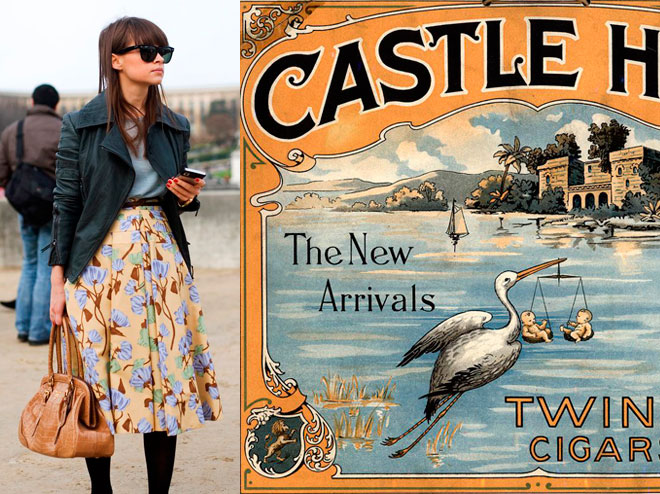
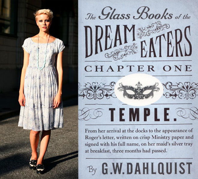
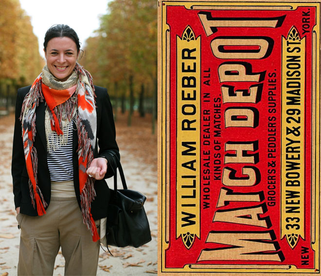
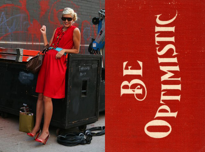
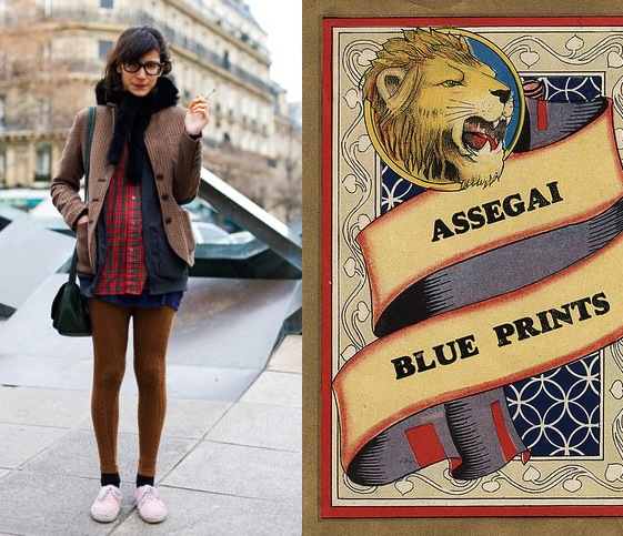
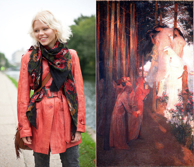
Graphic designer Diana Moss, of the Miss Moss blog, puts together these awesome color and style comparisons using outfits from street fashion photos (there’s a whole series using Sartorialist photos, like the ones above), stills from old movies, and magazine editorials and matching them up with the palettes and styles of everything from vintage packaging, to wallpaper patterns, to old master paintings.
The result is a visual feast for the design/fashion/color/art lover. Seriously, I feel like I could pore over these for hours, I love the nuances she finds and presents, and I love the comparisons between past and present.
Isn’t interesting to see that those with a great eye can make even a really quirky palette work, and that creative types have been coming up with those off-beat combinations for ages? See image with the dusky orange and lavender going on. A painter loved it then, a fashionista loves it now. Never would have occurred to me, but cool to see that these two great minds both thought of it!