Graphic Fix
Who Owns What
Graphic Fix
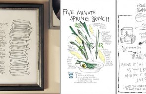
Paper Pastries
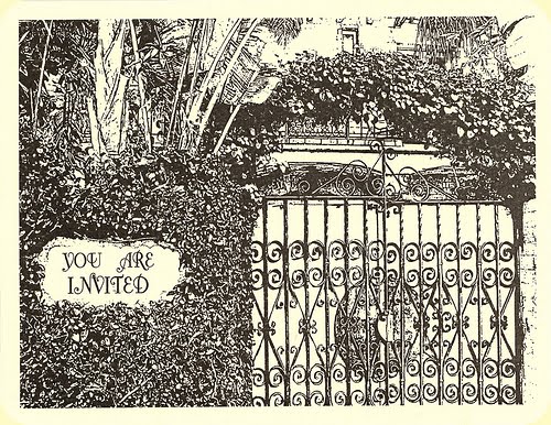
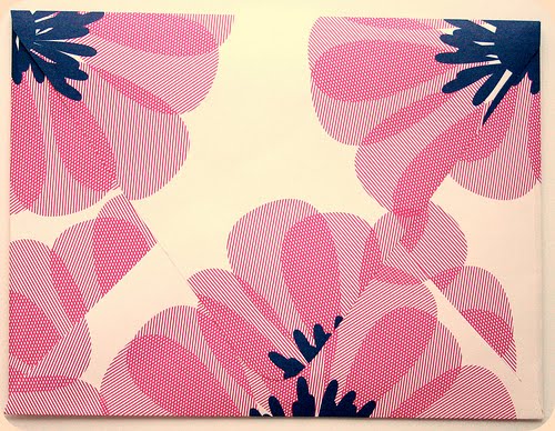
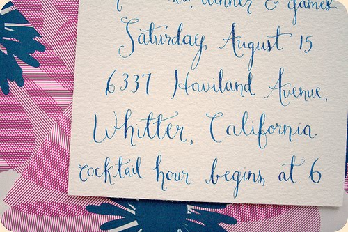
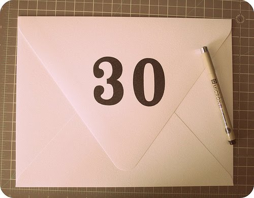
Pretty custom work by LA-based Paper Pastries.
Graphic Fix
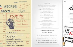
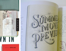
Wine Label Journal
Graphic Fix
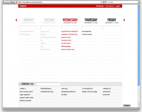
“TeuxDeux: A new, designy, simple TO-DO app”
I LOVE this to-do browser app. It is exactly what is says – simple and designy, which makes sense, as it was designed by Swiss Miss (the blogger, not the hot chocolate). It’s a per-week view, which I love, and after you type in to-do items, you can cross them off or move them to another day. I even love the name, my to-dos seem friendlier and more appealing as teux-deuxs.
There’s also the “someday” list that hovers at the bottom, which is brilliant b/c I always have those kinds of things and usually forget about them as they linger on days gone by in my planner.
If you set it as your home page, you are confronted with your to-dos every time you open your browser!
TeuxDeux here.
Graphic Fix
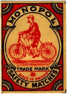
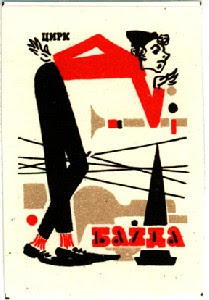
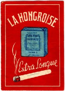
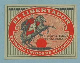
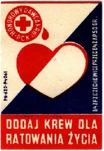
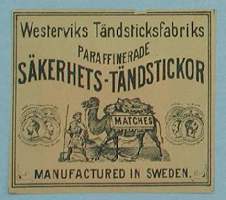
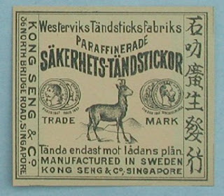
Vintage Matchboxes
The dealer, Style de Vie, here.
Graphic Fix
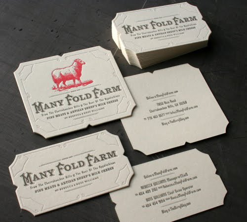
Many Fold Farm Identity System
Seriously. I’m totally hooked, just based on the identity system. That’s impressive for meat and cheese, something about which you really want to be sure of the quality.
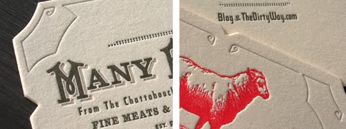
It’s not flashy or catchy at all, but the details work perfectly together– the font and its color, the image and its color, the card shape with its cutouts, the super-thickness of the paper, and the letterpress– to speak volumes about the quality of the brand. …Exactly what you’d want in an identity system.
By Studio on Fire for Many Fold Farm, which specializes in fine meats and cheeses. You can check out Many Fold Farm’s blog here.
images reblogged from Pixels & Arrows
Graphic Fix
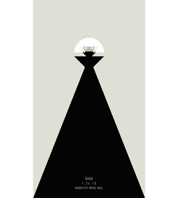
Fame Monster
Graphic Fix
Recent Packaging Favorites
I absolutely do judge food products by their packaging, and here are a few recent favorites.
 Chocolates designed by Sonia Rykel for Laduree. Feminine, stylish, luxe chocolates for the discerning, dare I say snobbish, chocoholic. Three-color illustrations on packaging always works for me.
 I love French Bulldogs, and I love Laduree (for their macarons, but I’m not diametrically opposed to these truffles), so naturally, this box does it for me. Also how funny is it that they made a French Bulldog look fancy(ish)? I would name her Scarlett.

Particularly like the handwritten (looking) labels (and the sketches on the rosemary!) for Jamie Oliver’s JME line.
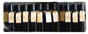 Maybe things just look better in bunches, but I love this shot of St. Helena Olive Oil Co.’s olive oil bottles. Actually, generally anything made with craft paper and/or resembling a luggage tag is right in my book.
Click the jump for more…
 Wonderfully simple homemade packaging by BBBCraft, via Design*Sponge. The look perfectly matches the product — it just oozes feelings of health, comfort, and simplicity.
 Pork rinds made cool in a classy wrapper* from Cochon. via this NYT article.
*Craft paper does it again.
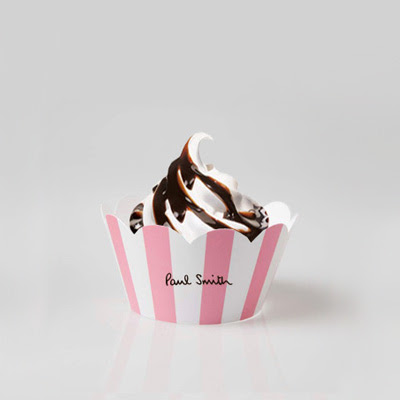 Clever marketing by Access Agency, via CoolHunter. Fun play on high-low– the Beverly Hills Hotel pink/white awning stripe + soft serve. But you know what I think is weird? At first I just thought they were inspired by the BHH stripe, but Paul Smith’s logo font is almost identical to Beverly Hills Hotel’s font… maybe that’s why the iconic pink/white stripe seems so fitting?? Maybe that’s where Access Agency got the idea? I mean the stripe + font is basically the whole BHH identity… wonder if it was intentional.
 Finally, just a cheeky poster via Happy Lady Eats by Jane Lang.
…I was actually just thinking the other day when I heard the song from which this line comes (thank you, 50cent) about how this would make a funny Valentine…
PS, this is not going to win any kind of packaging design awards, but is this for real??
Graphic Fix
Colorscope
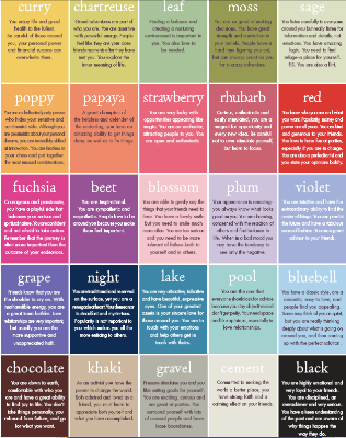
This is fun– without clicking on the image to make it legible, pick your favorite colors. Then click to see it larger and read what they say about you. It’s like a Seventeen Magazine quiz for grown ups*.
It’s from the Paper Source blog, and it is made using their product palette, and I think they did an amazing job selecting colors for their palette that look good together. Almost any three you put together look good!! Even if they are really odd combos! All about the same level of saturation and tint/shade (see more about the color sphere here**).
*read: “nerds”
**remember what I said about nerds?
Graphic Fix
The Devil’s in the Details
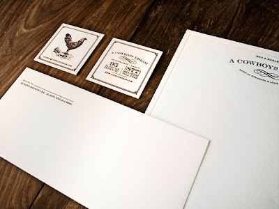
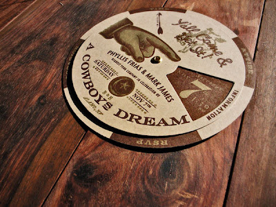
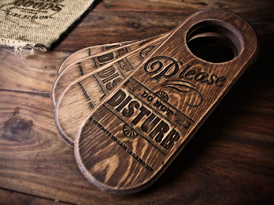
We’re currently picking up any and all tidbits that could inspire the branding and graphics package for the Mattei’s Tavern project (current logo design above), and I think this package by KURO collective for the A Cowboy’s Dream hotel is pretty awesome.
Click the jump for the rest of the post…
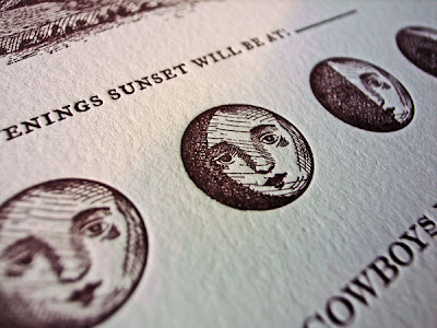
It goes way beyond a good logo and printed materials… they incorporate textures and objects that fit with the look of the hotel, like the wooden door tags, burlap grain sacks to hold toiletries, cast-iron skillet, and flask.
Love these brown glass bottles for the toiletries that look like they are from an old apothecary…
A comprehensive package like this can lay the foundation for a cohesive identity for a property. We want to make sure all the details, from room numbers, to key fobs, to menus, have a specific identity like this.
Also, as a side note, one thing we want to get exactly right is a picnic set people can take on hikes, so we’re constantly looking for cool bags and details, and I just came across these cool wooden utensils…

Utensils from Sprout Home via Happy Lady Eats, and Cowboy’s Dream materials found on Pixels & Arrows


