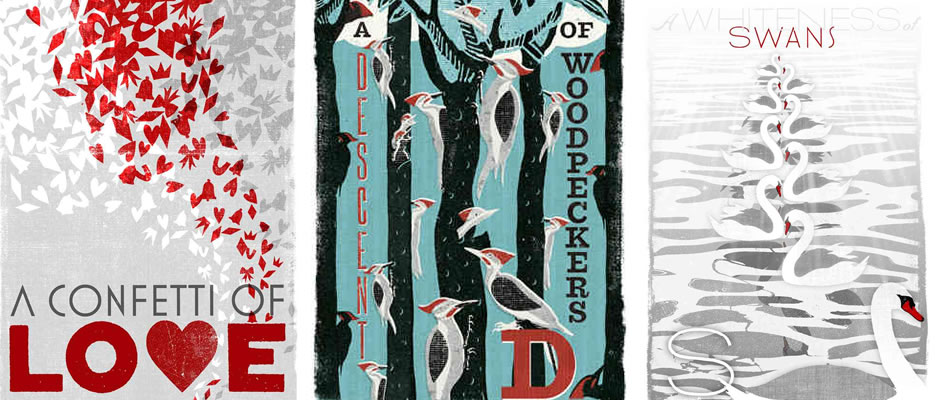
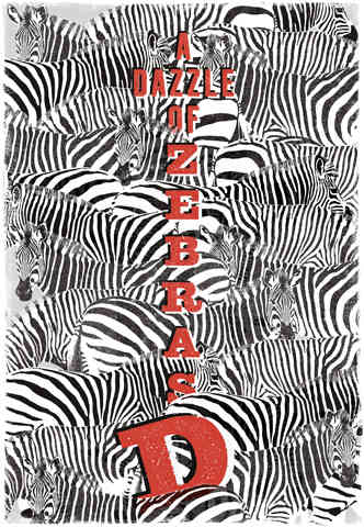
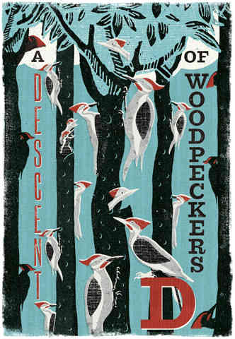
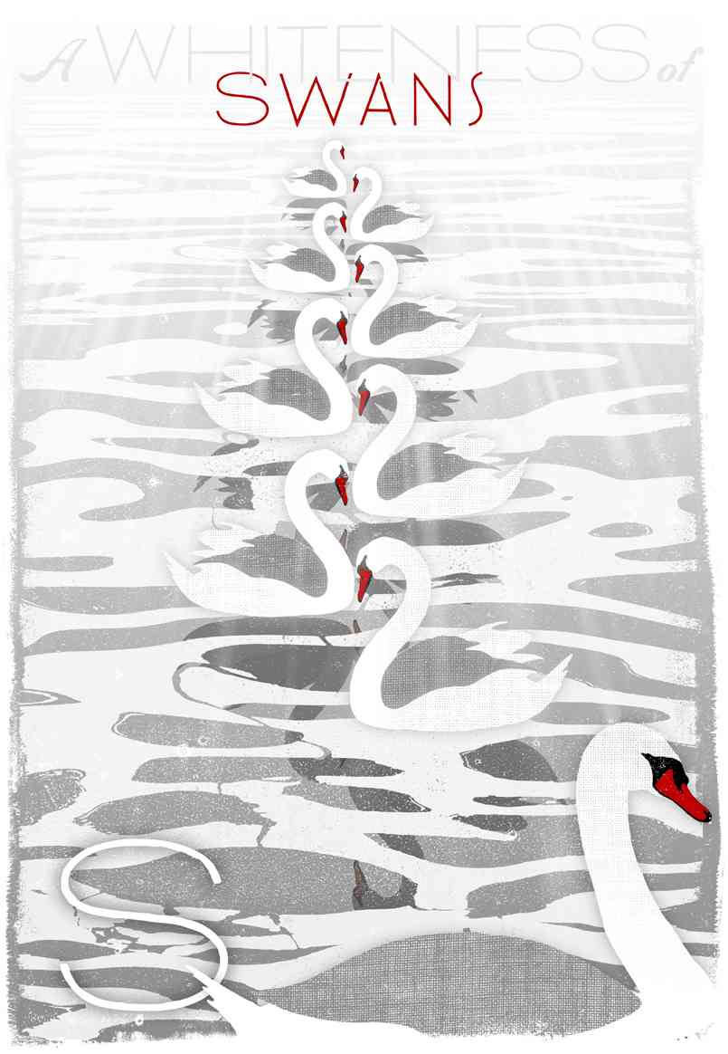
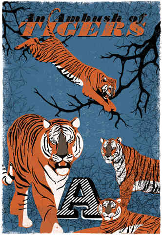
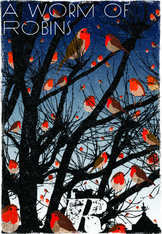
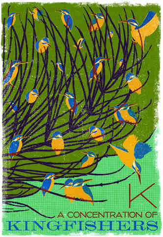
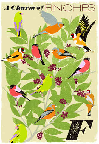
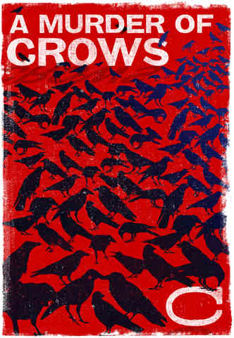
Collective Noun Posters
How fun are collective nouns?? This seriesof posters were created by WOOP Studios (who are also the graphic designers of the Harry Potter series) to celebrate collective nouns, which are, as they put it, “one of the eccentricities of the English language.”

It’s true! How random that we have terms for gatherings of so many different things? Terms that you really rarely use, and actually never need, considering they all mean “group.” I love it! They’re so evocative! “Murder of crows,” “parliament of owls,” “charm of goldfinches,” “party of jays” … the bird ones are some of my favorites.
I think a collection of these posters (sadly there’s no collective noun dedicated to posters, or I would have used it!) would be so cute in a kid’s room!


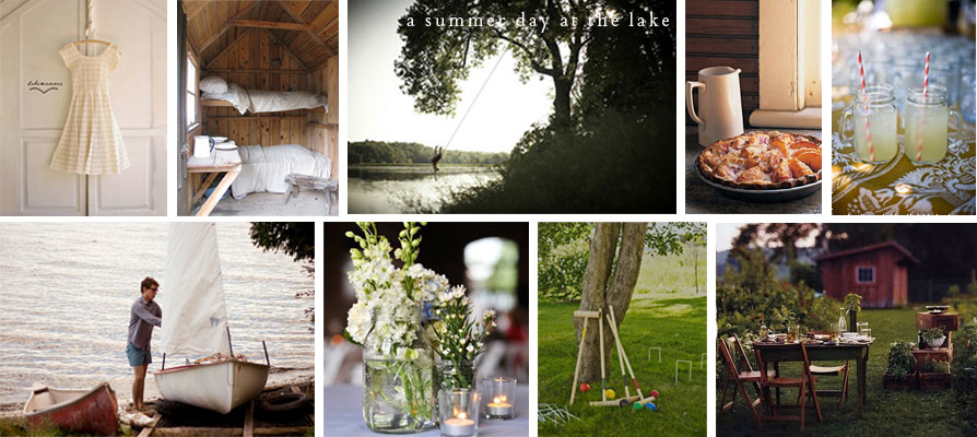
A summer day at the lake…
Rope swings, lemonade, bunk beds, wildflowers in mason jars, peach pie, sailing, al fresco dining… ahhh summer!
Hi wonderlusters, above is a post I put together for the Cultivate site (remember Cultivate, my real job?), where I’m also blogging! Check out the post for details (including a recipe for peach pie from my darling colleague Nicole and a recipe for that lemon grilled chicken below), but I wanted to share here because the post was inspired by a summer day at Lake Chautauqua, and I’m headed there in a few short days to stay with my oldest sister and her family!

And, I really couldn’t be more excited. Another of my sisters is joining too and bringing her one year old son, William, who I am absolutely enamored with, so, this is basically going to be the best summer vacation ever!
Oh, and in case that wasn’t enough, before I get there, I have my cousin’s wedding in Asheville, NC this weekend!! So much to look forward to!!!!
A quick congrats today to two of my sisters and their husbands– Ali and Charles and Leslie and Tim– who had a double wedding on this day 20 years ago! I’m so so happy for y’all and your cute families and so glad to be your little sister/sister-in-law/aunt!
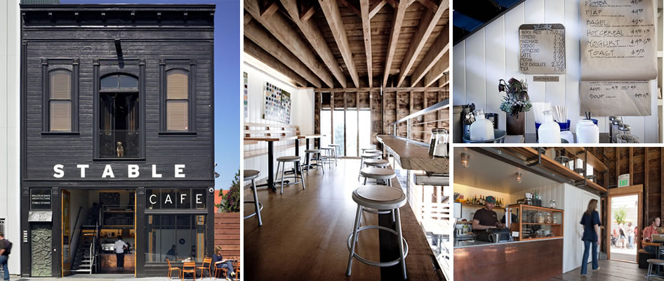
Stable Cafe
Isn’t the exterior of this cafe awesome? I love the black and white scheme on an old building, the font, and the huge doors that open to reveal a peak inside at that copper bar front and staircase.
I came across a pic of the outside and immediately googled the name to see if I could find pics of the interior, and I discovered it’s right here in San Francisco! In the Mission, no surprise. The story of the cafe is pretty neat too. Dwell already told the story magnificently, so I’ll just bring it to you in their words!
“San Francisco’s Mission District is known for its vibrant and often contrasting cultures—Mexican paleta wagons share the sidewalk with Twittering hipsters slinging crème brulée, produce markets sell tropical fruit and dried chiles beneath gilted Victorians, and murals line otherwise neglected alleyways. But it was far from all of this Mission buzz where architect Malcolm Davis and his partner, chef Thomas Brian Lackey, decided to turn a run-down building into a high-design home for their shared passions. On a retail-free stretch of Folsom Street, Stable Cafe has become a new anchor for the community.

The concept Davis and Lackey began with was loosely based on one Davis had once seen while traveling in England. “Sir Richard Rogers and his wife Ruth have the River Cafe in London,” Davis explains, “We thought it was such a neat idea that the architect was working next to his partner, the chef, who was growing vegetables right there between the two businesses. Stable is a little humble version of that—they have the Thames and we have Mission Creek!”
When Davis and Lackey found the 19th century carriage house that would become Stable, it was in dismal shape—graffitied on the exterior and falling apart inside. But the pair immediately saw the potential of the soaring ceilings and an adjacent vacant lot. “There was a great opportunity for daylight in the kitchen,” says Davis, “Most kitchens have low ceilings and get really hot; they’re more like a factory.”

A factory it is not, but the kitchen at Stable does much more than feed the cafe’s customers. The expansive, sunlit heart of the building is an incubator for a number of small food-related businesses that use Stable as their commissary. Zoning required that the cafe comply with industrial preservation codes, meaning it had to operate production, distribution or repair on the site. Davis and Lackey viewed this as an opportunity rather than an obstacle. “Thomas Brian had been very interested in opening a commissary kitchen,” Davis recalls, “He liked the interaction and creativity that comes out of a group of people running different food businesses in a shared space. It makes for a lively, kinetic kitchen experience.” Today nearly a dozen culinary entrepreneurs make up the Stable Collective, producing everything from empanadas to dog treats and selling them in the cafe and elsewhere around the city.

While the kitchen plays a central role, Stable has plenty of other programs in play. In the front of house, an inviting cafe serves locally-roasted coffee, breakfast and lunch all day, as well as tapas and drinks in the evening. At the rear of the building, sliding doors open onto a private event space that can be used for dinners or gallery exhibitions. Running along the length of the side wall, the vacant lot has been turned into a landscaped courtyard. And upstairs, an office suite houses Malcolm Davis Architecture.
It’s been just one year since Stable first opened in their tucked away location, but in that time they’ve managed to bring the Mission buzz to them. With community support as a central tenet of their operations, they’ve organically grown a network of neighbors and friends who regard the cafe not just as a place to eat and drink, but as a venue that welcomes and embraces their ideas and invites collaboration for special events.”
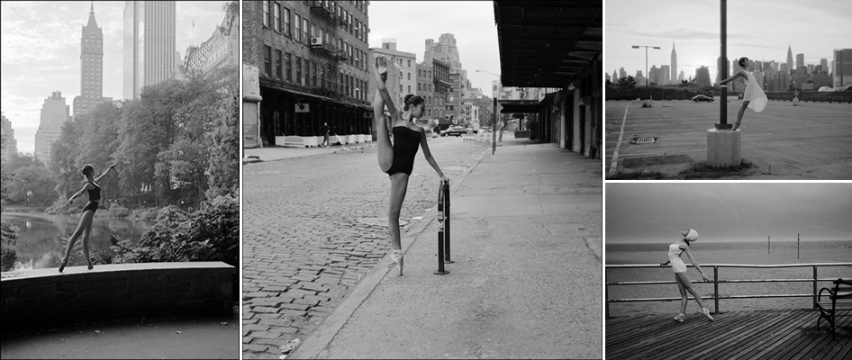
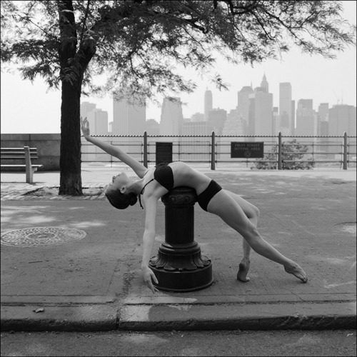
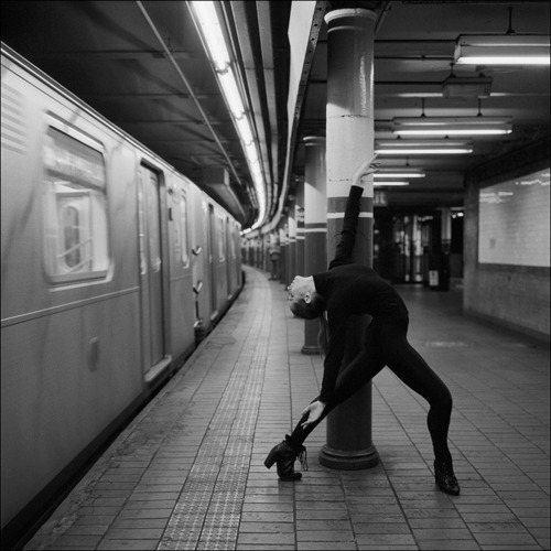
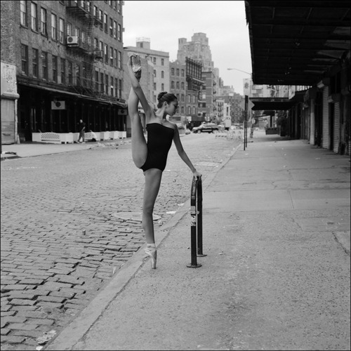
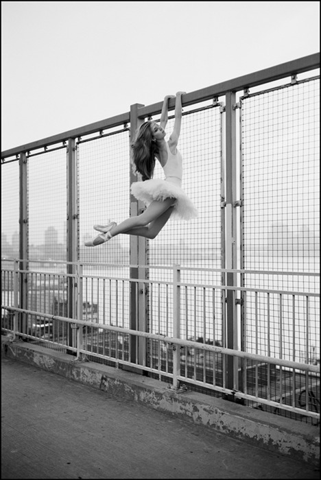
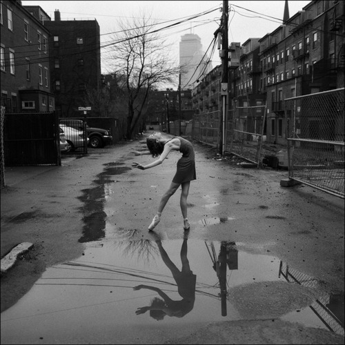
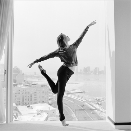
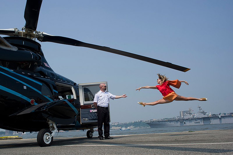
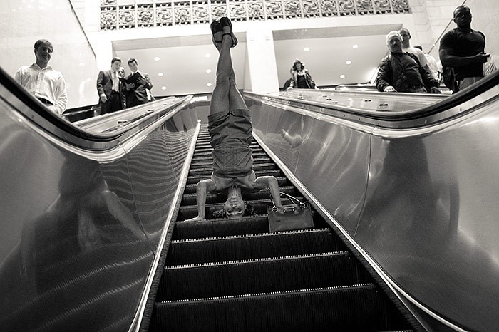
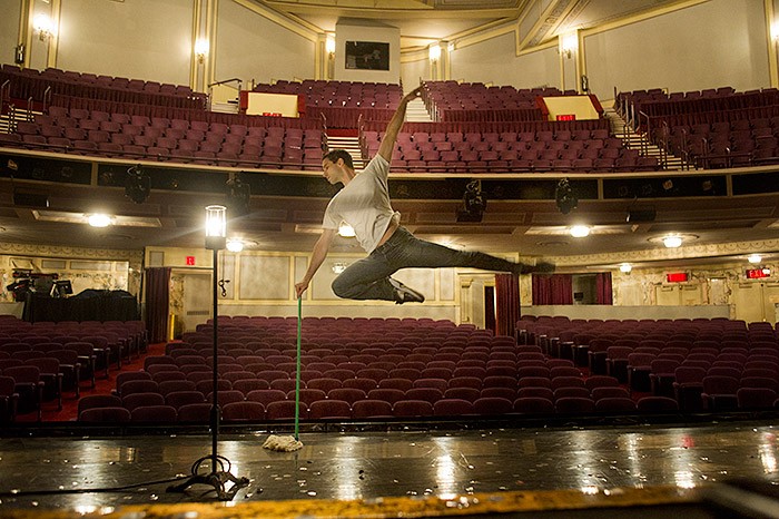
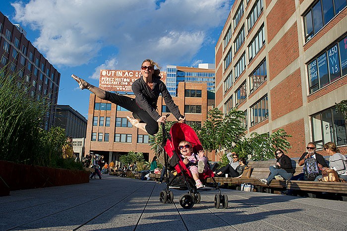
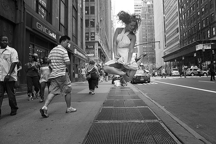
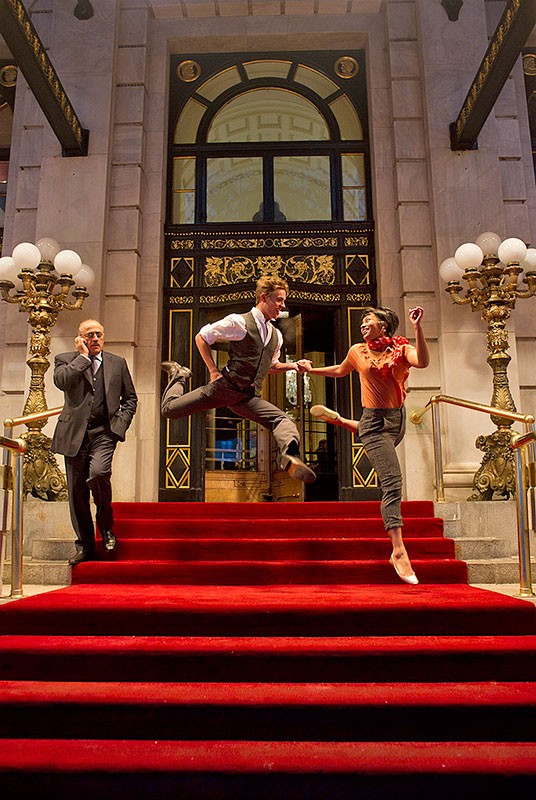
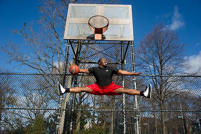
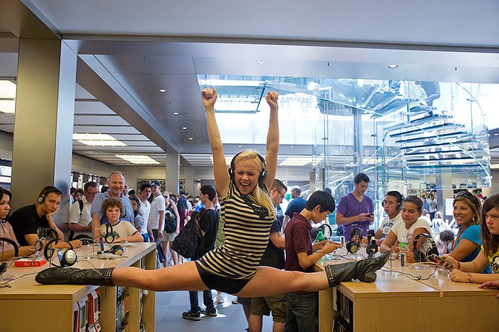
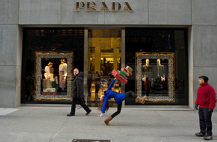
Dancing in Public
Two photography projects for you today with a few things in common: professional dancers dancing/posing in public in NYC.
One is called The Ballerina Project (black and white photos above) and takes a more serious, emotional approach (aren’t they beautiful?), and the other is called Dancers Among Us and has a little bit more of a fun, humorous, Improv Everywhere feel to it, capturing dancers in normal street clothes surprising crowds with a sudden leap or twirl (that’s the technical term- twirl) (photos in gallery– mostly color).


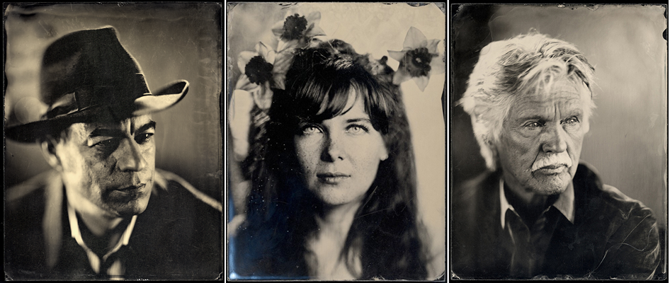
Collodion Process Photography
Wow wow wow. Loving, adoring, and super impressed by the work of Daniel Carrillo, a photographer who is working using the archaic wet collodion plate process to take portraits.
Isn’t it amazing how the images above look like they should be super old, because you recognize the old-timey style, but the subjects let you know they’re modern?

Introduced in the 1850s, the process was nearly extinct less than ten years later. It did remain in use for specific needs and in different forms through the 1960s, but the complicated process kept its use limited for obvious reasons (see below for more on the process). It’s also similar in a way to silver gelatin printing, but with the main distinction that wet collodion plates had to be developed immediately on the spot. Sally Mann has used collodion process, but other than her work, I’ve never seen it anywhere else.
I’m so glad Carrillo (and I’m sure others who I don’t know about) are keeping this art alive, the images are SO beautiful!!! The amazing tonal range and short depth of field combine to create such a unique style.

Check out this video of Carrillo talking about his work and describing the process for more info:
Here’s a description from wikipedia of how it works, which hilariously starts with the phrase “The process is simple.”
The process is simple: a bromide, iodide, or chloride is dissolved in collodion (a solution of pyroxylin in alcohol and ether). This mixture is poured on a cleaned glass plate, which is allowed to sit until the coating gels but is still moist. The plate is then placed in a silver nitrate solution, which converts the iodide, bromide, or chloride to silver iodide, bromide or chloride. Once the reaction is complete, the plate is removed from the silver nitrate solution and exposed in a camera while still wet. The plate loses sensitivity as it dries, requiring it to be coated and sensitized immediately before use. It must also be developed while still moist, using a solution of iron sulfate, acetic acid and alcohol in water.
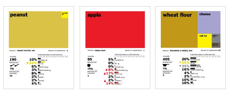
Redesigning Nutrition
I hadn’t ever thought about it before I saw this article, but the nutrition label that comes on the side of every packaged food really is in desperate need of redesign. So, GOOD held a contest to come up with a new design! Above is the winning entry, below, a few others.
Isn’t it amazing how design can totally change the way we understand and process information? Compare how you process the info in the label concept at top vs these below. Your understanding of the food really differs with the different designs! The FDA really is about to redesign the nutrition label, hopefully by combining ideas from all these entries, they can come up with something that is easily understandable and will lead us to better eating choices!

It also reminded me of this project I came across a while back– a conceptual redesign of the boarding pass…. I now think about this every time I fly, wishing my boarding pass were something visually pleasing and easy to understand like this!


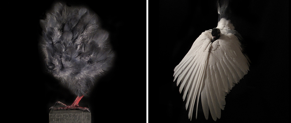
Conceptual Taxidermy
This is admittedly weird, and I’m not totally sure what I think about it, but it sent me on such an involved train of thought that I wanted to share it with you and get your thoughts.
Mathieu Miljavac, who formerly spent 10 years doing detailed embellishment for the couture fashion houses of Paris, now creates “conceptual taxidermy.” He learned the art of traditional taxidermy, but then took it another direction, where the animals are not posed as they traditionally would be (like the bird above right), animals not usually preserved by taxidermy (like a house mouse), or in some cases, a sort of new animal is created using only some of the parts of the original animal.
That sounds so morbid and creepy, but the results are rather amazing looking, or at least thought-provoking, like that feather fluff ball with one foot, above left. What do you think? Too twisted? Disrespectful of the dignity and beauty of the original animal? (Btw, the animals all died natural deaths.)

This also reminded me of the great article Vanity Fair ran in 2008 after the fire in the famous Deyrolle taxidermy institution in Paries. If you missed that article and/or don’t know about Deyrolle, read the article. Especially if you’re creeped out by taxidermy, it will shift the way you view it. (Deyrolle was also the set of one of the parties in Midnight in Paris!)

Then also it reminded me of these photos taken of Deyrolle after the fire, which chronicled a bizarre “second death” of the taxidermied animals.

Ok and finally, to lighten the mood a little, the bird at top right reminded me of the “night time… day time!” bird at the beginning of the video below. My littlest niece and I watched this vid about 10 times in a row, and if there’s any metric for measuring silly humor…
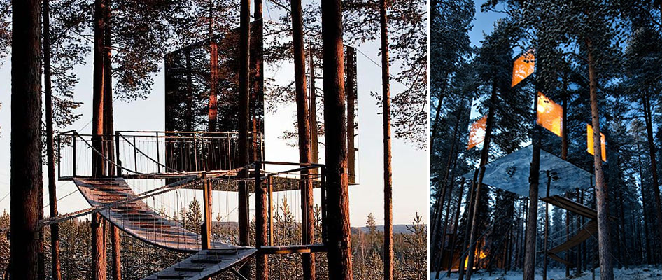
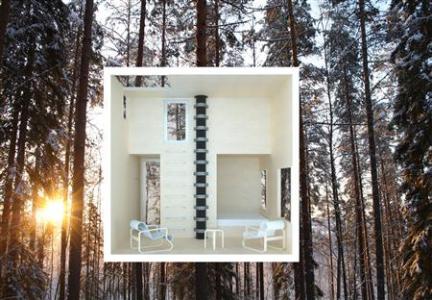
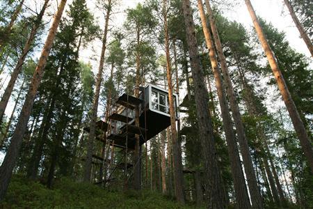
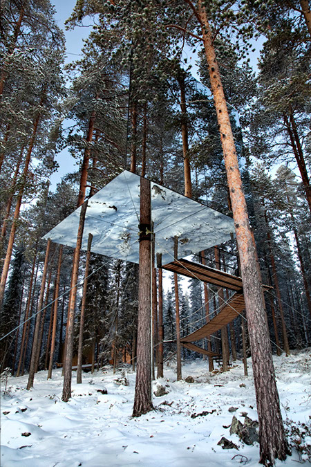
Treehotel
That striking creation you’re looking above is a room in the Treehotel in Sweden. How awesome is that? Treehotel has six treehouse rooms, each with a completely different concept and design. The room above is called the Mirrorcube, and is by far my favorite.

Aside from the modern high-design aesthetic of the structures, the concept of the hotel is based around a complete retreat-to-nature approach, eschewing even snowmobile tours for their noise in favor of guided nature hikes. With the location in Lapland, 60km south of the Arctic Circle, guests are able to experience not only the surrounding nature, but also the phenomenon of midnight sun in summer and the Northern Lights in winter. You’re already staying in a treehouse, and then you add an experience like that, and really the whole thing could not get more surreal!
Check out the video below for more info…

For more treehouse posts, click the “treehouses” tag under “labels” in the info for this post.
Curated by:
Eliza Coleman
Section:
Destinations
Labels:
architecture, hotels, treehouses

Street Style Favorites
Just a round up for you of some recent favorite street style finds posted to the “tumblr”– formerly Editor’s Chair. Especially loving for summer: silk button-ups, scalloped edges, white lace, heels with cropped jeans (white, black, or denim), mini dresses, and as usual, blazers. Emmanuelle Alt remains the coolest tomboy ever. Check out the tumblr for the full size pics and more!

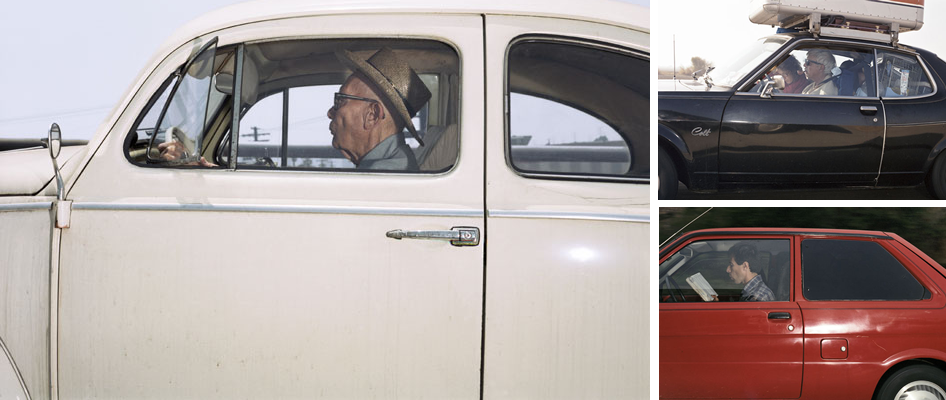
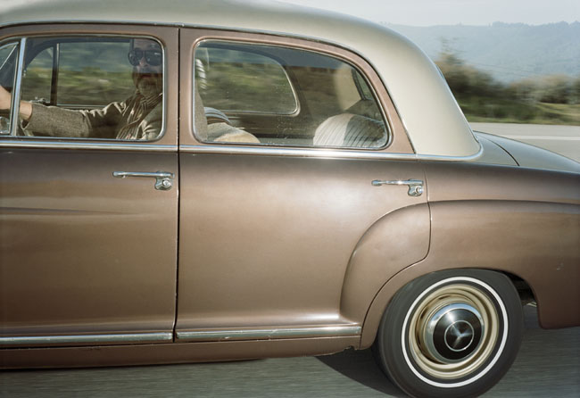
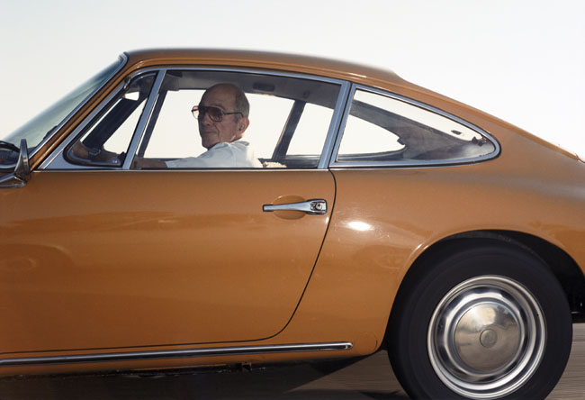
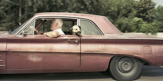
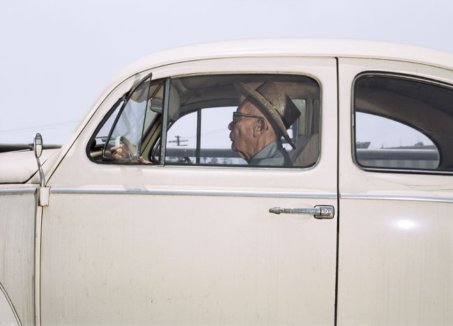
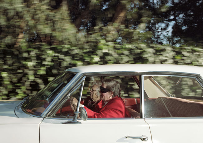
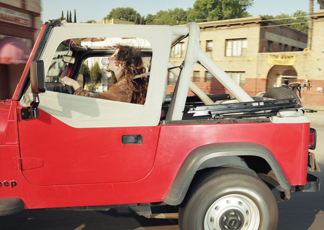
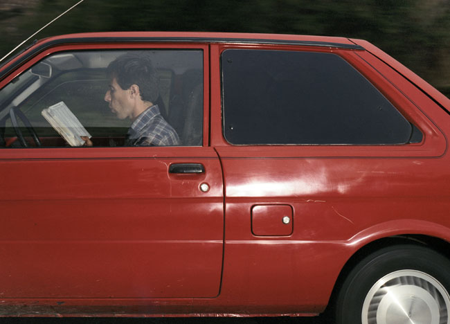
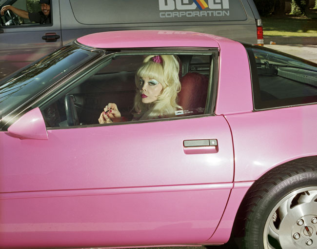
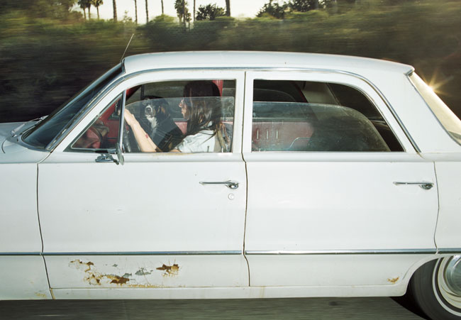
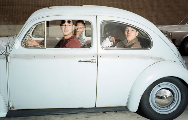
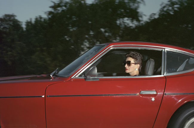
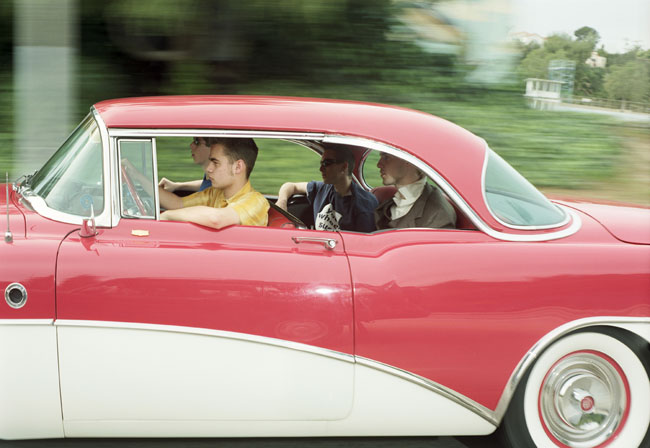
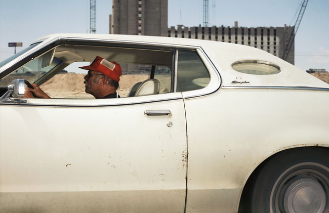
Drive
You know how when you’re in the passenger seat while driving on the highway, it becomes a total preoccupation to look at people in the other cars? (And then it’s really awkward when they look back at you? But you still can’t resist?)

Well, Andrew Bush cleverly turned that preoccupation into an photographic project, which he has now turned into a book. Most of the photos were taken in the early ’90s on the highways of LA (perhaps the best place in the country for capturing car culture), so in addition to being an awesome chronicle of people in cars, it’s also an interesting little time capsule of LA in the early ’90s.

Pretty amazing how the cars on the road have changed since then. Time flies, no? Looking at these made me feel old for the first time in my life. Also, why oh why are cars not still painted with those flat colors? I detest the current glittery (truly, look up close, they’re glittery), pearlescent paint colors on cars today.

This gent above was on the highway in Montecito– are you surprised? It’s so perfect. Check out his site for more photos, and for captions– the captions are occasionally hilarious in a very dry sort of way, often for the verb he chooses for “drive” to go with the person.
You can order the book here. [Via Swiss Miss]