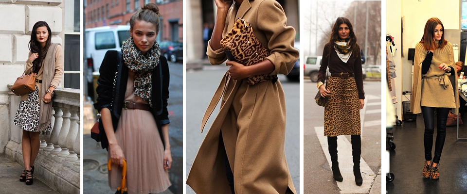
Neutral Layers + Leopard
I love these compositions of neutrals with leopard. That is all.
Pixar Behind-the-Scenes
I won’t beat around the bush, this whole post is an excuse to show this behind-the-scenes tour of Pixar from the New York Times. I am totally fascinated by animated movies. That may sound random, given that it doesn’t have a lot to do with the other interests I express on this blog, but I am so amazed by how the creators of animated movies have to think up and create an entire world from top-to-bottom!
As they say in the film, in a normal movie, if you have a scene in a grocery story, you just go out and scout the perfect grocery store. In an animated film, you have to create the whole thing from scratch! Even all the little products sitting on the shelves!
Thinking about it puts my mind on the exact same loop as the part in Inception when they talk about how your mind creates buildings and cities etc. in your dreams.
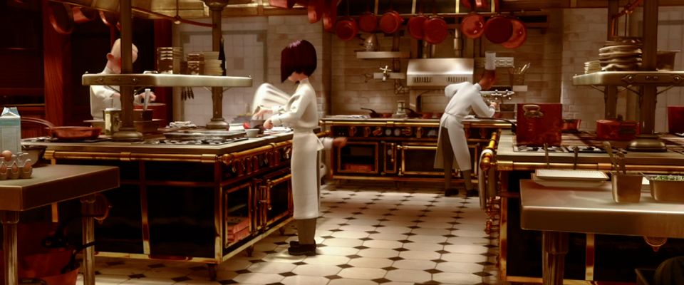
So, I totally loved this little preview into the world of Pixar, creators of my favorite animated movie I’ve seen yet– Ratatouille. The kitchen design alone was enough to make me fall in love (see above). The dozens of black and brass La Cornue ranges (oh the dreaming that animation allows… in real life that would be like $300,000+ worth of ranges!), the infinite copper pots and pans, the black and white tile floor… it’s spot on!
Highlights: That Steve Jobs oversaw the design of the Pixar building and “designed it for forced collisions of people; he felt best meetings were meetings that happened spontaneously in the hallway.” The fact that they cast animators like hollywood casts actors, depending on their strengths and style. The speakeasy behind a false bookshelf with guest book– I want one of those in my house someday.
PS- If you are as fascinated by animation as I am, check out Pixar’s website, they have great little factoids about the films, like these ones below:


Curated by:
Eliza Coleman
Section:
Masters and Their Crafts
Labels:
animation, kitchens, video
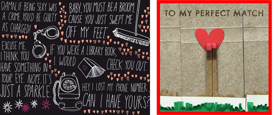
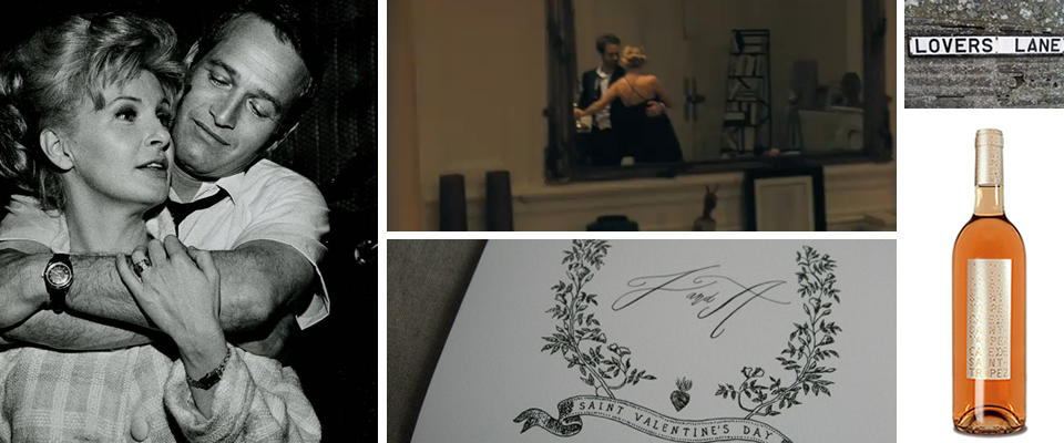
Send a Valentine…
Last year, one of my very favorite Valentine’s things I came across were the e-cards from Kate Spade, which are designed by a handful of the Kate Spade team’s favorite graphic designers, and I was so excited to see that this year’s cards came out today!
They all have a wonderful handmade and/or cheeky slant to them and are a far cry from the cheesy e-greetings you may be recalling from 1999 when people first got into the idea of e-cards. Click here to send your own e-Valentine’s!
Here are a few of my favorites this year…
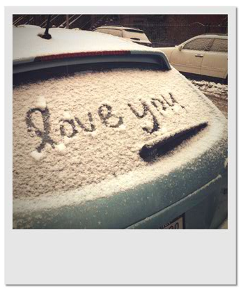
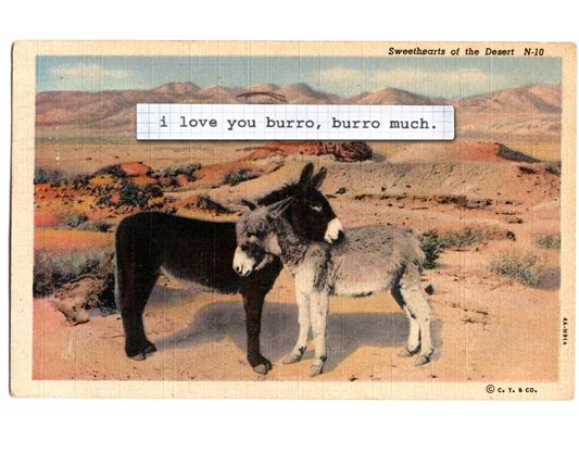

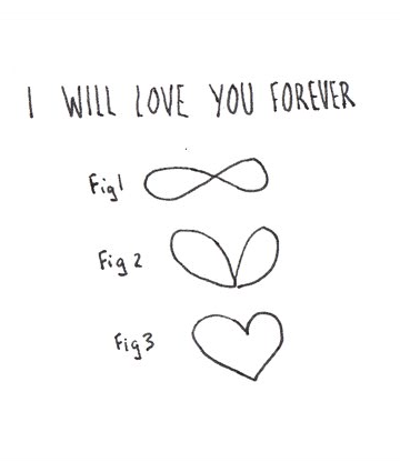
Valentine’s at top are by Julia Rothman and Alice Lam.
Curated by:
Eliza Coleman
Section:
Sentimentalism
Labels:
Graphic Design, illustration, valentine's

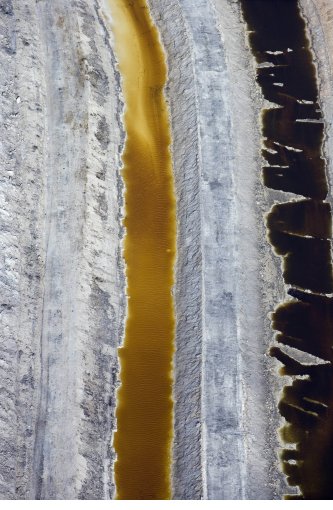
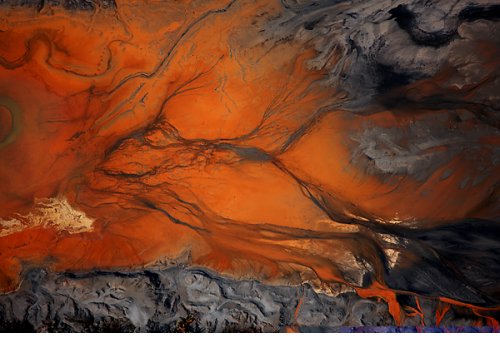
Abstraction of Destruction
What you’re looking at above is:
At left: Oil floating on the Gulf of Mexico after the Deepwater Horizon spill.
At right: Residue stream of water and chemicals resulting from coal washing.
Freaky, right? The images appear so beautiful at first and could initially be thought to be colorful abstract paintings, and even once you realize they’re photographs, you’d probably think the colors have been manipulated and you’d still be wondering what they are photographs of. Where, you’d wonder, can colors like that be found?
Well, unfortunately, the answer is ‘at the sites of manmade waste and disaster.’ J. Henry Fair’s new exhibit, “Abstraction of Destruction,” at the Gerald Peters Gallery, draws our attention to the messes we are making in a roundabout way. No harsh photos of birds covered with oil or babies with birth defects; instead, we are drawn in by the other-worldly colors before we realize that they are the freakish by-products of our own manmade processes.
Check out the gallery for more images and captions describing what each image is. I think the grossest is from the bacon factory…


Curated by:
Eliza Coleman
Section:
Arts Visuels
Labels:
aerial photography, Photography
Recently on Editor’s Chair
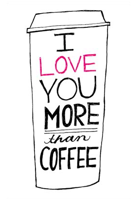
Some recent Valentine’s-esque inspiration on Editor’s Chair…
Are you excited for Valentine’s Day? I know I am! I love Valentine’s Day. Sure, it’s over-commercialized, and sure, if you’re single it can make you feel bitter, but why not just embrace as a day to celebrate love? In high school I used to make my girlfriends Valentine’s mix CDs, and they all always tell me that they still have those CDs! Because really, who doesn’t love love?
But if you’re not convinced, I promise, there’s tons more on Editor’s Chair that has absolutely nothing to do with Valentine’s Day. Click over to check it out…
Curated by:
Eliza Coleman
Section:
yes to all
Labels:
calligraphy, packaging, Paul Newman, wine
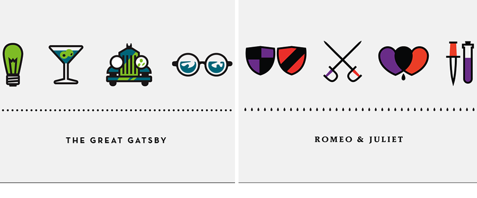
Minimalist Movie Posters
Like the “unsheets” I posted a while back, these movie posters by Kyle Tezak have an awesome minimalist style; they say a lot with very little.
Here’s what Tezak says about the project:
“Lately I’ve been working a lot with icons. Trying to capture the essence of an object or idea with only a few lines and at the same time maintaining its elegance is pretty much design in a nutshell. That’s what is so great about icons, they’re tiny poems. I decided it would be a fun project to attempt to sum up some of my favorite books, movies, historical events, anything, with just four icons; the meat and potatoes.”


Curated by:
Eliza Coleman
Section:
Graphic Fix
Labels:
Graphic Design, posters, unsheets
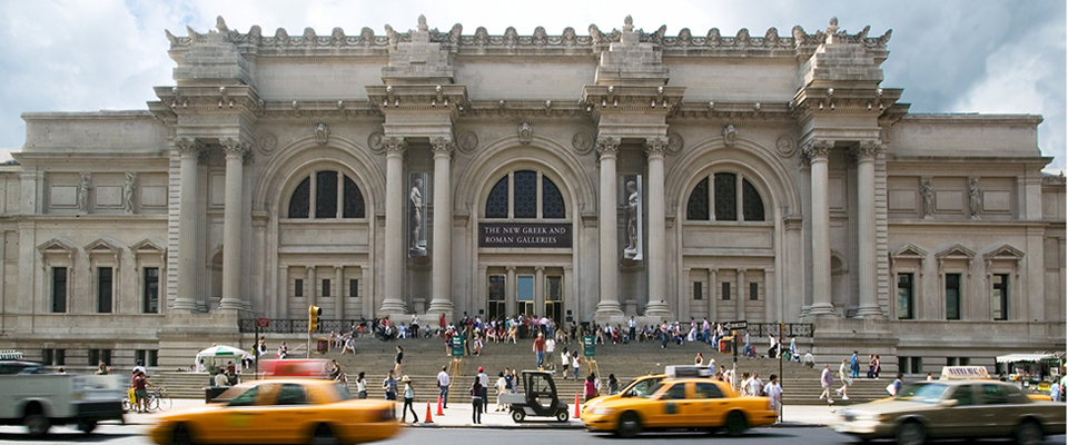
Google Art Project
Have you seen this? Google’s new “Art Project” site uses their street view technology to allow you virtually tour participating art museums (right now 17 are on board)! You control where you move and “look” by clicking the in-picture arrows (just like on google maps street view), and you can click on a work to zoom in on it– and you can really zoom– check out the still from the video below showing the zoom on Starry Night.
I’m pretty sure this is a closer-up view than you could get even in-person since you have to stand a couple feet back when you’re in the museum and can’t put your eye three inches from the canvas!

Here’s a screenshot showing what it looks like when you’re “in” one of the rooms. See the arrows on the floor? That’s how you pan around.

Check out the video to see how it works…
Even though I think this is super cool, I’m not sure I can totally tons of practical uses for this, except, I have to say, as an art history major at NYU, this would have been amazing for those assignments when you were instructed to go to a particular room at the MET or MoMA and pick a work to talk about it because you of course didn’t know exactly what was in that room, and hence there was no way around actually going to the museum. Which was fine, since I love museums, except when it was freezing and snowing and I hated having to trek uptown. Then, this little gizmo would have been AWESOME.
And regardless of the practical uses (or lack thereof), I love that Google used all its technology and wizardry to create something related to making art accessible! [via]
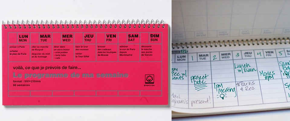
le programme de ma semaine
I love this planner. Small enough to fit in your purse, just two basic boxes per day– an am and a pm (does it bug anyone else when there are lines for each and every hour of the day? It just makes me feel bad about myself that I don’t have something to write onto every single hour, and my to-dos tend to fit more free-form into my day anyway, so then I don’t know where to write them.), and plenty of room on the reverse of the previous page to jot other notes (another common planner downfall– when there’s no spare room to write notes besides the boxes for each day).
And the spiral-binding allows it to lay flat! One of my must-have features for a planner. I hate when they won’t lay flat on your desk.
And, it’s cute.
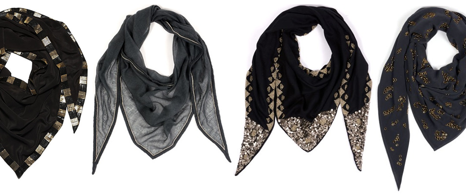
LustList: MOIO Scarves
Just came across these scarves by French brand Moio and I am seriously lusting after them. Created by two friends, Ionia and Monia, Moio only designs scarves. How fun is that?!
My go-to outfit is a good, well-fitting white t-shirt and jeans dressed up with either some interesting jewelry or accessories, plus good shoes and jacket, and I think these scarves would be a perfect addition to my standard outfit!

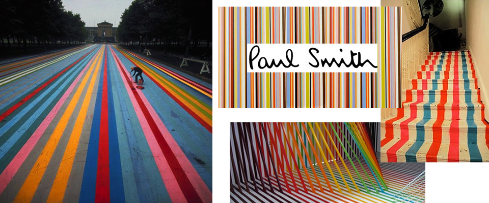
Gene Davis and Multicolored Stripes
I came across the above street painting by Gene Davis today on Black*Eiffel and totally fell in love. Seriously, how could you not just love this street painting? How fun is that? I would be so elated if I stumbled across something like this in real life without expecting it. Nothing like an unexpected bit of creativity in the world.
Typically, Davis just painted stripes on canvases, but he did the one above street painting in Philadelphia, in front of the Philadelphia Museum of Art, and then in 1987 and again in 2007, a group got together to honor Davis (who had died in 1985) by painting a similar scheme on a street in D.C., where the artist had lived for most of his life.

But in addition to loving the street paintings, this sent me into a multicolored stripe-inspiration frenzy. Paul Smith has used multicolored stripes to great effect, as has Kate Spade on the stairs of the London store. I’m also a big fan of the multicolored stripes used in Rebecca Ward’s tape installations and even Ball-Nogues Studio’s thread installations. Now I’m wondering if they were all inspired by Gene Davis! Isn’t cool how your picture of the world keeps making more sense as you learn more and can piece together what/who inspired what/whom?
It makes me want to paint some bright stripes somewhere fun and unexpected. Maybe the inside of my medicine cabinet doors?
Curated by:
Eliza Coleman
Section:
Arts Visuels
Labels:
artist, installation, Street Art


