Arts Visuels
Urban Play
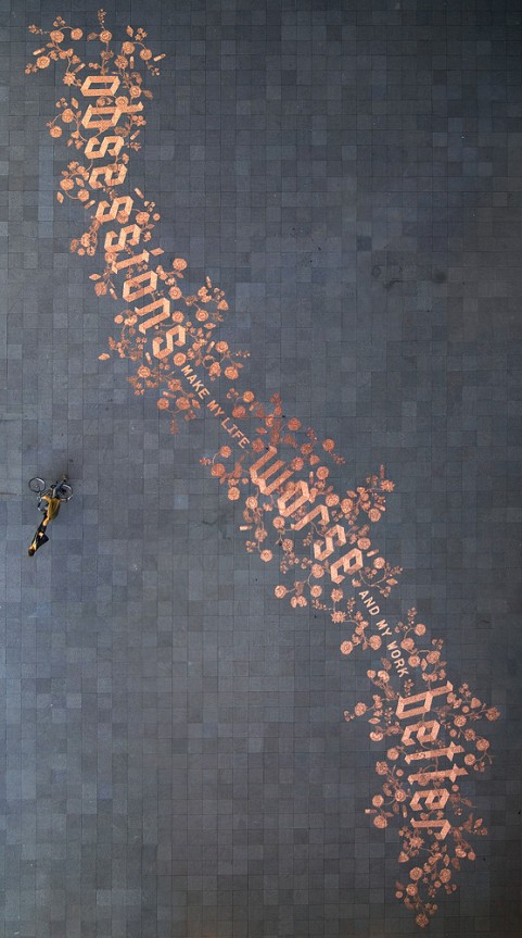
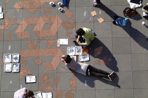
Graphic designer Stefan Sagmeister, in collaboration with lettering guru Jessica Hische and 150 volunteers, created this public installation in Amsterdam composed of 250,000 eurocents proclaiming, “Obsessions make my life worse and my work better.” After it was finished, the installation was left unprotected to see how the public would interact with it.
About 20 afters after it was complete, when the plaza was empty, a man came through and started picking up the coins and putting them in bags. A neighbor, concerned that someone was “stealing the artwork,” called the police, who tried to find the artist, and when they couldn’t, they called a city cleaning company to bag up all the money and put it in a safe until they could reach the artist. Ha!
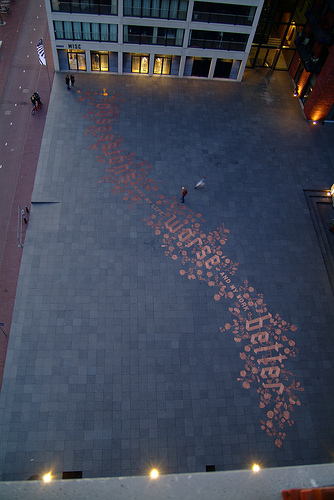
More on Sagmeister’s site here, including a timelapse video of the installation.
Jessica Hische website here (tons of awesome typography/graphic design stuff to explore).
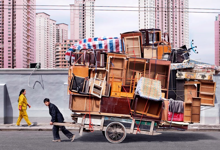
Arts Visuels
This is real.
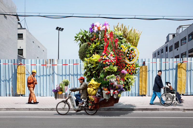
Photos by Alain Delorme, shot in Shanghai.
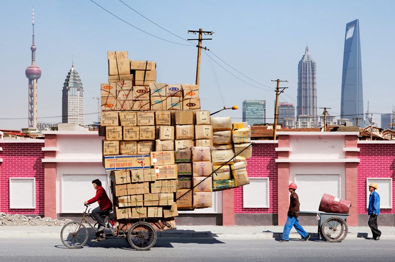
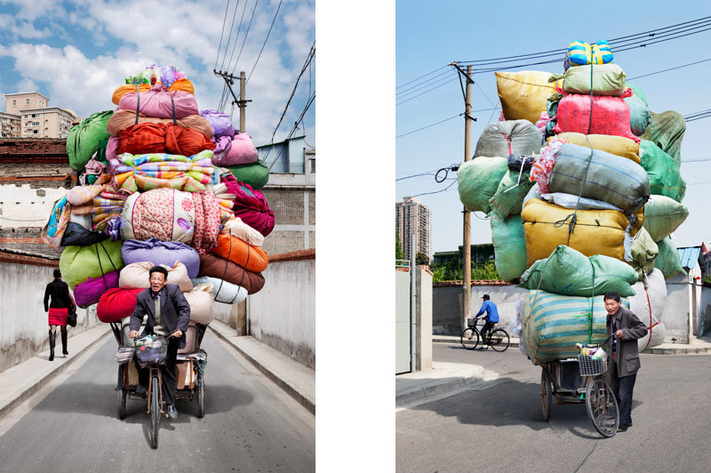
Maybe the US could cut emissions if we started shipping commodities this way…

Move Green moving company has got nothing on this guy… Who needs to plant a tree for every move when you can move a whole house full of furniture on a wheelbarrow?
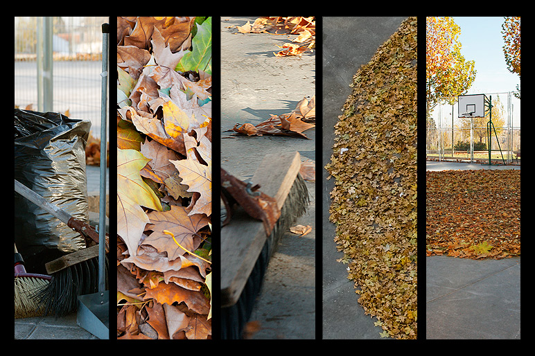
Arts Visuels
SpY >> Looks like Fall
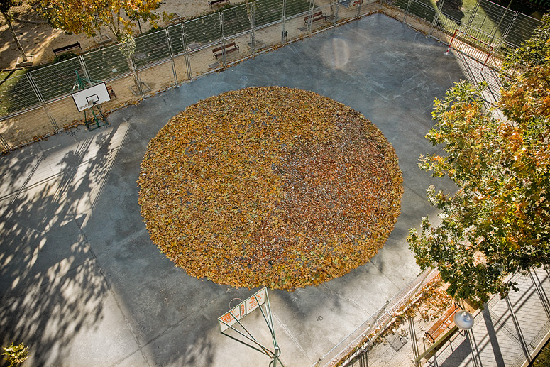
By Spanish street artist SpY

Arts Visuels
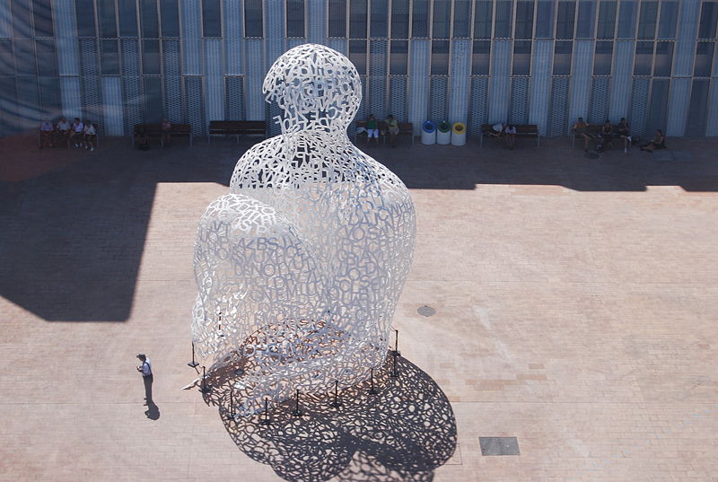
Jaume Plensa
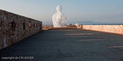
Jaume Plensa’s Nomade at Antibes.
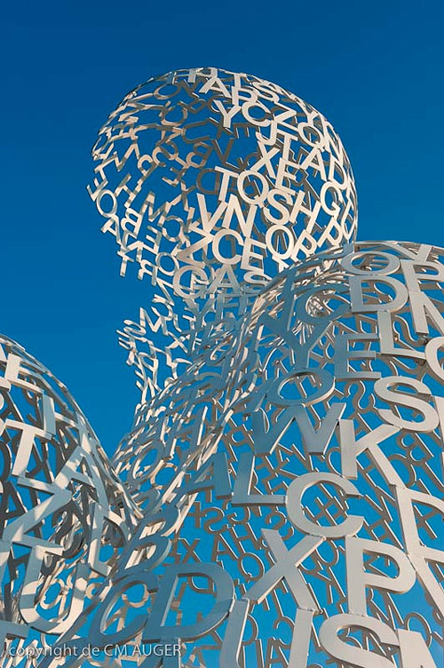
By constructing figures out of letters, Plensa’s work explores not only the human form, but also the role of language in the human experience. The figures are literally made out of the building blocks through which we communicate and describe emotion, both expressing the importance of language in the human experience and giving a physical, tangible form to language.
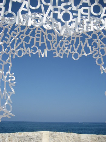
Many of his pieces, like Nomade, above, are built so that the viewer can walk inside of the piece. Very different from viewing a three-dimensional sculpture from afar, the viewer is now inhabiting the piece, having his experience of the work shaped both by the shape of his physical environment and by the language it is made out of, incomprehensible though it is.

The contemplative poses of many of his figures also suggests the artist’s interest in the role of language in reflection. While true meditation may be thought of as the absence of thought, by quite literally forming shapes out of letters, Plensa seems to emphasize the importance of language in giving shape to our inner monologues.

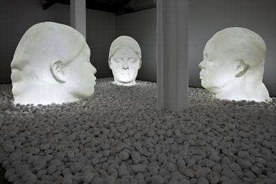
In the Midst of Dreams, above, in which three ambiguously-gendered and race-less forms appear illuminated from within while in sleep, was described by the artist as an exploration of the centrality of dreams to the human experience and his own interest in the concept of a universal human race, democratized by common experiences like dreaming.

In Song of Songs, the artist constructed “walls” out of letters that, when read from top-to-bottom, form the classical poem of the same name, walls that guide the movement of and form “rooms” around the viewer as he experiences both his environment and the poem.
Interestingly, the letters are suspended rather than laid against an impermeable surface, meaning that while the sheets of letters form “walls” around the viewer, the walls are transparent, allowing a visual interactivity with the entire room while the viewer reads the poem that mimics the way one also brings outside experiences and reference points to the reading of poetry in more traditional mediums.
If you want to check out more of Plensa’s work, read about his Crown Fountain project in Chicago here.
[Jaume Plensa website]
Arts Visuels
Best Made Co >> Block-Printed Maps
I really want to like Best Made Co’s Axes. They’ve been getting a LOT of attention in the designy-man-world, and I do really like their aesthetic, and I know on an instinctual level that they’re “cool,” but I just can’t quite get into the idea of a pretty axe, as I’m pretty sure anyone who cares about their axe being pretty isn’t using an axe. Right? Like what outdoorsman is like, “wow I just love the color palette of the painted stripes on this axe”?
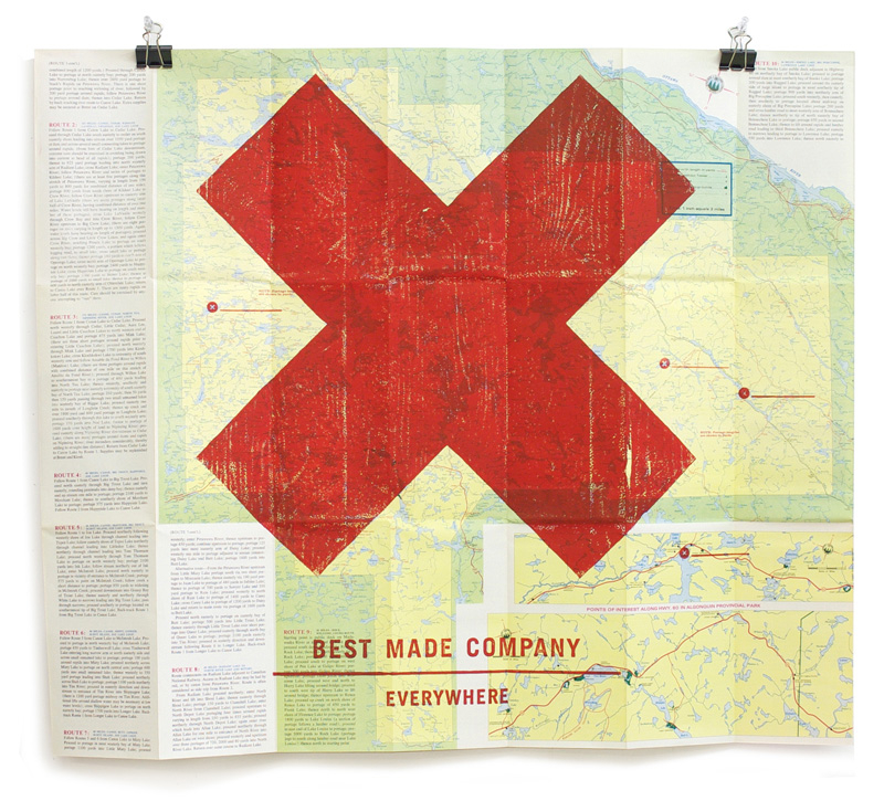
Still, I do like the looks of them, even though I can’t justify their existence or purchase. And I do like these maps block-printed with their logo. Again, they don’t quite make logical sense, but I am drawn to the aesthetic. Well, I like maps, and I like x’s (seriously, also equal-armed t’s), so it wasn’t a hard sell.
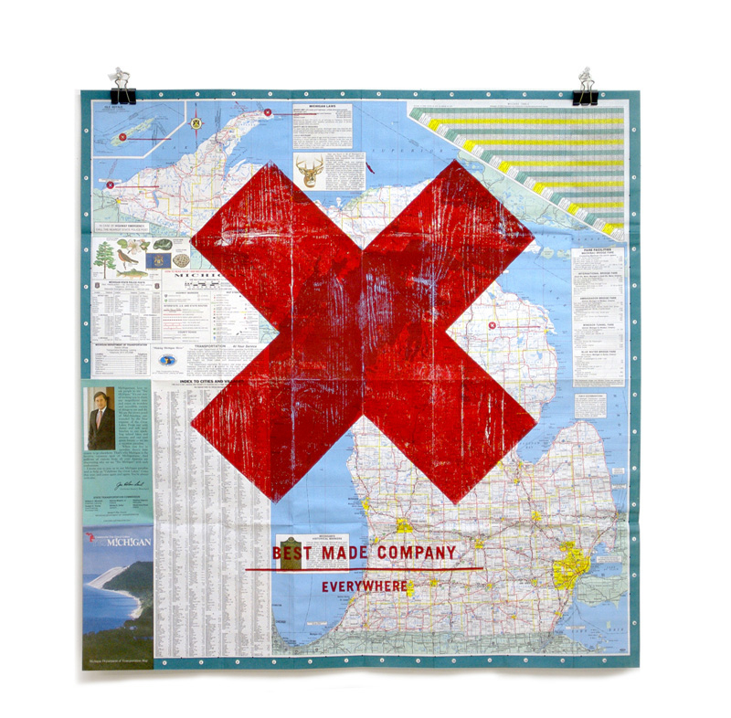
And it makes slightly more sense to me to buy a cool-looking thang to hang on your wall than to buy a cool-looking axe, purportedly a functional object, that you’ll obviously never use.
Best Made Co maps here (of course sold at Partners & Spade).
Arts Visuels
A Little Cheer
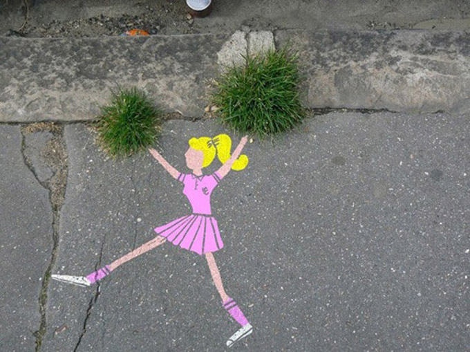
Unknown location, unknown artist.
I love it!
Arts Visuels
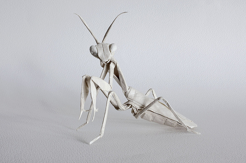
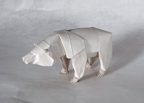
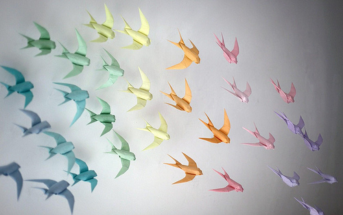
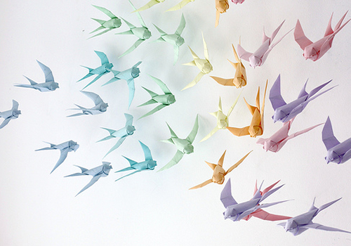
Mabona Origami
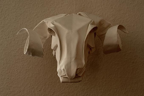
Amazed by the precision and expressiveness of these origami creatures by Sipho Mabona.

And of course loove the stop-motion animation video made from his creations. This video was created as an ad for Asics and won multiple international advertising awards.
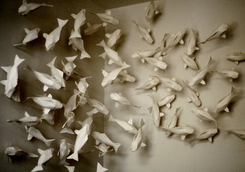
Also love these installations of the figures suspended in air…

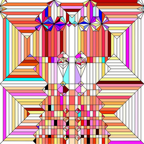
Click through for more, including a couple of examples of the absurdly intricate 2-d patterns these are made from.
These are what two of her patterns look like unfolded…. !!!

Thanks Monica!
Arts Visuels
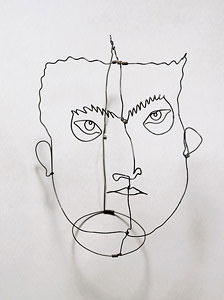
Arts Visuels >> Classics >> Alexander Calder’s Wire Sculptures
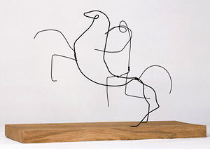
Le Cavelier, 1930
Edgar Varese, 1930
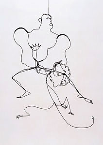
Hercules and Lion, 1928
Arts Visuels
The Right Moment to take a Photograph
Arts Visuels
A Simple Feat of Light

Sadly don’t know where this is or who made it. But I love it. Amazing what simple votive candles can do.


