Typography + Architecture >> Colosseo

I just couldn’t end the day with that creepy pageant post, and it was actually really hard to find something to follow that, because all of a sudden, knowing that those images would follow whatever I put up next, they started tainting everything!
So anyway… I’ve had this in the vault for a while and thought, ok, there’s no way the pageant pics could have any kind of dialogue with something with almost no allusions or connotations, something that is just purely graphicly, visually interesting.
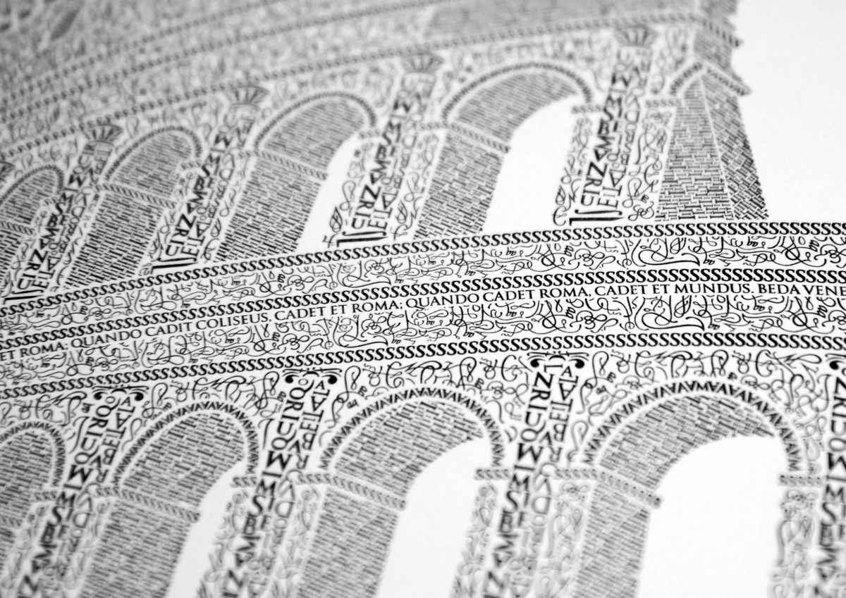
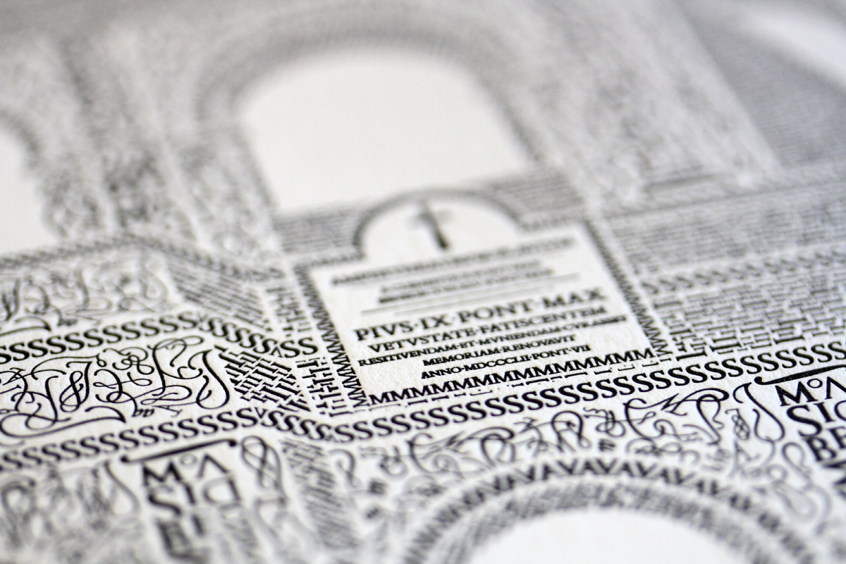
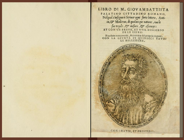
After a 10-year anniversary trip to Rome with his wife, designer Cameron Moll decided to make the Colosseum his next artistic subject. Using 16th century calligrapher M. Giovambattista Palatino’s work as his inspiration (see bottom), he then spent over 250 hours creating this piece, character by character, using the Goudy Trajan Bembo Pro typefaces.
[Available as a print here.]
August 3, 2010
Curated by:
Eliza Coleman
Section:
Graphic Fix
Labels:
architecture, Arts Visuels, typography
Curated by:
Eliza Coleman
Section:
Graphic Fix
Labels:
architecture, Arts Visuels, typography
Zimoun’s Sound Sculptures
Above, 21 of artist Zimoun’s “sound sculptures,” which despite their mechanical mediums all seem to sound amazingly like different types of rain and wind, making them peaceful-sounding but faintly maniacal to watch. I felt like I was listening to a sleep-sound-machine while slowly going insane.
Still, check it out. My personal faves are at about 2:24 and 7:23… I just realized I incidentally picked the two least mechanical as my favorites. Ha.
“Zimoun’s sound sculptures and installations are graceful, mechanized works of playful poetry, their structural simplicity opens like an industrial bloom to reveal a complex and intricate series of relationships, an ongoing interplay between the «artificial» and the «organic».”
[Thanks Monica!]
August 3, 2010
Curated by:
Eliza Coleman
Section:
Arts Visuels
Labels:
Arts Visuels, installations, video
Curated by:
Eliza Coleman
Section:
Arts Visuels
Labels:
Arts Visuels, installations, video
Classics >> Summer Uniform
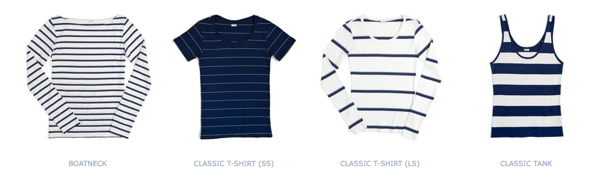
Chance, a new line by Julia Leach, former creative director of Kate Spade, is all centered around the striped French fisherman’s/navy t-shirt. And, not surprisingly, that makes for a collection of perfect summer essentials. I’ll take one of everything, please.
They also have a great timeline of the history of the striped shirt, including Matisse’s self-portrait wearing one!
Of course I would find this right after purchasing a child-sized St. James tee because I couldn’t find an adult-sized one I thought was as legit (and the St. James is def legit). And let me tell you, a child’s size 14 has a pretty strange overall shape when worn by a non-kid. Clearly, I was desparate. I also bought that exact tank on the right from Target, which also has a weird fit, obviously, because it’s from Target. If only I had held out.

My super-cool niece Mini (age 14) last week, after spending a week straight together was like, “you wear a lot of stripes.” So, I guess I can’t justify another stripe purchase after a comment like that.
However, one of my other super-cool nieces, Sadie (15), (yes I’m obsessed with my neices/nephews) told me that she had been considering buying the exact same kids’ St. James tee!! Without knowing I had it! So that made me feel a little better. And now I feel like I have good karma for directing her to this Chance one instead.
And now I’ve directed you there too. Enjoy!
August 2, 2010
Curated by:
Eliza Coleman
Section:
Style Files
Labels:
store, style files, summer, The Spades
Curated by:
Eliza Coleman
Section:
Style Files
Labels:
store, style files, summer, The Spades
XYXX

The tumblr XYXX is a “visual conversation between two iphones and two lovers.” Essentially, this couple started sending photos back and forth, any old thing from their days, more abstract and less cheesy than you might expect, and they turned it into a tumblr as a record of the “conversation.”

You can tell which photos were uploaded by him and which by her given their small tags at the bottom– either XX or XY.
Though the photos are interesting, it’s the concept more than the photos that I like. Here’s what they say about it in their “authors” section of the site:
where conversations can be routine, an image is so much more intimate. it’s letting someone in behind your eye and saying right now, this second, this is my world. this is what i see, how I feel, and what I want to share with you. somedays it’s a game of exquisite corpse. somedays it’s a quiet conversation. An ever evolving game of tag with no rules or expectations except to simply be present, and that’s the beauty of it.

August 2, 2010
Curated by:
Eliza Coleman
Section:
Arts Visuels
Labels:
Arts Visuels, blog, Photography
Curated by:
Eliza Coleman
Section:
Arts Visuels
Labels:
Arts Visuels, blog, Photography
The Selby >> A Bright, Fresh Brooklyn Retreat

Click through for more pictures of Lyndsay Caleo and Fitzhugh Karol’s awesome renovation of a Brooklyn brownstone, shot by The Selby.
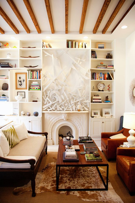


This is actually the guest bedroom, but I liked it more than the master! So charming!


Listening To >> Futurebirds' "Hampton's Lullaby"
I mentioned these guys, a couple of whom were in my high school class (¡hometown heroes!) (I feel an immature urge to do a TRL-style shout-out here), back here, and they just released their first full-length album on Tuesday! I’d been eagerly awaiting it, and I’m already loving it.
Though I personally think it’s an annoying label, I guess it is sort of useful in giving you some sense of their sound, so I’ll go ahead and tell you they are commonly called “alt-country,” but luckily with the added, flattering qualifier that they are “what modern alt-country ought to sound like.” I also read here a description of them being a “synthesis of the two extremes of Neil Young’s yin and yang.”
Here’s an except from one of the reviews that I thought particularly rang true:
“What I like about the record and the band for that matter is that it feels like it actually comes from somewhere, comes from real people. We’re flooded by countless bands with clever names creating sounds in their bedrooms that are nice, passing fancy, but the keepers that we remember over the years are the ones that make personal connections.” [Future Sounds]
Also check out an interview with them on Stark here. (I particularly liked that their interview corroborates my personal opinion that the south has a disproportionate amount of pretty girls.)
Art in Stead
The MAK Center’s project “How Many Billboards, Art in Stead” asked 21 contemporary artists to each produce a billboard to be placed around Los Angeles, giving residents a break from the generally un-stimulating clutter crowding their cityscapes.
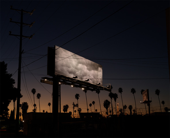
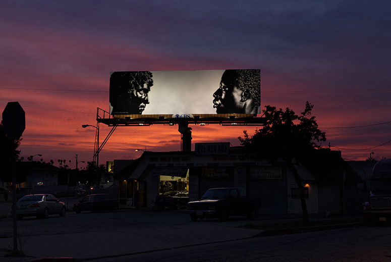
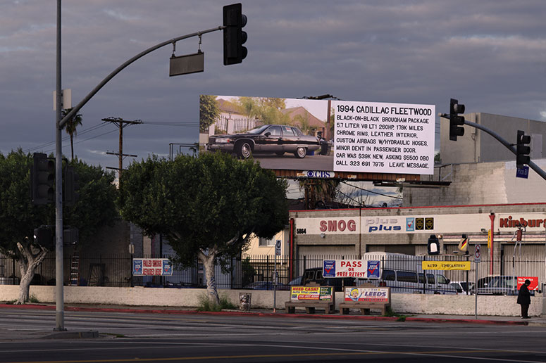
Wouldn’t it be cool if, for some amount of time per year, billboard owners were required to give a portion of their billboards over to art instituations for projects like this, the same way tv networks have to allow ad space for PSAs? And every once in a while you would glance at a billboard and see art instead of an ad?
Read more about the project (which is sadly over) in this NYT article.
Project website here.
July 29, 2010
Curated by:
Eliza Coleman
Section:
Arts Visuels
Labels:
advertising, Arts Visuels, installation
Curated by:
Eliza Coleman
Section:
Arts Visuels
Labels:
advertising, Arts Visuels, installation
July 29, 2010
Curated by:
Eliza Coleman
Section:
Arts Visuels, Classics
Labels:
Arts Visuels, classics, jetset, Photography, style files
Curated by:
Eliza Coleman
Section:
Arts Visuels, Classics
Labels:
Arts Visuels, classics, jetset, Photography, style files
CXXVI
See, I said it was going to be a music-themed day, but I get bored really easily and I’m already really over the idea of posting three music themed things in a row. I did it, and it’s making me feel really anxious, so I’m taking one down, putting it back in the drafts folder, and will post it later. So now you have something to look forward to! Aren’t you dying to know what it was now?
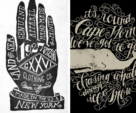
Moving on, I discovered CXXVI Clothing Co. via the cool hand-lettered collateral materials by Jon Contino shown below (I’m not really sure what they’re for, neither are their logo).
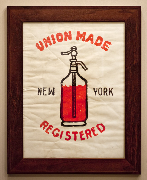
Upon seeing these materials, I decided I had to check out whatever company would commission these to be made, and that’s when I found this framed print of a seltzer bottle that I’m dying for.
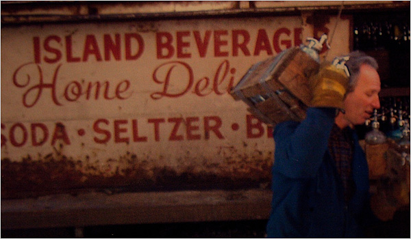
I’m still charmed by this article about the seltzer man in Brooklyn who had been delivering seltzer to homes for almost 40 years (accompanying photo below), and I think the print would happily remind me of the article every time I looked at it. But I digress…
I love brands that have a really defined look, so I like how all of their stuff seems to have this Moby Dick-inspired nautical/Americana thing going on, even if the nautical theme is getting a lot of air time right now.

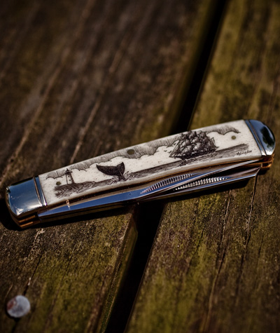
A pocket knife etched and inked with black India ink by a company in Maine. (I might need this too.)
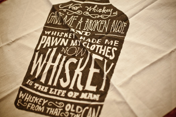
More lettering by Jon Contino, I presume?
Now wondering how I’d never heard of this company??
CXXVI here.
July 28, 2010
Curated by:
Eliza Coleman
Section:
Style Files
Labels:
branding, Graphic Fix, style files
Curated by:
Eliza Coleman
Section:
Style Files
Labels:
branding, Graphic Fix, style files


