
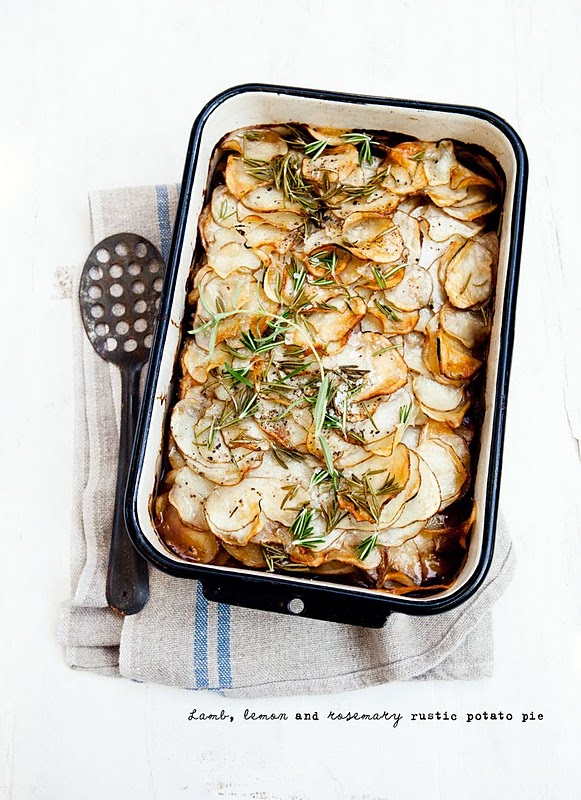
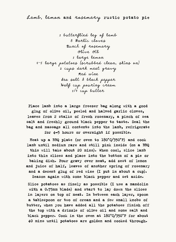
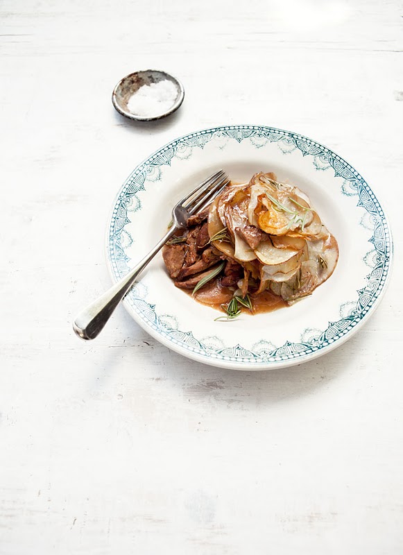
What Katie Ate
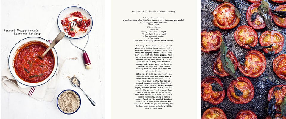
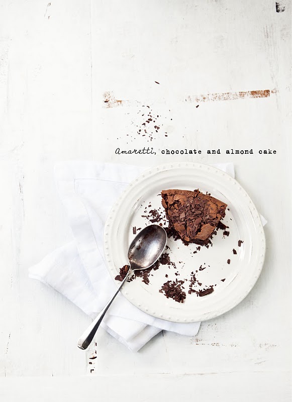
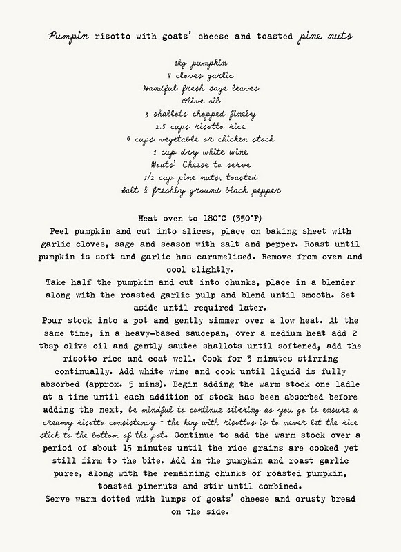
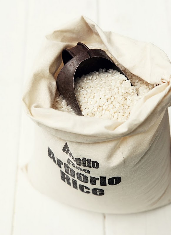
If you’re the type who likes to read cookbooks in bed before you go to sleep, haul out your iPad tonight and check out What Katie Ate by Katie Quinn Davies. Just a warning, you might be up late trawling through the archives bookmarking enough dishes to last you all winter.
The food styling and photography are so gorgeous that they could qualify as art. I think I would gladly have prints of her images hanging on my kitchen wall. I can’t wait until she puts out a cookbook!


Curated by:
Eliza Coleman
Section:
Masters and Their Crafts
Labels:
blog, food, Photography, recipes, styling
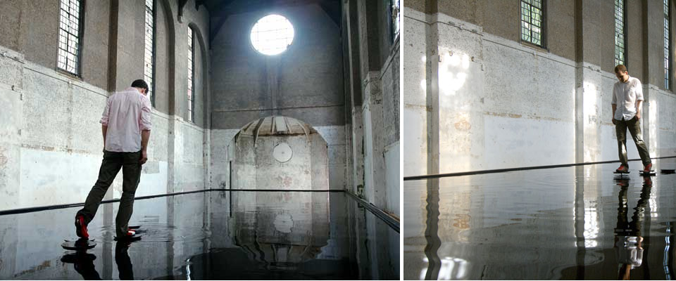
“Bridge”
Michael Cross’s meditative, yet playful, installation, “Bridge,” an abandoned church filled with 5ft of water and mechanical, “magically appearing” stepping stones, is like Alice in Wonderland-meets-a dream state-meets-those lily pad pools at water theme parks.
As you approach the water, one stepping stone emerges from the water in front of you, and another one doesn’t appear until you’ve stepped on the first one. The water is only five feet deep, so it’s not like you can drown, but that’s still deep enough to get totally soaked if you fall in! (The guy in the pictures looks so casual about it, like the stepping stones are just in a shallow puddle, but it’s five feet!).
Hence the water theme park reference– remember those pools at water parks with the shaky “lily pads” on springs that you would try to walk across? So I imagine it would actually be sort of stressful to get across, and yet also like some sort of zen-meditation exercise. The space certainly is beautiful and the whole experience must feel rather like you’ve fallen down the rabbit hole.
Check out the video below for what it actually looks like walking across it. About a third of the way through the video, the angle switches from first-person to panoramic so you see the whole space. Pretty beautiful.
Traditional meets Industrial/Modern in Spain
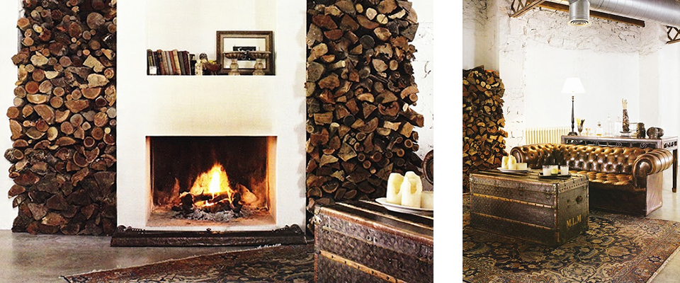
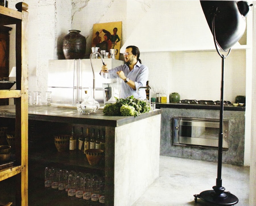
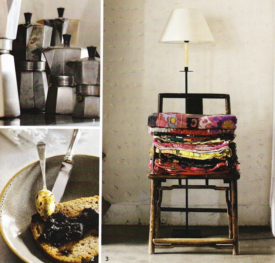
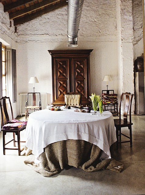
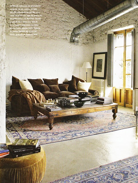
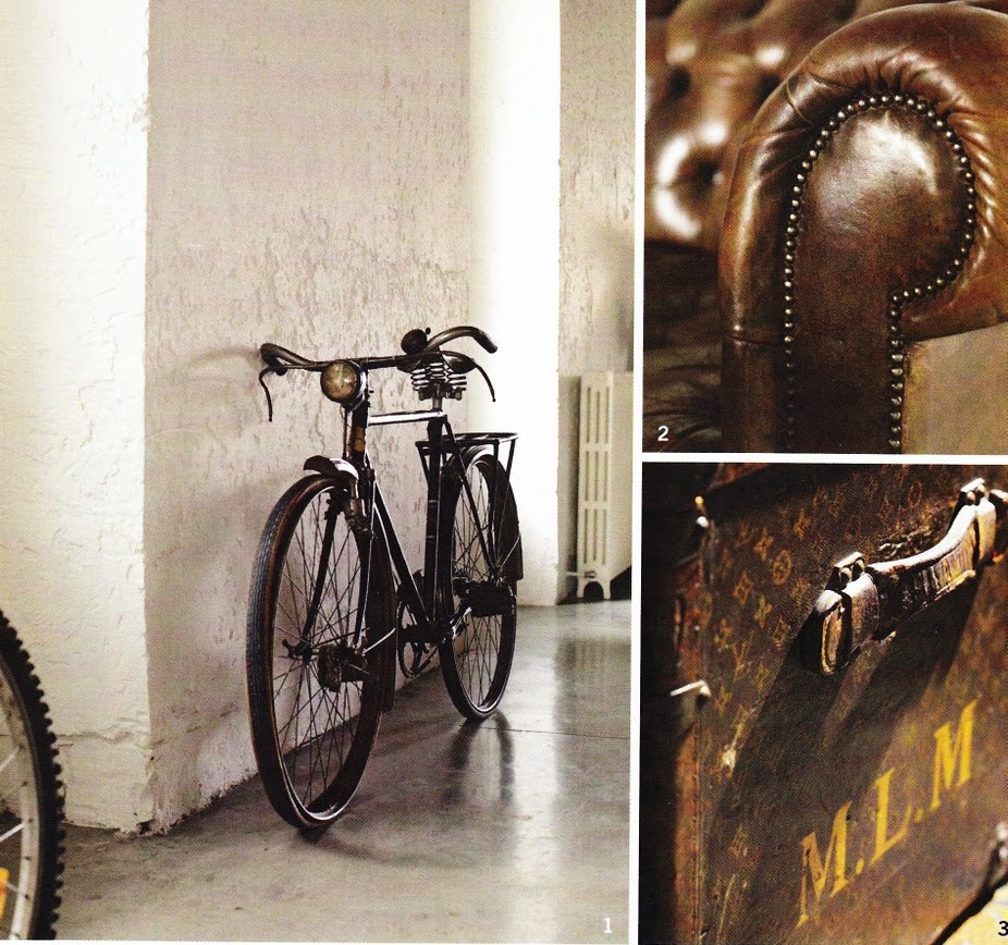
I think you could combine most style descriptors with “industrial” and I would like it. I don’t enjoy full-on industrial, it’s too cold, but mix in a little industrial with the traditional, the retro, the apothecary-chic, and I like it.
This space, with it’s clean modern lines, exposed industrial exposed pipes, concrete floor, and raw kitchen mixed with traditional furniture, like the English Chesterfield sofa, big Spanish wooden armoire, Oriental rugs, and rustic touches like the log stacks and simple linen table cloths, really has a wonderful balance.
The home belongs to Tony Espuch, owner of Azul Tierra, shot by Amador Toril for Habitania.


via French by Design
Curated by:
Eliza Coleman
Section:
Interiors
Labels:
fireplace, industrial, kitchen, Spain

Editor’s Chair
…recent visual inspiration on Editor’s Chair. Click over for more!
Curated by:
Eliza Coleman
Section:
yes to all
Labels:
ace hotel, brook shields, jean claude killy, warhol
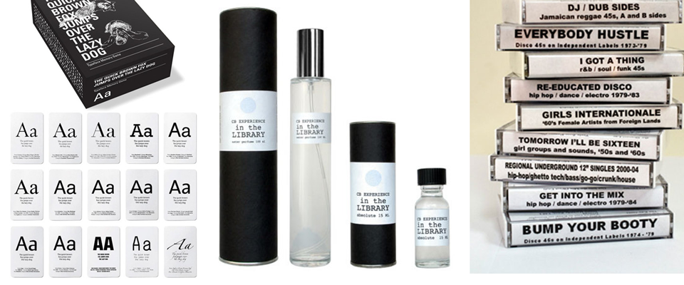
Core 77′s Quirky Picks
I know I said I wasn’t going to make a gift guide of my own, and I’m not, (well I kind of am), but I just couldn’t resist posting a few of my favorites from the quirky Core 77. These were just too fun to pass up. Their gifts are the kind that are so specific that you see them and instantly know exactly which of your friends or family members would enjoy them.
Like the typeface memory game… just like the children’s game of memory, but the cards are each a different font. Perfect for the typography/graphic design nerd in your life.
My very favorite thing they offer are these customizable fortune cookies! I’ve never seen custom fortune cookies, and I think it’s brilliant fun. It would be so awesome to give these to someone without them knowing that they were going to have personalized fortunes… Their description says it all…

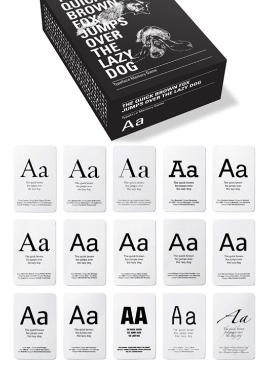

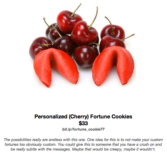
Also click the gallery for the descriptions for the others, they’re all pretty clever!

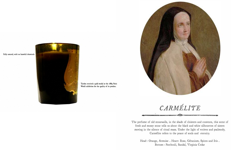
LustList: Cire Trudon Candles
Cire Trudon candles are a perfect example of how having a story behind your product can really hook buyers. I came across these candles (from the oldest wax makers in France!) on the Ill Studio site (they designed their logo and marketing materials, which I love), and wanting to see more, I checked out their website.
On the website, I discovered these enchanting descriptions for each candle and now I totally want one. I’ve never even smelled them, and that’s the whole point, that they smell good, but I’m completely captivated just based on these identities and stories they give each candle. I don’t even need to smell the candles, I feel like I’m on a mental vacation just reading their descriptions.
Like the Roi Soleil… “Fragrance of the mirror gallery and the vast wooden floor of the Chateau de Versailles, vapours of wax, candelabras and palace…” How could you not want a candle that makes your home smell like “palace”?!

These make basic candles, with scents like “fresh laundry” and “green meadows,” look even more quaint than they already were. I have never been drawn to candles like that, but especially now that I know how much better you can do. Why settle for “fresh laundry” when you can have “palace”?
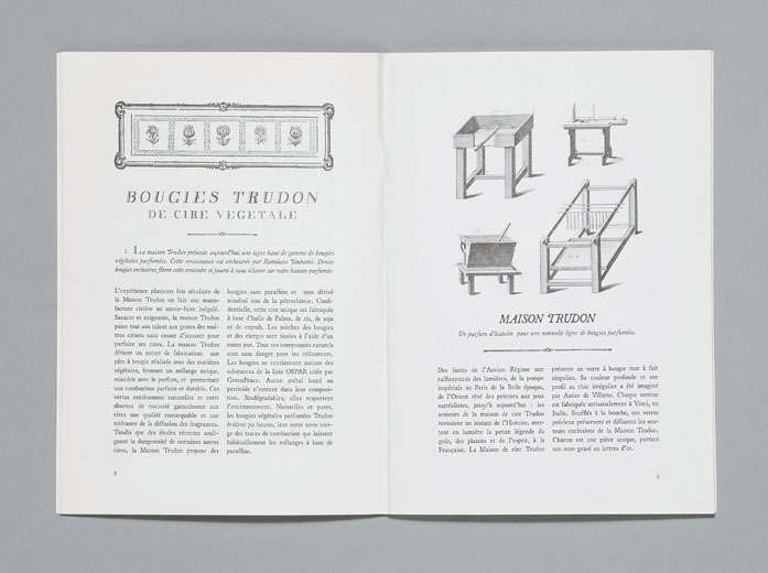
I’m just completely taken with their branding and marketing all around. The writing is amazing and the design is sophisticated, understated, and thorough. They even made these pretty booklets (see gallery) about the history of the company and their processes with these endearingly old-fashioned text book-like sketches illustrating their methods. Oh, and the header fonts were custom-made by Ill Studio for the company. Everything is perfectly in line with their overall brand image.


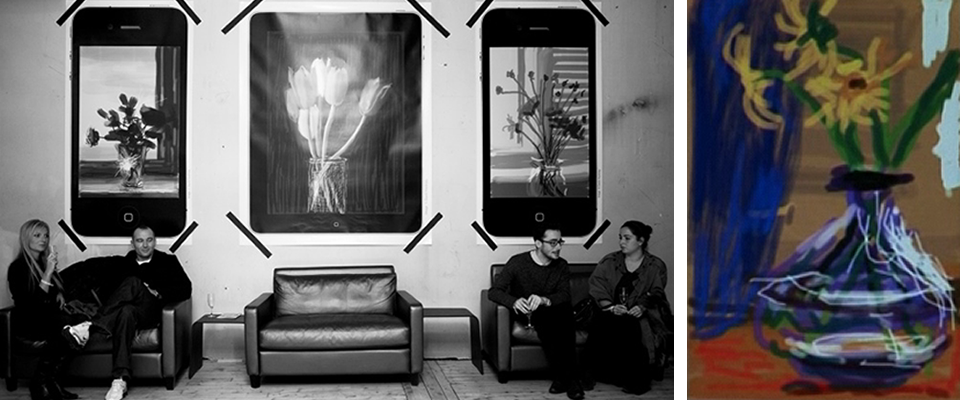
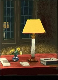
David Hockney’s New Exhibit of i-Paintings
David Hockney, easily the most likable grand old man of the art world, has a new exhibition in Paris. An exhibition displayed on, and created on, iPhones and iPads! He started this project by experimenting with the Brushes app for the iPhone by drawing the flowers on his bedside table or the view of the sunrise from his bed in the morning, and then he would email them out to friends.
Now on view at the Fondation Pierre Berge-Yves Saint Laurent, the exhibit, as Hockney said, is the first ever exhibition to be emailed to the gallery. (The banner image above is not the exhibit– that’s an image from the opening party at Tokyo Art Club in Paris.) The gallery installed 30 iPhones and 30 iPads, and over 300 images rotate across the screens, with new images being added at will as Hockney creates more. Also remarkable is that the screens sometimes show the evolution of the images, so the viewer sees not only the final product, but also the various stages of creation! This all thrills me.


I am fairly obsessed with this whole concept for a number of reasons. It so interestingly calls into question many of the age-old art issues– seeing the artist’s “hand” in the work (it is literally finger-painting, and yet there is no tangible evidence of human-involvement, like globs of paint on a canvas), how the artist can make money (how do you sell these?), the monetary value of a piece of art (if there is no way to prove an “original,” and it’s endlessly reproduce-able…), how to display the art (do you print it out? or does it always live on a screen?)…
And, on top of that, I love the fact that he’s used new media to execute a traditional style. Most art I see that employs new media seems to be trying too hard to be avant-garde, and I find it exhausting. It’s overly conceptual and underly aesthetic. Here, Hockney simply sketches as he would with pencil and paper, but he has upgraded to the latest media available.
There’s a great video, where you see how the exhibit is done, as well as how he creates the works, at the Fondation website here. Unfortunately it was un-embeddable so you’ll have to click over to see it. The video in German below at least gives you a preview (I don’t know why but there are 0 good videos in English about this exhibit). Also an excellent NPR interview here.

The Guide to Gift Guides
One of my favorite parts of the holiday season (and there are many things I love about the holidays) is reading all the gift guides that come out.
I love everything about gift guides– the artful collage layouts that make everything look so appealing (have you ever noticed that everything looks better in a collage?), being able to find the perfect thing for each person on my list, and the interesting themes and titles given to the guides– “10 gifts for the drama-queen glamour-lover in your life,” “5 things your green-thumbed oddball uncle can’t live without.”
Doesn’t it make you wonder what guide someone would depend on to find a gift for you? Like “if you were a gift guide, which gift guide would you be?” That would certainly be a fun game.
So, instead of adding another gift guide to the blog world, I thought I’d point you in the direction of some of my favorites. The gallery of screengrabs from the various gift guides goes in the same order as the descriptions below, so you can follow along! (Just click the thumbnails to enlarge and then click the right arrow.)
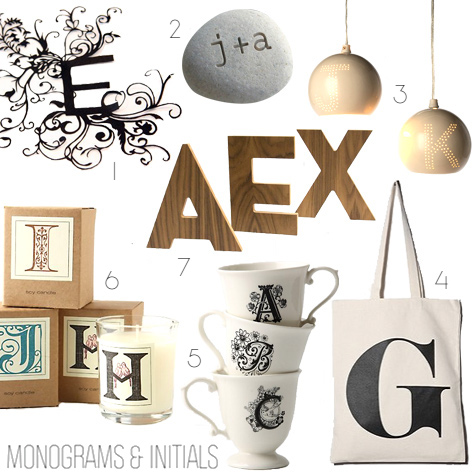


Design*Sponge gift guides — The design*sponge guides are entertaining for the variety of categories– gifts involving monograms, gifts sorted by color (seriously), etc.– and for the fact that they all full of lovely, pretty things. Wonderful for design lovers.
Core 77: Zany things you never knew existed, plus other fun curiosities for people who are hard to buy for but enjoy cleverness.
Hollister Hovey: Full of off-the-beaten-path eccentric ephemera, just like her blog. Perfect for hipsters or old folks in your life.
Coco + Kelley: Pretty, girly things.
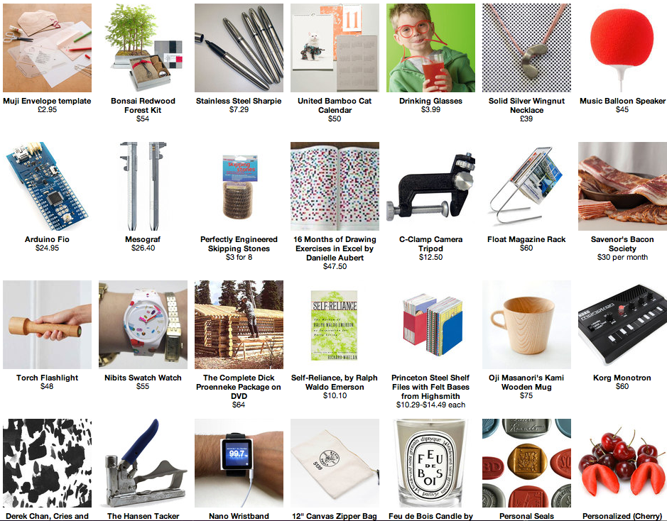
NotCot: They have thirty different guides. Thirty. 3-0. So if you can’t find what you’re looking for elsewhere, or don’t feel like sorting through the other guides, this is your go-to.
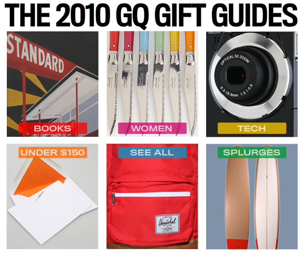
GQ: Plain old good ideas. Not too obscure, but special enough. However, I will note that their guide for what guys should get their girlfriends must have been written by a girl. One who wouldn’t find it weird to receive a vase from her boyfriend. I’m just sayin. There a lots of good ideas in there, but some would freak me out if I received it from a boyfriend. Sure, it’s good to be thoughtful, but there are certain categories of standard boyfriend-for-girlfriend gifts that are common because girls like them and they’re romantic.
Real Simple Magazine: Cute practical things. Great for finding things for moms.
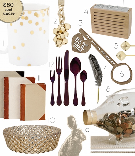
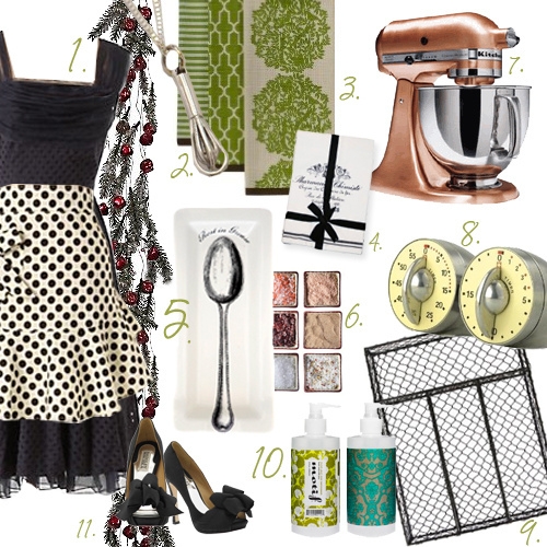
And finally, Ginny Branch: Hers are the two in the banner image at the top, and she has more on her blog. I love Ginny’s because they feel so personal and thoughtful. They’re not necessarily things you’ve never seen before, they’re just great ideas you might not have thought of.
Recently on Editor’s Chair…
Click over to Editor’s Chair, the tumblr within the blog, for more.

Does money make us happy?
This NYT article suggests, as most of us have heard, that no, money itself does not make us happy. And neither does buying things. However, the ways in which we choose to spend our money does have an impact on our happiness level.
The long and short of it is that spending on possessions does not increase happiness, but spending on experiences does! As one researcher put it, “If money doesn’t make you happy then you probably aren’t spending it right.” This, they say, is because experiences help build bonds, and having stronger relationships does build happiness in the long run.
So here’s the takeaway: spending money to go away for a weekend with your honey or to throw a dinner party with friends will make you happier than a new tv or pair of shoes. That’s a life lesson worth remembering! And it’s proven by research!
Here’s another interesting takeaway, about the idea that more is never enough: ”Scholars have discovered that one way consumers combat hedonic adaptation is to buy many small pleasures instead of one big one. Instead of a new Jaguar, Professor Lyubomirsky advises, buy a massage once a week, have lots of fresh flowers delivered and make phone calls to friends in Europe. Instead of a two-week long vacation, take a few three-day weekends.”
Read the rest here.
[via ECAB, images via Ginny Branch]


