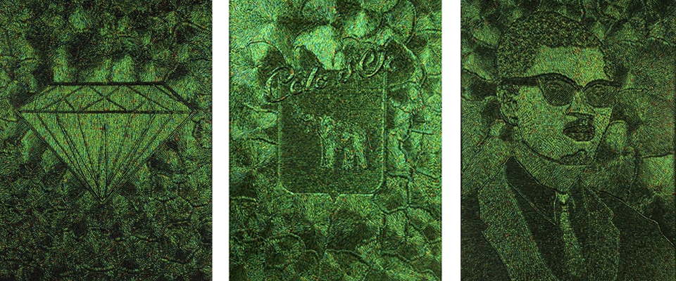
Jan Fabre at Art Basel Miami
At Art Basel Miami back in December, in addition to Seydou Keita, the other exhibit that majorly caught my eye was this series by Jan Fabre.
Each of these iridescent, irresistibly shiny pieces is about eight feet tall, so it is hard not to notice them, but then they become much more intriguing when you realize that their enticing appearances and glossy surfaces belie a controversial subject– the Belgian Congo.
THEN, you read the placard to see what that shiny green stuff is, as it is slightly dimensional and doesn’t seem to be paint (maybe a synthetic thread, woven into images?), and find out they are BEETLE SHELLS.

So now you realize you have a fraught subject represented not only in a rather eerily beautiful way, but also that the medium that underlies the intense shine of the facade is totally creepy (for a lack of a less-pun-ish, more erudite term), and the entire exhibit takes on a chilling effect that turns out to be perfectly appropriate for representing the colonial period unforgettably described by Heart of Darkness. You are literally looking at pieces that appear beautiful but have a heart of darkness. Pretty powerful. Oh, and in between the large canvases, in a rather Damien Hirst-esque move, are beetle-covered skulls with beautiful (taxidermied) birds in their mouths.
Interestingly, Fabre also once covered a ceiling (and chandelier) in the Belgian palace in over a million beetle carapaces:

For more on Jan Fabre, check out the gallery that presented this exhibit– Magazzino, out of Rome.
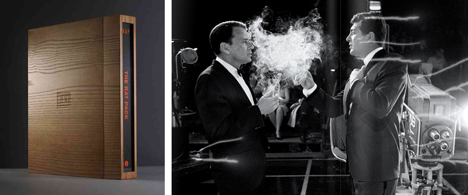
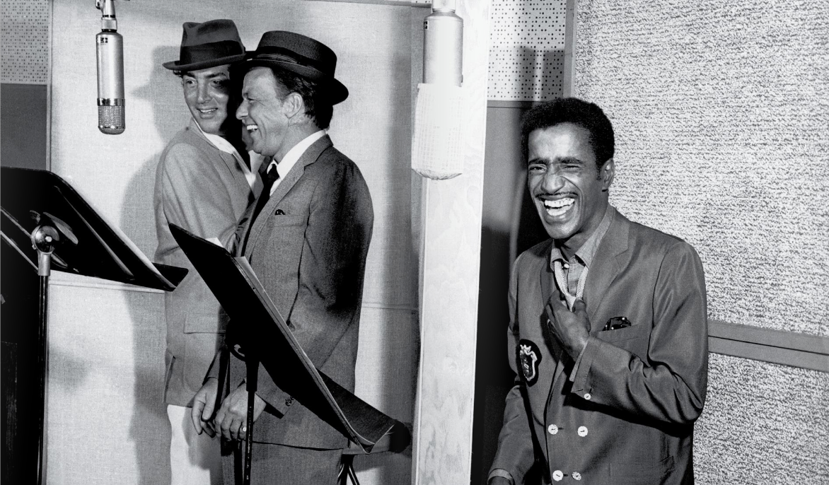
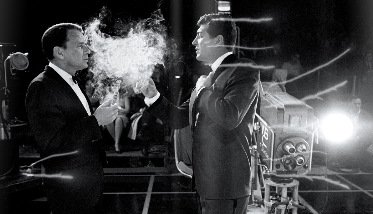
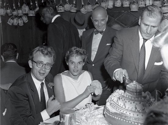
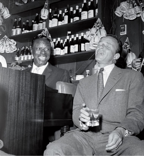
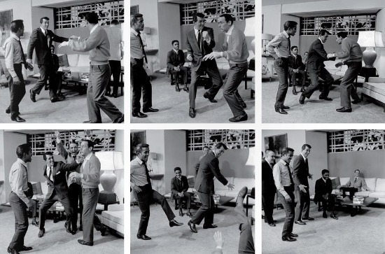
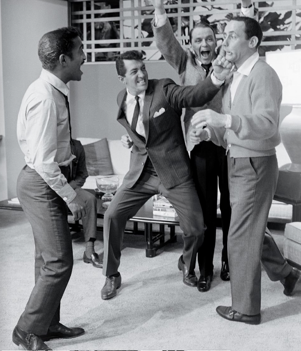
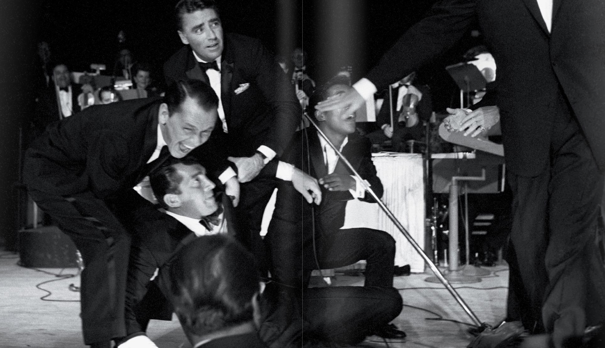
LustList: The Rat Pack Master Edition
Loving the looks of this beautifully-bound limited edition compendium of photos of the Rat Pack in their heyday. The packaging, designed by Progress Packaging, was what first caught my eye, but the photos and content are equally appealing. Published by Reel Art Press, here is what they say about the book:
“Frank Sinatra’s legendary clique defined life in the fast lane throughout the late fifties and early sixties, dominating American culture and epitomising a life of cocktails, love affairs and Hollywood glamour.
A select group of photographers, including Sid Avery and Bob Willoughby, captured the Rat Pack in their heyday. Many of the images they produced have been largely stored away, many even undeveloped. For the first time, access to these shots has been made possible to produce one deluxe, collector’s edition.

The Rat Pack is the definitive book on Frank, Dean, Sammy and co. tearing up Hollywood and Las Vegas with an extended cast including Marilyn Monroe and JFK. Fifty years on from the year many refer to as The Year of the Rat Pack, 1960, and their influence endures. Shooting Ocean’s 11 by day, performing at the Sands by night and sweating out the sour mash in the sauna in between, The Rat Pack includes behind the scenes footage at the JFK Presidential Inauguration and house parties with Ava Gardner and Marilyn Monroe.”"


Curated by:
Eliza Coleman
Section:
LustList
Labels:
classics, for the library, packaging, Photography
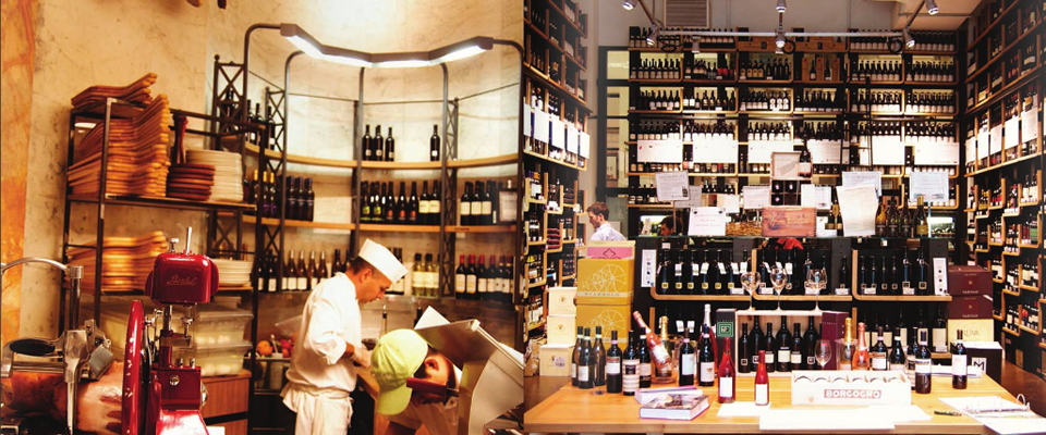
Eataly Flash Mob
At Eataly earlier today for lunch, I was already in food/pretty packaging heaven/overload, when a violinist started to play in the middle of the charcuterie and cheese area where we were eating. It’s not unusual in New York for musicians to crop up in random places, so at first I wasn’t too surprised, and he was actually really good, so we went about our lunch just enjoying the added background music.
Then, with song #2, the volume started to increase, and I realized there was an amp… and then I knew it. We were about to be flash mobbed!! …And the violinist turned out to be the super-famous David Garrett!
So without further ado, first, the video of the violinist playing song #2, a lovely classical number that started to get people interested, but before the mayhem began. You’ll hear at the very end of the song he starts to play “Smooth Criminal,” which would turn into the mob song.
And then, the mob begins:
Update: David Garrett’s people have uploaded this HD video of the event– I noticed after the event that there were cameras stuck up on the walls everywhere, and planted videographers, so I was waiting for something like this to surface!
PS- Thank you to Huffington Post and EaterNY for the re-blogs!
Banner photos by What Katie Ate
Curated by:
Eliza Coleman
Section:
Must See
Labels:
flash mob, random acts of creativity, video
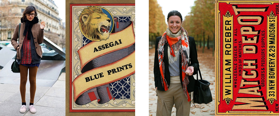
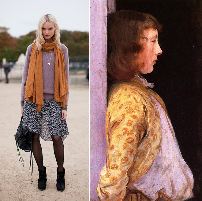
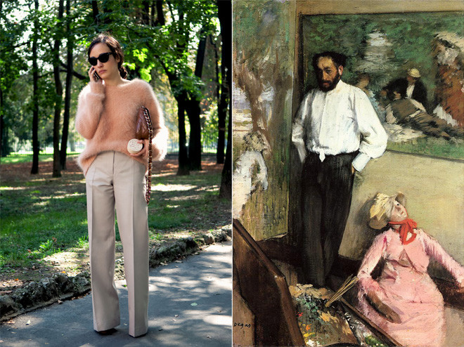
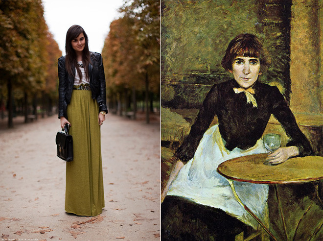
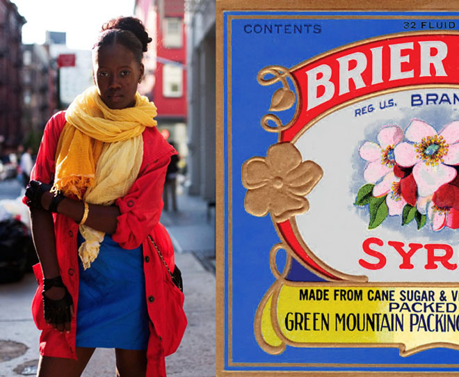
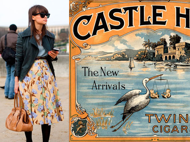
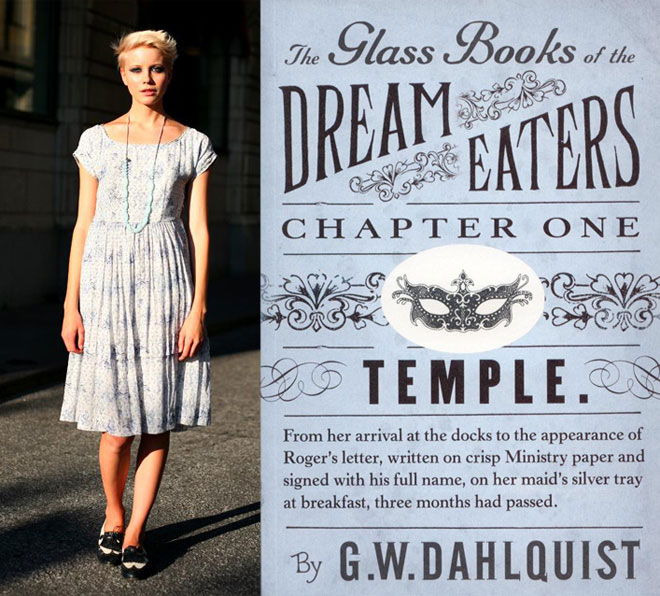
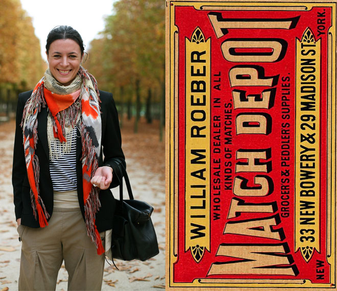
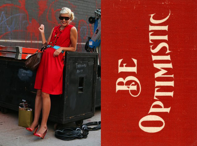
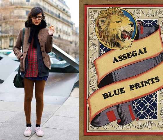
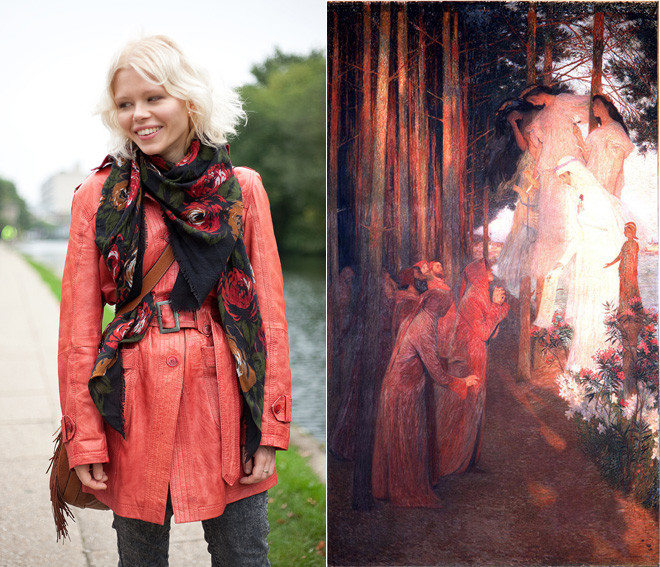
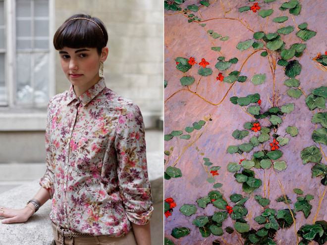
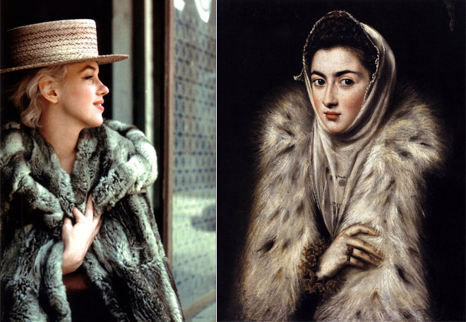
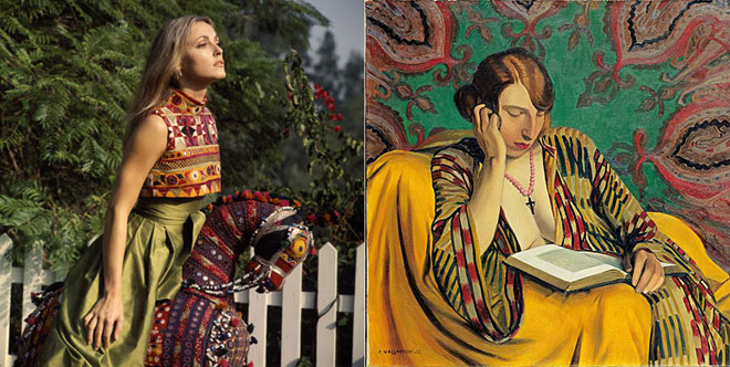
Diana Moss’s Image Comparisons
Graphic designer Diana Moss, of the Miss Moss blog, puts together these awesome color and style comparisons using outfits from street fashion photos (there’s a whole series using Sartorialist photos, like the ones above), stills from old movies, and magazine editorials and matching them up with the palettes and styles of everything from vintage packaging, to wallpaper patterns, to old master paintings.
The result is a visual feast for the design/fashion/color/art lover. Seriously, I feel like I could pore over these for hours, I love the nuances she finds and presents, and I love the comparisons between past and present.
Isn’t interesting to see that those with a great eye can make even a really quirky palette work, and that creative types have been coming up with those off-beat combinations for ages? See image with the dusky orange and lavender going on. A painter loved it then, a fashionista loves it now. Never would have occurred to me, but cool to see that these two great minds both thought of it!


Curated by:
Eliza Coleman
Section:
Style Files
Labels:
Color Story, fashion, packaging, paintings
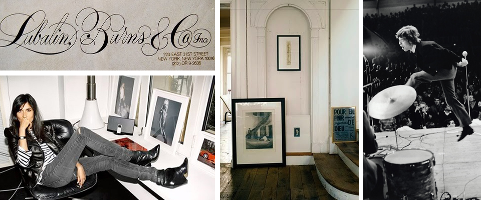
Recently On…
Recent visual inspiration on Editor’s Chair… click over for more.
Curated by:
Eliza Coleman
Section:
yes to all
Labels:
Emmanuelle Alt, Lubalin, Mick Jagger, wood black white

Treehouse Point
If you always wanted a treehouse and didn’t have the kind of dad who was into building things (Dad, I promise that is not a slight towards you), now you can live out your treehouse dreams for a few nights at Treehouse Point, a treehouse hotel outside of Seattle. How enchanting does this look? This forest looks like the ideal treehouse setting!
 For more incredible treehouses, including interiors, see this past post.
Curated by:
Eliza Coleman
Section:
Destinations
Labels:
architecture, hotel, treehouses
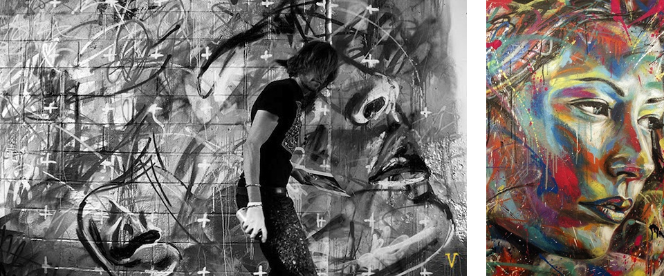
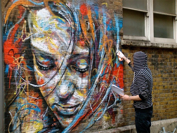
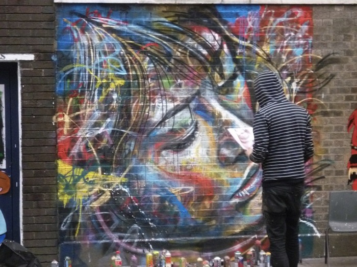
David Walker’s Graffiti Portraits
Graffiti’s place in society is an ever-evolving topic, one that totally fascinates me (as is probably no surprise if you’ve read this blog for a while), as the debate rolls on about public space (and its defacement), the use of public art to draw attention to an issue, art that cannot be collected, etc.
David Walker’s graffiti portraits add a new dimension to the street art debate. Though I’m sure his work is not totally unprecedented, I, at least, have never seen a classical subject like portraiture (or landscape, etc) approached through the medium of spraypaint, in a public place, and executed in a traditional style (the faces are three-dimensional representations with shadows and lights and darks, not just abstract lines or cartoon-style flattened figures). How wonderful to be walking down the street and see a huge, vibrant portrait?

It’s like Jackson Pollock’s removal of the brushstroke meets Warhol’s use of pop colors for representations of people meets de Kooning’s figurative expressionism meets public art! Such an interesting intersection of art historical influences and the place of art in society it makes my little heart pound. I love it. Oh, and Walker’s only been painting for three years.


Curated by:
Eliza Coleman
Section:
Arts Visuels
Labels:
artist, portraiture, Street Art
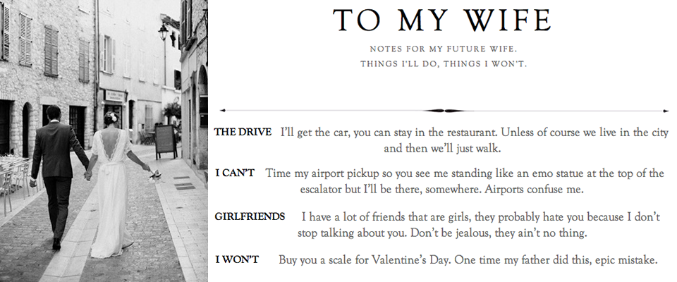
Who Could Resist: “To My Wife”
If you’re ever feeling like romance is dead, take a minute and indulge yourself in To My Wife. Girls, this may be your new guilty pleasure.
Similar to 1001 Rules for My Unborn Son (and who didn’t love that one??), Jannuzzi offers up charmingly sincere tidbits to his as-of-yet unmet future wife about what his end of the bargain will be and how he imagines small details of their relationship, including just enough things he can’t or won’t do to keep it from feeling overly sentimental or idealized.
![]()
Glamour UK interviewed Jannuzzi, offering more insight into who this guy is…
GLAMOUR.COM: How did you come up with the idea for To My Wife? Have you been keeping the list private before now?
John Jannuzzi: I saw a commercial for a jewellery store on television, a jewellery store I don’t particularly enjoy and wouldn’t want to buy my engagement ring at. So I just sort of thought to myself, “my wife should know I won’t be going there” and the idea really came out of that. So for a month I was thinking and gathering notes and I just publicised it this week. It’s not like I keep a leather notebook in my sock drawer with rhinestones and bows on it or anything, but I (and I think many other people) think about the future often. For me, I hope my future includes marriage and a family and all that stuff.
Recently on Editor’s Chair
Recent men and masculine things on Editor’s Chair… click over for more.
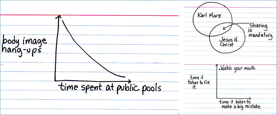
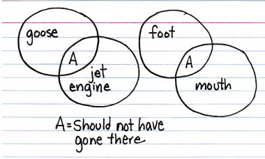
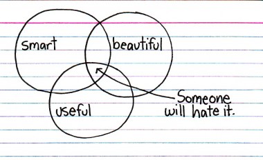
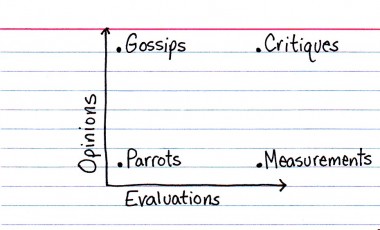
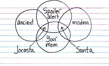
Indexed
Every once in a while, I love to check in on Jessica Hagy’s blog, Indexed. Each day, Jessica publishes either a venn diagram or a chart, and I absolutely love them for the same reason that I love good design: they communicate something complex simply. And quite often, they say something funny concisely, which is extra impressive.