Tourist Photo Composites That Look Like Monets
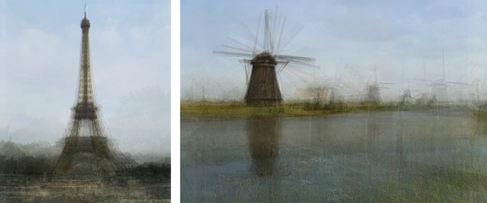
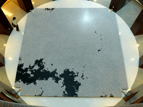
Artist Corinne Vionnet creates what at first appear to be Impressionist-style paintings by searching photo sharing sites using keywords for travel landmarks and then layering 200-300 of the photos of the same site on top of one another, creating this Impressionist effect.
The work is both catchy and amusing as well as slightly haunting and creepy, raising questions like, “Why do we take the same photos over and over? To prove we’ve been there?” “Is our experience of a place belittled and made tritewhen confronted with the reality that thousands of others have been there and chosen to capture the moment the exact same way?”

Or, one could see it as life and community-affirming in a way– even though so many have taken this same shot
before, it remains important and significant to the individual, and by taking the shot, and then uploading it to a photo sharing site, we all continue to contribute to a collective memory and to broaden the base of things we all as humans value and crave to experience.
I think this project could send me off on philosophical wonderings for quite a while, in a neverending argument with myself, so I’ll stop now and let you just enjoy this feat of technology. How cool is it that online photo sharing made something like this possible??

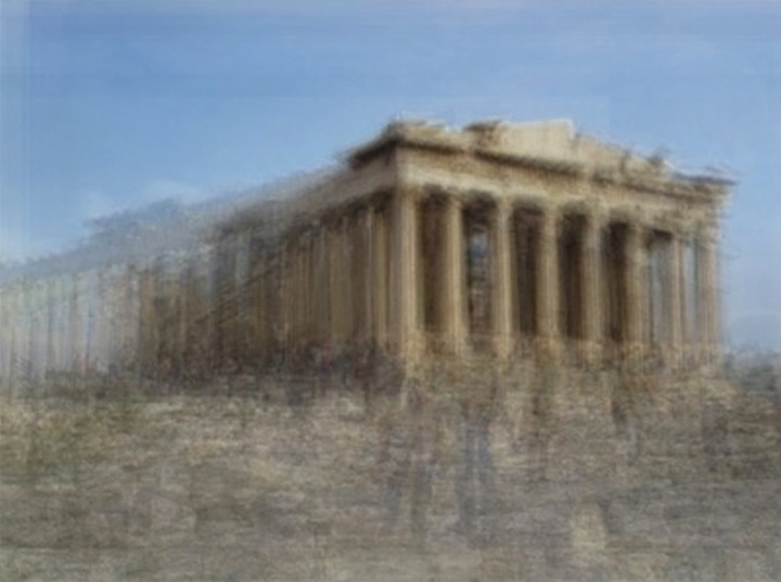
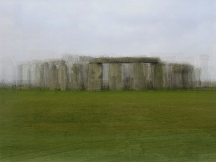
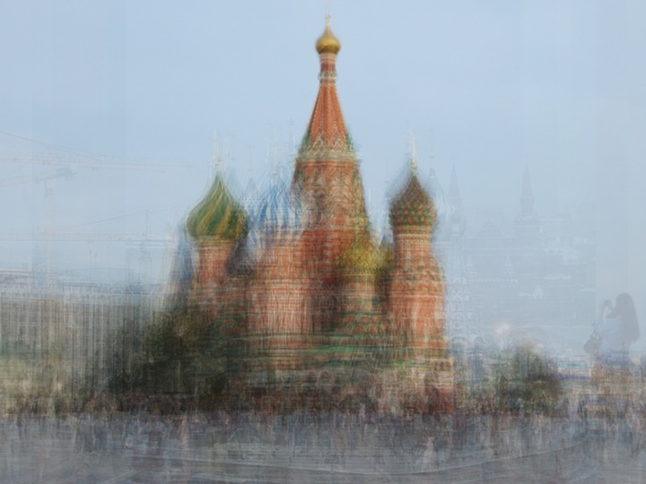
Ok and one final thought– a daydream I think about a lot that is relevant to this post– Have you ever wondered how many other people’s travel photos you appear in? Wouldn’t it be cool if face-recognition technology could scan photo-sharing sites and identify all the photos you’ve appeared in all over the world??
[via Fast Co.]
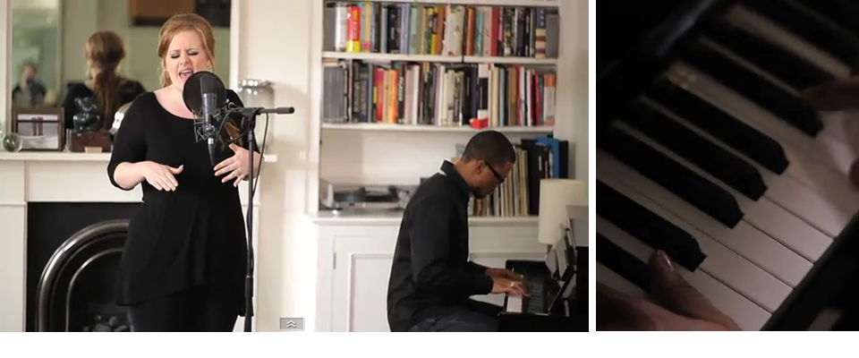
Adele
Yes, I’m talking about Adele again. It’s only the second time here on Wonderlust (but for one artist, that is kind of a big deal), but if you follow me on twitter you are probably ready for me to be done with it already!
I knew the first time I heard Rolling in the Deep when it was released months ago as the first single that I was going to love the album, and it did not disappoint. My play counter on iTunes tells me I have listened to the album 29 times. 29. I got it like three weeks ago. (Yes, bootleg, it drops tomorrow in the US.) And that doesn’t include iPhone plays.
Here, the song Someone Like You, which I’m pretty sure would put you on the brink of tears even if you’ve never had your heart broken. But I’m pretty sure everyone has imagined the situation she’s describing… you run into your ex and they’ve moved on… woof.
But anyway, in this video, she performs the song in her own house, so it’s quite cool to get a look at her house, and she gives a little intro on writing the song.
PS- If you’re new to Adele, check her out if you like Etta James, Lauryn Hill, and/or Ella Fitzgerald… she’s along those lines. But white and British. Interesting, no?
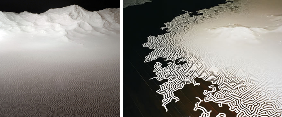
Yamamoto’s Salt Labytinths
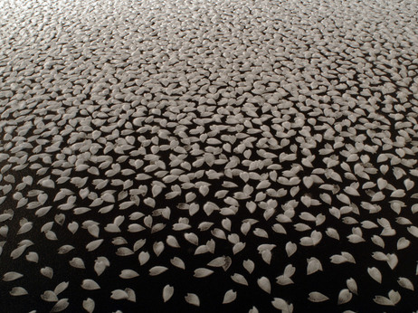
Most beautiful things made from unusual mediums will catch my eye (I think the fascination began with the work of Vik Muniz), and these salt creations by Motoi Yamamoto certainly fit the bill.
However, the rationale behind the medium in Yamamoto’s work ensures that it is not just beautiful, unusual, and wow-inducing for the time it takes to make, but also meaningful.
The artist began working with salt, which is significant in the mourning process in Japanese culture, after his sister died of brain cancer in 1994 at age 24 as a way of dealing with his grief and frustration. The labyrinths and complex patterns, according to Yamamoto, are meant to convey a sense of eternity.

Don’t they also remind you of the raking in zen gardens? Knowing the reason for the use of salt, the pieces take on a highly meditative effect.

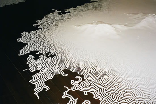
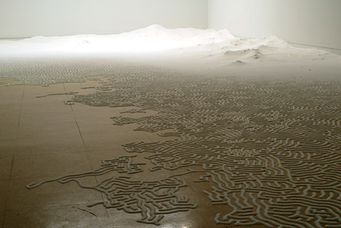


More at this NPR article.

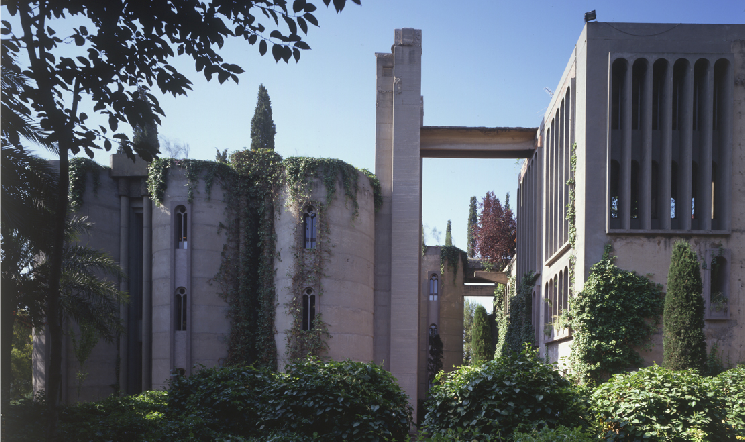
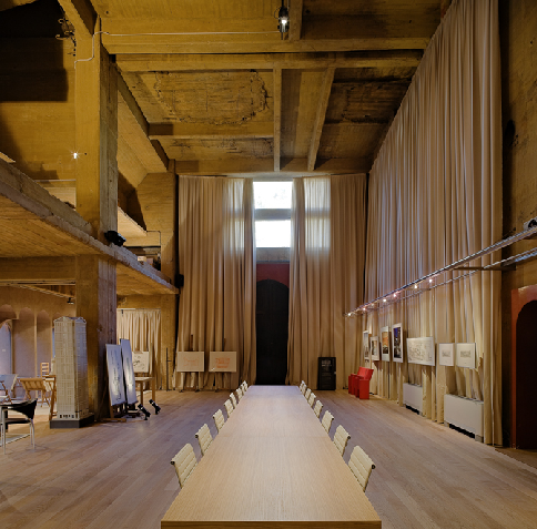
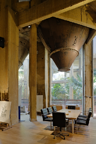
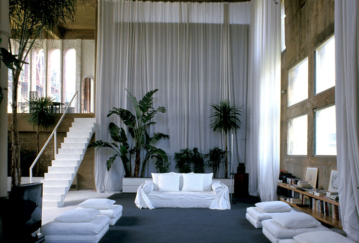
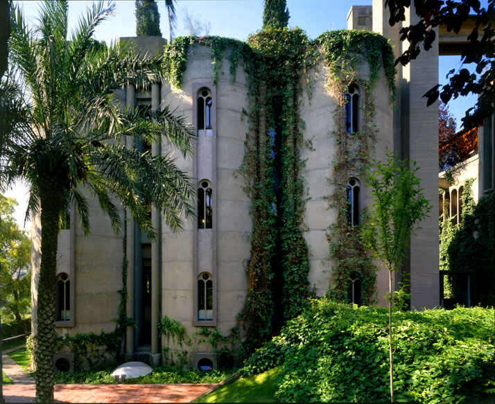
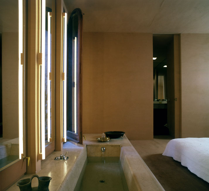
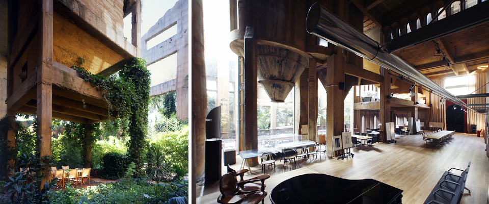
A Live/Work Former Cement Factory
I have a thing for converted spaces. You’ve probably noticed by now.
This amazing thing is a former cement factory in Spain that architect Ricardo Bofill bought in the early 70s and began transforming into his company’s offices and his own home.
Sophisticated, serene, and sexy, I’m digging the monochromatic palette and the combination of crazy lengths of linen, sleek furniture, soft white poufs, raw wood, and concrete.
For a thorough article on the project, check out this awesome piece on Yatzer.


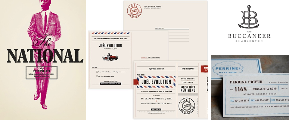
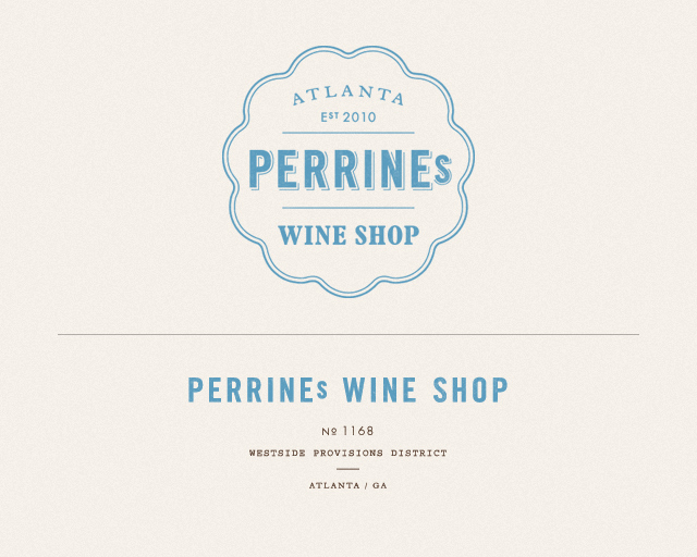
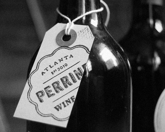
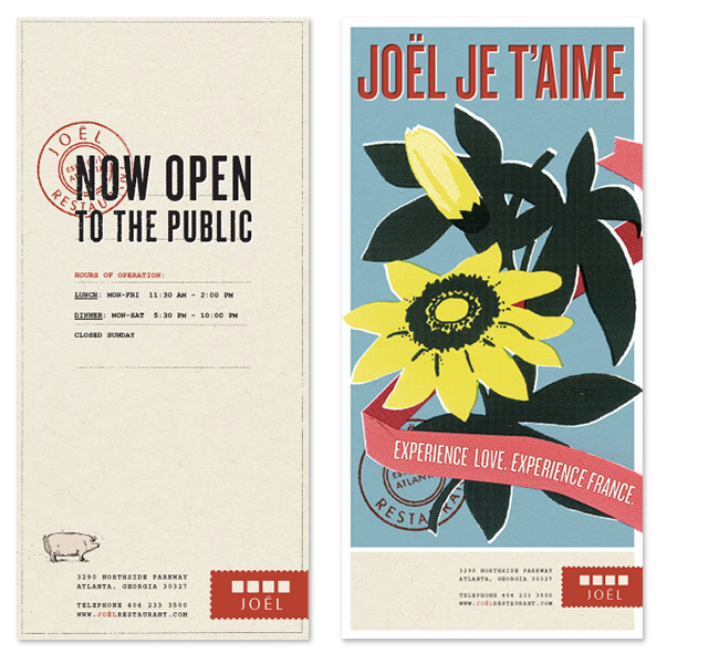
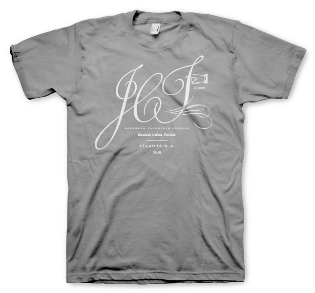
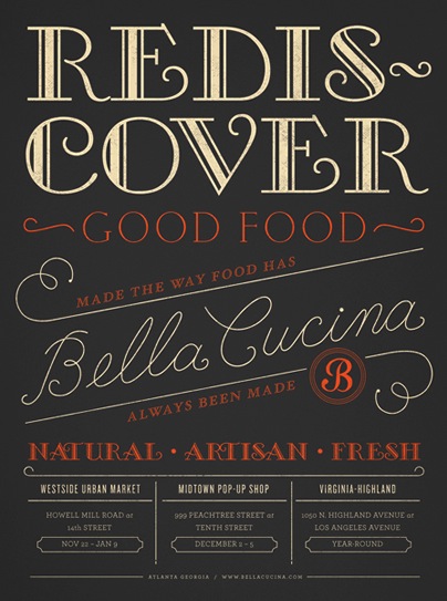
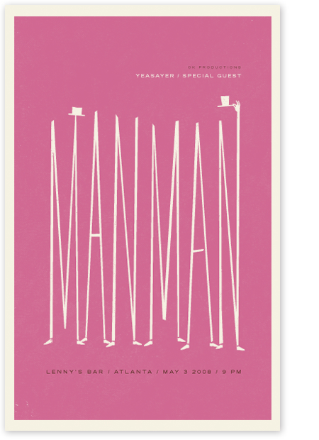
Alvin Diec
I recently came across the work of Alvin Diec and originally thought I’d post a couple of his pieces on Editor’s Chair. Then, I started perusing his entire portfolio, and as I usually do, I was dragging things I liked into various folders on my desktop. Then, I realized I’d dragged almost every single thing in his portfolio into one folder or another.
So, I decided to share all of it with you (or at least, a lot of it). His brand identity and graphic design work is just so spot on. Classic and authentic looking, like the brands could have been around for decades, and yet unique and interesting. And he seems to have a lot of the same obsessions that I do… things that look like old tickets, twine, airmail envelopes, ampersands, luggage tags…
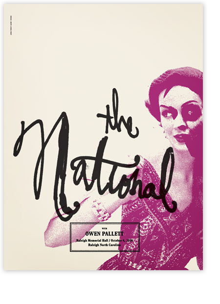
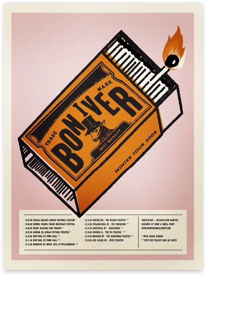
Here are a few of his poster designs…

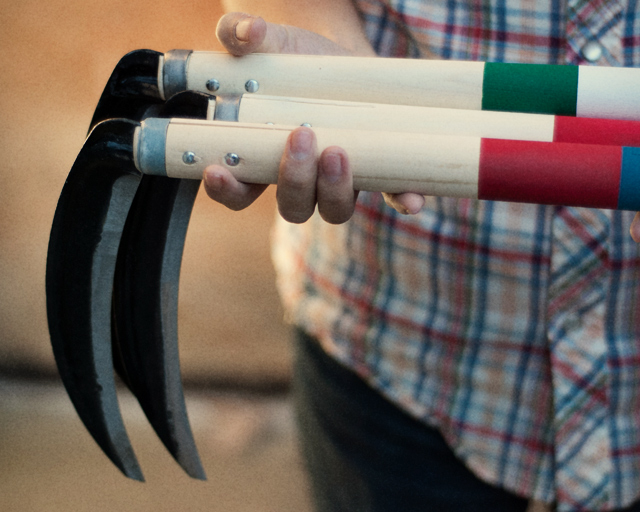
Oh! And he has a project in his porftolio called Fairly Well Made Co.– clearly a play on Best Made Co., the axe brand that I developed a serious fascination and love/hate relationship with– that makes scythes instead of axes and is hilarious. Here it is:

[And here, here, and here are past posts on Best Made Co if you missed them.]
Check out the gallery for lots more work…
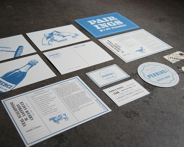
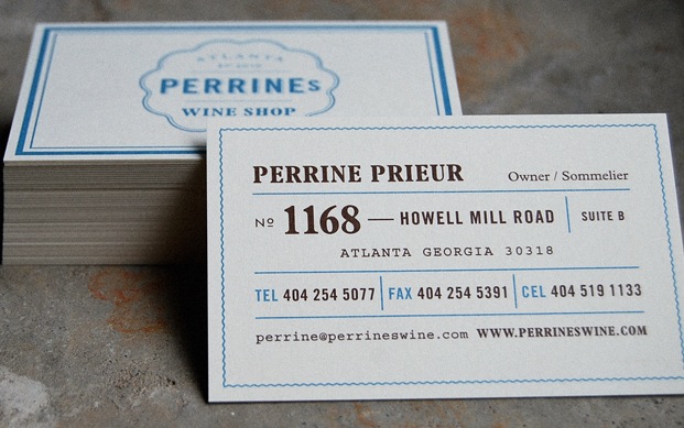
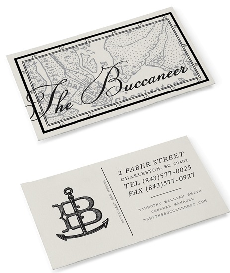
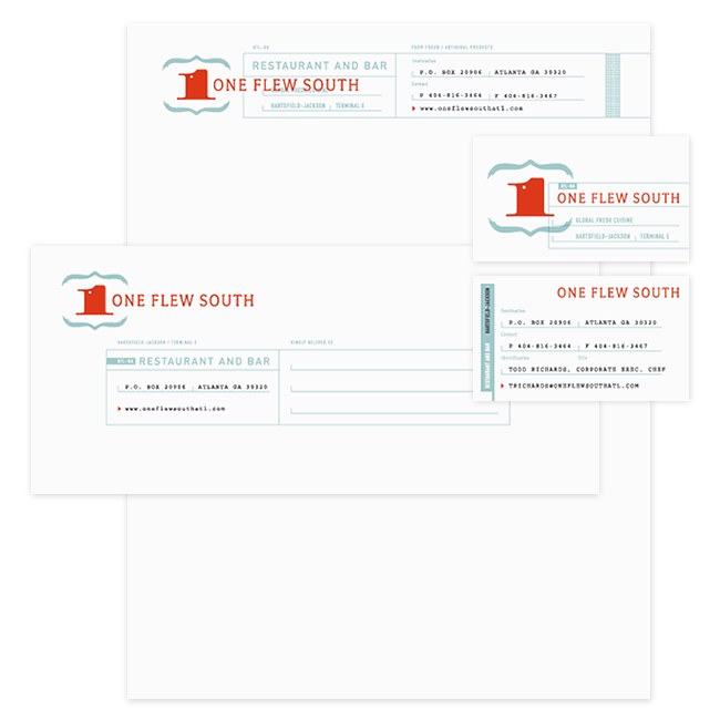


PS- AND, he lives in Atlanta! Atl represent!
Curated by:
Eliza Coleman
Section:
Graphic Fix
Labels:
branding, Graphic Design, posters
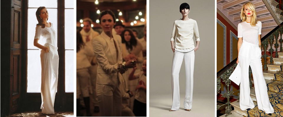
White on White
I’m totally intrigued by these all-white (mostly wide-leg trouser) looks, and the way their accessories (or lack thereof) and styling differentiate them.
My favorite is the look with the blazer, and I also really love what the chunky gold chain bracelet does for the outfit on the far left. And how about the white-on-white with blond hair and red lipstick!
I’m also digging this one:

Recently on Editor’s Chair
All this PLUS:
+A video in which a 9 year old boy tells you how to talk to girls
+The new Strokes single
+A candle that smells like books and “evokes the atmosphere of your fantasy library and the pleasure of reading through the enigmatic scent of paper.”
(All for only $19.99 plus S&H if you click within the next 90 seconds. Click now, supplies are limited.)
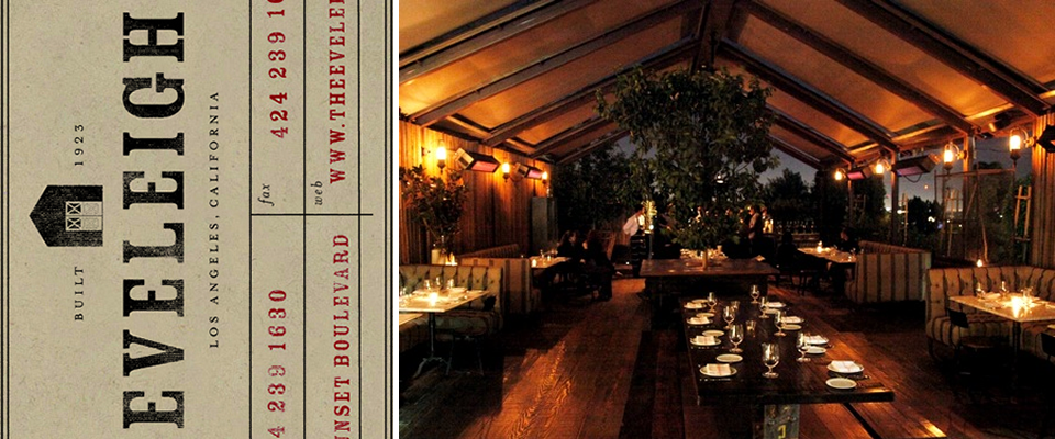
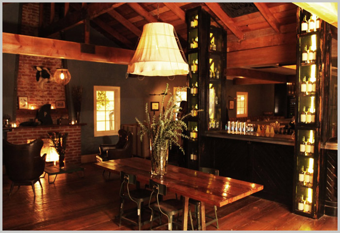
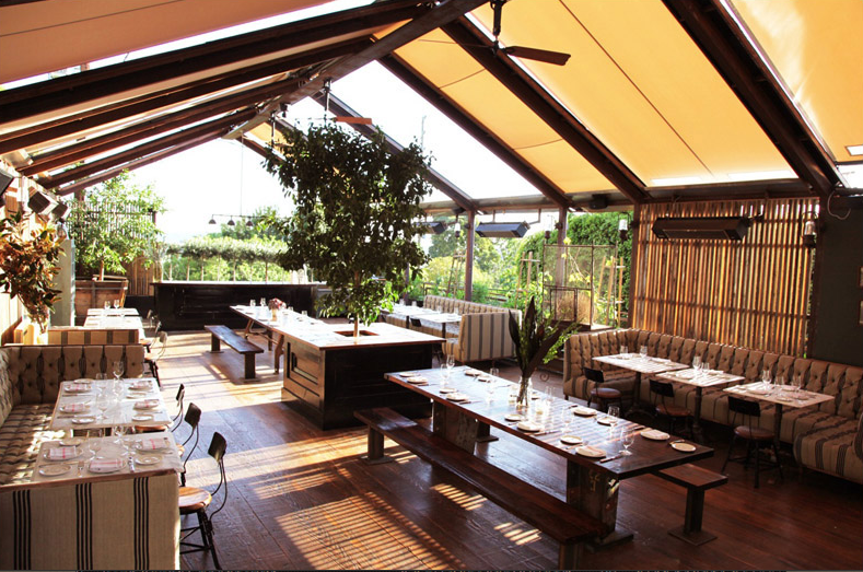
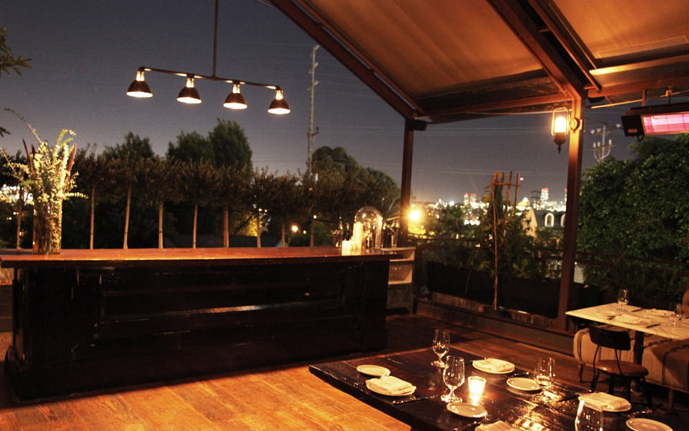
When in LA: The Eveleigh
I’ve never even been to the new restaurant The Eveleigh in LA, but I’m posting it anyway solely based on the design and the logo.
Depending on the weather, or more likely, your mood (because let’s not kid ourselves, it’s really rarely cold enough to need to be inside in LA), you can choose from an open air dining area with rustic wood floors, striped button-tufted banquettes, and a canvas tented top and sides, or a homey inside room with a brick fireplace, leather arm chairs, and wood beam ceilings.
Both options are alluring, and the food is described as “21st century LA comfort food.” Hilarious in it’s meaninglessness, and yet nonetheless appealing.


Curated by:
Eliza Coleman
Section:
Destinations, Interiors
Labels:
interiors, LA, restaurants
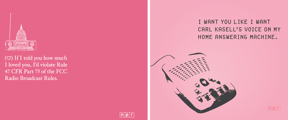
NPR Valentines
Ok good thing I posted that fight flow chart earlier and got something in there for the guys today, because now I absolutely cannot resist posting these NPR Valentine’s. (Not to say guys can’t love Valentine’s too!)
These make my NPR-loving heart flutter. I love that there’s even a Car Talk-themed one!
Download and then email, print, post to facebook, or whatever you want here.

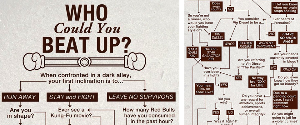
Street Fight Flow Chart
I like to keep a good mix of high and low, intellectual and fun, feminine and masculine, etc. etc. on Wonderlust, and since I just posted all those pretty outfits, I thought I’d throw this into the ring for a bit of more man-oriented fun/humor. And who doesn’t love a good flow chart?
Click the images below for full size….
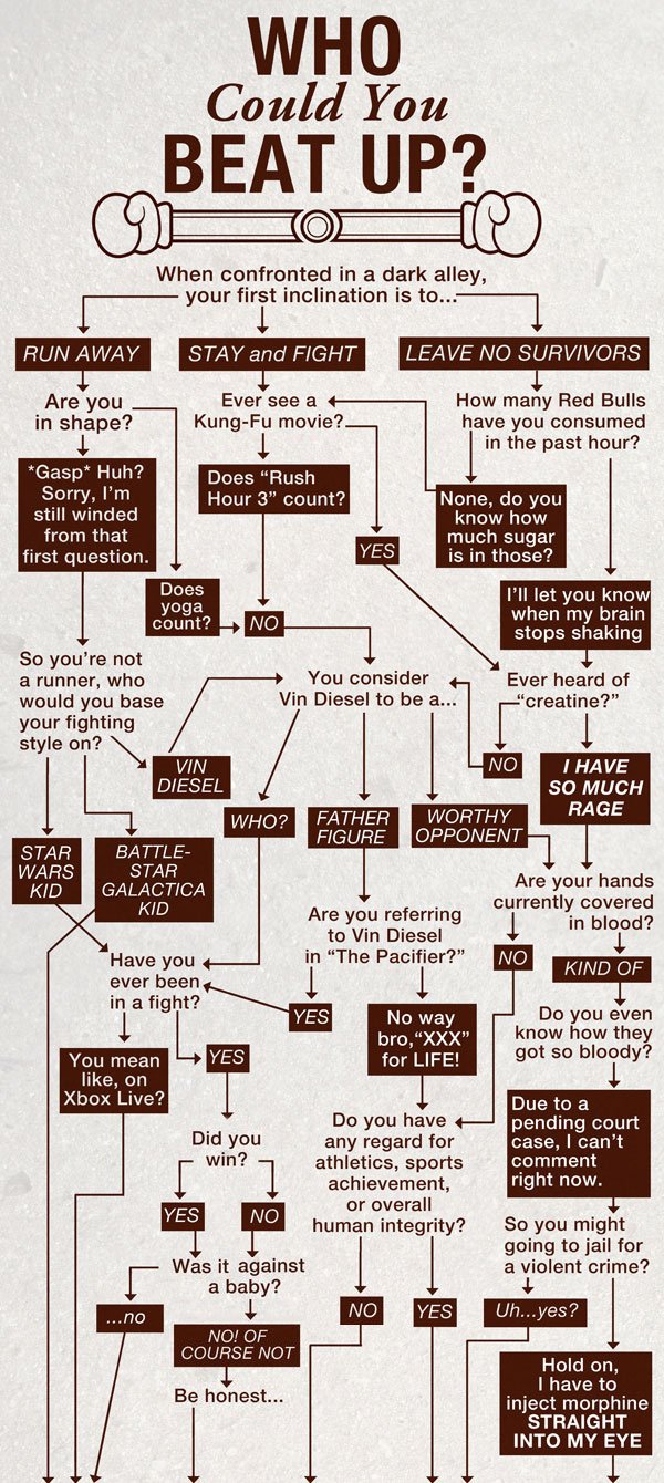

From none other than College Humor via LaEM.


