The Official Mfg. Co.
The Official Manufacturing Co. (OMFG), a collective of designers, describe themselves as “thing makers.” After working separately for the Ace Hotel and Wielden+Kennedy, they came together to unite their creative abilities.
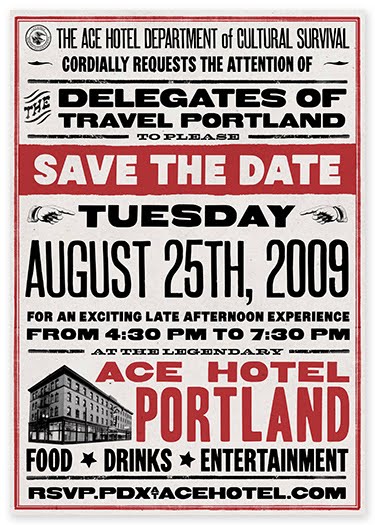
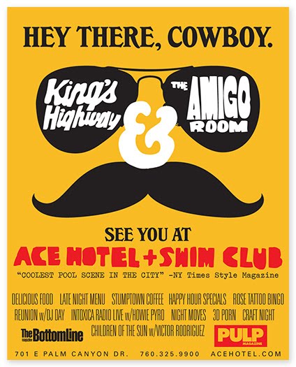
Below, some of the marketing collateral and identity work they have produced…
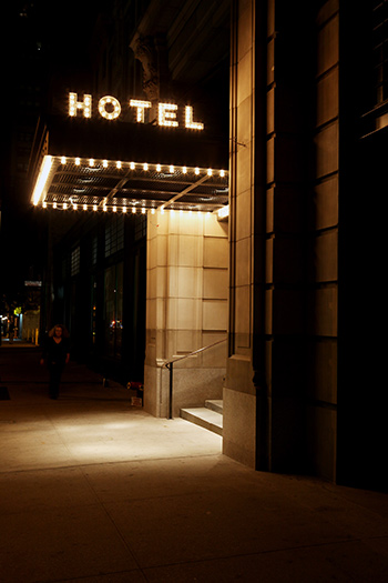
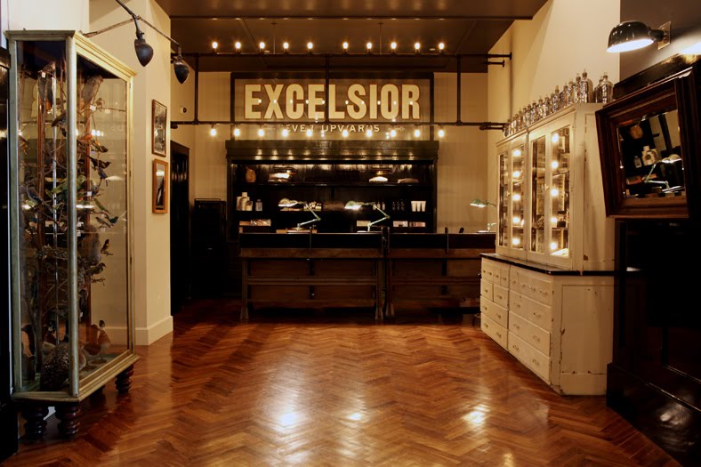
Their work, including the indoor and outdoor signage for the Ace Hotels, has a wonderful retro quality that manages to be evocative and authentic feeling, rather than kitschy. Or at least when it is kitschy, it is in a winkingly ironic way.
Doesn’t the sign above just do it for you? The marquee lighting is so simple, yet so appealing.


An album cover design for Black Prairie.
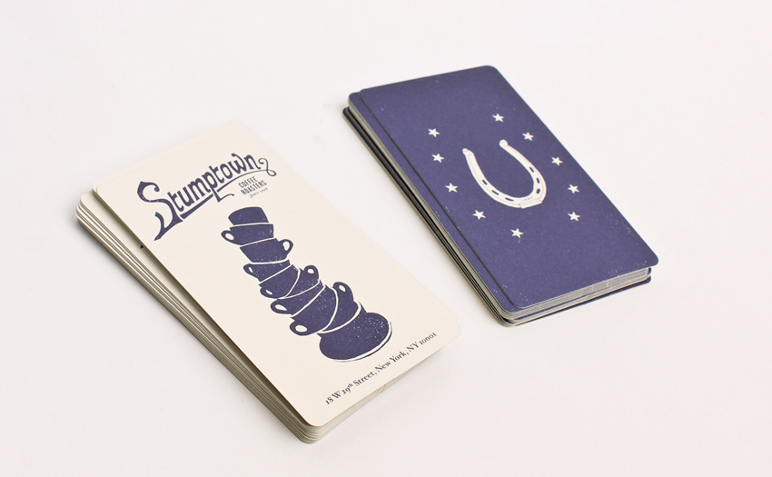
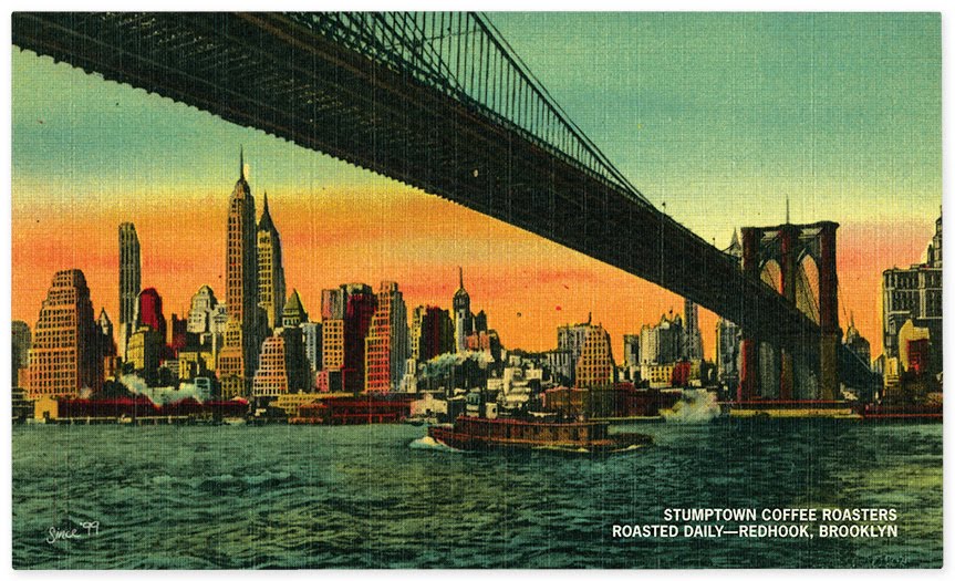
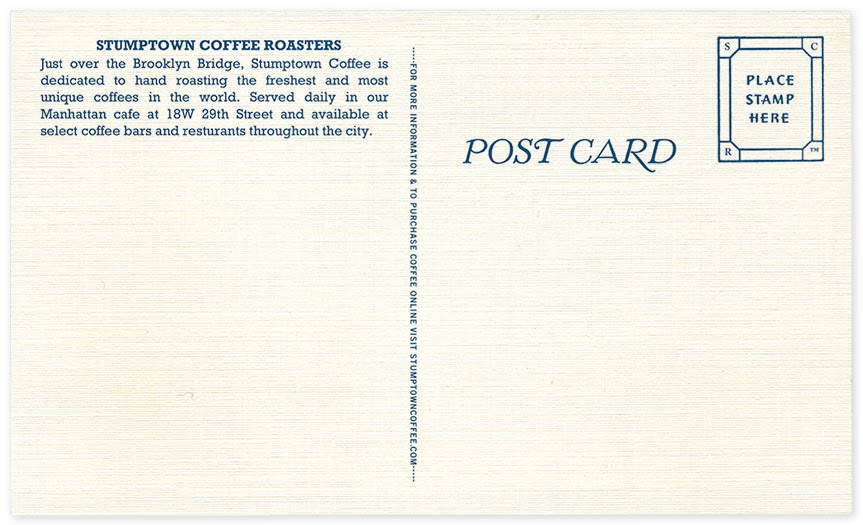
They also designed the packaging and marketing collateral for Stumptown Coffee (yum), which has a similar retro feel and looks awesome.

OMFG.
See more of OMFG’s work at their website here.
via Secret Forts
Field and Sea
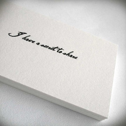
Loving Field and Sea’s tiny note cards– their straightforward messages are perfect examples of the kinds of things you just might rather say in a note than in person…


Also love the ones that say “You’re right, I’m wrong,” “You’re an amazing human being,” and “I have lost the right words, will these do?” Many more here.
Hand-Painted Wall Ads
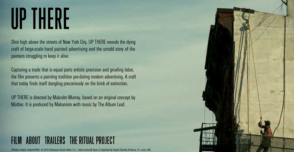
This video about the hand-painted billboards on the sides of buildings in New York, and the people who paint them, has a really magical quality. It sort of feels like when something starts with an image of the world from outer space and then zooms in and zooms in and zooms in and you finally land on one tiny detail on ground level… here the detail is the little world that revolves around the tiny and dying industry of hand-painted billboards.
It’s one of those things you might stop to think about for a brief moment every once in a while– “Who painted that? How long did it take?”– but then you never really get answers so your mind never wanders very far. In this really well-done (love the cinematography and the editing) short sponsored by Stella (brilliant move), you get a close-up peak at this world that not only gives those answers, but also puts human faces to the signs that seem to magically appear around town.
If nothing else, watch the the thirty seconds at the end between about 12:00 and 12:30… you miss out on the story but the visual is still awesome.
Random Acts of Creativity >> Hi-Jacked Classifieds
This is pretty great. I’d be stoked if my classified ad turned up looking like this…

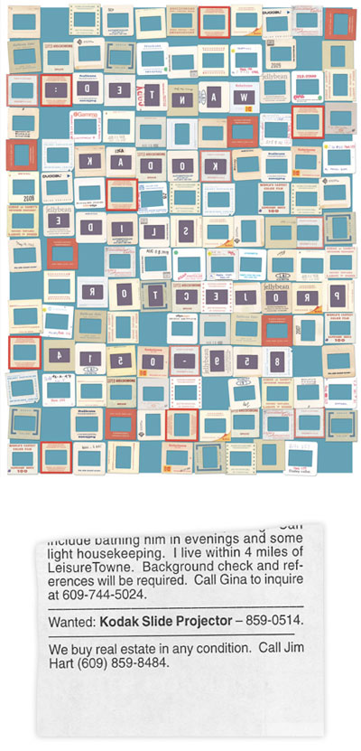
“The Type Directors Club in conjunction with Cardon Copy has asked some well-known designers to find a classified/personal newspaper ad from their local community to “hijack” typographically.
When redesigned, the once banal and disposable classified ads will be reinterpreted by the designer into a one-of-a-kind collectible poster.
Each poster will be auctioned on Tuesday evening, May 11th (starting at 6:00 pm), with proceeds to benefit the TDC Scholarship Fund.” The selection above is by Gail Anderson.
from Uppercase


