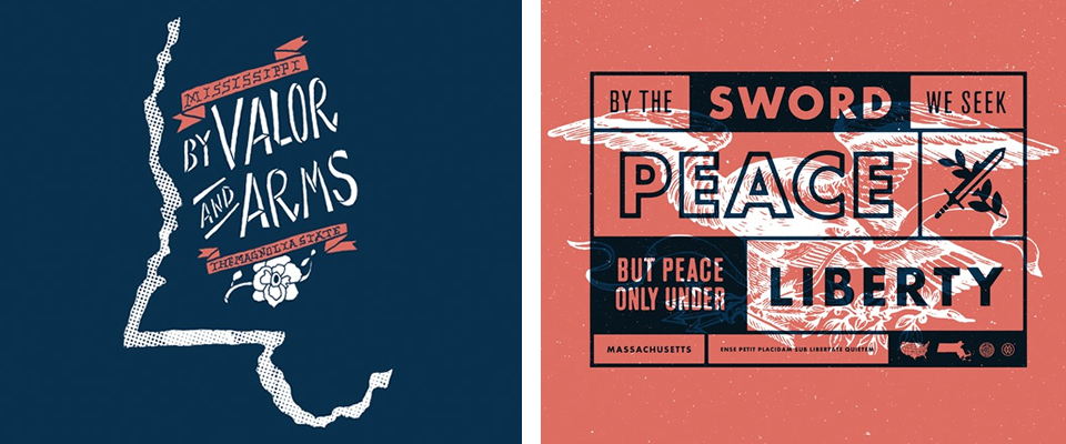
50 and 50: The State Mottos
This is horribly embarrassing, but If I had to point out Iowa and Missouri on a blank map, there’s about a 50/50 chance I’d mix them up. Also, the other day, I found myself in a conversation in which I was suddenly wondering if the Emirates in the United Arab Emirates were cities? Or states? How did I make it through 17 years of great schools without mastering geography?
All of that to say, I think this new project called 50 and 50, where a graphic designer from each state will illustrate their state’s motto, creating a “designers’ atlas,” may be my ticket to finally at least mastering our own 50 states.
So far, there are only six finished, but they are pretty enough that I spent time checking out each one, and if something is visually interesting, I have a far better chance of learning it…

PS- Did you know that California’s state motto is “I have found it! (Eureka)”? How awesome and (so California) is that? All of the other ones sound very formal and heavily wrought and then there’s California’s. And incidentally, as a California transplant, I talk almost every day about how I feel like I’ve discovered the best place on earth, so I can see why CA’s state motto-authors were unable to write anything other than something simply reflecting their joy at having found this state.
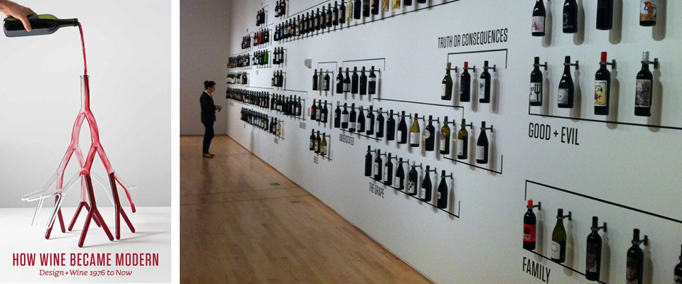
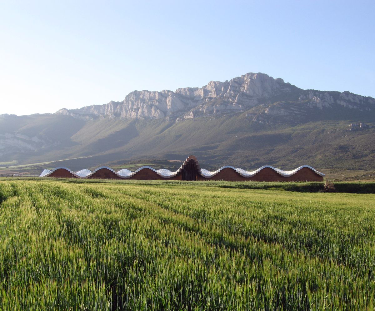
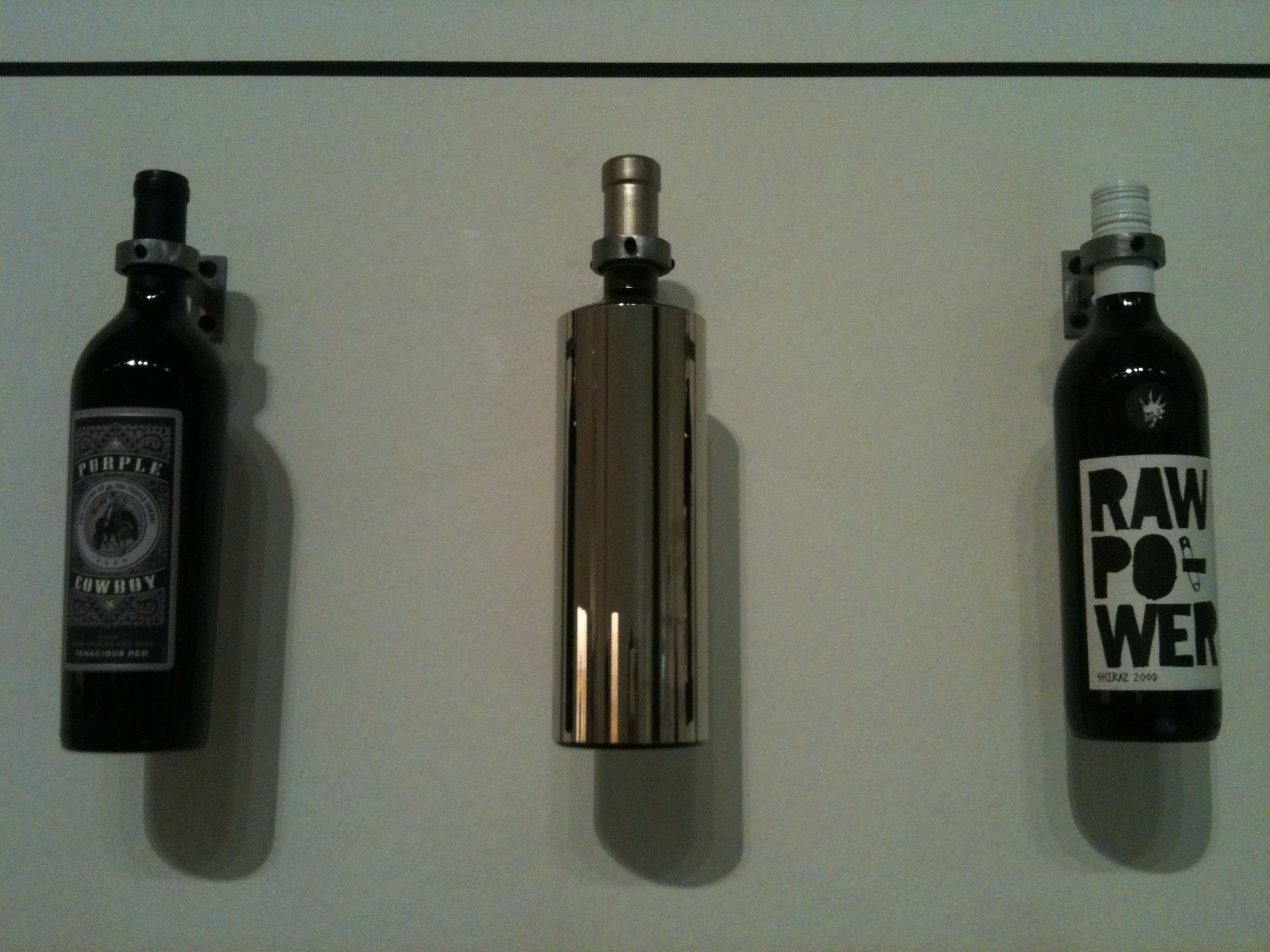
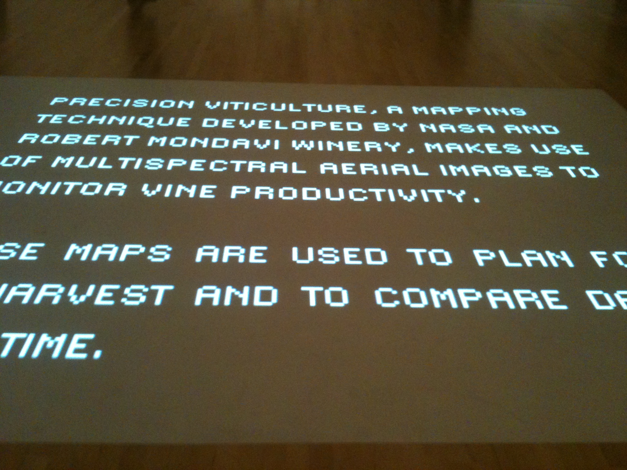
How Wine Became Modern
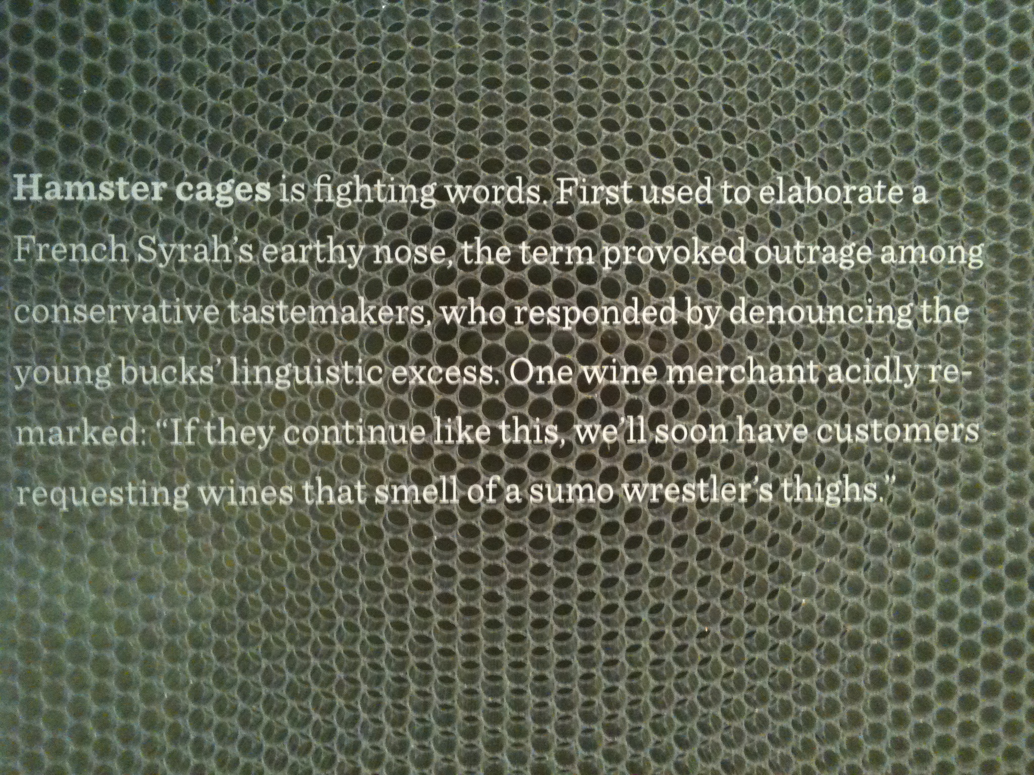
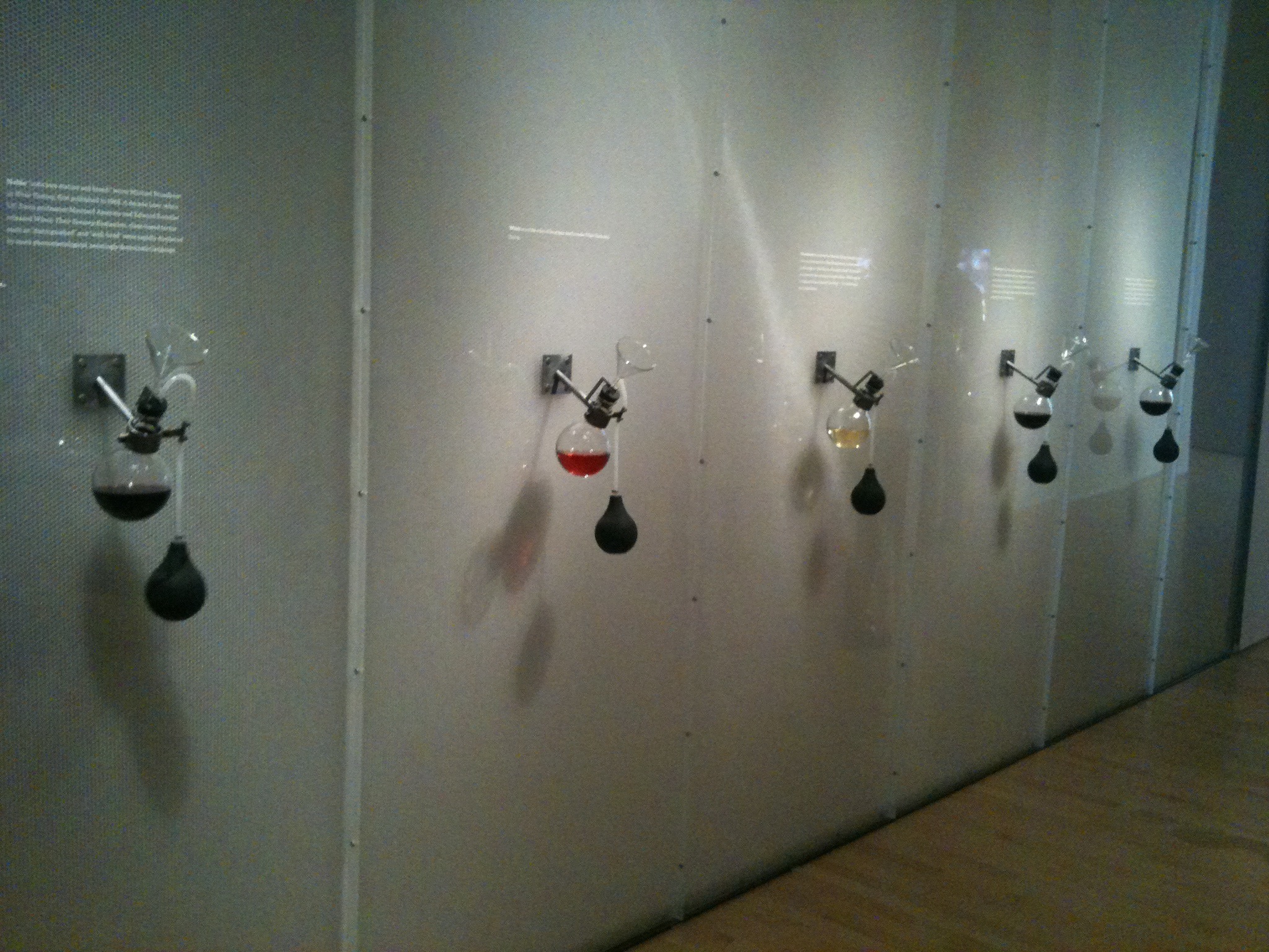
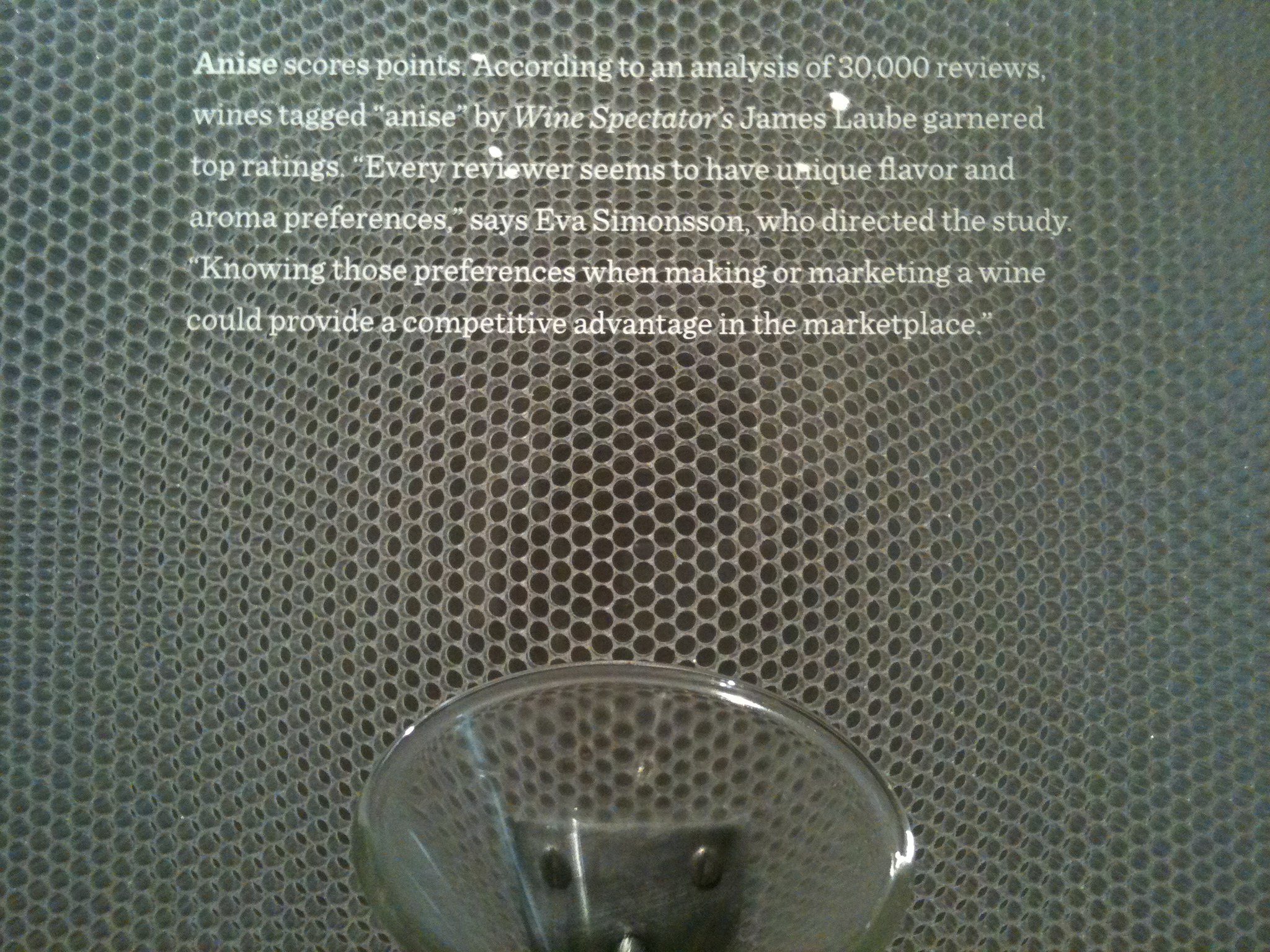
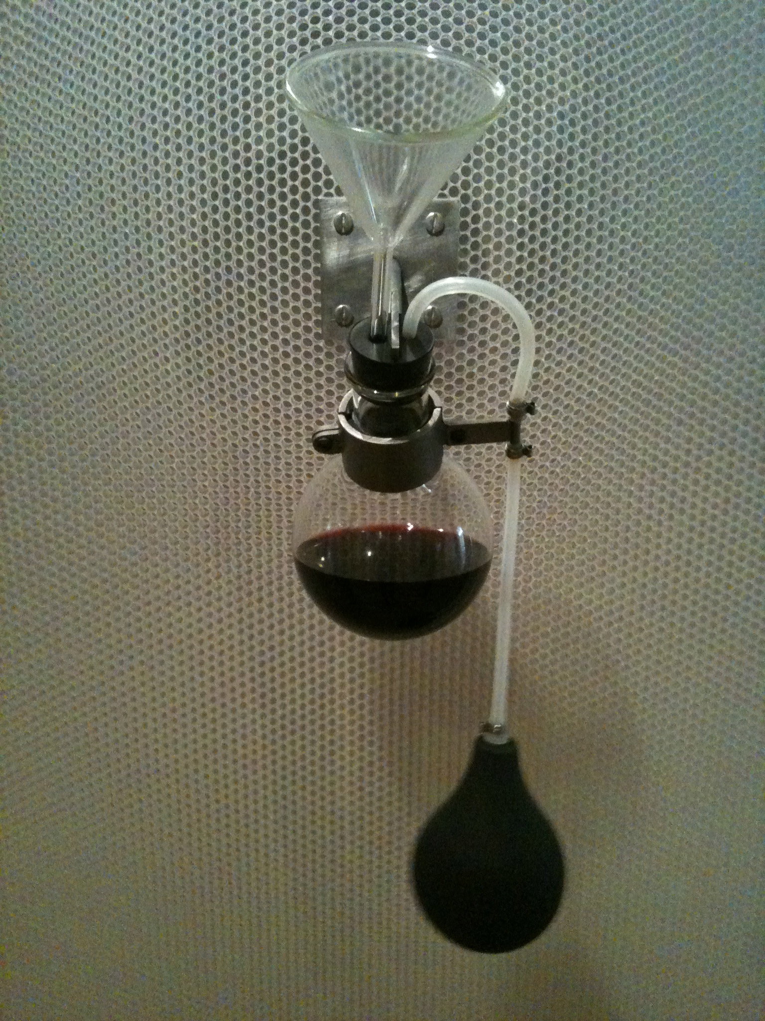
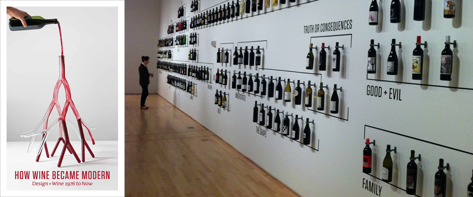
Last week, my roommate and I went to the exhibit “How Wine Became Modern” at the SFMoMA, and I think the only way I could have enjoyed it more was if they’d actually served wine (and seriously, they should have, that would have been awesome).
From winery architecture to terroir and dirt to labels, the exhibit covered such a range of topics related to the wine world that there was something for everyone, and it was un-pretentious enough to appeal to wine-novice but in-depth enough to still be educational for the wine-lover.

A few high points:


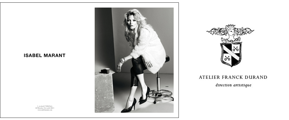
Atelier Franck Durand
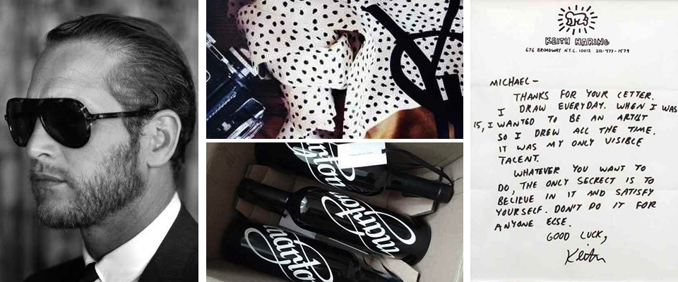
I love when the internet becomes a rabbit hole and one delightful discovery leads to another and another. That’s what happened last week when I saw the Man About Town skateboarding video of Kilian Martin that I posted on Editor’s Chair (it’s still floating around in my daydreams, by the way). I loved the video and paused at the credits to see who was behind it, which led me to Franck Durand, who art directed the video.
First thing I noticed is that I love his logo and font! Then from snooping around in his portfolio, I found out he also art directed the Kate Moss for Isabel Marant print ads I love (and posted on Editor’s Chair a while ago)! He has also art directed tons of ads for brands like Celine, Balmain, and Et Vous, and I’m crazy about their style. The photos have a wonderful combination of intensity and personality with a heavy dose of cool, and the layouts are so wonderfully clean.

Isn’t it interesting to see these brands’ ads all together, where you see the commonalities, and hence the perspective of the independent art director, rather than just the brand?


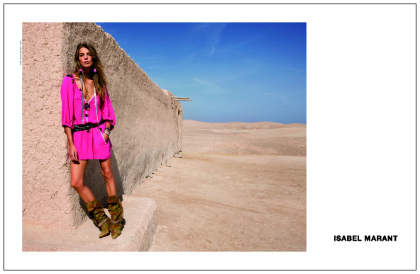
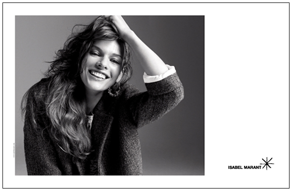
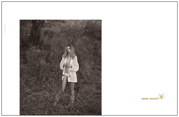
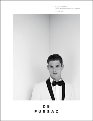
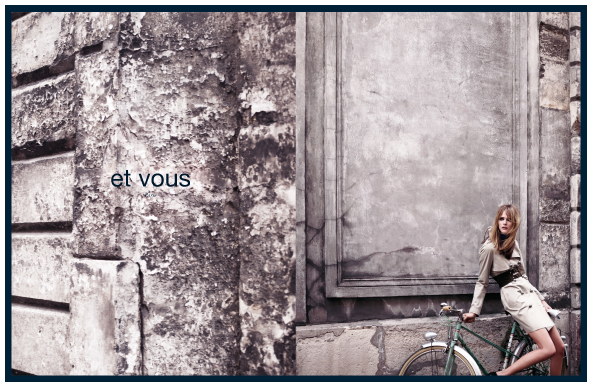
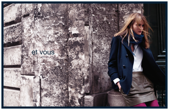
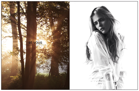


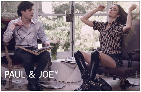
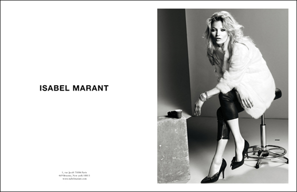
PS- Franck Durand is also the husband of Emmanuelle Alt! (Thanks to Kellina for commenting to let me know.) Very interesting. Totally makes sense. I feel like the same kind of cool that Emmanuelle simply oozes can be found in these photos. The man’s got a type (of cool).
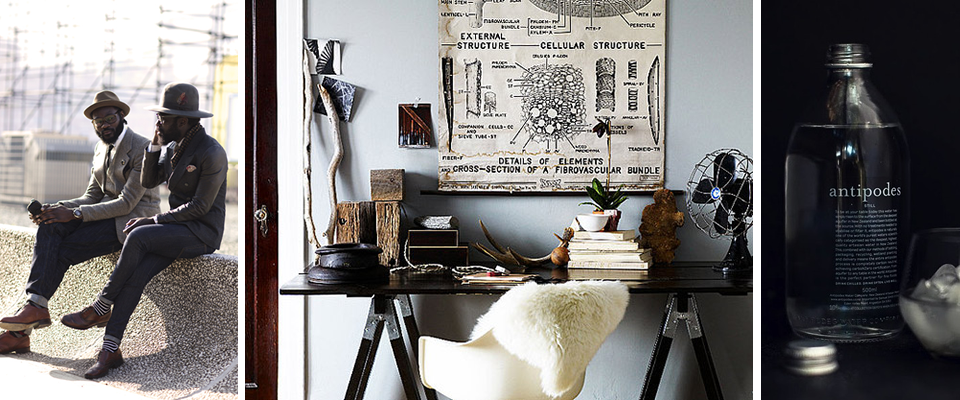
Recently on Editor’s Chair…
Just a tiny preview of the visual inspiration on Editor’s Chair this week…
Not to mention the most well-styled and art-directed skateboarding short I’ve ever seen and an interview with Banksy…
Curated by:
Eliza Coleman
Section:
yes to all
Labels:
fashion, Graphic Design, packaging, The Sartorialist
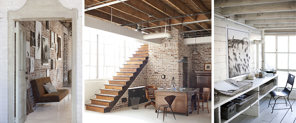
Industrial in Atlanta
Being from Atlanta, I was super excited when I came across this loft apartment in the King Plow Art Center on Design*Sponge! King Plow Arts is a former plow and agricultural equipment factory and warehouse that is now home to the Atlanta Actors Express theater, an event space, and other artsy companies. It’s located in the super hip East Side neighborhood, and I’ve been intrigued by the space ever since I went to a Bat Mitzvah there when I was twelve!
But I had no idea you could live there! The industrial heritage-meets-residential is so up my alley, and though I am absolutely in love with San Francisco, I found myself immediately checking if lofts* were available and how much they cost. I think there’s a possibility that I will live in about twenty different houses/apartments in my life because I can see myself in anything from an industrial loft to traditional Tudor style. But I digress.

Here, I present to you, the home of photographer Rob Brinson and his wife Jill Brinson, who is creative director for Ballard Home. You can read more about them and their home in the interview at D*S. Also, I fell in love with their pug, Ricky Bobby, who has his own website. He doesn’t have use of his back legs due to a spinal injury, and he has his own foundation to give wheels to disabled dogs! The website is hilarious/awesome.


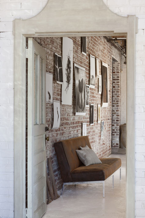
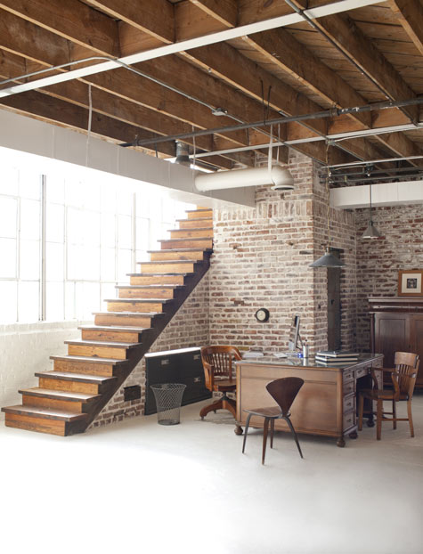
*In case you were wondering, you can get 2,300 square feet at King Plow for $475k.
Curated by:
Eliza Coleman
Section:
Interiors
Labels:
apartment, Atlanta, industrial, Southern
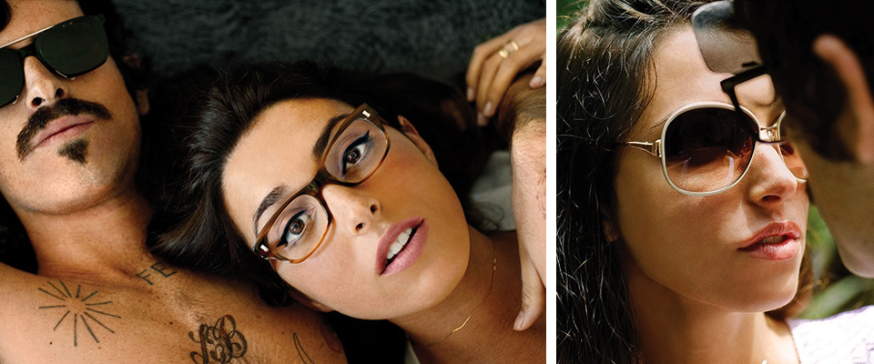
Devendra Banhart + Oliver Peoples + The Rainbow House
More LA for you today! Continuing the trend of fashion houses creating artistic short films featuring collaborations with famous directors to go along with their print campaigns, Oliver Peoples has created a real show-stopper.
For their new campaign, they brought in former fashion editor-turned-director and photographer Lisa Eisner to shoot Devendra Banhart and his (stunning) real-life girlfriend Rebecca Schwartz at the famous John Lautner Rainbow House on Mulholland Drive in LA.
NSFW, in an artsy kind of way, I’m pretty sure this video couldn’t be any sexier. The colors, the light, the song, the setting… allow yourself to be lulled into a daydreamy haze.
PS- How awesome is this song? It is called Brindo and is by Devendra.
[via Wine & Bowties]
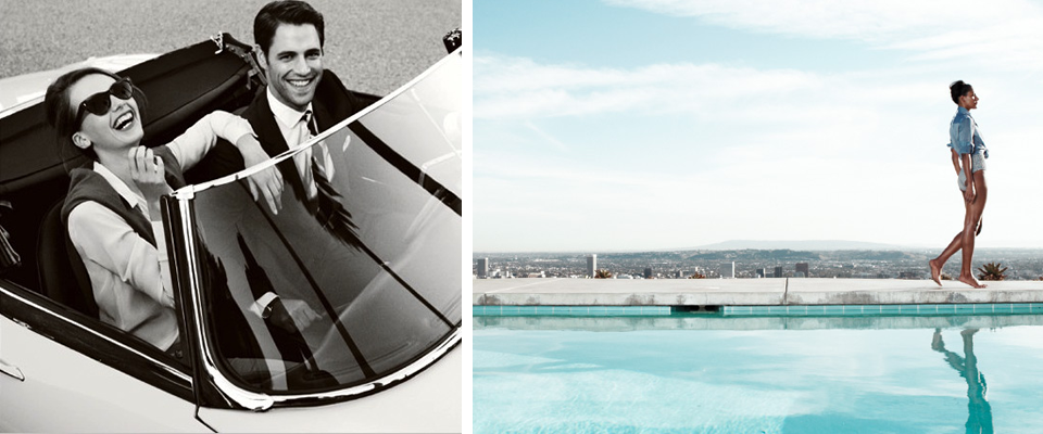
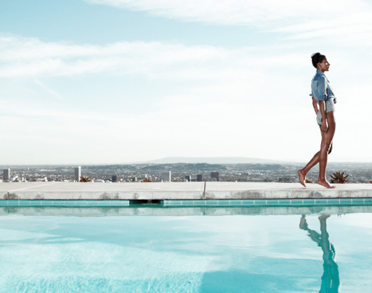
J. Crew does LA
I loooove the fact that J. Crew went outside their usual box for their newest catalog. When you think J. Crew catalog settings, you immediately think… coast of Maine canoe and picnic-spot type stuff. Not so for their latest, which is set in LA and wonderfully reminiscent of the Mad Men episode when they go to LA and Don goes MIA (not so much in the clothes, but in the photography)… cool blue pools, graphic black and white stripes, classic cars, and palm trees and sunshine.

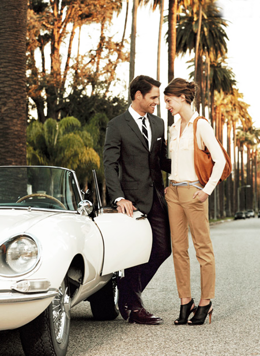

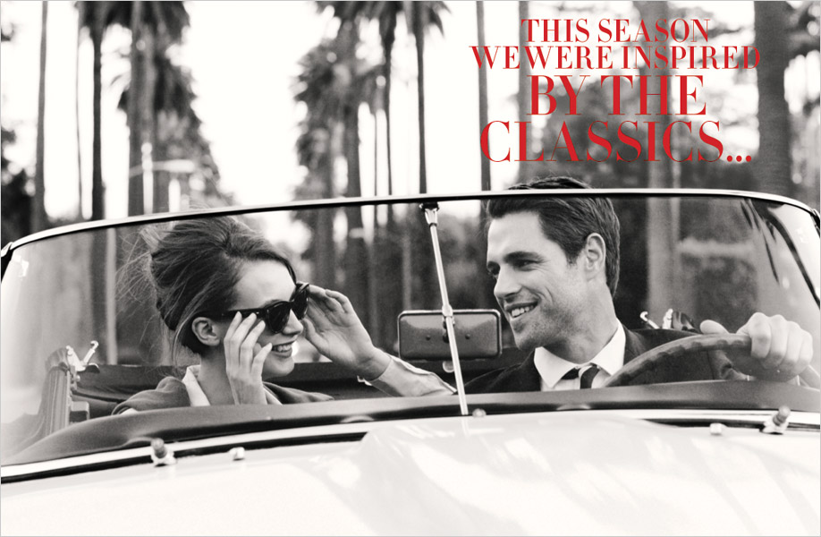
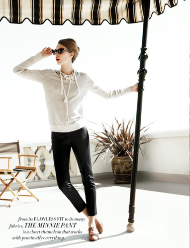
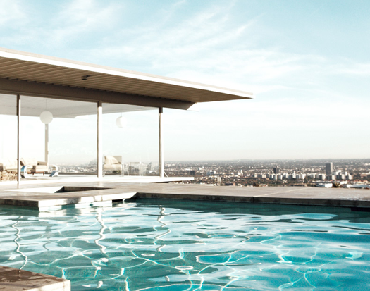
[via Dress, Design, Decor]
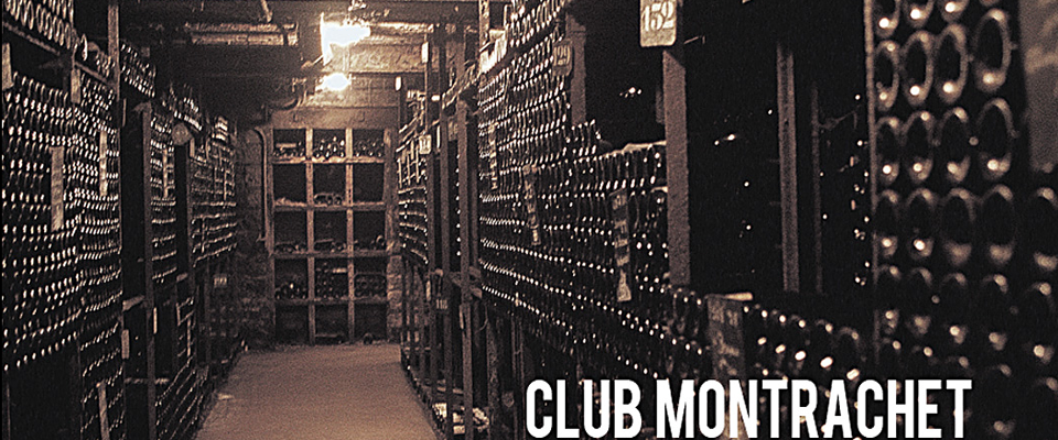
Club Montrachet
Wine can be an intimidating world, and few parts of it are as intimidating as Burgundian wines. That’s where Club Montrachet comes in. Club Montrachet is owned and run by a handful of people from Burgundy who are plugged in and know their stuff, and they curate a rotating selection of wines that you order six at a time. As an additional benefit, as a member of the club, you get the wines at a discount because you are bypassing the markups tacked on by distributors.
On top of that, their site, designed by Shane Edelman, is just really awesome and totally breaks the mold of what you might imagine from a French wine club. Fresh, approachable, and hip.

I particularly loved this little video, with it’s charming writing-on-photos + voiceover approach and Amelie-style music (I’m pretty sure that actually is a Yann Tiersen song playing!).
Lastly, I have to tell you, when I emailed Philippe Faraut, the president, about writing a post on Club Montrachet, expecting that maybe I would hear back, maybe not, he personally called me back about an hour later to talk about the company and to hear about Wonderlust! He clearly has a passion for this project, which is just a side hobby for him, and if I didn’t already love the concept, I certainly do now! How’s that for a personal touch?

Curated by:
Eliza Coleman
Section:
Masters and Their Crafts
Labels:
Graphic Design, video, website, wine
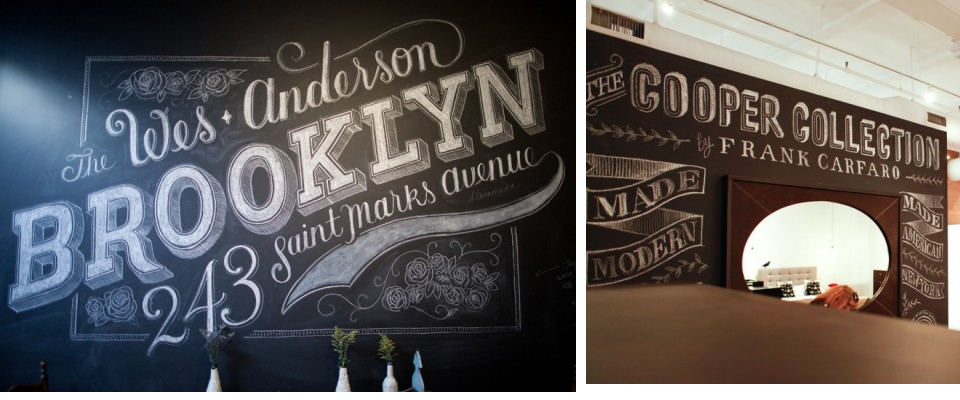
Dana Tanamachi’s Chalk Installations
I love chalkboard paint (see past post on chalk paint walls), and I love chalk writing (don’t menus in cafes look so much more charming when they’re written on a chalk board?), so naturally, I love Dana Tanamachi’s chalk installations. Their retro hand-painted storefront window sign quality is so appealing!
In addition to her chalk work, Dana also works for Louise Fili, so it’s no surprise that she’s a whiz with letterforms and signage.

Check out this fun 30-second time-lapse film of her Cooper Collection installation. I love that it’s set to a Morning Benders song!
Curated by:
Eliza Coleman
Section:
Graphic Fix, Masters and Their Crafts
Labels:
chalkboard, Graphic Design, installation, signage, typography
Recently on Editor’s Chair
For more (tumblr-style) visual inspiration, click over to Editor’s Chair…
Curated by:
Eliza Coleman
Section:
yes to all
Labels:
Garance Dore, packaging, Paul Newman, snail mail, wine


