E. Tautz Branding
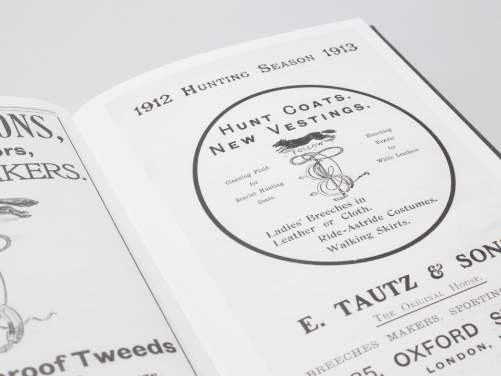
Moving Brands, a branding company based in London, was asked by E. Tautz, a luxury menswear brand, which started out as a military-outfitter, to create a brand identity for them.
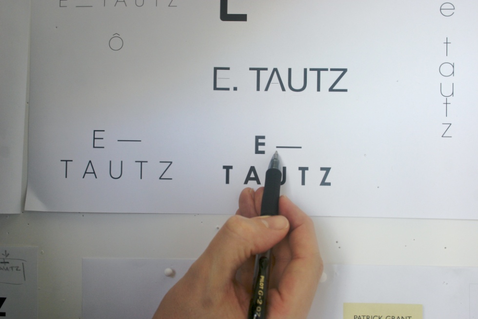
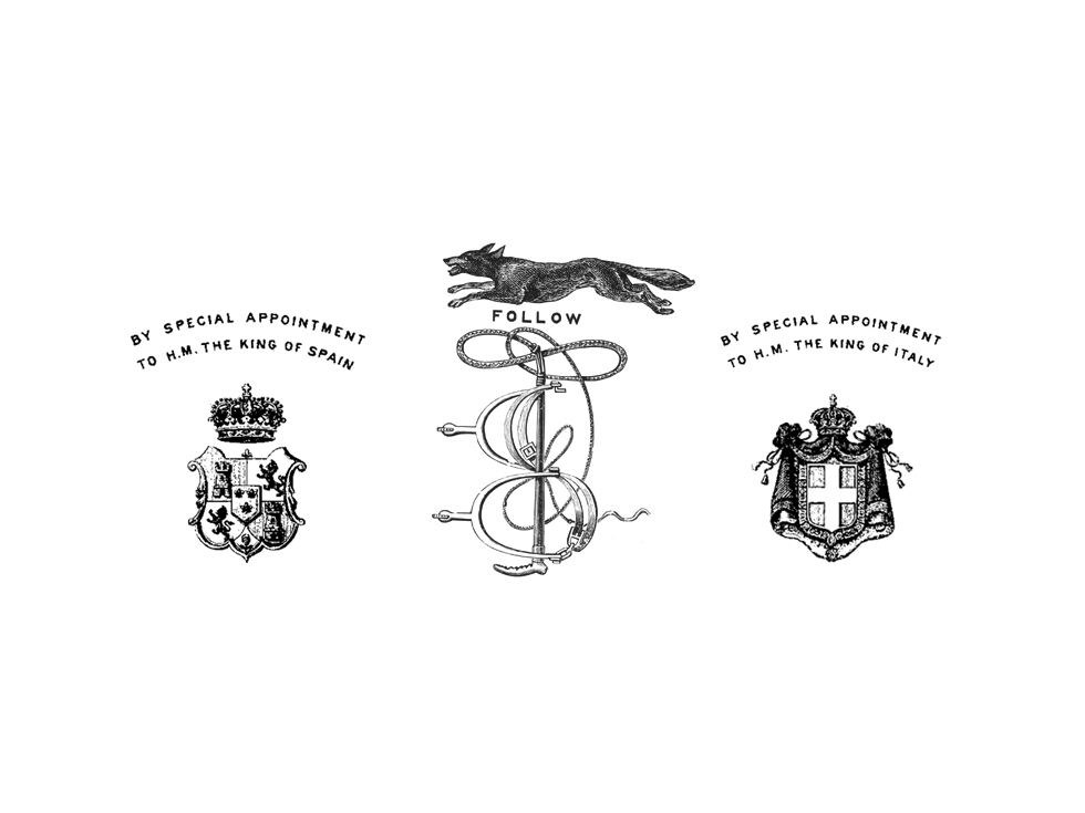
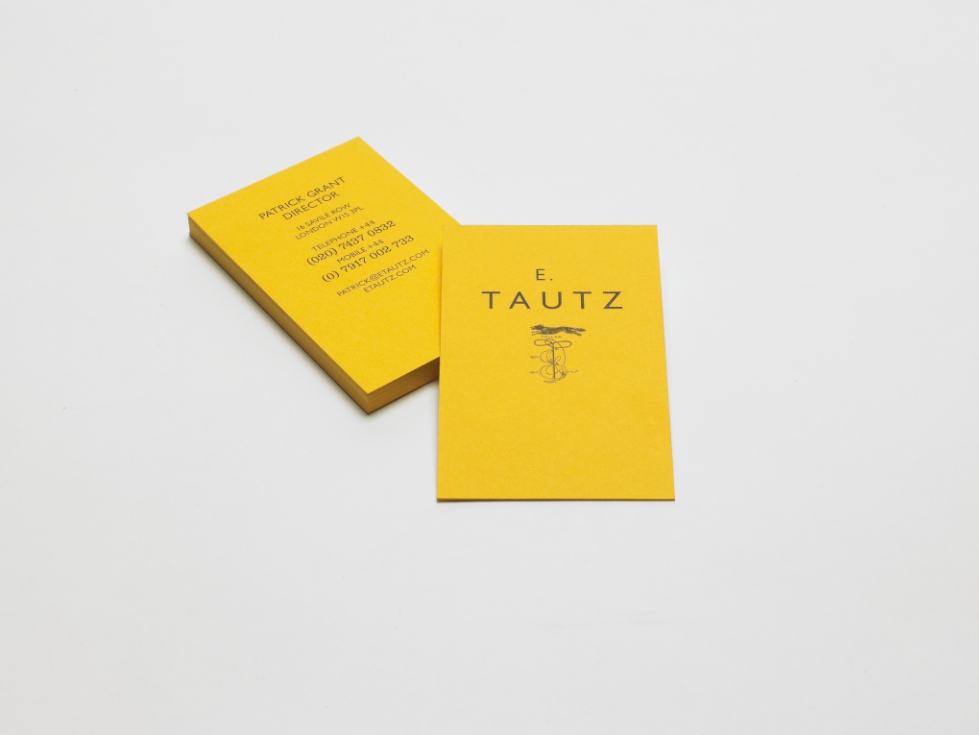
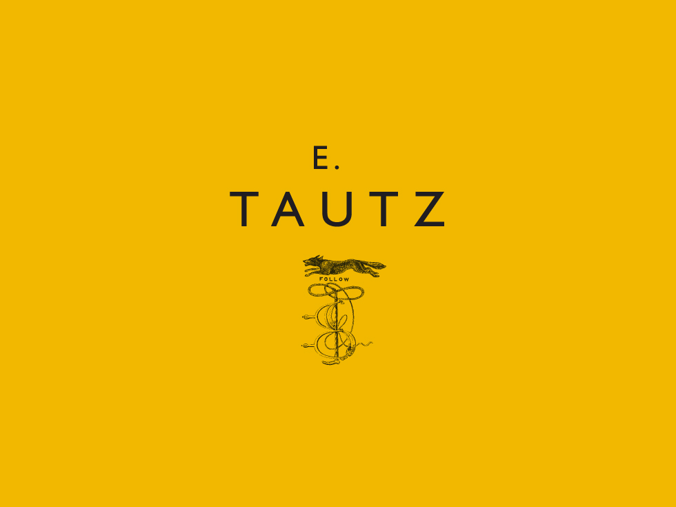
Above is the logo they came up with, pairing the clean, modern Gill typeface with the traditional-looking fox and whip icon, all set on the broad field of utilitarian-feeling yellow. Don’t you think the yellow is a stroke of genius? The yellow is so unusual and distinctive and the size of the field compared to the actual logo makes a serious visual impact.
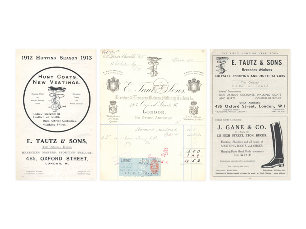
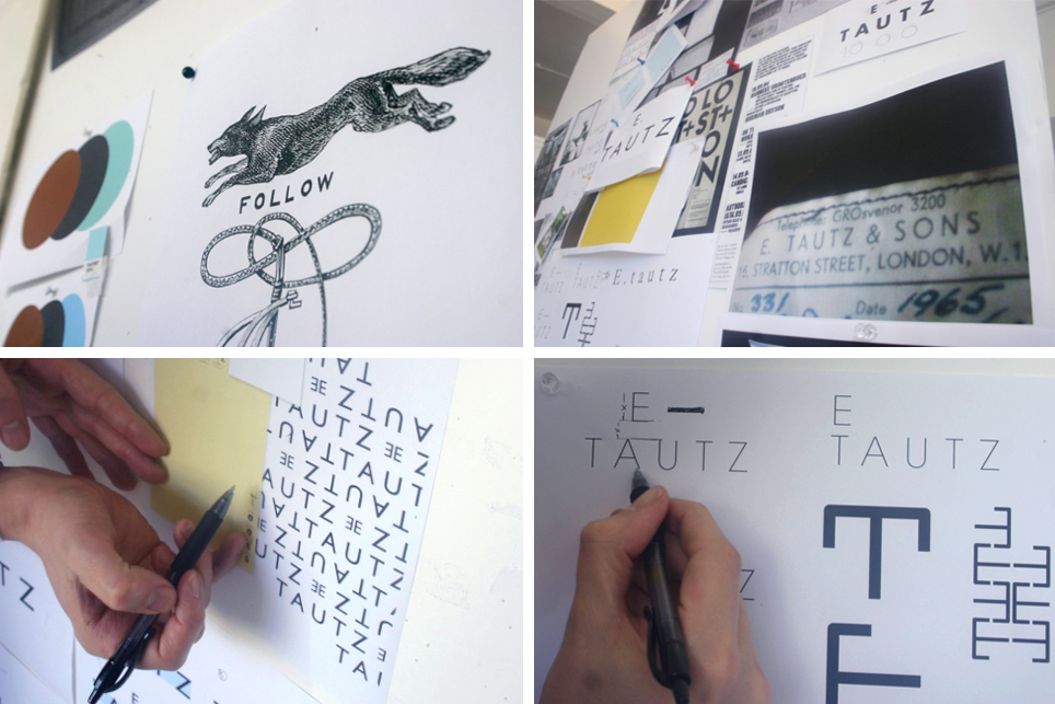
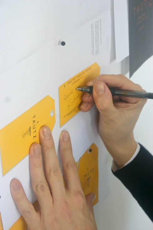
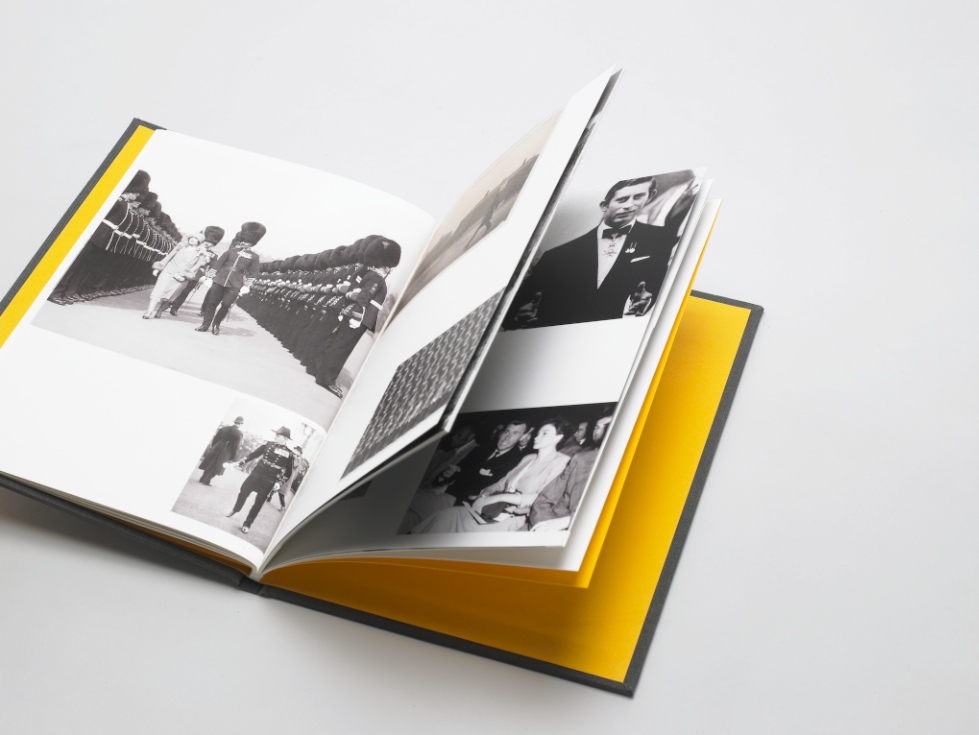
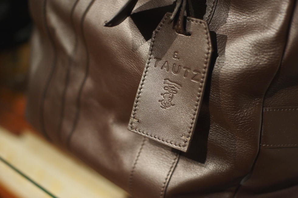
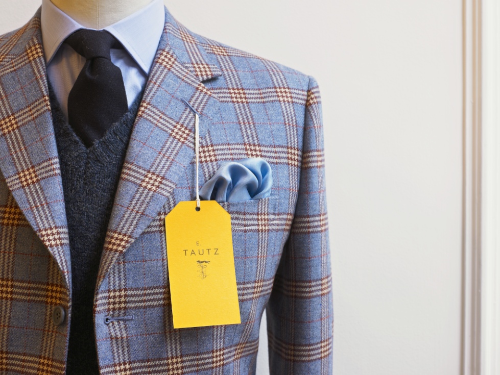
Below, their creative process and the resulting collateral.