In God We Trust

If I were a smoker, I’d definitely need one of these cool customizable brass lighters from In God We Trust. Just enough space to fit your initials.


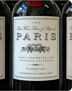
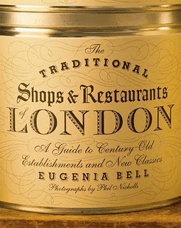
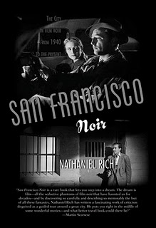
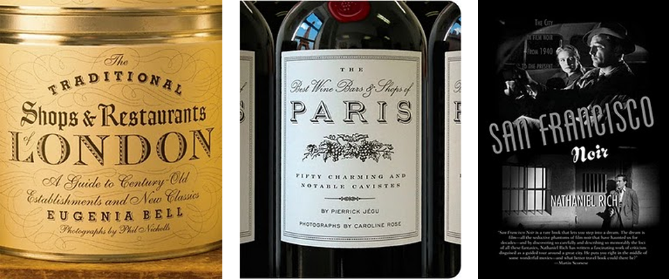
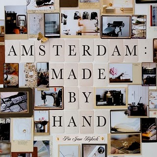
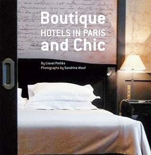
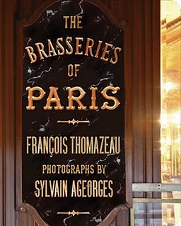
Travel Guides for Design-Lovers and Connoisseurs of All Sorts
Now this is the kind of guide book that could really get you excited about a trip. Published by the Little Bookroom, these guidebooks have fun, specialized topics and hands-down the best covers of any guidebooks I’ve ever seen.
Maybe not practical to actually haul with you, since each city has multiple books dedicated to various topics, rather than comprehensive guides, but wouldn’t you love to leaf through these every night in bed leading up to a trip to pick all the places you wanted to go?
And then they’d forever remain on your coffee table or bookshelves, collectible reminders of your trips.


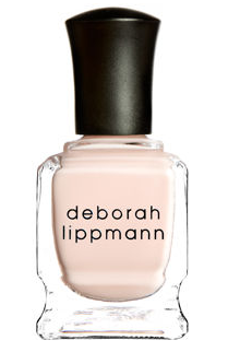
LustList >> Deborah Lippmann Nail Polish
I’m sure anyone who is a regular reader of this blog has noticed that I’m a pretty particular person, and those of you who know me outside of the internets probably know that this particularity extends to nail polish colors.
After growing up in a place where a French manicure seems like the only kind of manicure anyone ever gets (other than really bright toe colors for spring break/summer), I was convinced I hated painted finger nails. French manicures are a major pet peeve. I just can’t relate. I could go on about this, but I don’t want to offend anyone, and I do realize this is a personal peeve.

But then, I discovered the bright red, short-nailed look, and fell hard and never looked back. Red on the fingers, light light pink on the toes (occasionally on the fingers), but never anything else. For some reason I think these are the only colors that suit me. Other people can rock the purples and neon pinks, but I just can’t pull it off.
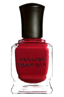
So of course, I am obsessive about the exact shade of red and light pink. Blue-undertoned straight-up red, slightly darker in winter, and pink so pale it’s almost neutral. No opalescense or pearliness. Straight pigment.
I can spend outrageous amounts of time in the store testing and picking the shade, and then I keep them in my purse so I always have them on my when I go to get my nails done. I simply can’t risk the nail place not having the right shade. (Do I sound high maintenance here or what? I prefer to call it “particular.” I swear there’s a difference.)
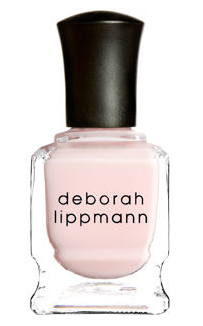
All this to say, I fell in love when I discovered the Deborah Lippmann line of polishes sold at Barney’s. She has multiple great reds and light pinks (including great orange undertone reds I wouldn’t usually go for), as well as other shades that despite my red-or-light pink-only rule, I am seriously tempted by.
So there’s gauranteed to be a color to suit everyone’s fancy, not just red/light pink people like me. The colors are so great that I found myself wondering if I could branch out to aubergine without having an identity crisis. I’m even tempted by the glittery gold… one time I wrapped gold foil around the tips of my fingers, loved the unabashed glam of it, and decided if I ever found a super gilt-y gold I’d have to try it. Somehow I think it’s a reasonable addition to my narrow repertoire.

Plus, they have great names like “My Old Flame,” “Prelude to a Kiss,” “Call Me Irresponsible,” and “Whatever Lola Wants.”
[Above, Giovanna Battaglia, former house model of Dolce & Gabbana, who I happen to have a major girl crush on, sporting red nails.]
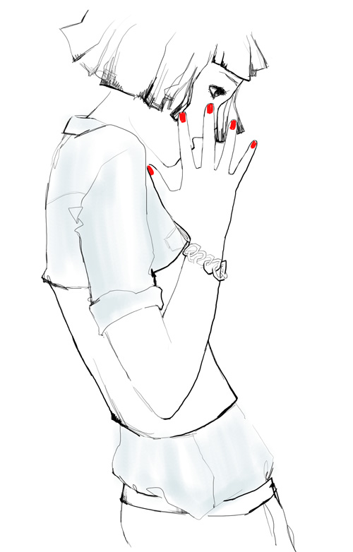
[At top, sketch by Garance.]
Available here. (Expensive, yes, but seriously it takes forever to use up a bottle of nail polish.)
And in case you’re wondering, favorite reds are Sally Hansen Salon Lacquer “Hollywood Scarlet” for winter and Essie “Pepperoni” for summer (although horrible name, I know).
ChairLust
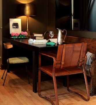
Ok just saw this chair in a house tour on Apartment Therapy and instantly became a little obsessed, thinking it was like 1960s Italian or Danish or something, and it turns out, as a commentor revealed, it is Restoration Hardware!! I tend to hate of RH, but they do have some really well-designed pieces. If you sort of ignore the overall overload on one trend (currently Belgian), individual pieces do stand out.
If anyone still is wondering what to get me for my birthday, I’ll take one of those chairs please.
Image from this post at Apt Therapy.
Mike Miller for West Elm
Silhouette art is definitely having a moment in the design world, and I might’ve almost had it with silhouettes, but these quirky silhouettes by artist Mike Miller for West Elm keep the charm alive.
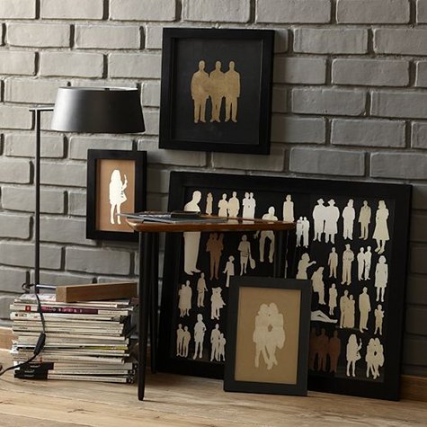
The palette and styling don’t hurt either… they manage to make silhouettes look less precious and more masculine, in a way that really works for me.
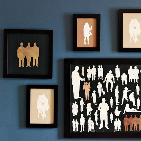
Available here at West Elm.
Via Design*Sponge
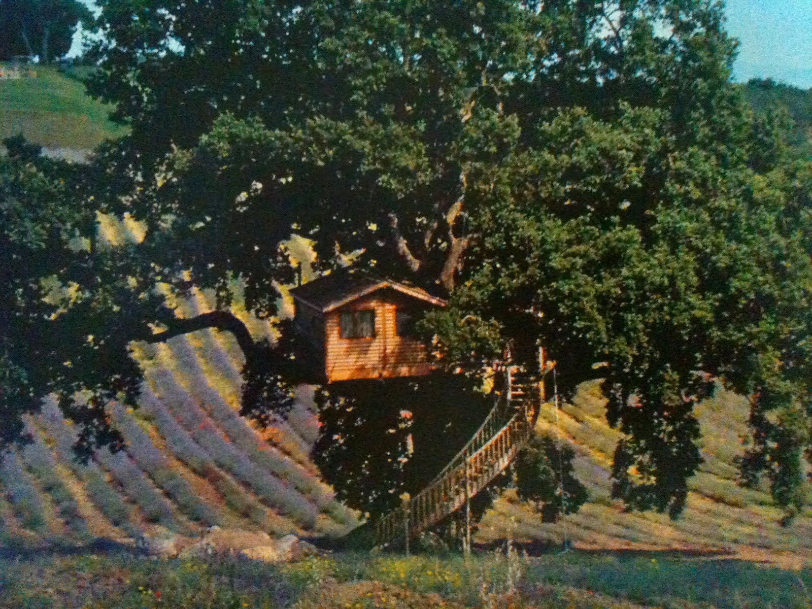
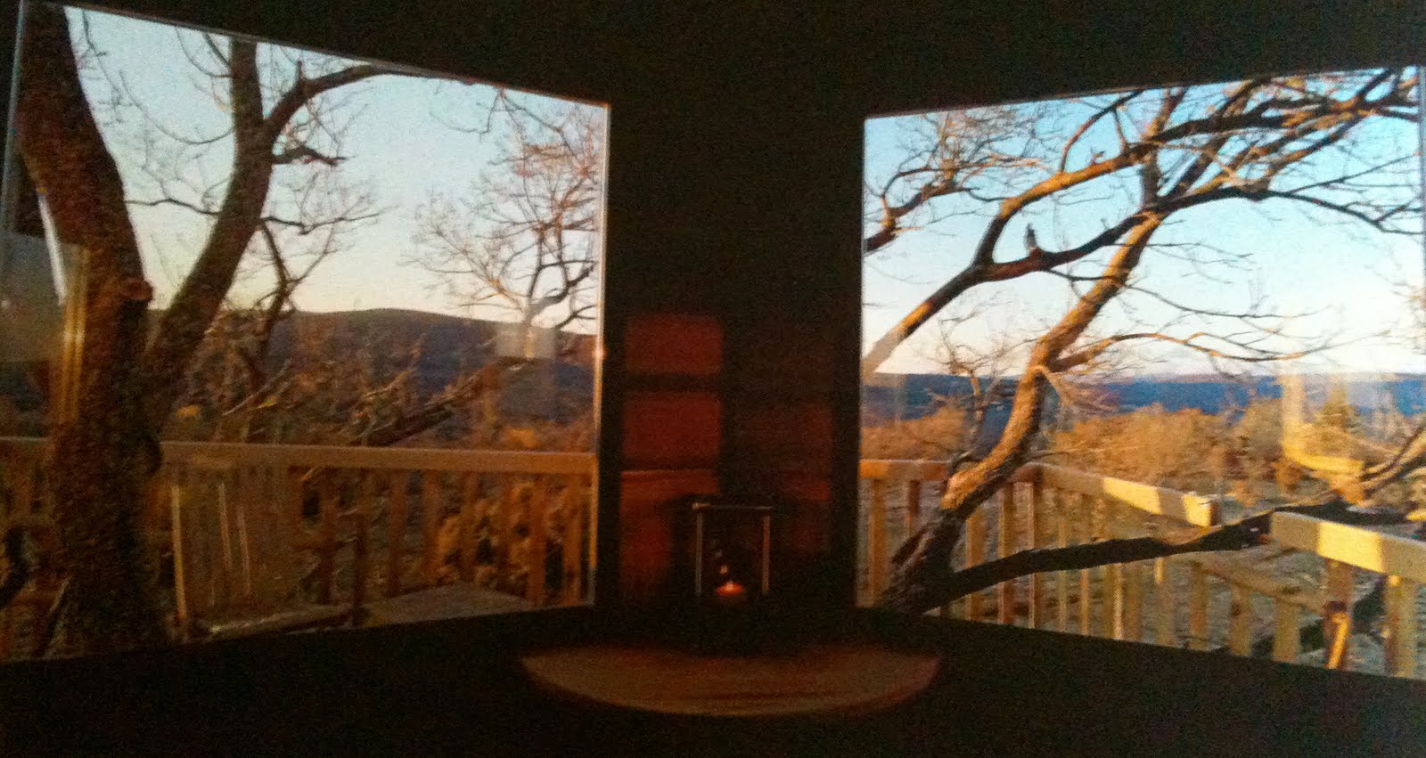
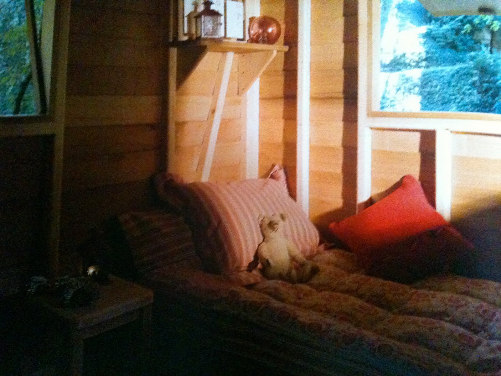
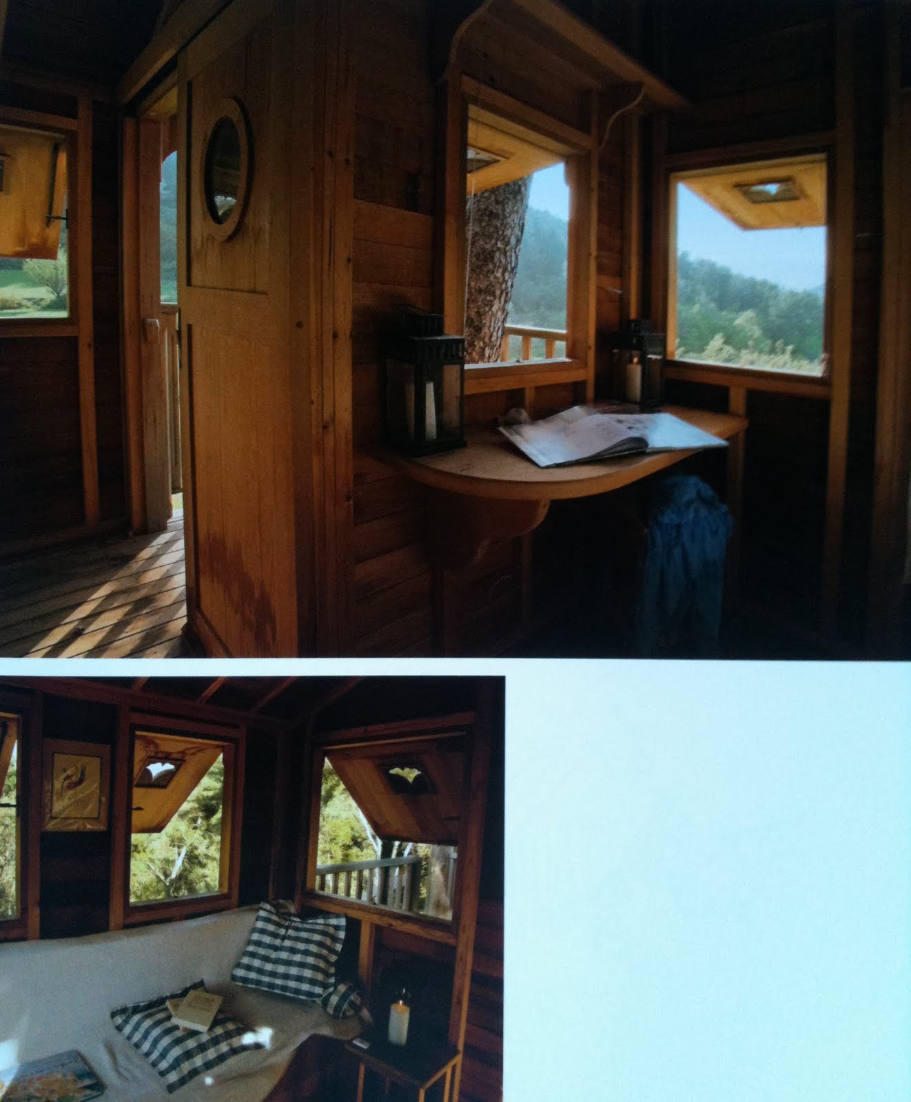
Treehouses
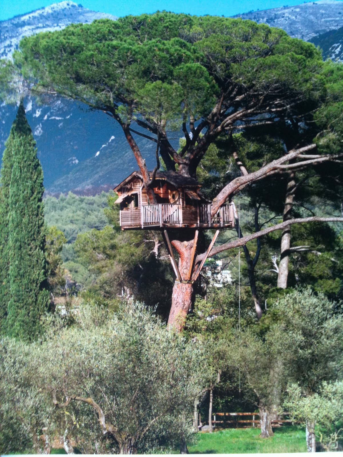
Love these incredible treehouses…
Aren’t they the fulfillment of all your childhood tree house daydreams?

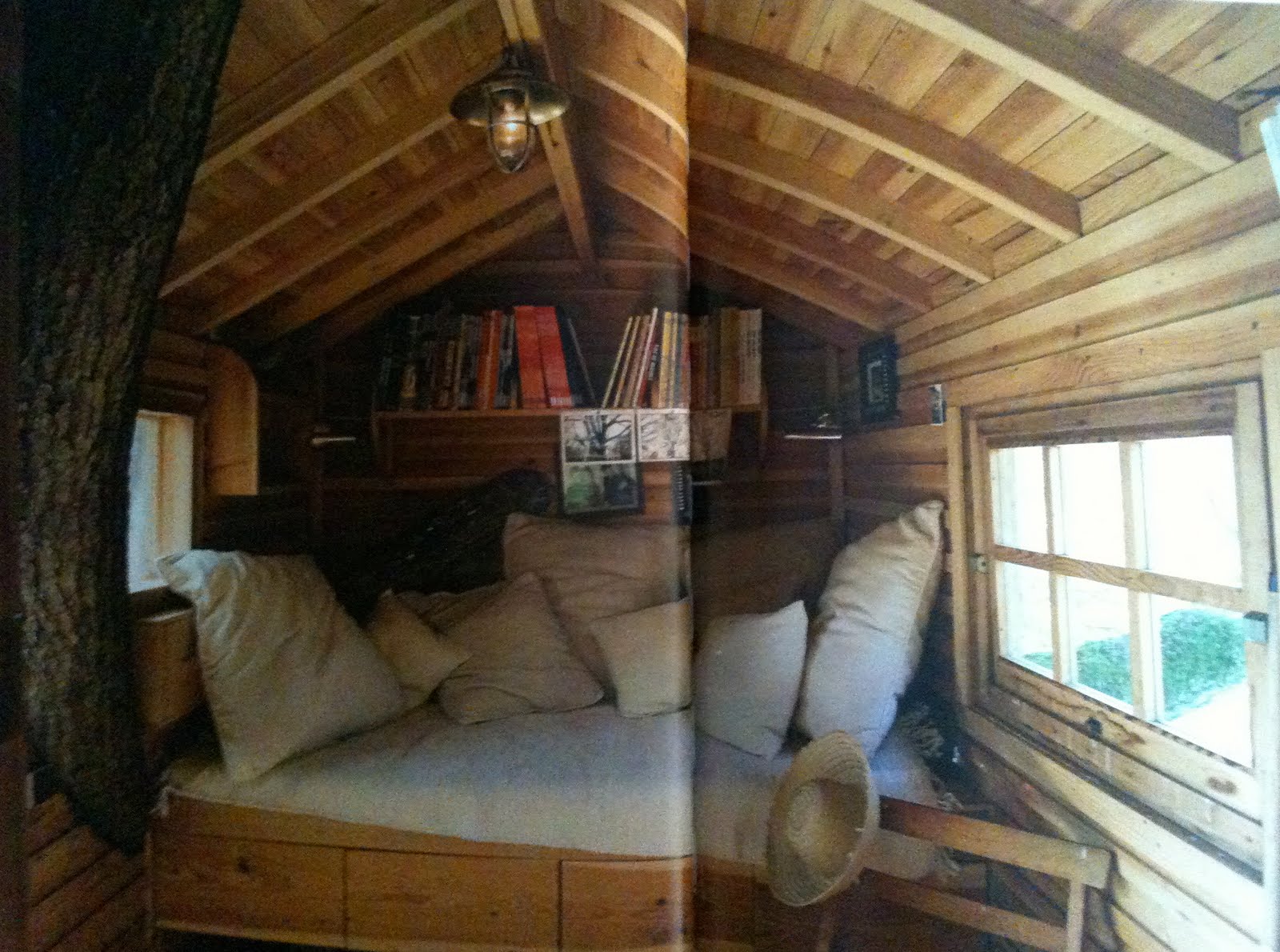
Maybe my favorite interior shot from the book– love that the tree is coming through the wall, the cozy built-in nook, the bookshelf, the totally simple cushion and pillows…
Click the jump for more treehouses….
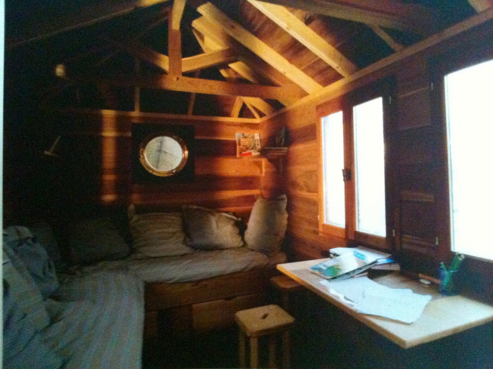
Another great looking built-in sofa… those pillows and the cushion in the simple ticking stripe look perfectly casual and comfortable.

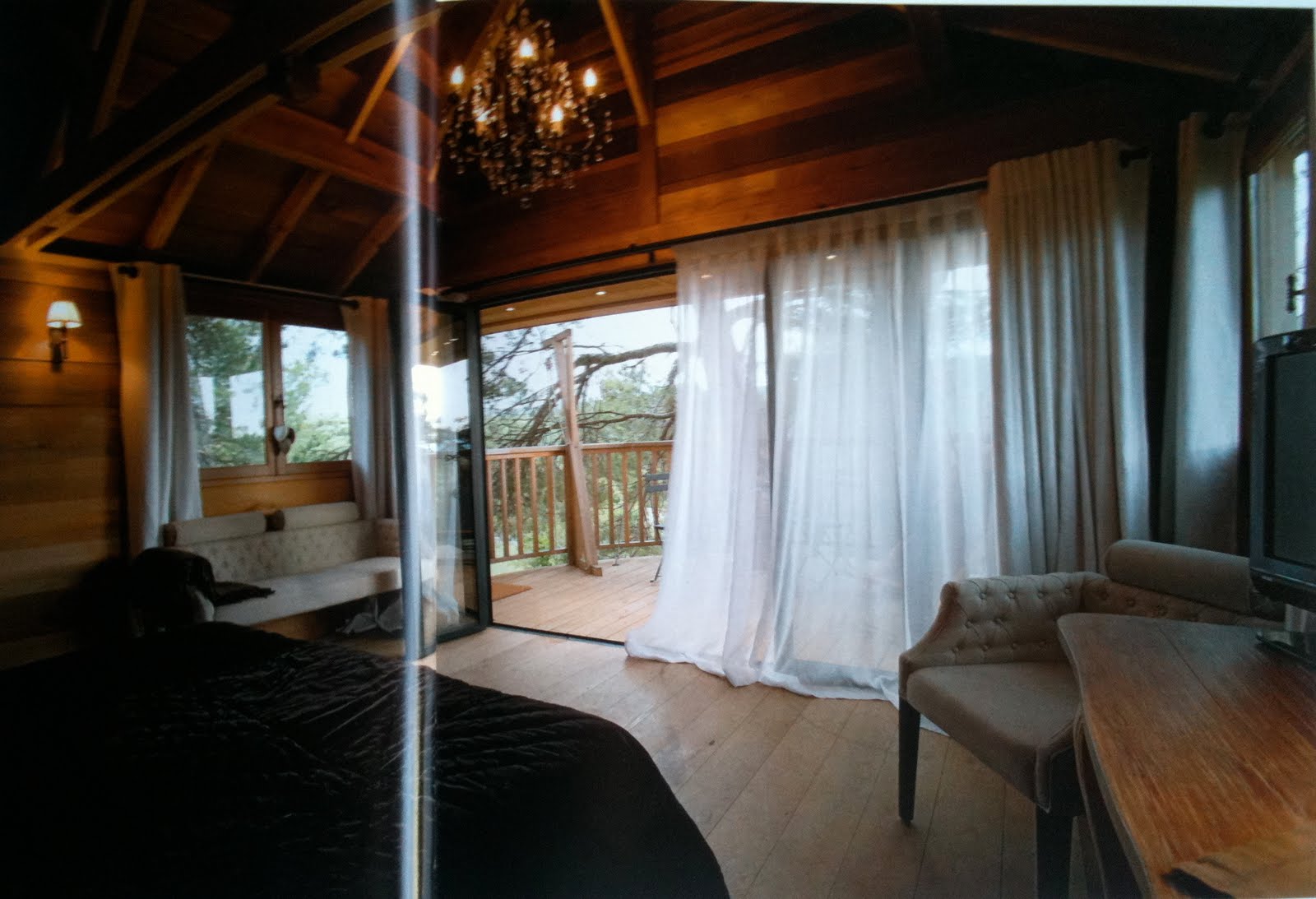
A super posh one!! It has a chandelier!

Love the awning windows on this one, and the gingham pillows.
All images from the book Exceptional Treehouses.
For the Library >> Lacoste

Due out later this month…


“In an ingenious marriage of adjective and image, Lacoste presents a full range of words and concepts synonymous with the storied brand: Heritage. Well-being. Cotton. Quality. Air. Lightness. Joie de vivre. Iconic. It is an encyclopedia of casually elegant style. Assouline will release the book later this month.”

Looking forward to it!
From Thinking For a Living.
Vintage Matchboxes

Loving these vintage matchbox covers!!

I found this dealer at the LA Mart last month who sells all kinds of vintage papers, and I seriously could have rifled through their stuff for hours.

The simple illustration with three colors was a brilliant time in advertising and packaging.


This one above is particularly interesting… It reminds me of Russian Constructivist art, which would make sense, as Constructivists in the 1920s, after a small degree of capitalism was introduced, began producing ads for companies in addition to working on political posters. (I think it’s actually Polish on the box, but that would still make sense.) Later, Constructivist designs would inspire famous graphic designers in the West.

(A Constructivist book cover – bold colors and fonts, geometric, )
Pretty fascinating that through this box, the country’s current art movement is reflected in a commercial object, as this also speaks to what was going on in art in the world at the time. For the first time, the current avant-garde “high art” (fine art) movements had begun experimenting with “low art” (kitsch, mass produced commercial products) through Surrealism, Dada, Cubism, which would shortly be followed up by the Bauhaus’s true extension of art into industry through product design. Later, the whole debate about the place of high art and low art would be explored through Pop Artists like Andy Warhol.


The dealer, Style de Vie, here.


