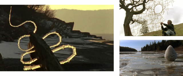
If you’re an Andy Goldsworthy fan, I’d highly recommend this documentary on him. If you’re not a Goldsworthy fan, I bet you’ll become one really quickly if you watch this film. His work is pure wonderment.
Seeing Goldsworthy at work on his ephemeral pieces, made completely of found materials, is almost meditative just to watch. I don’t know what I expected him to be like as a person, but I was enchanted in the documentary to see that he is so much a part of his work, and vice versa. You can’t imagine him doing anything else with his life, and it seems to completely consume him, so that he is completely at peace while he’s working.
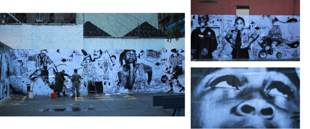
Last week, redu, a movement aimed at rebuilding America’s public school system, sponsored a huge collaborative arts show, called Re:Form School, aimed at raising public awareness about the need to reform our school system.
WK, one of the participating artists, created this awesome installation at a New York City public school playground using photos he took of kids at the school and drawings he collected from them.
Check out this time-lapse video to see how it was created…
Love that even the art world is helping focus attention on our public schools right now!
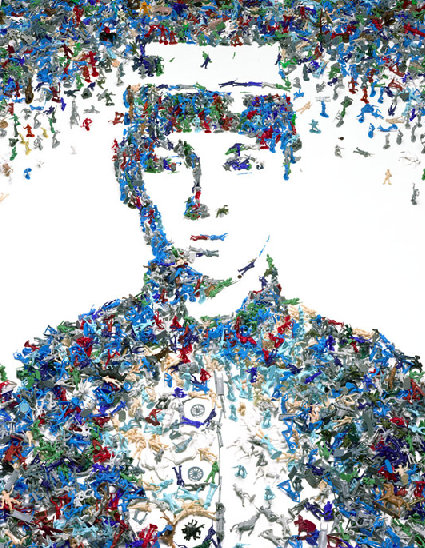
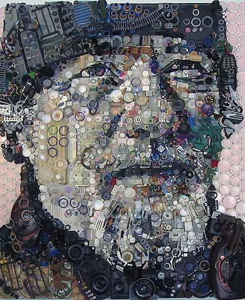
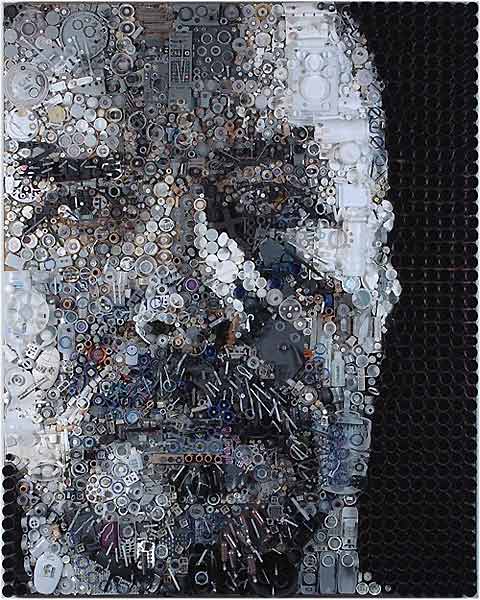
Found item collage portraits by Zac Freeman combine pointilism, impressionism, and mixed media by using film canisters, telephone parts, gears, and other odds and ends to create faces that are the sum of their parts.
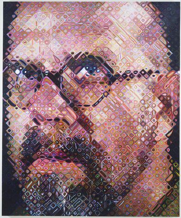
I like… but… also kind of just feels like a mash-up of some of Chuck Close and Vik Muniz’s work:
Chuck Close, “Phillip Glass,” 1977, Watercolor and Acrylic on Paper
Chuck Close, “Big Self-Portrait,” 2000-2001, Acrylic on Canvas
So Chuck Close has got the pointilist portrait thing going on…
Vik Muniz, “Self-Portrait (Back) (Pictures of Magazines),” 2003, Chromogenic Print
Vik Muniz, “Toy Soldier,” 2003, Chromogenic Print (of toy soldiers)
…And then Vik Muniz takes the idea to the collage realm, using hole-punched bits of magazines and toy soldiers and everything in between to make portraits (as well as recreations of Old Master pieces). So while Freeman’s work is impressive for its tedium and is interesting to look at, and he certainly has an eye for light and dark, I kind of feel like he’s ripping off two other great artists… do you?
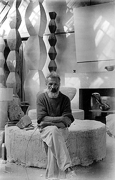
In seventh grade, Ms. Hearey, my art teacher, showed our class this piece and immediately and forever changed my understanding of Modern art.
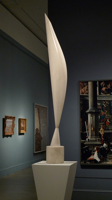
Bird in Space, 1923.
She put up a slide of this sculpture on the first day of class, without telling us the name or giving any introduction, and asked what we thought of it. As twelve and thirteen year-olds with no particular artistic leanings, we stared dumbly and were unable to offer anything of substance. I remember actually thinking the classic non-Modern-art-lovers’ comment, “I think I could have done that.”
Then she told us the name, and showed us more examples of Brancusi’s style of reducing and abstracting ideas to their simplest form– in this case, a flying bird represented not by beak and wings and feathers, but by a fluid, graceful form encapsulating the essence of a bird in flight– and it all clicked.
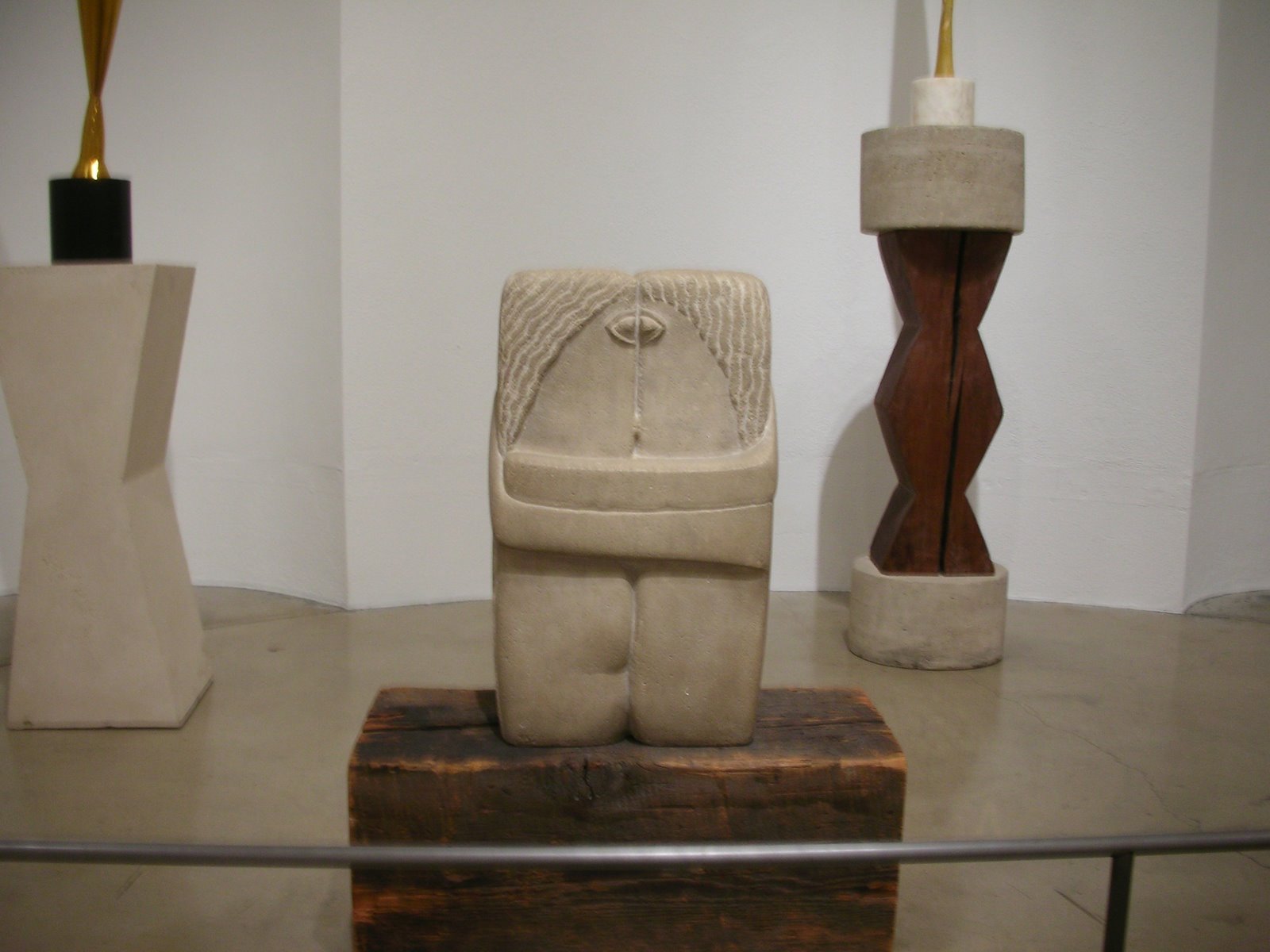
The Kiss, 1916
Brancusi (and these two pieces in particular) became a favorite, and Katy Hearey, if you’re out there, I think I have you to thank as starting me on a path that would result in my majoring in art history and generally loving art history for life.
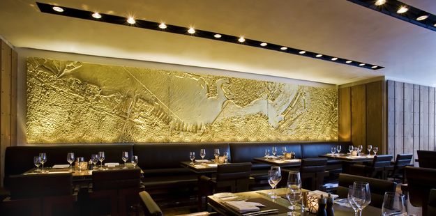
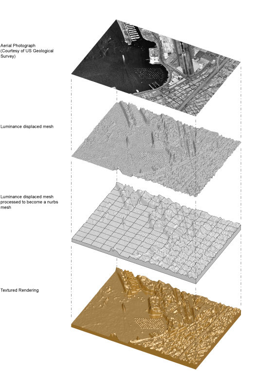
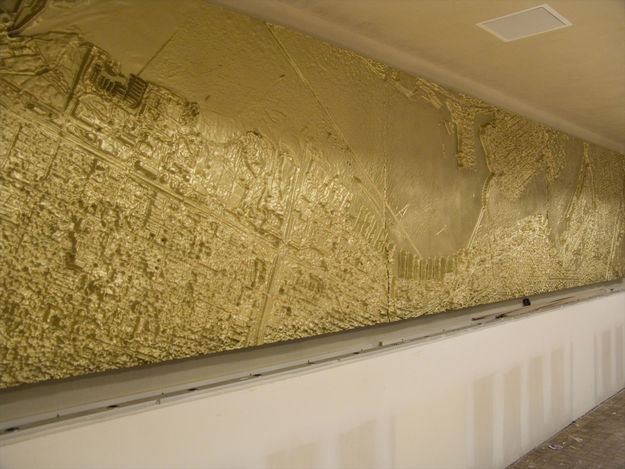
Ball-Nogues studio, who created these awesome suspension installations, also created this map of San Diego for a new local hotel.
Not content with merely an “artistic representation” of the layout of the city, they created a geographic and topographic replica using custom-made software to transform an aerial photo in a 3-d bas relief using wood, bronze, and polymer resin.
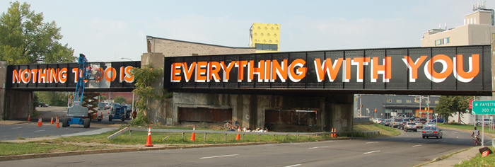
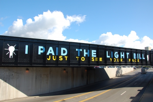
So glad to see that Steve Powers (a graffiti artist AND Fulbright scholar) is back with a new project. Called “A Love Letter for Syracuse,” it’s a project in conjunction with Syracuse University and local organizations intended to use public art as a means to neighborhood revitalization.
Powers, together with these organizations, used painted phrases to turn three train bridges that are physical and metaphorical dividers between two very disparate neighborhoods into points of unity and conversation-starters.
Here, Steve discusses “why” of the font, the words, etc behind this project…
The bridges that cross Fayette and West Streets were hand made in the 1940s from Carnegie Steel and the toil of countless people. They were built for a Syracuse of great industry and remain faithful to the industrial ideals of utility, dependability and (yes) austerity. In the era the bridges were built, sign painting was a viable profession and like many other professions in Syracuse, went away because a machine replaced hands, heart and head.
Once sign painting as a trade became extinct, it became interesting to me as a medium for art. I learned to paint signs as they had been painted for generations, but instead of the commercial concerns of most signage I used the letters and colors to talk about love and life. The font I employ was prized by sign painters because it is clear and versatile, qualities that serve me well when I am talking about complex things like love. Beyond that, my use of the sign painters craft is about the importance of the hands, heart and head being present in the work I make. The work we are calling on to renew the West side must possess the same qualities.
The words we painted were drawn from the neighborhood. The font was already on one side of the w. Fayette Street bridge. (It was painted for Romano Ford in the 60′s and again in the 70′s) The colors we used are present in every industry, the federal safety colors, blue, red, yellow, green, and especially orange. The gloss black is what the bridge was painted when it was first built. The innovations of the color and the content emerge from the history of the black paint. In doing so, these painted bridges represent what I believe is the future of Syracuse; Taking what has value and remaking it for the future, in a way that respects tradition and innovation.
If you missed his last project, the now-famous “A Love Letter For You,” check it out back here. More about the current project here.
A wonderful little piece of wonderment for your day…
Above, an ad for the new Canon Pixma printer, below, the making of the ad. To create what you see above, they put drops of paint on a membrane over a speaker, and then when they played a sound through the speaker, it made the paint bounce up, and they caught the action at 5,000 frames per second. That’s a lot of frames per second.
The result is ultra-clear slow motion video of tiny bits of gelatinous color exploding into the air.
The ad itself is wonderfully captivating, and the making-of film, if it’s publicized, will be an interesting combination of the two trends I’ve been talking about on this blog related to advertising… the short film approach (Chanel, GANT) and the “real people” approach (Tod’s by Eliot Erwitt and Cole Haan by the Selby), where the photographer him/herself is known and hyped (not just a tiny credit somewhere), and the subjects are real people who use the product (not actors) and are identified. In this case, it’s not exactly the first or the second, but still carries the themes of a well-crafted story and a behind-the-scenes, “we’re not a nameless, faceless corporation” tone. Interesting here that they even reveal who the advertising agency behind the project was…
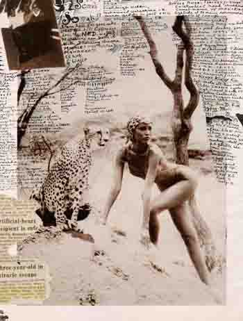
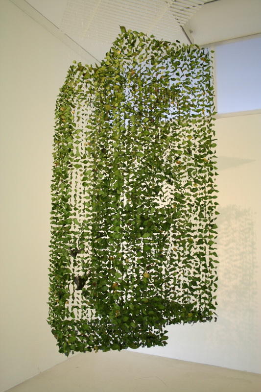
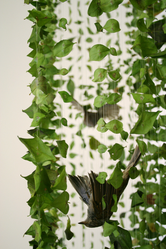
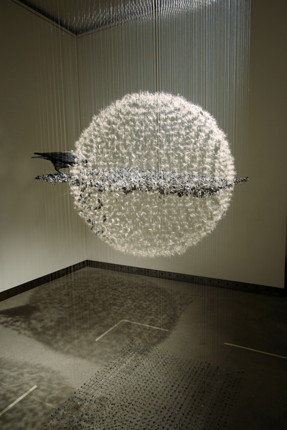
In the same way that people often describe experiencing the moments of a car wreck or calamitous accident as though it were in slow motion, so slow that they can recall every detail with supernatural clarity, Claire Morgan’s painstakingly precise installations composed of taxidermied animanls, manmade plastics, and natural elements seem to reconstruct a freeze-frame of the metaphorical factors that collided to cause the death of the animal on display.
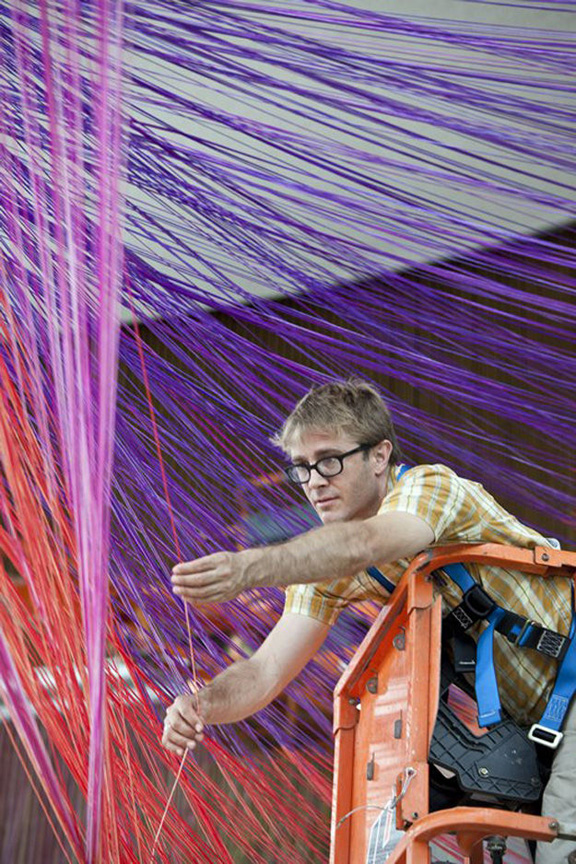
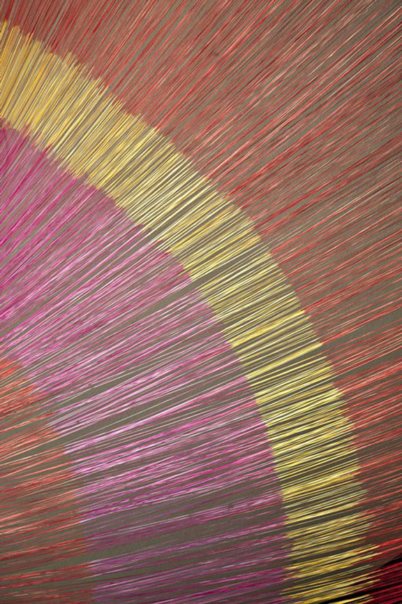
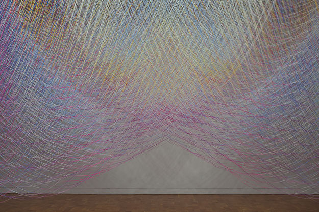
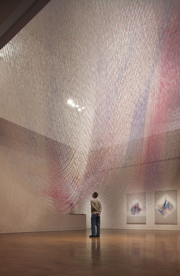
Ball-Nogues studio designs these installations of dyed twine, which they call “Suspensions,” using a computer program they created, and then they hang the twine by hand. Are you in awe?? I am!
Ball-Nogues studio is a design and fabrication studio based out of Los Angeles and is headed by Benjamin Ball and Gaston Nogues, who studied together at Southern California Institute of Architecture. Represented by Edward Cella Gallery in LA, their work has been featured at P.S. 1, the Venice Biennale, the Guggenheim, and many more prestigious institutions and exhibitions.
PS- if you like these, check out these installations.. highly reminiscent!
Loving this random act of creativity.
Last year, husband and wife design duo Lisa Blonder Ohlenkamp and Sean Ohlenkamp undertook a project to reorganize their bookshelves by color (something I myself do...
Remember this post about posters of collective nouns? At the time, the phrase “a murmuration of starlings,” was one of my favorites, and I liked the accompanying poster as well.
And then today,...
My time to work on Wonderlust has been incredibly pressed recently as things with Cultivate are taking off (very exciting, but very busy!), but I had to share this with you, it’s one of the most...
A delightful, thought-provoking project by designer Ji Lee– a new book called Word as Image. In his words:
“When we were children, letters were like fun toys. We played with them through our...
I love photography like the above… that dinner table in candle light… I have an obsession with shots like that. So it’s particularly awesome when those shots also include your wines!!...
I have a new obsession: this food and nutrition blog called My New Roots. It’s been around for a while, but I just discovered it, and I’ve been staying up at night reading it. Seriously. In...
As Miss Moss said, there have been an influx (onslaught?) of vintage-inspired lookbooks recently, but as Ralph Lauren tends to do, they really nailed the details on making the style of this lookbook for...
What a wonderful, brilliant, cool concept! Sketchtravel is a project that has taken one sketchbook around the world to 60 different famous illustrators, with the end foal of giving money to charity.
Each...
If I knew how to draw and stuff, I would make these for all my friends and family for Christmas. How sweet would that be? Ask them their favorite go-to recipe, illustrate it for them, and frame it! Voila!...
Loving this modern cottage in the woods of Ontario. I’m all for cozy, traditional cottages, but how wonderful to have these giant windows so that during your trip to the woods, you get to see the...
Ah I love fashion week season. So much street style inspiration floating around!! Above were some of my favorite shots from the last week, including, of course, perennial favorites Emmanuelle Alt and...
Recent eye candy favorites posted to the tumblr page. (If you were wondering, is not a real tumblr, but since it’s an image-only page, it was the easiest way to name it after we had to change it...
I am completely taken with these Lightning Series photographs by Hiroshi Sugimoto that I understand absolutely nothing about. I think that’s part of why I’m taken with them. The combination...
Today I’m daydreaming of… Greece. I came across the exterior of this house and a couple of interior shots a while ago, and posted them here, and I recently discovered lots more photos, and...
I’m excited about this new site, Art of the Menu, which is compiling menu designs! How fun!
I’m still in love with Cynthia Warren’s menus, which I emailed them to submit to the...
Fell in love with this peak at a Scandinavian summer house shot by Johanna Ekmark. From what I hear, Scandinavians are big on having simple little weekend/summer getaway cottages. I’m a fan of that...
This site is so much fun to browse. Talk about wanderlust. Alistair Sawday, author of the Special Places to Stay travel guides, has a new site called Canopy & Stars that features very off-the-beaten-path,...
Awesome round-up by Street Art Utopia of the 106 best street art photos of 2010. (106… guess they just couldn’t stop at 100?) Check out the gallery for more, these were my favorites out of...


.jpeg)