Cans and Bottles + Flowers

Loving this image of old tins being used for plants nestled amongst the books. I love retro packaging, especially tins (coffee, tea, cigars), and turning them into vases is a great use!


(Bottles too– I saved an image a while ago that I now can’t find of old brown bottles lined up on a mantel with white flowers coming out of them that I absolutely loved.)

I like this idea for using tea tins too…

1st, 4th, and 5th images from Design*Sponge, second from Martha Stewart, others from Flickr
LeWitticisms

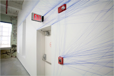
Sol LeWitt’s Wall Drawing #1167, Dark to Light (2005) at the Venice Biennale
When you get as close as this guy did, you realize that the whole thing is made up of graphite scribbles.

I saw this at the Italian pavilion at the Venice Biennale (which I have an unending, and possibly even growing, obsession with) in 2007. This is interesting if you notice the date of the work, which is 2005. And it’s on the wall, it wasn’t brought in on a canvas… so it was executed in 2007, but the date is 2005.
That’s because LeWitt’s work was all about the idea, which he explained through written instructions and then handed off to others to execute. LeWitt was actually one of the artists who verbalized the premises behind Conceptual Art, and in his “Paragraphs on Conceptual Art,” he writes:
“When an artist uses a conceptual form of art, it means that all of the planning and decisions are made beforehand and the execution is a perfunctory affair. The idea becomes the machine that makes the art.” (Artforum, 1967)
So in 2005, he came up with the idea that became the machine that produced the art in 2007.
 Wall Drawing #1245 (2007), first installed at PaceWildenstein
His work in general raises all sorts of interesting issues regarding art that I won’t delve too far into here since this isn’t a class, but I can’t help but point out a few interesting things:
- The work is all scribbles, which are sort of the definition of “my kid could do that” art, but they are controlled scribbles, carefully planned and executed to create an overall effect. Unlike abstract expressionist art, this is emotionless and devoid of individualistic expression.
- Also, he doesn’t do the execution, breaking down the idea of the artist as a solitary genius and sole possessor of an intangible talent. However, it’s interesting to note that early Renaissance masters also had entire workshops of artisans execute their works.
- The work could be reproduced countless times, based on the instructions. But if it isn’t authorized by him, is it a copy? Or is it still art? Is it still valuable?
- Even though LeWitt said his art was not meant to be beautiful, there is something beautiful about the scribble pieces, and their visual power in person is surprising given the methodical, process-oriented nature of the work. I for one wanted to stand and stare for a while.
- Finally, I think it’s interesting how he was obsessed with pointing out the flatness of the picture plane, which in most cases is actually the wall. This is directly opposed to pre-Modern art, in which the artist wanted to create a believable representation of 3d space within the picture plane that looked like you could walk right into it. Instead, LeWitt is saying “Look, it’s just a wall.”

Hair Like a Present
Tavi and Jane Aldridge are pretty awesome, but they ain’t got nothin on Augusta. Like one-name-only Tavi, I’m pretty sure Augusta will make a name for herself as just AUGUSTA. She’s my sister’s four year old daughter, and I can’t get enough of her.
This morning, she did her hair “like a present” — wrapped up in bows.
And she layered different striped components and tucked the shirt into the stretchy body-con-esque skirt. Like the outfits, the hair, and the makeup, the poses are all her. She needs no instruction.
Last Thursday, for school, she borrowed a shirt from her mom’s friend, Monica, to wear as a dress, which she belted, natch. Over a crochet tank (seen peeking out above and below the shirt/dress). Plus short-sleeve sweater and jacket. She’s all about the layering. This outfit necessitated a happenin side part and a little eye makeup.
Feelin a little boho/bag lady/country for school on Tuesday, with an attitude to match. No accessory was left unconsidered in completing the effect.
Lady Gaga, are you paying attention? This is how you do the no-pants thing. Just pretend you are wearing normal pants, and wear a classy button-up with the collar popped, then tuck it into some crazy layers on the bottom. Girlfriend knows how to work some boots.

Here, we see the little sweater (over a hoodie) and pink cowgirl boots again, but today she’s feeling a little street, a little sassy, ultra girly, for a sort of overall Dukes of Hazzard (J. Simpson version) meets Bring it On feel.
Now if you’ll excuse her, she has somewhere to be.

"There is no blue without yellow and without orange"
-van Gogh

My attraction to this image required self-analysis. I’m a blue fanatic, especially navy. And I normally don’t like yellow. It just doesn’t do it for me, it always seems either too country or faux “Provence” or whatever. Especially with a floral print. Risky.
But how MASTERFUL is this use of yellow?? The glam gold lamp (brilliant, that’s what really does it for me) and big gold watch save it from being too plain-Jane preppy, the navy border makes it crisp and sophisticated, and the coral colors mixed in brings it to life.
Doesn’t that van Gogh quote apply to this color story??
PS, Kate Spade is a genius. I’m sure of it. And, I like her kitchen. The black and white striped cushion reminds me of Jenna Lyons (here), and I’m pretty sure they are like style-soulmates, or at least cousins.

See all of the Spades’ apartment, which is now a blog-world classic, on Mrs. Blandings.
The Devil’s in the Details

We’re currently picking up any and all tidbits that could inspire the branding and graphics package for the Mattei’s Tavern project (current logo design above), and I think this package by KURO collective for the A Cowboy’s Dream hotel is pretty awesome.


Click the jump for the rest of the post…

It goes way beyond a good logo and printed materials… they incorporate textures and objects that fit with the look of the hotel, like the wooden door tags, burlap grain sacks to hold toiletries, cast-iron skillet, and flask.

 The skillet is brilliant.


Love these brown glass bottles for the toiletries that look like they are from an old apothecary…
A comprehensive package like this can lay the foundation for a cohesive identity for a property. We want to make sure all the details, from room numbers, to key fobs, to menus, have a specific identity like this.
Also, as a side note, one thing we want to get exactly right is a picnic set people can take on hikes, so we’re constantly looking for cool bags and details, and I just came across these cool wooden utensils…

Utensils from Sprout Home via Happy Lady Eats, and Cowboy’s Dream materials found on Pixels & Arrows
Cookies are the New Cupcakes
Well, actually, I don’t know that that’s true, but I think Sugarbuilt’s cookies are almost too cool to eat! And if it does turn out to be true, then you read it here first!


Based in Brooklyn, which explains the clever local inspiration above and below, Sugarbuilt is owned by Amelia Coulter, who has a degree in sculpture.
Click the jump for the rest…


 Found via Edible Brooklyn Magazine.
Also, check out these architectural cookie cutters Amelia posted on her blog.. They were produced for the moma in 1988 and she found them on ebay. So cool. Something like this would be such a great gift for a design nerd. It even came with this sheet that has little facts about each building!

Nikki Flurry and Amy Salk

I want to have a costume party where everyone has to wear masks like this.

Well not really, as they are clearly art and not costume, but wouldn’t that look cool? I can actually imagine an entire masked ball in black where the only white are these masks. The photos would be amazing. Aren’t they beautiful?

These, and the pieces below, are all made of only paper. Above, the masks are by artists/designers/stylists/cool girls Nikki Flurry and Amy Salk. They say on their website that they are about the “grace and nuance of this humble material.” The pieces below are just by Nikki Flurry. (Aside: Nikki used to own Addiction boutique in Buckhead!)


i made this for you
I think it’s probably common knowledge by now that I love (love) letters, general world-brightening acts of creativity, and clever sentimentalism, so I find this couple, of the blog Something’s Hiding in Here, to be beyond cute. In fact, I can’t believe they exist in the real world and not an Indie movie starring Zooey Deschanel.
Here, a few of the things they made for each other in their “i made this for you” project.
Shauna had been working on a big project, so Stephen made this sign along her route to work out of paper cups to cheer her on.

 Stephen carved Shauna’s initials into a tree in a park where they walk their dogs… love how old fashioned and simple it is. Swoon.
 Shauna took out this ad in one of Stephen’s favorite magazines, Uppercase.


And in my unending love of creative public defacement in the name of love/beauty, I of course really like this one. Stephen went out and spray painted hearts on a billboard that faces their loft. He said she was quite surprised when she woke up the next morning and saw it out their window.

found via the wonderful pixelsandarrows
Curated by:
Eliza Coleman
Section:
Random Acts of Creativity, Sentimentalism
Labels:
diy, gifts
Where to Have a Martini in London

The Connaught Hotel in London, part of the Maybourne Group, has revamped their bar with the help of interior designer David Collins. In fact, the Maybourne Group hired a slew of designers to refresh their three iconic London hotels with new suites, rooms, and restaurants. In addition to getting design buzz, the investment is apparently paying off, as they are still achieving occupancy over 80%.
I’m not actually crazy for the re-designs of the other spaces, but this bar is awesome. Interestingly, notice how little the furniture has to do with the overall success of the room. I mean it matters of course, but as is usually the case with restaurants and bars, it’s the scale, finishes, and lighting that set the tone…

The mirror behind the bar, the gold back-plate on the sconces, the panelling, the black reflective finish in the pass-throughs between the rooms. The black reflective finish (plastic?) also adds a little modern edge, which is nice.
Even with the furniture, what matters most here is not the style of the furniture, but rather the color and texture– here, black leather and more black leather, even on the table tops (cool, also like the nailheads on the table edge, incidentally). The density of black furniture also helps to ground the room, which is important given its super high ceilings. And speaking of scale, imagine how differently the room would feel if the ceilings were two-thirds the height…
Also interesting is the repeated use of rounded edges — on the “windows” and doorway, echoed in the mirror through the doorway, even the chairs and tables are rounded and don’t have corners. I think it helps soften what could be a rather austere or formal space.

via wandermelon travel website
And for a totally random aside, these guys would look sharp in there, wouldn’t they?

Models backstage before the Zegna show at Milan A/W.
I think this photo is really cool visually – the way you immediately notice their hands because they are all dressed almost identically and evenly spaced across the frame. It actually looks more like a contemporary art photo to me than just a snapshot backstage– it seems so tense and like it’s begging for some kind of interpretation about why these guys are together and dressed alike (if you imagine they aren’t at a fashion show).
from Wallpaper’s photos of Milan A/W 2010.
"We Like the Same Things and I Like Your Style"

Girlcrush: Zooey Deschanel.


Below, the video for “Why Do You Let Me Stay Here,” a song by her band with M. Ward called She & Him. Give it a listen, it’s irresistible. In fact, pretty much the whole album is downright lovable, one of my favorites of 2008. (Lyric in the post title is from the song.)


