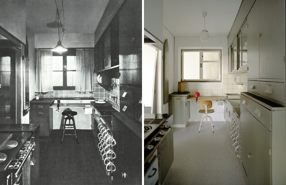
Must See >> "Counter Space: Design and the Modern Kitchen" at MoMA
F. Scott on Zelda

“I fell in love with her courage, her sincerity, and her flaming self respect. And it’s these things I’d believe in, even if the whole world indulged in wild suspicions that she wasn’t all she should be. I love her and it is the beginning of everything.” — F. Scott Fitzgerald
[Kisssing]
Pantone Credit Card

Speaking of functional objects being pretty, I NEED a Pantone Visa. Never before has having a special credit card, like with an image or your school logo or whatever, carried any appeal for me, but THIS, on the other hand, would just make the inside of my wallet look so much nicer. I wish I could have all my cards be Pantone cards so they would all stack up in their little slots in my wallet and make a nice little color story.
[Available here]
Martin Scorsese for Bleu de Chanel

PS – I’m mad for the painted patterned floors at 0:30. Aren’t they amazing??
Curated by:
Eliza Coleman
Section:
Must See
Labels:
advertising, style files, video
Thomas Pink debuts "The Informal Collection"


Curated by:
Eliza Coleman
Section:
Style Files
Labels:
advertising, Photography, style files
Take Me To >> Enoteca in Charleston, SC

Arts Visuels >> Claire Morgan
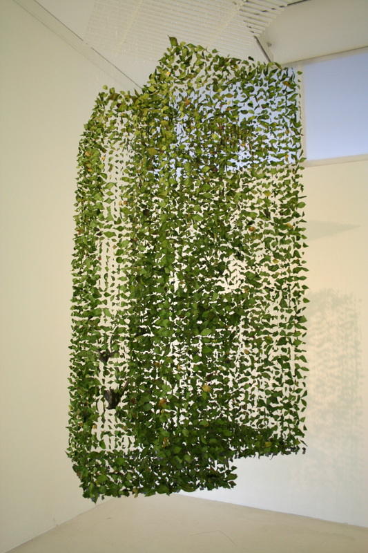


Curated by:
Eliza Coleman
Section:
Arts Visuels
Labels:
artist, Arts Visuels, installation
Listening To >> Portugal. The Man
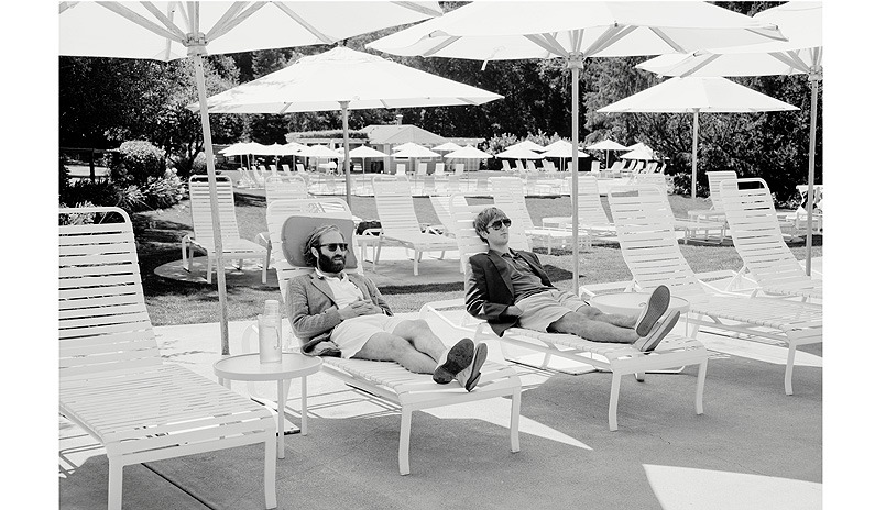
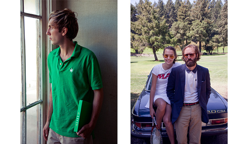
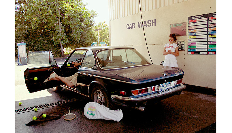
Boast is Back
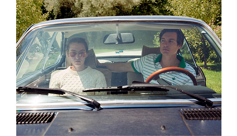

Curated by:
Eliza Coleman
Section:
Style Files
Labels:
advertising, branding, Photography, style files, The Spades
Graphic Fix >> 2010 Rolling Roadshow Posters

I discovered these through screenwriter John August’s website in his post about what he calls “unsheets.” ”One-sheets” are what Hollywood people call the posters designed for movies that are hung outside of theaters and are solely meant to sell tickets. They are generally formulaic and not very artistic, and almost always use the font Trajan (see hilarious video here about the unending use of Trajan for movies).
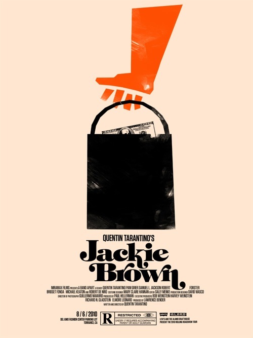
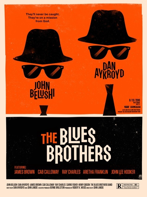
[2010 Rolling Roadshow]
[Olly Moss]
[past unsheet posts here and here]
Curated by:
Eliza Coleman
Section:
Graphic Fix
Labels:
Graphic Design, posters, unsheets


