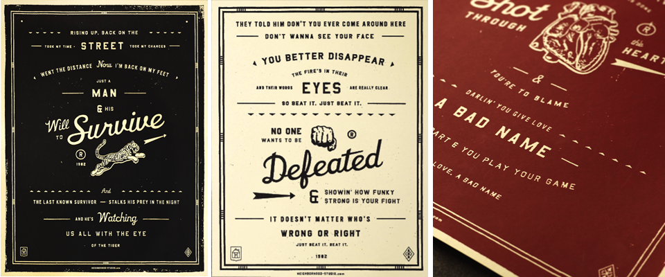
Lyrics Re-Envisioned
Just came across these fun vintage-style posters of famous song lyrics by the Neighborhood Studio and had to share. That’s all!
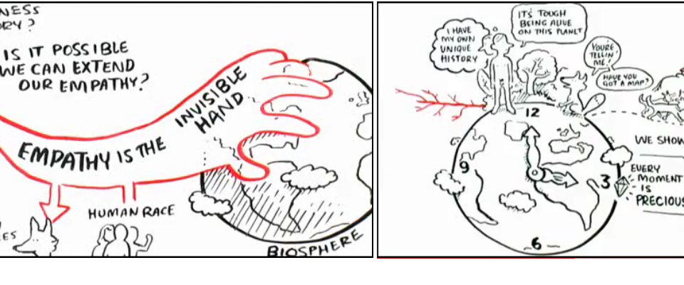
Could Our Inherent Empathic Nature Save the World?
Do you ever wonder how humankind will continue to survive on this planet with all the awful things going on? In this 10 minute talk, Jeremy Rifkin introduces us to empathy, how it works, how we are hardwired to have it, and how it could potentially save the world as technology continues to further the connection between us and everyone else around the world (and thus further our empathic concern for them).
If you want to feel a little more hopeful about the world this morning and have a few wonderful a-ha moments, definitely watch this video!
PS- Another amazing thing you learn in this film… there really were two people, a man and a woman, that started our entire race…Adam and Eve??!
PPS- I also think this is an excellent argument for why socially responsible businesses are the future of our economy– people want to care and connect and will buy products that help them do that and will respect companies that they feel share those values.
Curated by:
Eliza Coleman
Section:
A Teachable Moment, Must See
Labels:
animation, video
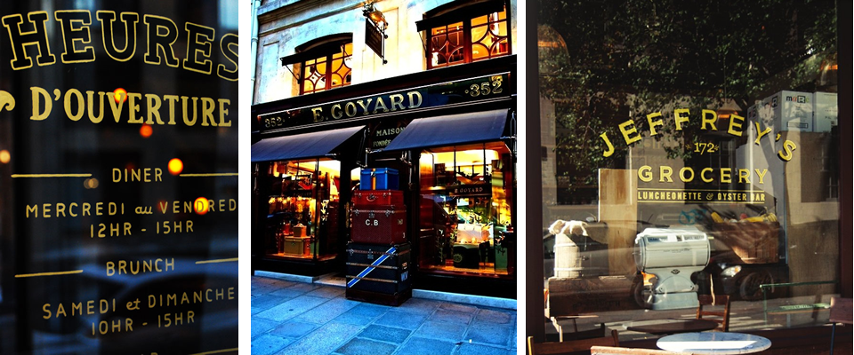
The Magic of Beautiful Storefronts
Another recent fascination is storefront design. For one project that we’re working on right now, my colleague/co-conspirator/friend Monica and I are loving gold hand-painted window signage as inspiration, and that train of thought spiraled into a complete obsession with storefronts.
When they’re done well, they are little miniature works of art, perfect coalescences of branding, merchandising, and aesthetics that combine to make you want whatever is in that store, and I feel like they are worth appreciating even completely separately from the stores they are attached to!
Here, just a smattering using almost exclusively black, white, and gold and mostly using all-caps serif or slab serif fonts.

Btw, the PINK storefront above is the Thomas Pink store, not the Pink collection by Victoria Secret!
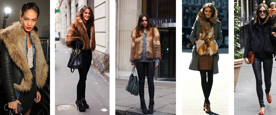
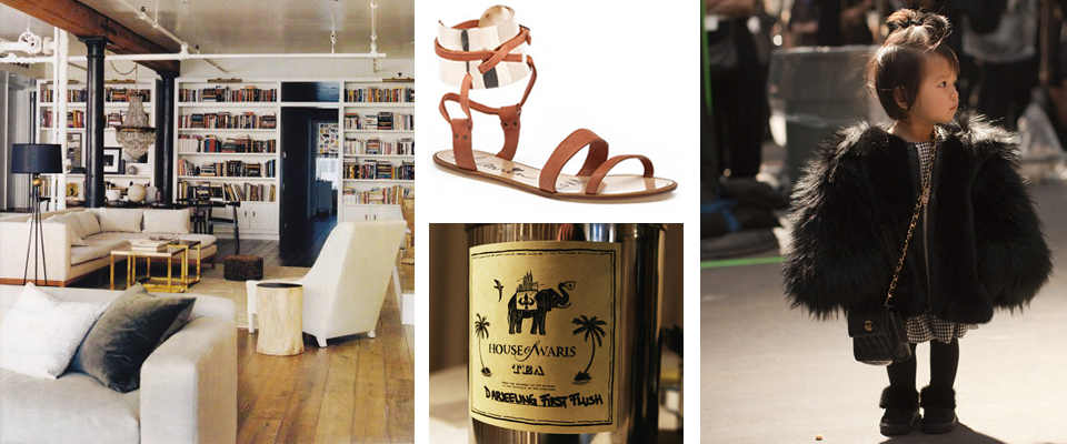
What I’m feeling right now…
Fur + leather.
If you’re anything like me, and the appeal of fashion is about the ability to try on a persona or express a mood, I think you’ll agree that the combination of leather and fur offers a fantastic spectrum of possibilities ranging from coiffed uptown chic to downtown rocker sex appeal depending on how you style it.
For example, in looks 2 and 4 above (from left), where the leather is only in the form of a handbag (2) and a demure brown skirt (4), the look is really about the fur, which is usually associated with old money, old Hollywood, and old Europe (and ok, sometimes old ladies), giving it a much more ladylike uptown vibe.
3 and 5, on the other hand, skew much more rock and roll due to those black leather pants. But the fur adds in an expected dash of eccentric class to the rocker look. And of course #1, with that jacket (and the chambray shirt underneath, love that layering), is also definitely downtown.
Here are a few more I loved that also show off the wide variety of looks that can be achieved with the combination of leather and fur…

PS- Did you notice that Olivia Palermo appeared three times in this post? Girl is crushing it.
PPS- Wow as soon as I typed out this post I realized how much PETA would hate me right now. So I’ll just note, this could be executed with faux leather and fur as well, it’s the look I’m after, not the animals.
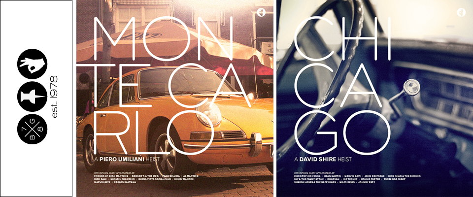
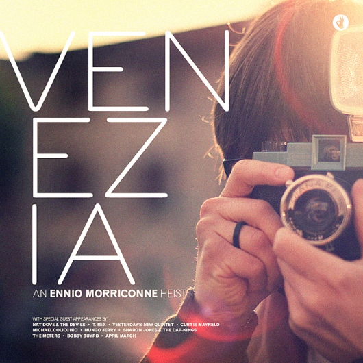
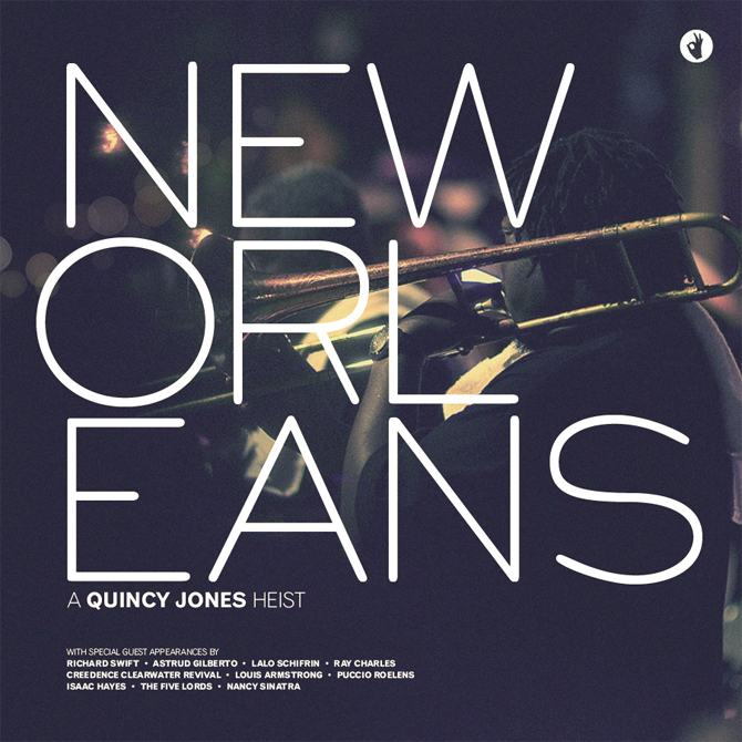
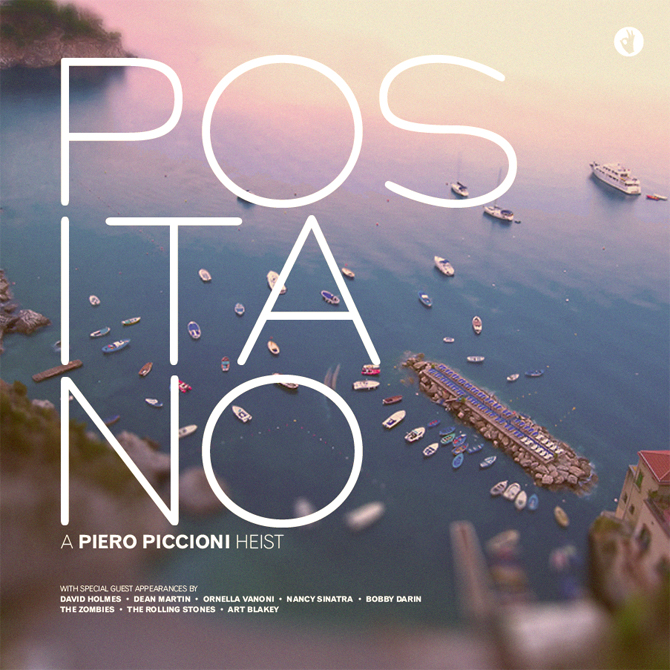
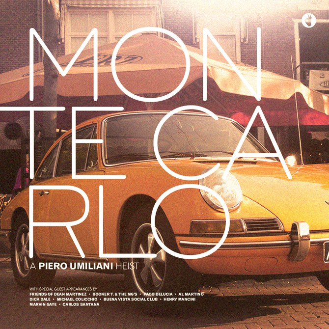
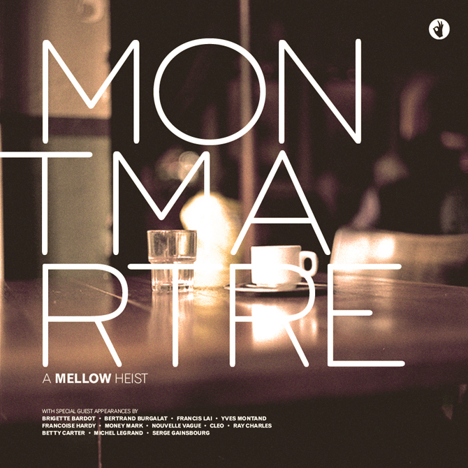
The Rad Mixes and Album Art of Brian Gossett
I am obsessed with the blog and work of Brian Gossett. Gossett is a freelance designer/art director/illustrator, and he also happens to have great (and eclectic) taste in music, which he has parlayed into a series of mixes created around different moods, themes, seasons, or whatever the inspiration might be that week.
The “album covers” above are from a series of mixes Gossett imagined as soundtracks for heist movies set in various international cities, each with their own little description like the one below. The descriptions of each mix are another thing I love about the blog, I love them like I love reading the description of a dish before reading the ingredients.

Another series, apparently very popular in the blog world (I figured I must’ve been late to this party, this stuff is too good to have gone unnoticed this long), was inspired by Take Ivy (you’re really late to the (blog) party if you missed that boat…) and A Continuous Lean and features solid mixes of current favorites like Phoenix and Grizzly Bear with classics like John Lennon and The Kinks.


I’ll leave you with a new favorite song off one of his mixes that will jumpstart your weekend…
And a more mellow tune if you’re still waking up this Friday…
Curated by:
Eliza Coleman
Section:
Listening To
Labels:
album covers, blog, typography

Weekend Retreat
I don’t know that I could live in a space this minimal on a daily basis, but for a weekend home, I love it.
My sister designed and built their vineyard house in a style very similar to this (but with a sand-hued palette to go with the surrounding land), and it was simultaneously the most peaceful and sexy house I’ve ever been in.
The open floor plan, restricted neutral palette, lack of any clutter, and wealth of windows and light just immediately put your mind and soul at ease and made you feel free– exactly what you want on vacation.


I’m sorry that I don’t have any information on this house or who designed it! Thus is the downfall of tumblr… I found these images on Seth’s tumblr here, but tumblr unfortunately eradicates any evidence of source or information on images. If anyone has any info, please comment!
Curated by:
Eliza Coleman
Section:
Interiors
Labels:
architecture, modern, restricted palette
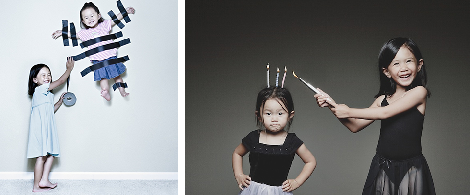
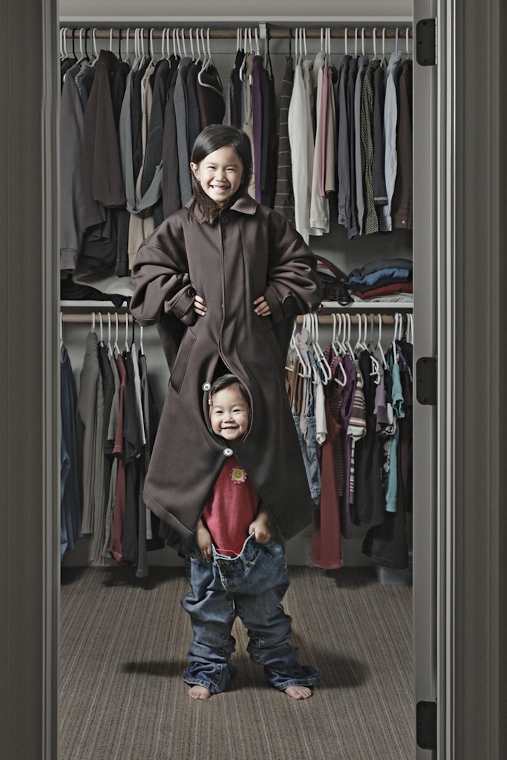
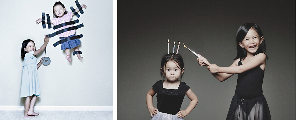
Jason Lee and his unique photography of his cute cute kids
Loving photographer Jason Lee’s photography of his two (adorable) daughters! His technique– creating quirky sets and situations for “shoots” and using lighting similar to an editorial shoot style– is such a fresh and interesting take on photographing children.
It’s clearly not an approach that would work for everyone, but for someone with this kind of skill, it’s such a fun way to document their childhood– for him to do and for the family to have later on!

Plus, in an interview, Lee explained the origin of the project, and it makes the whole thing even more endearing. In 2006, his mother was diagnosed with lymphoma, and because his kids constantly had runny noses and little-kid-illnesses, they couldn’t see her. So, Lee started taking these photos and posting them to a blog as a way for his mother to see the girls and to cheer her up.


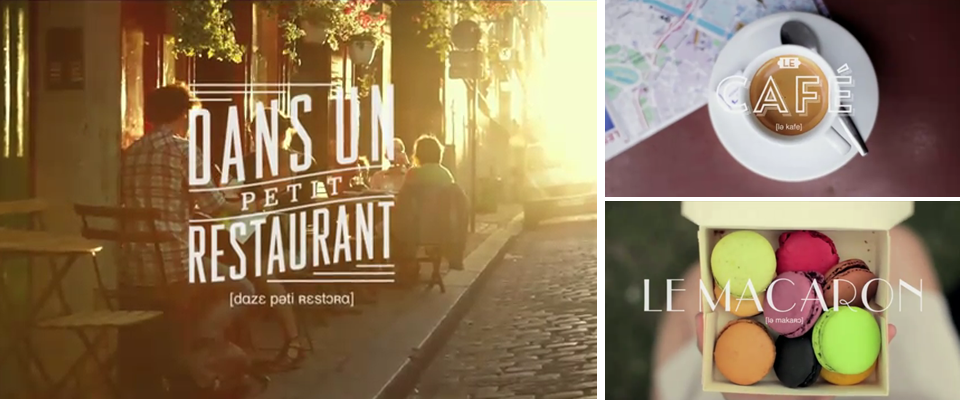
Live the Language
These short films by Education First are brilliant advertising. They are so all over the trend of making short web films that are heavy on aesthetics and low on anything that says “this is advertising.” You can make it all the way through the film without knowing what it’s for, but it’s so awesome that at the end you’ll want to dig a little deeper to find out.
After watching those, if I were to need a language learning program in the future, would I go to EF first? You know it! Am I a sucker for pretty things despite lack of content? You know it!
The cinematography is gorgeous and the use of typography really, really got me. I now want to design everything I’m working on using French signage as inspiration (all those lines around the words, the engraving shadows, the deco fonts, the angles of the words… oh la la).
The films were a collaboration between Gustav Johansson, Nicklas Johansson, Albin Holmqvist, and Camp David, all of whom I plan to research immediately (check back soon for results!), but I’m also just so curious what advertising/marketing firm EF hired that then in turn put this team together! I can’t imagine they sought these guys out on their own…
(And now they just need that same firm to redo their logo and their website so that it is all in sync with these videos…)
Two more films here.
Curated by:
Eliza Coleman
Section:
Graphic Fix
Labels:
advertising, typography, video

NYFW Essentials
Even though they are a inherently a little bit sickeningly bit self-indulgent and send me into a crisis over my own star-struck and/or voyeuristic tendencies, I cannot resist the “What are your essentials” features with celebs in magazines.
It’s a total love/hate situation. Every month when I flip to the page in Vanity Fair that chronicles a famous person’s list of must-haves, I inevitably go through a chain of thought similar to this: “Who cares what stuff you can’t live without??” … “Is that an Aston Martin? You seriously can’t live without an Aston Martin?” … “Oh wait, what skincare line does she love?” … “While I’m here I might as well see what her favorite brand of sheets is…” and I end up reading the whole darn thing. With interest.

I can’t explain it, but getting a peek at other people’s essential goods is oddly enticing. It’s like getting personal recommendations from someone and getting a little snapshot of their style/vanities all at the same time.

For NYFW, Vogue teamed up with The Coveteur to check out various fashiony people’s essentials for “getting through fashion week.” (While we’re sharing usually unshared chains of thought, I know it’s a busy week for those in the industry, but I have fairly little sympathy for industry folk when they talk about what they “need” to “get through” fashion week… despite the hectic pace, it still sounds pretty darn fun!)

But back on topic, I loved, without shame, these little vignettes of the subjects’ essentials, as much for their content as for the styling. As I’ve said before, anything in a collage looks more appealing, but these compositions are particularly well-done.
Is there a set of “essentials” that would capture your style?
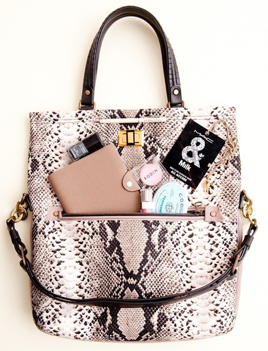
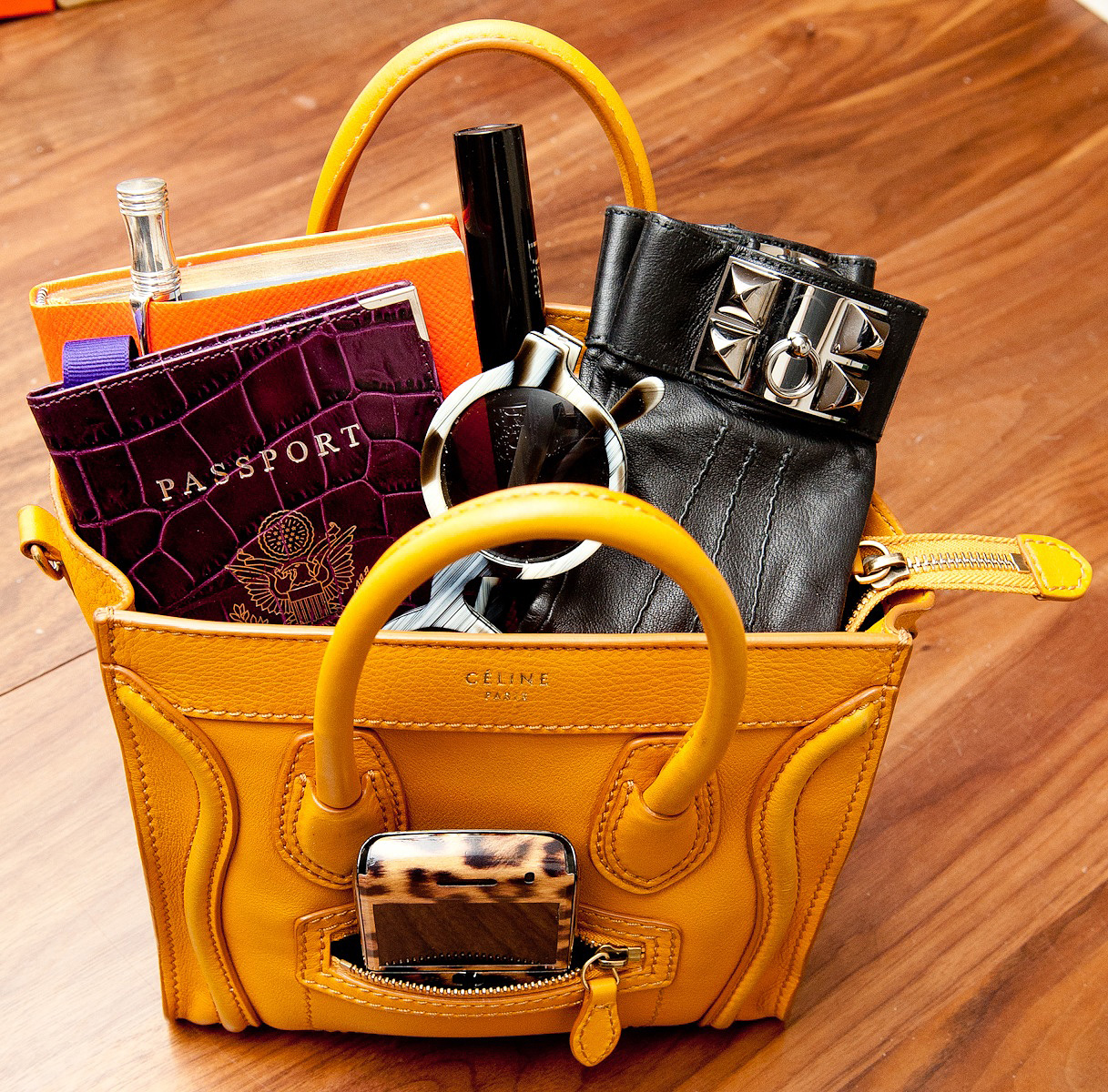
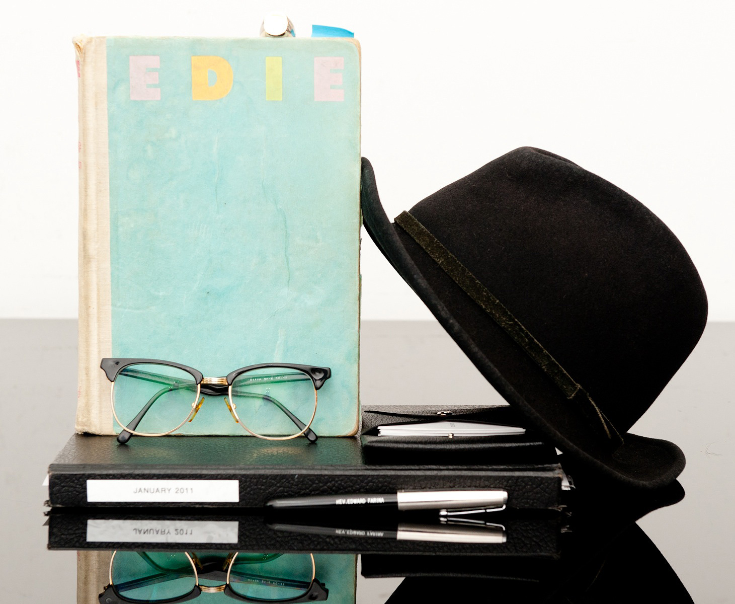
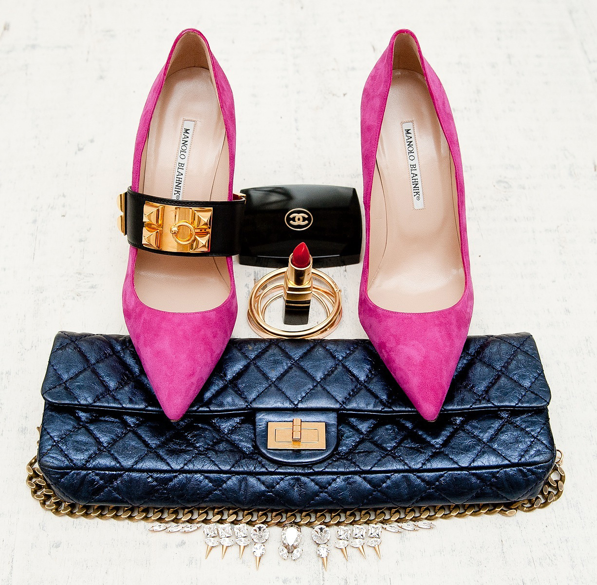
[From top left, essentials of: Gucci Westman, Prabal Garung, Jessica Sailer, Kate Young, Stephanie Wolkoff, Laura Bellafronto]
Curated by:
Eliza Coleman
Section:
yes to all
Labels:
alexander wang, Christiane Lemieux, Lanvin, Meyer Davis, shoes


