Mast Brothers Chocolate
As such, their product has a great story, and I also happen to love their packaging and the look of their storefront/factory!
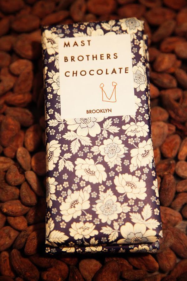
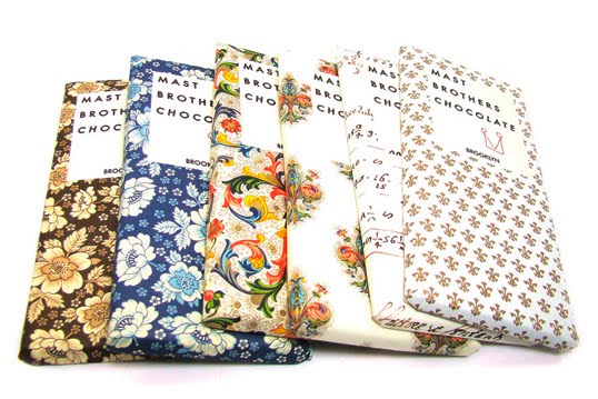
I love the combo of the beautifullly patterned and retro looking papers with the incredibly simple logo and modern font. And it’s awesome that their logo is a mast that also sort of looks like a crown, and the hand-drawn quality lends a homemade feel to the product and keeps it from looking like they take themselves too seriously.
Click through for more photos and a behind-the-scenes video at their Brooklyn storefront/factory…
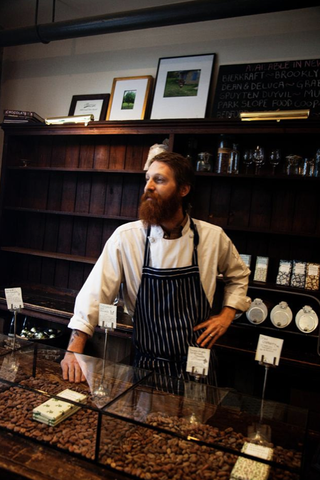
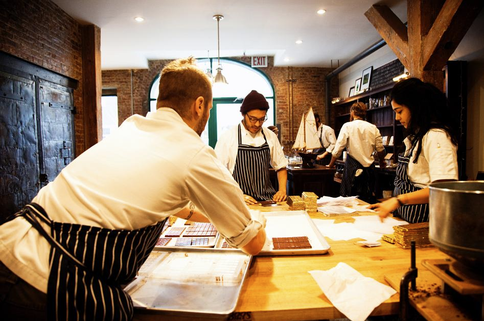
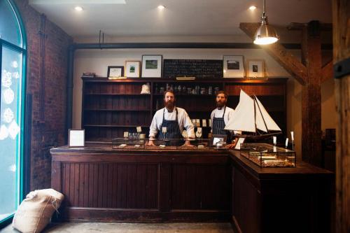
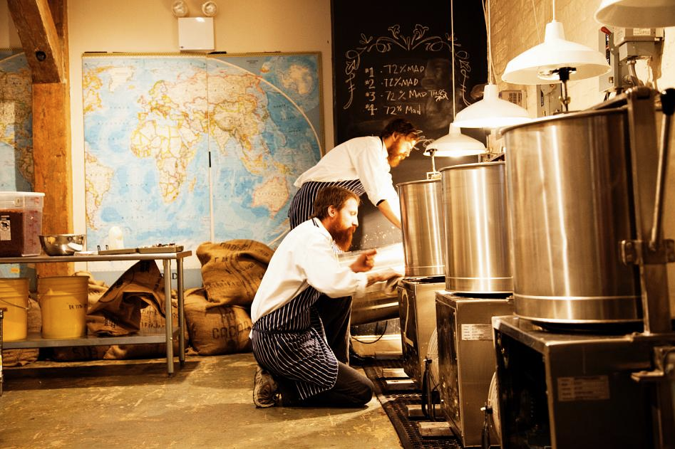
The combo of brick, wood beams, maps, grain sacks, chalk board, and industrial equipment is pretty awesome looking. I think they nailed the aesthetic for their little operation.
And of course, since I love behind the scenes videos… a video about their story and process. And you get to see what the brothers are like!


