Interiors
For Stirlgirl…
A while back, Stirling said her new kitchen in Charlotte is tiny and she needed some suggestions. So here, a round-up of small kitchen ideas. Other than these first three images, these aren’t necessarily pretty images, but they give good practical ideas that you could execute more attractively.
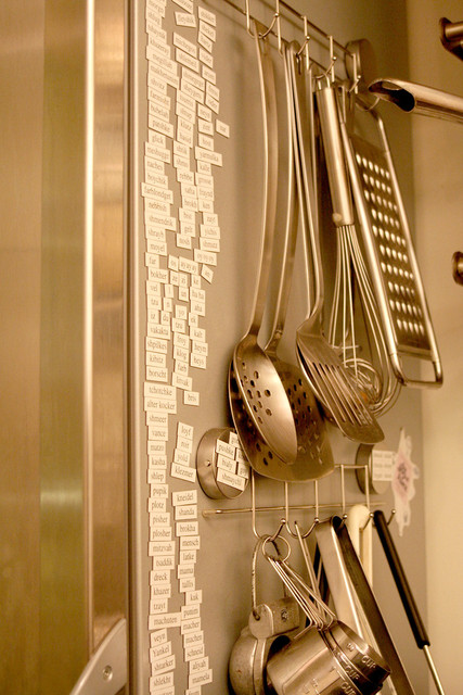
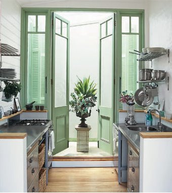
Above– this adorable small kitchen makes good use of the Ikea
grundtal kitchen accessories– the stainless steel wall-mounted racks and hooks.
Another key to this kitchen, which stores almost everything in plain sight, is the unified color scheme. The green/white/stainless combo looks clean and sleek here, whereas if there were all different metals and color dishes, it would look cluttered.
So as you build your kitchen, aim to keep all your dishes and cookware in the same palette.
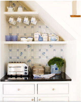
Hanging hooks under shelves is a great way to store mugs, as in the above photo.
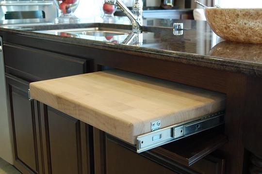
First, undermounted cutting boards. These actually used to be very common in 1920s homes and they’re a great idea!
Click through for a bunch more ideas…
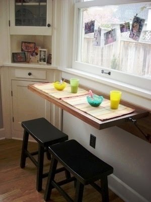
Fold-up counterspace on an empty wall can be mounted with hinges.
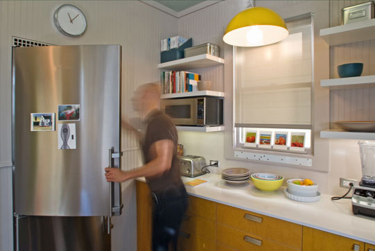
Moving microwaves and other small appliances up to shelves frees up counterspace (and looks less cluttered. I have a personal pet peeve for appliances on the counter!).
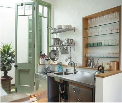
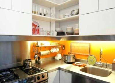
Another good use of the grundtal hooks, as well as a clever fold-up wall-mounted dish drying rack in case you don’t have a dishwasher.
Putting a large cutting board over the sink can also free up counter space.
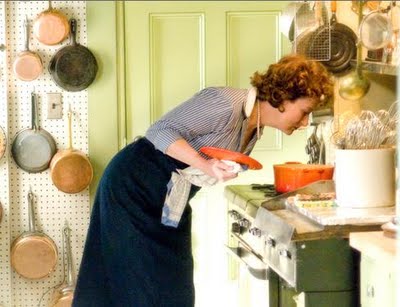
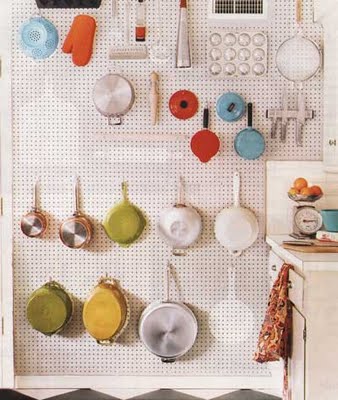
In Julia Child’s kitchen (preserved above in a museum, and also recreated in Julie & Julia), she hung her pots on hooks mounted on pegboard.
Here’s a cute reproduction of this idea..
These shelves are actually in a kitchen, but it made me think that if you have a big bookcase right near the kitchen, you could style the bookshelves with a mix of cookbooks and your prettier kitchen items, like ceramic bowls or cast iron or enamel cookware.
This image, also from apartment therapy, suggests hanging utensils on the side of the refrigerator. If your refrigerator was right next to your stove, this could be both handy and more unobtrusive than hanging them on the wall over the stove.
This images isn’t so pretty, but shows another good idea for undermounting– you can put in a rack to undermount wine glasses (or any glasses with stems).
Also not so pretty, but a good idea– a super high shelf could be installed to hold less-often used items, whether food items or dishware. My mom has always kept pretty cake plates and serving dishes up on top of our cabinetry.
Another article from the kitchn lists more tips, many of the same already pointed out here, but you can read the whole thing
here.
Interiors
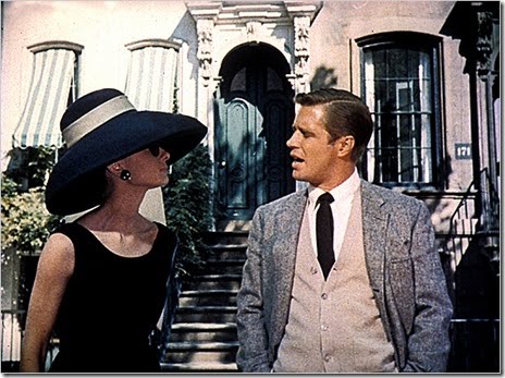
I just re-watched Breakfast at Tiffany’s, and I was reminded how much I loved the long green and white-striped awnings on the windows of her apartment building.
Aren’t they chic? They looked fabulous with the green door and overflowing windowboxes.
Here is the building now, and it just doesn’t look nearly as lively without the awnings or the window boxes, and with a black door.
Interiors
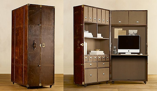
Now I am definitely on the antique trunk-as-decor bandwagon, I love the whole concept of steamer trunks– trunks that you would pack for a long voyage with every possible necessity and luxury you could need organized into neat little compartments– but this?? Really??
Restoration Hardware, the kings of knocking off the current trends (see their other trunks, which are direct copies of Andrew Martin’s cool repro steamer trunks), may have gotten a little overambitious on this one.
While I do like the concept of an office-in-a-box (it just seems so wonderfully organized), this is a bit ridiculous. A trunk + an office in a box is just too much. And seriously, would you ever close it? It’s essentially an entire room within a room, it would look absurdly gargantuan if you closed it! Like an actual elephant in a room!
Restoration Hardware Mayfair trunk here.
Interiors
Two things I love: bookshelves and art.
bookshelves + art hung over them = fabulous
For some people, this may be a bit much, but for me, it is like a result of this ideal world where you have so many books and so much art that they simply have to overlap because you don’t have enough room for all your treasures.
William Waldron — what a sophisticated bedroom. I love the look of the architectural print hung over bookshelves.
By Nate Turner. I also love this room in general (not that I don’t love all of these in general, but anyway…)– love that it is a tiny dining room but packed with character and looks cozy (love bookshelves, and well, art for that matter in dining rooms), love the crispness of the black and white– the trim on the chairs and table skirt, the frames, etc. This dining room looks like the kind of dining room you’d definitely use all the time– for meals but also for working on projects, planning trips, etc.
Not sure who exactly this is by… all I put in the file name is “Donovan”?
And finally, Miles Redd’s living room, which I also love for so many reasons, but here, just a small tableau showing one of his many great styling ideas.
At top by Jan Showers.
Interiors
Interiors
This image from Ralph Lauren’s new La Plage collection, in which they turned the books pages-out (instead of the usual spine-out), reminded me of these parchment-bound books I’d seen before.
I love the color that a variety of books adds to a room, but if you want a very neutral room, this pages-out and/or parchment spine look creates an interessing textured-neutral backdrop for a room.
Above, from Marie Claire Maison
I saw these wrapped books by
Trowbridge Gallery at Decorex in London in the fall, and though I guess they could be considered kitschy or cheesy, I thought they were really clever.
These parchment bound ones below are from
E. Lawrence Ltd. in Atlanta, and they also do some styles similar to Trowbridge’s more clever ones.
and one more…
Rose Tarlow
Interiors
Isn’t this office by Charlotte Crosland so appealing? I can’t even put my finger on why exactly, but I feel like paying bills would somehow feel nicer if you were sitting in here.
I love that the space is tiny, but not crowded, and it’s functional, but still cozy. The window-paned wall separating the room from the hall helps keep it from feeling like a cave by letting light flow in both directions, and I’m loving the touch of dark green.
Interiors
We are always thinking about how a piece’s legs will affect a space– is the room looking too heavy and dense? Too many skinny legs everywhere? Etc etc… Nendo’s “FadeOut” chair adds a humorous note to this discussion with it’s floating appearance… clever!
Interiors
My sister Leslie is working on remodelling an old cottage at Lake Chautauqua in New York, and she’s thinking about painting her kitchen in a dark color. She saw this image above, and asked what I thought about dark kitchens.
I’d never really thought about it explicitly, so I started a hunt through my kitchen images, and here’s what I came up with.
Amazingly, out of hundreds of images, this represents almost all of the non-white ones I have! I don’t know if it’s because I prefer mostly white kitchens, so I save more of those, or if colorful kitchens are actually less common… Either way, Les, hope this is helpful!
By the way, these are in no particular order, and clearly many of them are not exactly cottage-y! Just thought I’d throw them all out their for your consideration.
A common thread in these images is that if people go for a color on the cabinets, they still stick with white or a neutral on the walls. Although the very first image is all one color all over, and I think it really works. The pretty millwork in that one helps, though.
..Or they just inject some color in the backs of the glass-front cabinets.
This is a good way to do color on the cabinetry without it being overwhelming– doing the uppers as open shelving instead of cabinets.
More after the jump…
Again, color below, open shelving at top. I actually love this combo of shiny black, wood, and white-painted wood walls.
The wallpaper on the inside of the cabinet doors is pretty cute.
Miles Redd’s gutsy black kitchen, brightened by the mirrored counter and backsplash and white floor.
Painted beadboard below and white above is another way to do color without making the entire kitchen that color.
They went for it, with painted cabinets above and below, and honestly, I don’t think it looks quite right. Maybe it’s just the angle, but the high white ceilings and light floor sandwiching a band of grey looks funny to me. But at least the top cabinets are paned with glass. I will say, I liked this kitchen a lot the first time I saw this image, but the more I’ve seen at it over time, the more it bugs me.
They went for it with painted top and bottom cabinets too, and I think it’s actually more successful like this, without the white floor and ceiling. Usually I like a lot of contrast, but here I think it works better to have all the surfaces in this same moody palette.
Finally, love this dark green.
So, if this post were a poll, it would seem the most popular colors for kitchens right now are light green, grey, and shiny black, but Les, I’m personally digging this hunter green for you…
Interiors


 width="292" />