I Love Maps >> Vintage Classroom Maps

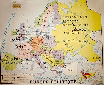
I really love maps, of all kinds, practical maps on road trips, treasure maps, historical maps, fictional maps in books like The Hobbit, etc., and this type, from Style de Vie at the LA Mart, recently caught my eye.

Style de Vie has a collection of old French classroom maps, the kind that look like they are printed on thick, waxy canvas and could be pulled down from a roll-up mechanism.  The ones they have are from French colonial days, so the colors have aged and have this appealing nostalgic tone to them, as if they are lit with pink bulbs.

The font, outdated borders, total lack of topographical detail (sometimes historical maps have so many lines, and these are pleasingly simplistic and solid-colored), and French country names add extra appeal.

The Style de Vie ones, which are framed really nicely, are out of my price range, but I’ve added them to my LustList and am going to be on the lookout for them at fleamarkets… if you come across any, let me know!

March 12, 2010

Curated by:
Eliza Coleman

Section:
I Love Maps, LustList

Labels:


Floating Chair

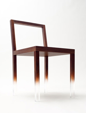
We are always thinking about how a piece’s legs will affect a space– is the room looking too heavy and dense?  Too many skinny legs everywhere?  Etc etc… Nendo’s “FadeOut” chair adds a humorous note to this discussion with it’s floating appearance… clever!

March 12, 2010

Curated by:
Eliza Coleman

Section:
Interiors

Labels:


Detroit’s Abandoned Houses

The blogging couple behind Sweet Juniper write about raising kids in Detroit, the city sometimes called “The City That Civilization Abandoned.”
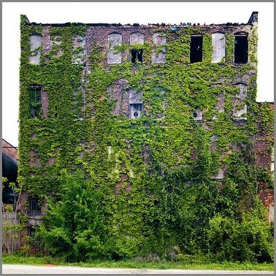
In their series “Feral Houses,” they document a few of the estimated 10,000 abandoned houses in Detroit.  10,000!
They call them “feral” because like the feral dogs of Detroit, stray dogs that have essentially returned to their primitive state and learned how to survive on the streets, these houses are slowly returning to a “wild” state.

I like this concept because it makes it sound like the houses were natural things that people found and tamed, and that they are now returning to the wild.  The image above particularly makes it feel like someone had once come and discovered this house behind all the vines and chopped them down, and now the vines have returned to take back the house.
They explain that as the lime-based paint and other materials deteriorate, they provide the perfect environment for growing vines.  Also, trees will often begin to grow right into and up through the house, as seen in the image at top.
The sign in the yard above reads, “WILL THE LAST PERSON TO LEAVE DETROIT PLEASE TURN OFF THE LIGHTS?”

via ReadyMade

March 12, 2010

Curated by:
Eliza Coleman

Section:
Green Thumb

Labels:


How You Can Live to 100

My mom is up there as one of my top blog-supporters, and I had to post this for her. 

I started reading and saw the tip about eating nuts, and my mom eats more almonds than anyone I’ve ever met, (at any given time there are about eight bags of almonds in their freezer just to ensure she’ll never run a shortage), and then I saw the part about having a baby after 40, and now I’m convinced she’s going to live to 100.  She had me at 42!  Not that I had any doubts before, but Mom, I’m pretty sure this gaurantees it.

Click for legible size.

From The Future Well, via The Essential Man.

March 11, 2010

Curated by:
Eliza Coleman

Section:
A Teachable Moment

Labels:


Loving the Work of >> Subhankar Banerjee

Caribou Migration I

I first saw Subhankar Banerjee’s photographs at Sundaram Tagore Gallery in Chelsea back in 2007, and these images have been stuck in my head ever since.

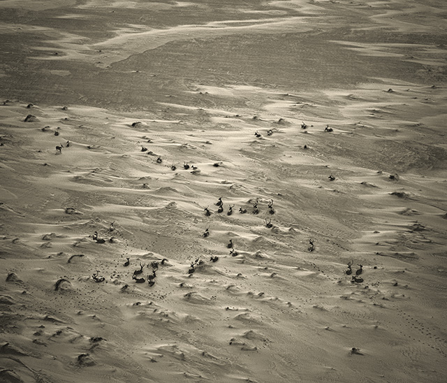
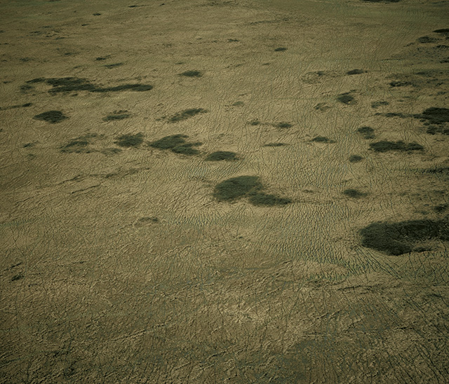
While at first they may seem like maybe they could fit simply into a nature-photography niche suitable for calendars, they are are soo much more.  First, you should know looking at these images that these are huge.  Around 6ft x 6ft.  You truly feel like you are with him in the helicopter looking down over vast, magnificent swaths of land.

 Caribou on Sand
Originally trained as a physicist and computer engineer in India, he later got into conservation, activism, and photography.  He set out to aerially photograph the Alaskan arctic in all seasons, and he found himself caught in the middle of the Bush-era Alaskan oil-drilling debate and while his photos can be merely taken at their aesthetic face value, they do not shy away from making a statement about Alaska.

Caribou Tracks on Tundra 
While the Right was pushing for drilling saying that the Arctic National Wildlife Refuge was frozen wasteland anyway, Banerjee’s photographs showed, in a way that was at once breathtaking but not sentimental, that this was untrue.  
 
His photos display the rich ecological life of the area, and the titles and accompanying literature provide gripping information, but his literal distance from his subject, allowed, as an Art in America essay noted, a sort of studied “topographical aloofness” that keeps the photos from becoming affected.
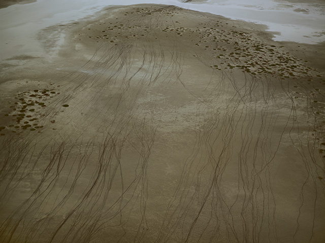
Caribou Tracks on Wetland III 
As in the photo above, his photos often show only the tracks of the animals moving through this space, merely “a documentation of documentation, a living history,” but that is enough to make the viewer acutely aware of the life happening on and across these lands.

Snow Geese I
Finally, formally, they are engaging for their composition and scale.  As soon as you walked into the gallery, you could appreciate them aesthetically from afar, but then when you got closer and saw the titles and noticed the tiny animals or tracks, they became so much more intersting.  With many of them, until you got up close, you could easily believe you are looking at a large chromatic abstract painting.  
This quality of his work directs you to consider that it is necessary to take a closer look at not only at his art, but also at the world around us.  We may initially think of the Alaskan arctic and picture a vast, boring tundra, but he shows us that there is much to be seen.
Subhankar Banerjee’s website here.
Art in America essay on Sundaram Tagore website.
March 11, 2010

Curated by:
Eliza Coleman

Section:
Arts Visuels

Labels:
,

The Gentlewoman

I read recently that it’s like the early ’90s all over again, with lots of young unemployed grads starting up independent magazines.  I think it’s true, and it’s cool!

I like that there are going to be not only fresh perspectives available on newstands (and online), but also fresh cover designs.  Ahhh, what a relief to see an artistic cover not covered in headlines and lots of different colors.

I’ll be featuring new ones under this series “Fresh Pulp.”

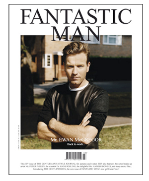
The latest, The Gentlewoman, is from the team behind Fantastic Man, and I am so excited that there is going to be a women’s counterpart to one of these new outlets, as I’ve mentioned before I feel like there is a wealth of interesting new men’s style blogs, magazines, and stores far outshining comparable women’s options.  (My favorite example being the J. Crew men’s store and Liquor Store being far cooler than the women’s store.)

And guess who is on the cover of The Gentlewoman?  A CREATIVE DIRECTOR.  Phoebe Philo, CD of Celine.  How about that?

March 10, 2010

Curated by:
Eliza Coleman

Section:
Style Files

Labels:


Tastemakers >> Monelle Totah

I always think it’s interesting to get a peak at the people behind the brands you love– Jenna Lyons from J. Crew, Deborah Lloyd from Kate Spade, the couple from Obedient Sons & Daughters, Alexander Wang– because for the more faceless brands, it’s cool to see that there’s a real live person behind the looks, and not just some kind of trend-tracking machine churning out the latest looks.  
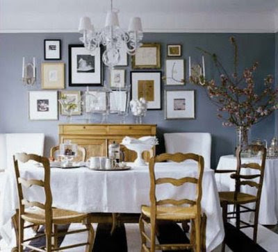
Here, the Manhattan home of Monelle Totah, the Creative Director for William Sonoma Home. 
  
I personally think we are sort of in “The Era of the Creative Director.”  Of course there have always been Creative Directors, but at larger mass consumer brands, the product lines were, in the past, more driven by strict pricing and merchandising formulas, and today, the Creative Director-as-muse concept has trickled down from high-end design brands to mass market brands, and the CD is given more importance.
  
Anyway, there’s my little theory for the day, and I’ll continue this look-at-people-behind-brands as a series.
What do you think of her home?  Does it fit with what you would expect from the woman behind WSHome?  
 

Personally, I feel like the rooms don’t all totally jive with each other– it’s like each one has a slightly different personality.  

But I feel like that makes sense given her job and the fact that she is constantly thinking about new trends and collections, don’t you think?  I feel like that would make it hard to pick only one style for your home.
Images via Habitually Chic
March 10, 2010

Curated by:
Eliza Coleman

Section:
Tastemakers

Labels:


the milk man + the ice cream truck = something more than the sum of its parts

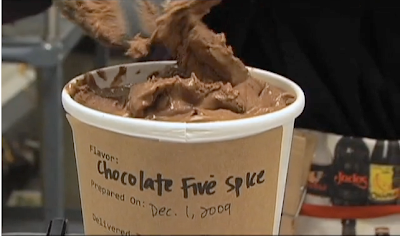
MilkMade, in Manhattan, has combined the concepts of the milk man and the ice cream truck, along with a lot of other great ideas, and is delivering their dessert delights to doorsteps in select neighborhoods in Manhattan.

MilkMade is a membership-based service, and members receive one flavor a month.

 
 Using ingredients from the local farmers’ markets, MilkMade creates unique flavors, like Maple Pancake, Peanut Butter and Brown Sugar, and Chocolate Five Spice.  Each of the flavors is only made once, so each month is something new.
  
  
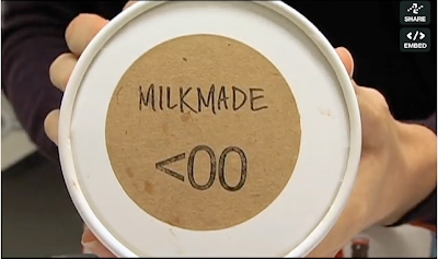
And of course I love the packaging with its simple brown craft paper and handwritten label.
MilkMade was started by this cute lady in her kitchen.
  
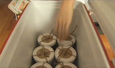
After finishing the first batch, she wrapped each one in twine (the icing on the packaging cake) and loaded them up in her cooler.

And then set out to deliver them to the first 50 members!

I’m rooting for this girl.  Mostly because I hope someday it will be a nationwide service so we can get some ice cream love out here in Cali. 

Images are stills taken from this video on Food, Curated.
March 9, 2010

Curated by:
Eliza Coleman

Section:
Masters and Their Crafts

Labels:


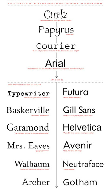
Evolution of Type Taste

 
Click for version large enough to read.. pretty funny.
March 9, 2010

Curated by:
Eliza Coleman

Section:
Graphic Fix

Labels:


Victorian Jewelry

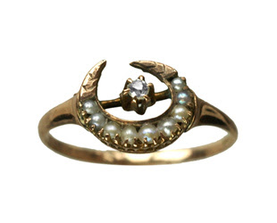
I came across this Victorian crescent ring at Erie Basin about a year ago (actually, on November 20, 2008, to be exact – aren’t bookmarks cool??), and I’ve loved this motif ever since.
After some research, I learned that the crescent shape became popular during the Victorian era after the discovery of the Vault of Curium, which spurred an interest in all things Phoenician, including  the “fertile crescent.”  The Victorians, who loved some good symbolism, re-appropriated the crescent, or moon shape, to be a symbol for a honeymoon, and husbands often gave them to their new brides.
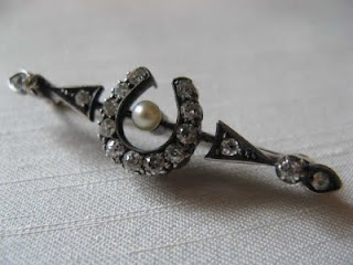
I’ve been on the lookout for antique crescent rings ever since, but they are actually really rare!  Most of the time I come across crescent pins, like the one above, rather than rings.
Jewelry designer Mociun must’ve been on the same wavelength as me, as they have debuted this new crescent ring below…
I love the crescent design not only for its history, but also the actual design!  It’s pretty, without being too precious… the pointy ends make it just slightly fearsome I think.
Also, I love that they used black diamonds.  It’s gorgeous, and also historically appropriate given the Victorians’ love of black mourning jewelry.
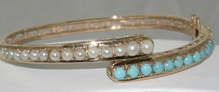
Above and below, a Victorian bangle and ring, both of seed pearls and turquoise.
The seed pearl + turqoise combo is another favorite of mine from the Victorians’ jewelry repertoire.
Mociun up’ed the ante on this one, and used diamonds instead of seed pearls…
Love it!

Mociun, discovered via Pixels & Arrows

Ring from Erie Basin in Brooklyn, which has lots of cool jewelry, crescent pin from Friar House Antique Jewelry, and antique seed pearl and turquoise bangle and ring from Ruby Lane.

March 5, 2010

Curated by:
Eliza Coleman

Section:
Style Files

Labels:


Masters and Their Crafts

Roost + Cultivate Wines
bberry

I love photography like the above… that dinner table in candle light… I have an obsession... 

Tastemakers

Katie Ermilio
katie ermilio

Dear Wonderlusters, I’m so excited to bring you this interview with the darling designer Katie... 

LustList

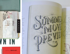
Drawn In
drawn in

I can’t wait to get my hands on this book of images from the sketch books of 44 artists and designers... 

Listening To

Arcade Fire + Chris Milk
creators project

I so wish I had been at Coachella for this. Director Chris Milk, as part of The Creator’s Project,... 

Destinations

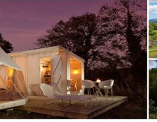
Canopy & Stars
canopy and stars

This site is so much fun to browse. Talk about wanderlust. Alistair Sawday, author of the Special Places... 
Interiors

Modern Cottage
canada cabin

Loving this modern cottage in the woods of Ontario. I’m all for cozy, traditional cottages, but... 

Style Files

RRL’s Vintage-y Lookbook
rrl

As Miss Moss said, there have been an influx (onslaught?) of vintage-inspired lookbooks recently, but... 

Classics

Recently on Editor’s Chair…
editors

Click over to Editor’s Chair, the tumblr within the blog, for more.  

Wonderlust
Wonderlust: a strong, innate desire for things that inspire wonder or the urge to create.
Other Goodness
Contributors
  • Eliza Coleman
  • Respect
    © 2011 The Wonderlust Journal. Content is distributed via the Wordpress platform.