To Have "a Look"
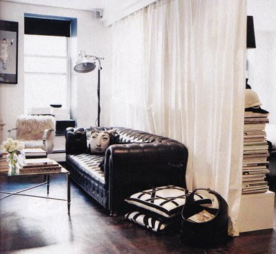
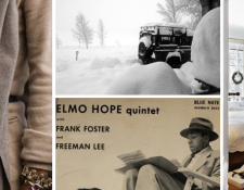
I think Alexander Wang is one of those people that has got his “look” figured out… doesn’t his apartment totally parallel his clothing?? He knows what he likes! The apartment was designed by Ryan Korban, and I think he did a fantastic job interpreting Wang’s taste. Usually one of the biggest challenges for designers is helping clients distill what they actually want and like… not this one!
Like his designs, which start with basics and classics and add a twist that gives them some sex appeal and edginess, the apartment is mostly filled with antiques (French chairs, above dresser, chesterfield sofa) and is done in a limited palette restricted to black, white, and a few neutrals, but the textures and materials and accessories (fur, chrome, black leather, black and white photo above) give it some glam and a rock ‘n roll vibe.
PS – Alexander Wang is going to be at Opening Ceremony in LA this Saturday for a trunk show!!! You can rsvp at Refinery29
Obliteration of Eternity
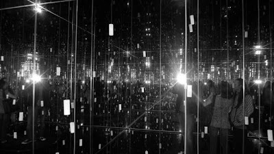
What you are looking at is a room of mirrors, lit with hundreds of candles hung on wires at different heights, with a shallow pool of water on the floor for an added layer of reflection (and disorientation, as the water ripples).
Installed at Gagosian Gallery in New York last summer, this work is by contemporary art doyenne Yayoi Kusama. Barely comprehensible in the above photos, the black and white gives a better sense of where the walls are, as you can see where they meet (and then meet again and then meet again and then meet again in all the reflections).
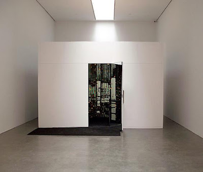
And guess what, you enter that after walking through this blank white room, and then the actual installation room is not very big at all!!
Watch this video for a better sense of the three dimensionality of the space and the effect of the glimmering light thrown off by the candles.
Infinity Room from mamojo on Vimeo.
How amazing is that?!! So simple, and yet so creative and other-worldly. Talk about transporting the viewer! (..or in this case the expiencer!)
Information is Beautiful
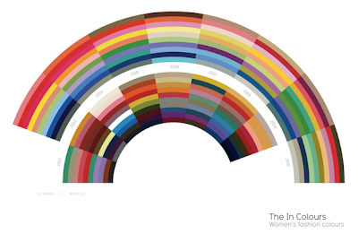
Below, the “in” colors for women from 2002-2010. (Click for larger image.)
David McCandless is an information designer. I like design, and for that matter, I really like information too (a friend regularly tells me I should put all my random factoids in a book. I think she means “instead of telling them to me all the time.”), so it’s no surprise I think the idea of an information designer is INCREDIBLE!! He basically takes information and makes it digestible through a visual form that is not just your typical pie chart.

Today, he created this graphic in response to the news that Google has stated that it will now refuse to censor google.cn in accordance with China’s censorship rules. In red are phrases that are blocked, and in black, websites that are blocked. (Again, click for legible image.)
Some are expected, like “political dissent,” others, like perezhilton.com, are a surprise!
Below, a comparison of “billions.” This was in response to constantly hearing incomprehensible multi-billion dollar figures in the news. See billions spent by US govt on the Iraq war compared to billions it would take to feed and educate every child in the world for a year, for example.

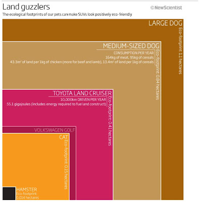
Environmental impact of pets vs cars… surprising!!
I think he’s brilliant. Being able to comprehend information and translate it into something visual and easily understood and also make it aesthetically pleasing is quite a skill.
Ps… I bet he’s a fan of Frank Stella’s 60s and 70s work, don’t you? Below, Frank Stella’s “Harran II,” 1967.
Stripes

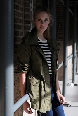
(Also, boy triplets has never looked so fun. Actually, I don’t know if they are triplets or not, but either way there’s no way three boys would ever dress alike! Ah the fantasy of editorial photography.)
 A look started, you might say, by one Gabrielle Chanel, as seen in Coco Before Chanel.
(PS- I am obsessed with Audrey Tautou.)
top two photos via this blog, illustration by Garance (who interestingly put a Barbour-ish coat on her illustration very similar to the parka on the girl in the photo above! Good look!), and still from Coco Before Chanel.
Funny I Should Mention That…
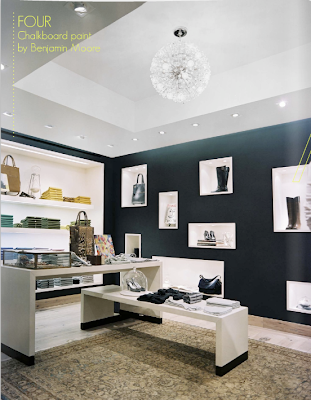
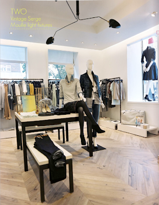
Funny I should mention the comparison of Madewell (as a J. Crew women’s-only store) to the J. Crew Men’s Collection yesterday, as I just came across this spread about the J. Crew Women’s Collection store in the fantastic Lonny Magazine today! I didn’t even know about it!
I obviously am dying to go, but I just have to say, I still don’t think it’s on par with the men’s store. But maybe that’s just because this particular style is not my thing really, and I love the style of the men’s store. Still, thought I’d share!
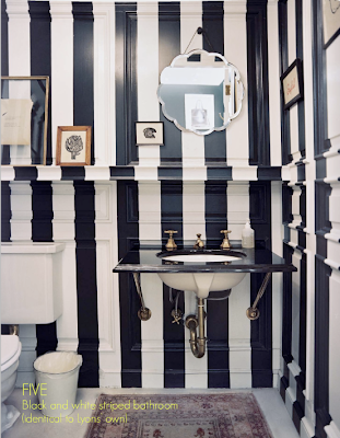
I do love this striped bathroom, which is actually based on the one in Jenna Lyons’ home.
Madewell
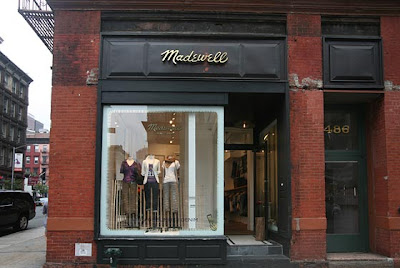
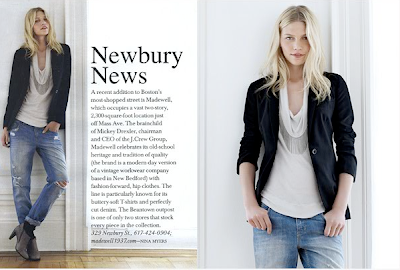
Once again, as with the Garance + Scott romance that I just now uncovered, I just figured out that Madewell is owned by J. Crew. Now it makes total sense! I loved the windows and storefront and knew someone smart had to be behind it, and anything owned by J. Crew is probably going to get it right with Mickey Drexler at the helm and Jenna Lyons leading the creatives.
The brand, which is named after the defunct American workwear label they took over, is J. Crew’s women’s-only more casual and bohemian line.
J. Crew has been only on the up and up the past few years, so I have no doubt that Madewell will get there, but at the moment I don’t think it’s look has quiiite fully evolved. The merch has gotten better over the past year, and there are some great basics, but it still isn’t obsession-inspiring.
Also, in comparison to the creative, extremely well-curated TriBeCa J. Crew Men’s Store (below) that was born fully-hatched with every detail in line with its message, it leaves much to be desired.


However, I will say that they’ve inspired glimmers of loyalty in me (and hope that they will end up super cool) simply because they sell my favorite French tennies- Bensimons!!
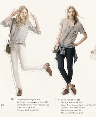
Above, a fave look from the website.
At top, a spread from Boston Common magazine. Men’s Store photos from NYMag and complex.com.
Brick/Wood/Bookshelves/etc
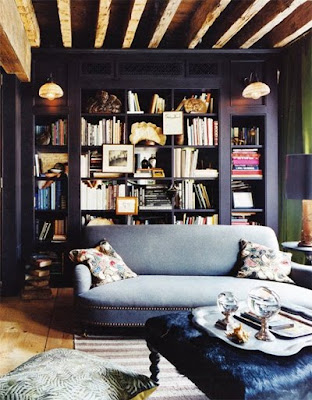
Loving the cozy apartment of fashion photographer Carter Smith! I love:
-The dark painted built-in book case
-The assortment of objet and art on the bookcase
-Particularly, the art is framed on the outside of a bookcase
-That stack of eye-catching pink and purple books on the right. I know some people are soo over books arranged by color, but the styling touch of having a stack of bright books works here!
-The simple-lined sofa in wool upholstery (at least I think it’s wool… or maybe mohair velvet?) with nailhead trim… all in all very tailored looking, but not stiff.
-The beeaaams, oh the reclaimed-wood-looking beams and wide-plank wood floors.
-The black hide on the ottoman! Adds some shine against the grey wool, raw wood, and dark bookcase.
Don’t love the floppy floral pillows. Sorry. Hate to hate, but had to say it.
Below, more photos of his apartment, along with some of his work that has fall/winter feel similar to his apartment.
 Love:
Love:
-The exposed brick walls.. I think I will always be a sucker for them…
In fact, I think that: Exposed brick + wood beams + sturdy, handsome antique furniture + any tufted upholstery (bonus if it’s antique) + Belgian linen, leather, velvet, and cashmere + a dash of mid-century French industrial + books everywhere + a little glamour in the form of shiny things === a winning combo for moi every time
Thus, I really like the mercury glass lamp above and the shiny chartreuse curtains. Well, I mean everything, actually. It’s not quite my perfect combo, but it covers many of the bases.
via This is Glamorous and Art + Commerce, Smith’s agency. Not sure who decorated his place… maybe he did!
Street-Style Romance
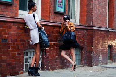
Am I the last person in the world to know that Garance and Scott Schuman are dating?? I mean I suspected it since they frequently mention each other on their blogs and travel together, but I finally googled it and it is confirmed. What a 21st century couple… two power-bloggers dating! And taking the fashion world by storm!
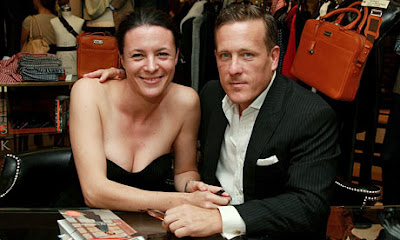
Do you think they just dress up and take pictures of each other when they are alone?
Prints and the Revolution
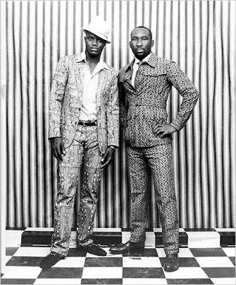
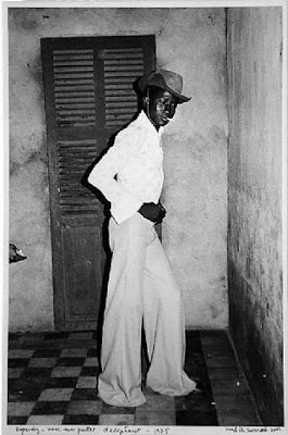
Bold and graphic photos by Malick Sidibe, a photographer from Mali.

Would you believe the above three photos are from this year? Not only are they current, but the models (his family members) are all dressed head-t0-toe in clothes from designers’ African-inspired spring collections from last year, including Marni, Dries van Noten, Marc Jacobs, etc. It’s all about context, eh? Would you have ever guessed?
Shot for the NYT Style Magazine, “Prints and the Revolution” (I stole the title), April 2009. More photos there.
Click the jump for more…
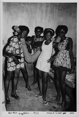
Originally, however, he started out photographing parties in Mali in the 1950s and ’60s, a heyday in Mali when Western clothes were becoming popular.
Interesting that he would later shoot Western clothes adapted to an African look, when he started out photographing African people trying to adopt the Western styles.
Those girls are really cool, btw.. check out that girl’s long-sleeved supershort tunic on the left.
I don’t know anything about these final three, but they remind me so much of some of the portraits by a few of my favorite painters … perhaps Sidibe was a fan of art history and knew these paintings and was riffing on them?
 Manet’s Olympia – 1863 – This is uncanny, I can’t be imagining the similarities– seated women, ankels crossed protectively, each with a hand on their laps, both aware of the viewer’s gaze, addressing the gaze somewhat uncomfortably, surrounded by textiles… they even both include bouquets of flowers!
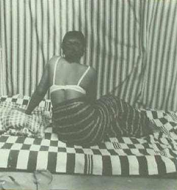
 Ingres’ Grande Odalisque – 1814 – again, similar composition, a stretched out seated woman leaning on a hand/elbow, with her back to us, knees bent, surrounded by textiles. Even notice the way the textile in the background of Sidibe’s bends sideways to meet her knee, just like the curtain in the background of Ingres’ meets the odalisque’s knee.
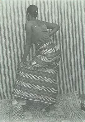
 Matisse’s Robe Violette et Anemones – 1937 – and once again, a similarly composed portraits of a woman in a somewhat angular pose (notice elbows and knees), oriented vertically, figure takes up almost the whole picture plane– with the use of multiple patterns on walls, floors, and textiles, melding foreground and background.
He MUST have been aware of these portraits, right??!
A Love Letter For You

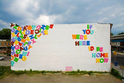
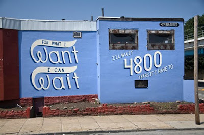
LOVE this mural project, called “A Love Letter For You,” in Philadelphia spearheaded by Philadelphia-born artist Stephen Powers. Powers, who grew up in Philadelphia and used to use the neighborhood walls for graffiti, is now an artist with his work shown in places like the Venice Biennale (one of my favorite events ever) and the Institute of Contemporary Art in Philadelphia.
 Many of the messages and designs reference the original signs that might have been painted in those locations, like this one next to a barber shop.

Made to be viewed from the El train, the blog about the project captions each photo with a description of what train each mural can best be viewed from.
Who can resist a love letter?
Curated by:
Eliza Coleman
Section:
Arts Visuels, Sentimentalism
Labels:
Street Art


