Poker Face

Francoise Nielly‘s abstracted portraits …are… striking. Loud. Almost brash. And somehow also intimate. And beautiful. Which is interesting given that their proximity, as in, how close-up the viewer is brought to the subject, is uncomfortable. The subjects almost always appear suspicious of their viewer. And yet there is a vulnerability to them. You get the feeling of an undercurrent of tension revolving around the subject’s exterior persona vs. interior life.

This is amazing to me: Nielly paints these based on black and white photographs, meaning she has an incredible ability for translating dark and light into unexpected colors and values that our eye will still translate as a 3D form.

Also, she paints in big, simple, uninhibited strokes using a palette knife. Watch the video at bottom to see her process– it will invoke envy at her ability to look at something and translate it almost instantly, instinctually, into the forms and colors that she does.
Click the jump for the rest of the post…

And as I can never resist the “guess the influence” game… I think Nielly is definitely aware of her predecessors, particularly a few ab-exers and pop artists. Above, Lichtenstein’s The Melody Haunts My Reverie, 1965. The echoes of this prototype of a woman that Lichtenstein did over and over are hard to deny.
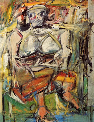 Secondly, doesn’t the somewhat aggressive rendering of her subjects remind you of de Kooning’s women (above, Woman I)?
 And finally, the garish, un-lifelike colors remind me of Warhol’s portraits. However, though similar in style, I don’t find Nielly’s use of color to be dehumanizing the way Warhol’s was. Although I will say the third one down reminds me a lot of an Avatar, which brings up interesting human/nonhuman questions…
Definitely watch from about 2:00-3:30 for a look at her process. She goes from blank canvas to something totally unidentifiable to a complete portrait with a minimum of brush strokes. When the canvas is only partially done you’re like, “What is that?”
PS- Would you have guessed her age and personal style based on her paintings??
Listening To: The Avett Brothers
Sweeter Than the Title Lets On…
Just last week, I downloaded the Avett Brothers’ album I and Love and You, and then I discovered this song, off their album The Second Gleam, via Hollister Hovey, and I started to think I needed that album too. I think I was behind the times on this band and that the Avett Brothers’ earlier albums are potentially even better.
The lyrics and harmonies of this song are so simple and beautiful.
Then I discovered the song “If It’s the Beaches,” which is off their EP, and now I’m wondering if I need all their albums?
Also, doesn’t his voice on “Color Show” sound kind of like the lead singer of Say Anything?
Floor Envy
 I die over this chevron-patterned floor. Not to mention the wonderfully moody photographs of this apartment of a super-creative Parisian couple. They took the photos themselves! Isn’t the light wonderful? How about the colors in the photo above?
 Old rusted letters from a Paris hotel sign that they found on the sidewalk makes.
Though such sparsity isn’t personally my style, this is a wonderfully edited space.
 This “bear skin” is actually a huge door mat, designed by the husband’s company. I love the quirk factor in this bare-ish (haa pun was not even intended) place. The wife is creative director of this brand.
More photos on design*sponge
Recent Packaging Favorites
I absolutely do judge food products by their packaging, and here are a few recent favorites.
 Chocolates designed by Sonia Rykel for Laduree. Feminine, stylish, luxe chocolates for the discerning, dare I say snobbish, chocoholic. Three-color illustrations on packaging always works for me.
 I love French Bulldogs, and I love Laduree (for their macarons, but I’m not diametrically opposed to these truffles), so naturally, this box does it for me. Also how funny is it that they made a French Bulldog look fancy(ish)? I would name her Scarlett.

Particularly like the handwritten (looking) labels (and the sketches on the rosemary!) for Jamie Oliver’s JME line.
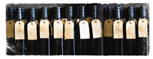 Maybe things just look better in bunches, but I love this shot of St. Helena Olive Oil Co.’s olive oil bottles. Actually, generally anything made with craft paper and/or resembling a luggage tag is right in my book.
Click the jump for more…
 Wonderfully simple homemade packaging by BBBCraft, via Design*Sponge. The look perfectly matches the product — it just oozes feelings of health, comfort, and simplicity.
 Pork rinds made cool in a classy wrapper* from Cochon. via this NYT article.
*Craft paper does it again.
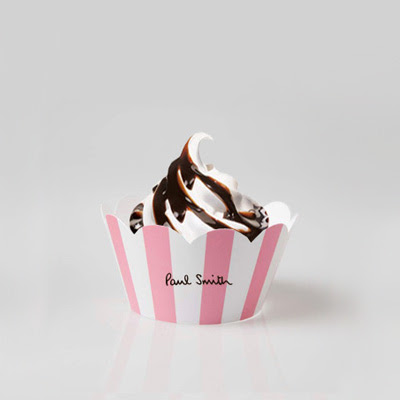 Clever marketing by Access Agency, via CoolHunter. Fun play on high-low– the Beverly Hills Hotel pink/white awning stripe + soft serve. But you know what I think is weird? At first I just thought they were inspired by the BHH stripe, but Paul Smith’s logo font is almost identical to Beverly Hills Hotel’s font… maybe that’s why the iconic pink/white stripe seems so fitting?? Maybe that’s where Access Agency got the idea? I mean the stripe + font is basically the whole BHH identity… wonder if it was intentional.
 Finally, just a cheeky poster via Happy Lady Eats by Jane Lang.
…I was actually just thinking the other day when I heard the song from which this line comes (thank you, 50cent) about how this would make a funny Valentine…
PS, this is not going to win any kind of packaging design awards, but is this for real??
Eadward Muybridge
Isn’t this video cool? It’s a composite of time lapse photographs by early photographer Eadweard Muybridge. I think it’s so neat that his stop-motion photographs are now able to be put back together to create very early motion-pictures..
Here are some of his works (1880s), which you may recognize, and which I love for a reason I haven’t put my finger on. Also of note, he influenced Sol LeWitt early on… a fascination with process?
Ok and lastly, going forward in time again, can you see how Muybridge influenced Duchamp’s Nude Descending a Staircase (1912)?
GQ’s 50 Most Stylish Men
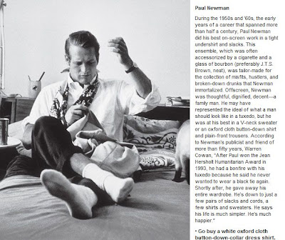
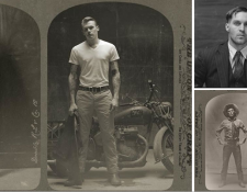
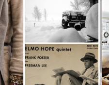
7 favorite shots from GQ’s 50 Most Stylish Men of the Past 50 Years

(The descriptions are great too if you click for full size.)
via fashion blog Maison Chaplin, which I discovered on Nick’s blog, and I do tend to listen to anything dear Nick recommends.
Curated by:
Eliza Coleman
Section:
Style Files
Labels:
classics, menswear, Photography
Mann Takes it to the Wall
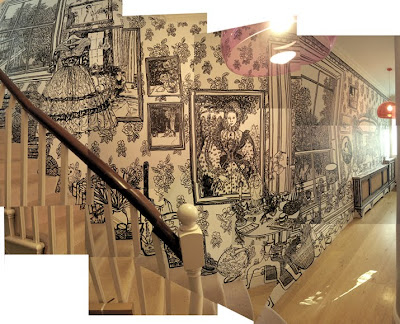
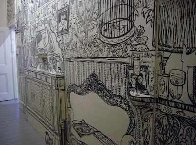
Charlotte Mann gives a new meaning to “mural,” as well as to “pen and ink drawing.” She takes her pen and ink directly to the wall, and makes a mural not depicting some unrelated subject matter, but rather, an imaginary version of what the wall could look like, or what the rest of the room could look like were there not a wall right there.
 (Click for a larger image.) For a Peter Jensen show, she created this backdrop using all images from Tina Barney’s photographs. According to her website, every detail, down to a cigarette pack, can be found in Barney’s book Theatre of Manners. Do check out Tina Barney as well, her photographs documenting her family and friends’ lives is fascinating.
 This room literally had a desk and a file cabinet and nothing else. She created quite a little world in ink! Love the details.. the barcelona chair, the Chanel book, the model helicopter…
PS- Yes, that is a Lil’ Jon reference in the title.
Colorscope
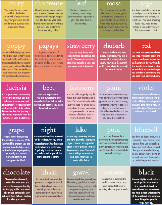
This is fun– without clicking on the image to make it legible, pick your favorite colors. Then click to see it larger and read what they say about you. It’s like a Seventeen Magazine quiz for grown ups*.
It’s from the Paper Source blog, and it is made using their product palette, and I think they did an amazing job selecting colors for their palette that look good together. Almost any three you put together look good!! Even if they are really odd combos! All about the same level of saturation and tint/shade (see more about the color sphere here**).
*read: “nerds”
**remember what I said about nerds?
LustList >> Wrapped Up in a Book(shelf)

I sat next to Rebecca Orlov, a contributor for Apartment Therapy LA, at an event at the Pacific Design Center last year, and she told me something fascinating. She said that two of the most searched terms on Apartment Therapy are “mirrored bedside tables” and “windowseat.”
Apparently, those two things strike a chord with a lot of people. Have you noticed how some things just do that? Like certain antique cars– there seem to be certain elements of design that just universally resonate with people.
And then we have the things that just totally resonate with ourselves. For me, Vespas and Mini Coopers. They are the perfection of transportation. My list could go on and on, there are certain things I obsess over like that, that I think are perfection in their respective category. I guess that’s a lot of what this blog is about.
But anyway, one of those things for me are built-in bookshelves that wrap over doorways, sofas, windows, you name it. If it’s a bookshelf, and it wraps up and over something, I like it. No, I love it.
 I am in love with this bedroom. I don’t know that I’d ever do my own bedroom so feminine, but I die over the wrap-around bookshelves. Duh, I know, but these are really awesome: they wrap around a corner. And a window, and a door. In fact they just envelope this whole bedroom. Imagine how basic this bedroom would have been without them– just a little box. And I love how that one wall just gets a teeny bit at the top and how the books are stacked clear up to the beams. Love the deep salmon color, the oil painting, the plain vintage-looking linens, and the toile screen.
 They wrap over a windowseat, that’s extra points.

Moral of the story, if you’re going to build in bookshelves, build them up and over something. Anything. Snug a sofa in underneath them, take them up and over a doorway, whatever. It will make the room ten times cozier.
Update: See Part II of this post here.
Top image from Atlanta Homes Magazine, 2nd is FPN via Cup of Joe, 5th is Charles Faudree, 6th is from Skona Hem via Desire to Inspire. Others are old scans and I don’t remember where they’re from!
Crazy Heart
I can’t get over how much I loved Crazy Heart. It’s understated, subtle, touching, and poignant. I actually rewatched the trailer AFTER I saw the movie, just to sort of, relive it for a minute.
And now I’m in love with the soundtrack. The song in the background, The Weary Kind, by Ryan Bingham, is SO GOOD– even if you don’t care about watching the trailer, just listen to this song.


