Chez Panisse and Alice Waters Menus

Just came across these wonderful menus done for Alice Waters and Chez Panisse 
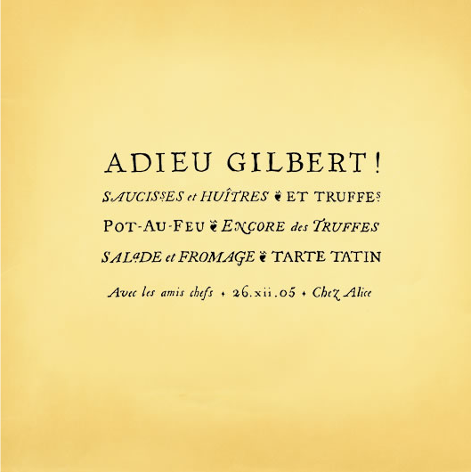
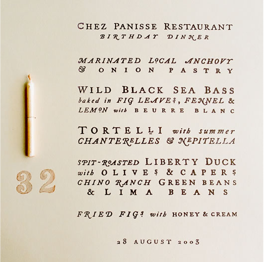
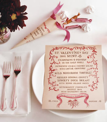
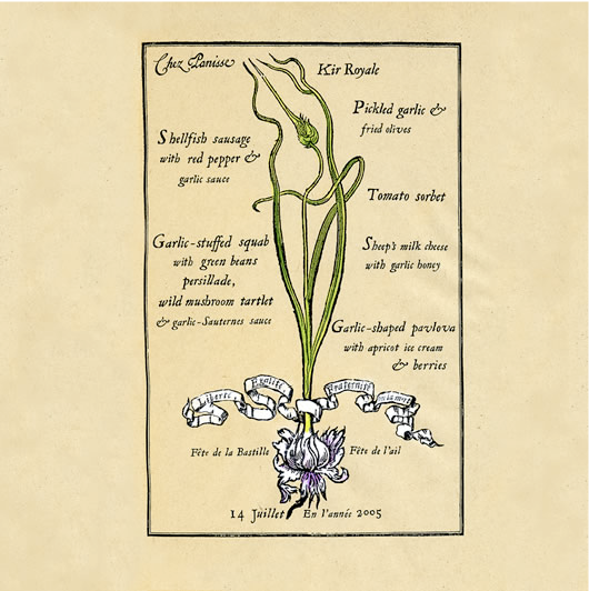
by Cynthia Warren, and I am in love with them! The design and typography are always spot on, and they clearly communicate the tone and look of the evening.
Above, a New Year’s menu.
  
A going-away party at Alice’s house.  Love the font!
This was for a dinner held by the Chez Panisse Foundation’s organization The Edible School.  
  
 
Love this birthday dinner menu.
  
Bastille Day menu
  
  
Valentine’s menu
 
  
another Bastille Day menu
  
another Valentine’s menu
  
a New Year’s menu and noisemaker 
I like Alice Waters even more now knowing that she had all these beautiful menus made for special occassions!
Cynthia Warren here
March 5, 2010

Curated by:
Eliza Coleman

Section:
Graphic Fix

Labels:
, ,

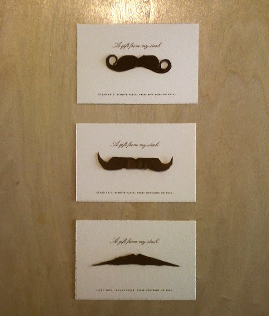
A Gift From My ‘Stache

 
Artist Annie Stanger sent these as her holiday cards– they are usable temporary mustaches!  Pretty funny. 

By artist Annie Stanger.

March 4, 2010

Curated by:
Eliza Coleman

Section:
Graphic Fix

Labels:


Non All-White Kitchens

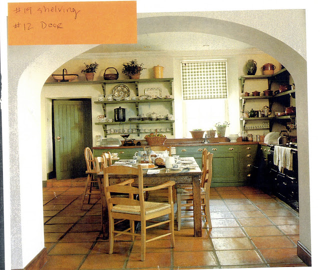
My sister Leslie is working on remodelling an old cottage at Lake Chautauqua in New York, and she’s thinking about painting her kitchen in a dark color.  She saw this image above, and asked what I thought about dark kitchens.

I’d never really thought about it explicitly, so I started a hunt through my kitchen images, and here’s what I came up with. 

Amazingly, out of hundreds of images, this represents almost all of the non-white ones I have!  I don’t know if it’s because I prefer mostly white kitchens, so I save more of those, or if colorful kitchens are actually less common…  Either way, Les, hope this is helpful!

  
By the way, these are in no particular order, and clearly many of them are not exactly cottage-y!  Just thought I’d throw them all out their for your consideration. 
  
A common thread in these images is that if people go for a color on the cabinets, they still stick with white or a neutral on the walls.   Although the very first image is all one color all over, and I think it really works.  The pretty millwork in that one helps, though.
..Or they just inject some color in the backs of the glass-front cabinets. 
  
This is a good way to do color on the cabinetry without it being overwhelming– doing the uppers as open shelving instead of cabinets. 
More after the jump…

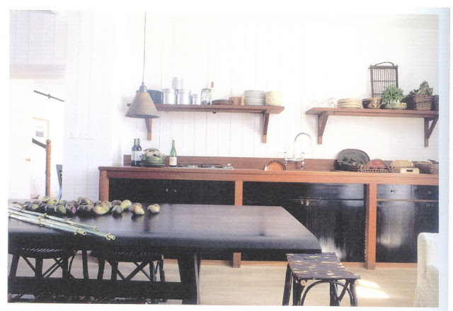
Again, color below, open shelving at top.  I actually love this combo of shiny black, wood, and white-painted wood walls.

The wallpaper on the inside of the cabinet doors is pretty cute.

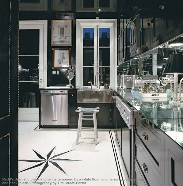
Miles Redd’s gutsy black kitchen, brightened by the mirrored counter and backsplash and white floor.

Painted beadboard below and white above is another way to do color without making the entire kitchen that color.

They went for it, with painted cabinets above and below, and honestly, I don’t think it looks quite right.  Maybe it’s just the angle, but the high white ceilings and light floor sandwiching a band of grey looks funny to me.  But at least the top cabinets are paned with glass.  I will say, I liked this kitchen a lot the first time I saw this image, but the more I’ve seen at it over time, the more it bugs me. 

They went for it with painted top and bottom cabinets too, and I think it’s actually more successful like this, without the white floor and ceiling.  Usually I like a lot of contrast, but here I think it works better to have all the surfaces in this same moody palette.

Finally, love this dark green. 

So, if this post were a poll, it would seem the most popular colors for kitchens right now are light green, grey, and shiny black, but Les, I’m personally digging this hunter green for you…
March 4, 2010

Curated by:
Eliza Coleman

Section:
Interiors

Labels:


Itinerary >> Portugal

Maybe second in line behind Turkey on my list of places to visit will be Portugal, which I’ve wanted to go to ever since reading Frances Mayes’ travel memoir A Year in the World, which makes the food out the food in Portugal out to be quite wonderful.  
Oh, and for $150 a night, you can stay in a place like this in a room with an ocean view:

 
 Estalagem da Ponto do Sol
  
  
Or this…

A hotel housed within this mansion and its modern addition.
Near this cute town…

Estalagem here.
Farol here.

Hotels found in the Design Hotels Yearbook 08, available here.

March 4, 2010

Curated by:
Eliza Coleman

Section:
Destinations

Labels:


In Essence

 
Miu Miu
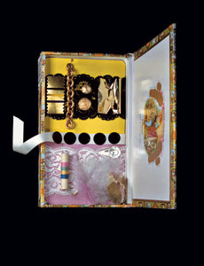
Artist Sarah Illenberger is a freelance 3-D illustrator, meaning, she creates 3-D designs to illustrate things for magazine editorials.  
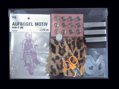
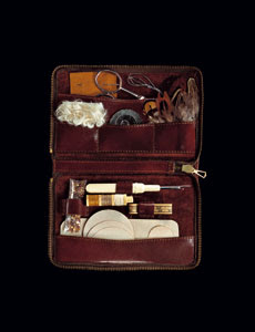
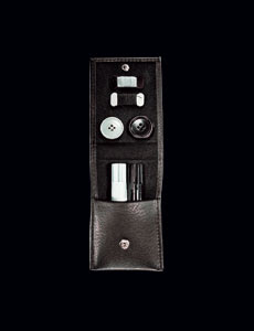
There are no descriptions or captions on her website of what each design is, so I’m not entirely sure what these were for, but I’m assuming that she created these little faux notion kits as imaginary versions of what each of these designer’s notion kit would look like if they had them. 
The incredible thing is, she really captures the essence of these 
fashion houses in these tiny made up kits!
  
Jil Sander 
The details say it all– what the kit itself is made of and how it functions (snaps, rolls up, etc), how fancy or simple it is, how much stuff is in it, how organized or ad-hoc it is, and then the colors and textures of the actual bits inside. 
  
Chanel
The more I look at these the more I’m amazed at how she captured and distilled the look 
of each house and the differences between them.  
  
Y-3 Adidas
Alexander McQueen
 
D&G
Sarah Illenberger here, discovered via Sight Unseen.
March 3, 2010

Curated by:
Eliza Coleman

Section:
Arts Visuels

Labels:


Provenance You Can Believe In >> S.N.S. Herning

Oh how I love a brand with a good story.  Who doesn’t, really?  Knowing the provenance of a brand makes all the difference in how you feel about a product, and I think it’s actually a brilliant marketing tool. 

With the return to traditional techniques, local materials, handmade, etc., I think people want to believe in what they’re buying and are turning away from enormous faceless corporations mass-producing things in who-knows-where.

S.N.S. Herning definitely fits the bill…

According to online boutique Gargyle
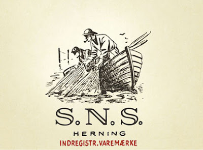
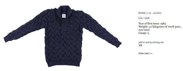
 ”S. N. S. Herning was founded by Soren Nielsen Skyt. As a young man he made his living selling knitted garments to the fisherman of Denmark. In the 1920’s he started to explore new knitting techniques that would make his sweaters warmer. He knew that the fisherman of the Danish West Coast were in need of woolen sweaters to help them bear the rough weather at sea.  In 1931 he succeeded in making a sweater that would serve this purpose, today renowned as the Fisherman’s Sweater.

To this day, S. N. S. Herning knits are crafted in the same old manner, using the original machines, in the original factory. Production is very limited, and as a nod to this fact, every item is signed in hand by the artisan who makes it.”

 A cross-section of a machine with codes referring to each part in case they need to replace something.  On the website it says, “If we needed, say, a new handle, we would have to ask STOLL in Reutlingen for spare part No. 577.  The knitters use the handle when the machine needs to be started up manually after a halt.”

However, may I submit again that the menswear industry is doing a much better job of this than womenswear?  I feel like all the cool brands that are promoting their use of the traditional methods, local materials, etc. are all for men!  Why aren’t womenswear brands onto this trend yet?

Maybe it’s because menswear has a pretty limited range of actual articles and styles, and so they are more focused on craftsmanship as a means of differentiating themselves?

But still, women do wear button down shirts, sweaters, etc., so I think there is definitely room in the market for a womenswear company that does all these staples well like some of the menswear brands out there… until then, I’m tempted to just wear some of these ones for men.


See also: Apolis Activism and Stanley & Sons for more brands with great stories here , and Madewell for menswear vs womenswear debate here.

S&S Herning website.

March 3, 2010

Curated by:
Eliza Coleman

Section:
Masters and Their Crafts, Style Files

Labels:


Listening To: A Fine Frenzy

Gorgeous song and video!!  Love the stop motion.

The song is “Lost Things,” by A Fine Frenzy, the girl is Alison Sudo (who basically is A Fine Frenzy), and it was directed by Angela Kohler and her boyfriend Ithyle Griffiths, who also directed this cute stop motion Kindle ad.

You can listen to the whole album on her website, and it is becoming a fast favorite for me… Feist-ish, but more up-tempo and with more nostalgia.  

via Pixels & Arrows, whose picks I always like.

March 2, 2010

Curated by:
Eliza Coleman

Section:
Listening To

Labels:


For the Library >> Lacoste

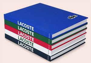
Due out later this month…
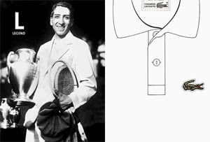
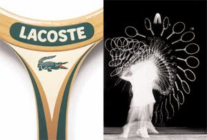
“In an ingenious marriage of adjective and image, Lacoste presents a full range of words and concepts synonymous with the storied brand: Heritage. Well-being. Cotton. Quality. Air. Lightness. Joie de vivre. Iconic. It is an encyclopedia of casually elegant style. Assouline will release the book later this month.”

Looking forward to it!

From Thinking For a Living.

March 2, 2010

Curated by:
Eliza Coleman

Section:
Style Files

Labels:
, ,

Basquiat: The Radiant Child

Sorry!  The trailer didn’t publish the first time for some reason…

March 2, 2010

Curated by:
Eliza Coleman

Section:
Arts Visuels, Must See

Labels:
, ,

Old Favorites >> Basquiat

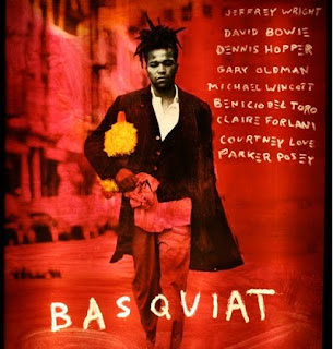
I went through a major Basquiat obsession in about ninth grade, to the point that I actually burned out on him, but I just watched the trailer for this upcoming documentary on him, and I can’t wait to see it!  …I guess it’s been long enough.

Also, if you haven’t seen this Basquiat movie, you definitely should, despite the mixed critical response and slightly skewed portrayal of the artist.  It’s still good.

 
Trailer via Curated.
The “guess the influence” game after the jump…

 
Dubuffet
  
de Kooning
  
Francis Bacon
I don’t think he ever actually talked about de Kooning or Bacon being influences, and maybe they weren’t direct influences, but there are definitely some similarities in both their treatment of the human form and handling of paint, at least in the case of de Kooning.
Interesting to know that he was also heavily influenced by a copy of Gray’s Anatomy that was given to him when he was born, and that that spurred his interest in mixing images of anatomy and text.
March 2, 2010

Curated by:
Eliza Coleman

Section:
Arts Visuels, Must See

Labels:


Masters and Their Crafts

Roost + Cultivate Wines
bberry

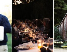
I love photography like the above… that dinner table in candle light… I have an obsession... 

Tastemakers

Katie Ermilio
katie ermilio

Dear Wonderlusters, I’m so excited to bring you this interview with the darling designer Katie... 

LustList

Drawn In
drawn in

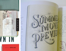
I can’t wait to get my hands on this book of images from the sketch books of 44 artists and designers... 

Listening To

Arcade Fire + Chris Milk
creators project

I so wish I had been at Coachella for this. Director Chris Milk, as part of The Creator’s Project,... 

Destinations

Canopy & Stars
canopy and stars

This site is so much fun to browse. Talk about wanderlust. Alistair Sawday, author of the Special Places... 

Interiors

Modern Cottage
canada cabin

Loving this modern cottage in the woods of Ontario. I’m all for cozy, traditional cottages, but... 

Style Files

RRL’s Vintage-y Lookbook
rrl

As Miss Moss said, there have been an influx (onslaught?) of vintage-inspired lookbooks recently, but... 

Classics

Recently on Editor’s Chair…
editors

Click over to Editor’s Chair, the tumblr within the blog, for more.  

Wonderlust
Wonderlust: a strong, innate desire for things that inspire wonder or the urge to create.
Other Goodness
Contributors
  • Eliza Coleman
  • Respect
    © 2011 The Wonderlust Journal. Content is distributed via the Wordpress platform.