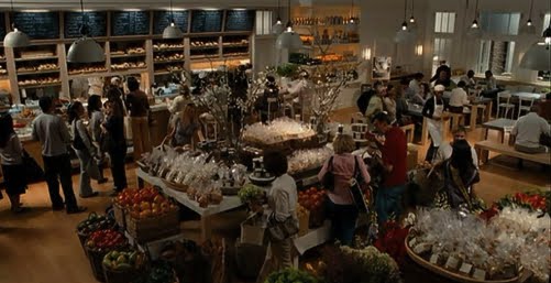
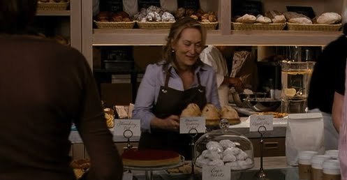
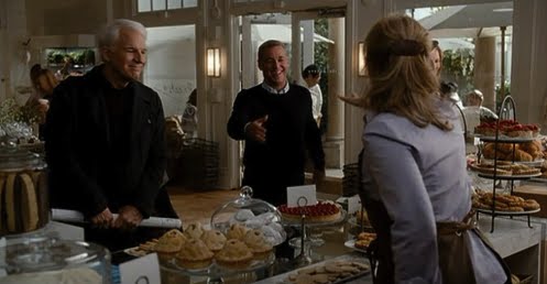
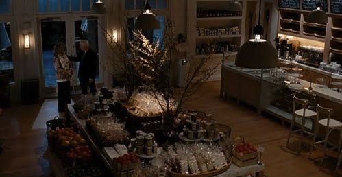
Back to It’s Compicated for a minute…
I didn’t include the bakery from It’s Complicated in the post about Meryl Streep’s character’s house, and it’s seriously wonderful, so I thought I’d go back to it for a minute…
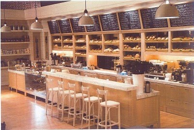
Based on Dean & Deluca, it has that wonderful fail-proof aesthetic… Chalkboards, marble counters, shaker cabinets, warm neutral palette, hand-written signs on everything, baskets of breads and pastries and produce… to die for.
The bakery at night…
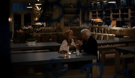
Loved that they made chocolate croissants on their date… so cute.

Images courtesy of Universal Pictures
Federico Uribe

Artist Federico Uribe reimagines the torso, a classical art staple, simply by switching up the medium. It’s amazing how the medium not only changes the visual effect, but also the connotations of the form.
Whether intentional or not, it’s difficult not to imagine what a female form made of bullets, or locks, or lips, might mean…


Styling Brilliance >> The Appeal of the Unmade Bed
Generally, bedrooms are photographed with a crisply made bed, complete with layers of matching pillows, sheets, blankets, etc. But sometimes, it’s the unmade beds that look the most appealing, especially when the whole bed is crisp white.
There’s a wonderful suggestion of lazy, indulgent mornings…


…especially effective with morning light streaming through the windows.


first four images via MaraisUSA
For when you need to strap a growler to your bike…
Or really, when you need to strap anything to your bike, but the growler adds to the overall effect…
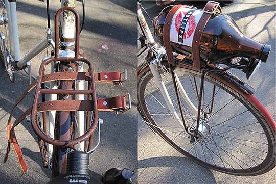
A great product by Walnut Studiolo out of Portland, the leather “Strap Down” is a both functional and attractive addition to your bike… but then again I pretty much love anything that combines leather and buckles and/or stitching, and when it involves a bike, it becomes even more charming.
They also make aweseom handlebar wraps, available in two different color ways…

I personally like this one:

…and you might as well get a clever “can cage” for your pbr, or what-have-you, while you’re at it.

I’m pretty sure if you have a cool bike and you trick it out with these accessories, you’re automatically accepted in Portland…
Walnut Studiolo here.
Listening To >> Francis and the Lights
This song, and Francis’s voice, grew on me the more I listened to it… and now I really really like it. Interestingly, they just performed with Edward Sharpe and the Magnetic Zeros, who I featured back here.
And the video, which was directed by the keyboardist, is a great example of what you can do with basically no budget if you get creative– the whole thing is a single-take live performance, and the use of light is killer (looks way better in full-screen).
Especially love the dance sequence at about 1:50, so watch that if nothing else, it makes you happy to be alive.
Listen to the whole album streaming on their website here (I have a feeling this album is about to go into heavy rotation for me), along with more videos. The video for “The Top” has some pretty amazing dancing by Francis…
Discovered via Black*Eiffel.
LustList >> Limited Edition SS '10 Bensimons

I have a bit of an obsession with Bensimon tennis shoes. I think they’re fantastic with just about everything, and even though I already have three pairs, (there’s a really good justification I promise), I’m pretty sure I really need these SS ’10 limited editions. They’ve never done this natural linen color with the darker piping, and I’m mad for it!!
Sadly, the site where I found them is sold out of my size (37), so if anyone knows another place to find them… well, my birthday is on Tuesday. Just sayin.
Field and Sea

Loving Field and Sea’s tiny note cards– their straightforward messages are perfect examples of the kinds of things you just might rather say in a note than in person…


Also love the ones that say “You’re right, I’m wrong,” “You’re an amazing human being,” and “I have lost the right words, will these do?” Many more here.
May 25, 2010
Curated by:
Eliza Coleman
Section:
Graphic Fix
Labels:
Graphic Design, paper stuff, sentimentia, typography
Curated by:
Eliza Coleman
Section:
Graphic Fix
Labels:
Graphic Design, paper stuff, sentimentia, typography
Seeing is Believing: Markus Georg
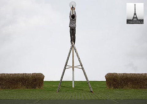
In Markus Georg’s new exhibit, “The Power of Images”, he uses highly straightforward, even banal-looking images to remind the viewer of, ironically, the power of the imagination.

In his artist’s statement, he proposes that imagination is a forgotten currency in our highly empirical world, and that he wants these pieces to “resocialize imagination,” which he says is “a fundamental prerequisite for both producing art and its reception.”
Hence, out of highly ordinary materials, which appear at first to be nothing more than exactly what they are, he creates motifs that are just familiar enough to trigger some level of recognition, but not quite literal enough to be understood without the employment of one’s imagination.
Strawser & Smith
I like the looks of this new store in Brooklyn…

Huge surprise, I know… I like yet another combo of brick, wood, old leather furniture, and industrial lighting and accent pieces… but it just works every time for me!

The store, Strawser & Smith, specializes in refurbished American industrial relics– many from Rustbelt cities like Detroit and Youngstown. …Love the American slant.
Store info here.
Soy Cuba – “I am Cuba” – 1964
I just discovered the film Soy Cuba, from 1964… I’m sure any film buff already knows of it, but for me it was such a treasure to find!
The film has a really interesting history. It was filmed in 1964, after the Cuban Revolution, and the resulting US isolation, when Cuban filmmakers had starting reaching out to Soviet companies to help them produce their films. It was directed by a Georgian, Mikhail Kalatozov, and attempts to show Cuba at the time from four different perspectives– luxury, poverty, vagrancy, and revolution.

At the time of its release, it was rejected both by Cubans and Soviets, for different reasons, and went unknown outside of those countries. It wasn’t until 1995, when a Cuban co-director of the Telluride had it screened, that it was re-discovered.
It then garnered the interest of both Martin Scorcese and Francis Ford Coppola, who both realized its incredible cinematographic merit and decided to lend their names to its re-release. Beyond its plot (which is not its strong suit or even its main focus), and its propagandistic nature, its hard to deny the amazing visual qualities of the film, which have influenced many famous American movies.
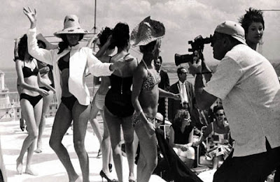
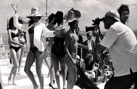
(Most directly, the scene above, which goes from a rooftop beauty pageant down to a hotel pool and then underwater in the pool, was used in Boogie Nights, but many other films have borrowed more loosely from Soy Cuba.)
One of the main things the film is noted for is the use of long tracking shots– which were done with a handheld camera. In the clips at above, the camera goes up or down entire stories of buildings simply by being handed off from one crew member to another– no cranes or anything mechanical involved to create these incredibly long takes. Pretty amazing.
In the shot above, which follows a funeral procession, the camera goes up four stories and then in through the window of a cigar factory and back out again. The effect of leaving behind the coffin as the focal point and smoothly transitioning into a setting so iconically Cuban is pretty awesome. Unfortunately the only clip of it I found doesn’t have the original music, but it’s still pretty amazing visually.
(The scene above isn’t that noteworthy, I just really loved the song, and the panning of all the women at the bar. The second half, with the Russian overdubbing, gets really weird though.)

I was so spellbound by the visuals in this incredible (even if totally biased and/or cliche) look at Cuba, from the very first moments of the clip at top, that I just had to share… check them out when you have a minute to soak it up. I feel like I just time-traveled back to 1960s Cuba.
Buy the re-release of Soy Cuba / I am Cuba here.


