High Contrast
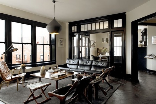
Another space by Roman and Williams, who I featured a while back for the design of the Ace Hotel. I’m digging the high contrast created by the black molding and mullions and the modern but comfy looking furnitre.
The whole space feels so sexy, no? I wouldn’t mind having a glass of wine on that couch come five o’clock, with some Nina Simone in the background.
I seem to be feeling anything bold, contrasty, and typographic today, including the wine labels and the space above, so why not throw in a video of a Nina Simone song made only with typography and typographic elements? Seems fitting…
Pretty cool.
June 4, 2010
Curated by:
Eliza Coleman
Section:
Interiors
Labels:
interiors, listening to, typography
Curated by:
Eliza Coleman
Section:
Interiors
Labels:
interiors, listening to, typography
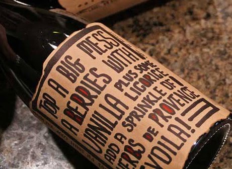
Typographic Wine Labels
For a new project we’re gearing up for, I’ve been digging around looking at different kinds of wine labels that have been coming out recently, and I’ve noticed a couple of interesting trends…
One of them is the use of interesting typography and an emphasis on typography rather than imagery and logos.
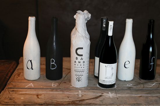
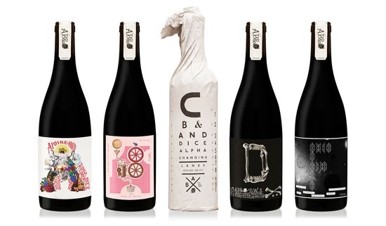
Above, the ABCD&F line from Justin Lane, designed by Australia-based Mash, whose names and labels are each a letter of the alphabet, which then takes on a personality and story–
A for Apostle, B for Blood of Jupiter, C for Changing Lanes, D for Dead Winemakers Society, and F for Fog.
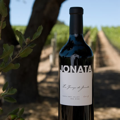
With no image at all and highly restricted palette, the graphic Jonata label stands out as clean and sophisticated and is a perfect example of a label that focuses solely on typography. It also happens to taste fantastic…
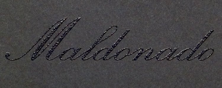
This Maldonado label, designed by Michael McDermott, uses black thermography and gold foil to emphasize the word alone.

Broadside deftly and cleverly uses typography to mirror the name of the wine and its meaning as an ad or leaflet printed on one side of a piece of paper and simultaneously underscores the “broad” portion of the word through the expansive font.
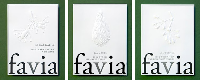
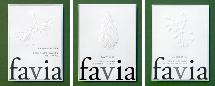
Favia, incidentally one of my favorite wines, uses blind embossing for the images used on the different labels so that the very simple, bold word is what always pops.
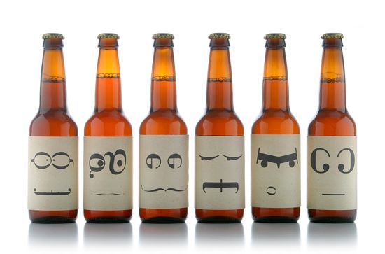
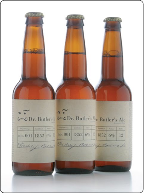
Ok, it’s not a wine, but I couldn’t resist sharing this beer, “Dr. Butler’s Ale,” whose labels are all faces made of characters from the Bodoni font. A student project by Ashley Lewis, the different faces are meant to represent the multiple crazy personalities of Dr. Butler, who was an infamously nutty “doctor” in England and used his ale as a cure for many ailments.
Love the back label as well… feels very apothecary-ish.
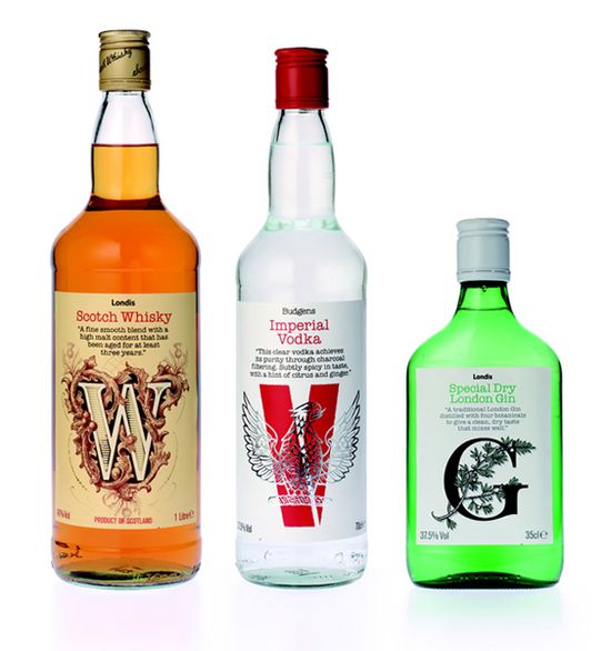
Again, not a wine, but thought this concept was clever — they used the first letter alone of each type of liquor to totally create it’s identity. And it works! They all have a totally different feel, communicated solely by the design of the letter.
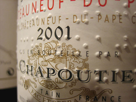
Starting in 1994, Chapoutier started included braille on its label, adding another kind of typography to the mix. The braille is a nod to the property’s history, but it also has a very cool graphic effect.
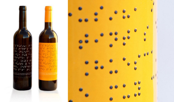
Lazarus Wines takes the braille thing a step further…
These next few labels combine creative typography with a touch of wit that communicates a message of “dropping the act” of the snobbery of wine. They are straightforward and intentionally avoid pretense. There’s nothing to read into, it just is what it says it is.
Love the idea of the label telling you what it tastes like in easy to understand, appetizing terms. By magnificent wines.

I can’t help it, I really, really like this concept of just a good, standby house wine being called House Wine. It’s so simple and conveys exactly what it is meant to be.
It might be bordering on gimmicky, but B Frank’s concept is pretty clever– you are meant to write on the label why you are sharing the wine with someone.

I even just like the idea that you are meant to write on it– how has no one ever thought of a label that the person buying it participates in in some way? It makes sense given that wine is frequently a gift and even more frequently something someone is sharing with someone else.
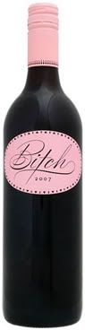
Ok I personally think this wine is so gimmicky I can’t stand it, but whoever designed this packaging was on to something and really nailed it– the girly-cute script used for “Bitch” and the all-pink label gauranteed this wine’s place at every bachelorette party since its debut.
More trends to come as the research continues…
June 4, 2010
Curated by:
Eliza Coleman
Section:
Graphic Fix
Labels:
packaging, Shelf Appeal, typography
Curated by:
Eliza Coleman
Section:
Graphic Fix
Labels:
packaging, Shelf Appeal, typography

Ready for an Atlantic Crossing
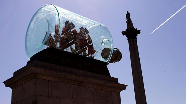
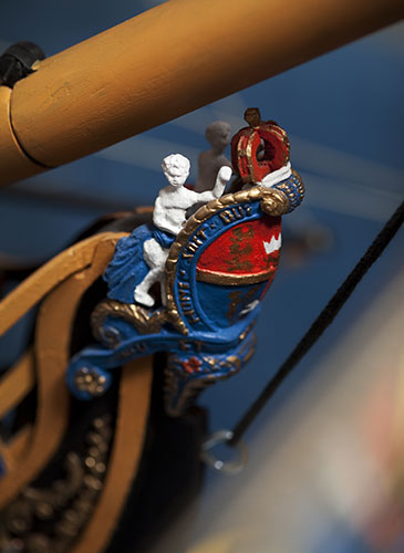
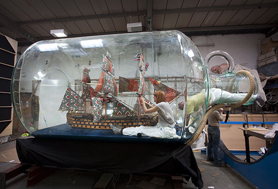
Trafalgar Square’s Fourth Plinth, one of Britain’s most popular contemporary art display spaces, just received a new installation– the largest ship in a bottle ever made.
Though it may look kitschy due to the fact that, well, it’s a ship in a bottle, the ship itself is actually a fully to-scale (1/30) model of Nelson’s ship Victory, which is the ship Nelson died on in the battle of Trafalgar. So perhaps it is equal parts monument and kitsch– a fitting combination for a contemporary art piece.

Click through for the rest of the post and more images…
The opening of the bottle was large enough for artist Shinka Yonibare’s studio assistants to climb inside to work on it…

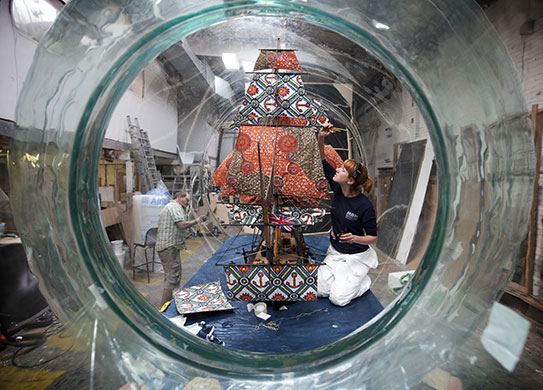
Details of the original are faithfully replicated, from the paint colors to the 80 cannons, to the 37 sails, with 31 of the 37 sails set, just as they were on the day of the battle.
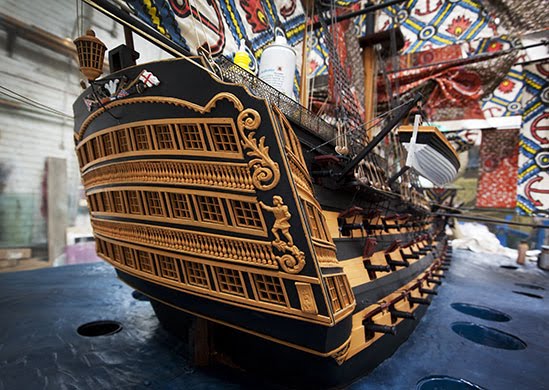

Even the same materials are used– oak, rope, brass, canvas, etc. The only area in which the artist, who is British-Nigerian, has taken liberty are the sails, which he has printed with African batik patterns– a tactic he regularly engages in his art to subvert Western icons.

See the full article in the Guardian here.
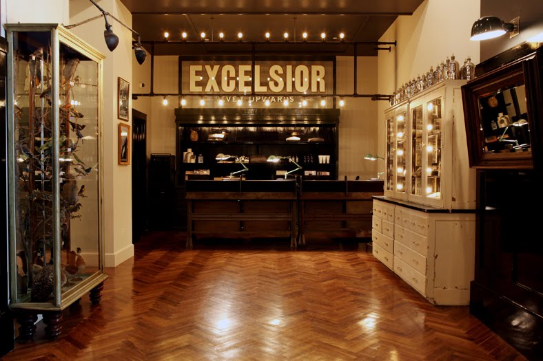
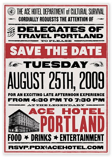
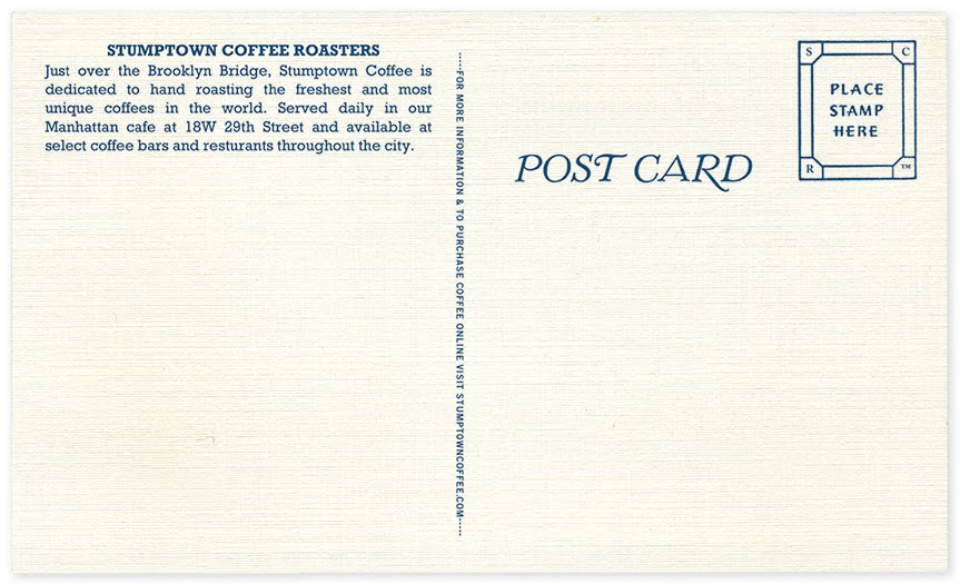
The Official Mfg. Co.
The Official Manufacturing Co. (OMFG), a collective of designers, describe themselves as “thing makers.” After working separately for the Ace Hotel and Wielden+Kennedy, they came together to unite their creative abilities.
Below, some of the marketing collateral and identity work they have produced…
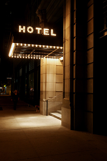
Their work, including the indoor and outdoor signage for the Ace Hotels, has a wonderful retro quality that manages to be evocative and authentic feeling, rather than kitschy. Or at least when it is kitschy, it is in a winkingly ironic way.
Doesn’t the sign above just do it for you? The marquee lighting is so simple, yet so appealing.


An album cover design for Black Prairie.
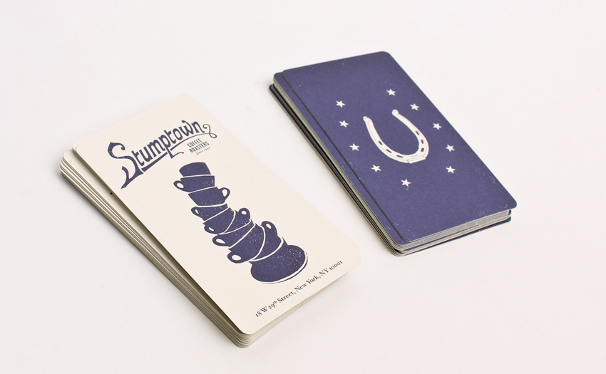
They also designed the packaging and marketing collateral for Stumptown Coffee (yum), which has a similar retro feel and looks awesome.
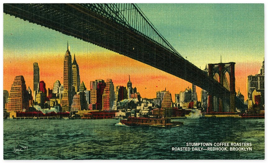

OMFG.
See more of OMFG’s work at their website here.
via Secret Forts
June 2, 2010
Curated by:
Eliza Coleman
Section:
Graphic Fix
Labels:
Graphic Design, paper stuff, typography
Curated by:
Eliza Coleman
Section:
Graphic Fix
Labels:
Graphic Design, paper stuff, typography
Without you…
Today is my birthday, and as part of my “do-my-favorite-things” plan, I am going to re-watch my favorite movie– Amelie. Without fail, it always makes my heart almost burst. In the most wonderful way. Even watching the trailer you can feel that the film holds something special…
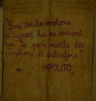
Above, just one of many wonderful bits of the movie. Above, a line by the writer Hipolito, which she sees written on a wall. Watch the clip below for the translation… “Without you…”
…. “today’s emotions would be the scurf of yesterday’s.”
Hometown Heroes >> FUTUREBIRDS
Listening to…
Can’t wait for the album to come out in July!!
Hear more at their myspace here.
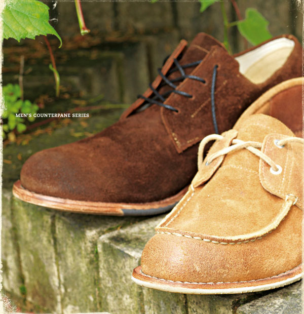
Didn't see this one coming >> The new look of Timberland

Timberland has debuted a new collection that goes in a drastically different direction from what they’ve come to be associated with in the past decade or so… (ie the chunky standard tan suede men’s boot and baby pink suede high-top, high-heeled, thick-soled boots with faux-shearling around the ankle for girls…yikes).
Inspired by New England and Northern England between 1900 and 1945, they’ve nailed some excellent details like the leather and suede stain colors and grain levels, the skinny laces, the wood and leather soles that look as though they’ve already spent years walking the docks…
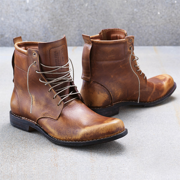
And I’m liking it. At least the men’s collection. Rolled up jeans with a plaid button-up and one of the pairs below would look just about perfect for gent spending summer in the city.
Classics >> Elliot Erwitt
To jumpstart your weekend, a few photographs by Elliot Erwitt, whose images capture such a wonderful joie de vivre…


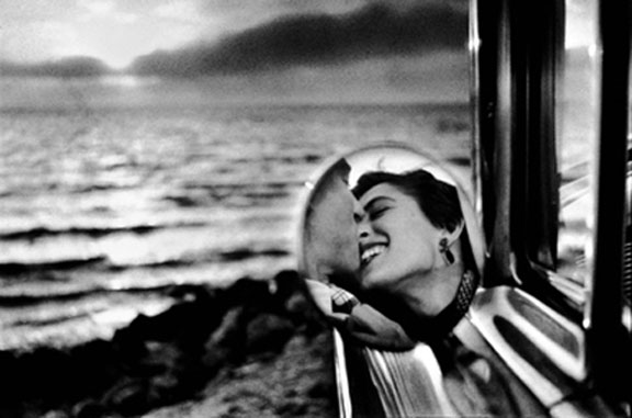
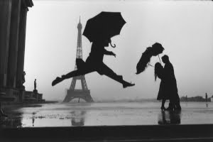
Here’s to a weekend of such moments…


