Random Acts of Creativity >> Looking Into the Past

 
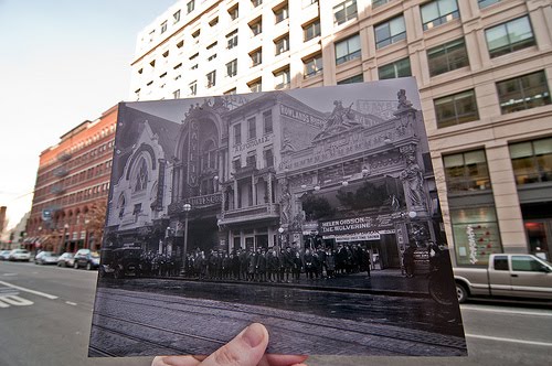
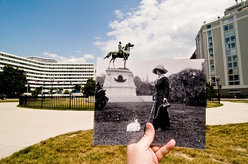
This flickr group, Looking into the Past, is too cool.  People find these old photos of recognizable locations, and hold them up in front of the modern day scene.
  
 
Of course there are books that do things like this, overlaying the old and new (my dad gave me one for Christmas a few years ago about New York and it’s so cool), but I love that this one is just random people recognizing places they know in old photographs and contributing to the project. 
 
 
 It makes it a little more personal– you wonder how they found the photo, or what association they have with the place or the buildings that used to be there.  Did thier grandparent work in the building that was there?  Do they live near this spot now and they wondered what used to be there and looked it up?
Definitely provokes some wonderment…
flickr set here
found via Swiss Miss
February 25, 2010

Curated by:
Eliza Coleman

Section:
Random Acts of Creativity

Labels:


Care Package

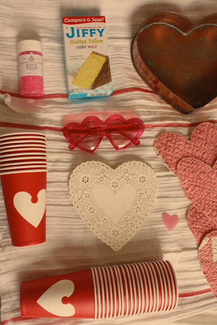
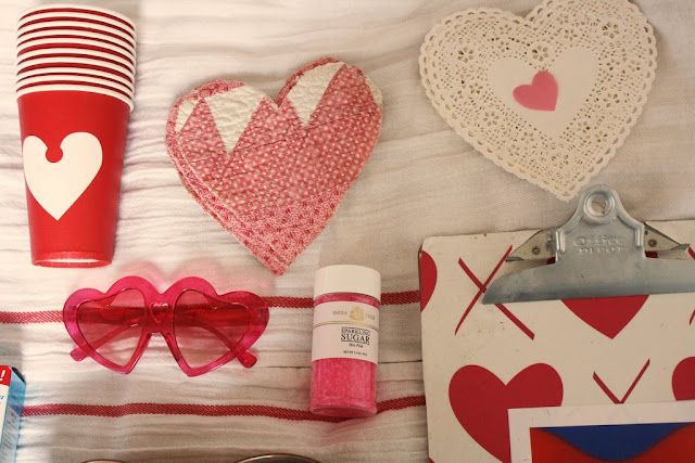
Ginny Branch Stelling’s mom sent her this sweet care package for Valentine’s day, complete with a heart-shaped cake mold and cake mix so she could make a Valentines cake for her husband.  Isn’t that the cutest?
Ginny’s awesome blog here.
February 25, 2010

Curated by:
Eliza Coleman

Section:
Sentimentalism

Labels:
, ,

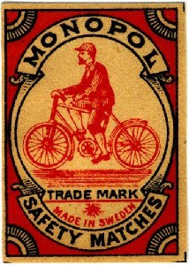
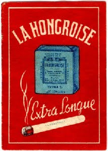
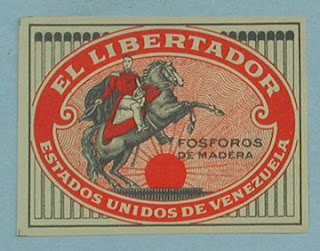
Vintage Matchboxes

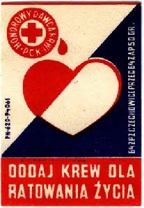
Loving these vintage matchbox covers!!
I found this dealer at the LA Mart last month who sells all kinds of vintage papers, and I seriously could have rifled through their stuff for hours.
The simple illustration with three colors was a brilliant time in advertising and packaging.
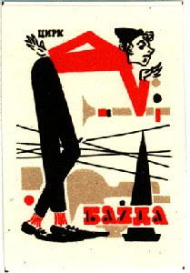
This one above is particularly interesting…  It reminds me of Russian Constructivist art, which would make sense, as Constructivists in the 1920s, after a small degree of capitalism was introduced, began producing ads for companies in addition to working on political posters.  (I think it’s actually Polish on the box, but that would still make sense.)  Later, Constructivist designs would inspire famous graphic designers in the West.
(A Constructivist book cover – bold colors and fonts, geometric, )
Pretty fascinating that through this box, the country’s current art movement is reflected in a commercial object, as this also speaks to what was going on in art in the world at the time.  For the first time, the current avant-garde “high art” (fine art) movements had begun experimenting with “low art” (kitsch, mass produced commercial products) through Surrealism, Dada, Cubism, which would shortly be followed up by the Bauhaus’s true extension of art into industry through product design.  Later, the whole debate about the place of high art and low art would be explored through Pop Artists like Andy Warhol.

The dealer, Style de Vie, here.

February 24, 2010

Curated by:
Eliza Coleman

Section:
Graphic Fix

Labels:
, ,

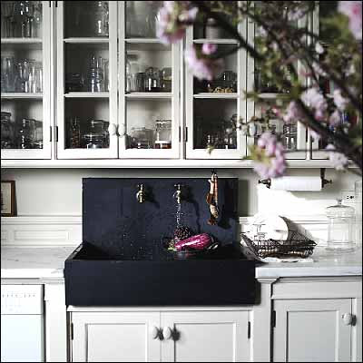
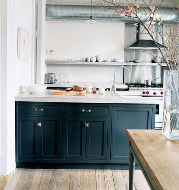
It all started with this kitchen…

I love this kitchen.  That sink is what got me first, and then the perfect paint color, marble counter, and molding detail as the backsplash. 

So then I looked up the firm who did it, Roman and Williams, and based on this kitchen, you’d never guess the other stuff they’ve done. 

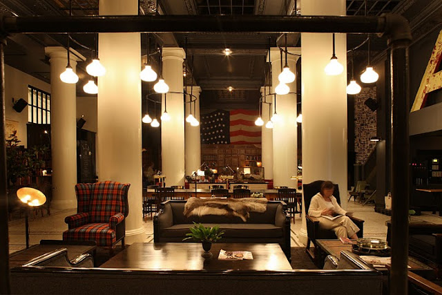
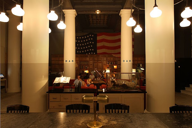
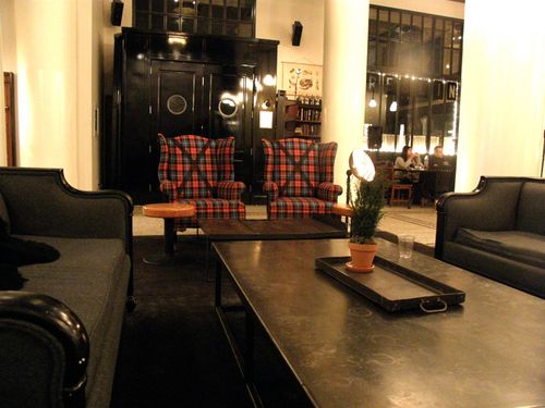
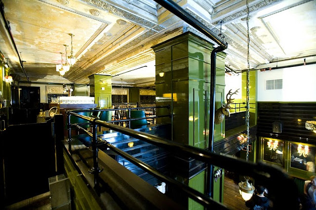
First, the Ace Hotel in New York! 

 
I’d wondered when I was there who had designed it, but failed to look it up later, so it felt totally random that I would discover it via hunting more from the designers of that kitchen, which could not be more different in style from this hotel.

I’m sure this hotel design is being hated on as being hipster, and I will say that when I was there, I equally loved everything around me and simultaneously felt like it was going to feel so “over” in just a couple of years.  
However, after seeing this firm’s whole portfolio, I can honestly say that I think they are extremely fluent in many styles and all aspects of design and architecture, which makes me think (hope?) they even gave this pretty trendy spot enough legitimate design roots to have some staying power… I guess only time will tell.
  
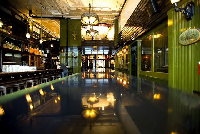
By the way, around happy hour time, this entire lobby is dimly lit and PACKED with people meeting friends for drinks.  I mean packed.


The front desk.
More after the jump…

 
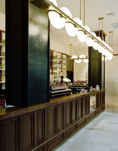
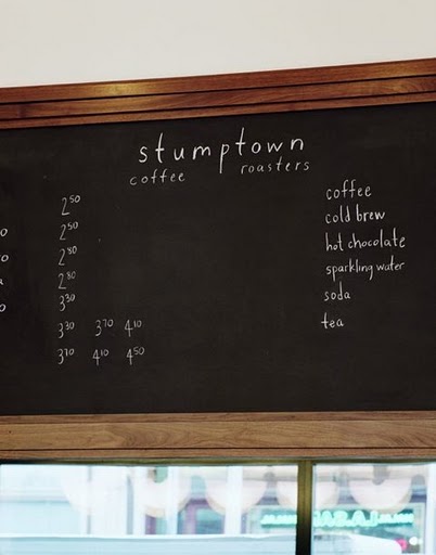
Their design also included stumptown coffee at the front of the lobby… 
 
which they said was modeled after 1940s-60s Milanese architecture and industrial style.  …Odd that I was just posting those Italian fixtures from the same period.  I guess my trend radar should be going off, but again, I still love it!

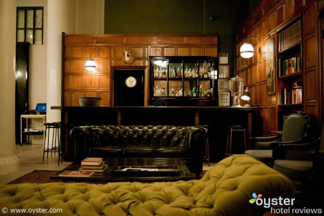
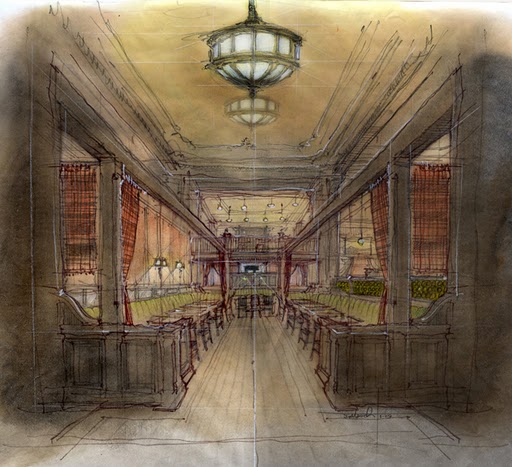
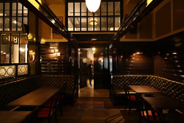
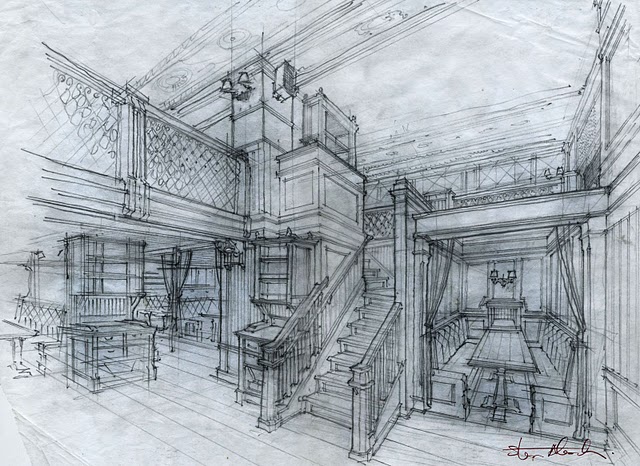
And the ultra-cool Breslin Bar & Dining Room…


(I love when designers publish their sketches!) 


Don’t worry, I’m going to post the rest of their portfolio soon.  Lots more looks to come.  I devoured the whole thing…

February 24, 2010

Curated by:
Eliza Coleman

Section:
Interiors

Labels:


Listening To: "Jolene"

“Jolene” – Originally by Dolly Parton, above, the song has been covered by over thirty singers since she wrote it.  According to an interview with Parton, the song was written about a tall red-headed bank teller that flirted with her husband too much, and who “must’ve been six feet tall” and had everything that “some short sawed-off little honky like [her]” didn’t.  The name, however, came from a little girl she met after a show, and she just liked her name.

Apparently, Jack White did too.  He said he was drawn to the “J” sound and it’s slightly accusatory sound due to the associations with the name “Jezebel,” as well as the haunting melody of the song.  The White Stripes version, which takes the haunting aspect to a new level, below.  The first time I heard the White Stripes version, I thought it was creepy, but I warn you, it will get stuck in your head and come to mind at random times for years to come. 

February 24, 2010

Curated by:
Eliza Coleman

Section:
Listening To

Labels:


Classy by Derek Blasberg

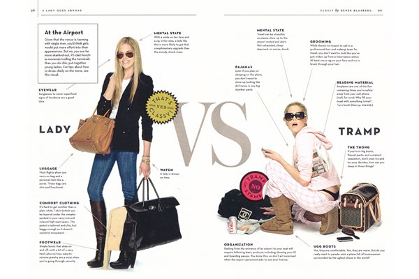
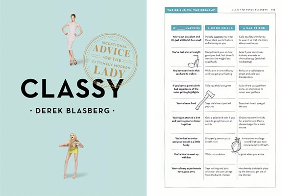
This new book, about how to be a classy “extremely modern” lady, by Derek Blasberg looks incredibly entertaining.  Blasberg, who only graduated from NYU (That’s right!  Making the alma mater proud..) in 2004, is now Senior Fashion News Editor for V Magazine and also writes routinely for Vogue and other magazines. 

 
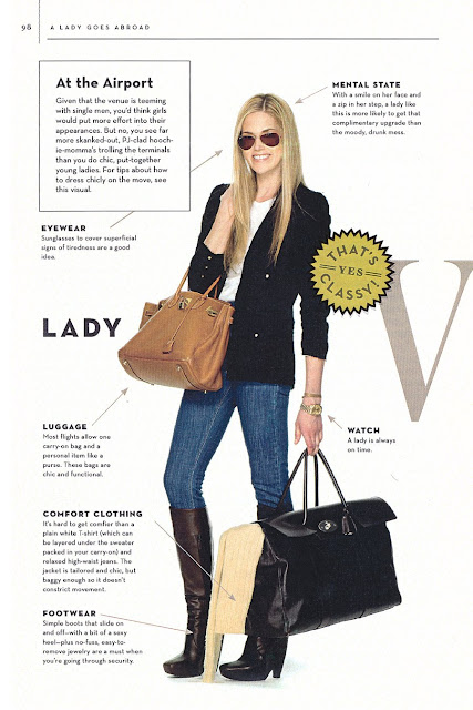
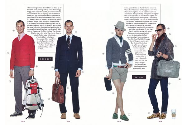
Not your typical etiquette book, it includes sassy commentary and well-designed magazine-like pages like this one above, illustrating how to be a lady when travelling.  
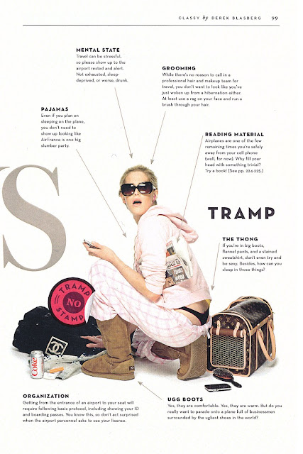
(Click the pages below for the large-enough-to-read version… it seems he and I have similar pet peeves about people not dressing to impress when travelling!  And, he makes a very very good point I hadn’t considered… Why not dress well to travel when “the venue is teeming with single men”?)


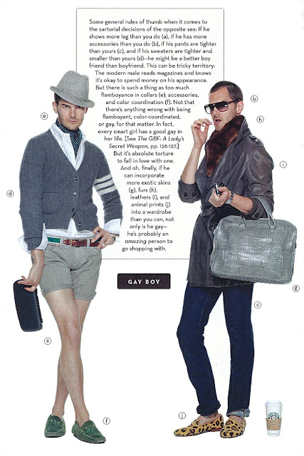
A helpful manual on how to spot good boys and gay boys.  My dear friend Ali will attest that on the West Coast, this can be helpful, as apparently out here, the gay boys themselves don’t always know they’re gay. 

  
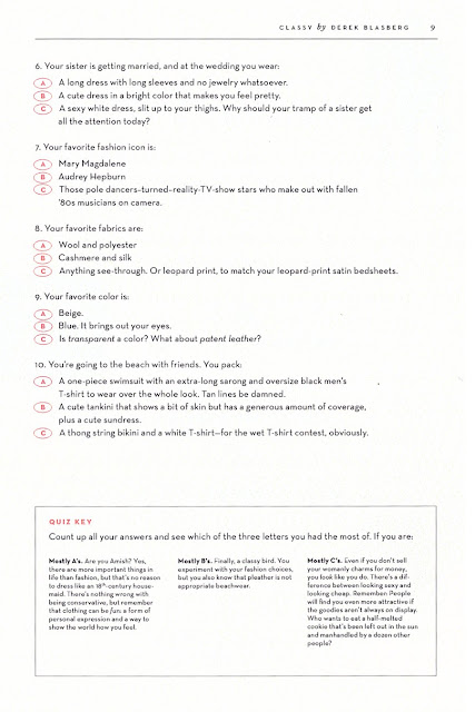
And finally, a checklist to see whether you dress like a tramp.


Available here on April 6.

via Refinery29

February 23, 2010

Curated by:
Eliza Coleman

Section:
Style Files

Labels:


Mix(ed) Tape

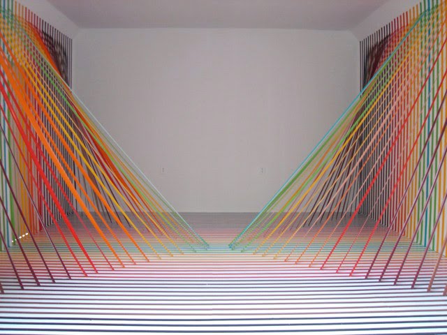
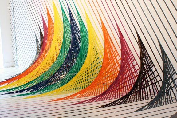
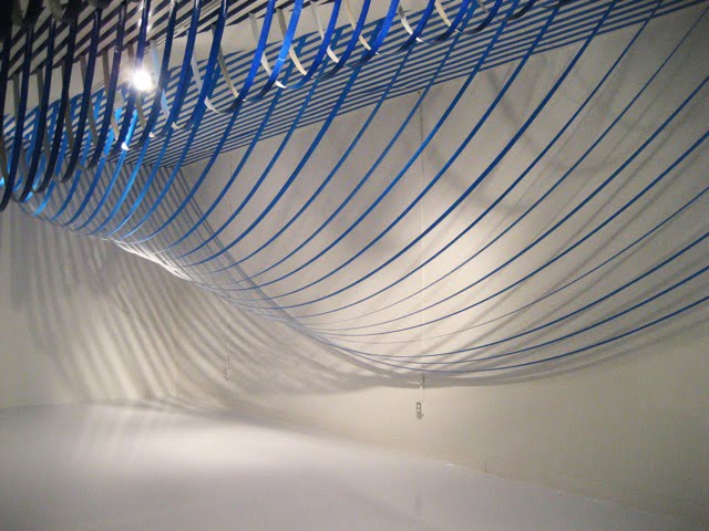
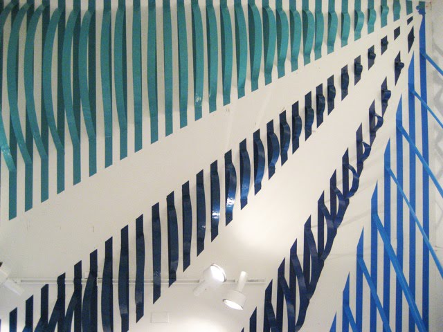
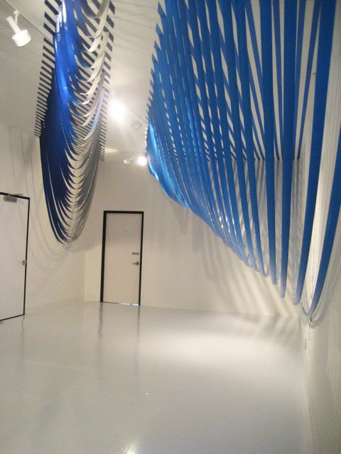
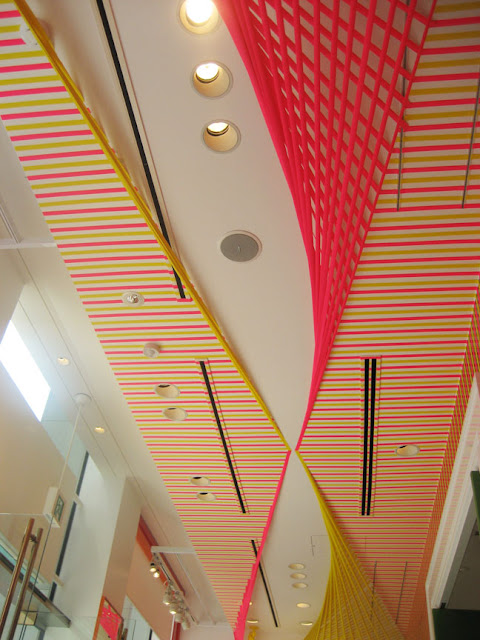
Rebecca Ward’s installations made of tape and vinyl adhesive


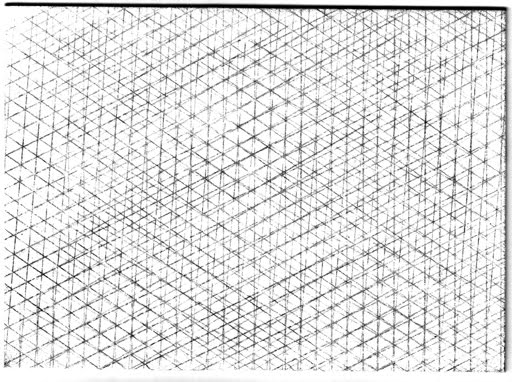
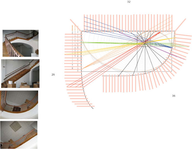
I guess this is the type of work you can’t really fly by the seat of your pants on, but I hadn’t really imagined how much preparation and calculations would go into it until I saw some of her process drawings…

 
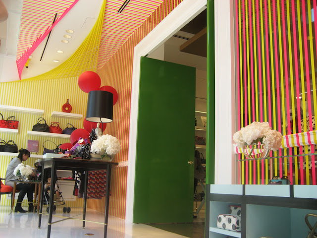
Finally, her current installation at the Kate Spade Tokyo store…


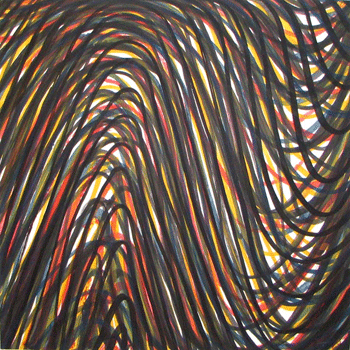
And lastly, a lot is reminding me of Sol LeWitt these days (sometimes you don’t realize how brilliant someone or something is until later, when you realize how many things remind of them, like The Great Gatsby… it just keeps coming up forever in life, but you don’t know that in 10th grade when you read it for the first time), but doesn’t Ward’s work remind you of some of this stuff? …
 
Untitled Lithograph, 1992

Wavy Brushstroked Superimposed #4, 1995
 
Corner Piece No. 2, 2001

Rebecca Ward website here
February 22, 2010

Curated by:
Eliza Coleman

Section:
Arts Visuels, The Spades

Labels:


Tastemakers >> Jenna Lyons

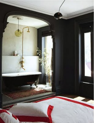
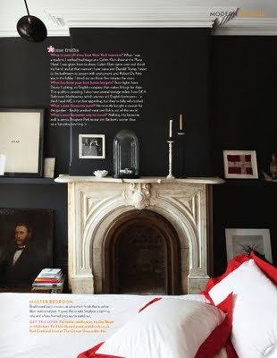
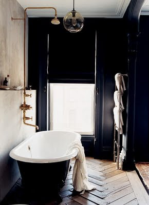
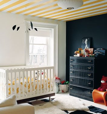
Since I’ve mentioned her twice now, I figured I’d just go ahead and post her apartment here for those who haven’t seen it yet.  It’s one of those that has made its rounds on the blog world, but just in case you haven’t seen it…

 
For the unitiated, Jenna Lyons is the Creative Director for J. Crew and is largely responsible for the major increase in style and quality that J. Crew has witnessed in the past few years that has taken it from the J. Crew of my childhood, which I remember being full of only ill-fitting lumpy khaki pants, to the reliably current-but-classic brand seen often on Michelle O.


The bedroom, which was sometimes photographed with plain white linens.  I personally prefer the shot of red!


More on Jenna Lyons’ career here.

Photos from the now-defunct Domino website and Living Etc. shots via Habitually Chic

February 22, 2010

Curated by:
Eliza Coleman

Section:
Tastemakers

Labels:


Sugarbird Sweets (and Teas)

This Monday morning, I would love a cup of Sugarbird tea in this lovely sitting area off of Jenna Lyon’s* kitchen.  Don’t you think you could linger here visiting with a friend over a pot of tea for hours?

Above, an Earl Grey and vanilla blend.

Sugarbird, in LA, is owned by Kei Okomura, who trained at cooking schools and restaurants in Paris and LA before going out on her own to start this cute tea shop and bakery.
I have a feeling that people are going to start getting into tea– the origins of the leaves, the craft, etc.– the way people have really gotten into coffee and beer, and places like Sugarbird that are creating these unique whole-leaf blends are leading the way.
Above, a rooibos, raspberry, vanilla, rosehip, and hibiscus blend.
I was also excited to discover Sugarbird as an addition to my list of places to try in LA.
You can buy their teas online here.
*Yes, I’m writing about her again, but isn’t her kitchen sitting area wonderful??
February 22, 2010

Curated by:
Eliza Coleman

Section:
Food

Labels:
, ,

Spotted:
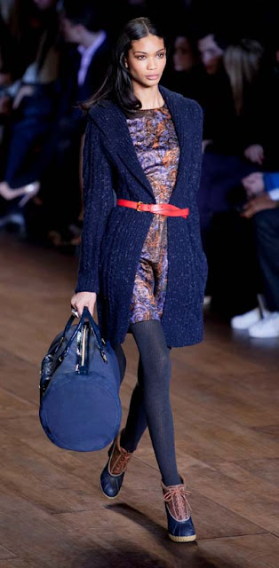
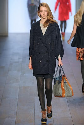
HIGH-HEELED DUCK BOOTS on the scene at Tommy Hilfiger’s FW10 show.
and…

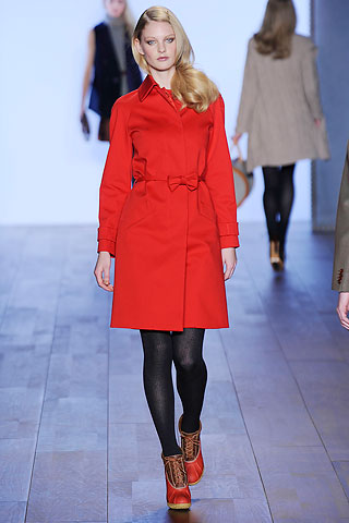
…RED high heeled duck boots… 
…Looks like Lonely Girl’s got something new to add to her lustlist. 
xoxo, Gossip Girl

Aside: lesson-learned about publicly, vehemently airing pet-peeves that I will almost certainly perpetuate.  Case in point, stating my annoyance at having to look at FW10 looks before we can even wear SS10 stuff yet, and then absolutely being unable to stop myself from showing FW10 images.  
I thought I could just peruse the images, and just not blog them, but who was I kidding.  However, I maintain that the timing of the seasons of fashion week shows is annoying.
February 21, 2010

Curated by:
Eliza Coleman

Section:
Style Files

Labels:


Masters and Their Crafts

Roost + Cultivate Wines
bberry

I love photography like the above… that dinner table in candle light… I have an obsession... 

Tastemakers

Katie Ermilio
katie ermilio

Dear Wonderlusters, I’m so excited to bring you this interview with the darling designer Katie... 

LustList

Drawn In
drawn in

I can’t wait to get my hands on this book of images from the sketch books of 44 artists and designers... 

Listening To

Arcade Fire + Chris Milk
creators project

I so wish I had been at Coachella for this. Director Chris Milk, as part of The Creator’s Project,... 

Destinations

Canopy & Stars
canopy and stars

This site is so much fun to browse. Talk about wanderlust. Alistair Sawday, author of the Special Places... 

Interiors

Modern Cottage
canada cabin

Loving this modern cottage in the woods of Ontario. I’m all for cozy, traditional cottages, but... 

Style Files

RRL’s Vintage-y Lookbook
rrl

As Miss Moss said, there have been an influx (onslaught?) of vintage-inspired lookbooks recently, but... 

Classics

Recently on Editor’s Chair…
editors

Click over to Editor’s Chair, the tumblr within the blog, for more.  

Wonderlust
Wonderlust: a strong, innate desire for things that inspire wonder or the urge to create.
Other Goodness
Contributors
  • Eliza Coleman
  • Respect
    © 2011 The Wonderlust Journal. Content is distributed via the Wordpress platform.