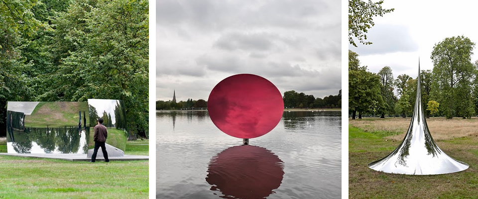
New Anish Kapoor: Turning the World Upside Down
Anish Kapoor’s new installation at Kensington Gardens, on view through March 13th.
Check out the video to see the effect on the pieces of the clouds moving across the sky… the photos don’t capture the fact that the pieces are always in flux due to the ever-changing sky.
Curated by:
Eliza Coleman
Section:
Arts Visuels
Labels:
Arts Visuels, installation
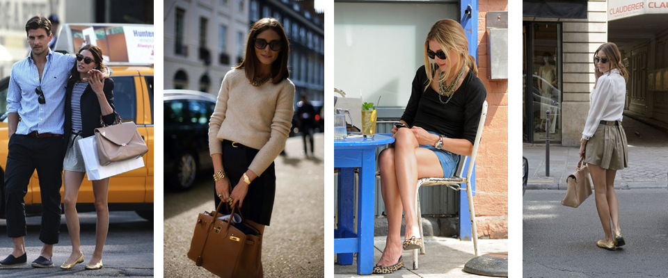
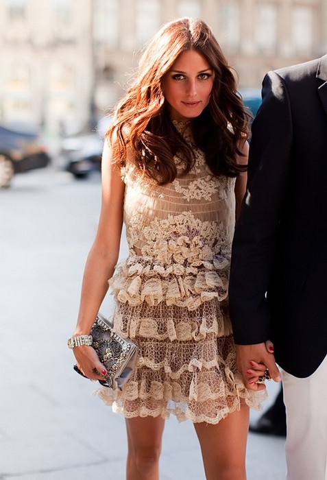
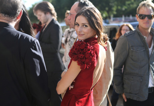
Style Crush: Olivia Palermo
I have never actually seen the show The City, or The Hills, so I can say nothing for her personality, but Olivia Palermo has been turning it out recently. I think I might prefer to never see her show, because even the idea that she was (/is?) on a reality show is a bummer, and I would prefer to know her only for her style. Which is excellent.


Curated by:
Eliza Coleman
Section:
Style Files
Labels:
fashion, girl crush, olivia palermo
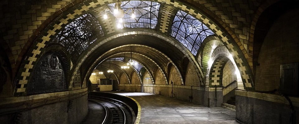
How to See the Secret, Abandoned City Hall Subway Station
This is soo From The Mixed Up Files of Mrs. Basel E. Frankweiler!
New Yorkers, you know how the 6 train ends at Brooklyn Bridge, and they say “Last stop, Brooklyn Bridge/City Hall”? Well that stop is really only Brooklyn Bridge, and is not the original City Hall stop, and the original City Hall stop is actually this beautiful, magical place you see above, by far the most beautiful New York subway station ever made.
But the City Hall station was closed decades ago, for reasons you can read about here, never to be seen by passengers again…
UNLESS.
If you stay on the 6 train after they say last stop at Brooklyn Bridge (which you ordinarily would never do, because if for some reason you did want to just head right back up town, you would cross the platform to the uptown side), the 6 has to pass through the City Hall station to turn around and head back uptown! So if you just stay on for a few extra minutes, you can see the lost station!
How cool is that??? I feel like a little kid. I’m dying to do it.
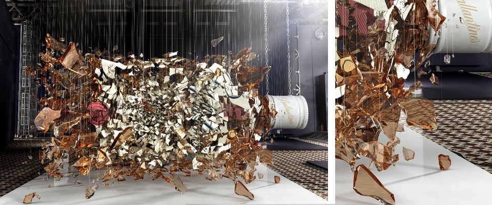
Baptiste Masse
I know. I can’t believe it either.
A “smash hit,” no? Ah, what an awful pun, but I couldn’t resist.
By Baptiste Masse.
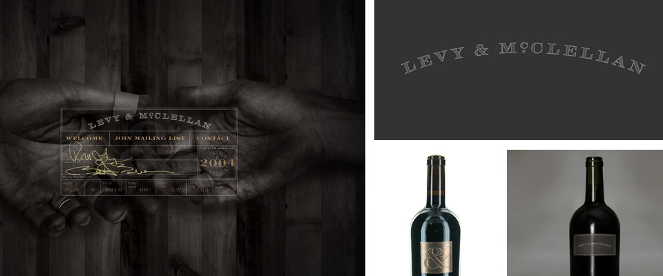
Levy & McClellan
This is definitely a “yes to all.” Typeface for the name, website design, and sole ampersand as label (I do love a good ampersand). Nailed on every level.
Levy & McClelland website here.
Designed by Dan Miller.
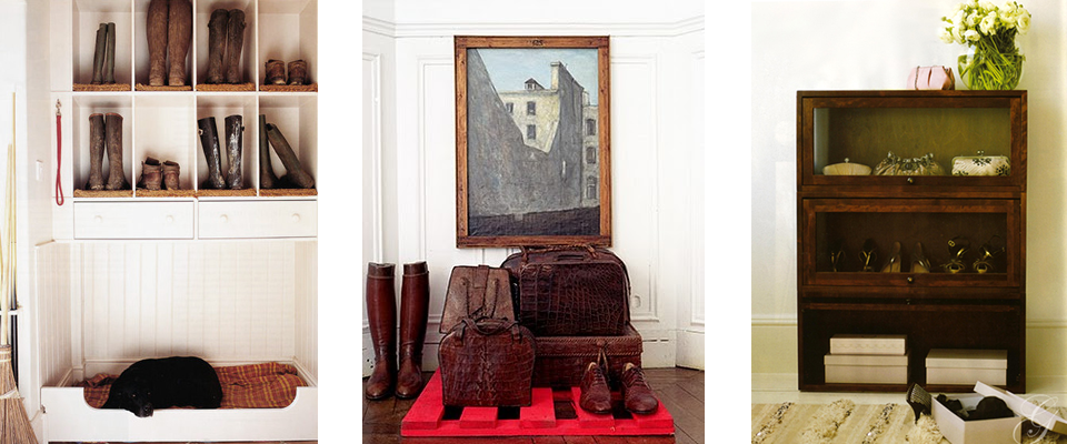
In Plain Sight
As I get ready to move to San Francisco, I’m filing away little ideas to get a head start on dealing with the reality that I probably will not have the giant closets that Santa Barbara apartments have spoiled me with.
The styling here is lovely, and suggests that if your luggage and footwear are beautiful, and you don’t have a lot of closet space, why not just display them nicely?

If you style your belongings that belong in the closet as though your apartment were a store, artfully arranging pieces, mixing clothing items in with other kinds of things, and keeping it all very tidy, I think you can get away with it. And why not use normal furniture as shoe/bag/jewelry storage?
Speaking of which, what ever happened to a good old-fashioned armoire for storing hanging clothes?

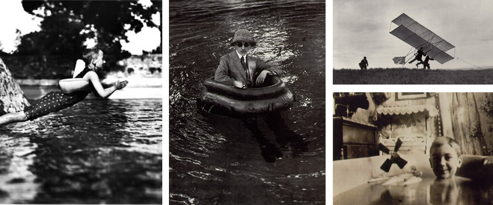
Jacques Henri Latrigue
I am totally enamored with Jacques Henri Lartigue and his work. Born in 1894, he received a camera for his seventh birthday, and from then on essentially kept a photo diary of his life. Fascinated by the things most young boys are interested in, including cars, dogs, his family and friends at play, aircraft, many of his most famous photographs were taken during his childhood.
 Apparently, Wes Anderson is a big fan and has modeled many of his characters and images after Lartigue’s work, including Max from Rushmore. Also did you notice the photo of Zissou? Bet that’s where he got Steve Zissou’s name!
As he continued to document his surroundings and outings for his entire life, he later took many photos of fashionable Parisian life and French vacation spots, but I’ll save that era for another day.
Today, I’m loving the joie de vivre, humor, and idiosyncrasies captured in his childhood photographs.
Can you believe his technical capability at such a young age? This was before digital made everything look good, y’all.
Curated by:
Eliza Coleman
Section:
Arts Visuels
Labels:
Art Visuels, classics, Photography
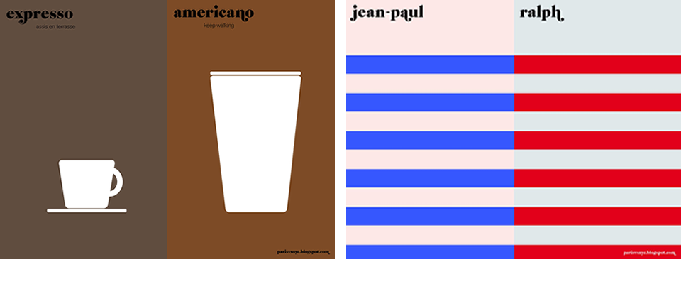
Paris vs. New York
I love this representation of the idea of “Paris versus New York”– the reduction of a vast subject down to highly simplistic, single image representations is a great example of effective graphic design. Communicating a complex subject in a way that makes it seem straightforward.
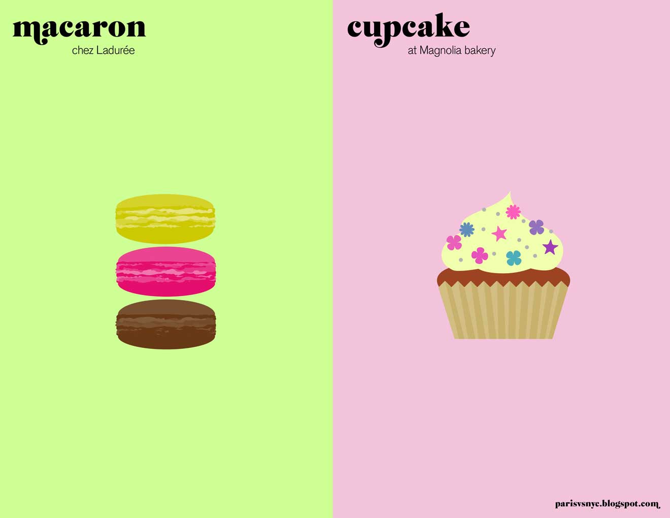
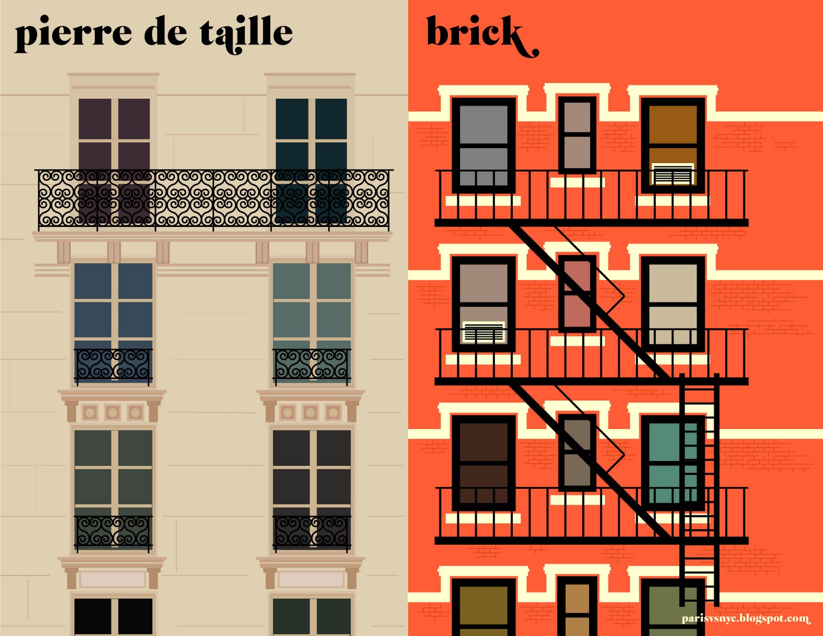
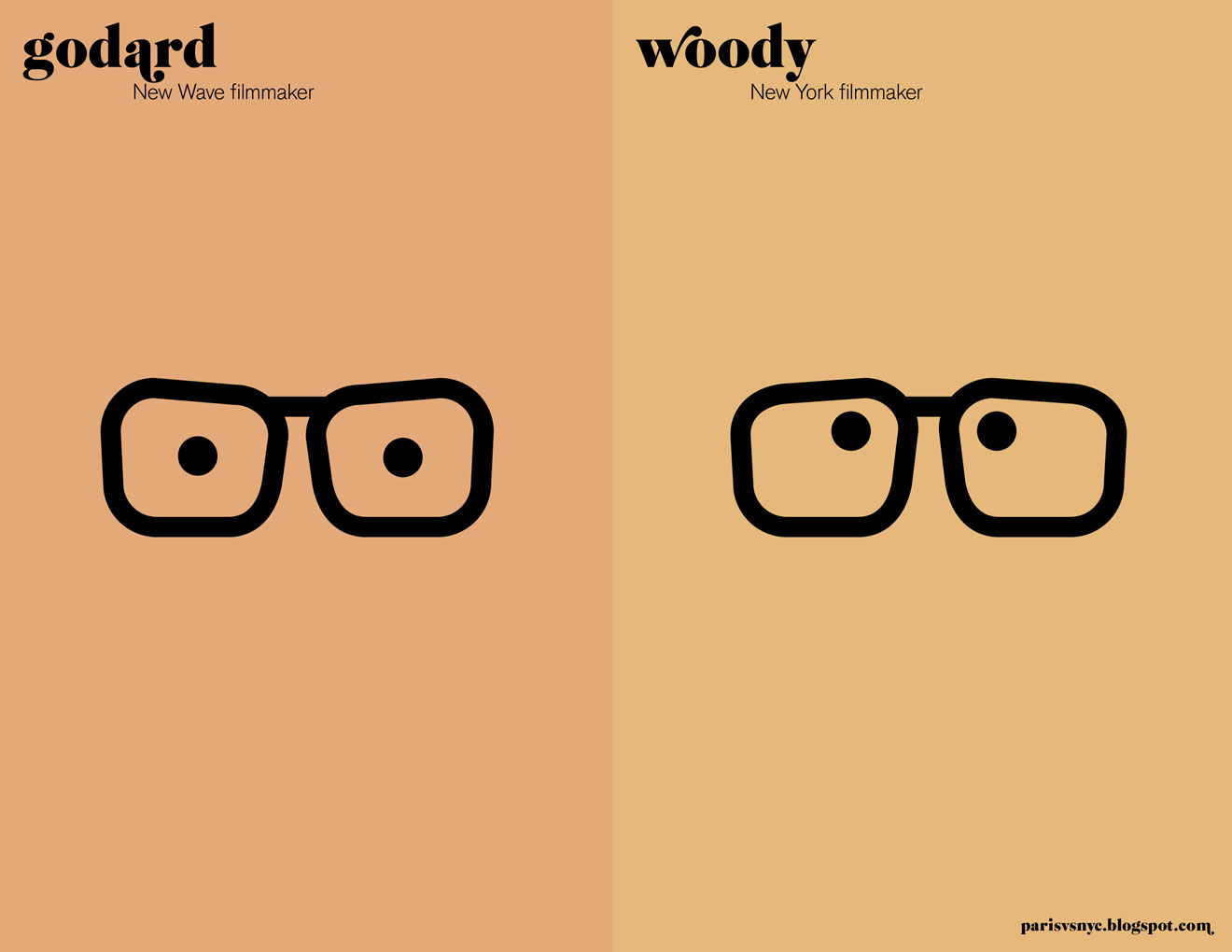
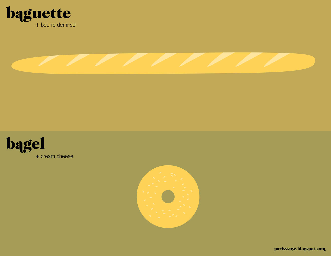
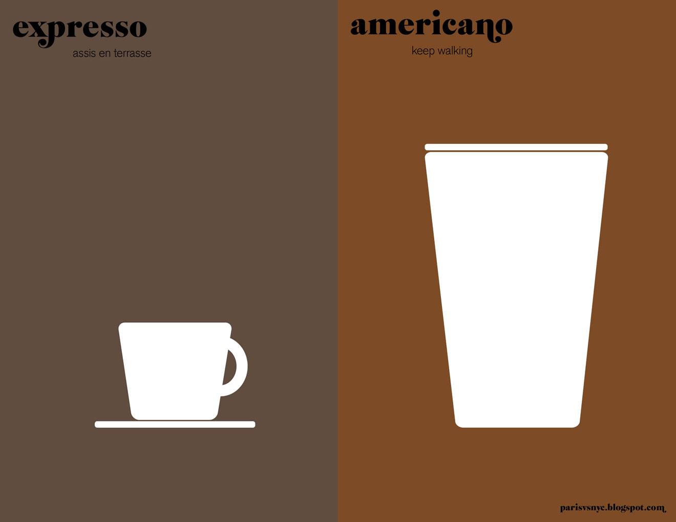
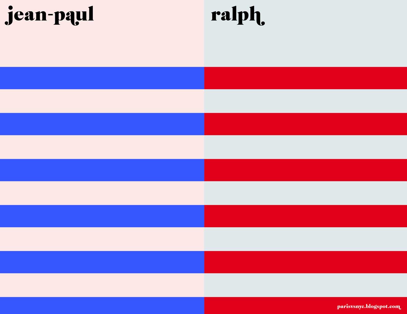
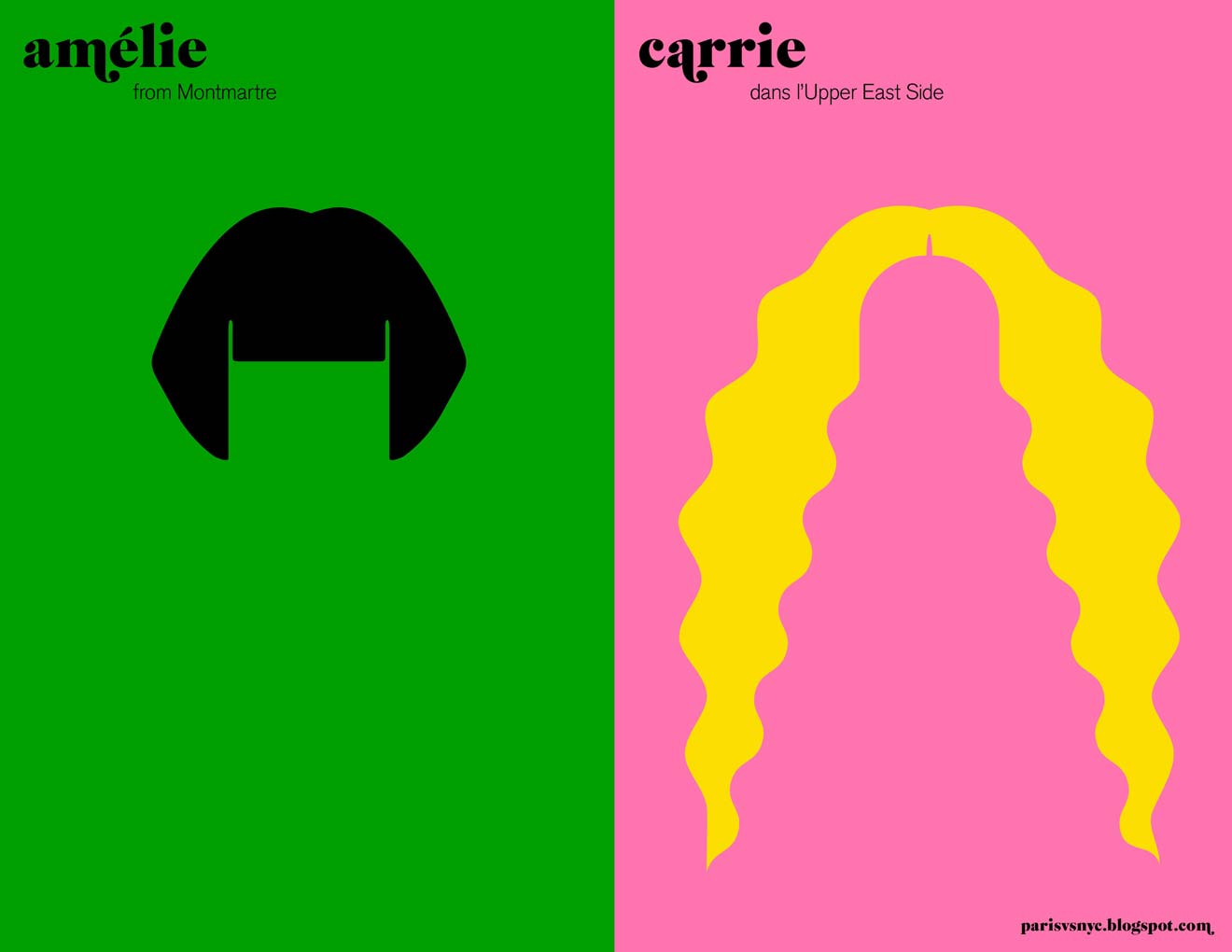
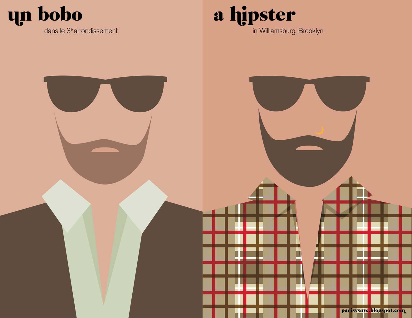
From this blog, by Vahram Muratyan.
PS- Did you get to the end and feel like you have a preference for one over the other? Even though I love New York, I preferred Paris in almost every single one! So either the illustrator’s bias (which I can’t even detect in these images) swayed me, or I’m really a little secret Francophile. But who doesn’t love Paris.
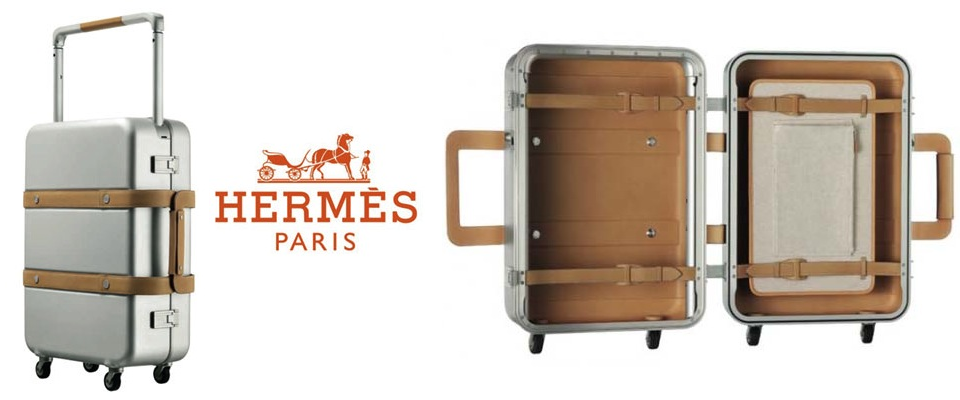
LustList: Orion Suitcase
Hi, my name is Eliza, and I am a luggage addict.
This goes outside the usual parameters for the luggage I like, with its tough/sleek/modern appearance, but I like that it looks hearty enough to withstand being checked. It looks practical, which cannot be said for most of the luggage I fall for, and thus deserves to be added to the lustlist. See, this is what addicts do. Justification.
Luckily for me, my addiction lies beyond my means of acquisition, and hence exists only on this here digital list of lusts.